


Famous yellow logos: Zesty companies with yellow logos
How many famous yellow logos can you picture right now? From the iconic golden arches of McDonalds’ to the bold icon of Best Buy, there are plenty of examples out there. Companies with yellow logos instantly convey a sense of joy and affinity to anyone who sees their branding.
Bright and engaging, yellow is a color perfect for capturing anyone’s attention. That’s why we often see the shade in hi-lighters, high-visibility jackets, and warning signs.
Of course, yellow isn’t just great at pulling the focus of your target audience, the hue can also have a profound emotional impact when used carefully in your brand assets.
As the lightest color in the spectrum, yellow is uplifting, enlightening, and illuminating. It’s a shade many people associate with cheerfulness, fun, and hope. Yellow is also said to be connected with things like creativity, original thought, and curiosity.
Today, we’re taking a look at some amazing companies with yellow logos!
Why do companies use yellow in their logos?
Often, when companies choose a specific color palette for their logos, they’re not just picking colors the CEO personally likes.
In the branding world, every color is associated with a certain set of emotions. The right use of shades in your brand assets can immediately have a lasting impact on your target audience, improving your chances of a strong image in a competitive world.
Yellow has several meanings in the marketing and branding spectrum. In some cases, it can be intense, bright, and even abrasive. When matched with certain colors (like black), it’s easy to associate yellow with warning signs and symbols.
While yellow is warm and bright, it can also lead to visual fatigue when used in large doses. This is why many companies who use yellow in their logo use other colors like white throughout their other visual assets and packaging.
Yellow is energetic, cheery, and friendly. It’s a color many people associate with positive feelings, but it can also be aggressive in the wrong setting.
Let’s explore some of the most famous yellow logos, to see how companies use this shade…

Denny’s
Yellow is a common color in the fast food industry because it inspires both joy and hunger. According to some psychologists, the combination of red and yellow, like the colors in the Denny’s logo, can even boost the metabolism.
The Denny’s logo is one of the most instantly recognizable images in the American landscape today. The color choices, combined with the fun and friendly font, convey an environment ideal for families in search of a laidback experience.

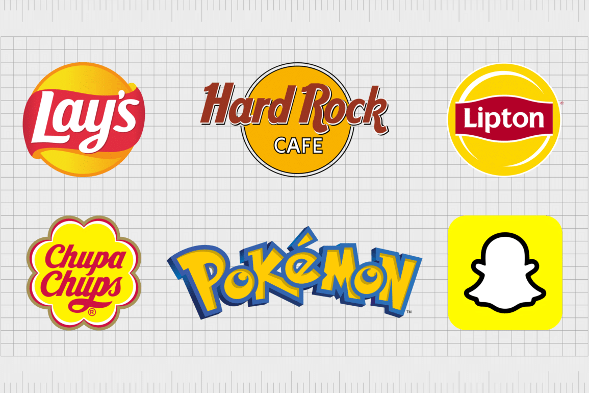
Lay’s
Another of the most popular yellow logos in the landscape today, Lay’s has been a part of the snack space in the US since 1932. Today, the round yellow logo is an icon throughout the world.
The image immediately conveys ideas of hunger, thanks to the red and yellow combination.
The Lay’s logo also reminds us of warmth, thanks to its orange gradient, and the circular shape (similar to the sun). It’s a great example of how yellow can bring a smile to someone’s face.

Ferrari
Easily one of the most eye-catching emblems in the automobile industry, the Ferrari yellow logo is well-known across the globe. The shade immediately sets Ferrari apart from other leading automotive companies, which usually rely on shades of white, silver, and blue.
The Ferrari logo is intended to convey ideas of joy, excitement, and speed. The bright yellow coloring helps to establish the company as a true innovator in its space.
Find out more about the Ferrari logo here.

Stanley
As mentioned above, Stanley can be a very versatile color, often associated with both joy and aggression. In the “Stanley” logo, we associate the deep shade of yellow with the DIY industry, and the various signs we often see at construction site.
Yellow pertains to caution in a lot of communities, and it makes a lot of sense for a company focused on an area where people would need to show caution (like cutting materials)

Snapchat
Perhaps one of the most modern yellow company logos, the Snapchat emblem hasn’t been around for quite as long as some of the leaders on this list. However, when it comes to logos that are yellow, Snapchat may now be one of the main images you think of.
Snapchat uses a bright shade of yellow to immediately create a sunny and playful disposition. The use of yellow in the main icon for the brand also ensures this application can stand out from the competitors on your smartphone screen.

DHL
DHL is one of the few companies with a yellow logo using the colors yellow and red for something other than depicting hunger. This brand image uses a combination of energetic and engaging colors, with a slightly slanted font to depict speed and motion.
DHL’s logo also helps to set the company apart from a number of other logistics brands that tend to use darker, more sophisticated, and “traditional” shades.

Pokémon
Yellow is a color frequently associated with youth and fun. It makes a lot of sense as the primary color of the “Pokémon” logo, a franchise dedicated to capturing the attention of a younger audience.
Since the color yellow is also associated with creativity and innovation, it’s a great pick for depicting a world of new creatures and experiences.
Yellow is also an excellent pick for Pokémon because it’s frequently linked to concepts of discovery. The characters in this anime are often setting out on adventures.
Find out more about the Pokémon logo here.

National Geographic
Speaking of logos associated with discovery, few are quite as compelling as the “Nat Geo” brand image. This television and magazine company features a host of subjects including world history, science, and geography.
The yellow square in the National Geographic logo is intended to convey ideas of enlightenment and discovery.
Yellow is a popular color in education because of its ability to speak to people of all ages. The shade also makes is think of new dawns and innovation.

McDonald’s
It’s impossible to discuss brands with yellow logos without throwing a mention out to the golden arches. Probably one of the most famous yellow logos in the world, the Mcdonald’s logo appears all over the globe, designed to bring a smile to the face of everyone who sees it.
The Mcdonald’s golden “M” is instantly eye-catching and ideal for grabbing the focus of people on the road who might be interested in a drive-thru meal. Mcdonald’s also uses red in its branding to create the yellow and red hunger-inducing effects.

Best Buy
Another example of an excellent yellow logo where the color is used to grab the attention of audiences wherever they are, Best Buy has one of the most eye-catching emblems out there. The yellow logo immediately draws attention to the brand.
The shape of the logo, combined with the black and white color scheme makes us think of important signs or announcements. Best Buy has become a symbol of cost-effective shopping.

Subway
Committed to helping customers “eat fresh”, Subway took a slightly different approach to the majority of fast-food brands. With this logo, the company uses a yellow arrow combined with a green arrow to make the shape of an “S”.
The combination of yellow and green reminds us of fresh things like fruits and vegetables or the sun rising over a green field. It’s an excellent image for a company trying to convey a commitment to nature and freshness.

CAT
Yellow has been one of the primary colors associated with the CAT brand for a number of years now. Once again, this company, committed to designing products for construction sites, uses yellow and black to convey the warning signs we often see in these environments.
The yellow triangle in the logo can also be associated with light, illumination, and creativity – all concepts most people in the construction world are very familiar with.

Shell
An interesting insight into the versatility of red and yellow as a color combination in branding, Shell isn’t trying to create hunger with its imagery here. Instead, the company has built an image of importance and energy.
The color yellow is something we commonly associate with endurance and stamina, so it makes sense the Shell Company would want to embrace this coloring for its branding. The business is committed to keeping vehicles moving with access to fuel.

Post-it
Ask anyone to name a product they commonly associate with the color yellow, and there’s a good chance they’ll mention Post-its. The Post-it Note is a bright-yellow sticky note intended to grab your attention when you need to remind yourself of something.
The current Post-it brand offers a range of designs to its customers, hence the variety of shades of yellow in the brand’s logo.

Chupa Chups
The Chupa Chups Company actually uses a few colors in its logo, but yellow is one of the primary shades. The yellow flower shape on this logo is one of the most eye-catching images in the confectionary landscape.
It’s also excellent for conveying ideas of joy and youth.
Like many food companies, Chupa Chups uses the color psychology of red and yellow to its advantage. However, the bright colors are intended to be as friendly as possible to youngsters.

BIC
Designed by an artist named Raymond Savignac, the BIC logo hasn’t gone through too many changes over the years. The use of the color yellow is a staple in the organization’s branding, designed to convey ideas of discovery and creativity, thanks to the slightly deeper shade.
While the color in this logo can still be associated with joy, it’s intended more to connect with concepts of intelligence and enlightenment.

Rockstar
Another excellent example of brands with yellow logos, Rockstar is a leading innovator in the world of energy drinks. The color yellow is used here to convey “energy.” Yellow is often associated with zeal and animation because it’s linked to things like lightning and electricity.
The bright yellow in the Rockstar emblem also makes a lot of sense, because yellow is commonly linked to stars – a shape which makes up a big part of this logo.

The LA Lakers
Yellow appears all over the branding world for a range of different reasons. In the sporting landscape, it’s often used to convey the colors of a particular state. The LA Lakers use the combination of yellow and purple to create a distinct and unique contrast.
Interestingly, in color psychology, yellow and purple are often considered to be the perfect complementary colors because they oppose eachother on the color wheel.
Find out more about the Los Angeles Lakers logo here.

Pirelli
The Pirelli Tire Company has leveraged several colors in its logo over the years, including black, white, and red. One of the most memorable examples of the Pirelli logo is simply a red font on a bright yellow background intended to demonstrate ideas of energy and force.
The liveliness of the Pirelli logo is excellent for a company designed to keep vehicles running smoothly.

Hertz
Simple, but effective, the yellow logo used by the Hertz Company embraces yellow as a complementary color to black. The car rental company wanted to add a sense of vibrancy and pizazz to its logo with yellow, but in this variation, they’ve reduced the intensity of the shade.
In previous iterations of the Hertz logo, yellow has played a more central part in highlighting the company’s identity.

Pringles
Easily one of the better-known mascot logos globally, the Pringles emblem uses the color yellow to great effect in its wordmark. The color yellow here conveys hunger and happiness, but it also has a slight gradient to it, intended to remind you of the shade of the snacks you’ll be eating.
Like many innovators in the food landscape, Pringles has also combined the colors yellow and red, but somewhat subtly, by making the mascot’s bow tie a crimson color.

Rockstar Games
An American video game publisher launched in 1998, Rockstar Games has produced some of the world’s better-known titles, including Red Dead and Grand Theft Auto. The company uses and orange-yellow shade for the central coloring in its logo, showcasing virility and verve.
The coloring of black, white and yellow together works to set Rockstar apart slightly from the warning signs using black font on a yellow background.

Bumble
Sometimes, a yellow logo makes sense when your name has a connection to the color. For instance, the shade yellow is something we associate with bumblebees, making it a great choice for the “Bumble” logo.
However, because the company didn’t want any negative associations with caution or danger in its image, it swapped the black stripes of a bumblebee with white.
The overall image is a friendly and engaging logo, great for conveying ideas of happiness and community.

Reese’s
The Reese’s confectionary company uses a number of colors to depict an eye-catching image, including a vibrant shade of yellow. Here, the color yellow is intended entirely to connect with ideas of happiness and joy.
The colors yellow, brown, and orange have all become a fundamental part of the “Reese’s” logo today.
Find out more about the Reese’s logo here.

In N’ Out
Our search for yellow company logos took us to the fast food industry a number of times, thanks to the colors unique ability to create feelings of hunger. The Yellow arrow on the “In-n-Out” burger sign is great for showcasing ides of speed and agility.
The design simultaneously points customers into the restaurant, while reminding them they can get in and out of the drive-thru fast.

Hard Rock Café
Yellow might not be a color you’d immediately associate with rock n’ roll, but the Hard Rock Café has used this shade in a fantastic way, to demonstrate the liveliness of the rock community. The yellow circle in the background of this logo gives the image a sense of zest.
Yellow matched with the brown coloring in the Hard Rock Café logo also creates a wonderfully warming and friendly overall design.

Juicy Fruit
One of the best-known chewing gums in the world, Juicy Fruit uses a selection of eye-catching colors, combined with a bold and friendly font style to connect with its audience. The yellow in this logo is great for creating ideas of fresh, zesty fruits, like lemons.
Yellow is also strongly connected to youth, freedom, and happiness. The color helps us to associate juicy fruit with something fun and playful.

Schweppes
Another example of a yellow logo just making sense for the brand in question, the Schweppes logo uses a simple, creative banner with a wordmark to depict its brand.
Since Schweppes is best known for its lemonade products, it only makes sense it would want to convey the zest of lemons with the logo.
Interestingly, the Schweppes logo uses a slightly warmer shade of yellow today, perhaps to separate the brand from the black and yellow of caution signs.
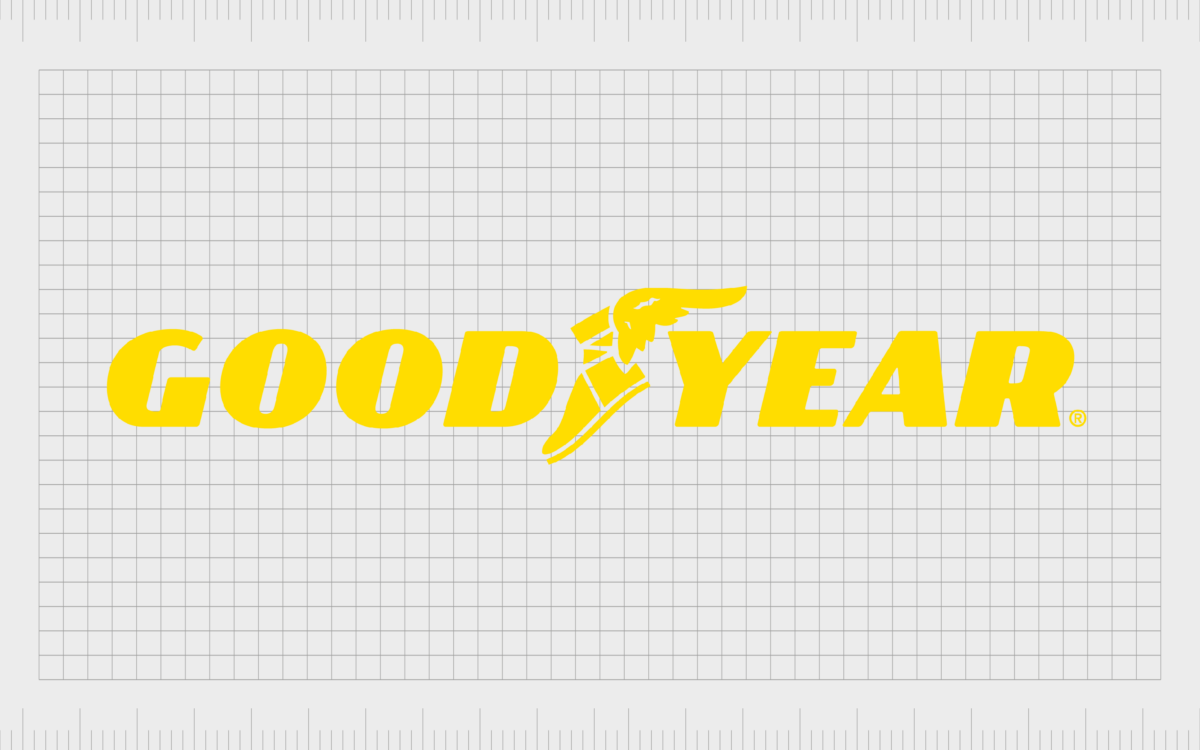
Goodyear
A brand image with plenty of get-up-and-go, the Goodyear logo uses an interesting combination of bright yellow to show vivacity and virility, and dark blue. The darker blue shade in this logo reminds customers they’re dealing with a reputable brand.
The deep blue could also be associated with the sky, where Hermes (a deity from Greek mythology) could zip through the clouds sharing messages with the Gods. Hermes’ shoe is also depicted in this logo.

UPS
Another of the top brands with yellow logos, UPS has a wonderfully warming and prestigious image for its brand mark. The yellow shield with brown accents is intended to remind us more of the color gold than standard yellow.
The warming shade of yellow here is great for conveying ideas of prestige, while still highlighting the energy and vivacity UPS uses when delivering products around the world.
Find out more about the UPS logo here.

Cheetos
Fun, friendly, and playful, the Cheetos logo is easy to remember. The shape of the bold letters in the Cheetos font reminds us a little of the fur of a cheetah, the company’s brand mascot. The yellow and orange combination is great for this purpose too.
The bright color of yellow in the Cheetos logo also draws attention to the flavor of the cheesy snacks Cheetos offers.

Sonic the Hedgehog
An icon of the video game world, Sonic the Hedgehog’s logo is perhaps one of the better-known images around the world. The yellow coloring in the Sonic logo is fun, friendly, and brimming with energy, just like the titular character himself.
The Sonic the Hedgehog logo also conveys three colors from the three main characters of the series. We see blue for Sonic, yellow for Tails, and red for Knuckles.

Maggi
An international brand known for selling instant noodles, seasonings, and soups, Maggi has had a place in the food industry for nearly 140 years. The company uses the colors yellow and red in a similar way to other leading food companies, to create a sense of hunger.
The coloring could also remind some people of the versatile range of spices sold by the Maggi brand, like cinnamon and turmeric.

Lipton
If you’re a fan of iced tea, you’re probably familiar with the Lipton logo. The yellow in this logo is meant to convey a number of ideas. You could associate the yellow with a slice of lemon (a zesty fruit often added to iced tea), or the shining sun.
The Lipton iced tea logo is friendly and energetic. It makes us think of vitality, fun and fresh flavors, and refreshment.
Celebrating popular yellow logos
There’s certainly no shortage of famous yellow logos out there to explore. As one of the more eye-catching colors on the spectrum, companies with yellow logos can rely on this shade to grab their customers’ attention.
Yellow is one of the more versatile shades for branding, capable of conveying ideas from creativity and innovation to happiness, community, and youth. However, it can also have negative connotations in the wrong circumstances too.
Could yellow be the ideal color for your company’s brand?
Fabrik: A branding agency for our times.
Now read these:
—Famous companies with blue logos
—Well-known brands with red logos
—Green logos to make you envious
—Popular brands with orange logos
—Today’s most famous purple logos
—The timeless black and white logos
—Standout companies with pink logos
—Exploring the colors of the rainbow

Clarity starts with a conversation.
Thanks—we’ll get back to you shortly.
Whether you're navigating a rebrand, merger, or simply need a clearer identity—we’re here to help. No hard sell, just honest advice from people who know the sector.
Let’s start with a simple question…
Prefer to email? Drop us a line.
Fabrik’s been helping organisations rethink and reshape their brands for over 25 years. We’ve guided companies through mergers, rebrands and new launches. Whatever stage you’re at, we’ll meet you there.