


Beauty brand logos: Famous cosmetic and makeup brand logos

How many famous beauty brand logos can you picture right now? Even if you’re not a huge fan of the industry, there are probably quite a few images springing to mind. After all, cosmetic and makeup brand logos are everywhere, from the “Body Shop” to “Clinique”.
Worldwide, the value for the beauty (cosmetics) industry is expected to hit an incredible $758.4 billion by 2025. As the niche continues to grow, there are endless new logos and brand images appearing all the time.
Today, we’re going to be exploring just a handful of the best beauty logos, ranging from luxury beauty brand logos to the designs for everyday companies.

1. Anastasia
Anastasia, or Anastasia Beverly Hills, is one of the makeup brand logos gaining a lot of attention in recent years, as the company continues to grow to fame. Unlike many of the cosmetic brand logos on this list, Anastasia avoids taking the ultra-minimalistic approach to its image.
With this logo, we get a unique emblem designed to look simultaneously like an A and a butterfly, placed in a circle to represent community and acceptance. Underneath the image is the Anastasia wordmark, featuring similarly creative flourishes, and the “Beverly Hills” element.
Find out more about the Anastasia Beverly Hills logo here.
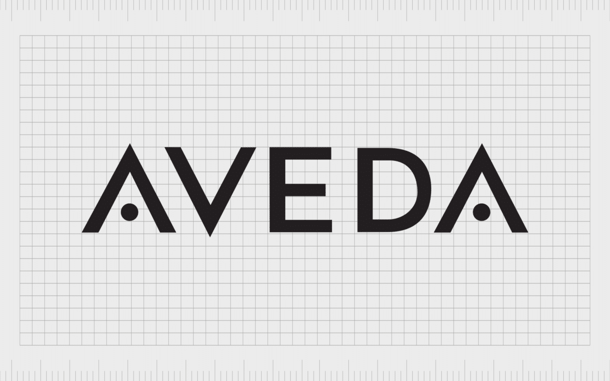
2. Aveda
An innovative, yet timeless beauty brand, Aveda was launched in 1978 and has been introducing high-quality, unique products to the market ever since. Now owned by Estee Lauder, the business produces everything from skin and body care to hair care products.
There’s also a segment of the business devoted to training students in cosmetology. The logo matches the innovation of the brand, with eye-catching geometric shapes in the wordmark, and a sleek, modern design in the “A’s”.
Find out more about the Aveda logo here.

3. Avon
Avon might be a British brand, but it’s something known all around the world today. The company, selling makeup, personal care, and skincare products, currently has more than 30,000 employees across the globe.
The branding for the company has changed a few times over the years, but today features a beautiful, brightly coloured wordmark.
The bold and attractive logo for the Avon brand helps to highlight the company’s innovative approach to growth, which involves getting all kinds of on-commission salespeople involved in selling the products. The bright colors of pink and purple are feminine and friendly.
Find out more about the Avon logo here.
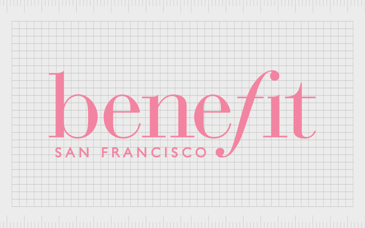
4. Benefit
One of the major manufacturers of cosmetics in the market today, Benefit has risen to fame over more than 40 years in the industry. Founded by twin sisters Jane and Jean ford, Benefit has now grown to a presence in more than 30 counties.
Like many of the best beauty logos, Benefit’s image is simple and compelling. The wordmark, written in all lower-case serif letters is sophisticated but friendly. The stylized “f” demonstrates elegance, while the “San Francisco” mark underneath the main wordmark gives the company additional local appeal.
Find out more about the Benefit Cosmetics logo here.
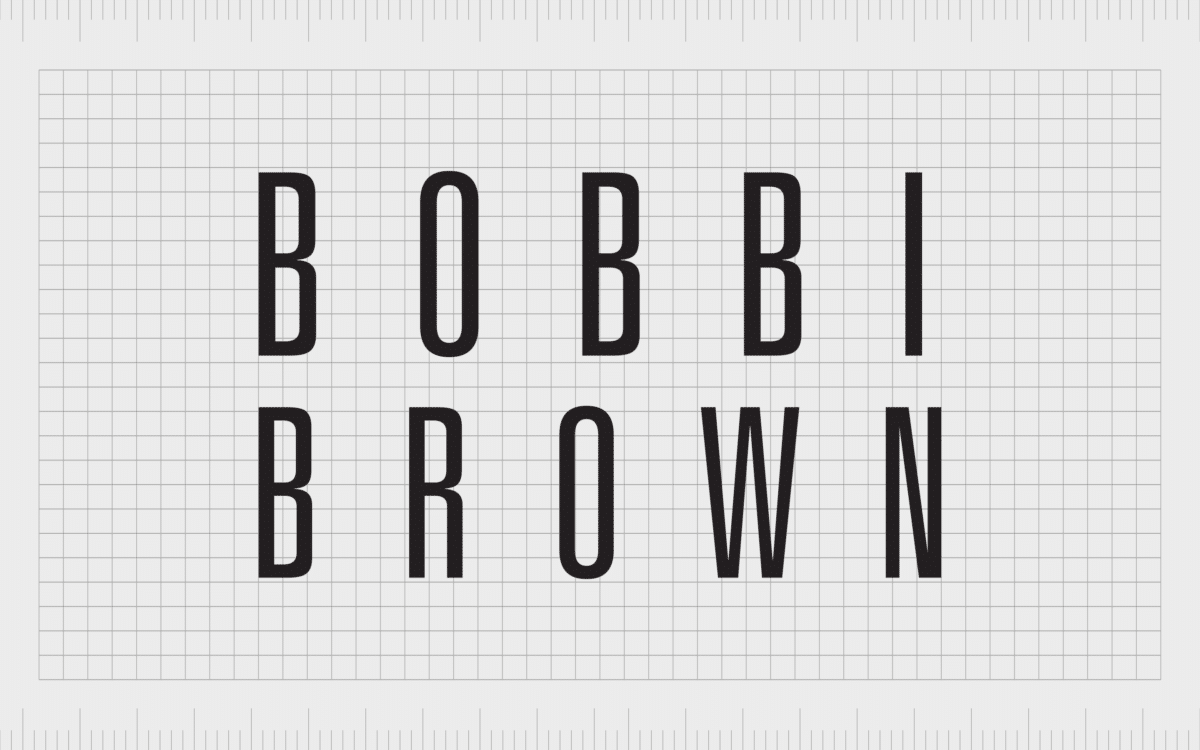
5. Bobbi Brown
Originally founded in 1991, Bobbi Brown belongs to the Estee Lauder organization, but this hasn’t stopped the company from making a name and an image for itself. The Bobbi Brown logo is wonderfully modern, featuring a sans-serif wordmark.
The use of slim, almost symmetrical letters in the Bobbi Brown logo, combined with careful kerning and spacing, makes the image look immediately more impressive. There’s something inherently timeless and even futuristic about this wordmark.
Find out more about the Bobbi Brown logo here.
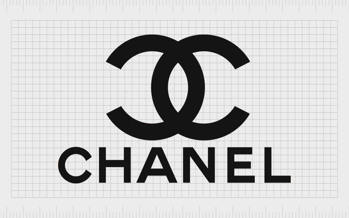
6. Chanel
Chanel is a company best-known for its dedication to luxury and high class. The brand creates everything from accessories to perfumes and cosmetics. Launched in France in 1909, Chanel brings significant heritage and sophistication to its brand image. The logo features the word “Chanel” in all capital sans-serif font.
Perhaps the most appealing part of the Chanel logo, however, is the monogram, with the two interlocking “C’s” representing Coco Chanel. The image has become an icon of fashion in many global circles.
Find out more about the Chanel logo here.
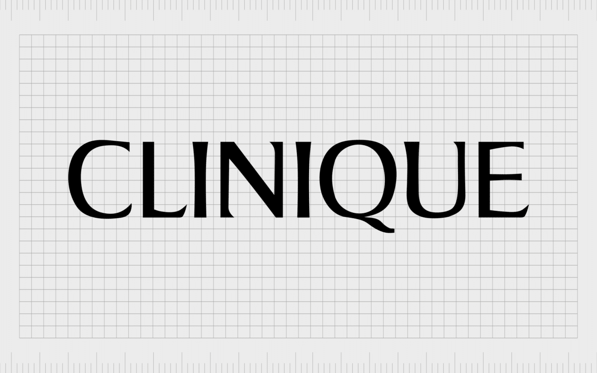
7. Clinique
When it comes to beauty company logos, it’s hard to find anyone who hasn’t seen the “Clinique” brandmark. Clinique Laboratories first launched in 1968 and has delivered high-quality beauty products ever since.
Today, the company has more than 22,000 consumer consultants across the globe and ranks as one of the best-known beauty companies around. The Clinique logo is simple but effective.
A serif wordmark with a line to the top and bottom gives the company an image of stability, power, and sophistication.
Find out more about the Clinique logo here.

8. ColourPop Cosmetics
Simple but effective, ColourPop cosmetics’ logo is intended to be flexible enough to adapt into any color theme, expressing the versatility of the brand. The wordmark itself is fun and handwritten, with a series of imperfect letters in various sizes, making the word “pop” from the page.
Despite the British spelling, ColourPop is actually one of the top cosmetics brands in the United States.
Find out more about the ColourPop logo here.

9. Dove
Often referenced by a host of branding and marketing experts as an expert in storytelling and emotional advertising, Dove is one of the biggest beauty brands in the world.
The logo of the company is romantic and engaging. Unlike most beauty brand logos, Dove’s wordmark is written in sentence case (rather than all capitals).
Dove also features the color blue, to convey feelings of calmness and reliability. Underneath the Dove wordmark is the image of a golden dove – a kind of mascot and icon for the company fused into one.
Find out more about the Dove logo here.

10. Estée Lauder
Makeup brand logos don’t come much more iconic than the image of Estée Lauder. This American multinational manufacturer sells everything from makeup and skincare to fragrance and haircare products.
Though the company initially launched 75 years ago in 1946, it remains one of the most popular organizations in the industry today. The Estée Lauder logo is minimalist and luxurious, written in all capital letters, with a deep blue shade to represent reliability.
Find out more about the Estée Lauder logo here.

11. Fenty Beauty
One of the more recent beauty logos to hit the market, the Fenty Beauty image is one still gaining traction right now. Created by Rihanna, the company uses a modern logo to demonstrate its commitment to creating a unique experience for customers.
The logotype is sans-serif to keep its modern edge, and the backwards “N” adds an edgy and innovative tone to the overall image. The decision to use the phrase “by Rihanna” instantly grabs customer attention by associating the company with a major celebrity.
Find out more about the Fenty Beauty logo here.

12. Garnier
When it comes to exploring the logos of famous beauty brands, Garnier’s offering really stands out. The circle in the image demonstrates completeness and community.
The leaf texture in the circle highlights the natural ingredients used by the company – one of the major selling points for many consumers interested in Garnier products.
The wordmark is also unique for Garnier. Though most of the letters are in capitals, the “e” is in lowercase, demonstrating the out-of-the-box thinking of the brand, and the commitment to creating products accessible and approachable for everyone.
Find out more about the Garnier logo here.

13. Glossier
Glossier ranks among the best-known beauty brand logos in the United States, and indeed across the globe. Glossier started life in 2014, thanks to the forward-thinking innovation of the incredible Emily Weiss.
Celebrating the natural beauty of people around the world, Glossier rose to fame with a unique, transparent approach to cosmetics. The Glossier logo is a simple, sans-serif wordmark, intended to represent straightforward products.
Find out more about the Glossier logo here.

14. IT Cosmetics
IT Cosmetics, created by Jamie Kern Lima, is a brand connected to the L’Oreal company. However, rather than relying on the image of the parent brand, this company builds its own unique aesthetic appeal.
The IT Cosmetics logo is modern and simple, with a hand-drawn “IT”, followed by a simple sans-serif word: “cosmetics”.
The initial part of the logo looks almost as though its drawn with a paintbrush, which helps to convey the artistry in the company’s personality.
Find out more about the IT Cosmetics logo here.

15. Kat Von D
When it comes to beauty company logos, many designs seem to take inspiration from the founder of the company, and their unique signature.
For a business started by pin-up icon and tattoo artist Kat Von D, this logo makes a lot of sense. The unique image draws attention to the out-of-the-box thinking of the brand, which produces cruelty-free products.
The logo is very similar to the subculture it was established in, focusing on the heavy metal and gothic scene. The calligraphy is beautiful, bold and vivid, with a bit of an edge.
Find out more about the Kat Von D logo here.

16. Kiehl’s
Elegance is clearly the main focus in the Kiehl’s beauty company logo. The first store belonging to this brand opened over 150 years ago, making it one of the longest-standing organizations in the industry.
The stunning wordmark draws attention to the heritage of the company with the use of the phrase “Since 1851”.
The primary wordmark for Kiehl’s logo is an elegant image, looking almost like hand-drawn calligraphy. The swirls and curves of the letters pull attention to the artistry behind the company.
Find out more about the Kiehl’s logo here.

17. Lancôme
A luxury perfumes and cosmetics brand distributing products around the world, Lancôme first rose to fame almost 90 years ago, in 1935. The company is committed to highlighting its French origins whenever possible, with the word “Paris” often displayed in the logo.
The Lancôme wordmark is simple but elegant, using a serif font to convey ideas of sophistication and class. Though there’s no particularly unique graphic or design here, the Lancome brand is easy to identify anywhere in the world.
Find out more about the Lancôme logo here.

18. L’Oréal
Easily one of the best-known beauty company logos out there , the L’Oréal logo is impossible to forget. The heart of this image is definitely the larger “O” in the center of the wordmark, which makes the company appear more fun and exotic.
The use of flourishes in the word “L’Oréal” also helps to remind us of the background of the company, which began in Paris. This immediately helps customers to associate the business with the classic elegance and beauty of France.
Find out more about the L’Oréal logo here.

19. MAC Cosmetics
One of the many beauty brand logos listed under the Estee Lauder company, MAC Cosmetics has risen to fame since its launch in 1984. Today, the company is present all over the world, though its headquarters is in New York.
MAC Cosmetics’ logo is wonderfully modern, highlighting the forward-thinking and edgy nature of the company. The brand appeals directly to a younger audience, which is perhaps why they chose a more futuristic design.
The MAC logo almost looks as though it’s moving at speed.
Find out more about the MAC Cosmetics logo here.

20. Maybelline
Maybelline is a company all about “the cutting edge”. This is a company committed to constantly producing new products so its customers can stay up-to-date with the latest beauty trends. The modern and forward-thinking nature of the brand certainly shows through in its logo.
Like many of the beauty brand logos we’ve looked at in this list, Maybelline uses a wordmark to identify the company, written in a simple, sans-serif font. The image is highly modern and minimalist, perfect for a company committed to timeless, forward-thinking beauty.
Find out more about the Maybelline logo here.

21. Morphe
Also known as “Morphe Brushes” and “Morphe Cosmetics”, Morphe is an LA cosmetics and beauty company created in 2009. Specializing in the digital retail of beauty products, Morphe has risen to fame thanks largely to its collaborations with beauty influencers.
The company’s eye-catching logo demonstrates sophistication, class, and heritage. Morphe’s serif wordmark is prestigious and luxurious, demonstrating a higher quality of product.
Find out more about the Morphe Cosmetics logo here.

22. NARS
One of the top cosmetics, beauty, and skincare brands in the world, NARS has a logo designed to immediately grab attention. The wordmark is written in all capitals, with a sleek and modern font representative of the company’s forward-thinking personality.
The decision to overlap the letters in the logo helps to demonstrate the brand’s commitment to out of the box thinking. However, it’s also a reference to some of the intimacy present in NARS’ product line.
Find out more about the NARS logo here.

23. NYX
A subsidiary of L’Oreal, NYX is a modern company designed to attract a younger audience. As beauty logo examples go, this is one of the more modern we’ve seen. The image uses the classic wordmark we see with most cosmetics brand, but the font is definitely eye-catching.
There’s a symmetry to the use of the sans-serif capital letters in “NYX” which avoids any angular or harsh shapes, to make the brand seem more welcoming. The use of semi-circles in the letters makes the brand seem more open.
The company also includes a small heart shape in its brandmark, to help it connect emotionally with its audience.
Find out more about the NYX logo here.
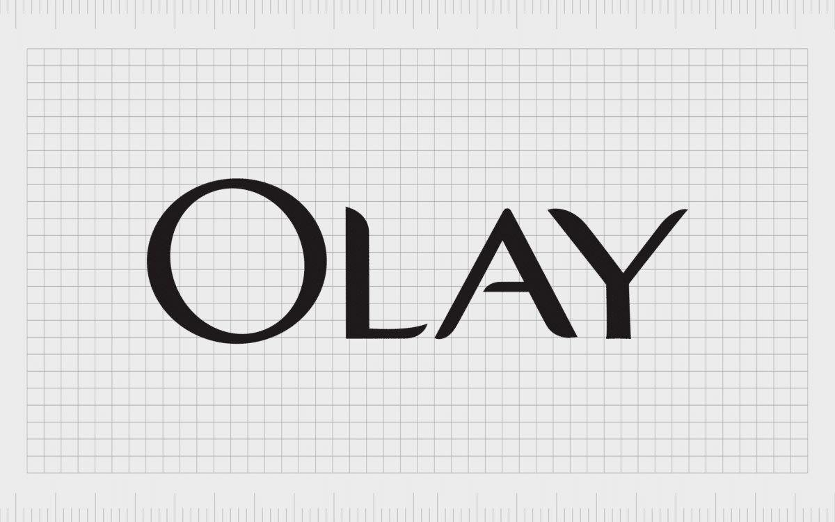
24. Olay
Previously known as Oil of Olay, or Oil of Olaz, Olay is a skincare brand owned by Procter and Gamble. The company has always taken a unique approach to marketing and branding, as it never fully described what its serums and creams actually did initially.
The Olay brand logo is attractive and intriguing. The wordmark has evolved over the years to feature a simple word in all capital letters, in an easy-to-read font. The underline under the “Olay” name seems to convey power and strength.
Find out more about the Olay logo here.

25. Pantene
Owned by Proctor and Gamble, Pantene is a global hair care product developer with extensive impact all around the world. The Pantene image is very similar to many beauty company logos.
Over the years, the company experimented with a range of designs and flourishes but has since simplified its emblem to make it look a lot like other leading brands, such as Revlon.
Pantene’s logo is simple and understated, featuring a serif wordmark written in all capital letters. The design is usually shown in black only.
Find out more about the Pantene logo here.
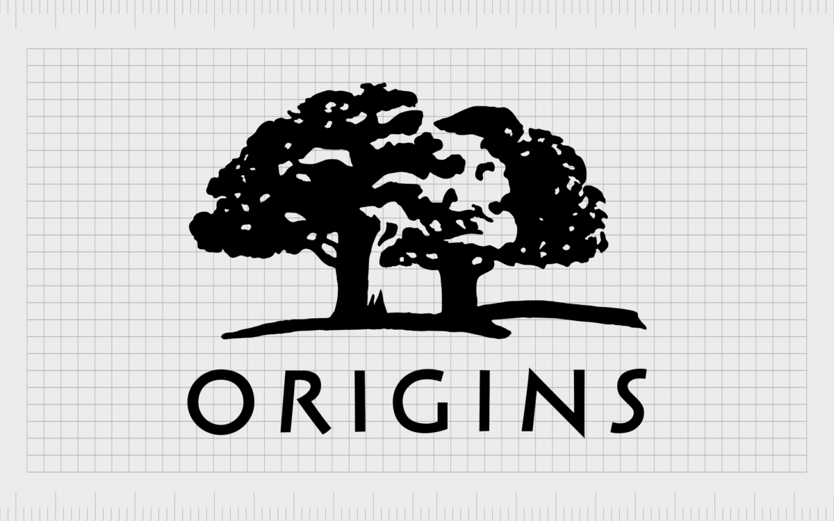
26. Origins
Many of the best beauty logos work because they focus on the unique selling points of the company. This is definitely the case with the “Origins” logo. Featuring the classic cosmetics wordmark in sans-serif font, the image is modern and engaging.
Above the wordmark, we see a pair of beautiful oak trees, highlighting the company’s focus on natural, and organic ingredients in all of Origins’ products. The use of the color green is also fantastic here, as it helps to highlight the natural background of the business.
Find out more about the Origins logo here.

27. Revlon
An American multi-national cosmetics, skincare, personal care, and fragrance company, Revlon has become an iconic brand all across the globe. The company was actually founded during the Great Depression in 1932. Today, it’s widely regarded as a forward-thinking brand in cosmetics.
The Revlon beauty brand logo is similar to many of the memorable company brand marks we’ve seen so far. The company uses a sans-serif, all-capitals wordmark for this logo, with a connected “L” and “O” to represent artistry and creativity.
Find out more about the Revlon logo here.

28. Stila
Innovative and artistic, Stila is a cosmetic brand committed to modern, forward-thinking products. The company has always promoted a sustainable approach to business, with cruelty-free items and a focus on transparency. The raw nature of the brand logomark is an excellent testament to this.
The “Stila” wordmark is instantly recognisable and approachable. There are no harsh lines or angular shapes. The image is also wonderfully creative and fun, but still has a touch of heritage to it, as it’s similar in style to a word typed with a typewriter.
Find out more about the Stila logo here.

29. Tarte Cosmetics
An American company currently headquartered in New York; Tarte Cosmetics is a brand gaining a lot of attention in the industry lately. The organization was founded in 2000, making it one of the newer companies in the niche.
Tarte Cosmetics avoids using any chemicals or unnatural products in its creations, and this approach to organic products certainly shows through in the logo. The wordmark for Tarte Cosmetics is simple, minimalist, and modern, with a friendly appeal to it.
Find out more about the Tarte Cosmetics logo here.

30. The Body Shop
One of the few beauty logos on our list to go beyond using a wordmark, The Body Shop maintains a unique circular emblem, representing completeness and community. The shape looks similar to a laurel wreath, giving the business an air of heritage and history.
It also works perfectly with the green coloring of the overall logo to remind customers of the naturalness of the company’s products. While other companies focus on showcasing class, the body shop concentrates on its natural, organic ingredients.
Find out more about The Body Shop logo here.

31. Urban Decay
Edgy and eye-catching the Urban Decay brand is ideal for capturing the attention of a younger audience. This is clearly an image meant to make an impact compared to the elegant and sophisticated images we usually associate with the cosmetics industry.
The mark includes a monogram of the “U” and “D” written in a gothic font.
Though still fantastic for exuding a concept of excellence and luxury, the Urban Decay brand takes a different approach to its beauty logo than most competitors.
Find out more about the Urban Decay logo here.

32. Yves Saint Laurent
A true icon in the beauty industry, Yves Saint Laurent is a beauty, fragrance and cosmetics brand first launching in 1961. The logo of the company features a monogram combining the first letters from the beginning of the three words in the words in the name.
The image has become so iconic many people now refer to the brand as “YSL”.
Underneath the monogram, we see the full name of the company written in the same eye-catching sans-serif font. This is a design perfect for showcasing modernity and style.
Find out more about the Yves Saint Laurent logo here.
Celebrating beauty brand logos
Beauty brand logos come in a range of different designs, though there seem to be a number of trends worth mentioning, including the use of simplistic wordmarks. Above, we’ve covered just some of the most famous beaty brands, from luxury beauty brand logos to more everyday options.
If you’d like to explore more of the top logos from various industries, make sure you check out our other handy Logofiles on the Fabrik website.
Fabrik: A branding agency for our times.
Now read these:
—The benefits of the Benefit logo
—Exploring the Bobby Brown logo
—The history of the Avon logo
—The Anastasia Beverly Hills logo

Clarity starts with a conversation.
Thanks—we’ll get back to you shortly.
Whether you're navigating a rebrand, merger, or simply need a clearer identity—we’re here to help. No hard sell, just honest advice from people who know the sector.
Let’s start with a simple question…
Prefer to email? Drop us a line.
Fabrik’s been helping organisations rethink and reshape their brands for over 25 years. We’ve guided companies through mergers, rebrands and new launches. Whatever stage you’re at, we’ll meet you there.