The Olay logo history and meaning: A journey from a small entity to global brand

Few symbols are more iconic than the Olay logo for those familiar with the beauty industry. While simple, the Olay emblem effectively conveys the elegant, sophisticated, and professional nature of the brand, capturing the attention of customers worldwide.
But where did the Olay logo history start, and how has the company’s visual identity transformed over the years?
Olay is one of the better-known companies in the beauty and cosmetics landscape. Launched initially in 1952, this globally-renowned organization currently belongs to the larger Procter & Gamble corporation.
The business is best known for its compelling skincare products, ranging from moisturizers and face creams to shower and bath scrubs.
Like many well-known organizations, Olay has updated its logo over the years to adhere to the changing trends of the beauty industry. However, the company has undergone various other transformations, such as changing its name.
Today, we’re taking a closer look at the origins of the Olay beauty logo and how the emblem has been refined throughout the decades.
Olay meaning: What does Olay mean?
Before we begin discussing Olay logo history, let’s take a closer look at the brand and the inspiration for its iconic name. Today, Olay is an American skincare brand with a presence in regions all over the globe.
However, it originally started life in South Africa when Graham Wulff, a former chemist of Unilever, decided to produce his own beauty brand.
The company, named “Oil of Olay,” was created as a spin on the word “lanolin,” one of the core ingredients in the initial Olay products. The flagship Olay product instantly captured the attention of the beauty market.
Most people were familiar with white moisturizing creams, but Olay produced a pink liquid packaged in a luxurious glass bottle.
Not only was Olay’s product unique, but the marketing campaigns of the company were eye-catching too. The company never described its product as a moisturizer, and the packaging didn’t actually describe what the item did. This allowed Olay to position its solution as the “secret to beauty.”
As the company began to market the product internationally, it modified its name to make it more appealing to different customers. Eventually, the name of the company responsible for the “Oil of Olay” product changed its title from Adams National Industries to “Olay.”
Olay logo history: When did Olay rebrand?
Olay has always relied on unique product positioning and compelling marketing to capture the attention of its target audience.
The organization’s quest to leave a lasting impression on its customers inspired Olay logo history, pushing the brand to experiment with a range of different emblems and symbols.
Over the years, the Olay logo has grown increasingly more simplistic to match the trends of the modern marketplace.
The Oil of Olay company: Why is Oil of Olay now called Olay?
As mentioned above, the Olay company was initially known by the name of its flagship product, “Oil of Olay.” The first name chosen for the solution was taken from the name of one of the core ingredients in the product: lanolin.
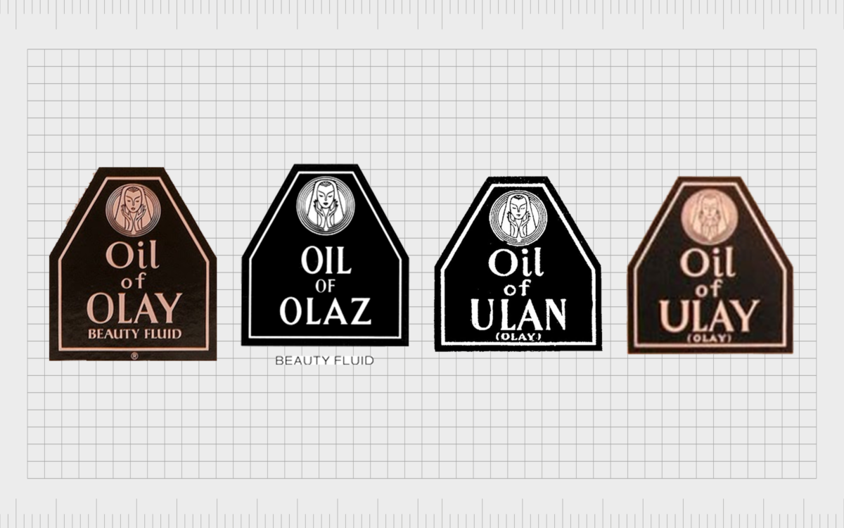
When Olay branched out into an international market, it altered its packaging, logo, and name to make it sound more pleasing to customers. In France, Germany, Italy, and the Netherlands, Olay was known as the “Oil of Olaz.”
In the UK and Ireland, it was the “Oil of Ulay.” Finally, in Australia, Olay adopted the name “Oil of Ulan.” The unique name was positioned on a geometric label on Olay bottles.
The original logo featured the name of the company across three lines in a simple, serif-style font. Each label also included an image of a woman, with her hands pressed to her face, in a circle badge.
The various names of the Olay company remained with the brand for several years until the parent company was purchased by Procter & Gamble. In 1999, P&G unified the brand under the single shared name of “Olay,” used throughout the world.
The Olay logo
After the Oil of Olay company officially became just “Olay,” the brand introduced a variety of new logos over the years, based originally on the initial design.
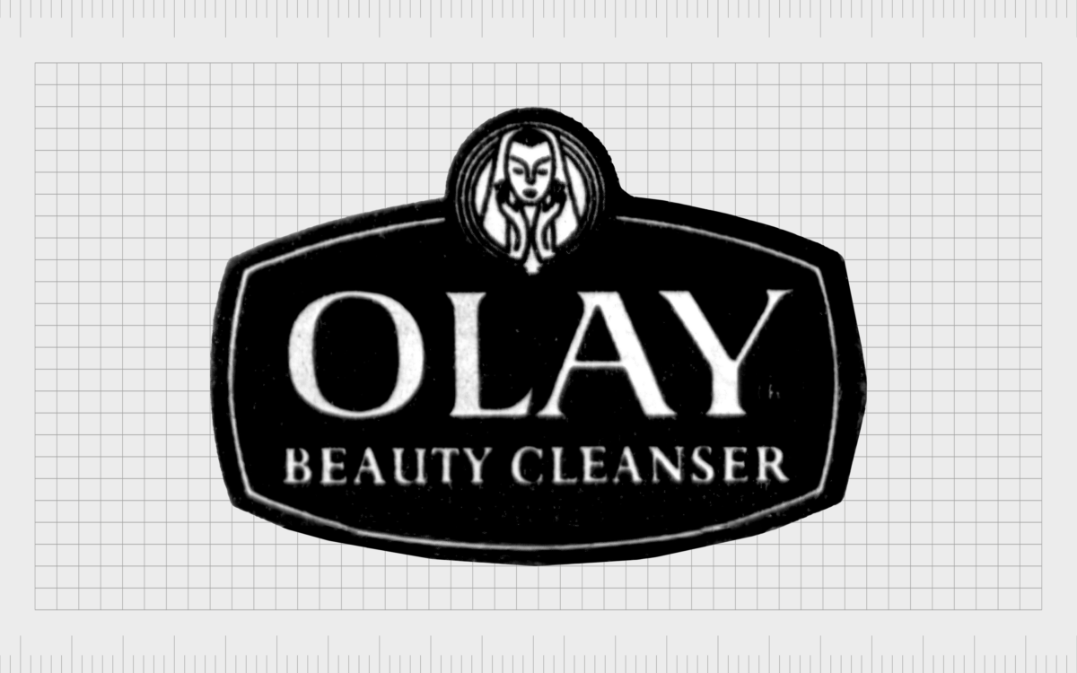
In 1999, the Olay badge was simplified, with an oval-shaped design featuring the word “Olay” in all uppercase letters, in a serif font. The words “Beauty Cleanser” were placed underneath on a secondary line in a similar but smaller and thinner typeface.
The image of the woman with her hands pressed to her face remained in this design, but it was simplified slightly and positioned just above the wordmark in a teardrop shape.

Just one year after refining its logo for the first time, Olay introduced a new version of the emblem featuring a simpler wordmark. The background shield was removed, and the Olay inscription appeared in a simple, sans-serif font with thinner lines.
It was also underlined by a golden curve.
Above the wordmark, we see the image of the woman again; this time simplified to feature just a dark golden outline on a softer gold circular background. The circle badge appears on a black geometric shape with its own matching golden border.

During the same year, another variation of this logo was introduced, featuring a simplified badge for the woman’s face, with the outline depicted in black on a silver/gold background.
The lettering of the wordmark was also updated, featuring the letters “l” and “y” in lowercase, with the “O” and “A” in an uppercase font.
2006
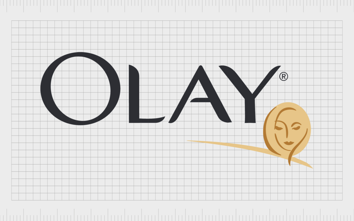
About six years later, in 2006, Olay experimented with the typeface for its inscription and the positioning of the accompanying symbol of the woman’s face. The new font type appeared bolder and more refined, with balanced uppercase letters.
The golden face was positioned just underneath the “Y” and featured a subtler design than in the previous logo.
In this variation of the Olay emblem, the golden line returned, appearing beneath the woman’s face and the last couple of letters in the inscription.

In 2010, Olay changed its wordmark again, returning to a font with a similar style to the design used in the year 2000. The “l” was much slimmer than the rest of the letters in the inscription, giving the overall design a classy and elegant look.
The image of the woman’s face was removed.

In 2017, the Olay team added more balance to the logo once again by extending the bottom line on the “l” character. A swipe of black was added just beneath the wordmark to give it a confident appearance.
Later, the company removed this line to leave us with the Olay symbol we know now.
The Olay logo: Colors and fonts
Looking back at Olay’s logo history, we can see the company’s brand identity has come quite a long way over the years. Initially, the company used numerous variations of its logo to connect with customers from different regions and cultures before eventually unifying its brand in 1999.
Over the years, Olay refined its logo, making it simpler and more sophisticated, as the beauty industry began to focus on more minimalistic designs.
Today, we have one of the most simplistic logos produced by Olay so far, featuring just the name of the company in a stylistic sans-serif font.
You can find some useful resources connected to the Olay logo here:
What color is the Olay logo?
The Olay logo color palette has changed a few times over the years. In the initial decades, Olay used a combination of gold and silver in many of its emblems, alongside the standard contrasting shades of black and white.
However, today, the Olay logo color palette has been simplified to feature just a black font on a white background. In some cases, this color collection may be inverted to feature white font on a black background for certain product packages.
The colors of black and white are an excellent choice for brands in the beauty industry, as they convey ideas of sophistication, elegance, and purity.
What font does the Olay logo use?
The Olay logo font has undergone several changes over the years as the company has experimented with different typeface styles and spacing. Today, the company uses a custom sans-serif font with smooth ends on the bars and balanced contours.
The style of the typeface is similar to Sabler Tilting Ext Regular and Bodrum Sweet 14 Regular, with a few modifications to the lines and edges.
The iconic Olay emblem: Celebrating Olay’s logo design
Though the Olay logo may seem relatively simplistic today, it’s a powerful and impactful design, ideal for a company in the beauty and cosmetics world. This sleek and streamlined emblem showcases the company’s commitment to elegance, grace, and beauty.
The minimalism of the design also highlights the company’s commitment to creating pure, high-quality products.
The Olay logo works well across various materials and mediums thanks to the black and white color palette and the easily legible custom font. It’s a modern and timeless design, which helps the company to stand out in its industry.
Fabrik: A branding agency for our times.
Clarity starts with a conversation.
Thanks—we’ll get back to you shortly.
Whether you're navigating a rebrand, merger, or simply need a clearer identity—we’re here to help. No hard sell, just honest advice from people who know the sector.
Let’s start with a simple question…
Prefer to email? Drop us a line.
Fabrik’s been helping organisations rethink and reshape their brands for over 25 years. We’ve guided companies through mergers, rebrands and new launches. Whatever stage you’re at, we’ll meet you there.


