


Avon logo history and the Avon name meaning
The Avon logo is one of the better-known emblems in the cosmetics, fragrance, and personal care landscape. Even if you don’t know everything about the Avon Company and its background, you’ve probably spotted the Avon logo, or even the Avon catalog from place to place.
The Avon Company started life more than 100 years ago, in 1886, as the dream of a door-to-door book salesman who wanted to upgrade from selling books to selling perfumes.
Eventually, Avon transformed into one of the biggest cosmetics companies in the world, with 6.4 million representatives all around the globe.
Today, we’re going to dive into the history of Avon, and discuss some of the logos the company has adopted to help showcase its brand over the years.
Avon background: When did Avon start?
Officially, Avon history began in the year 1886, when a man named David H. McConnell decided he wanted to stop selling books door-to-door and sell perfume instead. Initially, David named his brand the “California Perfume Company” and chose a classic trademark for the company’s image.
In 1894, Alexander D. Henderson joined Avon, and became the VP and treasurer for the brand. By 1909, the California Perfume Company had moved to New York, and distribution for the brand started to grow.
It wasn’t until June 3rd, 1932, when the company changed its name to “Avon”, applying for a trademark at the same time.
Gradually, the products available from the Avon Company began to grow, introducing everything from compacts to lipsticks and toiletry products. Now, Avon sells a host of items in over 100 countries.
The largest market for the brand is Brazil, which bypassed the US in sales during 2010.
Avon is one of the more unique cosmetics companies in the market today, because of the way it advertises and sells its products. Individuals from local communities still deliver Avon products from door-to-door today, even in a world of digital transformation.
Avon name meaning
The name “Avon” was chosen for the business based on the birthplace of McConnell’s favorite playwright, Shakespeare. According to history, Shakespeare was born in Stratford-on-Avon. The name “Avon” was trademarked in 1932.
Who owns Avon today
Avon belongs to the larger Natura & Co Company. Natura & Co is a Brazilian personal care and cosmetics company with customers around the world. The brand also owns Aesop and The Body Shop.
Avon logos throughout the years
With a headquarters now located in London, within the United Kingdom, Avon is a multinational skincare, personal care, and fragrance company, with annual sales of more than $9.1 billion worldwide as of 2020.
The company is one of the most recognizable in the world, thanks in part to its carefully chosen logo.
As you may imagine, the long history of Avon means the brand has also had a number of different logos over the years.
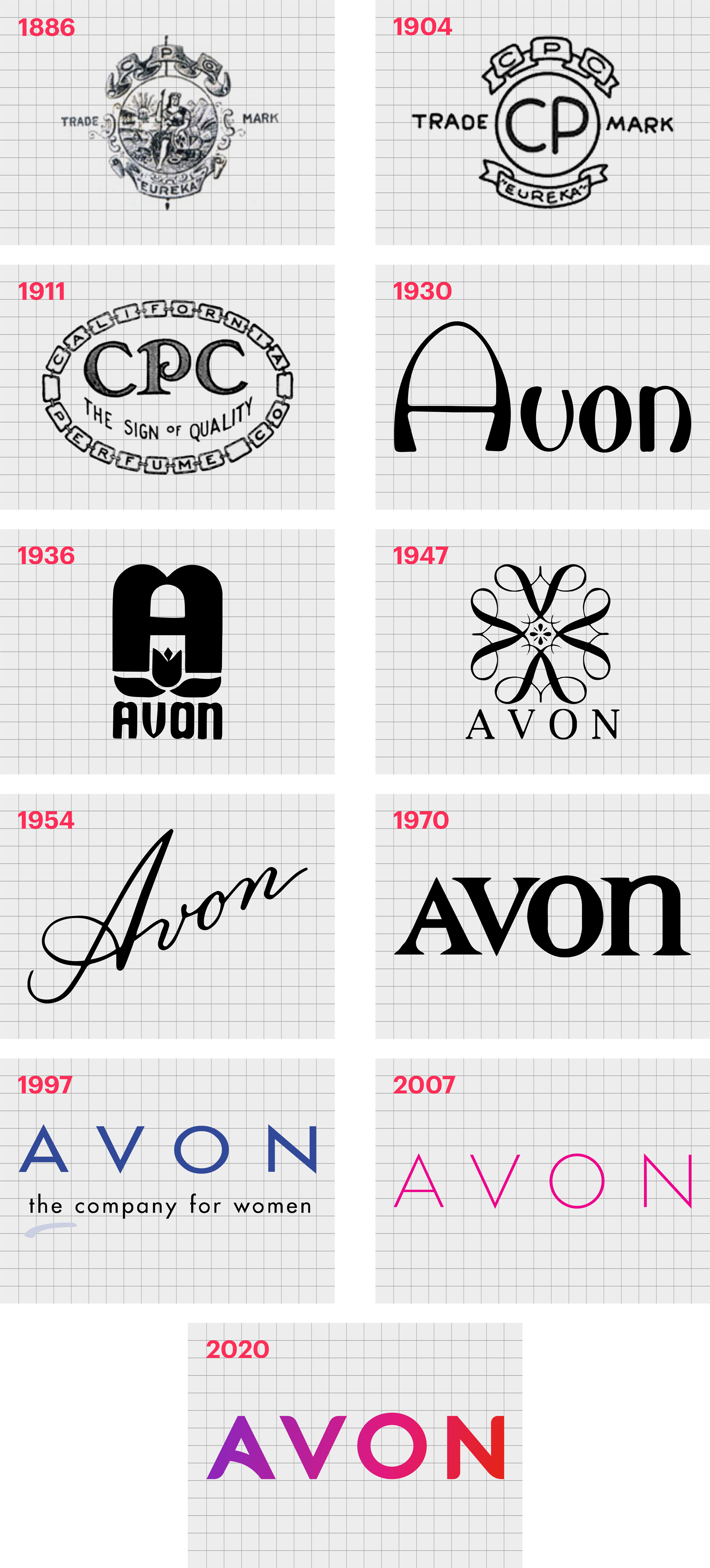
1886
The first Avon brand logo was a traditional trademark chosen by the company when it was established as the “California Perfume Company”. This ornate, classic emblem placed ribbons above and below a circle, with flowers depicted in the middle of the image.
Apparently, the name the “California Perfume Company” was chosen in part because of the abundance of flowers in California.
During the brand’s time as the “California Perfume Company”, the trademark logo updated a few times. In 1904, a more simplified version of the emblem was introduced. While the ribbons and “trademark” messaging were still present, the gradients and flowery design disappeared.
By 1911, the company had adopted a combination of its previous, more ornate logo, and the simpler design from 1904. This attractive oval consisted of the letters “CPC” written in a creative, serif font. The words “The Sign of Quality” also appeared in all capital letters below the brand monogram.
In this version of the Avon cosmetics logo, the frame was made up of a chain, formed up by several squares, each of which contained a single letter of the company’s name.
1930
The first official “Avon” company logo appeared in 1930, just before the trademark for the brand was approved. The organization began experimenting with branding options immediately after submitting a request for a patent in 1929.
This version of the logo was a stylish and modern word mark, in a custom sans-serif typeface, with a smooth, arched “A”.
The design was strong, modern, and surprisingly contemporary for the time. Avon also chose a monochrome color palette, to help with a more timeless image.
1936
Only 6 years after the first Avon logo was introduced, a new visual identity was unveiled. This design combined the flowers which inspired the original brand, with the new name “Avon”, and a large “A” emblem.
The bold and beautifully balanced logo was excellent for capturing audience attention.
The tulip in the image was a symbol of femininity and beauty, and even the “O” and “A” of the word “Avon” had a feminine curve to them.
1947
The next “new” Avon logo emerged in 1947. Once again, flowery imagery was used here, but the overall design was more sophisticated and elegant. The wordmark for Avon was also a lot more graceful here, with a classic serif-style typeface.
All letters except for the “n” in the wordmark were depicted like capitals.
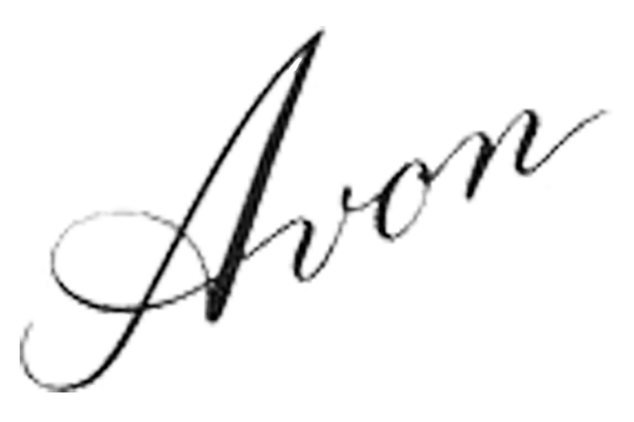
1954
During the 1950s, Avon experimented with a signature-style wordmark, a common theme among many cosmetics companies. The script-style logotype stayed with the company for almost twenty years, a symbol of elegance and creativity.
1972
In the 70s, Avon updated its logo yet again, embracing a more simplistic and modern style. Once again, the all-caps design was present here, with the lower-case “n” to create a sense of visual balance.
The logo here is stylish, powerful, and easy to remember.
1997
The 90s introduced the first colorized version of the Avon Company logo. A new tagline was also present at this time, conveying Avon as a “company for women”. The blue wordmark was simple, modern, and easy to read – perfect for the contemporary age.
The tagline written in all lowercase font was a deliberate choice by the brand, to make the business appear more approachable.
2007
During 2007, Avon began experimenting with its logo again, introducing a more delicate wordmark, inscribed in pink. The sans-serif font was attractive, minimalist, and still appears in some of the branding and marketing strategies for the company today.
2020
Today, the new Avon logo is a sleek, modern, and eye-catching design. Similar in style to the logo from the 1970s in some ways, this wordmark depicts much bolder letters.
The use of a gradient of pink and purple colors helps to maintain the feminine nature of the brand, while conveying ideas of creativity and discovery.
Avon cosmetics logo: Elements of the Avon brand
The Avon brand has undergone a number of changes throughout the years, starting when the business was the “California Perfume Company”. One thing which has remained consistent throughout Avon history, however, is the use of a wordmark in the brand’s imaging.
The Avon symbol today is an eye-catching, colorful design intended to capture the attention of a wide audience and stand out in any environment.
You can find some helpful Avon logo resources here:
What color is the Avon logo?
An official Hex color palette for the Avon logo as it stands today isn’t available online. However, we do see several amazing shades in the emblem. The Avon logo colors are a mixed gradient of different hues from magenta to purple.
This is a huge world away from the days when there was only a single Avon logo color to speak of.
What font does the Avon logo use?
Avon has always chosen a custom typeface for its wordmark, and this continues to be the case today. The Avon logo font is very similar in style to the Geometos font or Extended Futura font. It’s a simple, elegant, and modern font, excellent for conveying the timeless nature of the brand.
Celebrating the Avon logo today
The Avon logo today is one of most memorable, and recognisable logos in the world of personal care. Known across the globe for delivering a wide selection of beauty and cosmetics products, Avon has captured the attention of millions of customers.
Over the years, Avon has evolved to discover a brand-new identity, complete with a different name to the one it originally started with. Fortunately, the company’s rebranding strategies have paid off, helping to bring Avon into the homes of more consumers than ever before.
Fabrik: A branding agency for our times.
Now read these:
—Cosmetic and beauty brand logos
—The benefits of the Benefit logo
—Exploring the Bobby Brown logo
—The Anastasia Beverly Hills logo


Clarity starts with a conversation.
Thanks—we’ll get back to you shortly.
Whether you're navigating a rebrand, merger, or simply need a clearer identity—we’re here to help. No hard sell, just honest advice from people who know the sector.
Let’s start with a simple question…
Prefer to email? Drop us a line.
Fabrik’s been helping organisations rethink and reshape their brands for over 25 years. We’ve guided companies through mergers, rebrands and new launches. Whatever stage you’re at, we’ll meet you there.