The Body Shop logo history: A symbol of ethical beauty

The Body Shop logo is one of the better-known emblems in the ethical beauty world, particularly among consumers in the United Kingdom. This popular cosmetics and skincare company has developed a powerful reputation over the years, thanks in large part to its eye-catching emblem. But where did The Body Shop logo history begin?
First launching in 1976, The Body Shop has been an icon of the British high street for decades. Commonly associated with eco-friendly and natural products, this organization has developed its brand identity around a focus on transparency, authenticity, and compassion.
Over the years, like many famous beauty and cosmetics companies, The Body Shop has updated its emblem to adhere to changing consumer preferences and trends. However, many of the core elements of the organization’s visual presence have remained consistent.
Today, we’re going to be taking a closer look at The Body Shop brand, the origins of its iconic logo, and how the company differentiates itself from the competitors in its field.
Is The Body Shop a luxury brand?
Before we begin exploring The Body Shop logo history, it’s worth learning a little more about the company itself. As mentioned above, The Body Shop is a British skincare, perfume, and cosmetics organization, first founded in 1976 by Anita Roddick.
Originally, the company began trading in Brighton, but has expanded across the UK throughout the years.
Today, The Body Shop is owned and managed by a Brazilian cosmetics company, as a subsidiary of the Natura & Co corporation. However, it previously spent some time operating under the L’Oréal brand too.
Though The Body Shop is best known in the UK, it does sell a huge range of products (more than 1000), across around 3,000 stores in 65 different countries.
The Body Shop doesn’t identify itself as a luxury brand, although the products offered by the company are a little more expensive than those you may find from other competing companies. Instead, the organization positions itself as an ethical, eco-friendly, and sustainable organization.
Though the group’s commitment to ethics has been questioned over the years, The Body Shop is a certified B corporation, which refuses to test on animals, using scientific testing methods instead.
Additionally, The Body Shop has a strong corporate social responsibility strategy, undertaking regular social audits of its sourcing activities to maintain strong ethical standards.
What is The Body Shop’s slogan?
Over the years, The Body Shop has used various marketing slogans and taglines in its campaigns, such as “A New Force for Good in Beauty”, and “Nature’s Way to Beautiful”.
Currently, the company’s slogan is based on the brand’s underlying purpose, to deliver high-quality, ethical, and sustainable products to consumers of all ages.
The slogan, “Your body is yours for life”, highlights the company’s commitment to helping consumers choose effective cosmetic and skincare solutions for all use cases.
The Body Shop logo history: The evolving emblem
Since launching in the 1970s, The Body Shop has utilized a number of different logo designs. However, if we look back through The Body Shop logo history, we can see a consistent theme throughout all of the emblems.
Since its inception, this company has consistently used a combination mark as its logo, featuring a unique circular design, and an attractive wordmark.

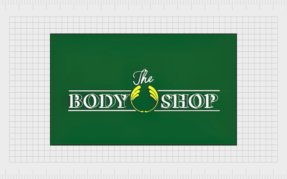
The original logo for The Body Shop was a slightly more traditional version of the emblem we know today. The majority of the company’s banner was dominated by the name of the brand, set on two levels.
The word “The” appears in on its own, in the center of the image, with the “Body Shop” components positioned below, in three-dimensional, serif-style font.
Between the words “Body” and “Shop”, we see the iconic symbol of the brand, depicted in yellow. The symbol is similar to a traditional laurel wreath, but with fewer details.

1990
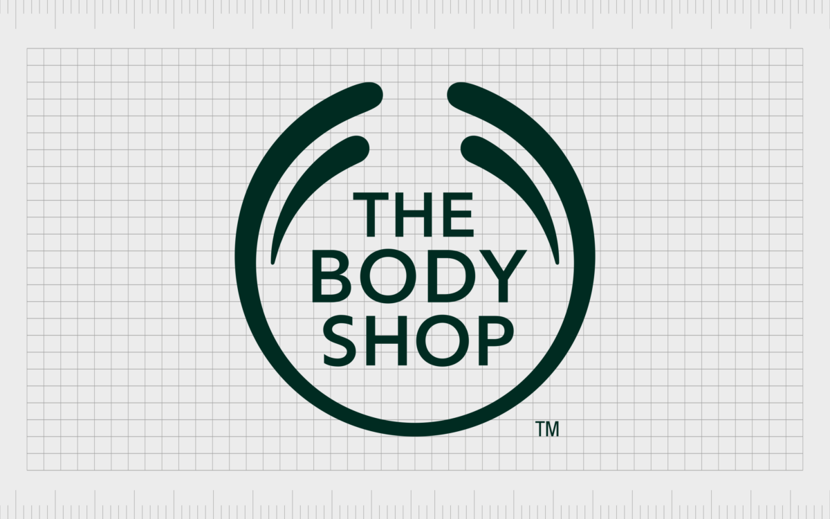
In the 1990s, The Body Shop logo was simplified, and updated. The name of the company now appears on three lines, aligned with the three arching elements of the roundel design. All of the words appear in the same, serif typeface.
The whole image is depicted in a deep shade of forest green, highlighting the company’s commitment to selling natural products.

2004
During the early 2000s, The Body Shop made an interesting change to their logo. The roundel design was altered. The three feathered components at the top were switched with a single set of disconnected “splashes” separate from the primary circular shape.
The name of the company moved from the top of the emblem, into the middle, growing larger, and more legible, thanks to the use of a sleek, sans-serif font. The coloring was also darkened to a much deeper forest green.

In 2017, The Body Shop updated its logo very slightly, adjusting the color palette to a slightly softer shade of green. The alterations to the image were so small, most people didn’t even notice the change.
Notably, the typeface for the logo was also changed slightly, with the letters growing a little more elongated, taking up more space in the center of the badge.

2020
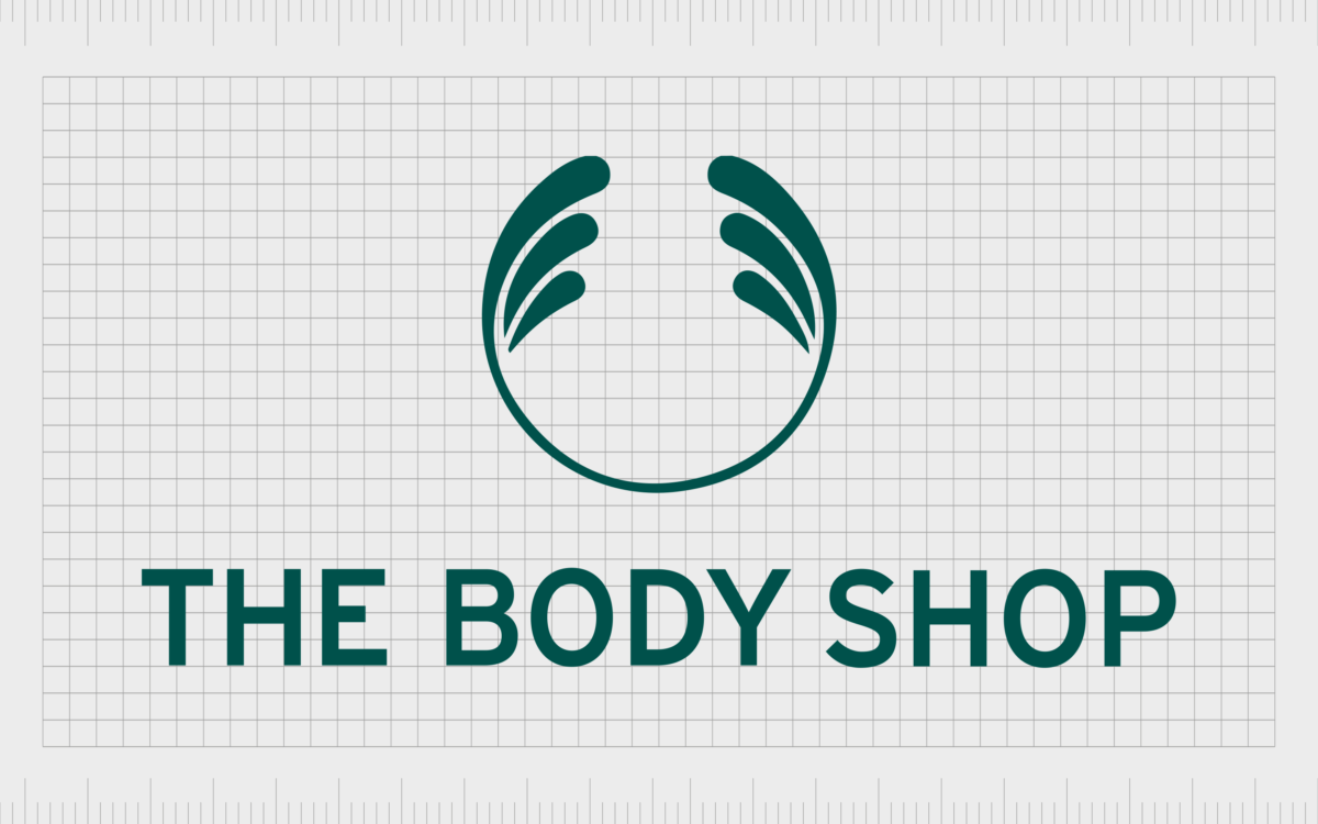
When The Body Shop updated its logo to the most recent design in 2020, it incorporated elements both from its previous emblem, and the original logo.
The roundel became more elegant and feminine, with thinner lines, and the three feathered components returned, though the two lower splashes were separated from the rest of the badge.
The wordmark for the logo was taken out of the rounded shape, and placed below the design on a single line, in all capital letters. The font style is similar to the typeface used in the previous logo, with a simple, sans-serif design.
What is the meaning of the logo of The Body Shop?
The Body Shop logo is a simple but elegant emblem, intended to highlight the core values and personality of the beauty brand. The circular shape, used throughout The Body Shop logo history, is a symbol of compassion and community, as well as inclusion and fairness.
The unique design of the feathered components on the top of the circle remind us of traditional laurel wreath emblems, giving the company a sense of heritage. However, they also look a little like feathers, or plants, helping to connect the company to the natural world.
The Body Shop’s logo is intended to represent the company’s mission to fight for a fairer, more beautiful world, where everyone has access to high-quality, natural products. The green coloring of the design helps to further draw attention to the brand’s sustainable and eco-friendly approach.
The Body Shop symbol: Colors and fonts
Simple and elegant, The Body Shop symbol is a fantastic example of an attractive, sophisticated logo for the beauty and cosmetics landscape. Carefully designed and refined over the years, the emblem combines a sense of professionalism and heritage, with community and compassion.
Every aspect of The Body Shop logo, from its green color palette, to its sans-serif font, conveys a friendly, caring, and authentic brand personality. Although the logo has changed slightly over the years, the core components of the brand’s visual identity have remained largely consistent.
You can take a closer look at The Body Shop logo with the resources below:
What color is the The Body Shop logo?
The Body Shop logo colors have always been a combination of white and green, intended to showcase the company’s commitment to pure, natural, and sustainable products. The exact shade of green used in the emblem has changed slightly over the years, growing a little darker, and more sophisticated.
Today, the shade is a compelling forest green, reflecting nature, power, and strength. The official “The Body Shop” logo color is similar to Brunswick Green:
GREEN
Hex color: #004236
RGB: 0 66 54
CMYK: 100 0 18 74
Pantone: PMS 3292 C
What font does the The Body Shop logo use?
Similar to the color palette, the fonts used by The Body Shop logo have changed slightly over the years. The company began with a relatively complex selection of typefaces, combining a script-style font with a three-dimensional type. Today, The Body Shop logo font is a lot simpler.
Although it’s specific to the company, the minimalist, sans-serif font is very similar to a lot of common typefaces available on the market today. You can create a similar effect using typefaces like FF Yoga Sans Pro Medium, or Ricaro Bold.
The eye-catching logo of The Body Shop
Looking back at The Body Shop logo history, we can see the company has retained a relatively consistent visual identity over the years, chosen to reflect its core values.
The shades of green and white have always been consistent within the logo design, demonstrating the company’s focus on purity, and the natural world.
Additionally, the organization has always used a version of its roundel graphic, though the feathered components and the exact design of the symbol has been refined over the years. Today, the logo of The Body Shop is a symbol of ethical beauty, innovation, and sophistication.
Fabrik: A branding agency for our times.
Clarity starts with a conversation.
Thanks—we’ll get back to you shortly.
Whether you're navigating a rebrand, merger, or simply need a clearer identity—we’re here to help. No hard sell, just honest advice from people who know the sector.
Let’s start with a simple question…
Prefer to email? Drop us a line.
Fabrik’s been helping organisations rethink and reshape their brands for over 25 years. We’ve guided companies through mergers, rebrands and new launches. Whatever stage you’re at, we’ll meet you there.


