


Famous orange logos: Well-known companies with orange logos
How do you feel when you spot one of the famous orange logos used by brands like Fanta, or Harley Davidson? Companies with orange logos embrace this shade to associate themselves with energy, excitement, spirituality, and joy.
Not to mention, the vibrant hue is very attention-grabbing.
Though less common than other branding colors like green, blue, and red, orange has a unique sense of power, capable of transforming a company’s identity. It’s a shade associated with zest and warmth, capable of creating some of the heat of red without the aggressive edge.
Ideal for companies hoping to cultivate enthusiasm, courage, and vitality, the color orange can be an excellent way to bring a dose of adrenaline to a brand image.
Today, we’re taking a closer look at some of the most iconic brands with orange logos, to explore how this shade has helped these companies to find their identity.
Why do companies use orange in their logos?
Choosing the ideal colors for your logo is one of the most important tasks for any business leader building a new brand. Color psychology ensures we’re predisposed to connect certain emotions with particular shades.
So, why do companies use orange in their logos?
Orange is one of the most positive colors there is. The shade is optimistic, enthusiastic, and cheerful, ideal for an extroverted and adventurous brand. As a warm shade, orange is associated with many similar concepts to red, like vitality.
However, orange has a far more balanced energy than red, because it’s less connected with passion and anger.
Many people see orange as a rejuvenating hue, making it a good choice for food and beverage brands. The color is also naturally bold and confident, so it’s helpful for brands with a focus on the outdoors.
Let’s take a look at some famous orange logos.
What companies have an orange logo?
As mentioned above, an orange company logo isn’t quite as common as a red, blue, or even black and white brand image. However, this could be part of the reason the shade is so eye-catching. Companies who do use orange tend to have a confident voice, and a bold, outspoken image.
Orange can also be associated with a range of positive things, from autumn leaves to sunsets and tropical weather. However, too much orange can be overwhelming to the eye.
Let’s look at some examples…

1. JBL
What’s more energizing and motivating than the right music? JBL is a company with a strong presence in the music industry, with a heritage dating back to 1946.
With the color orange, this company helps to convey the vitality and excitement we feel when we’re listening to our favorite tunes. This is a logo filled with spontaneity and zeal.
The JBL orange logo also works particularly well because it’s connected with other elements which demonstrate the overall pluck of the brand. The geometric shapes forming an exclamation mark and the bold letters all speak to the confidence of the brand.

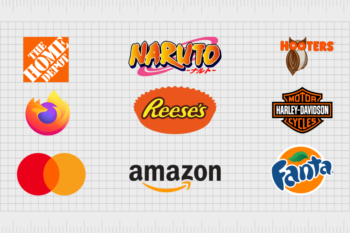
2. Naruto
Orange is a color filled with life and cheer, making it an excellent shade for grabbing the attention of a younger audience. It makes us think of adventure and exploration, as well as uninhibited creativity.
The Naruto anime brand clearly took this into consideration when choosing orange as one of the primary colors for the show’s wordmark.
Using two different shades of orange in a gradient also means the Naruto logo reminds us of a sunset or sunrise, symbolizing new beginnings and discovery.
Find out more about the Naruto logo here.

3. Mastercard
Easily one of the most recognizable orange company logos, the MasterCard brand combines two shades of orange with red to convey ideas of passion, vitality, and progression.
The company wants its customers to associate it with feelings of joy and opportunity, which it accomplishes perfectly with these two overlapping circles.
The modern version of the Mastercard logo comes from a number of different iterations over the years. Today, it’s one of the most iconic symbols in the financial landscape.

4. Fanta
Orange is a naturally refreshing and rejuvenating color. We associate it with the rise of the sun and the tangy taste of fresh fruit and vegetables. Fanta takes advantage of this fact with their eye-catching orange logo.
Though there are a number of colors in this emblem, orange is one of the most important shades. When it comes to popular orange logos, it doesn’t get much better-known than this.
The orange shading in the Fanta logo also reminds us of the flagship product of the company – an orange carbonated drink.

5. Dunkin
Another bold and fresh orange logo from the food industry, the Dunkin’ emblem is one of the better-known fast food logos out there. Though the Dunkin’ image has changed a few times over the years, it has kept orange in its logo for quite some time.
The orange in the Dunkin’ logo isn’t there to remind us of the food, but to make us think of the fresh start we get in a morning with a coffee and a delicious donut. Dunkin’s orange color is energizing and motivational, the ideal thing someone wants to see on a groggy Monday morning.

6. Firefox
Orange and red are the colors we most commonly associate with foxes, so it’s no surprise Firefox would want to use these shades in its logo. However, there’s more to Firefox’s image than just making a reference to a furry critter.
The “fire” element is also present here.
Using orange instead of red to depict the “flaming” elements of the logo helps Firefox to create an energizing and joyful image, rather than something which might come across as overly aggressive.
The combination of colors here is lighthearted, and versatile.

7. Soundcloud
Orange is a popular shade in the audio industry because many people see music as a source of motivation and stamina. The orange of the Soundcloud logo infuses the company’s personality with a sense of zest and creativity – perfect for a music streaming brand.
The color of this logo is enlightening and engaging, creating the image of a lively brand, committed to helping the world find its “get-up-and-go”. The fun and intelligent cloud-shaped emblem just adds to the overall appeal of this orange logo.

8. Nickelodeon
As the world’s first cable channel committed to children’s television, Nickelodeon has always been an innovator. The bold and confident nature of the company made orange a clear choice for its brand pallet.
However, there are other reasons this shade is effective too.
Like other logos that are orange in the entertainment world, the Nickelodeon logo appeals to a younger crowd. Shades like orange and yellow are naturally youthful and joyous – perfect for any brand looking to entertain the younger generation.

9. Home Depot
At first, the color orange might seem out of place for a company selling hardware and DIY supplies. However, it’s worth remembering this is a shade we often see as creative, adventurous, and rejuvenating.
The right shade of orange could be just enough to inspire us to tackle a DIY project.
The use of orange in the Home Depot logo depicts courage and enthusiasm. It inspires homeowners to make their ideal property a reality. The stencil-style font only adds to this creative, Do-It-Yourself image.

10. Hooters
An orange company logo many diners across the United States are likely to be familiar with, Hooters uses the color orange in all of its branding. The shade is a perfect choice for this company, as deeper shades of orange can be associated with concepts like risk taking and lack of inhibition.
Hooters is definitely a bold and courageous company – something they highlight with their use of orange in not just their logo, but the outfits their servers wear too.

11. Harley Davidson
It’s hard to find an orange brand logo with more impact than the Harley Davidson emblem.
The perfect example of the explorative and adventurous spirit behind the color orange, Harley Davidson uses this shade to symbolize power, strength, and discovery – reminding customers of the unique experience available when you purchase a motorcycle.
The Harley Davidson brand uses a slightly darker shade of orange than some of the orange logos on this list. This helps to identify the brand as a bold and daring company, rather than focusing too heavily on concepts like youth.
Find out more about the Harley Davidson logo here.
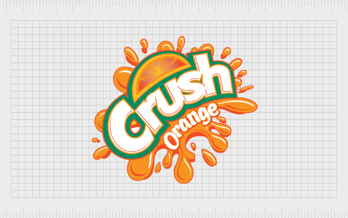
12. Crush
A competitor to the Fanta brand, Crush is another company in the food and beverages industry using the color orange to convey zest and refreshment. The shade also reminds us of the flavoring in the orange drink.
The various shades of orange in the logo help to highlight the multitude of fresh flavors a customer can enjoy with a sip of “crush”.
Over the years, Crush has experimented with a number of unique ways to add orange into their logo. In every design, the orange shading helps to highlight the name of the brand.

13. Headspace
Speaking of the refreshing nature of the color orange, Headspace uses this idea in a different way, with a bright orange circle placed alongside its logo wordmark. The orange circle is intended to remind us of a rising sun, and a “fresh start”.
For a company committed to mindfulness, meditation, and positive thinking, the color orange is a great way to get customers into the right frame of mind to start leveraging the brand’s app. The orange circle is joyful and rejuvenating.

14. Reese’s
If you’re a fan of confectionary, then you’re probably no stranger to Reese’s. Though there are a number of colors in the Reese’s logo, the orange element is one of the most eye-catching parts of the company’s branding.
Virtually all Reese’s packaging uses orange heavily.
The color range in the Reese’s logo is intended to make us think of joy and innovation – like the creativity which brought peanut butter and chocolate together. The use of orange and yellow together create a sunny aesthetic.
Find out more about the Reese’s logo here.

15. Penguin Books
Countless children and parents are familiar with the iconic penguin from the Penguin Books logo. This adorable penguin often stands inside of an orange oval.
While orange might not be something we’d typically associate with penguins, it’s definitely a good color choice for a brand focused on creativity, youth, and vitality.
The orange coloring in the Penguin Books logo is a wonderful insight into the company’s desire to attract a younger audience and motivate them to enjoy the wonders of reading.

16. Orange
It’s hard to have an article on brands with orange logos without at least mentioning the “Orange” Company. This brand chose orange not just as their logo color, but their name, in an attempt to break the mold of typical telecommunications businesses.
Orange wanted to step away from the stuffy and old-fashioned images often associated with telecommunications, to create its own new image. The color orange here is intended to convey creativity, innovation, joy, and discovery.

17. Bitcoin
Innovation and inventiveness are some of the most common concepts associated with the color orange. So, what better color would there be to depict a company focused on changing the financial world as we know it?
The Bitcoin icon intends to highlight the originality and vision of the underlying cryptocurrency.
The bold orange circle highlights the confidence and adventurous nature not only of the Bitcoin concept itself, but the people who are daring enough to explore a new avenue for finance.
The slightly golden tone to the orange also reminds us of money.

18. Payless
A footwear retailer focused on bringing more affordable shoes to the masses, Payless has taken the fashion world by storm for more than 60 years. The choice of orange for this brand has a number of connotations.
First, orange is a color we normally associate with excitement and joy – feelings customers are likely to have when they get a great deal on some shoes.
The color orange is also associated with innovation – which is something Payless has tried to accomplish, by making shoes more affordable.

19. Bitly
Since orange logos are often associated with creativity and adventure, it makes sense we’d see a handful of these designs used by innovative digital brands. Bitly, the URL-shortening and link management platform, uses a darker shade of orange for its logo.
This company, first opening in 2008, wanted to introduce its audience to a fresh take on the concept of sharing logos online. The orange coloring highlights the punchy nature of the company and gives it a more friendly appearance.

20. TNT
International delivery company TNT Express, belongs to FedEx, another company with a smaller amount of orange in its logo. The TNT brand is named after Thomas Nationwide Transport – the grandfather company responsible for initially launching the business.
For TNT, an orange logo is an opportunity to convey speed and friendliness – two things most consumers definitely want from a courier or delivery service. Orange in a darker shade is also associated with endurance – indicating you’ll get your package come rain or shine.

21. Blogger
Similar to Bitly, Blogger is another company embracing the power of the color orange for innovation and adventure. Notably, this brand has experimented with a wide range of different shades of orange over the years, some darker, or brighter than others.
The blogger logo today helps to highlight the spirit and drive behind the people who publish and manage their own blogs. Orange is also a great color for conveying zest and vivacity, without the aggression of the color red.

22. Just Eat
One of the most popular food delivery companies in the UK for the age of peer-to-peer food delivery, Just Eat has taken the nation by storm. The use of the color orange in this company’s logo serves a number of purposes.
As with many food brands, the color orange is great for showcasing rejuvenation and freshness.
Orange is also a fantastically friendly color, ideal for highlighting the sense of community behind Just Eat and creating a sense of enthusiasm and joy.

23. B&Q
Similar to Home Depot, B&Q is another DIY company leveraging the power of the color orange. For this company, the bold orange background highlights the white letters of the logo. The shade also helps to convey a sense of resourcefulness, vision, and imagination.
Orange is a color we commonly associate with originality and inspiration, making it the perfect choice for a company trying to motivate its customers to take the next step in their home improvement projects.
The color also helps the company to stand out in any environment.

24. Wattpad
An online social reading platform designed to bring people together for writing and reading original stories, Wattpad is all about creativity. The digital platform was launched more than 15 years ago and began using its rebranded orange logo in 2018.
The image features the word “Wattpad” in orange font, followed by a large “W”.
Clearly, the reason the company chose an orange logo here was to convey ideas of imagination and creativity. The company is focused on people sharing their stories and getting feedback from other likeminded people.
The color orange is great for indicating community too.

24. Amazon
You could argue the primary color of the Amazon logo is black. However, the orange “smile” is an important part of what makes this icon so eye-catching. The orange arrow on the Amazon logo plays several roles in conveying the brand’s identity.
It shows customers they can find products from “A” to “Z” by connecting the two letters.
At the same time, the curved orange arrow is intended to symbolize happiness and satisfaction – things you’re sure to be looking for with an online retailer. The splash of orange on the Amazon logo is ideal for highlighting the creativity of the brand.
Celebrating companies with orange logos
Famous orange logos are everywhere, from the technology industry to the food and beverage landscape. Companies with orange logos can leverage this color alongside other shades, or match it with something simple like white, to create a unique, eye-catching effect.
At a basic level, orange logos are wonderfully eye-catching. They guarantee you’ll grab your customer’s attention, particularly if you’re showcasing your logo in a space surrounded by more common colors like white, black, and grey.
However, like all colors, orange can convey its own meaning too. Used correctly, orange logos bring a sense of energy and vitality to a company’s brand identity. The right orange logos can make your customers feel inspired, creative, and happy.
This warm color can even remind us of important experiences, like watching a sunset, or seeing the leaves change in autumn.
The key to success with any logo and any color, is learning how to portray the right message about your brand. Could orange be the right color for your brand?
Fabrik: A branding agency for our times.
Now read these:
—Famous companies with blue logos
—Well-known brands with red logos
—Green logos to make you envious
—Today’s most famous purple logos
—The timeless black and white logos
—Famous yellow logos with zest appeal
—Standout companies with pink logos
—Exploring the colors of the rainbow

Clarity starts with a conversation.
Thanks—we’ll get back to you shortly.
Whether you're navigating a rebrand, merger, or simply need a clearer identity—we’re here to help. No hard sell, just honest advice from people who know the sector.
Let’s start with a simple question…
Prefer to email? Drop us a line.
Fabrik’s been helping organisations rethink and reshape their brands for over 25 years. We’ve guided companies through mergers, rebrands and new launches. Whatever stage you’re at, we’ll meet you there.