Exploring the Naruto logo: Naruto symbol meanings

Almost every anime fan is familiar with Naruto – but how much do you know about the Naruto logo? Recognized as the most popular manga comics in the world, the Naruto series created by Masashi Kishimoto in 1995 has captured the hearts of people worldwide.
Championed by those who want to show their appreciation of the brand, the Naruto logo appears worldwide, on merchandise including enamel pins and stickers, clothing, and countless other products. Today, we’re going to be taking a closer look at the Naruto logo and the symbols most commonly associated with the brand.
Let’s get started.
The Naruto logo: Meaning and history
Naruto is the title of one of the best-known manga comics in the world, first released in 1995. The comic inspired a follow-on anime TV series, which featured more than 200 episodes.
Naruto Shippuden is the TV series released in 2007 covering the second part of Masashi Kishimoto’s Manga series. The Naruto manga and anime both follow the story of a ninja named Naruto Uzumaki, and his friends.
Though ridiculed by the villagers in his town, Naruto aims to become the village leader and earn the approval of his peers. The Naruto story also paved the way for animations like Boruto: Naruto Next Generations.
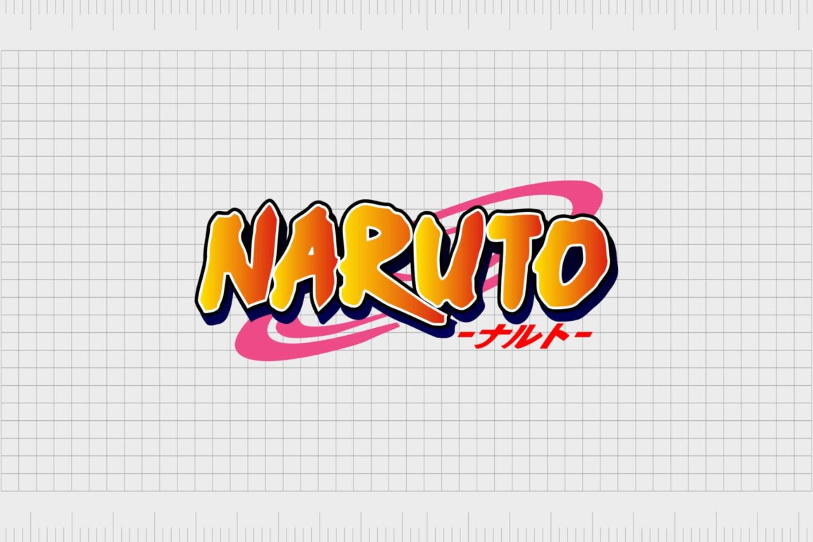
The current logo for Naruto features a series of bright, bold, and confident colors, perfect for a show aimed at capturing the attention of younger viewers.

The famous Manga logo was designed for the original comic series and hasn’t changed since. Subsequent components of the Naruto franchise, like Naruto “Shippuden” use the same primary logo, with the addition of the word “Shippuden” underneath.
Naruto logos and symbols: Naruto symbols
Though the Naruto logo is the most iconic Naruto symbol, there are also several designs used within the show and Manga that help represent the brand. Many of the common symbols from the story stand for specific clans.
For instance, the Uzumaki clan symbol is a swirl in a circle, while the Uchiha symbol is a Uchiwa fan.

Many fans of the Naruto series use these signs when referencing the movies, shows, or Manga. There are also several Naruto hand sign symbols which commonly appear in tattoos and merchandise.
The Akatsuki symbol is also common in references to the Naruto visual identity. This white, black and red cloud graphic is representative of dawn or early morning, when the sky is more likely to use pink and red.

Naruto colors: The colors of the Naruto logo
Perhaps the most important part of the Naruto logo is the choice of colors used in the design. The most significant color combination is the yellow and orange gradient used in the Naruto wordmark.
These bright shades represent strength, happiness, and confidence. They’re also the same colors we frequently see in the Naruto TV series. The main character, Naruto has yellow hair and frequently wears orange clothing.
Outside of the central orange and yellow gradient, we have white and black outlines, intended to bring a sharp contrast to the logo image. The use of yellow and black help the Naruto wordmark pop from any environment, giving it an almost 3D effect.
The pink swirl in the background of the Naruto logo adds an extra layer of fun to the visual identity. Overall, we have a selection of colors chosen to appear bright, and brave. Naruto’s logo is wonderfully engaging and memorable.
Naruto logo font: What is the Naruto font?
Aside from the meaningful color palette, one of the most meaningful elements of the Naruto logo is the font. The Naruto font, like many of the type options chosen for TV shows and books, is a custom creation.
An all-capital typeface with plenty of bold lines and depth, this font is almost like graffiti in style. The careful use of colors and shading help to make the word Naruto leap from the page.
The bold lines of the Naruto lettering are an excellent representation of the bold and memorable personalities of the people you meet in the Manga or anime. The Naruto font also looks a little like hand-drawn calligraphy, which gives it a more exotic appearance.
The Naruto colors and font work perfectly together to create a sense of dynamic energy and power, which are the most important characteristics of the famous ninja at the forefront of the story.

When new series or subheadings appear within the Naruto logo, they share a similar logotype, though these are frequently written in Japanese rather than English.
Exploring the Naruto logo
Over the years, the rich characters and storylines of the Naruto world have created a number of assets for the brand’s visual identity. The Naruto logo is just a series of icons and symbols frequently associated with the famous series.
Like many popular logos today, Naruto’s symbol has become a badge of honor for fans of the storyline. Today, you can find this image on all kinds of merchandise, from jackets and hats, to wall art for the home.
If you’d like to learn more about the Naruto icon or various Naruto symbols, here are some resources to help:
- Naruto logo png download
- Naruto logo vector download
- List of Naruto icons
- List of Naruto hand signs and what they mean
- Naruto symbols and markings
Fabrik: A branding agency for our times.
Clarity starts with a conversation.
Thanks—we’ll get back to you shortly.
Whether you're navigating a rebrand, merger, or simply need a clearer identity—we’re here to help. No hard sell, just honest advice from people who know the sector.
Let’s start with a simple question…
Prefer to email? Drop us a line.
Fabrik’s been helping organisations rethink and reshape their brands for over 25 years. We’ve guided companies through mergers, rebrands and new launches. Whatever stage you’re at, we’ll meet you there.


