Unity in graphic design: What is the unity principle of design?

Unity in design is one of the seven major principles of design used to guide the composition of websites, art pieces, and various other aesthetic assets.
This principle has supported designers in achieving their visual goals for much longer than most people realize, helping to ensure harmony, balance, and visual impact in endless projects.
Unity in design, like the various principles of graphic design, is intended to help designers get the most out of the work. With unity, we ensure all of the components in a design project are aligned and “unified” to achieve a specific overall impact.
Unity ensures each individual element in a website, logo design, or anything else created by an artist can coexist with one another to form something aesthetically pleasing.
Let’s explore the principles of design unity.
What is unity in graphic design?
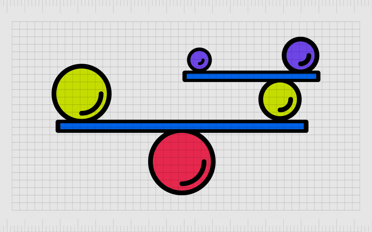
Unity in design is the art of connecting various principles in a piece of work through a variety of factors, like color or proximity. With elements of unity, it’s possible to create a more cohesive image and a more aesthetically pleasing design.
Graphic design unity gives a visual project an appearance of cohesiveness, even if there are various elements to consider. In web design, unity ensures all the elements on a website page look like they belong.
Unity, like the other principles of design, must be considered alongside other major factors like alignment and contrast in every design project. With unity, designers can ensure every logo, image, or visual piece makes sense from an aesthetic perspective.
Through unity, designers look at the “bigger picture” in design to ensure all the parts work together to make up a cohesive whole.
Definition of unity in graphic design
The unity principle of design is one of the essential guidelines for advising designers on creating compelling and succinct projects with every creation. It works alongside other principles like emphasis, movement, pattern, proportion, balance, and contrast.
Designers use their compositions not only to make a visual impact, but to send a message and achieve a specific goal. Graphic design principles like unity help to provide rules which ensure the right message can be understood by people without a clear knowledge of design.
In any composition, unity architecture is achieved when the design achieves an essence of harmony via all of the design components.
Sometimes, a lack of unity can also be an important tool for designers. If a section of a leaflet used completely different colors and fonts from the rest of the design, this would separate it from the body content and make it stand out.
When not deliberate, a lack of unity can sometimes be a result of a designer failing to look at the bigger picture of a composition.
When creating contrast between objects to draw attention to a specific element of a composition, a designer might play with things like scale, lighting, and color. However, if the designer isn’t careful, those changes could mean the objects no longer fit with the overall design.
Often, to ensure unity in design, experts need to step back and assess the whole composition as a whole to see if every element has the right level of harmony.
If you’re a designer working as part of a team, this could even involve having colleagues evaluate a design from a perspective of unity and provide feedback on what may not fit.
Why is unity important in graphic design?
All the principles of graphic design are important to ensuring the correct visual impact in a composition. The unity principle design has a number of powerful benefits for user experience, visual hierarchy, and even brand identity when working on brand assets.
From the perspective of user experience, imagine a website design.
When content is distributed across multiple pages of a website, it needs to maintain a sense of unity to prevent customers from becoming confused or overwhelmed. Sometimes, a lack of unity can lead to conflicting information or lack of functionality on a website.
When designing for web and mobile experiences, most designers use layout grids to help ensure their design remains cohesive and unified. There’s actually a specific method designers use to ensure unity in design for digital assets called heuristic evaluation.
Through heuristic evaluation, designers leverage ten heuristic principles identified by Jakob Nielsen to determine areas of usability problems within a user interface. Conducting a heuristic evaluation alongside the seven principles of design can improve the visual experience of a product.
Aside from improving user experience, unity can also have an impact on visual hierarchy. Unifying related elements within a composition using a consistent style is a good way to instill a sense of visual hierarchy and guide a customer or viewer through certain components.
Using the same repetitive elements to list blog posts shows customers where to click to read a post.
As an added benefit, a good unity architecture can also be extremely useful to the development of brand identity.
Consistency is one of the most important factors in ensuring a strong brand identity. Using the same colors, elements, font styles, and other components in design help to cement a clear view of a brand’s visual identity from one page or asset to another.
With graphic design unity on a website, leaflet, social media page, or any other brand asset, designers can create a sense of familiarity with a company through the same repetitive elements used in a cohesive and consistent manner.
What is the principle of unity?
As mentioned above, the principle of unity falls into a larger selection of principles chosen to help guide designers in creating visually appealing and impactful compositions.
If every button on a website was a different color or every image followed a different structure for sizing and positioning, it would lead to confusion and chaos.
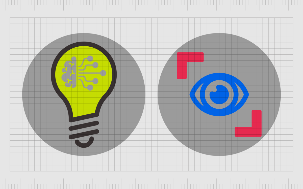
The unity principle of design states all elements in any composition should be conceptually and visually harmonious to demonstrate their connected state. There are two ways to define unity in design for most experts:
Conceptual unity
Conceptual unity is an ideal that can be a little harder to understand. It essentially refers to the “singleness” of multiple components in a composition. Designers achieve conceptual unity by considering the user’s experience viewing the composition and their convenience.
The concept of conceptual unity aims to make things as simple and naturally aligned as possible for a customer.
Suppose the functionality on one screen can be unified with another screen, step, or webpage in the user experience flow. In that case, this reduces the required number of interactions for a user to meet their objective.
One FAQ entry on a page about how to download a file and how to save a file could be combined into a single entry.
On a checkout page for an online store, conceptual unity would ensure all the information required for customers who want to purchase an item is located in the same space, rather than asking customers to jump from one page to another.
Many designers leverage a concept called “Usability testing” for the purpose of conceptual unity. This helps to accurately measure whether or not the intended user can view, interact, and enjoy the composition in the way the designer intended, with minimal hassle.
Visual unity
Visual unity is a little more straightforward than conceptual unity. Essentially, it refers to the visual harmony we see when various elements contain similar components or are designed with a certain level of proximity to make them appear naturally connected.
Visual unity is all about cohesiveness, bringing things together with design elements to demonstrate the link between them. Elements of visual unity can be seen when designers use the same colors or fonts throughout a website page or repeat aspects of a design.
Every blog page you click on a website is likely to follow the same basic structure.
Visual unity involves thinking about the overall visual impact of an image or composition rather than looking only at each individual component as an independent concept.
How is unity used in graphic design?
Unity may seem complex, but it’s much more straightforward than most people realize, particularly when you leverage the right planning and steps to make the most out of your approach to unity.
Most designers will use a series of specific steps to ensure unity in their design, just as they’ll use certain steps for other design principles.
To achieve unity in graphic design, you can follow these steps:
Start with a clear vision or purpose
Before sitting down to begin work on a design, professionals should set specific goals about what they want to accomplish. Are you trying to persuade someone to explore a website further or click on a link at the bottom of a page? Do you want to share a specific message or highlight a brand identity?
If you’re combining multiple elements for a landing page, what kind of story do you want to tell, and how are you going to convince your customer to take the next step in the buyer journey? Having a clear vision will help to guide you towards a cohesive design.
Incorporate crucial elements of unity
There are certain elements of unity (which we’ll address further in a moment), which can help to make a composition appear more unified. Repetition and patterns are excellent for tying a design together and creating a sense of cohesiveness.
Using elements like texture, patterns, and repetition effectively brings your piece together while also using aspects like contrast to draw attention to certain elements.
Choose colors carefully
Color is one of the more important elements to consider when ensuring unity in design.
Choosing colors that work well together can help to strengthen the link between various elements on a page or in a composition. If you’re creating a design from scratch or building a new brand identity, it’s important to use color choices that make sense.
Many designers will spend significant time assessing a color wheel to determine how certain shades can complement or contrast in a design.
Choose a consistent style
“Style” is an interesting concept in graphic design, but it’s an important element to think about when you’re trying to achieve unity. If you use cartoon-style animations on the homepage of your website, it might not make sense to use hyper-realistic photography elsewhere.
Utilizing a more consistent style from one part of your design to another helps to remind your viewer which components are connected.
Select fonts with precision
Just as color can help to highlight the unity in a design, fonts can make a direct impact too. On a web design or logo design, an artist will usually choose various types of fonts that work well to complement each other.
Choosing the right complementary typography options and using them consistently across a variety of assets or pages can help to ensure cohesion.
What are the types of unity in graphic design?
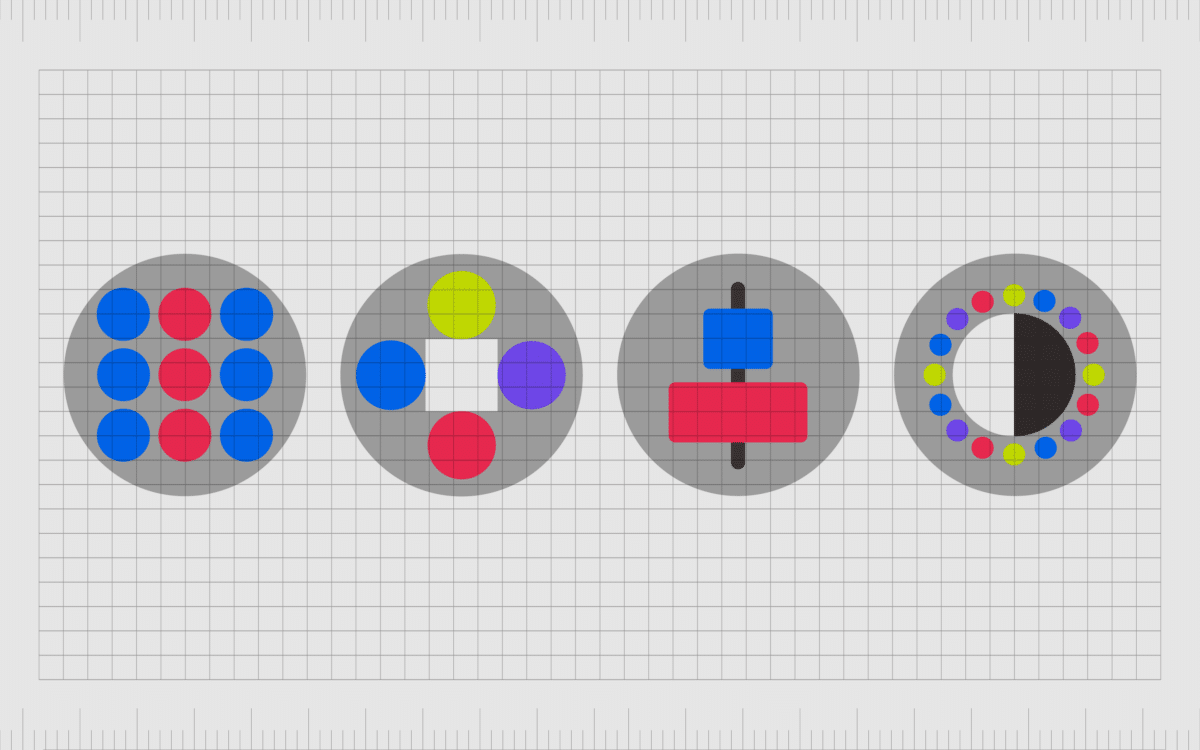
We’ve already discussed types of unity, like conceptual and visual unity. Now, let’s look at some of the methodologies designers can use to achieve a higher degree of unity with their compositions. Some of the most common types of unity in graphic design include:
Repetition
Repetition is one of the most important tools a designer can use to achieve unity. Repetition of the same assets or elements in a composition is how we often see a connection between multiple elements.
We see repeated elements from one page of a website to the next, such as structure, color, and even the presence of certain images (like logos).
The more users see the same repeated elements, the better they identify what they mean, reducing overall cognitive load. Designers should consider creating visually consistent elements to add to their designs where possible.
Proximity
The principle of unity in design is crucial in ensuring your viewers understand which elements of your image have a relationship or connection. Proximity can be one of the valuable tools leveraged to demonstrate that some items on a page are related.
A list of articles on one side of the page on a website connected in a box would show they belong to the same content series.
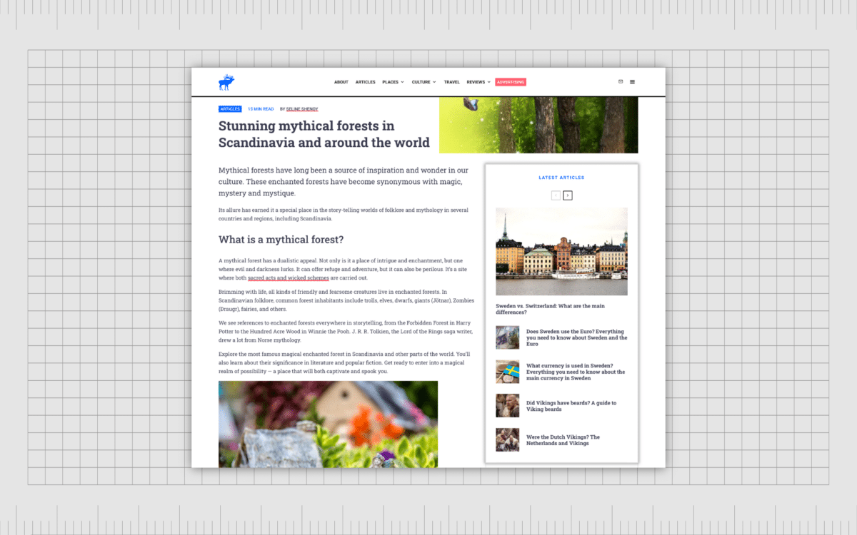
Proximity often works hand-in-hand with repetition to build a sense of cohesion and consistency. Users understand objects closer together often have a shared relationship.
Alignment
Alignment is another common component designers need to consider when implementing unity. This is actually a design principle in its own right, but it usually works alongside unity to achieve complete cohesion in a composition.
Alignment involves lining elements up on a single axis, so they all seem to be connected. This design principle is also excellent for improving user experience.
Contrast
Unity doesn’t always have to mean equality. Many design principles like repetition are intended to be used alongside concepts like “contrast” to help differentiate different elements.
Contrast in the form of color changes, typography options, and differences in alignment can help to differentiate a group of options or help make certain elements stand out.
Examples of unity in graphic design
Visual unity examples are evident in many offline and online environments if you’re ready to look for them. You’ve probably noticed how office buildings use the same signage choices throughout their environment to help consistently direct you around a space.
Websites use unity consistently in the form of repeated logos, colors, and other components, designed to remind you which brand you’re dealing with.
Here are some brief examples of unity in graphic design.
Coca-Cola
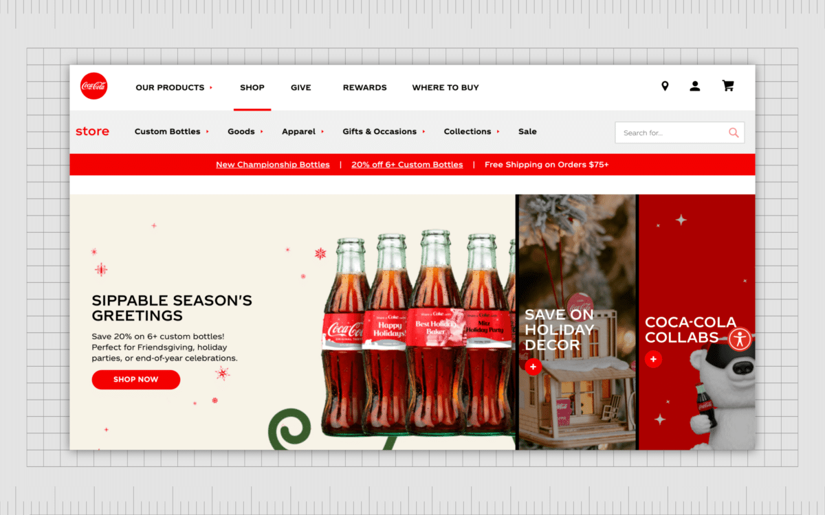
Coca-Cola’s website and entire brand image is an excellent example of visual unity. One of the most significant defining features of the Coca-Cola brand is the iconic red coloring.
As a result, the company uses this shade on every page of its website, as well as various other design elements, like the buttons users can access on the site.
Using the same shades of red and white throughout all of its branding elements, both online and offline, allows Coca-Cola to strengthen its brand image with its target audience.
In areas where the colors need to change (such as from one type of cola to another), the use of the same font choices achieves unity for the company.
Squarespace
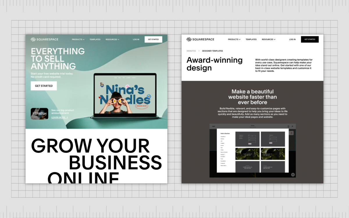
Each page of the Squarespace website contains its own content and specific focus. However, the company still achieves a sense of unity by using consistent font choices, spacing, and proximity from one page to the next.
There are also certain elements of repetition on the Squarespace website. The positioning of the menu and the logo for the company are the same on every page, ensuring customers can easily get to the homepage or find the next location they want to visit on the Squarespace site.
The grid-style alignment of the different components on Squarespace’s pages helps demonstrate which components in the design are connected and which are separate.
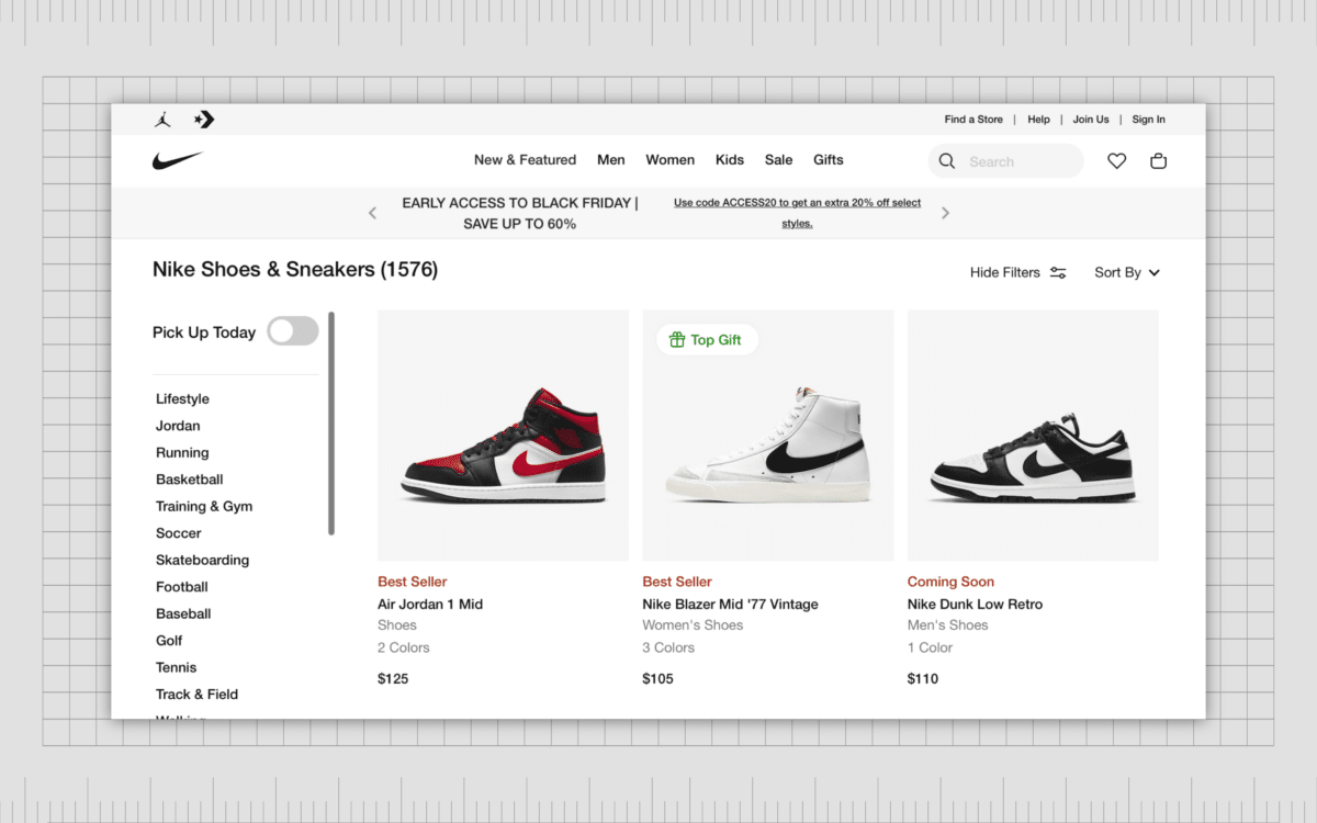
Nike
Consistency is an important part of achieving a sense of unity in any design. On the Nike website, the use of proximity separates each shoe on a list of products from each other, while the positioning, font, and other stylistic choices ensure the whole image still looks aligned.
The consistent use of white space throughout the website also helps us better understand which content elements need to be consumed together. The text you need to read all at once are situated much closer to each other.
Achieving unity in design
Unity in graphic design is just one of the many principles of design today’s creative experts should be following when creating compositions.
It helps ensure a sense of cohesion, consistency, and alignment in your designs while simultaneously improving the customer experience by helping to guide each user.
Unity in design is particularly crucial in the age of web design, as it ensures all the pages you create for your website or the components you design for your application have a cohesive theme.
However, achieving unity in design often means regularly stepping back and looking at your composition as a holistic picture rather than focusing too heavily on single elements.
Fabrik: A branding agency for our times.
Now read these:
—Introducing the principles of graphic design
—Understanding balance in graphic design
—Discover the alignment principle of design
—What is the hierarchy principle of design?
—Getting to grips with contrast in graphic design
—Understanding the emphasis principle of design
—Discover the repetition principle of graphic design
—What is the pattern principle of graphic design?
—Exploring the rhythm principle of graphic design
—Get ahead with the movement principle of design
—Why variety is an important factor in design
—How to bring harmony to graphic design projects
—The principle of white space in graphic design
—How to use the proportion principle in design
Clarity starts with a conversation.
Thanks—we’ll get back to you shortly.
Whether you're navigating a rebrand, merger, or simply need a clearer identity—we’re here to help. No hard sell, just honest advice from people who know the sector.
Let’s start with a simple question…
Prefer to email? Drop us a line.
Fabrik’s been helping organisations rethink and reshape their brands for over 25 years. We’ve guided companies through mergers, rebrands and new launches. Whatever stage you’re at, we’ll meet you there.


