


Variety in graphic design: Why is variety important in graphic design?
They say variety is the spice of life, but what exactly is variety in graphic design? Widely regarded as an essential component of any successful composition, variety in design ensures a piece is interesting, compelling, and not monotonous.
While the exact definition of variety in graphic design can differ depending on who you ask, most agree it’s about giving a piece intrigue.
When creating a composition, whether a business logo, website, or a new piece of art, using the same elements over and over can create a sense of cohesion and unity.
However, too much of the same can also lead to boredom. Imagine watching a video that consisted of the same three patterns consistently. Eventually, you’d get tired and look away.
Learning how to use variety in graphic design is how creators make sure their compositions continue to make a lasting impact.
Today, we’re going to take a closer look at the principle of variety in design and how you can use it.
What is variety in graphic design?
Routine and repetition can be extremely comforting. It helps to create a sense of balance and cohesion and make consuming information easier. Imagine how difficult it would be to read an article if the text and typeface changed from one paragraph to the next.
While some parts of a design composition will always require repetition, it’s also worth exploring the “contrasting” side of design too. Variety, when implemented correctly, can effectively interrupt mundane experiences and create a sense of intrigue.
Variety also helps to send important messages in branding by drawing attention to different ideas.
Variety is one of the many principles of graphic design experts follow to ensure their compositions not only make sense but have the right impact on the viewer. For any design to be effective, it needs to be cohesive and easy to absorb but also interesting and compelling.
Definition of variety in graphic design
Like the other principles of graphic design, variety in design doesn’t exist in a vacuum. The variety principle of design is only possible when a designer also considers other principles consistently.
We couldn’t effectively define what counts as “variety” in a design if we didn’t also have repetition and unity to show us more consistent patterns.
Variety can be used in all aspects of graphic design, from website creation to logo depiction. Looking at some of the other principles of graphic design can help you better understand how “variety” really works:
Contrast
Without contrast, a composition would be nothing more than a blank canvas. The degree of difference in a background and accompanying features is how we design contrast. Contrast can also help to add variety to design.
Changing the colors in a logo to contrasting shades helps to implement more variety than using two components of the same shade.
Balance
Whether in the use of typography, shapes, pictures, or designs, balance is essential for creating visual comfort. To achieve balance, you need to ensure the various components of a page are equally weighted in their visual impact.
Using variety in balance could mean placing more items with a low visual weight on one side of a page to make up for fewer items with a higher visual weight on the other side.
Emphasis
When used correctly, variety can be a powerful way to emphasize a specific design part. Imagine scrolling through a page where all blocks of text are organized into rectangles. Suddenly, you see a circular text box.
The image’s variety and contrast would immediately pull your attention to the circle.
Repetition
Variety is the opposite of repetition in a lot of ways. It ensures you don’t simply repeat the same element endless times without exploring other options. While some repetition is often necessary for the design to create a sense of cohesion and unity, too much can get overwhelming.
Having variety helps to break the pattern.
Why is variety important in graphic design?
The benefit of variety in graphic design is simple enough. Without it, our visual experiences would be pretty dull. Artists and creators use variety in virtually all compositions.
It’s not just graphic designers, but writers and composers too. Imagine how boring a piece of music would be if it used the same notes endlessly or how exhausting it would be to read a text repeating the same words.
Variety allows creators to break free from the principle of repetition in graphic design when necessary and draw attention to different parts of a composition. Variety breaks up the monotony otherwise evident in a design with too much repetition.
Variety is a tool for visual interest and intrigue. It could mean changing up the shapes in a composition from time to time, experimenting with different shades or color tones, or simply playing with size and positioning.
With variety, a designer:
Holds the viewer’s attention
You’re less likely to get bored and distracted when there’s variety to keep your eye moving across the page and consuming more information.
Guides your eye around your work
Variety helps guide the user’s eye through and around your work, creating a sense of hierarchy in the elements you use.
Provides contrast
As mentioned above, variety acts as a kind of contrast, stopping all of the elements of your design from simply blending together.
Makes your piece more fun
Variety adds diversity to a piece and stops it from being dull. Any composition should always be enjoyable.
Directs the viewer
Used correctly, alongside elements of balance and unity, variety can direct the user’s attention to the most relevant aspects of your design.
Separates elements
Variety in design can also be an excellent way to separate elements. On a website, you might use different colored boxes to highlight blog posts and news or press releases from your company.
What is the principle of variety in design?
As mentioned above, variety is one of the many “principles” of graphic design. These are the rules designers and artists follow to enhance their images’ appearance. Everything from photos to logos, typography, and websites follow the same consistent principles.
These principles work to make a lasting impression on an audience and have been proven over decades of experimentation in the visual world.
In the principles of design, variety is the tool working alongside unity, contrast, and other concepts to disrupt the monotony of a composition. The key to using this principle correctly is ensuring your variety doesn’t cause too much disruption.
While the right amount of variety makes your content more interesting and engaging, too much variety can also break the “harmony” or “unity” of a piece. As a result, the image can end up looking disjointed and overwhelming.
When using the variety principle of design, experts need to consider the entire composition carefully and balance visual intrigue with a sense of consistency.
Variety can also help to create “patterns” in design.
These patterns are slightly different from repetition, as they convey a series of specific ideas or images consistently, rather than doing the same thing endless times. Just by using different shapes in your image, or different kinds of text, you can instantly pique your user’s interest.
How is variety used in graphic design?
There are many ways to use variety in graphic design to have a specific impact on your audience. One of the most common strategies a designer follows is to use unity and variety in cohesion. These two principles work side by side to hold a composition together.
After all, behind every piece of art, website design, or other visual creation, there’s a specific message or series of messages a designer wants to send.
The use of specific colors, shapes, and other elements can create emotional responses in your customers and even make viewers generate specific perceptions.
Good design requires a balance of both unity and variety. Too much unity makes a design monotonous and boring, while too much variety leaves viewers unable to understand the purpose and meaning behind the composition.
While unity is about making different elements appear as though they’re part of the same larger composition, variety is about diversity. When design uses variety and unity in a single product, you get a result that delivers consistent messaging without being dull.
Rather than adding the same shapes over and over to a web page, a designer might use different shapes and lines to draw your eye down the page. However, aspects of those shapes would have the same consistent elements, like colors, sizing, and positioning.
What are the types of variety in graphic design?
Most of the principles of graphic design have different variations worth looking at. When using the principle of balance, designers can balance compositions by using elements with the same visual weight, colors, and positioning.
With variety in graphic design, similar principles apply. There are multiple kinds of variety a designer might explore to get the right results, such as:
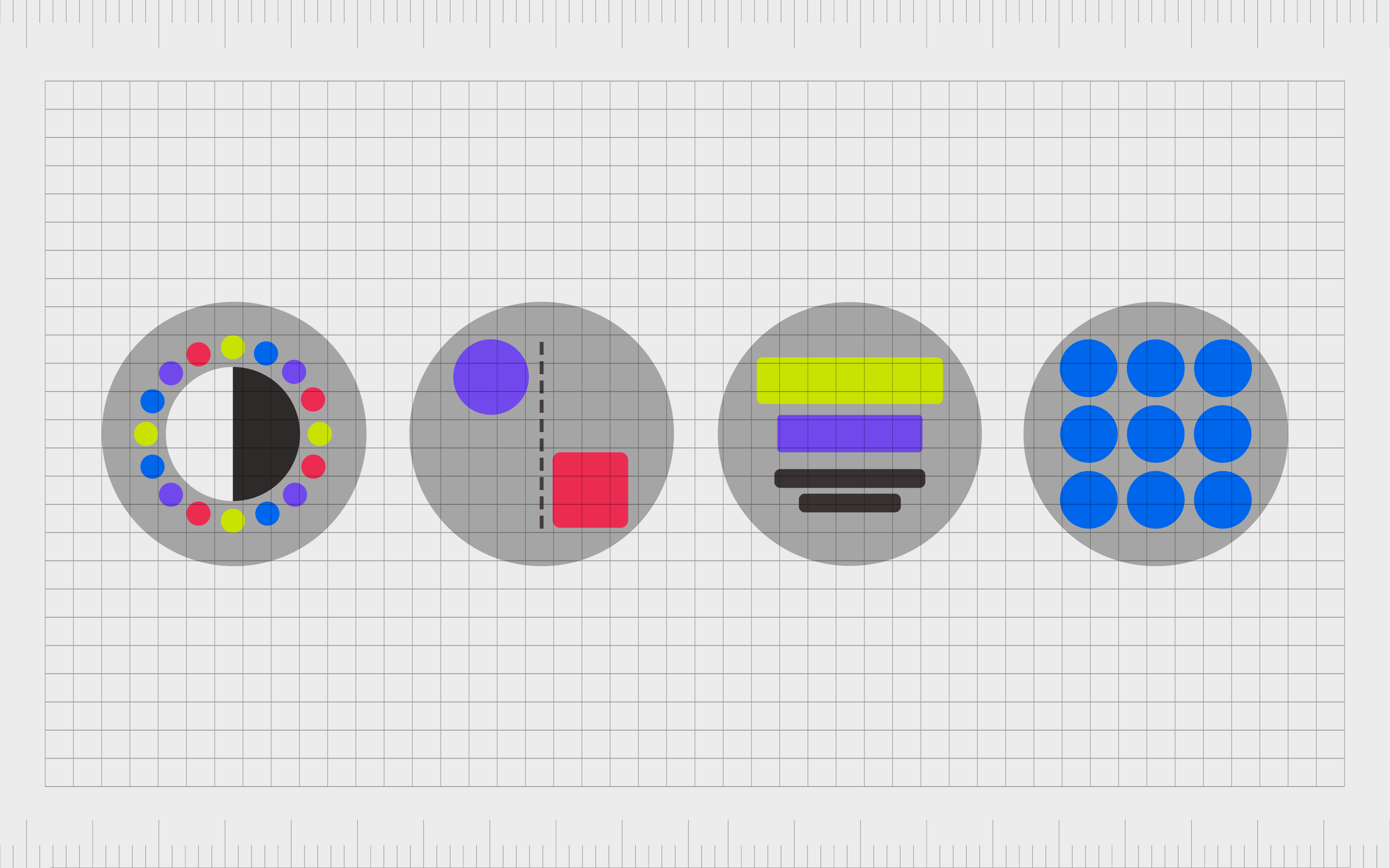
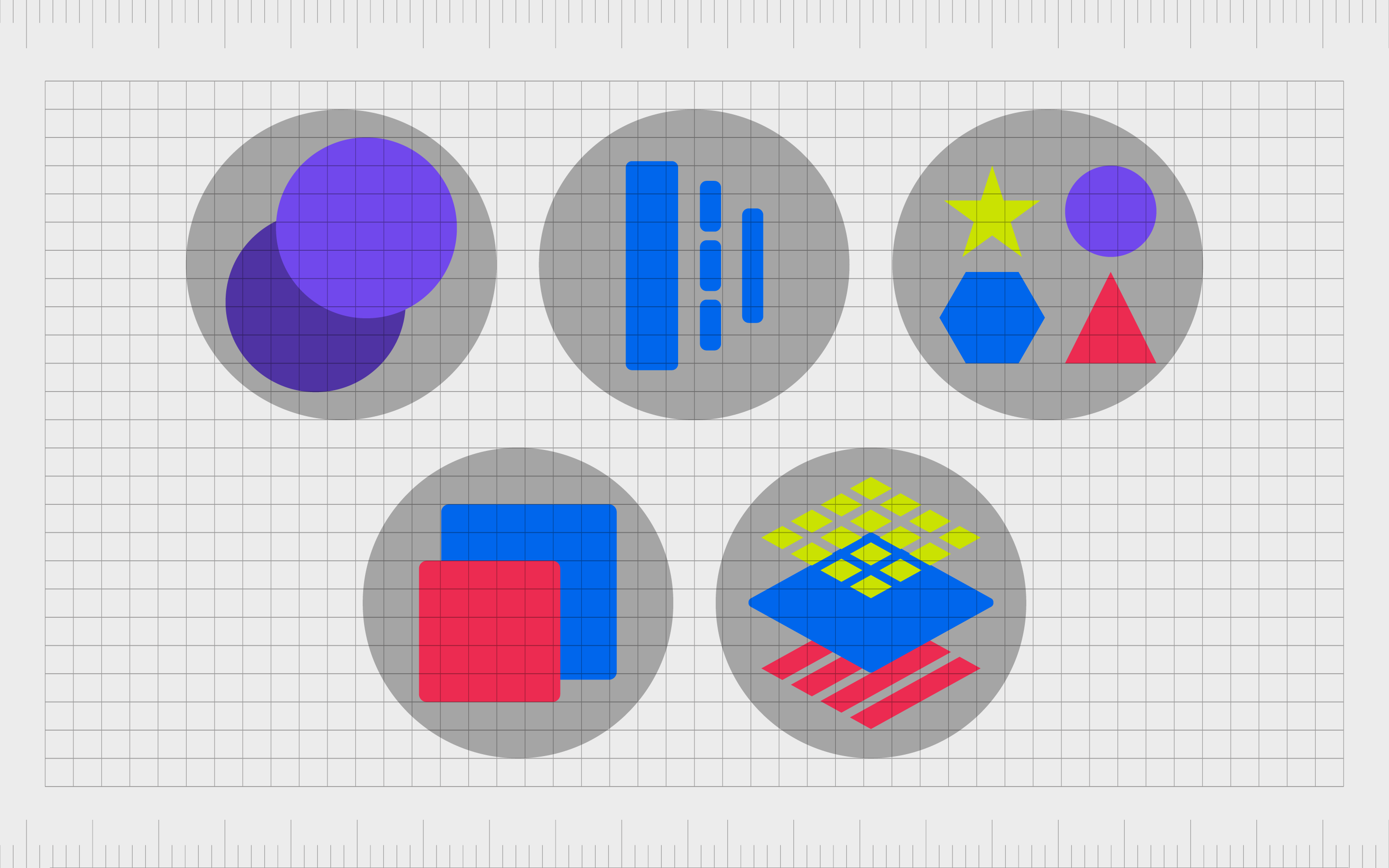
Color variance
Color variance is one of the most common forms of variety in design. Look at most websites and art pieces, and you’ll notice the designer doesn’t just use the same shades consistently. This would be overwhelming and reduce the clarity of the piece.
Color variance in graphic design can include the consideration of concepts like:
- Value: How light or dark your color is.
- Saturation: The richness or intensity of a color.
- Hue: Where a color appears on the color wheel.
Notably, colors don’t have to be contrasting to have variety. Different shades of blue in a logo still add elements of interest.
Line variance
Line variance is another common element of variety of design, most commonly seen in website design and the development of various documents. Lines are excellent for drawing attention to a composition’s elements and positioning components in certain areas.
Lines can be:
- Thin or thick
- Continuous or broken
- Straight or curved
- Short or long
Variety in lines can even help to draw focus to a specific part of a website page. The line above the CTA in the below example is thicker than the separator line after the blog post entries.
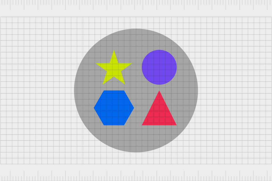
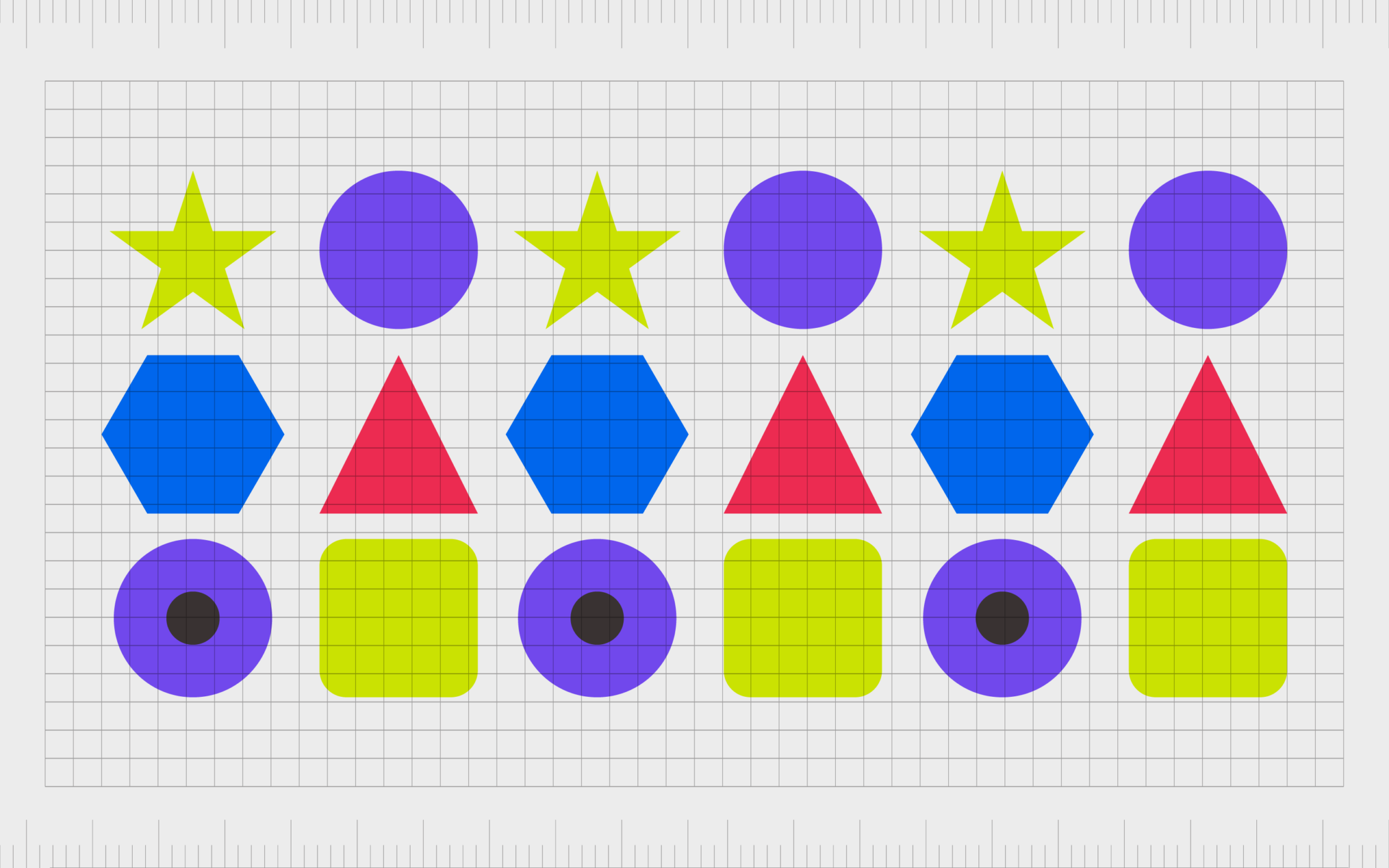
Shape variance
Shapes are everywhere in graphic design, from the modules throughout the pages on your website to the elements in your logo. A lack of shape variance can often look unnatural and bland. However, experimenting with different styles of shapes gives your composition more depth.
Shape variance can also have a lot of meaning. Different shapes are often associated with different concepts in the modern world. Circles are welcoming and inclusive, while squares and rectangles are reliable and professional.
Shape variance can include:
- Sizing: Shapes can appear in a range of different sizes.
- Geometric or organic: Squares and angles compared to images of trees or flowers.
- Impact: Shapes can be made solid or weaker, depending on your needs.
- Color: It’s possible to create shapes in a variety of colors, light, and dark.
Size variance
Size is another concept in the world of variety in graphic design, used for creating depth, perspective, and visual hierarchy. Making one piece of text larger than the rest on a blog post will draw attention to headings and sub-headings.
Sizing is usually one of the most common elements used to emphasize specific parts of a design. Larger elements on a piece will immediately capture our attention than smaller components. It’s also possible to combine size variance with other aspects of contrast to make more of an impact.
A larger block of text written in dark color has more visual weight than a smaller text in a less impactful shade.
Other elements of variety in graphic design
Aside from the main types of variety in graphic design mentioned above, experts can experiment with diversity in a selection of other ways, such as:
Texture: How does the design look as though it would feel? Is it rough or smooth, distressed or soft? How can your user imagine it in their hands?
Font and typography: Variance in font and typography is particularly popular in the digital world. It helps to ensure we know which pieces of text are most important.
Emotional impact: Different parts of a design can have different emotional effects. A sharp triangle on a page will impact a soft circle differently.
Content: Variety can be created through the use of different kinds of content, like placing text next to images on a blog post.
How to use variety in graphic design
Like most principles of graphic design, using variety effectively takes practice. The correct use of variety in graphic design requires professionals to consider the full composition carefully and determine which pieces need to be differentiated from others.
Variety makes design compelling and interesting. It ensures we don’t create a monotonous or meaningless experience for viewers by including too many of the same consistent elements.
It keeps things engaging and interesting while preventing your design from becoming stagnant and predictable. The more you ensure elements are varied, the more you engage your audience.
However, variety also requires caution.
As mentioned above, variety works best when aligned with unity. While unity holds the image together, variety makes it more worth looking at. A complete lack of unity and cohesion in a design is confusing.
Designers can implement variety by placing dark colors next to lighter hues and text next to images. Even placing photos and graphics throughout a blog post creates variety and breaks up the otherwise overwhelming blocks of text a user would see.
One of the best ways to use variety is to highlight a difference in purpose. A company might place two CTAs in various colors or differently shaped buttons to highlight the fact they do different things.
Examples of variety in graphic design
Variety in graphic design is perhaps one of the most common and fundamental principles used by any designer. As such, it’s easy to see examples in virtually every part of the modern world. Let’s look at some quick examples of variety in graphic design.
Trello
A glance at the Trello homepage shows all kinds of variety at work. The positioning of different elements, like the people in the illustrated graphics, is varied to create a sense of motion. Colors are varied to convey different ideas of reliability and creativity.
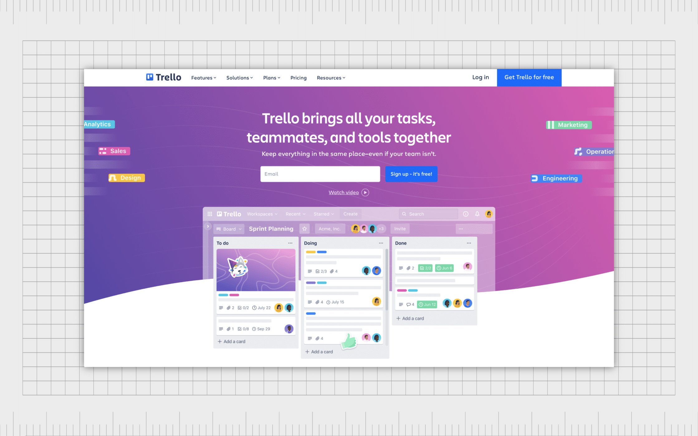
Even the font on the page is varied. Although the same font is used for headlines and sub-headers, it’s positioned in different weights and sizes to create emphasis.
Slack
Slack’s home page is equally varied. There are boxes in different sizes to draw attention to specific CTA points on the page. Unique colors used throughout the list of customers already using Slack draw attention to the social proof on the page and keeps the eye moving downwards.
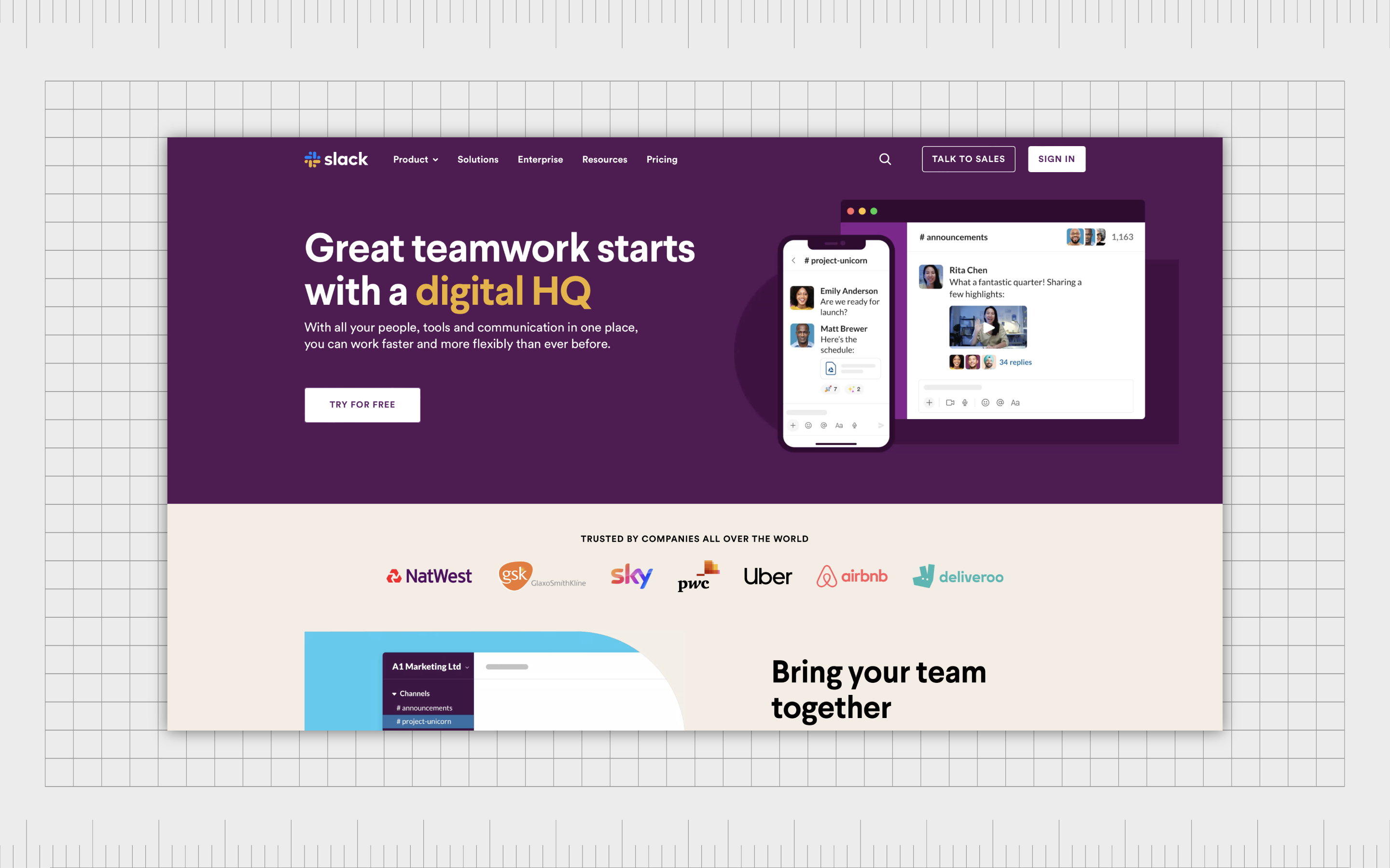
The use of different shapes is also evident here. The curved notification at the top of the page is different from the CTA buttons further down, helping to separate different elements and showcase their unique purpose.
Medium
Medium uses variety in a multitude of ways. The headline on the page is written in serif text to convey a sense of professionalism and heritage, while sans-serif fonts in smaller sizes make the content more friendly and appealing.
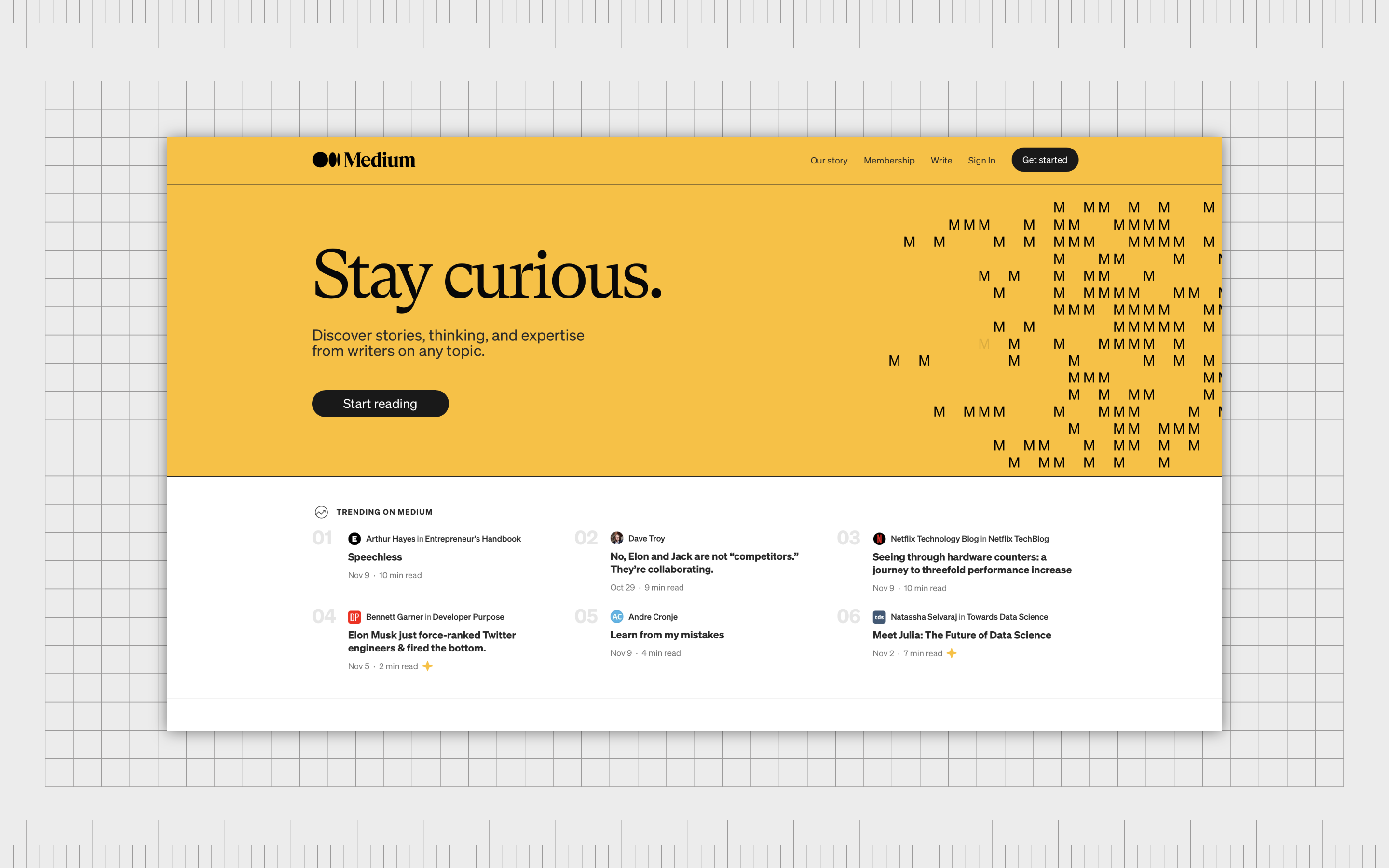
Using different shapes, such as curved boxes for CTAs, and sharp rectangles for tag buttons, helps to differentiate the different elements of the website.
Using variety in graphic design
Leveraging variety in graphic design is one of the most important things any creator can do. The right amount of variety stops your composition from becoming boring and predictable, but it can also do so much more. An effective use of variety conveys purpose and visual hierarchy.
With variety in graphic design, creators can draw a person’s eye through composition and navigate their attention to the right components at the correct times. Variety can create contrast and emphasis while still ensuring a piece remains cohesive thanks to the use of unity.
However, using variety in design can also be complex. Too little, and your design is mundane, and your composition becomes meaningless. This is why designers spend so much time exploring, practicing, and perfecting the use of variety.
Fabrik: A branding agency for our times.
Now read these:
—Introducing the principles of graphic design
—Understanding balance in graphic design
—Discover the alignment principle of design
—What is the hierarchy principle of design?
—Exploring the unity principle of graphic design
—Getting to grips with contrast in graphic design
—Understanding the emphasis principle of design
—Discover the repetition principle of graphic design
—What is the pattern principle of graphic design?
—Exploring the rhythm principle of graphic design
—Get ahead with the movement principle of design
—How to bring harmony to graphic design projects
—The principle of white space in graphic design
—How to use the proportion principle in design

Clarity starts with a conversation.
Thanks—we’ll get back to you shortly.
Whether you're navigating a rebrand, merger, or simply need a clearer identity—we’re here to help. No hard sell, just honest advice from people who know the sector.
Let’s start with a simple question…
Prefer to email? Drop us a line.
Fabrik’s been helping organisations rethink and reshape their brands for over 25 years. We’ve guided companies through mergers, rebrands and new launches. Whatever stage you’re at, we’ll meet you there.