


White space in graphic design: What is white space in design?

White space in graphic design is one of the most important but frequently overlooked design elements.
Without white space, or “negative space,” as it’s sometimes called, we wouldn’t have any idea what was going on in a composition; all of the pieces of a design would simply be crammed together.
Whenever a designer begins work on a new project, they start with a blank canvas – an environment of infinite possibility. The key to success with any design strategy is learning how to fill the canvas and use the space wisely.
White space in design is the tool designers use to create clarity in a piece, separating components, creating emphasis, and directing the eye through visual hierarchy. In some cases, white space can inspire imagination and create new opportunities to connect with an audience.
Here’s your guide to white space and why it’s so essential.
What is white space in design?
White space is simply the area between the elements of a composition. It’s also the spaces within individual design elements, like the color filling a circle on a page. White space even includes tiny gaps within the glyphs in a typeface and the gaps between elements on a logo.
All designs come from white space, an infinite blank void waiting to transform into something with depth, meaning, and content. When designing a website, you start with a blank screen, then add elements such as photos, text, buttons, and menus.
When trying to convert customers and form emotional connections, it’s common to disregard the importance of white space. Older websites and branding assets generally aimed to consume as much white space as possible to take full advantage of the available real estate.
Now, it’s more common to see larger amounts of white space in the modern world, as we’ve discovered that additional space can improve clarity and make a more significant impact.
Like many of the principles of graphic design, white space can be complicated to master at first. Artists need to find the right balance between too much white space – and not enough.
An excessive amount of white space on a page can sometimes make a composition look empty and mundane. However, not including enough white space damages the user experience.
Why is white space important in graphic design?
Look at any web page, article, or logo, and you’ll notice that all elements aren’t simply crammed together or buzzing with activity. Designs need to breathe, and the white space in and around them allows them to do so.
White space is a tool for balancing design elements and organizing content in a visually appealing and cohesive manner. In the right circumstances, the use of white space can:
Create clarity and legibility
Too many elements squashed together without breathing room in a composition overwhelms the eye. If the lines of text on a page didn’t have gaps between them, we’d struggle to differentiate one sentence from the next.
Similarly, if modules on a website or pictures are too close together, it’s hard to separate each element.
White space enhances readability, legibility, and clarity by making it easier to see the separation between various elements on a page.
Connect individual elements
White space, or the lack of it, also impacts how we comprehend information. This is because of something called the “law of proximity.” One of the basic “Gestalt laws” in design, the law of proximity, suggests objects close to each other appear to have a clear relationship.
Seeing white space, therefore, acts as a visual cue to our brains, letting us know a collection of components should be perceived as a whole composition.
By reducing the amount of white space between elements you want to appear “connected” and increasing the white space between disparate objects, you provide your users with more information about how to understand a composition.
Drive focus to specific objects
Good design doesn’t just look good; it also has an essential purpose. The right design elements will guide users through the components of a page, helping them to understand and process what they see.
The more white space around a specific element, the more the element will stand out from the rest of the page, creating emphasis.
With a higher level of white space, we can identify elements on a page as being more important than the rest of the content. Usually, this method is used alongside other principles of “emphasis” to create impact, like contrast or the use of large, bold fonts.
Create visual hierarchy
Many of the common principles of design in the graphic design world play a part in creating a “visual hierarchy.” This means organizing content to help users easily process whatever they see on a page.
When visitors see most graphic designs in today’s fast-paced world, they’re more likely to scan what they see rather than read it thoroughly.
Good visual hierarchy helps with this “scanning” process. The use of white space allows designers to build a flow the user’s eyes will naturally follow when scanning a page. Increased white space will also demonstrate which pieces or elements in a design require a user to stop and pay attention.
Build a certain aesthetic
White space has a powerful impact on how people perceive an entire composition. As mentioned above, old-fashioned brand assets, from posters to leaflets, would commonly cram as much information into a piece as possible to take full advantage of the available space.
Using more white space, and giving the elements plenty of room to breathe in a composition, helps to identify an image as more “modern.”
White space can come across as luxurious and elegant, particularly when paired with other design elements, like the right choice of typography and photography.
What is the white space rule?
White space is such an important principle of graphic design, it even has its own specific “rule” for professionals to follow. The white space rule is a design technique that ensures experts leave enough clean or white space on a canvas.
For any design to allow elements to breathe, white space is necessary. Without enough white space, the elements of a design begin to suffocate. This also creates a claustrophobic experience for anyone viewing the design.
People naturally feel frustrated when information bombards them too aggressively. We’re not designed to process vast amounts of information at once. White space calms us, and gives us the room we need to take in elements one piece at a time.
When creating a composition, designers must regularly step back and ensure the amount of white space balances with the number of elements on a page.
The level of white space in the design should at least be enough to balance out the number of components in a composition. However, it’s also possible for designers to use more white space than is necessary, usually to create an essence of elegance or luxury.
What is the principle of white space?
The definition of white space in graphic design is usually mentioned alongside an overview of numerous other “principles” for graphic design excellence. The principles of graphic design are a series of rules professionals follow to ensure a composition makes the right impact on any audience.
White space is perhaps one of the most important principles of graphic design, because without it, we’d struggle to leverage other principles like emphasis, unity, cohesion, and balance.
White space appears in all aspects of graphic design and art, from product branding, to website creation. The negative space around elements in a page can separate or connect elements in a design layout, create emphasis, and convey important information.
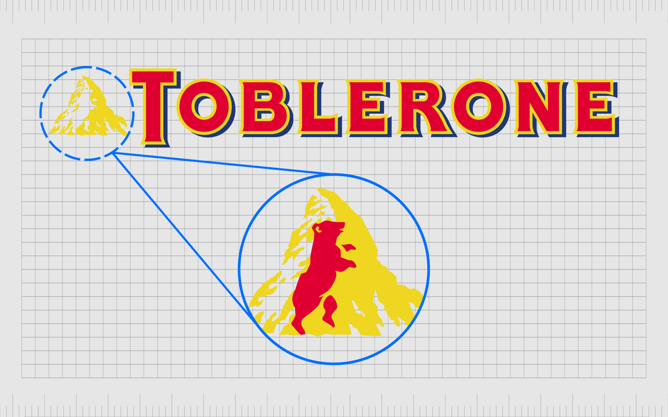
Some designers even use white space as a tool for sparking the imagination. For example, the white space in the mountain of the Toblerone logo draws attention to the strength and heritage of the brand.
Crucially, the term “white space” is a misnomer because it indicates the space in question needs to be white. However, white space is actually just “negative” space. It can be any color, provided no additional elements within the space exist.
In some cases, using a different color for white space can also help to convey meaning. Black can highlight sophistication, and yellow can often create a sense of happiness or brightness on a page.
The white space principle of design should always be used in conjunction with the other principles of design, to create a cohesive image.
How is white space used in graphic design?
The use of white space applies to all digital and print mediums. Designers use white space on packaging for products, in logo and website design, and even when determining how certain documents should like, like whitepapers and case studies.
The overall purpose of white space is to make content consumable while guiding a specific experience from a composition. White space can be passive or active, explicitly sending a message or simply acting as a foundation for other content.
To successfully leverage white space in graphic design, users need to:
Look at the whole picture
It’s important to step back and examine the composition, rather than focus too much on individual components. White space can dictate how a piece’s elements are connected and separated.
Focus on legibility
White space should make the content on a page easier to consume. Designers can determine how easy it is to consume content by closing their eyes for a moment, opening them, and considering how they naturally scan a page.
Use contrast
To create emphasis from white space, certain elements need more white space than others. This means using contrast throughout your design to differentiate one element or component from another.
Maintain consistency
White space is an important part of identifying a brand and its personality. It’s important to take a consistent approach to how you use this principle. If one page on a site has a lot of white space, the rest should also use white space liberally.
Test the experience
User testing can provide a good insight into how white space will actually guide your audience in any given situation. Testing a design on multiple people will usually make it easier to determine how your white space may be perceived.
What are the types of white space in graphic design?
As mentioned above, white space can serve a number of purposes in design. This also means there are different “types” of white space, with different abilities. The most common way for experts to identify a kind of white space, is to determine whether it is micro or macro, passive, or active.
Micro white space
Micro white space refers to the smaller spaces between graphical elements, like letters, text lines, icons, paragraphs, and icons. The micro white space in a composition might include the tiny amounts of space within the glyphs in a letter or character on a page.
Though small, micro white space is critical in ensuring content legibility and helping the viewer to read text as quickly as possible. This form of white space is most commonly used in typography design, but it can also appear in logo design.
Macro white space
Macro white space in design refers to the space between the larger graphical elements of the design composition. Unlike micro white space, macro white space works with the bigger picture, almost acting as a foundation or background for the rest of the composition.
You can use macro white space in many ways, including everything from the gaps between content modules on a website to the margins of a newsletter. Macro white space is also beneficial when emphasizing specific elements of a composition.
Active white space
Active white space, as you may expect, plays more of a significant role in the message and impact of a composition. With active white space, designers intentionally attempt to focus more on specific parts of a design or content within a design.
Using active white space can include large amounts of space around an element which demands additional attention or white space used to create a unique shape or send a different message to the user.
Passive white space
Passive white space has less of a specific purpose. This kind of white space is brought into a composition more organically. It appears in the blank space around a logo design, between words and lines, and in other composition parts.
For the most part, passive white space is intended to go unnoticed, as the main function is to increase the comprehension and readability of the overall design.
How to Use White Space in Graphic design
Like all principles of design, white space requires careful consideration and planning on behalf of designers.
The exact strategy you use for implementing white space into your design choices will depend on various factors, such as:
The viewer
Organizing components in any design should always keep the viewer’s needs in mind. You’ll need to consider how your audience will likely consume the content you’re displaying and how much white space they might expect to see. Younger audiences might expect more white space.
Legibility
Both micro and macro white space are essential for making content legible and easy to follow. As a designer, experts should consider the white space carefully when choosing everything from typography to where images should go.
Think of leading, kerning, and tracking and how different images exist on a page.
Branding
The overall personality and essence of the brand you’re designing for should also be considered when implementing white space. As mentioned above, significant amounts of white space are usually aligned with elegance and modernity. Think of how Apple or Google uses white space effectively.
Content
The content included in a design will have an impact on white space. Some pieces of content, like blocks of text, are more visually demanding than a simple shape in a block color. The right balance of elements is essential when figuring out how much white space is necessary for any design.
Focus
As mentioned above, white space is a critical tool in guiding the attention of your target audience through any kind of content.
Designers should strategically plan how they want to direct the attention of their viewer or user when deciding how to use white space. This will include determining which pieces need the attention of the viewer first.
Examples of white space in graphic design
Because whitespace in design is essential in ensuring a composition’s success, there are plenty of examples today. The use of white space appears in virtually every form of design, from web design to logo and banner design.
Let’s look at some quick white space in graphic design examples.
Buffer (Web design)
The white space on the buffer website makes it easy to understand which content demands your attention. The use of contrast, like a bold button with added texture, and colorful photos against a white background help to create visual hierarchy.
At the same time, micro whitespace ensures the font on the page is legible.
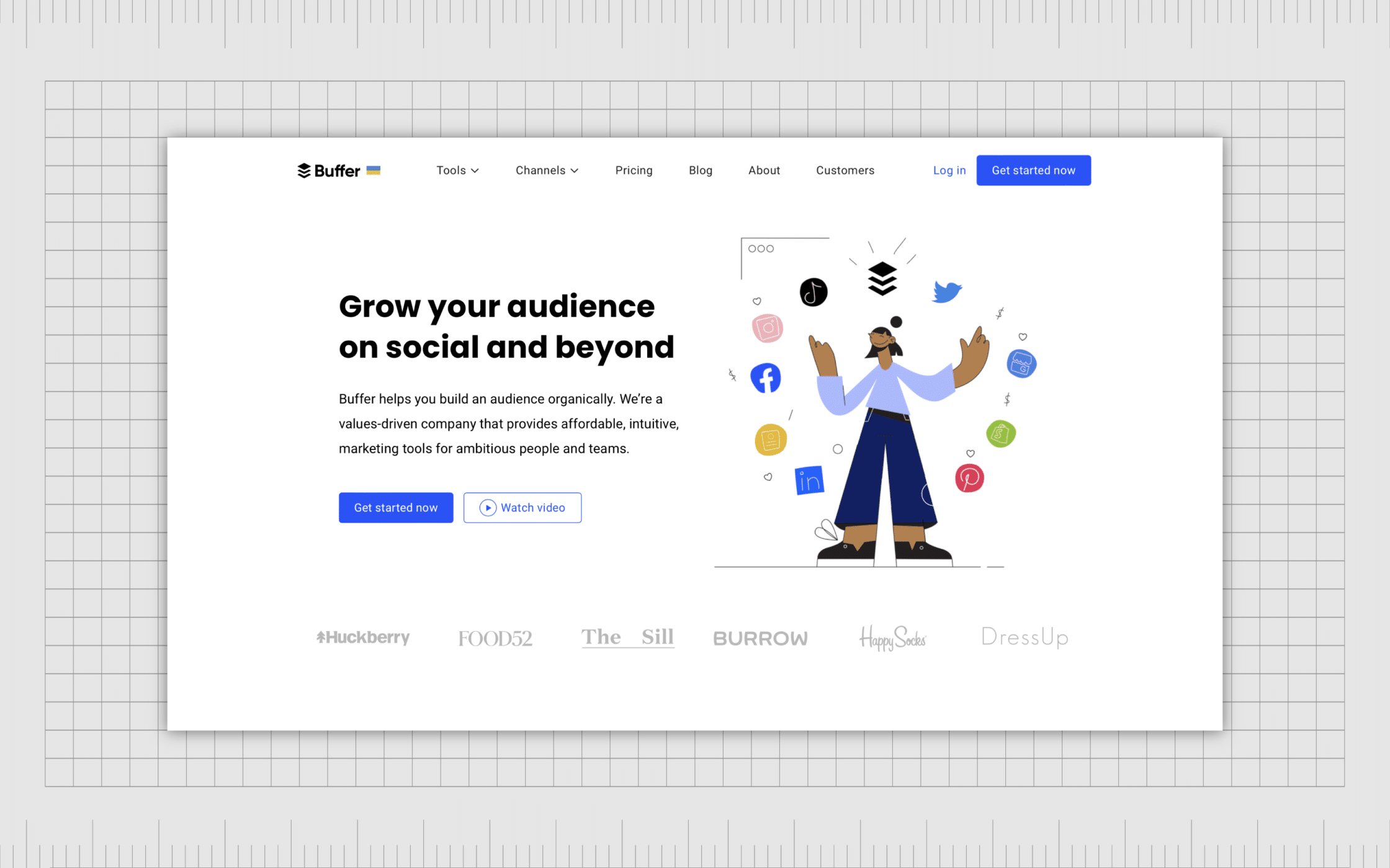
Buffer’s website is also a great insight into how the amount of white space has increased significantly over the years, particularly for tech brands.
Mailchimp (landing page)
Landing pages are all about maintaining the focus and attention of the customer as they move through a page full of useful information. With a landing page, it’s important to have as few distractions within the composition as possible, making white space essential.

In Mailchimp’s landing pages, we see clear examples of how white space helps to guide visitors to take action, placing the focus on buttons and imagery.
FedEx (logos)
Logos rely on white space just as much as any website or landing page. In some cases, the whitespace in a logo can also have more meaning than we initially realize. In the example above, the space in the FedEx logo doesn’t just make the font easy to read; it also sends an important message.
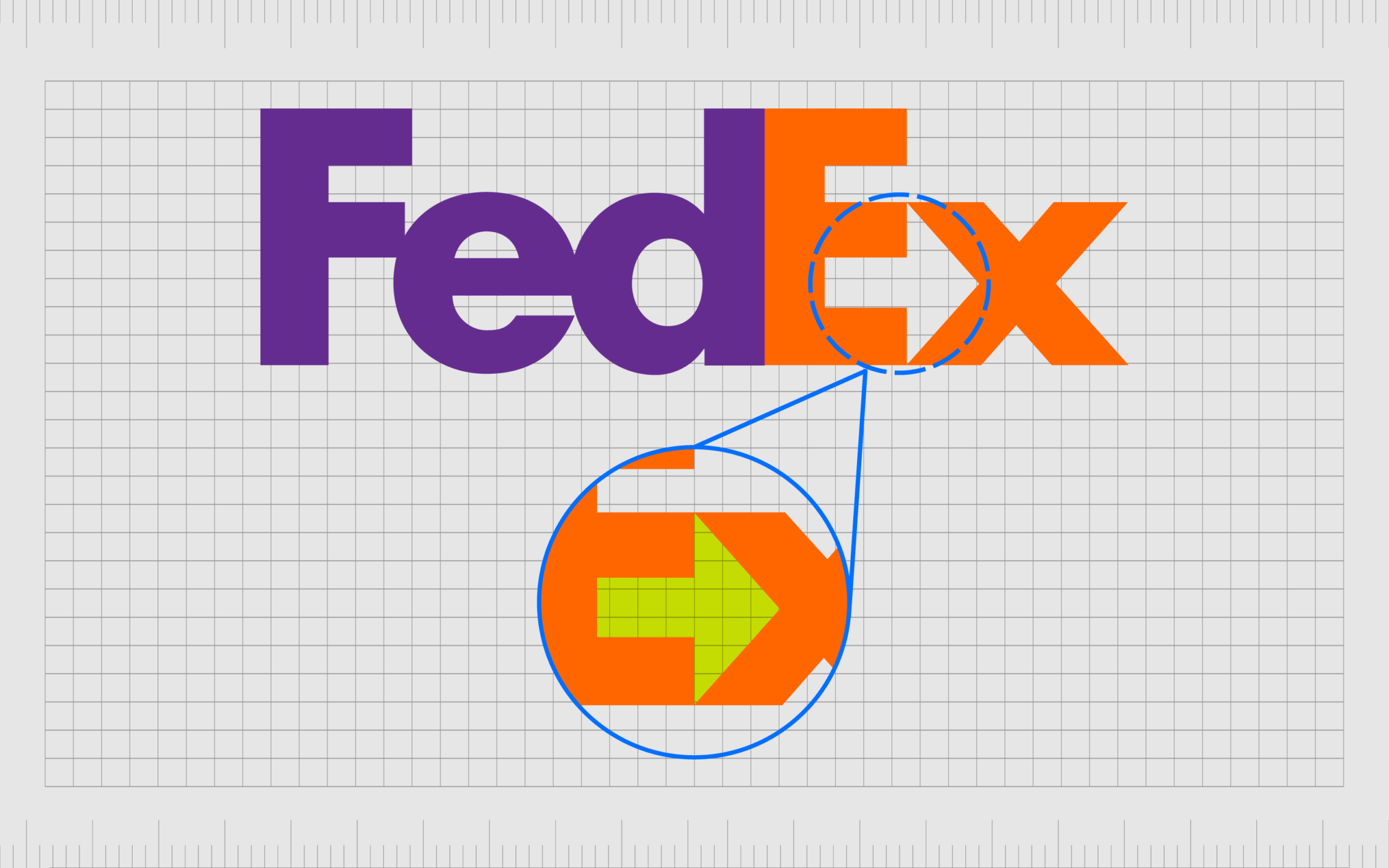
The space between the “E” and the “X” in the wordmark creates an arrow pointing to the right, indicating forward motion and speed.
Using white space in graphic design
Wherever you look in today’s design-focused world, you’ll see examples of white space in graphic design. White space helps to create clarity and emphasis in everything from newsletter and banner design to business cards and websites.
Used alongside the other key principles of design, white space is an essential tool in any designer’s toolbox. This solution can be an integral part of visual design, holding different parts of a page together and separating unique components.
White space is also a crucial part of ensuring your customer’s experience with your design assets is as great as possible.
Learning how to use white space effectively can be challenging, but when it’s leveraged correctly, this tool can have an incredible impact on your target audience.
Fabrik: A branding agency for our times.
Now read these:
—Introducing the principles of graphic design
—Understanding balance in graphic design
—Discover the alignment principle of design
—What is the hierarchy principle of design?
—Exploring the unity principle of graphic design
—Getting to grips with contrast in graphic design
—Understanding the emphasis principle of design
—Discover the repetition principle of graphic design
—What is the pattern principle of graphic design?
—Exploring the rhythm principle of graphic design
—Get ahead with the movement principle of design
—Why variety is an important factor in design
—How to bring harmony to graphic design projects
—How to use the proportion principle in design

Clarity starts with a conversation.
Thanks—we’ll get back to you shortly.
Whether you're navigating a rebrand, merger, or simply need a clearer identity—we’re here to help. No hard sell, just honest advice from people who know the sector.
Let’s start with a simple question…
Prefer to email? Drop us a line.
Fabrik’s been helping organisations rethink and reshape their brands for over 25 years. We’ve guided companies through mergers, rebrands and new launches. Whatever stage you’re at, we’ll meet you there.