


Pattern in graphic design: What is the pattern principle of design?

The use of pattern in graphic design can be more powerful than you’d think. Pattern in design creates a sense of consistency and unity in a design project, while also helping to strengthen the emotional impact of a composition.
Through the right pattern, you can give depth and life to an image, infuse a design with texture, and capture more attention. Pattern, like many of the principles of graphic design, can have a significant influence on your target audience, communicating brand values, personality, and preferences.
With the pattern principle of design, it’s also possible to align multiple components of your visual presence in today’s competitive world. Pattern in design can show your audience which pages on your website are connected or which parts of a page share a conceptual connection.
Today, we’re going to be exploring the power of graphic design pattern, and how creative minds can use elements of pattern in their creations.
What is pattern in graphic design?
The pattern principle of design is one of the various “design principles” experts follow to ensure they’re making a specific impact on their audience with each composition. A kind of “repetition,” pattern can help to establish brand equity and presence.
Pattern designs occur from a repeated arrangement of carefully chosen shapes, lines, and colors, distributed over a surface. The effect of the pattern changes depending on the graphics or symbols used, and how they might be repeated at irregular or regular intervals.
While patterns frequently appear in design trends, like minimalism and flat design, they’ve been a common part of the design process for decades.
Patterns appear abundantly in nature, through trees, seashells, and even on animal pelts. Its little wonder patterns have also become a common component of how we express ourselves in design.
Definition of pattern in graphic design
Principles of design pattern guide today’s artists and creators to compose more user-friendly and aesthetically appealing designs. While patterns are simply a repetition of more than one design element working together, they’re often more meaningful and impactful than people realize.
A seamless pattern where every element of a design combines to form a whole, can create a sense of holistic comfort and simplicity. A more disjointed pattern, with breaks in the flow of certain elements, can draw our attention to certain parts of a page and create emphasis.
Designers tend to base most patterns on the use of textures, shapes, and colors, rather than words. However, we can find patterns in all manner of design, from architecture to fashion design.
When colors, symbols, and icons are used with a consistent sense of structure and spacing, our brain immediately recognize the repetition and experience a sense of satisfaction.
We naturally look for patterns and order in the content we see, and a harmonious order of elements can give us a more pleasurable aesthetic experience. This positive experience also makes it easier for consumers to form a positive connection with your brand.
Why is pattern important in graphic design?
Pattern in design creates a positive aesthetic experience for viewers, which forms stronger emotional connections between companies and their customers.
Additionally, like most forms of repetition, pattern is also an excellent form of reinforcement; it sends a consistent message to your audience, building a sense of memorability and trust.
We can recognize shapes and patterns sometimes more rapidly than words, and patterns can also be a valuable way to draw attention to one part of a composition over another.
Some of the most significant benefits of using the principles of design pattern in your work include the following:
Adding life to a design
Natural patterns and textures help to add a natural feel to your design. In life, we’re surrounded by pattern and texture in the natural and man-made world.
As such, we expect to see pattern in the things we interact with. The right use of pattern can bring life to a product or composition and make it more relatable.
Creating visual intrigue
We are naturally predisposed to seek out patterns and rhythm in the things we see. Adding the right pattern to a composition will immediately add a new sense of visual intrigue to your creation. This visual intrigue helps to make whatever you create more memorable.
Textures and patterns make statements
In some cases, the careful use of certain patterns and textures can help with the creation of bold statements. Repeating a certain shape, like a leaf, over and over helps to demonstrate your commitment to or connection with the natural world.
Improved brand recognition
Audiences often remember brands based on their visual identity. Everything from the patterns you use in your websites, apps, and packaging, to your logo and color choices, will make your brand more recognizable. A good pattern can even help to distinguish you from other similar brands.
Enhanced representation
The visual elements you use to represent your company can help to demonstrate important values and ethics. The use of certain shapes and color choices can say a lot about your company.
Pattern can even be a great way to make simple advertising collateral and brand elements more impactful. Regular business documents and stationery can be quite boring, but a good pattern engages and delights your customers.
What is the principle of pattern?
The principles of design pattern come from the various “principles of graphic design” used to guide professionals in the creation of powerful compositions. The pattern principle of design believes using repeated elements in a composition can deliver emphasis or unity in an image.
Elements of pattern can assist in creating a standout image for your company.
Carefully crafted patterns, used in marketing collateral like business cards or brochures, logos, websites, and packaging, can be versatile and powerful tools for communicating brand values and personality.
The more a certain pattern repeats throughout a composition, the more of an impact it has.
Patterns can exist in the background of designs to bring a sense of depth or texture to a creation.
Think of the patterns you see on website or app backgrounds. Patterns highlight a specific element of a composition. A pattern placed around a logo, showcasing important shapes and colors, can emphasize the logo while sending an important message.
The principle of design pattern works well alongside other principles like repetition, unity, and alignment in graphic design. This solution creates a sense of aesthetic satisfaction for your audience, gives harmony to your design, and improves your brand’s reach when used correctly.
How is pattern used in graphic design?
Pattern can have several different effects, depending on how you want to use it. In some cases, a subtle pattern in the background can form a foundation for emphasizing another element of a design, like a pattern of lines around a piece of text.
Pattern can also be an important part of building a brand’s visual identity. Repeated elements in graphic design often form the foundations for what we understand about a brand based on its aesthetic. Certain shapes and repeated images can send a valuable message.
As an example, circles in graphic design, particularly in logo creation, can often express unity and community.
It’s important to choose and leverage patterns carefully in graphic design for several reasons.
Too much of a pattern, particularly some kinds of patterns, can overwhelm other design elements and make it more difficult for the underlying message of the piece to emerge.
Patterns can also easily send contrasting messages for a brand when not chosen correctly. The wrong shapes or colors could clash with the kind of brand identity you’re building. Therefore, it’s so important for companies using pattern in design to look at the composition holistically.
Each principle of design needs to be considered in the context of the overall image or project being created. Ideally, the principle of repetition should work perfectly alongside other essential principles, from repetition and unity to emphasis and contrast, to deliver a specific outcome for the designer.
What are the types of pattern in graphic design?
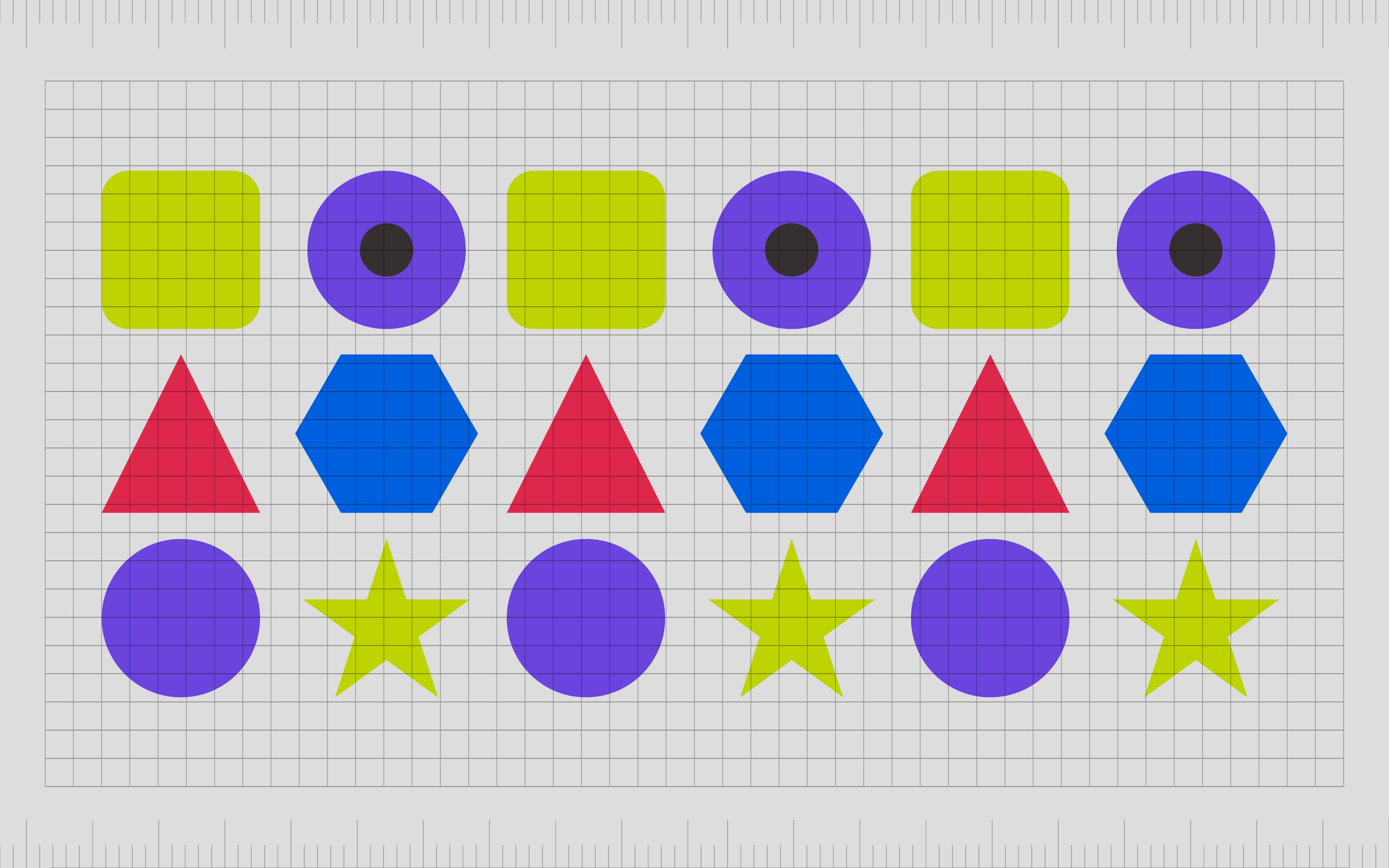
A visual pattern in graphic design is simply any element repeated in a cohesive manner within a composition. Patterns can include several different shapes and colors, provided those elements come together to create a cohesive whole.
The diversity of pattern as a concept means there are many different types and elements of pattern designers can use to create a specific result with their models or output.
Here are some of the most common types of patterns you may have noticed in the past:
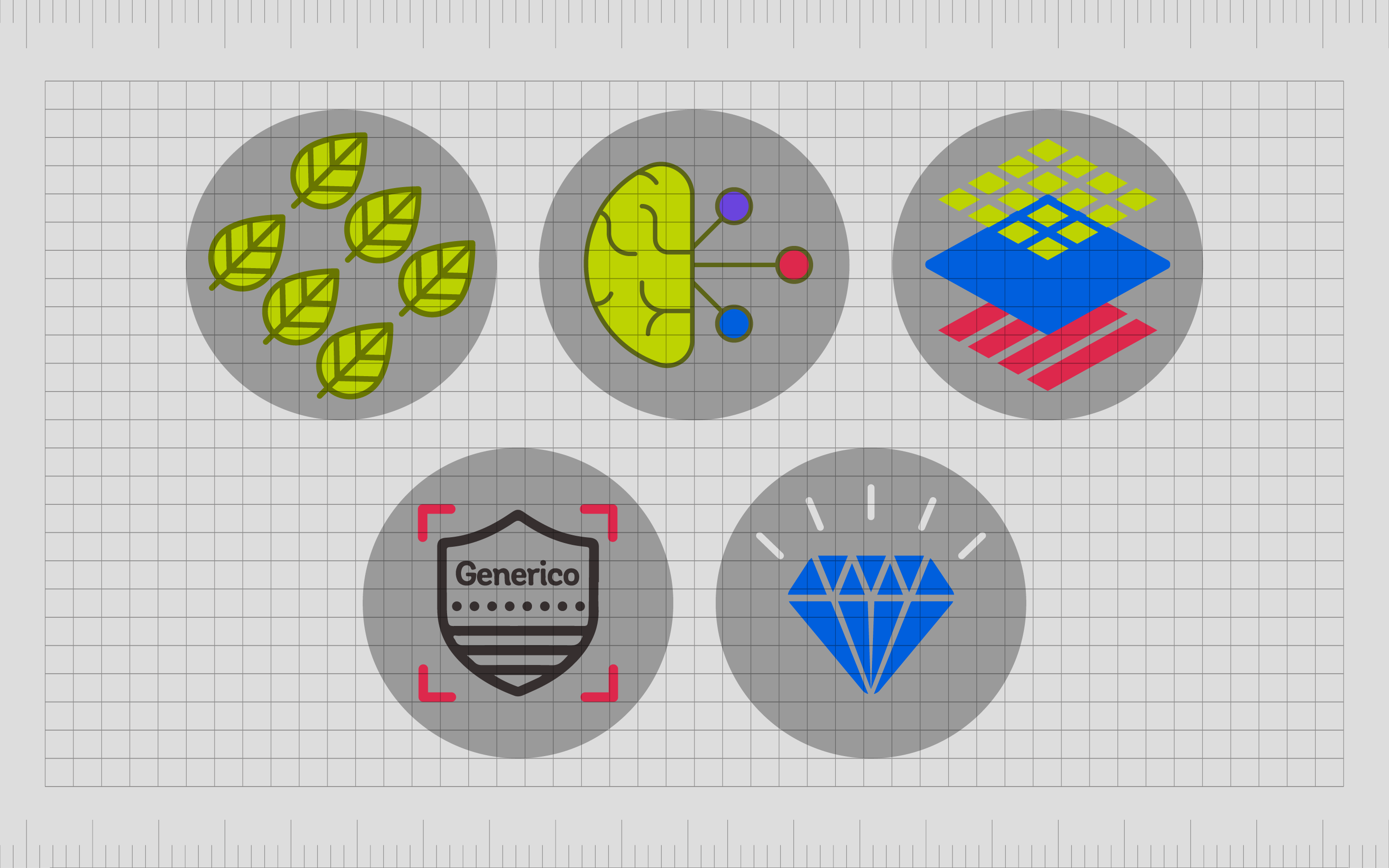
Natural or organic patterns
Natural and organic patterns leverage environmental images like the rings or grain of a piece of wood or leaves to create an outdoorsy effect.
These patterns are often intended to connect the business with the outside world, whether they’re trying to demonstrate a more sustainable or eco-friendly nature or make themselves look adventurous.
These patterns are often easy to recognize because we’re all familiar with the outside world.
Abstract patterns
Abstract patterns in design can add a touch of modernity and forward-thinking innovation to a design. Because they’re less likely to follow conventional rules, abstract patterns will often demand more attention than natural patterns, as the eye isn’t used to seeing them.
This means you can easily use abstract patterns to create emphasis, but too many of these patterns may make your composition look cluttered and overwhelming.
Minimalist patterns
Minimalist patterns are some of the most popular in the design world right now.
Built with a strong focus on white space and simplicity, minimalist patterns are visually relaxing and form a textured foundation for other design elements. Because minimalist patterns don’t demand too much attention, they’re great for directing the attention of the viewer towards other messages.
Minimalist patterns are common when a blank space on a composition isn’t appropriate, but too much information or content could be overwhelming.
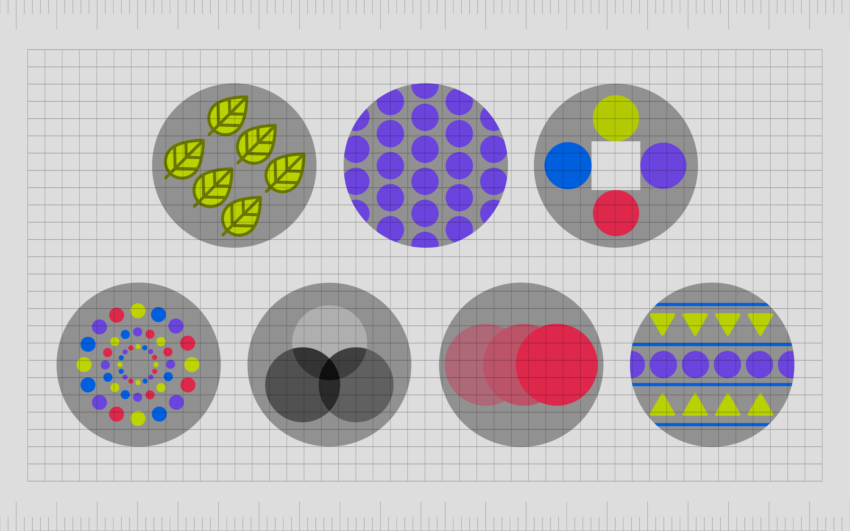
Colorful patterns
Colorful patterns aren’t necessarily just an arrangement of colors thrown together for no reason. There will usually be an underlying color scheme to consider under the design.
This type of pattern used in graphic design leverage the use of certain blocks and shapes to distinguish how much of a color should be present in any design.
At the same time, a colorful pattern can create an emotional impact and tell your audience a little more about your values and what your business stands for. Colorful patterns are great for celebrating brand identity.
Monochrome patterns
Like minimalist patterns in design, a monochrome pattern can often be easier on the eyes than a colorful or feature-rich pattern. Because they’re clean and simple, these patterns allow for other elements to jump in and take center stage in a composition, like a logo or a headline.
A monochromatic pattern doesn’t necessarily have to be shades of black, white, or grey. The right pattern can embrace any color you choose, provided you stick with a single color.
Gradient patterns
Gradients are transitions of colors from one tone to the next. This is a common pattern choice for today’s companies in search of a more simplistic and minimalist design. Gradients can create a very subtle presence, depending on the colors you choose, or they can have a bold effect.
Because gradient patterns don’t use a lot of different colors and shapes, they’re more likely to appear as a tool for emphasizing another element in a design.
Mixed patterns
As mentioned above, because a pattern can reference any repetition of certain elements, from lines and circles, to squares and dots, there’s little limitation in what you can create. Some designers even combine various elements from different pattern techniques mentioned above.
You can mix complementary colors in a colorful pattern with geometric shapes or play with different repeated organic and abstract images.
Just keep in mind that the more elements present in your pattern, the more complex it will become. Multiple elements can also make it difficult to see where patterns start and finish.
How to use pattern in graphic design
Patterns in graphic design can be extremely powerful or overwhelming, depending on how you use them. It’s critical for designers and creatives to ensure they’re leveraging patterns as effectively as possible.
Like most of the principles of graphic design, elements of pattern can take a little practice to use correctly.
The right use of patterns can define surfaces and components in a composition, show scale, and convey specific styles and personalities. Patterns can also draw attention to certain areas of an image and add visual interest to a portion of the design.
Some of the best ways to use the principles of design pattern include:
To enhance branding
Graphic design pattern is one of the best ways to enhance a brand image and distinguish a company’s unique personality or aesthetic appeal. Patterns appear across all kinds of branded merchandise and assets, from packaging to websites, conveying a business’ identity.
Repeating elements of a pattern through multiple components within a brand’s assets makes the brand more memorable.
For texture and depth
Patterns and textures bring a design to life and give a composition more visual interest. In real-world environments, items have pattern and texture regardless of how subtle these components might be. The right kind of pattern makes your content feel more authentic and realistic.
To emphasize important messages
Patterns can be excellent for highlighting certain design areas. A pattern within a box, where you’re going to showcase product images, separates the module on your website from the rest of the page.
You can use repeating elements of pattern to highlight the most important elements on multiple pages, too.
Establish associations
Some patterns improve user experience. Your customers might associate a certain pattern at the bottom of the page on your website with the footer of your pages.
You can also use patterns to highlight buttons or certain modules of text and content throughout an app or website design.
Create personality
The patterns you use in branding and graphic design, like the shapes and colors you use throughout your packaging, branding elements, and other items, highlight your personality. Every kind of shape and visual has an emotional impact on your audience.
With patterns, you distinguish your brand.
Make products stand out
Patterns are common in packaging design because they make certain products stand out from other competitors on a shelf. The right use of pattern can even make an item look like it’s gift-wrapped, ready for the customer.
Examples of pattern in graphic design
Patterns are everywhere in our visually driven world. We see patterns not just in graphic design, but in the natural landscape, too. Patterns exist in architecture, clothing design, packaging creation, and website design. They can be bold and eye-catching or lingering just beneath the surface.
Here are some excellent examples of patterns in graphic design to inspire you:
EJET Precise Works
The EJET Precise Works from Athens use pattern a significant part of their brand identity to highlight their precision as a cutting and machining company. The logo of the company is a specific pattern created to showcase the main letters of the company’s name.
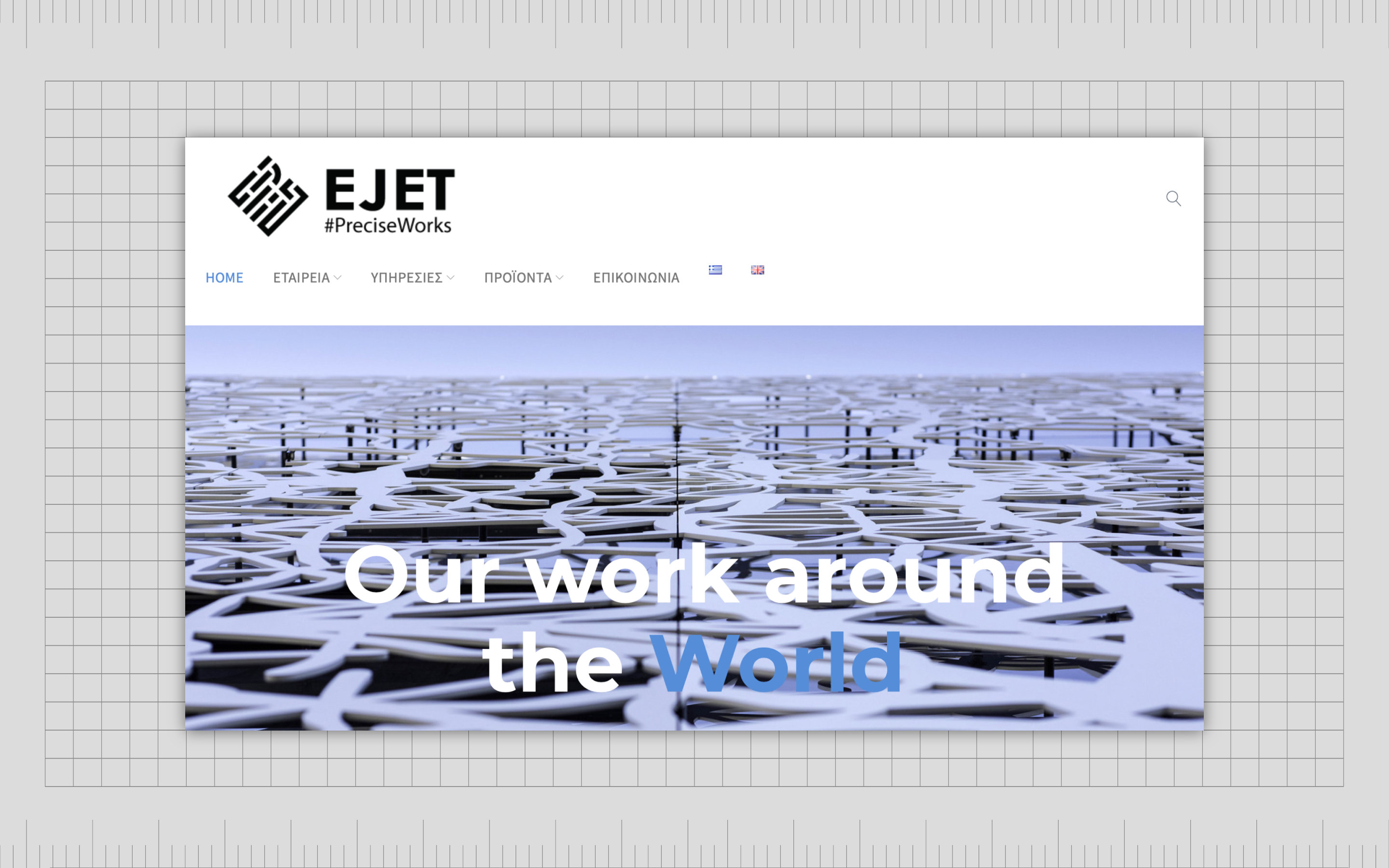
The company also uses pattern in a lot of its packaging and promotion.
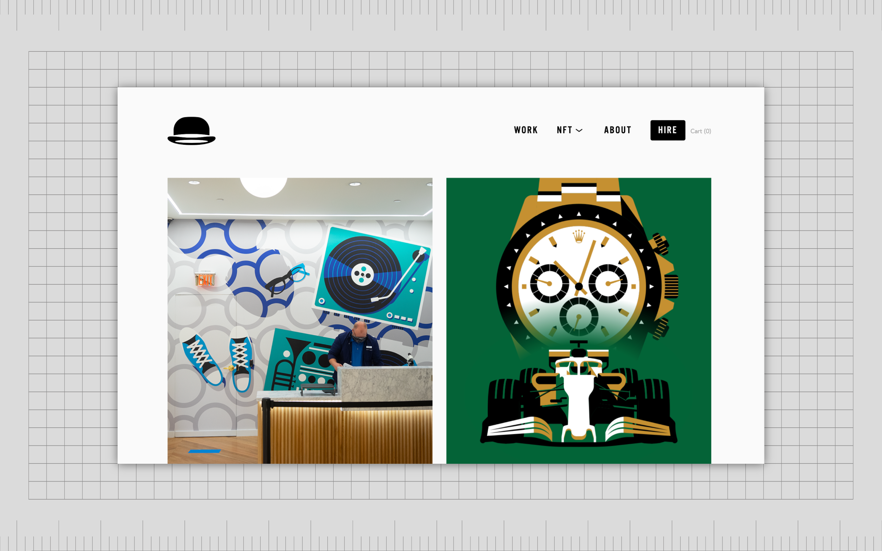
Jeremy Booth
A Designer and illustrator, Jeremy Booth offers excellent insights into how patterns can be utilized in design. In this project for the GA Foreign Trade pamphlet, Jeremy frequently uses lines and specific color options to create a high-octane, pop-art style image.
The use of pattern here is bright and minimalist, excellent for grabbing attention.
City of Melbourne
Created by the Landor company, the City of Melbourne’s branding involves several different patterns in a repeated logo shape.
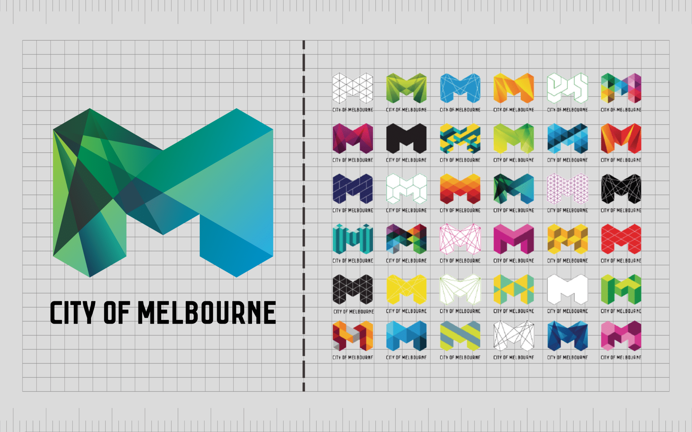
The “M” for Melbourne is evident throughout a lot of the branding components used by the group. However, there are also various patterns in play intended to highlight the different aspects and personalities of the city.
Exploring the pattern principle of design
Pattern in graphic design is one of the most common principles of design used by artists. Highlighting important information, and sending a consistent message, pattern can be extremely useful to designs, ideal for emphasizing certain pieces of a composition.
With visual pattern, companies make their products more engaging and appealing, particularly with packaging. Pattern also make brands more memorable by highlighting specific images and colors which we connect with the company’s identity.
The key, of course, is using pattern correctly without being too overwhelming. If you’re struggling with pattern in design, reach out to a graphic design team with experience handling the nuances of pattern.
Fabrik: A branding agency for our times.
Now read these:
—Introducing the principles of graphic design
—Understanding balance in graphic design
—Discover the alignment principle of design
—What is the hierarchy principle of design?
—Exploring the unity principle of graphic design
—Getting to grips with contrast in graphic design
—Understanding the emphasis principle of design
—Discover the repetition principle of graphic design
—Exploring the rhythm principle of graphic design
—Get ahead with the movement principle of design
—Why variety is an important factor in design
—How to bring harmony to graphic design projects
—The principle of white space in graphic design
—How to use the proportion principle in design

Clarity starts with a conversation.
Thanks—we’ll get back to you shortly.
Whether you're navigating a rebrand, merger, or simply need a clearer identity—we’re here to help. No hard sell, just honest advice from people who know the sector.
Let’s start with a simple question…
Prefer to email? Drop us a line.
Fabrik’s been helping organisations rethink and reshape their brands for over 25 years. We’ve guided companies through mergers, rebrands and new launches. Whatever stage you’re at, we’ll meet you there.