


Emphasis in graphic design: Exploring the emphasis principle of design
Emphasis in graphic design is one of the many tools or “principles” of design used by professionals. The purpose of emphasis is to identify the “star of the show” in a composition. With emphasis in design, you highlight a specific element, or group of elements as being more important than the rest.
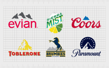
- In logo design, a combination mark may use color and size to draw attention to a symbol over a word.
- In web design, emphasis can pull the viewer’s line of sight to a CTA button, a link they need to click, or an image intended to grab their attention.
Almost every visual composition has certain elements intended to draw more attention than the rest. Using elements of emphasis as a graphic designer captures your target audience’s interest, guides their visual experience, and delivers a specific message.
Today, we’re going to take a deep-dive look at the principles of design emphasis, and how they influence the development of powerful creative works.
What is emphasis in graphic design?
Emphasis is a relatively well-known concept in the art and design world. Graphic designers will usually learn emphasis early on in their education. This is because we use emphasis for many purposes, often to drive action, or elicit a response.
We see emphasis in most fields of design, including landscape design, architecture, and even fashion design, when specific structures and shapes are used to emphasize one body part over another.
Emphasis surrounds us in our entire aesthetic landscape, though we might not always refer to it as such.
With graphic design emphasis one central element is determined as the focal point of a composition or design. In a landing page, a CTA button or form may have more emphasis than the surrounding components on a page, because it’s meant to capture the viewer’s attention.
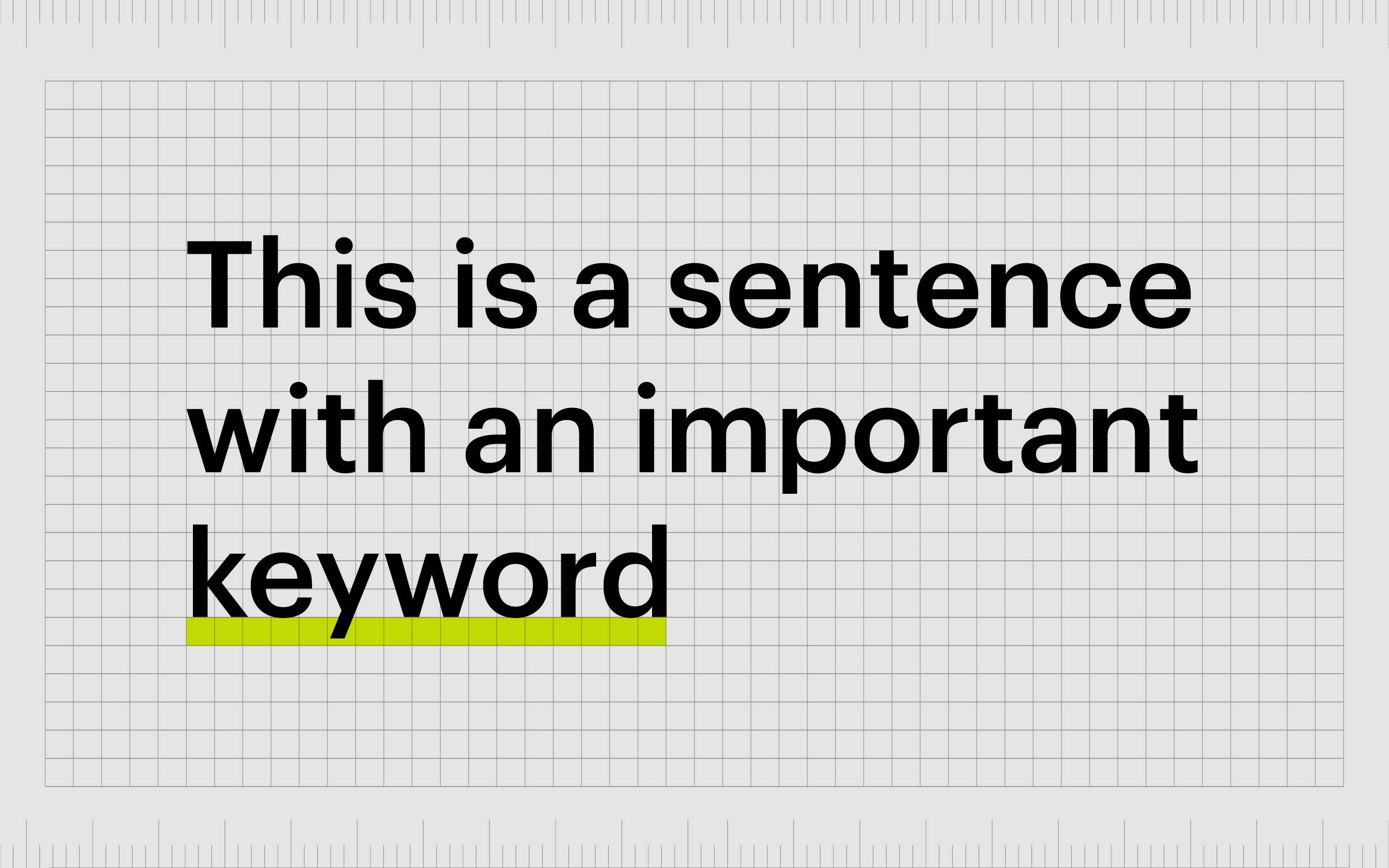
Emphasis in a blog post might be seen in the use of large underlines under the words we want people to pay attention to, or different colored fonts. Emphasis is usually used in conjunction with the other principles of design, like contrast and unity.
Contrast and emphasis in design can often feel like two interchangeable concepts, but contrast is just one way of creating emphasis in a design. Arrows pointing to a part of a webpage your web designer wants you to pay attention to wouldn’t be a form of contrast, but they highlight emphasis.
Definition of emphasis in graphic design
Emphasis is a concept used to create a focal point in a design. It’s made up of various strategies and methodologies to ensure one part of a composition is distinct from the rest. This requires a level of contrast but can also require the use of lines, shapes, colors, textures, and scales.
When defining emphasis in graphic design, it’s commonly linked to the idea of “unity” another important principle of design.
Unity is the strategy used in graphic design to ensure various parts of a design link together and share a consistent element, while emphasis is about making a particular feature stand out more than anything else.
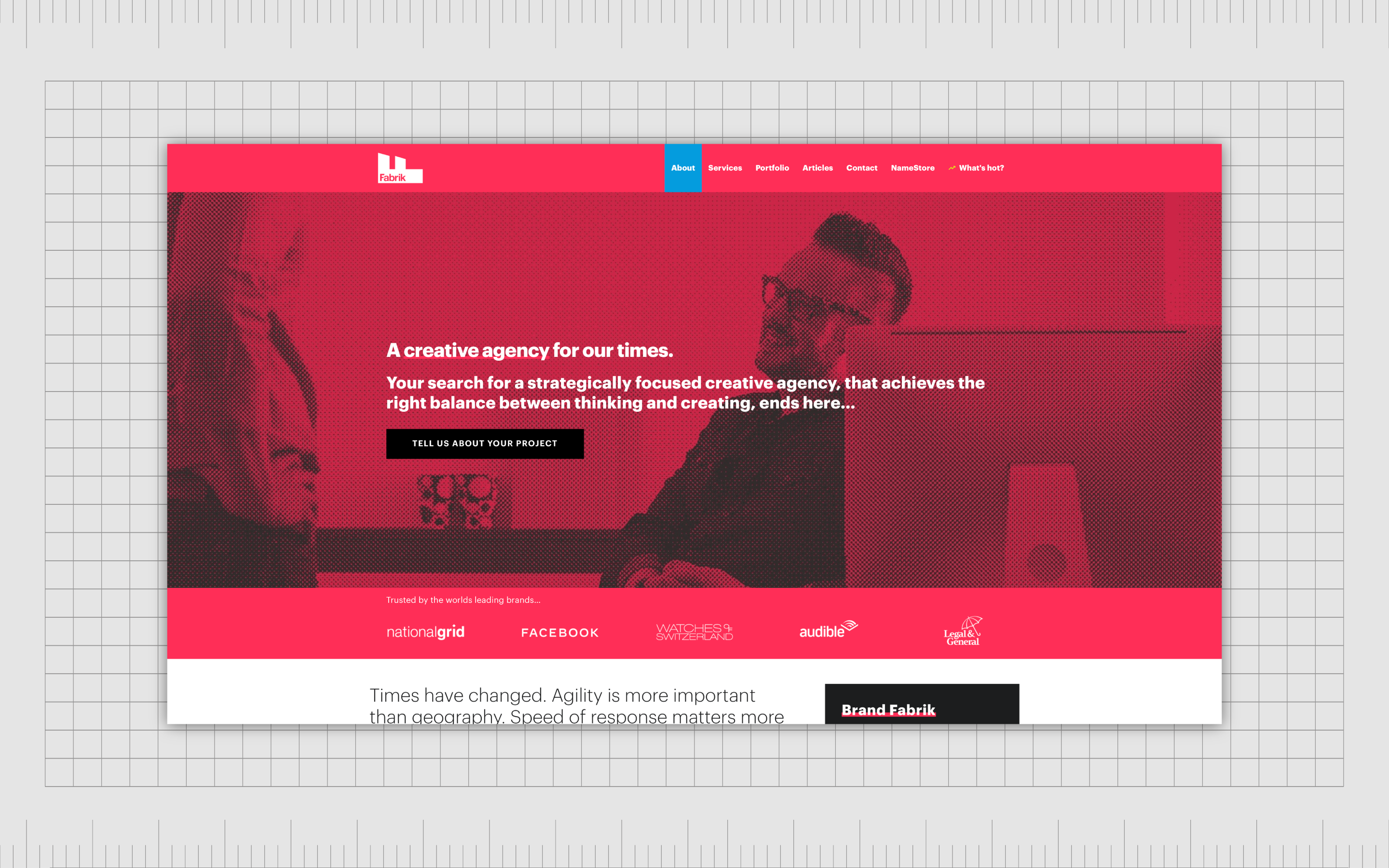
Let’s look at emphasis from the perspective of a standard “about” page for a website. When you design any page for a website, including a “about” page, you define one element you want to stand out more than anything else.
Using emphasis is how you demonstrate which elements you want to stand out.
On this contact page, the button to contact the company stands out from the rest of the design by using a black box to highlight the call to action. It doesn’t directly contrast the rest of the design, but it’s clear this one element has particular importance distinguishing it from the rest of the page.
Why is emphasis important in graphic design?
Creating emphasis in design isn’t just a way to make CTA buttons stand out. It’s also how designers create visual emphasis hierarchy and draw a viewer’s eye across a page.
In any design, particularly web design, it’s essential to guide viewers to where you want them to look. This helps to encourage action and push your customer to do whatever you want them to do (such as buy a product or fill out a form).
Emphasis is used in all design forms to draw the viewers’ attention to specific areas and objects to elicit particular responses at the correct time from your target audience.
Even in standard art pieces, artists use emphasis in the form of lighting and color to draw attention to a specific part of a piece first, such as a character’s face.
Crucially, a piece may have multiple points of emphasis, but one will often dominate over the other, usually in a hierarchy of most to least essential elements.This hierarchy gives your viewers an insight into the order in which they should be looking at content.
As an example, you may start with an underlined headline, then follow up with a large subheading, and continue to the standard body copy.
In the design and art world, “subordination” refers to a piece’s accent or “secondary” elements. Some creators would argue all valuable works of art or design employ emphasis. Both emphasis and contrast help to make a visual piece exciting and avoid monotony.
What is the principle of emphasis?
When it comes to the principles of design, emphasis is just one of a series of points designers and artists need to consider when creating a composition.
The emphasis principle of design highlights the belief that one or more elements in a design should have greater importance and stand out more than the other elements.
Emphasis exists alongside the other principles of design, such as hierarchy, balance, contrast, repetition, rhythm, white space, and unity, to give depth and meaning to a composition.
Like all principles of design, emphasis must be addressed as part of a holistic strategy for good design. The elements of emphasis need to be considered in conjunction with other concepts like unity, rhythm, and repetition to be truly effective.
The emphasis principle of design asks artists and creators to determine the most critical elements in a composition.
If you were creating a poster for a company, you would ask what the first piece of information your audience needs to see is. Do you want them to know the name of the product first, the name of the company, or the price of the product?
Making a mental list of all the components in your design and in which order your viewer should see and interact with them will help you determine which parts require the most emphasis. This hierarchy can also inform artists of which elements to de-emphasize.
How is emphasis used in graphic design?
Graphic design emphasis appears in virtually every example of graphic design in various styles and formats. With graphic design emphasis, designers sometimes pull specific attention to one part of a design while simultaneously drawing attention away from other elements.
If an artist wants to emphasize the lips on a portrait, they may depict them in red, while muting the rest of the colors on the canvas into shades of greys and browns. Designers will often achieve emphasis by using contrast.
However, there is a slight difference between the definition of contrast and emphasis in design.
Contrast applies to situations wherein elements of a composition are compared, such as a black font to a white background, or a large picture to a smaller one. Emphasis is when various elements are used to make one component have a more significant impact than any other.
Contrasting colors, styles, and sizing choices in a design can increase the visual emphasis of a component to create emphasis. However, the focus is often on creating a hierarchy to look at in order than separating one element from another.
Finding the right balance of emphasis in design can be complex. It’s not always easy to know what aspects of design certain viewers will be drawn to more aggressively than others.
At the same time, designers must ask themselves whether they still want to maintain a sense of unity in their design or balance while creating emphasis.
Making an element in an image the center of attention doesn’t necessarily mean overpowering the design or making it confusing and unbalanced.
What are the types of emphasis in graphic design?
You can achieve emphasis in many different ways in the design world. Everything from adding a shift in color to an image, to underlining a word can create emphasis.
Here are some of the most common elements of emphasis in design you may be familiar with:
1. Lines
Many designers use lines to determine the direction of the page, or pull the attention of a viewer’s eye. Invisible lines can help to highlight a specific direction of a design for most of an image. When these lines are broken, or the direction is changed, this creates emphasis.
Lines can even be used as a specific way of grabbing attention, like a line under crucial words in a text.
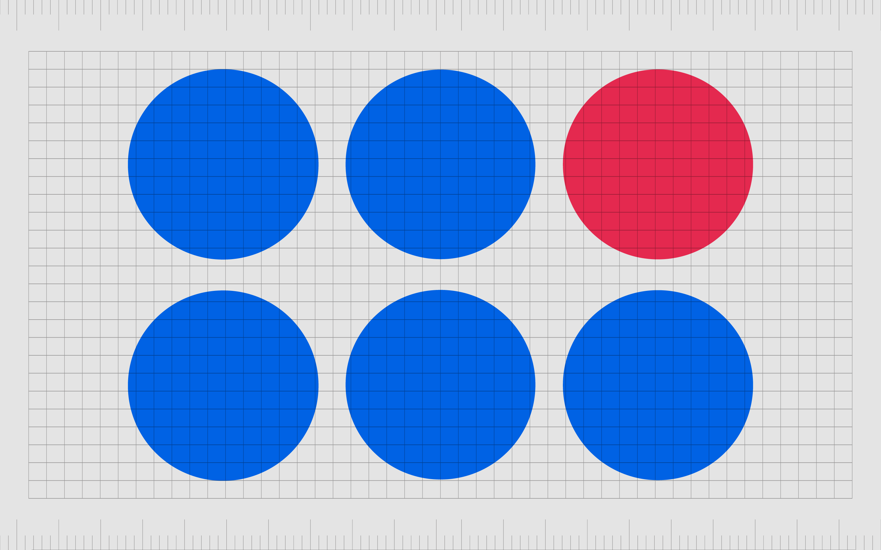
2. Colors
A color shift is one of the most common ways to create emphasis in a design. The more contrast used in the shift of shades, the more the point demands the viewer’s attention.
Soft contrasts might gradually draw attention from one page area to another, while a bright contrast makes a clear statement. A bright contrast could distinguish which page someone is currently on when viewing your navigation bar.
3. Alignment
Alignment is an essential principle of design in its own right, but it can also be used as a tool for creating emphasis. The purpose of alignment is to create a cohesive flow of information for the eye to follow.
Breaking this flow immediately grabs attention and re-directs the person’s view. If every content on your page is typically aligned to the left, and you have one paragraph placed on the right, this emphasizes the content on the right.
4. Texture
Texture can help to draw attention to a specific element, particularly in web design.
On buttons designed to grab a customer’s attention and encourage them to click, many designers use 3D gradients to create a sense of texture. An embossed effect can also emphasize text elements, or a drop shadow can make an area stand out on a page.
5. Mass
Specific colors and shapes can suggest heaviness or create “visual weight” for an image.
A particularly dark-colored element on a bright or light-colored page is more likely to emphasize the dark-colored element. To create this sense of weight, the headline and title text are often darker and bolder on most blog posts.

6. Balance
Balance is yet another principle of design that can be altered for the sake of emphasis – using balance, unity, and symmetry in design grants equal importance to various objects in a composition.
When we break this balance by creating an asymmetric range of elements, our attention will naturally go toward where the break in balance occurs.
7. Contrast
One of the most powerful elements of emphasis in design, contrast is a standard tool for pulling attention to a specific element in a composition. Many designers use contrast subtly in their designs to help create legibility in an image.
However, when two areas are in stark contrast, this creates a higher emphasis. A call to action with a bolder font and brighter color than the rest of the page will naturally draw more attention.

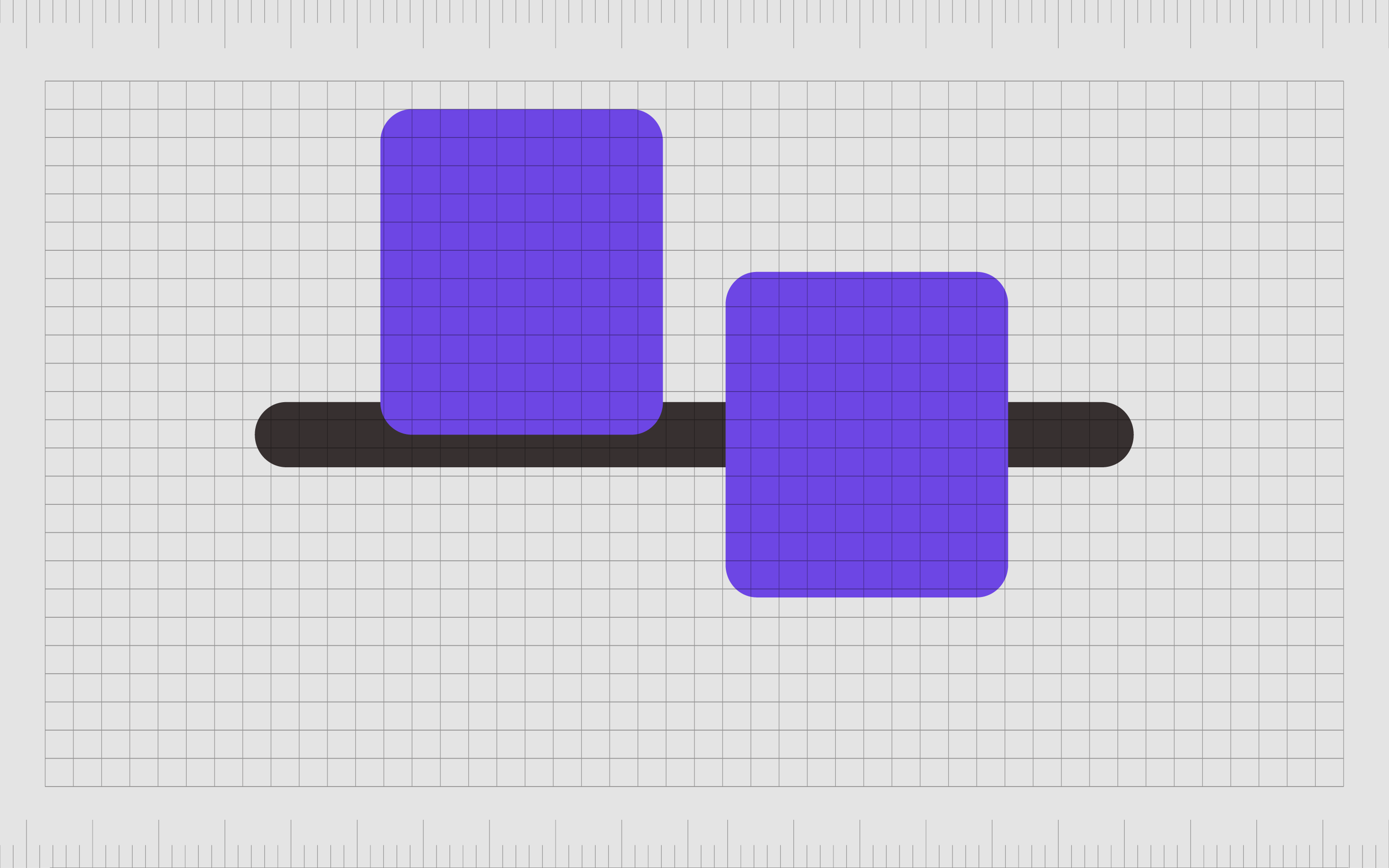
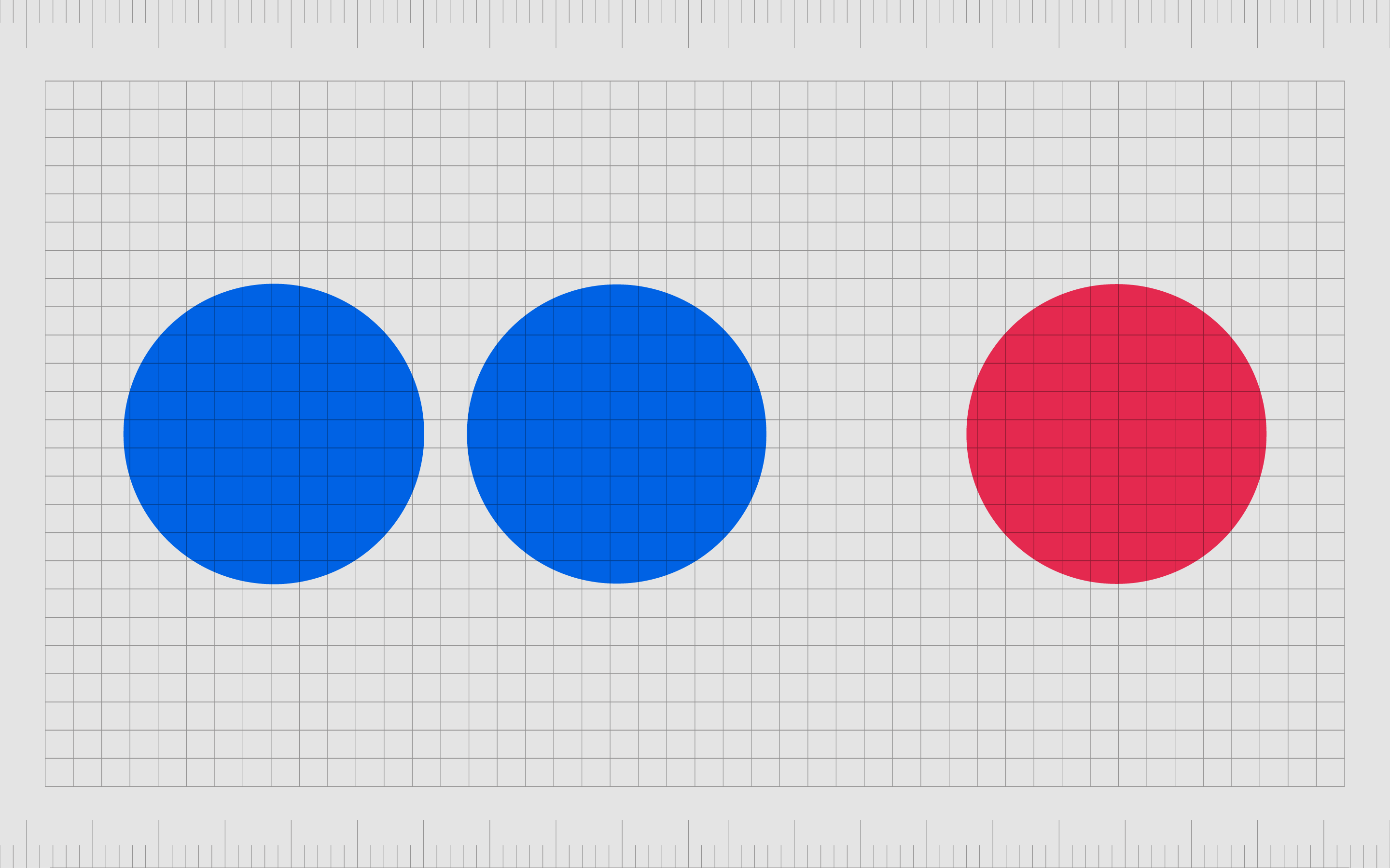
8. Proximity
As per Gestalt psychology, the law of proximity suggests we see objects placed close to each other as part of a shared group. Sentences placed closer together on a page can all be part of one paragraph.
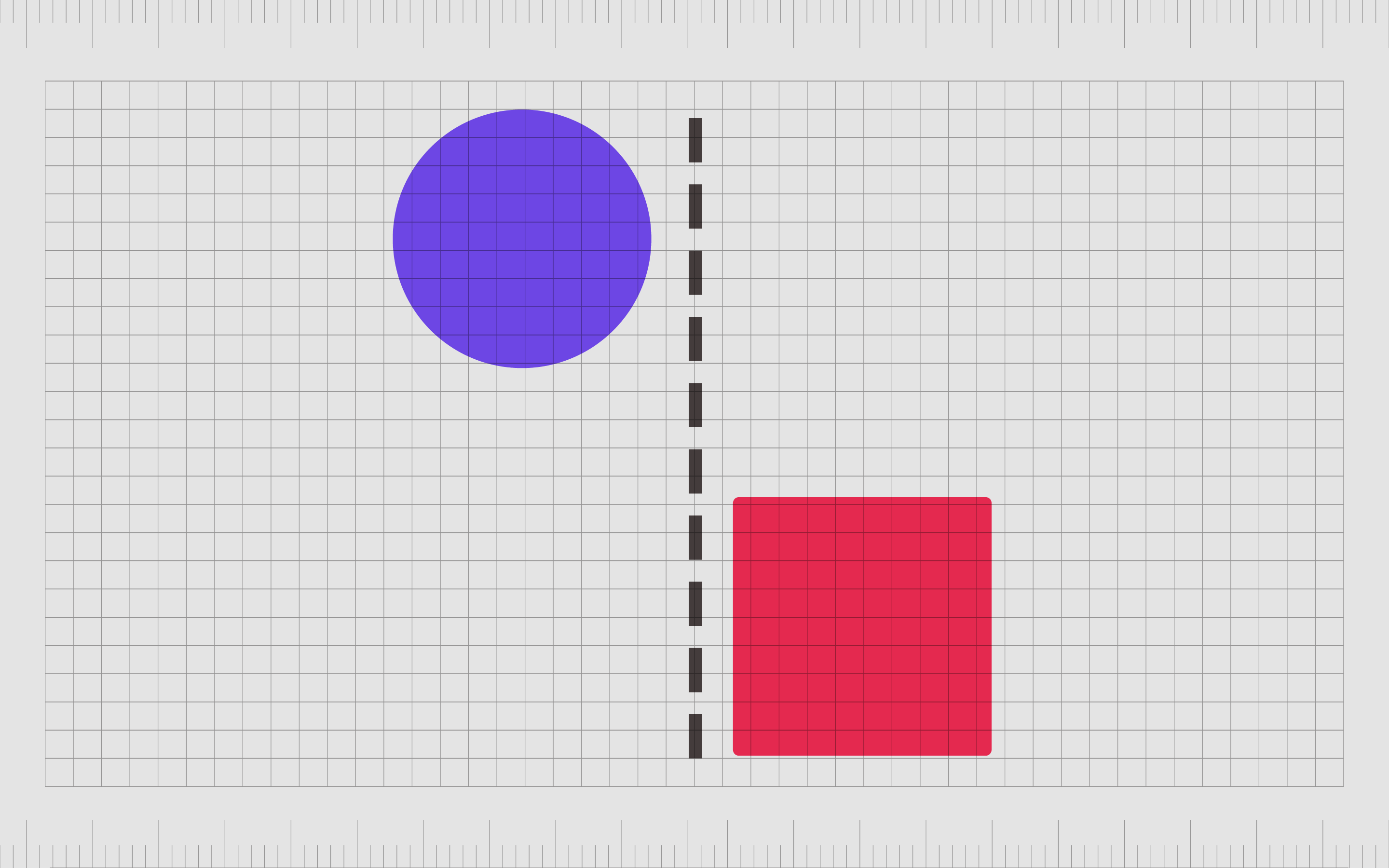
Putting a particular element further away from the rest of the components on that page can create emphasis.
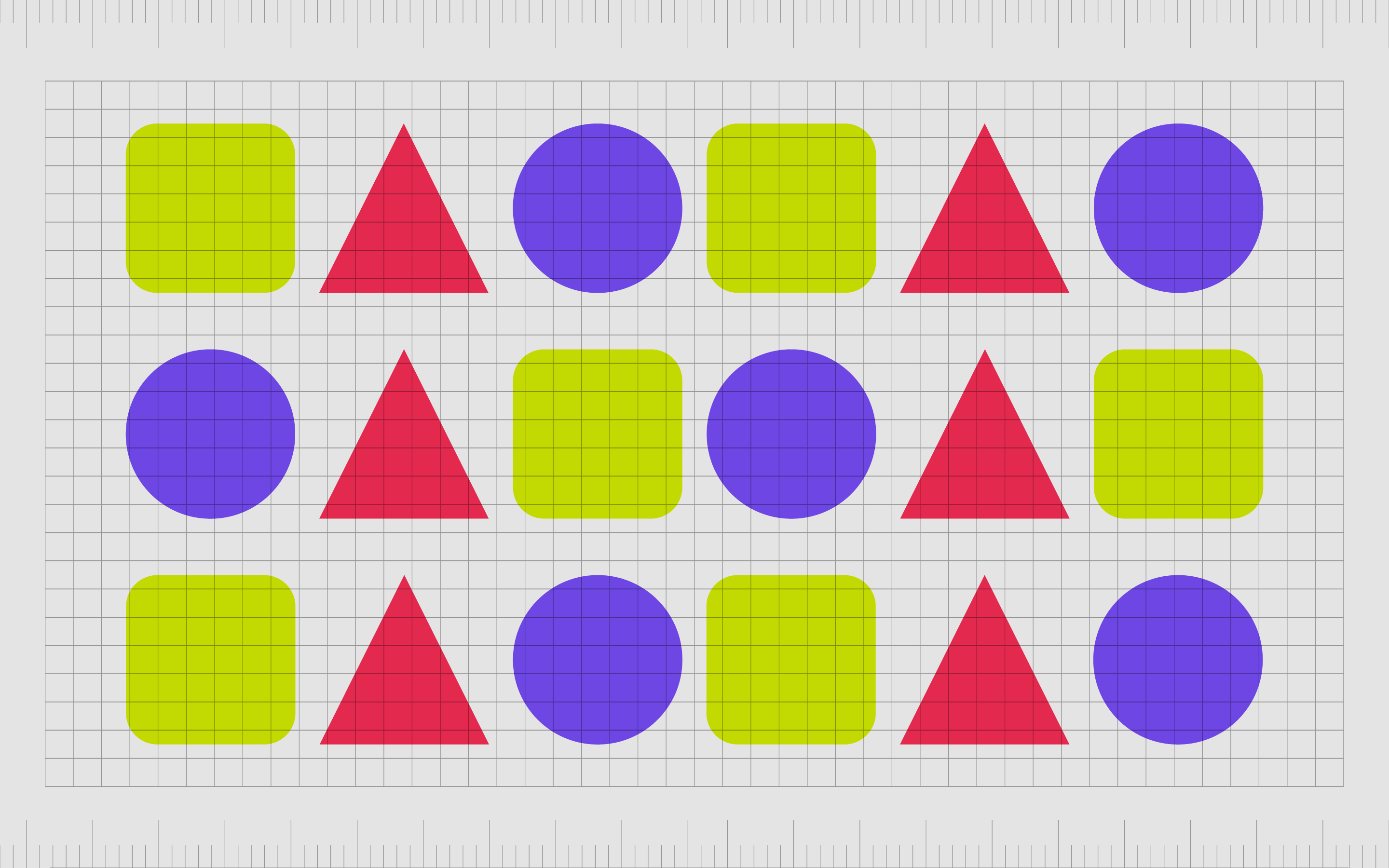
9. Repetition
A design principle used to create unity and balance in some designs, repetition is also something we can use for emphasis. You can have a selection of similar elements that all look the same on a page, until something different jumps out.
While the repetition creates a smooth background experience, the lack of repetition highlights the area needing attention.
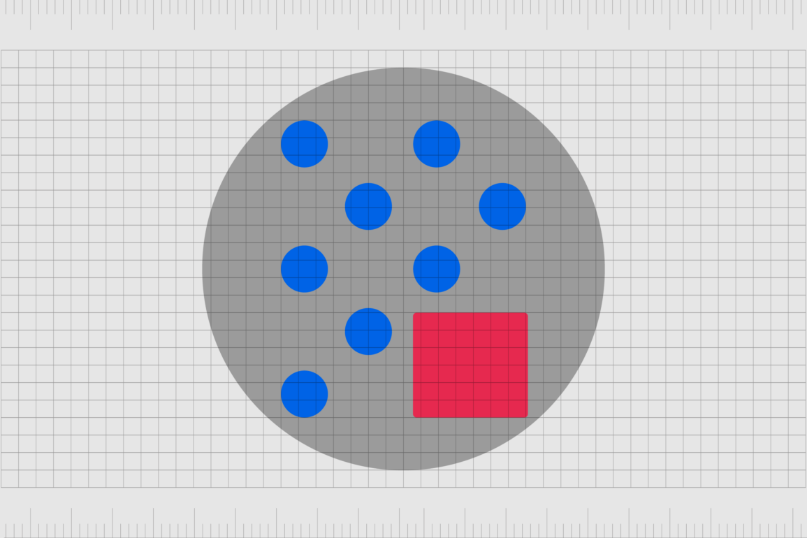
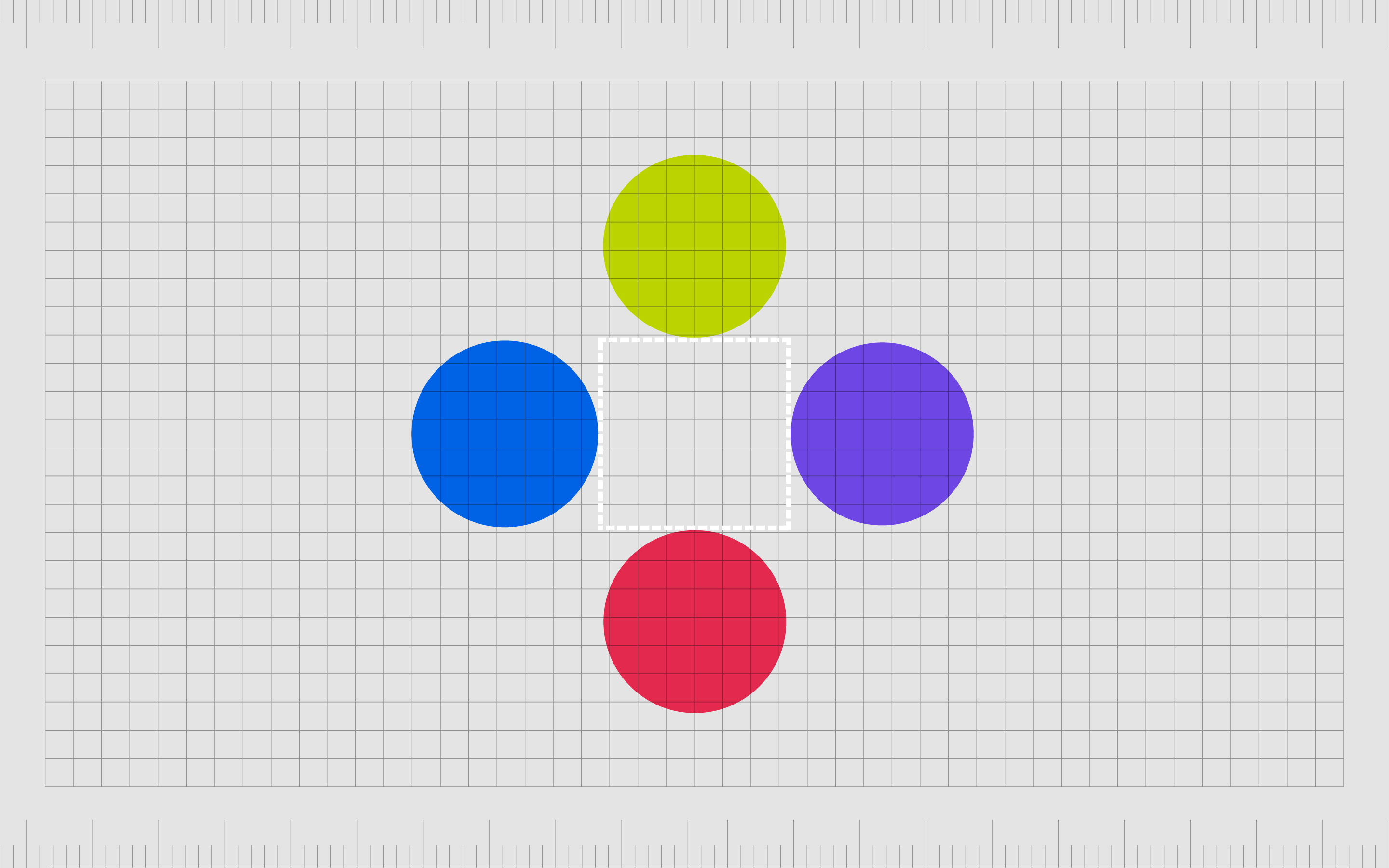
10. White space
White space is a concept similar to proximity in the use of emphasis.
Placing additional white space around an element or isolating a component from the surrounding components shines a spotlight on it. This negative space around an asset immediately highlights it as something which deserves greater attention.
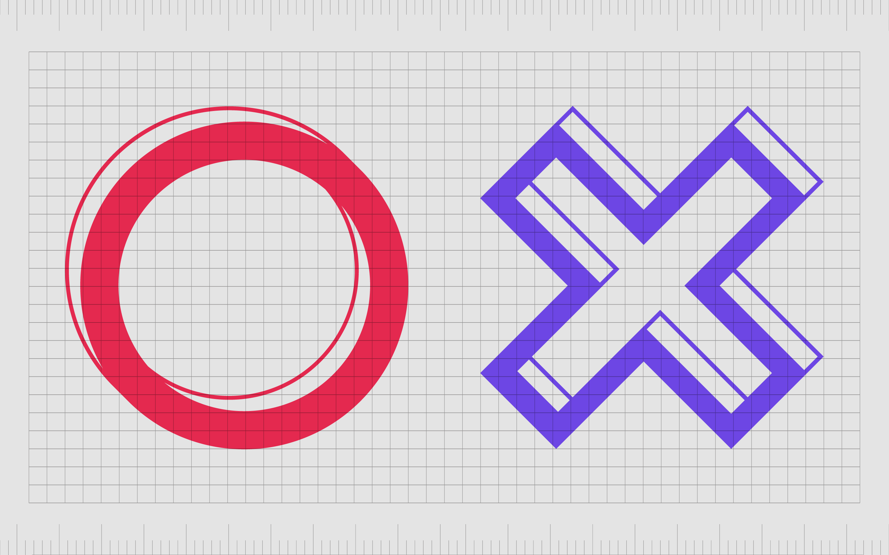
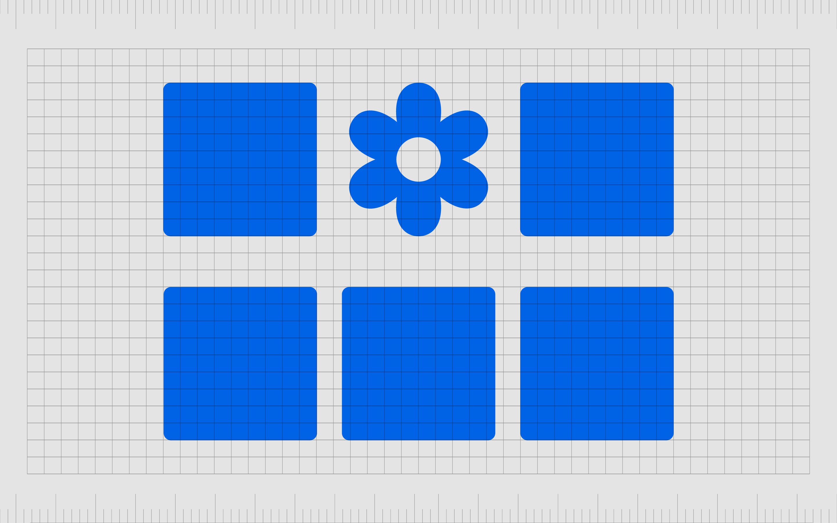
11. Shapes
If you use a specific group of similar shapes on a page, such as squares and rectangles, to organize your content into modules, then you suddenly use a different shape, like a circle, to border a picture, this will naturally draw attention.
The human eye is naturally drawn to a break in thepattern of various objects or elements in a composition.
How to use emphasis in graphic design
It’s important to use caution when leveraging emphasis in graphic design. If too many components in a composition share the same elements of emphasis, they’ll lose their overall impact.
Graphic designers must choose tools like lines, textures, shapes, and colors to create emphasis carefully, considering the visual hierarchy they want to portray.
At the same time, it’s possible to “break” from typical design components like balance, alignment, repetition, and proximity to strengthen the impact of emphasis further.
When looking at the overall composition, designers will need to consider elements they may need to “de-emphasize” to draw greater attention to the elements that matter most.
In some cases, designers will need to work alongside other creators in thebusiness to determine which elements should have the most emphasis. This is often the case in web and app design, where it’s essential to agree on which elements need to drive the most attention as a team.
Usually, CTA buttons requesting a certain behavior from a customer need the most emphasis.
Perhaps the most important rule is that emphasis will always be relative.
For one element in a composition to stand out, there needs to be another fading into the background. Everything can’t have the same level of emphasis, or nothing will stand out. You’ll need at least two different asset styles in a composition to create emphasis.
3 Examples of emphasis in graphic design
Emphasis is everywhere in the graphic design world. You’ve probably noticed plenty of visual emphasis examples without even realizing what you were looking at.
Here are some quick insights into what emphasis might look like:
1. Asana
The Asana website uses white space and proximity to create emphasis around the buttons on their website. The button is also in the opposite color to the rest of the background and text on the screen.
Instead of dark text in a white background, we see white text in a dark background, which breaks from the rest of the visual flow of the design.

We can also see examples of emphasis in the use of small pieces of block text placed over the top of photo images, creating different textures and breaking from the overall flow of the design.
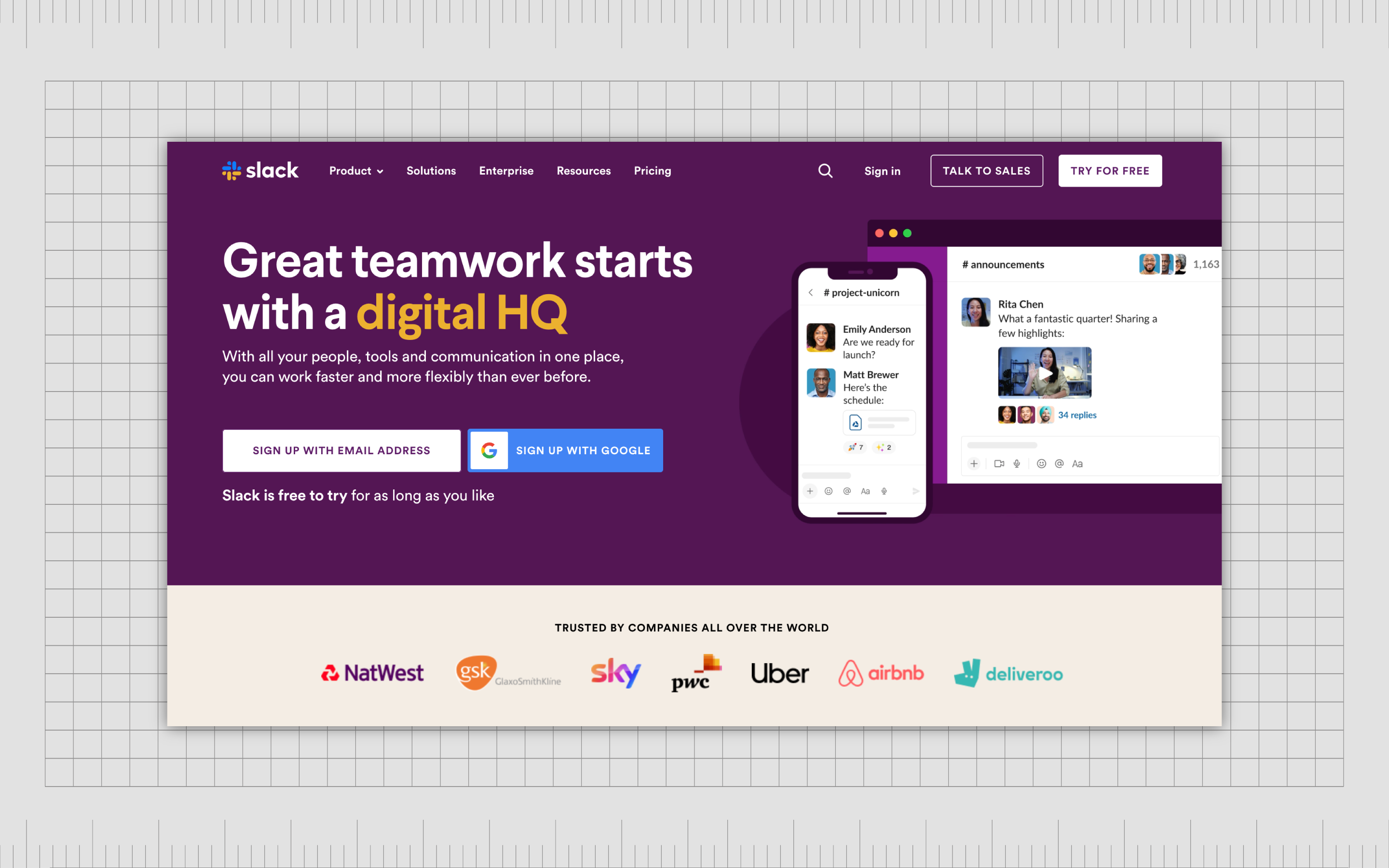
2. Slack
Like many leading companies, the Slack brand frequently uses emphasis to pull attention from its target audience. The contrasting color of the “Sign up with Google” button goes against the natural unity of the contrasting colors used elsewhere on the company’s page.
Using a completely different color from Slack’s standard brand shades creates emphasis and outlines the button as something new and exciting.
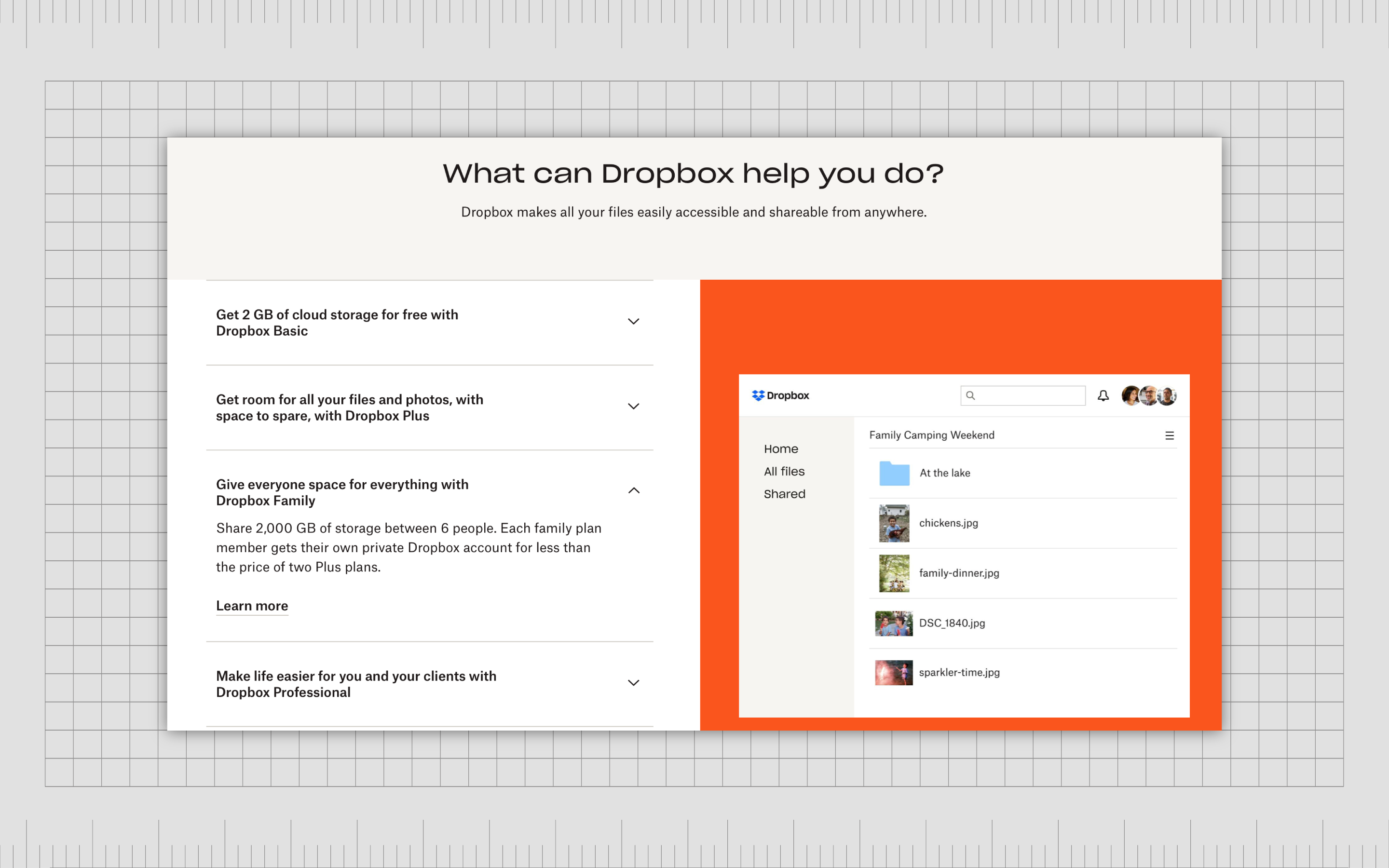
3. Dropbox
There are various elements of emphasis on the Dropbox website, intended to pull a customer’s attention and show them what they need to know about the service. An animation appears in an orange block, a color contrasting the rest of the shades on the page.
The animation in itself is also a form of emphasis as it breaks from the static nature of the rest of the graphics on the page.
Using emphasis in graphic design
Like most of the principles of graphic design, the concept of emphasis in design can be a little challenging to get used to. To really master emphasis in graphic design, you’ll need to take the time to experiment with various elements of emphasis at length.
Looking closely at how different shapes, lines, and colors can draw attention to an asset or push engagement away from certain elements is essential to ensuring your content follows the right path of “visual hierarchy.”
Remember, emphasis is just one of the many principles of design worth considering when creating your composition. You’ll still need to ensure you’re considering all of the other components responsible for creating a good design too.
When all else fails, you can rely on a graphic design expert or agency to guide you.
Fabrik: A branding agency for our times.
Now read these:
—Introducing the principles of graphic design
—Understanding balance in graphic design
—Discover the alignment principle of design
—What is the hierarchy principle of design?
—Exploring the unity principle of graphic design
—Getting to grips with contrast in graphic design
—Discover the repetition principle of graphic design
—What is the pattern principle of graphic design?
—Exploring the rhythm principle of graphic design
—Get ahead with the movement principle of design
—Why variety is an important factor in design
—How to bring harmony to graphic design projects
—The principle of white space in graphic design
—How to use the proportion principle in design

Clarity starts with a conversation.
Thanks—we’ll get back to you shortly.
Whether you're navigating a rebrand, merger, or simply need a clearer identity—we’re here to help. No hard sell, just honest advice from people who know the sector.
Let’s start with a simple question…
Prefer to email? Drop us a line.
Fabrik’s been helping organisations rethink and reshape their brands for over 25 years. We’ve guided companies through mergers, rebrands and new launches. Whatever stage you’re at, we’ll meet you there.