


What is hierarchy in graphic design? The principles of design hierarchy
What is hierarchy in graphic design, and how can you use it to improve the visual appeal of your project?
People have always leveraged specific techniques to manipulate how we view and consume content, and it’s remained more or less the same for a long time. As the world has evolved, these techniques have transformed into what we now know as the “principles of design.”
The principles of design, including everything from rhythm and movement to balance and alignment, dictate how our eyes move across a piece of art, a page, or a website. They help designers give greater weight or importance to certain elements on a page while subduing others.
Hierarchy in design is just one of the key tools professionals use to enhance the quality of their images.
Visual hierarchy involves arranging various graphical elements in a specific way to convey their order of importance. The idea is to subtly tell your audience what you want them to focus on and which elements they should look at in specific order.
Let’s explore the elements of good hierarchy in graphic design.
What is hierarchy in graphic design?
Let’s start with the basics: what is hierarchy in graphic design?
Visual hierarchy is one of the core design principles used by artists, designers, and graphical experts. It refers to how elements are arranged in a design using alignment, balance, contrast, and other techniques.
With visual hierarchy, designers and developers ensure they lay each piece element logically to guide the eye and generate an aesthetic result.
In website design, visual hierarchy tells the visitor on a blog to focus on the top of the website first, where they can usually see a large image and title. The eyes are naturally drawn to other elements based on their weight within the page.
A simple definition of hierarchy in graphic design
Visual hierarchy principle of design is the art of arranging elements in a design piece to demonstrate order of importance.
Structuring visual characteristics in a specific way tell our eyes where to focus and when so we consume the right information at the correct time. Laying elements out logically and strategically allows designs to influence each user’s experience.
While examples of hierarchy in design usually focus on website design, hierarchy is present in virtually every visual element you see. From the pieces produced by artists to banners, posters, and email messages, everything we “design” has its own specific hierarchy.
Why is hierarchy important in graphic design?
While graphic design hierarchy is just one of the elements graphic designers use to influence the structure and appearance of a page, it’s one of the most important. Essentially, it’s how designers influence the sequence of experiences someone has when viewing a piece.
Without a clear visual hierarchy, our eyes wouldn’t know what to focus on first. Think of a block of text all in the same font, color, and size. A lack of hierarchy can make pieces overwhelming and confusing.
Alternatively, embedding a piece with a design hierarchy logically guides our attention, so viewers don’t have to think about what to look at first.
Visual hierarchy is particularly important when conveying information to a customer. It allows customers to navigate through information, focusing on the most valuable elements first. Because of this, visual hierarchy is a common practice in UX (User Experience) design, as it reduces the effort needed to engage with a piece of content.
What is the principle of hierarchy?
Good hierarchy in graphic design is one of a selection of key principles used by artists and creatives to influence the overall experience of a piece.
Similar to concepts like balance and alignment, hierarchy doesn’t just make a piece look more attractive; it also reduces visual fatigue and strain, making it easier for us to consume information.
Compared to other principles of design, hierarchy can be somewhat complex as it involves using different techniques and elements, each with its own levels of complexity.
Designers need to consider how their customers view or read a page and how different factors will affect the weight of each element.
The principles of design hierarchy leverage space, texture, color, contrast, balance, symmetry, and a range of other concepts to guide viewers through a specific pre-determined path.
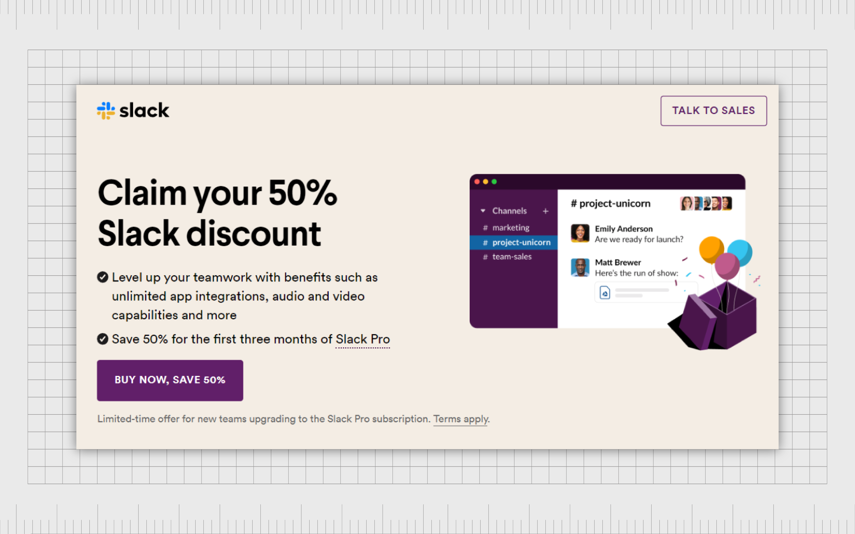
Using certain colors or font sizes, you ensure your customers focus on a headline or image first, followed by other crucial information. Look at the following product page.
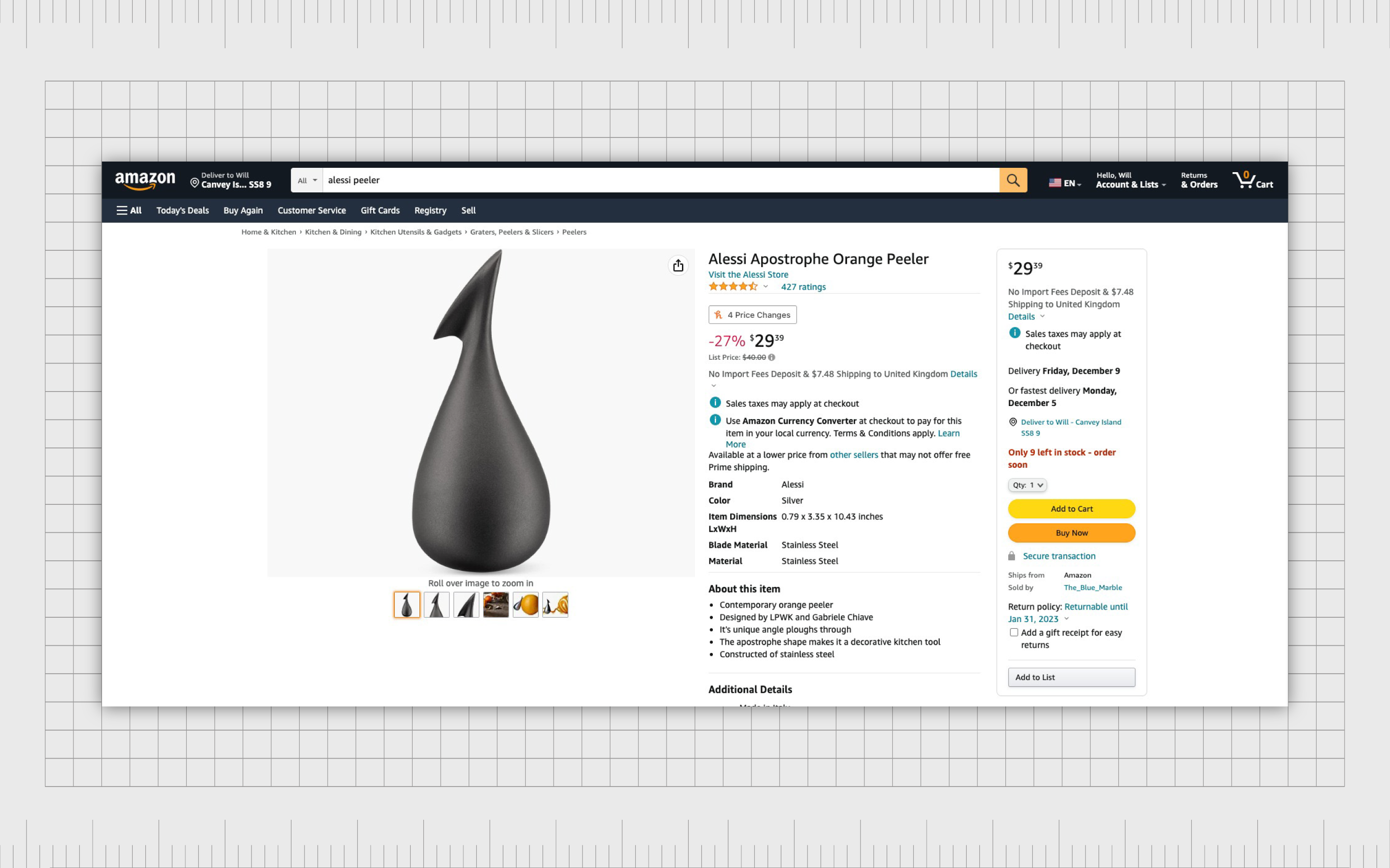
The first things we notice are the picture, and the name of the product, followed by the price and product details.
What are the types of hierarchy in graphic design?
Many factors influence the “hierarchy” of a design. To effectively leverage hierarchy in graphic design, designers must look at their creation holistically and imagine how potential viewers will absorb the information available.
This means considering the page customers will be presented with on a website when they load information on a browser or smartphone. In the offline world, poster designers, magazine creators, and newspaper editors use hierarchy throughout the entire visual structure of the piece.
Below are some of the elements of visual hierarchy in design.
Hierarchy in design: Viewing patterns
The first thing designers consider when looking at hierarchy in design is how their viewer is likely to look at the page. Each of us has a subconscious pattern we rely on to scan content and information. This pattern can vary for each user and may change depending on the type of content in question.
The Z and F are the two most common types of viewing patterns. Both have a specific purpose depending on the kind of content being digested.
F-Patterns
F-Patterns are the most common viewing pattern associated with traditional text-based pages, like articles, blog posts, and news reports. With an F-pattern, viewers start by scanning sites from the top left to the top right, then down the next line, and so on.
Using subheadings to guide them, they’ll also determine which parts of the text they might want to skip. When designing content to flow with this pattern, it’s worth remembering most viewers will only scan the left portion of each row when looking for something to grab their attention.
Z-Patterns
The Z-pattern is typically used for visual hierarchy on a less text-heavy page. With ads and websites, information isn’t typically presented in block paragraphs. There may also be a wider range of “elements” to explore, like pictures and videos.
In a Z-pattern, the customer scans across the top of the page first. Then the attention usually shoots down to the next piece of available information.
Many web designers construct their pages to conform to this behavior, placing the most important information in the corners of the page and on the bottom and top bars of the screen.
Size and proportion in visual hierarchy
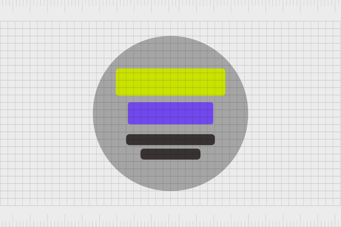
Another of the principles of hierarchy in design focuses on the size of each element. Specifically, how much space it consumes on a page. People are naturally drawn to the largest objects, which take up the most room before anything else.
In the design below, you’re likely to notice the large piece of text directly in the center first.

With size and proportion, designers can break free from the rules of standard viewing patterns.
The larger the element, the more likely it is to override the desire to look at a page in a specific order. Designers use proportion and size in design hierarchy to highlight the most important information, regardless of where it is on the page.
Using space for visual hierarchy in design
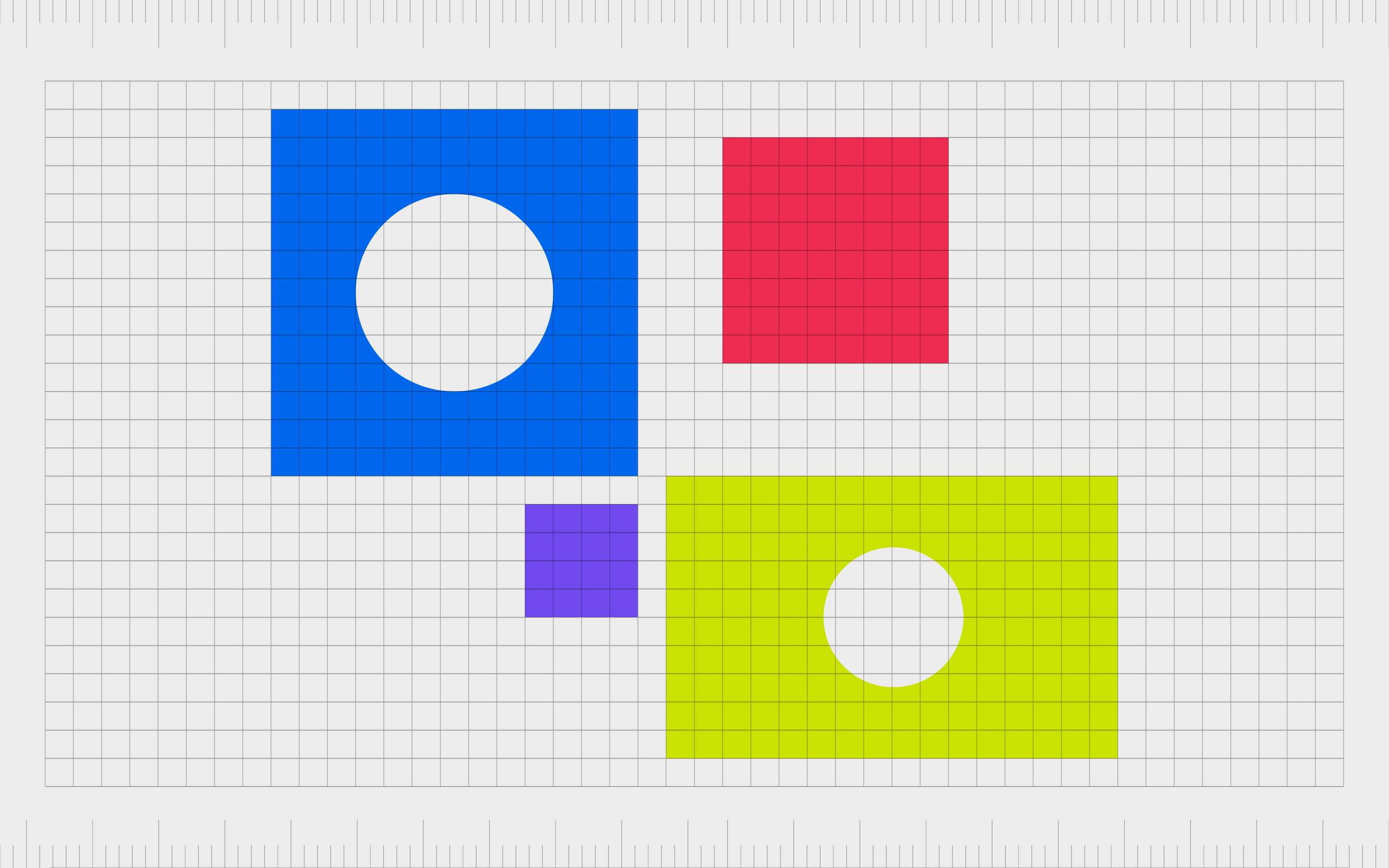
White space is an important principle of design on its own, as it helps to enhance contrast and improve the overall reading experience. Most designers start with a blank space to fill with the right elements. However, the space kept blank is just as valuable as the space used.
The negative spacing between different elements can help to either group components together or separate them on a page.
In the example below, whitespace helps position the visuals as one section of information and the text as another.

The separation between the different elements also balances the overall visual effect to ensure one part of the page doesn’t overwhelm the rest.
Adding texture to visual hierarchy
Texture and tone are other ways to direct a viewer’s attention to a piece. Even if some elements are smaller or in a lower position on a page, texture can cultivate interest. Texture can be used to either make one element stand out or help it blend into the background.

In the example above, the texture on the page is visually interesting, but it also drowns out some of the impact of the larger title text. The tone and positioning of the lower piece of font, and its spacing away from the rest of the textured content, make it stand out more prominently.
Texture assists in making a piece more visually interesting while also helping users view each piece of information in terms of importance.
Typeface weight and pairing
Typefaces are one of the most important tools in a designer’s arsenal.
Not only do different typographies elicit specific responses and emotions, but they also assist in organizing a page and its elements. Typefaces with greater sizes and weights generally draw our attention first and make specific elements on a page stand out.
From this example, the use of all capital letters in one typeface helps to distinguish which part of the text is the most important, even if the specific typography and coloring remain the same.
In most blog posts and articles, designers arrange content using headers and subheaders, wherein the most important information is the largest.
Other than font size and weight, designers can also experiment with styles, using italics and bold to make a font seem heavier or lighter. Pairing different fonts can also assist with making one piece of text appear more important than another.
As an example, a lightweight modern and sleek text will draw less attention than a bold and decorative font.
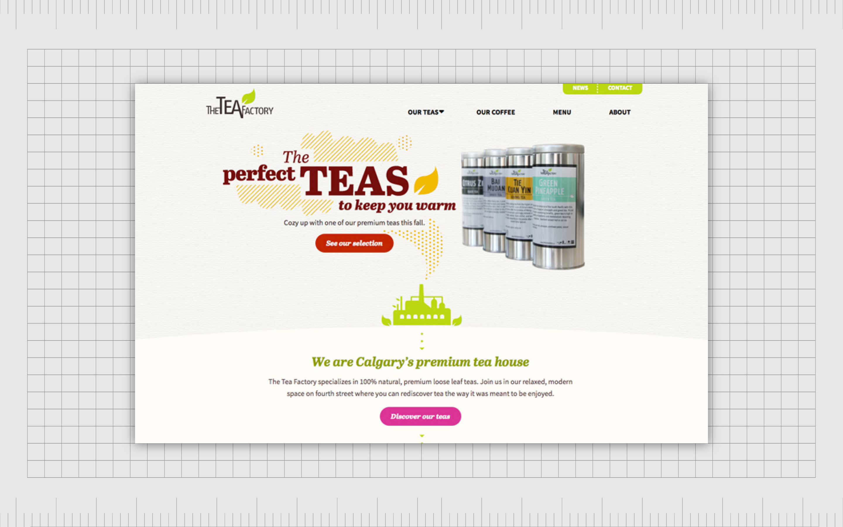
Color and contrast
Like typefaces, colors have a direct impact on how people feel about a design piece. However, they’re also an excellent tool for making some parts of a piece appear more important than another. On a dark website, brightly colored components will stand out from the rest of the content.
On a page with a white background, the darker elements will be the ones that draw the most attention. Think of how newspapers use black font on white backgrounds to create an attractive visual contrast. Color can also be used to accentuate important information.
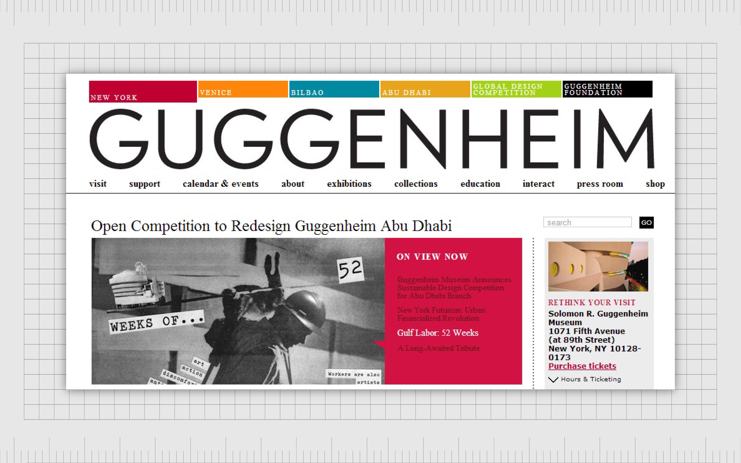
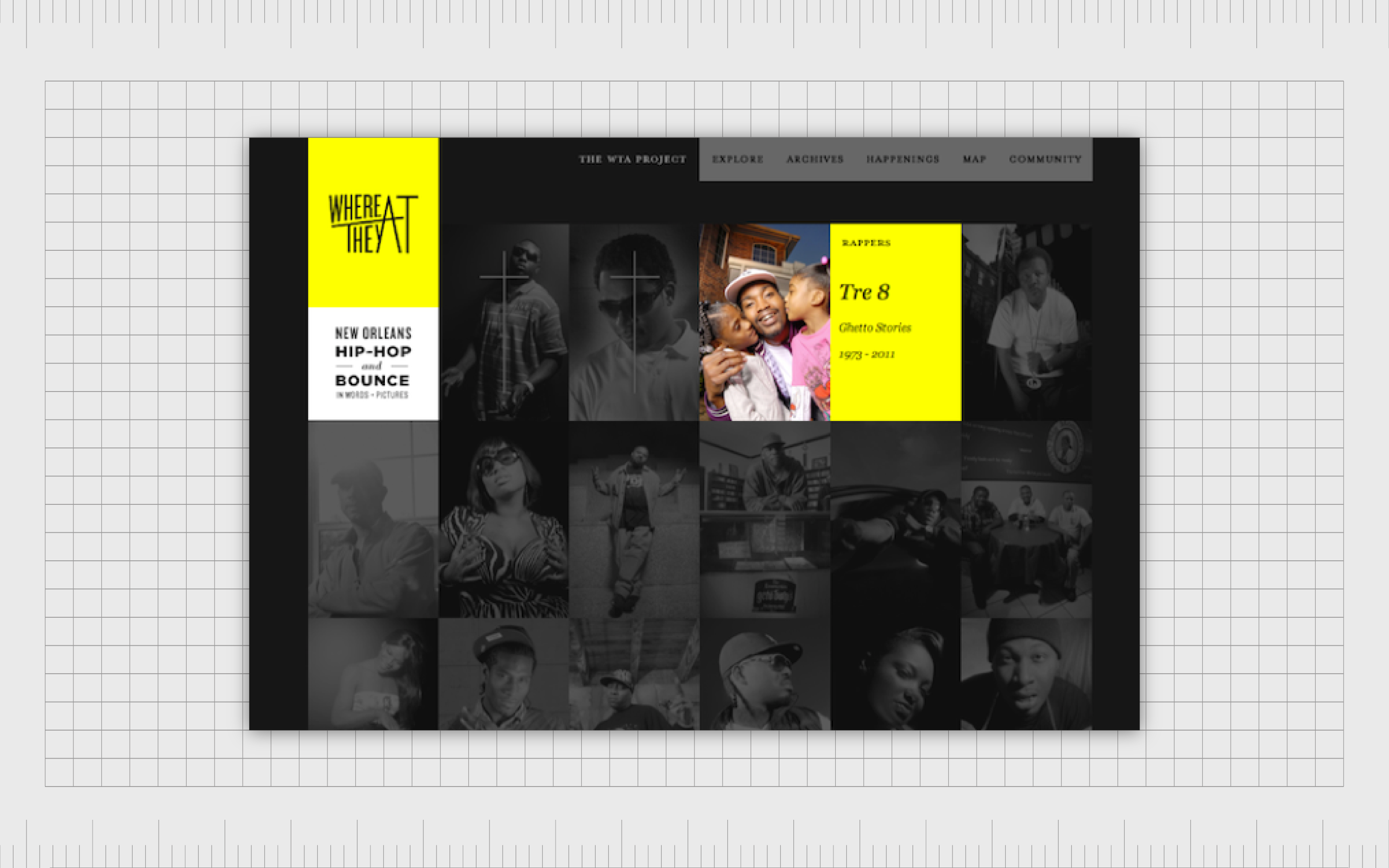
The Guggenheim website uses different colors to accentuate important information, like choice of location, and lists of available exhibits to see.
In some cases, color can be particularly important for hierarchy in graphic design because other techniques may not be as accessible.
When creating a mobile app, users have limited options to work with whitespace and font sizing. This means they’re more likely to use color and contrast to draw attention to specific areas.
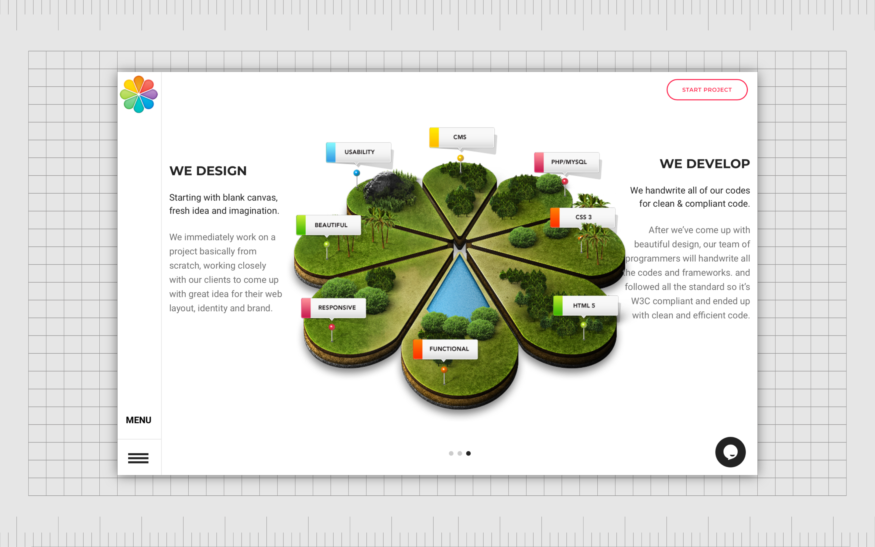
Balance and symmetry in visual hierarchy
As mentioned above, “balance” is another principle of graphic design commonly used in all parts of the design journey. It’s also a key component of hierarchy in graphic design. Elements that appear symmetrically on a page have similar levels of importance.
In the example below, each section of text and each component within the center of the page have a similar level of importance. This allows the user to scan the page easily and choose which pieces of information are most relevant to their needs.
Designers also use lack of balance and symmetry in graphic design to attract attention to specific elements.
Our eyes are naturally drawn to things that “break the mold” of what we expect to see. This is often a good way to push customers out of the habit of using the standard F-Pattern and Z-Pattern styles of viewing.
Alignment for hierarchy in graphic design
Like balance and symmetry, alignment gives more structure to a page.
When objects are aligned along the same path, they seem to have a clear connection and a consistent level of importance. Think of the blog posts you see positioned on a company’s website. They all generally follow the same path in terms of text and imagery.
When elements are correctly aligned, this removes the need for specific grids, lines, and bars to separate one component from another. The eyes know which pieces are connected just by following the invisible lines on the page.
Alignment can also be seen in websites with navigation bars at the top of the page. All the tabs are aligned horizontally, so you immediately know each element on the bar is intended to help you move through the website.
The placement of elements
Element placement and white space in graphic design typically go hand in hand. The elements placed closer together on a page are usually seen as being related. In the example below, we know the title and information on the right of the page are related to the picture on the left.

On the lower portion of the page, each “story” is connected to a specific date, image, and accompanying text. The images are separated by white space to inform us of which content belongs to which picture and so on.
The placement of elements in the correct spaces helps with user experience, as it allows users to scan through content and see which pieces are relevant and related.
Direction and motion
Direction relates to how text and images are organized on a page to push customers to read or view something in a certain order.
On websites, most pages are laid out according to a grid of vertical and horizontal lines. Some elements may be placed on the top of the screen, others on the bottom, and a few in the middle, with different methods used to show you where to look first.
Adding motion and direction to your images with curved font and lines automatically draws attention to pieces that stand out from the traditional grid.
In today’s design world, companies and designers can even use motion in the form of animations and interactive elements to capture your audience’s attention.
If we see something moving on a page, we’re more likely to pay attention to the motion than the static elements.
How is hierarchy used in graphic design?
Examples of hierarchy in graphic design
From the examples of hierarchy in graphic design above, there are many ways to use this technique to achieve specific results.
By focusing on concepts like viewing patterns, size, proportion, and space, graphic designers can dictate where people focus their attention. This improves the user experience and ensures the most important parts of the page get the most visual focus.
Here are visual hierarchy examples and how to properly use them:
Use scale and size to pull focus
Using size and scale is one of the easiest ways to adjust hierarchy in graphic design. The larger an element is on a page, the more likely it is to capture our attention. Increasing the scale of an element automatically makes it more important than the other elements on a page.
Make objects stand out with color and contrast
Color, contrast, and the use of white space is another excellent way to experiment with visual hierarchy.
The brighter the colors on the page and the more they stand out from the rest of the content, the more likely they’ll be to capture attention first. In the example below, the bright portions of the page automatically grab attention the fastest.
Most designers will use a combination of color and white space to help make certain components of their project leap off the page and engage the audience.
Play with perspective
Although some designers naturally create their projects to follow the standard viewing patterns of their users, hierarchy in design also allow creators to break free from this mold. With the use of balance, symmetry, alignment, direction, and motion, we can dictate what people look at first.
Texture, direction, and various other principles of hierarchy in graphic design can make some parts of a piece appear closer and more accessible than others.
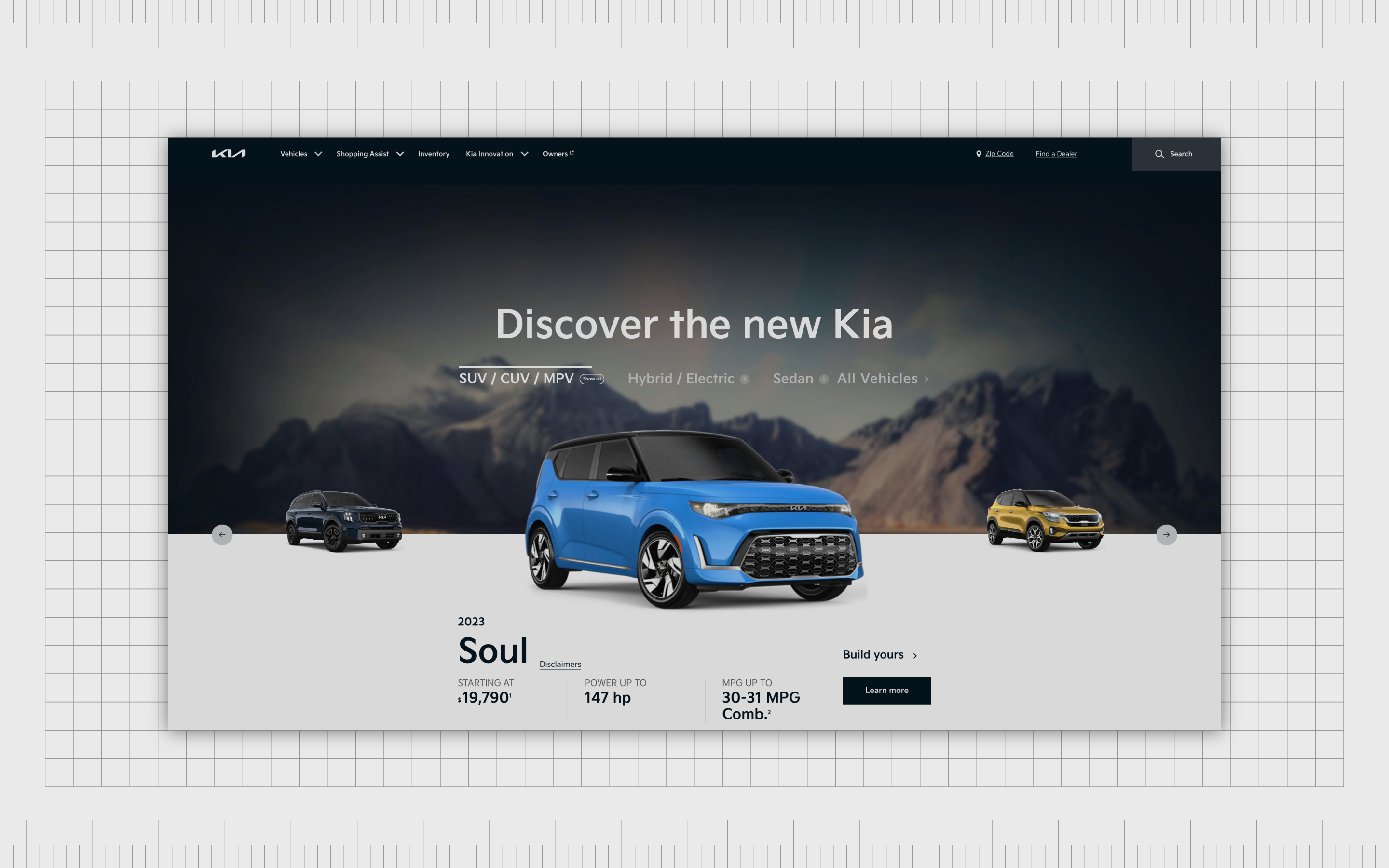
The car on this page breaks free from traditional grid lines to have a more dramatic impact.
Using hierarchy in design projects
Hierarchy in graphic design is an important concept for any creator. It influences how people view and consume a page, and ensures the most important elements of your design gain the most attention.
Using the principles of design hierarchy mentioned above, you can influence how someone experiences your website, poster, or anything you create.
The key to success with good hierarchy in graphic design is ensuring your hierarchy architecture is balanced, well-structured, and logical. The elements on a page need to make sense according to your customer, so they can consume information cleanly and easily.
That means designers need to be careful not to prioritize one design principle too heavily over another. Adding too much weight to too many elements at once can turn a page into a disorganized mess without any clear direction.
Fabrik: A branding agency for our times.
Now read these:
—Introducing the principles of graphic design
—Understanding balance in graphic design
—Discover the alignment principle of design
—Exploring the unity principle of graphic design
—Getting to grips with contrast in graphic design
—Understanding the emphasis principle of design
—Discover the repetition principle of graphic design
—What is the pattern principle of graphic design?
—Exploring the rhythm principle of graphic design
—Get ahead with the movement principle of design
—Why variety is an important factor in design
—How to bring harmony to graphic design projects
—The principle of white space in graphic design
—How to use the proportion principle in design

Clarity starts with a conversation.
Thanks—we’ll get back to you shortly.
Whether you're navigating a rebrand, merger, or simply need a clearer identity—we’re here to help. No hard sell, just honest advice from people who know the sector.
Let’s start with a simple question…
Prefer to email? Drop us a line.
Fabrik’s been helping organisations rethink and reshape their brands for over 25 years. We’ve guided companies through mergers, rebrands and new launches. Whatever stage you’re at, we’ll meet you there.