


Proportion in graphic design: The principles of design proportion

Proportion in graphic design is an important concept for any expert attempting to create a realistic, harmonious, and compelling composition. As one of the key principles artists follow in their work, proportion in design determines image balance and effectiveness.
Often used alongside concepts like scale and composition, proportion is a concept capable of blending art and science. It has a lot more to do with mathematics than most people realize, as designers need to calculate the correct proportions for various elements in a piece.
Using proportion in graphic design allows designers to leverage concepts like emphasis and contrast more effectively, guiding a viewer through a piece. Proportion can also create harmony, ensuring the various components of a logo, website, or image look realistic.
Today, we explore the definition of proportion in graphic design, how it’s used, and what it can do for your piece.
What is proportion in graphic design?
Proportion in graphic design refers to the relationship between the size, weight, and other essential elements of design components. It alludes to the dimensions of each element and their interactions with other parts of a piece.
Like in many of the principles of graphic design, achieving exceptional proportion requires designers to take a broad look at the entire piece.
Leveraging different types of proportion in graphic design can influence the appearance, realism, and style of a design. Proportion also tells us the importance of certain parts of an image. As an example, the size of the larger star in the Subaru logo draws attention to one component before the rest.

Proportions set relationships between various elements, enhanced by other design principles, like color, weight, and contrast. The aim of the designer is to combine all elements together in a harmonious way, achieving a level of balance and coherence in the process.
The proportion appears in virtually all aspects of graphic design. When you design a web page, it’s crucial to ensure everything from the heading of the page to the text within it follow a certain scale for proportion.
Definition of proportion in graphic design
The proportion principle of design has a lot to do with the “sizing” of elements in a composition.
The size of one element should complement and work well with the other related elements. However, many designers exaggerate proportion, and use contrast to break from the harmony of the image and draw attention.
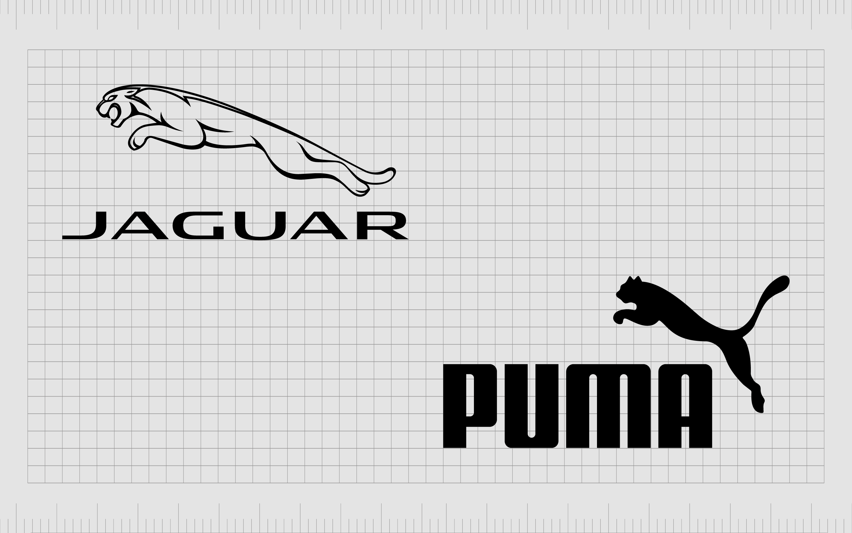
If designers maintain the same proportion through an image, it looks sleek and balanced. This can also be a good way to ensure logos are legible. Take a look at the letters in the Jaguar wordmark. They are designed to have the same overall proportion relative to each other.
Breaking free from pre-conceived concepts of proportion and alignment naturally allows designers to draw the attention of a viewer. Our eyes are typically attracted to bigger elements on a piece first. However, good proportion doesn’t always have to mean every element is the same size.
One element in a piece can be larger than another, but not to the point where it overpowers the rest of the image. The “m” in the Puma logo is slightly bigger than the rest of the letters, but it also looks balanced alongside the rest of the image.
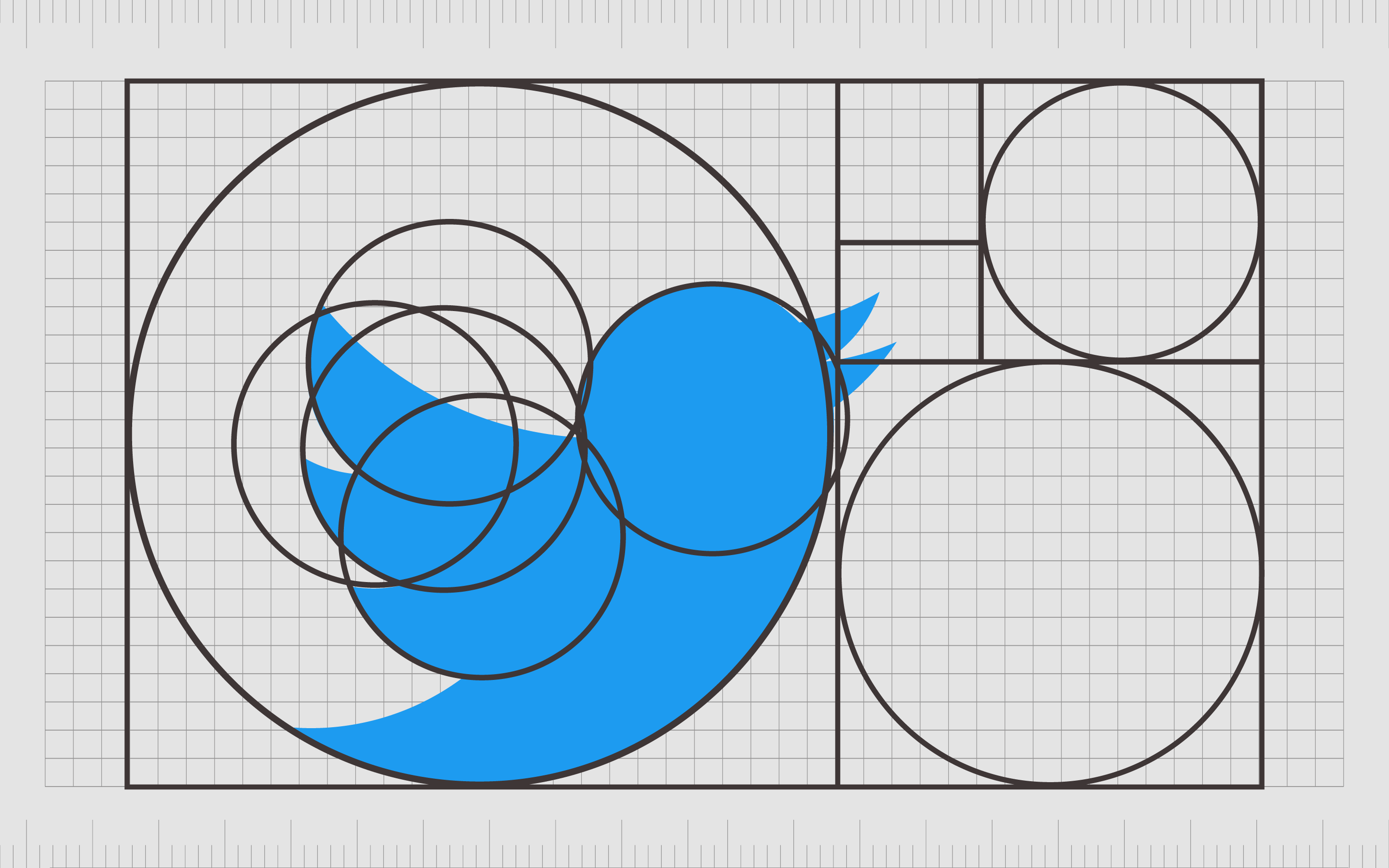
One of the ways artists and designers define proportion and ensure it remains consistent in their composition is with the “Golden Ratio.” This is a mathematical principle used in design to determine whether the “ratio” between elements is equal to the ratio of the larger element.
Why is proportion important in graphic design?
Examples of proportion in graphic design are used to create synergy in a piece.
Proportion in graphic design is all about how objects or components relate to each other. Designers need to consider the shapes, scale, size, and quantities between various elements in a composition to create truly balanced “proportion.”
Designers also use the concept of proportion to create sensations of realism and perspective. If a designer wanted to make one part of an image feel closer to the viewer, they’d make the proportion of these elements larger than the elements in the background.
A good proportional design is easy on the eyes, and comfortable for viewers. It clarifies what your viewers are meant to see and how they’re expected to take the image in, creating visual hierarchy. Alternatively, bad proportional design is confusing and may harm the message of the project.
Proportion in design helps to create:
Realism
When drawing realistic objects, getting the proportions right makes the image look more realistic and “natural.” Playing with proportion allows designers to make images look more abstract and unusual, which can be appealing in its own way.
Distance
Proportion creates a sense of distance. The smaller a piece is, the further away it appears. In web design, a larger button or image feels closer to the viewer, which makes it seem more accessible and engaging.
Aesthetic appeal
Good proportions are visually appealing. People are pre-disposed to seek out harmony and balance in what we see. We enjoy looking at ultra-realistic artworks, but we also find entertainment in viewing pieces, which experiment with the meaning of proportion.
What is the principle of proportion in design?
The proportion design principle is one of the many principles of graphic design. These principles guide designers through the creation of a composition, allowing images to be more appealing.
When using the proportion principle of graphic design, there are two primary concepts for experts to consider:
- Proportion based on context.
- Proportion based on relationship.
From a contextual perspective, we judge whether something makes sense proportionally based on the context of the image.
An easy way to view proportion based on context is to consider the human body.
We may see someone as having big ears because they don’t seem to fit with the sizing of the components of the rest of their face. In this case, we’re making judgments based on the standard we expect from the average human being.
We expect all of the parts of the human face, from the eyes to the nose, to take up a certain amount of space. When the space is exceeded or not used fully, it appears “out of proportion.”
Another way to look at proportion is based on relationships.
Looking at the human face again, if someone’s nose appears “out of proportion,” it’s because its sizing is far different from the other facial features. In graphic design, we can look at different parts of an image to justify proportion.
The various components of the Porsche logo appear to be “in proportion” when examined as a whole.
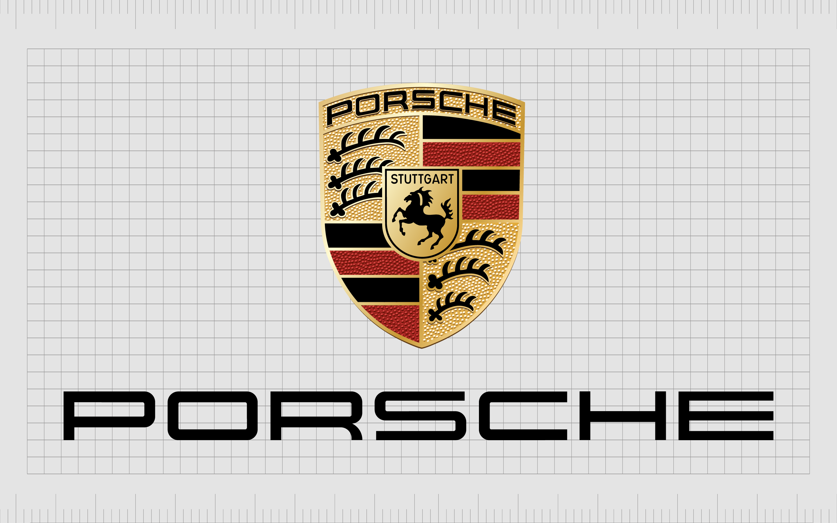
The lines on one side of the shield are the same size as those on the other side. The balance between the weight of the elements from one side to the other is harmonious.
While in many design strategies, the goal is to achieve a “harmonious” relationship, intentionally disproportionate elements can also make a statement. A piece of text on a blog or web page larger than the rest of the text is intended to grab attention.
When we view a “header” or subheading compared to other smaller elements, the difference in the relationship helps us define which element is most important.
How is proportion used in graphic design?
Like most principles of graphic design, good proportion is used for aesthetic appeal. You create harmony by leveraging proportion in various types of logo design and web design and exaggerating or emphasizing specific points.
The key to success with proportion in graphic design is knowing when things should be “proportionate” or “disproportionate” to achieve specific effects. Through the correct methods, elements can look strong, weak, mysterious, or novel.
Exaggerated proportions emphasize meaning and direct attention. To create proportion, designers must consider:
- Size: Scale and size are key design elements in proportion. The size of an object in relation to another in a composition defines the overall balance of the piece.
- Relationship: Proportion can’t exist when one element doesn’t have another to work with or against. If you drew an apple on a piece of paper, you couldn’t judge its proportion without other elements (like a person or tree) to judge it against.
- Comparison: Your brain visually measures the size of components in a composition and compares them to conclude which is big or small and which is most important.
- Realism: Following proportion correctly creates a sense of realism, but in many forms of graphic design, like logo design, realism is not the goal. This allows for flexibility when it comes to proportion.
What are the types of proportion in graphic design?
While the types of proportion in graphic design may differ depending on who you ask, most experts define different styles of proportion in a similar way. Let’s look at some of the most common uses of proportion in graphic design and art.
Standard proportion
Standard proportion refers to the typical balance we expect to see between elements.
Most artists follow “expected” guidelines when determining how certain elements should be composed on a page. If you were drawing an image of a tree with an apple on it, you’d assume the apple would be much smaller than the tree.
Standard proportion creates realism. It focuses on accuracy and conveying the right relationship between different elements in the context of the image.
The concept of standard proportion is actually heavily debated in art.
Some artists question whether there’s such a thing as “standard proportion” in the first place. This is because the world rarely follows a set of specific rules. Most people don’t follow the “golden ratio” of proportion with their facial features, for example.
The good news is to achieve standard proportion in a design, you don’t need to follow a specific mathematical equation. The key is to make your piece look as natural as possible.
Hierarchical proportion
Hierarchical proportion is when various elements in the artwork aren’t designed “as expected” but according to their importance. Look at the image below, and you’ll see the visuals are the largest part of the composition.

Following the visuals, the heading of the blog posts is larger than the rest of the text, and emphasis on the tags draws attention to those before the “body” text. This draws the eyes to the most important aspects of the image first.
Hierarchical proportion has been commonplace throughout art for centuries. Even in early paintings, artists regularly drew pictures of kings and monarchs larger than images of commoners. This highlights the importance of the monarchs.
Exaggerated proportion
Otherwise known as simply “out of proportion,” exaggerated proportion refers to situations where two elements in artwork have sizes that don’t reflect the relationship between them. For instance, a human head drawn to be much larger than the human body is out of proportion.
Exaggerated proportion is intended to send a specific message. A company using illustrations of people with exaggerated elements, like a bigger head, might be doing so to convey a friendly, playful, and even childlike personality.
Similarly, exaggerated proportion also helps to draw attention to the elements of an image that need the most attention.
Altered proportion
Similar to out-of-proportion, altered proportion is something designers and artists do deliberately to create a specific aesthetic or vibe. Altered proportion involves skewing the typical rules of proportion to achieve certain effects.
Altered proportion doesn’t have to be focused entirely on size. A designer might give an object features from other objects to create a more abstract image.
Used correctly, altered proportion has a direct impact on emotion. Playing with proportion deliberately can make an image look funny or endearing, but it can also create a sense of fear, disgust, or shock.
How to use proportion in graphic design
Applying proportion in graphic design is a lot simpler than most people realize. We all have an innate sense of when something is “in proportion” or not. At a glance, you can tell if an image of someone standing next to a house looks proportionate.
Some of the elements designers use to leverage proportion in graphic design include:
Similarity
Placing similar elements with shared features or characteristics in a design creates a sense of symmetry, which can support proportion.
Harmony
Harmony is achieved in design when every element is complementary to the rest. Agreement between sizes and shapes creates similarities and patterns in a composition. If one element seamlessly fits into the right space, a harmonious relationship is formed between all elements.
Ratio
Ratio refers to the relationship between different elements. The golden ratio highlights the importance between equal sizing and positioning in a composition. Dramatic shifts in ratio cause disharmony, but improve emphasis.
Emphasis
When designers want to attract attention to one element more than another, they’ll play with proportion to create emphasis. Increasing the size of an image gives it more impact and directs the attention of the viewer.
Purpose
Considering the purpose of the design in advance makes it easier to know what kind of proportions should be in play. Knowing what you want to achieve with an image helps you determine how to direct the viewer’s attention.
Examples of proportion in graphic design
To complete a thorough explanation of proportion in graphic design, let’s take a closer look at some examples of how this principle is achieved. Most of the time, examples of promotion in graphic design are achieved through a size comparison.
We can compare elements like:
- The width, depth, and height of components.
- Size of one element to the size of another.
- Size of one area to the size of another.
- Relationship between various elements.
Let’s start by looking at the height, depth, and width of elements. To understand the correct proportion for any element in an image, we need to consider all of the aspects of its size.
Generally, we have an idea of how wide something should be compared to its depth, or how high an item should be compared to its width.
If the various sizing elements of a component are skewed, the image appears out of proportion. Of course, it’s much easier to determine whether the height, depth, and width of an item make sense when we have context.
This is why artists and designers use the size of other elements in a composition to make work proportional.
However, positioning of different elements can also impact the kind of proportion that makes sense. We can make elements appear closer to the viewer or further away to play with the size one element should be in comparison to another.
The size of an area an element covers in a design is important, too.
Designers need to be cautious not to leverage too many differences in areas, as this can disconnect the elements and harm the relationship between different components. For instance, if the size of one eye on a person’s face is much larger than the other, the whole face appears disproportionate.
Designers also use the concept of “relationships” between elements in a composition, too.
If you’re trying to achieve realism in a design, you would make the size of a ladybug smaller than a leaf and so on. Using a shared universal knowledge of how certain elements relate to each other in the day-to-day world can be a great way for designers to ensure an image makes sense.
Using proportion in graphic design
Proportion in graphic design is just one of the valuable tools designers can use to bring a composition to life. We see examples of proportion in the world around us all the time, but sometimes it’s difficult to understand just how important this concept is until we see something disproportionate.
Correct proportion brings realism and authenticity to artwork, while disproportionate compositions can emphasize, draw attention, and create an abstract image. Proportion in design can show distance and depth, as well as help guide viewers through a composition.
Learning proportion in design correctly takes significant practice. If you’re struggling with the principle of graphic design, you could always reach out to the team at Fabrik for some dedicated design help.
Fabrik: A branding agency for our times.
Now read these:
—Introducing the principles of graphic design
—Understanding balance in graphic design
—Discover the alignment principle of design
—What is the hierarchy principle of design?
—Exploring the unity principle of graphic design
—Getting to grips with contrast in graphic design
—Understanding the emphasis principle of design
—Discover the repetition principle of graphic design
—What is the pattern principle of graphic design?
—Exploring the rhythm principle of graphic design
—Get ahead with the movement principle of design
—Why variety is an important factor in design
—How to bring harmony to graphic design projects
—The principle of white space in graphic design

Clarity starts with a conversation.
Thanks—we’ll get back to you shortly.
Whether you're navigating a rebrand, merger, or simply need a clearer identity—we’re here to help. No hard sell, just honest advice from people who know the sector.
Let’s start with a simple question…
Prefer to email? Drop us a line.
Fabrik’s been helping organisations rethink and reshape their brands for over 25 years. We’ve guided companies through mergers, rebrands and new launches. Whatever stage you’re at, we’ll meet you there.