Yellow packaging: Should you use yellow in packaging design?

Using yellow in packaging design can often seem like a good idea. After all, when trying to capture your audience’s attention in a world cluttered with competitors, it makes sense to use a bright, eye-catching color like yellow.
The right yellow packaging can certainly make a business stand out. The question is whether it will send the right message to your audience.
Choosing the right design for your product packaging is one of the most important things you’ll do when building your brand image. Like your name and logo, your packaging is one of the first things your customers will use to form opinions about your brand.
This means the ideal packaging shouldn’t just be intuitive and attractive; it should also emotionally impact your target audience. The color of your packaging, more than anything else, will immediately engage your audience on an emotional level.
So, what does yellow signify in packaging design?
What does yellow signify in packaging design?
The decisions made by consumers are more emotional than logical. In fact, 95% of our purchasing decisions are influenced by how we feel, according to some studies.
Color psychology tells us that certain shades can evoke specific emotions. Red is associated with passion, love, and sometimes danger. Green is connected with the natural world and wealth, while blue symbolizes tranquility, reliability, and trust.
Using yellow in packaging design also tells your audience something specific about your product. Yellow is the brightest and most visible color in the spectrum, thanks to its ability to reflect significant amounts of natural light.
This means it’s more eye-catching than virtually any other color available and great for grabbing attention.
Yellow is also frequently connected with joy, optimism, energy, and fun concepts. We see yellow shades as youthful, sunny, vibrant, and creative. On the flip side, yellow packaging can have negative connotations too.
In larger doses, yellow is an abrasive color, causing visual fatigue, frustration, and agitation. Studies have even found that babies cry more in overly-yellow rooms.

What does yellow packaging design convey?
Yellow can signify different things in your packaging, depending on your shade or tone. While a vibrant yellow hue might be associated with youthfulness and fun, a golden-yellow shade could be connected to luxury and sophistication.
Most commonly, yellow in packaging is associated with the following:
Affordability
Around 22% of consumers say they associate the color yellow with bargains, frugality, and affordability. This may result from many retailers using the color yellow to draw attention to sales and discount stickers.
Fun
Yellow is seen as an energetic and youthful color. It’s mentally stimulating and inspiring, ideal for playful brands who want to make their products seem a little more exciting. Yellow packaging could be an excellent choice if you’re selling a product focused on younger customers.
Happiness
Yellow is an optimistic color, connected with the sun and feelings of joy. If you’re trying to make your customers smile, then products with yellow packaging could be the way to do it.
Creativity
Many brands with yellow packaging use the color to separate themselves from their market competitors. Since yellow can be a problematic color in some industries, it’s often used less frequently than other well-respected shades like blue.
Refreshment
In some cases, yellow is associated with zesty, refreshing products. In the beverage world, we often connect yellow with citrus fruits. This may be why many beverage brands use hints of yellow to make their products seem more refreshing.
Should you use yellow in packaging?
Yellow is an extremely versatile color. On the surface, it makes a fantastic packaging color because it’s eye-catching and designed to encourage action. However, too much yellow can be overwhelming and may send the wrong message about a product.
For example, yellow is often associated with affordability, so it could make luxury items appear cheap.
Additionally, because yellow is frequently seen as a youthful color, it could make more serious brands seem immature. Take health companies as an example: You’re less likely to see yellow packaging on a product connected with the health industry.
When deciding whether to create products with yellow packaging, it’s also worth considering your intended audience. Associations with yellow can vary depending on where you are in the world. In Canada, yellow is a sign of optimism and hope.
In the US and most western countries, it’s also a symbol of positivity and happiness.
In Africa, yellow is usually compared with gold and is often reserved as a symbol of luxury, while Japan sees color as a sign of bravery. Alternatively, yellow is a color commonly connected with jealousy and envy in Germany.
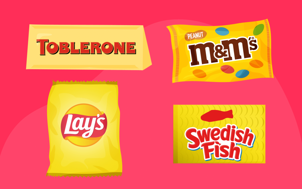
Products with yellow packaging: Yellow packaging examples
Notably, brands with yellow packaging are more likely to thrive in some industries than others. Food with yellow packaging is notoriously common for one core reason. Experts believe colors like yellow can engage and stimulate the metabolism.
In other words, we’re more likely to feel hungry when we see the color yellow. That’s why countless fast-food brands use yellow in their packaging.
Yellow food packaging is present in virtually every landscape around the world. Beverages use yellow packaging to showcase citrus freshness. Snacks with yellow packaging are designed to capture attention; there’s even candy with yellow packaging too.
For instance, some common examples of products with yellow packaging include:
- Toblerone
- Lays chips
- M&M (Peanut)
- Butterfinger
- Hippeas
- Swedish Fish
- Coco Pops
Sometimes, food with yellow packaging is chosen to highlight the flavors you’ll find in the items. For instance, peanuts are often brownish-yellow in color, so it makes sense to use yellow on Peanut M&Ms.
Honey-nut Cheerios have the color yellow in reference to honey, and Butterfinger candy bars are yellow to remind people of the color of butter.
Of course, yellow packaging isn’t just reserved for food companies. There are plenty of other yellow packaging examples outside the food industry too. Starface zit removers come in a yellow box, and Stanley tools are also packaged in yellow.
How to use yellow in packaging design
If you plan on using yellow in packaging design, the most important thing you can do is ensure you’re using the right strategy. Start by assessing your target market and competition. Are any other companies already using yellow in their packaging?
If you can’t see any examples of yellow packaging design in your industry, it might be worth asking why this is.
Ask yourself what kind of customers you want to reach. Younger consumers are more likely to be attracted to yellow packaging than older business buyers. Yellow often signifies fun and playfulness, making it less suited to sophisticated brands.
It’s also worth thinking about the following:
Complementary colors
Yellow in packaging is rarely a standalone color. You’ll need to think about the other colors that will support your primary shade. Green and yellow together can be a sickening combination when used incorrectly.
Black and yellow can also remind people of hazards and warning signs.
Shades of yellow
Different shades can have different results for your packaging design. A soft shade of pastel yellow is more likely to make your products look friendly and compassionate, while a vibrant shade makes your items look fun and exciting.
Visual impact
While your packaging should draw attention, it shouldn’t be difficult to read or understand.
Ensure the yellow doesn’t overwhelm your customer’s eyes or make reading important information about your products difficult. In most cases, it’s advisable never to use yellow for fonts, as it’s challenging to read.
Is yellow a good color for packaging?
So, is yellow in packaging a good idea?
It all depends on what you’re trying to accomplish with your packaging design. If you want to tell your customers your products are fun, affordable, or creative, yellow could be a good choice. Yellow grabs attention and is frequently associated with positive emotions and optimism.
On the other hand, if you want to convey your brand as sophisticated, professional, or luxurious, there may be better choices than yellow. At the same time, it’s worth remembering there’s more to good packaging design than just getting the coloring right.
You’ll need to ensure the shape of your packaging, the positioning of your logo and any relevant information, and even the performance of your packages live up to expectations. Make sure you do your research and choose your packaging strategy wisely.
Fabrik: A branding agency for our times.
Now read these:
—Your guide to colors that complement yellow
—The ultimate guide to the many shades of yellow
—How to make yellow and create the perfect mix
—The psychology of yellow and what it represents
—What does yellow signify in branding and design?
—Should you choose yellow for logo design?
—Exploring the colors of the rainbow
Clarity starts with a conversation.
Thanks—we’ll get back to you shortly.
Whether you're navigating a rebrand, merger, or simply need a clearer identity—we’re here to help. No hard sell, just honest advice from people who know the sector.
Let’s start with a simple question…
Prefer to email? Drop us a line.
Fabrik’s been helping organisations rethink and reshape their brands for over 25 years. We’ve guided companies through mergers, rebrands and new launches. Whatever stage you’re at, we’ll meet you there.


