


Subaru Logo history: The Subaru emblem and symbol meaning
Subaru logo history isn’t something most people are familiar with. Although you might envision the Subaru emblem when you close your eyes, you might not know why the company chose that iconic image for its brand mark.
The Subaru symbol is a simple but effective representation of a brand reaching for the stars. The design highlights the “Taurus” constellation, and it’s based on the name of the company.
Today, we’re going to give you a behind-the-scenes look at the memorable Subaru car logo, what it means, it where it originally came from.
Subaru history: The Subaru logo today
The Subaru car symbol as it stands today is an attractive oval emblem, with a silver border and a metallic blue background. Within the blue badge, we can see a series of 6 four-pointed stars. One star is larger than the rest and is depicted on the upper left-hand-side of the oval.
Though the Subaru stars might not look like much at first glance, they’re actually representative of the car brand’s name “Subaru”. In Japanese, the word “Subaru” translates to mean “Pleiades”, or the group of stars which make up the Taurus constellation.
The Subaru car logo is one of the few in the industry which has remained largely consistent over the life of the company. Though the exact design has changed slightly, the emblem always features the six crucial stars of the Taurus constellation.

Subaru: Brand overview
| Founded: | 1953 |
| Founder: | Kenji Kita and Chikuhei Nakajima |
| Headquarters: | Ebisu, Shibuya |
| Website: | www.subaru.com |
| Logo downloads: |
The Subaru Company, founded in 1953, is one of the leading Japanese manufacturers of cars and vehicles. Subaru Cars is best-known for its consistent use of the boxer engine layout in almost every vehicle above the 1500 cc rating.
In Western markets, Subaru isn’t quite as popular as some other leading car companies. However, the brand continues to attract a devoted set of core customers, who appreciate the unique all-wheel drive and rough-road capabilities of the vehicles.
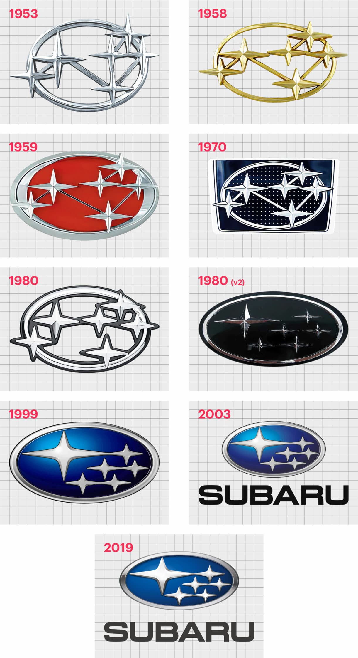
Subaru logos over the years: The Subaru emblem evolution
Subaru logos over the years have all maintained the same consistent use of the six-star constellation of Subaru. The Subaru constellation is better known among most Western customers as the “Pleiades star cluster”, or the “Seven Sisters” (one of which is invisible).
1953
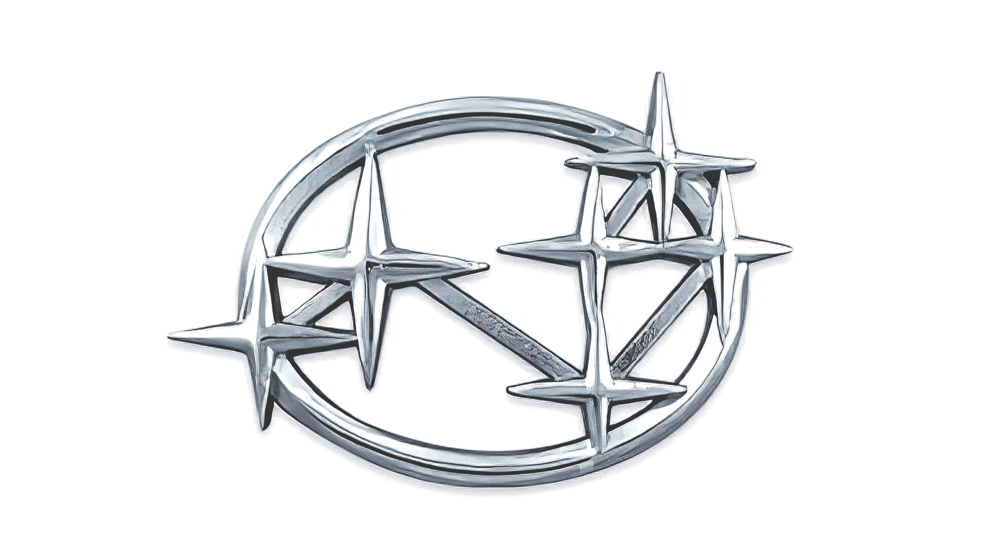
The first version of the Subaru star logo looks much like a simplified version of the Subaru emblem we know today. This old Subaru logo featured a slightly different layout for the six stars of the Taurus constellation, and also has a 3D design.
The original badge was designed in silver, but a golden version was introduced in 1958, in which the stars were slightly refined.
1959
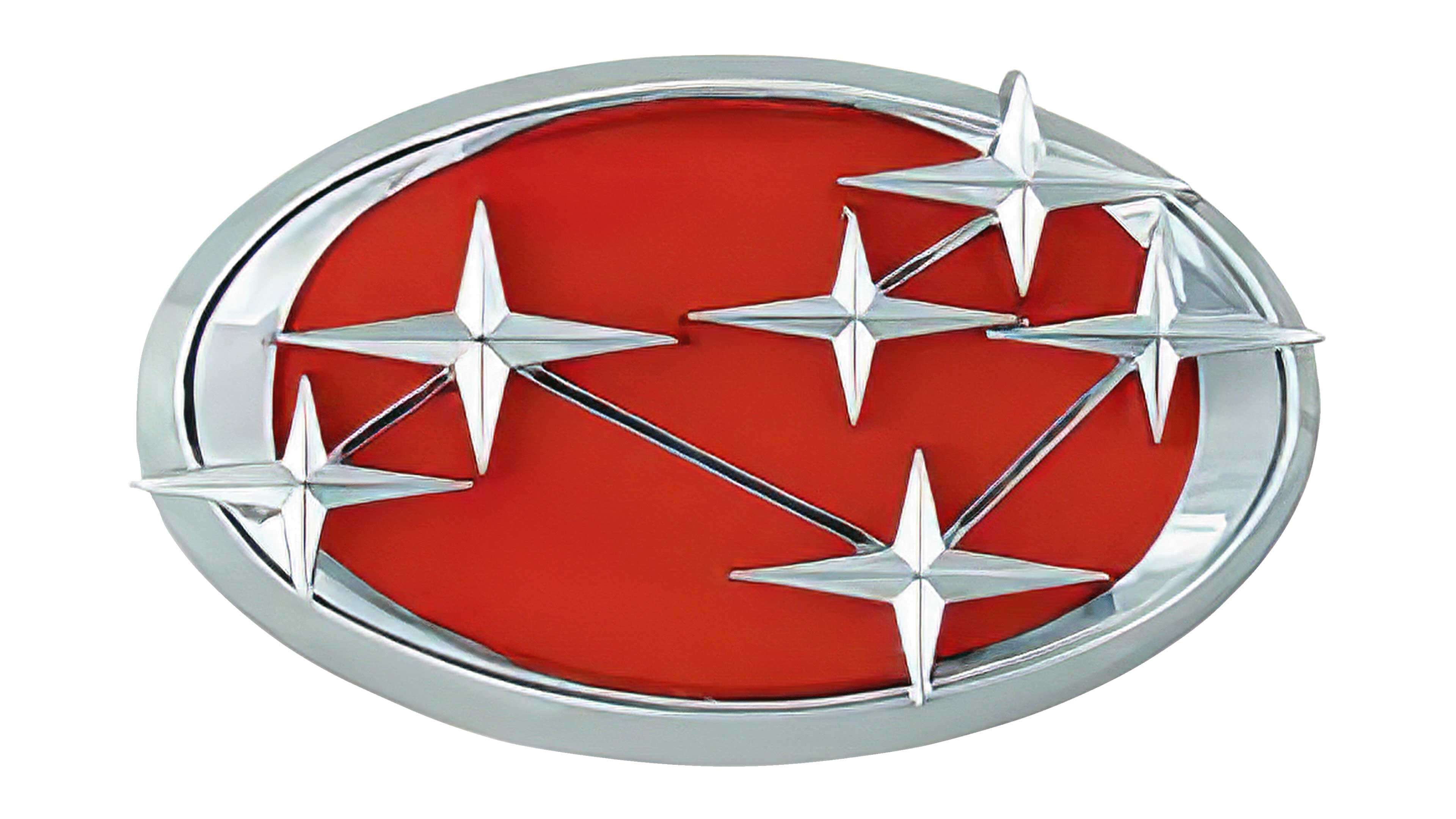
In 1959, the Subaru logo constellation evolved again, this time growing more colorful. The primary color of the logo was still a metallic silver. However, behind the silver stars was a bold red background.
This choice of the color red was intended to represent passion for progress and movement.
1970
In the 1970s, Subaru introduced a simplified version of the previous emblem, placed on a dark black background. This was an interesting modern upgrade for the brand, and the new Subaru logo remained in use for around 10 years, until the 1980s, when the black background was removed.
The upgrade in the 1980s also refined the shape and design of the stars slightly, while extending the oval frame. A black outline brought extra depth to the overall image.
1980s
The 1980s also saw the introduction of a new logo similar to the design we know today. The emblem featured the same oval with stars; however, the background of the oval was now in a deep dark blue.
The blue, in this case, seems to represent the night sky, bringing extra contrast to the Subaru star cluster commonly associated with the brand.
The shapes in this logo are clearly refined, and we can no longer see the metal lines connecting the stars as on previous iterations of the image.
1999
In 1999, Subaru modernized its logo again, this time using various gradients and shades of blues to make the primary star in the constellation look as though it’s shining. The oval shape became a little wider, and the silver took on its own texture for each star.
2003
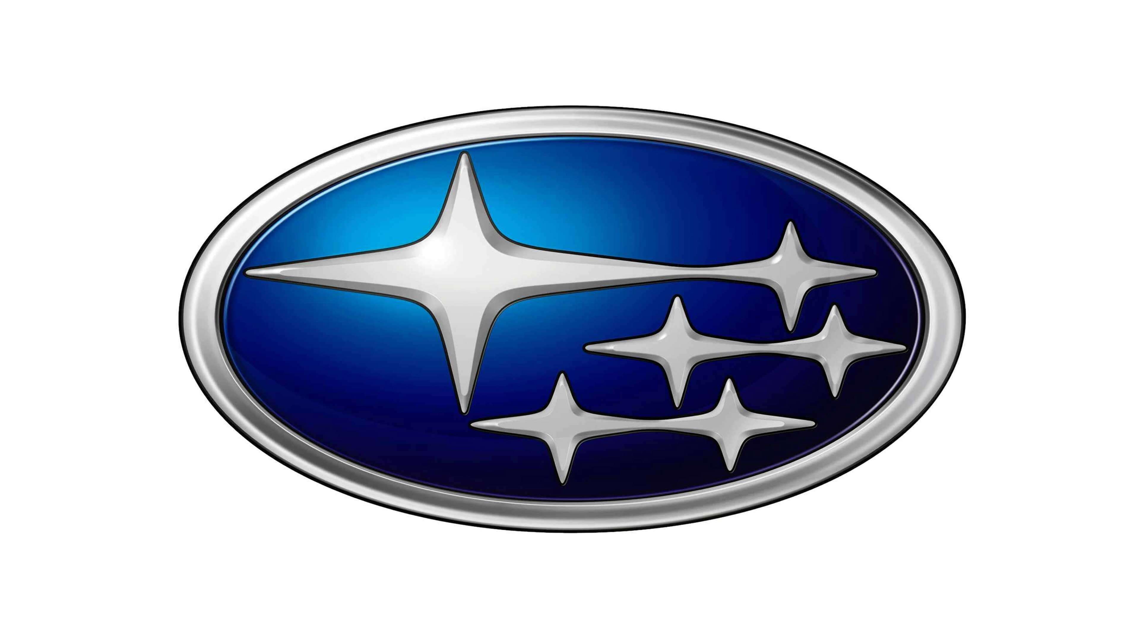
The Subaru logo introduced in 2003 is the one still present in the brand’s marketing assets, and on the hood of Subaru cars today. This image is very similar to the previous logo from 1999, though the shading of the blue has changed a little, becoming darker and more sophisticated.
Once again, for the 2003 logo, Subaru refined the elements of its constellation-based logo, and the silver border also became a little slimmer.
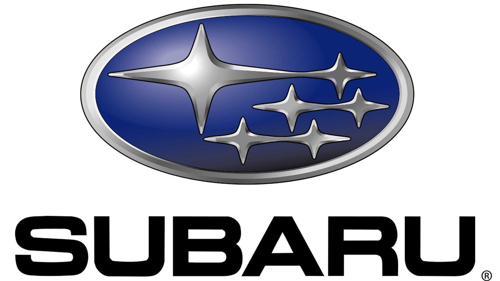
In 2003, Subaru also introduced the wordmark for its logo, written in a simple, sans-serif font, all in capital letters. The wordmark doesn’t always appear alongside the Subaru emblem.
What does Subaru mean? Subaru symbol meaning
Few car logos throughout history have the same depth of meaning as the Subaru logo. While many companies chose to name their brands after their founders, Subaru took a different route, and named their cars after a famous constellation.
The name “Subaru” is the Japanese title for the Pleiades (6-star) constellation, otherwise known as Taurus. The 6 stars also apparently represent the 6 companies which merged into Fuji Heavy industries, which became a parent company for the brand.
The use of the silver coloring for the primary shades of the logo represents sophistication and modernity, while the blue background simultaneously forms the sky and sea.
A famous Japanese saying compares seeing the stars reflected in the water of the sea to make them more accessible to setting achievable, but ambitious goals.
Subaru logo colors
The Subaru logo colors have long included the silver shade common among many car brands. Since the majority of car badges and emblems are made from metal, it makes sense to create a logo which will match the other trimmings on a car.
Although Subaru did experiment with the use of silver (briefly), the silver shade has remained consistent for most of the company’s life. Outside of the silver coloring, the primary Subaru logo color is a deep, dark blue, representing both the sea and the sky.
Blue: #004890 – rgb (0, 72, 144)
Black: #000000 – rgb (0, 0, 0)
What font is the Subaru logo? Subaru logo font
The Subaru wordmark sometimes appears alongside the logo to highlight the name of the company. Subaru’s font is a simple but effective sans-serif typeface, written in all capital letters.
The weight of the font is bold without being overwhelming, and there are a number of square elements to the design, which help to highlight the modernity of the brand.
Subaru’s font is unique to the company, but its similar in style to the Square 721 bold font, or the Eurostile Ext2 font.
Celebrating the Subaru logo today
Though Subaru’s logo might not be the most complex in the vehicle landscape, it’s certainly one of the more memorable designs on the market.
Subaru’s decision to use the name of a constellation both for the company, and the inspiration for its logo has led to the company becoming an icon in the vehicle landscape.
Don’t forget, you can read up the histories of other leading vehicle marques by checking out other Logofiles on Brand Fabrik.
Now read these:
—Which car companies own which car brand?
—Famous car brands, their names and logos
—The ultimate list of French car brand logos
—The 50 best-known car logos with wings
—The definitive guide to German car logos
—Famous car logos and emblems with stars
—Top American car brands and their logos
—Your ultimate guide to Italian car brands
—American car companies that went bust
—The conclusive guide to British car logos
—The essential list of Japanese car logos
—A decisive guide to car logos with circles
Fabrik: A branding agency for our times.

Clarity starts with a conversation.
Thanks—we’ll get back to you shortly.
Whether you're navigating a rebrand, merger, or simply need a clearer identity—we’re here to help. No hard sell, just honest advice from people who know the sector.
Let’s start with a simple question…
Prefer to email? Drop us a line.
Fabrik’s been helping organisations rethink and reshape their brands for over 25 years. We’ve guided companies through mergers, rebrands and new launches. Whatever stage you’re at, we’ll meet you there.