


What is balance in graphic design? Understanding the balance principle of design
Balance in graphic design is one of the key principles determining whether a project is visually appealing or not. With balance in design, experts can ensure the various elements of a page are distributed in an aesthetically pleasing format, reducing eye strain and visual overwhelm.
Visual balance also helps to ensure the various components of a page or project all get the right amount of attention from a visitor.
To achieve optimal balance, graphic designers need to consider the various objects, colors, textures, and surrounding white space in a composition carefully, looking at each element’s relationship to the rest of the design.
Today, we’re going to look closely at the “balance” principle of design, how artists can use this concept, and why it’s so important.
What is balance in graphic design?
Graphic design balance is a principle referring to the distribution of elements in a composition. Everything we see on a page, from colors and textures to fonts and shapes, carry a certain visual weight.
Through balance in design, experts can ensure this weight is dispersed in a way appealing to the eye, and effective for the overall purpose of the page.
The human eye naturally seeks out order when viewing any composition and graphic design balance can help professionals to leverage this fact.
To achieve proper balance, compositions need to be balanced in a range of ways, including vertically, horizontally, and in the background vs the foreground of the image.
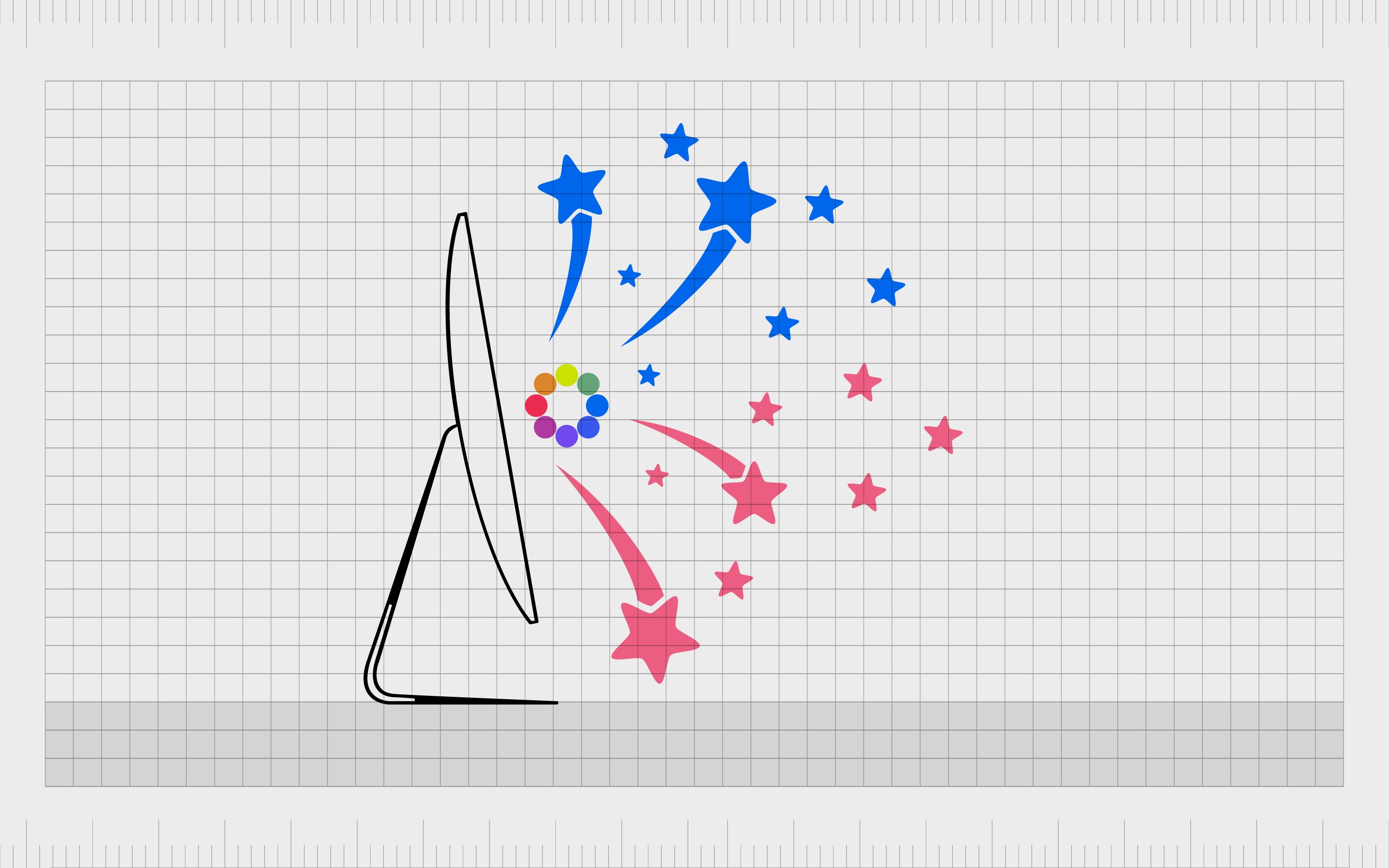
Understanding balance in graphic design requires a basic knowledge of “visual weight” and “visual direction” in a composition. Visual weight is the perceived “weight” of an individual element in design.
A large black box on a screen would carry more weight than a soft blue line, for instance.
Visual direction, on the other hand, is the direction to which your visual focus shifts when taking in a design. Weight can help to determine which direction your eye takes when moving down a page.
Simply playing with concepts like visual direction and visual weight can help you to explore different kinds of balance for your composition.
Definition of balance in graphic design
The principles of design balance as we know them today date back further than most people realize. Graphic design balance and visual balance appear even in early and prehistoric art forms. However, the concept only truly began to gain scientific and formal recognition during the Renaissance.
One of the experts best-known for leveraging balance in graphic design was Leonardo da Vinci. His meticulous attention to detail in creating focal points and structure in compositions created masterpieces like The Last Supper, and the Vitruvian Man.
Today, balance in graphic design is a far more formal concept, used alongside a series of other principles to ensure the success of any visual piece, from a poster image, to a website design.
Why is balance important in graphic design?
Simply put, balance in graphic design is important because it helps to convey a message in an image through a more structured format. Balance in graphic design is aesthetically appealing, and comforting to the human eye, as we like to see structure in the things we view.
Designs with balance also establish clear focal points throughout an image, which can be useful in storytelling and advertising.
With the principles of design balance, graphic artists can effectively guide a person’s eyes through a composition, drawing additional focus to where they most need to make an impact. Every element in the composition will be arranged to ensure the overall image has the maximum impact.
Without balance in design, there’s no clear focus area or rhythm. The resulting design may look messy or confusing and fail to convey the right message.
Notably, balance in design doesn’t have to mean making everything symmetrical. Experts can use contrast and focal points, as well as “dissonance” to create the right effect. However, the only way to achieve the right outcomes is to first understand the foundation of balance.
What are the types of balance in graphic design?
Notably, balance in graphic design is more involved than most people think. There are various kinds of balance you may use to create a brand’s visual identity or an art piece.
The most common and well-known form of balance is “symmetrical” balance, wherein one side of an image mirrors another. However, there are other options to consider too.
Symmetrical balance in graphic design
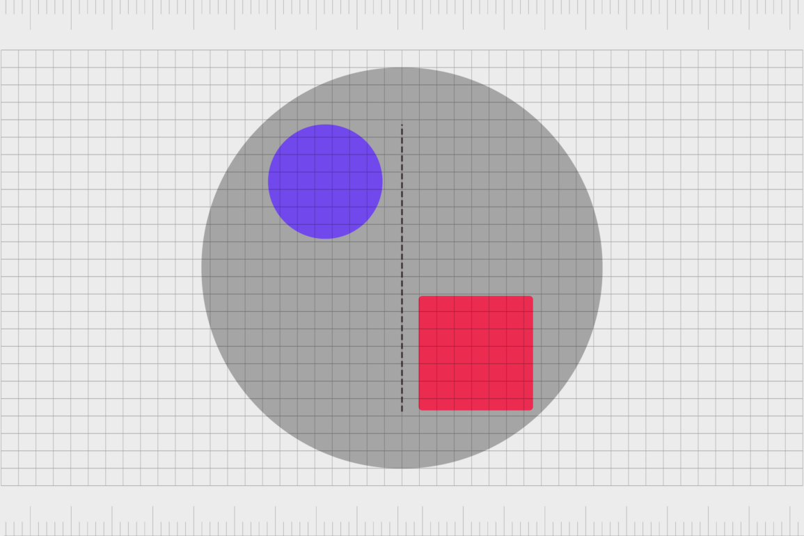
Symmetrical balance in graphic design is the concept most people will already be familiar with. This form of design balance asks artists to “mirror” their image from one point to another.
If you draw a line across a composition horizontally or vertically with a symmetrical design, the visual weight should be identically balanced.
These designs are easy on the eyes and have a clear structure. However, in some cases, symmetrical balance in graphic design can look too simple or boring. Subtle changes between symmetrical points can help to add contrast and depth.
Sometimes, it’s possible to achieve symmetrical balance in design while still adding unique elements through things like color. For instance, the yin and yang symbol is symmetrically balanced, but one side is black while the other is white.
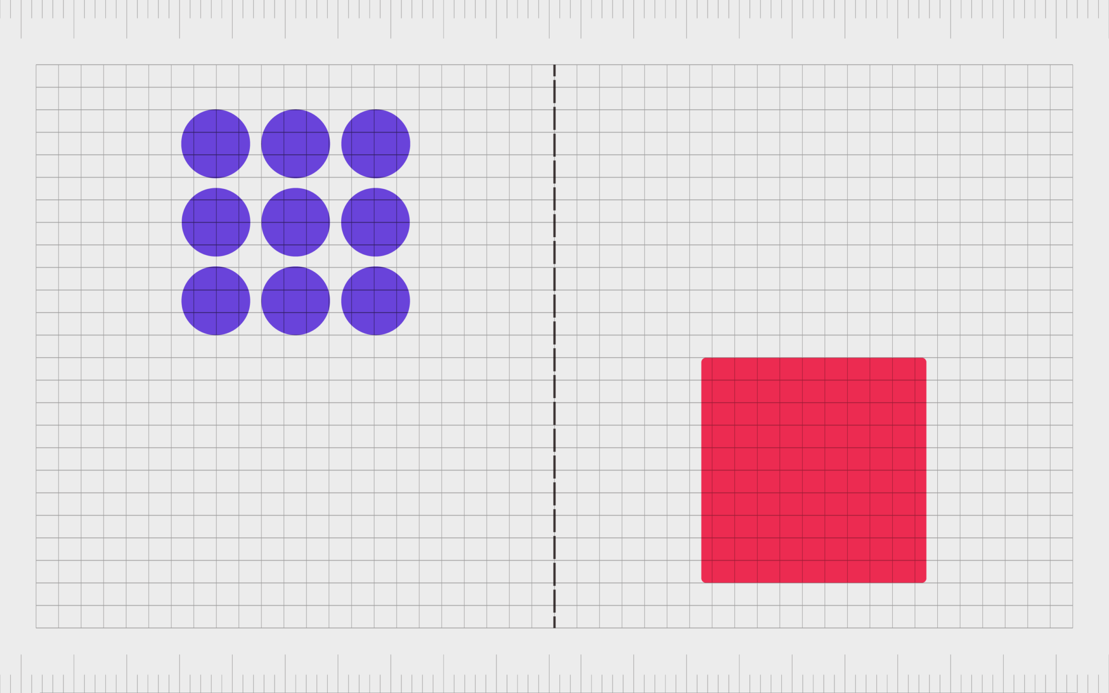
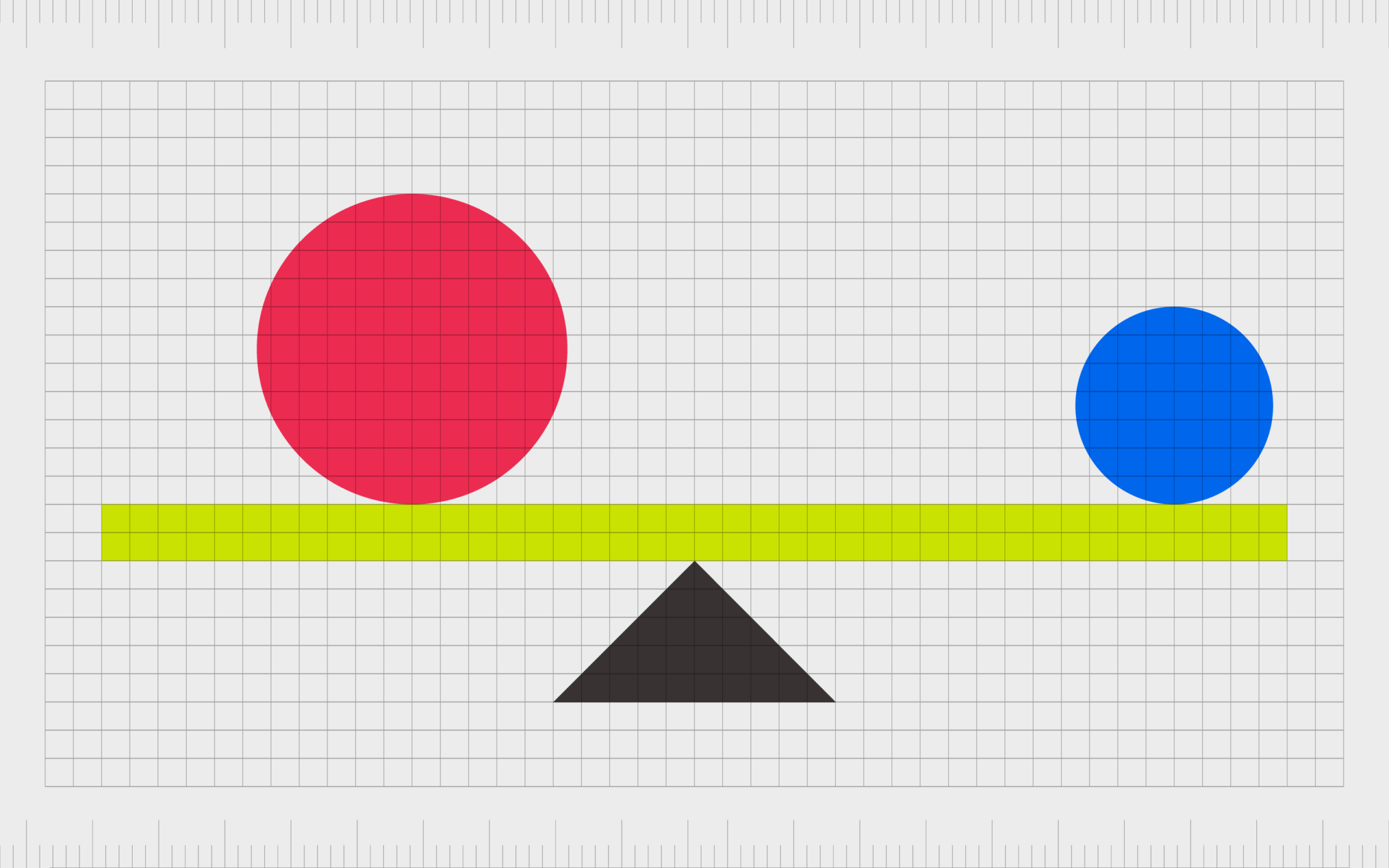
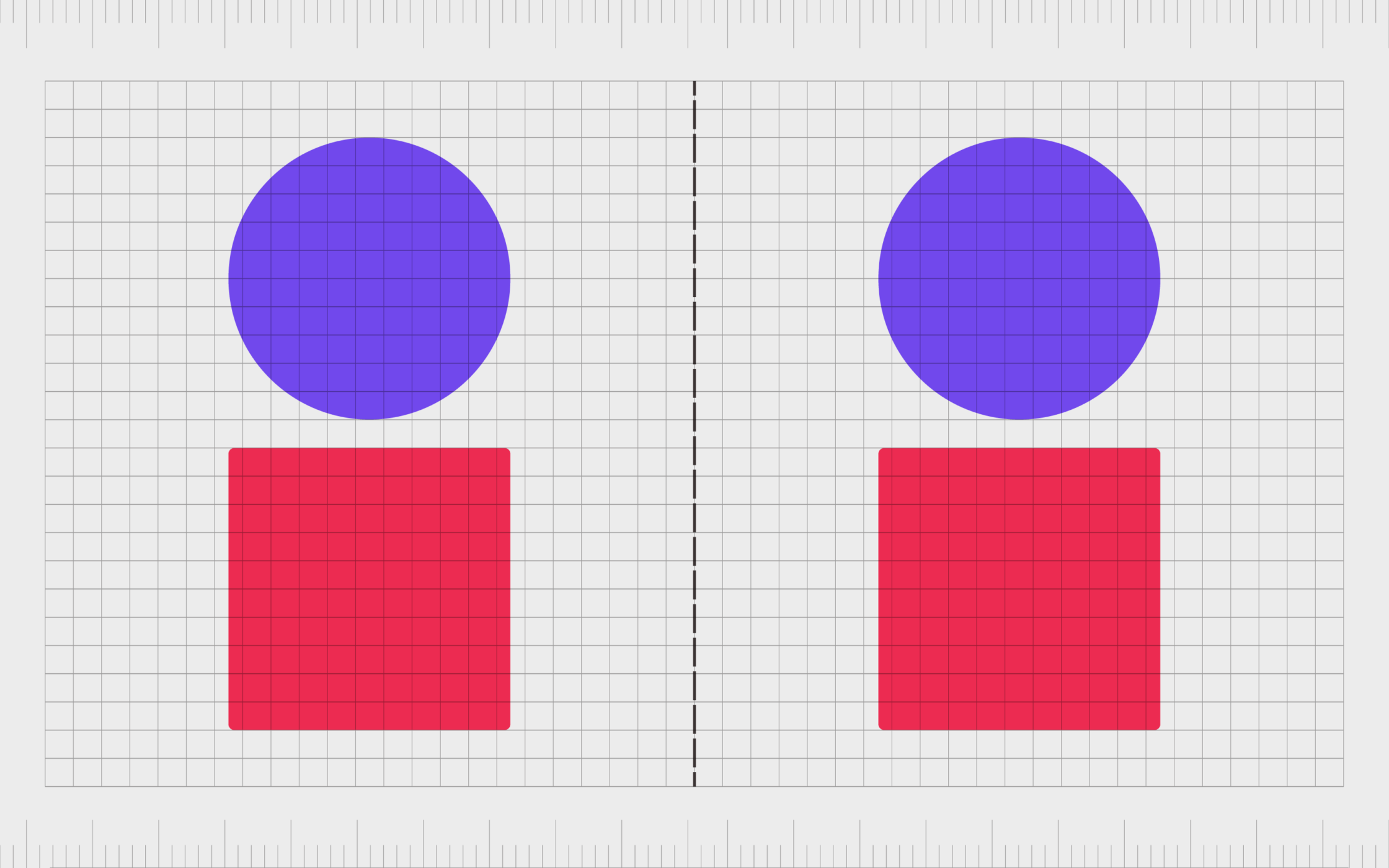
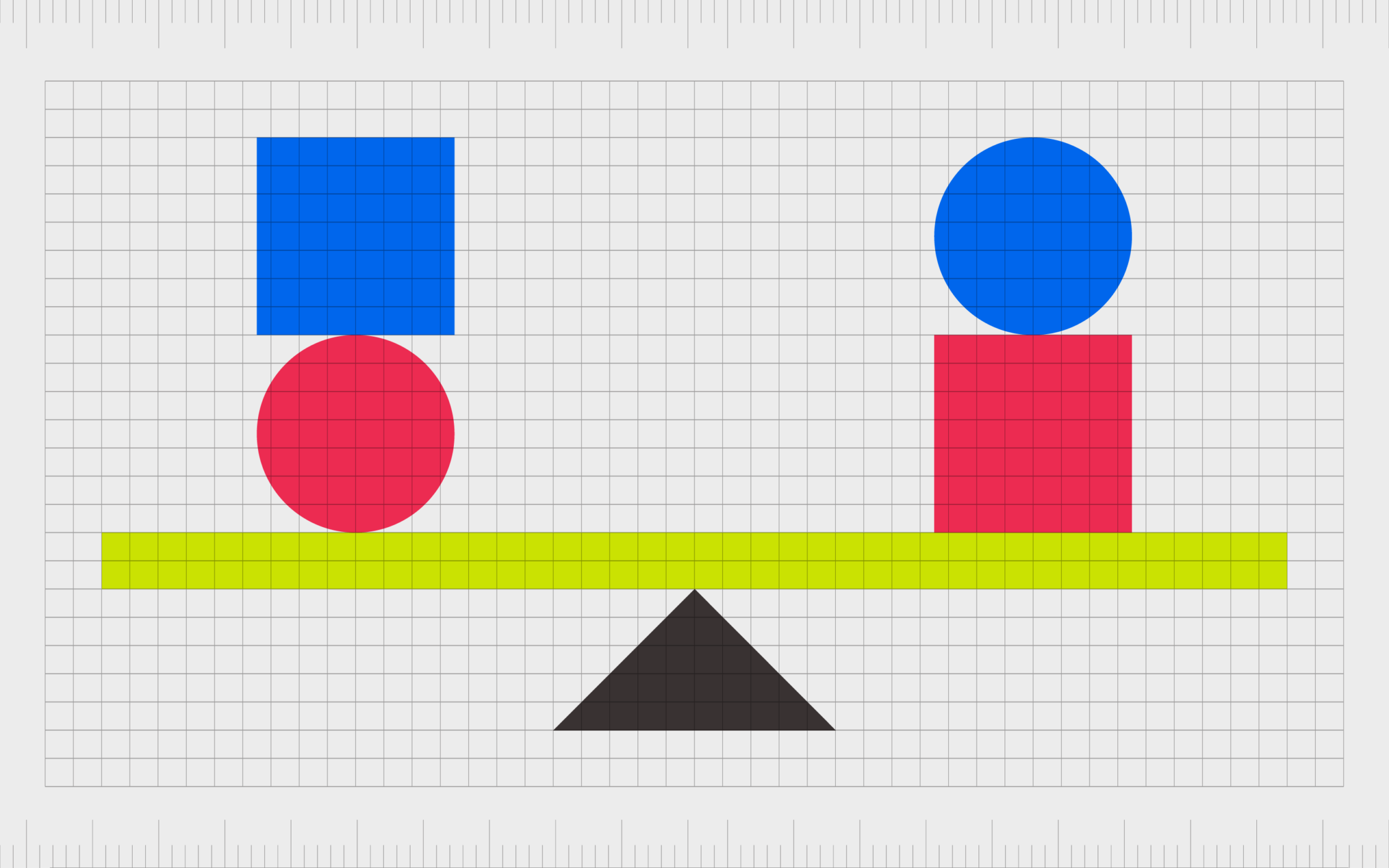
Asymmetrical balance in graphic design
While symmetrical balance describes the use of mirrored images and weights to create balance in design, asymmetrical balance takes a different approach. An asymmetrical balance in graphic design is a way of creating movement, tension, and focal points in a composition.
The weights of different elements in the composition are altered, to make one part of an image heavier than the other. There’s still a strong sense of balance conveyed through the weight on either side of the image, but the elements will be distributed differently.
For instance, if one side of a webpage had multiple small sections of text, and the other side had one long piece of text, the sides may be equally balanced overall, but the elements they used would be asymmetrical.
This kind of balance in design is a little more creative and compelling, so it’s more likely to capture our attention than other forms of graphic design balance.
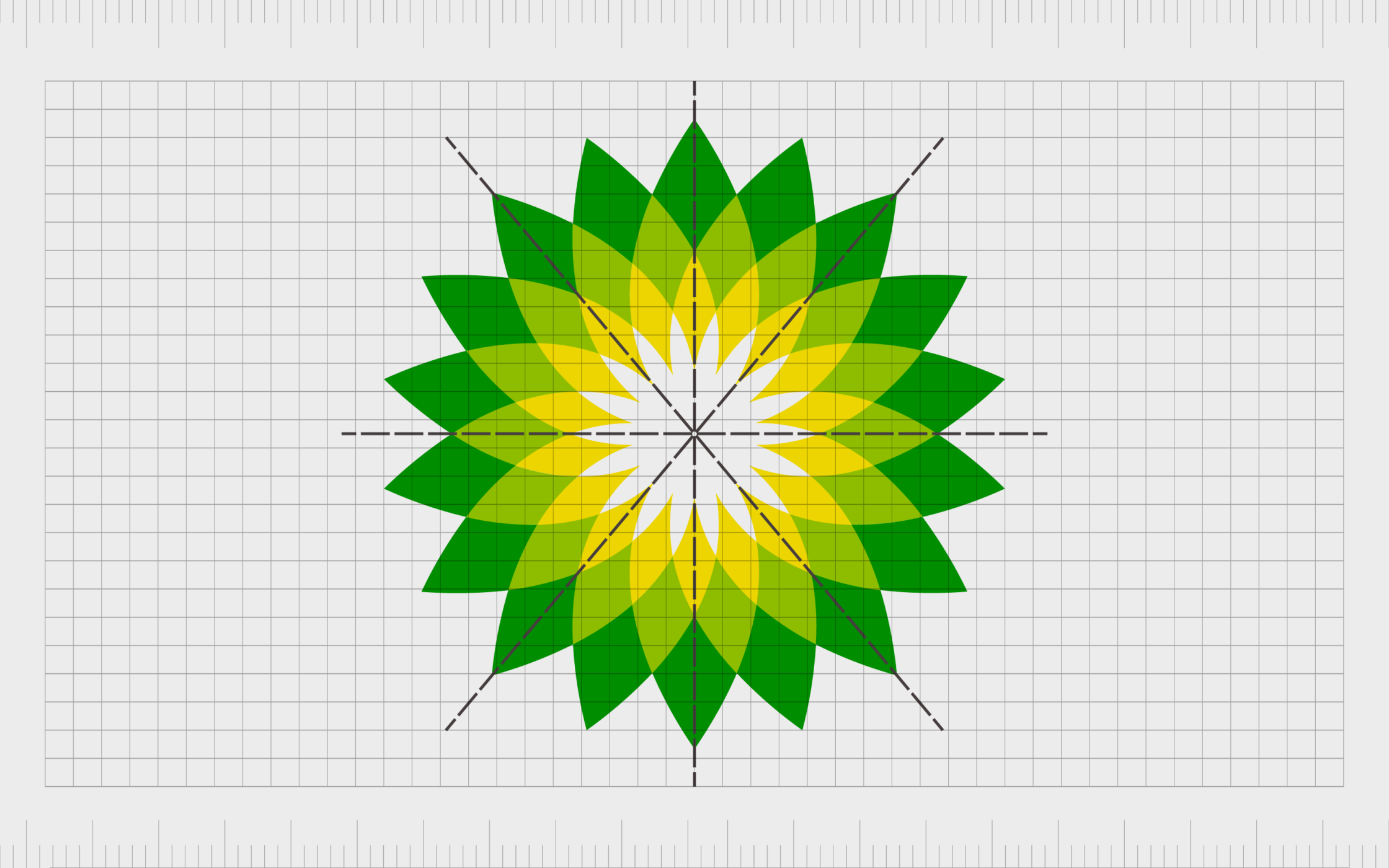
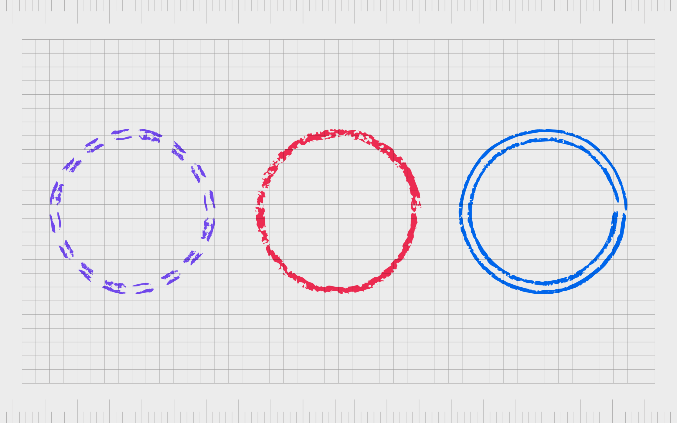
Radial balance in graphic design
In concepts like asymmetrical and symmetrical design, you’re assessing the weight of elements on two sides of a centered line. However, this isn’t the only way to achieve balance. Rather than using a line, you can also access radial balance around a single point.
With radial design, visual elements from a clear central point. There are various axes within the design, all meeting together at one part of the page. For this form of balance to work, equal weight needs to be given to the elements distributed in each axis.
For example, the British Petroleum logo is an excellent example of radial balance, where everything radiates from one point in the middle of the composition.
Graphic designers frequently use radial balance when creating logos, as it can help to convey a message quickly and easily, in a compact design.
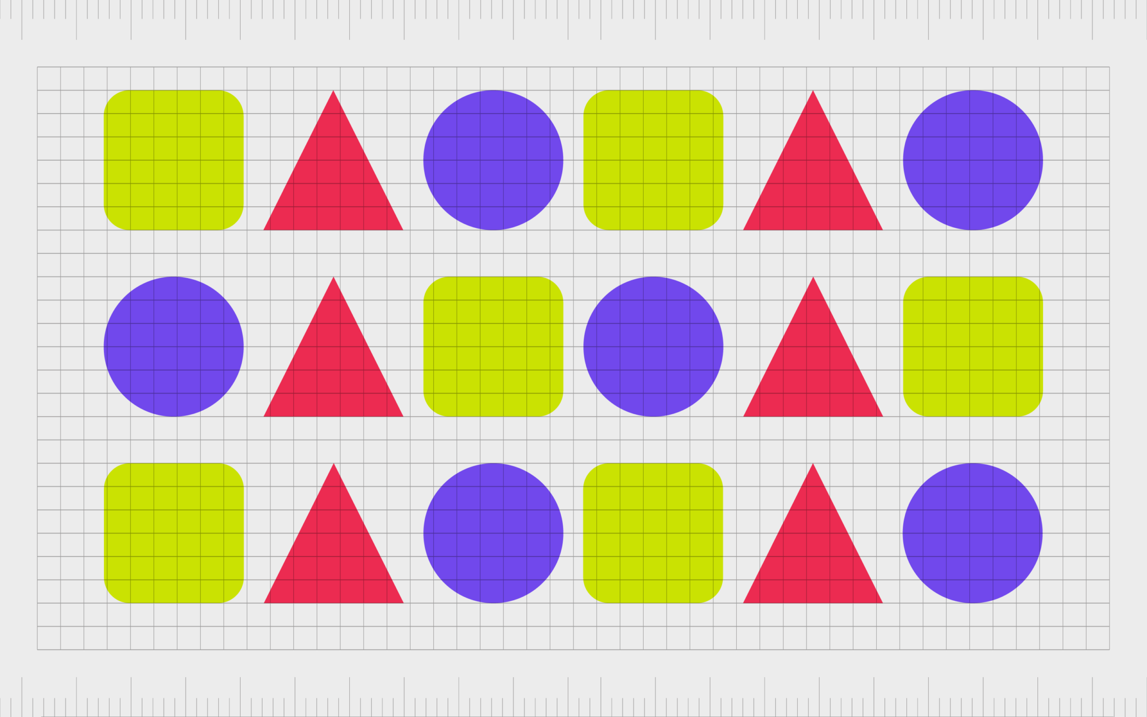
Crystallographic balance in graphic design
Otherwise called “mosaic balance”, crystallographic in balance design is a kind of organized chaos. This is the term used to refer to a composition wherein various apparently disorganized elements can work together to create a more balanced image.
With this form of balance in graphic design, elements of equal visual weights are spread across a purposefully chaotic layout. At a glance, the image may seem overwhelming, but overall, the various elements work together to create a complete sense of balance.
Sometimes, crystallographic balance is also called “all-over” balance because the intent is to create a comprehensively balanced image, leveraging movement, while maintaining an aesthetic appeal.
Designers use this kind of balance to create subtle backgrounds, ensuring the foreground elements in a design will capture the most attention.
Mosaic balance also allows designers to play with scale and proportion. Though some elements may be small, and others enlarged, they won’t come across as overpowering in a complex design.
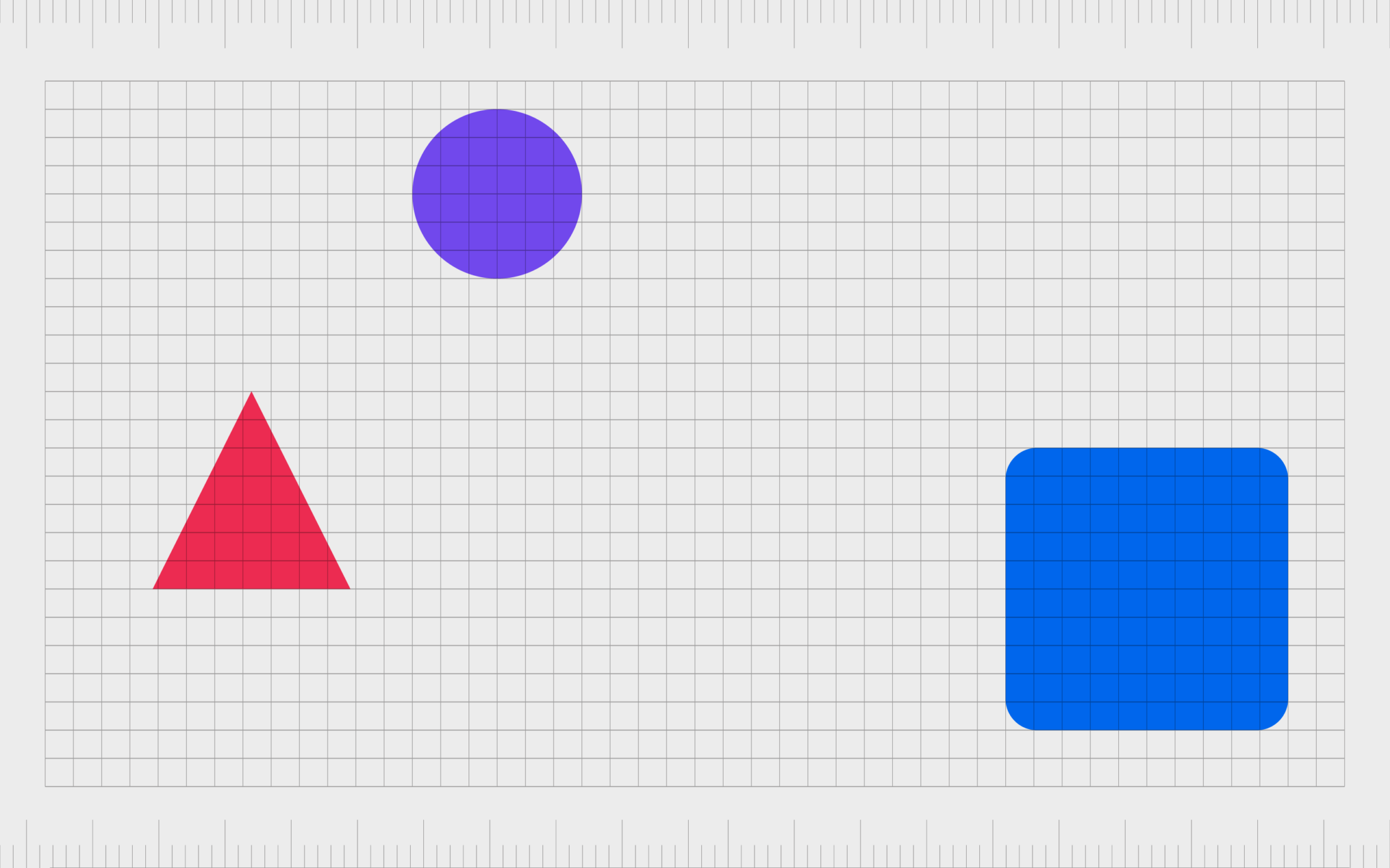
Discordant balance in graphic design
As mentioned above, sometimes artists deliberately go against the concept of balance to create a unique image. Off-balance or discordant balance in graphic design is the process of creating visual appeal without balance.
Notably, discordant balance is not the same as asymmetrical balance. In asymmetrical balance, the perspective in the image is shifted, but equal weights are still used on both sides of an image.
An off-balance design is intended to create a feeling of unrest by, using different weights on various parts of the composition or image.
While discordant balance can be eye-catching, it’s important to tread carefully, as it can also appear overwhelming and uncomfortable to look at.
Examples of balance in graphic design
There are endless examples of balance in graphic design both online and offline.
Graphic designers can leverage balance in the creation of a huge range of different assets, from websites and landing pages, to forms and logos.
HubSpot
The HubSpot website is an excellent example of asymmetrical balance. In this design, the image of the person on the right side of the screen balances the font and buttons on the left side.
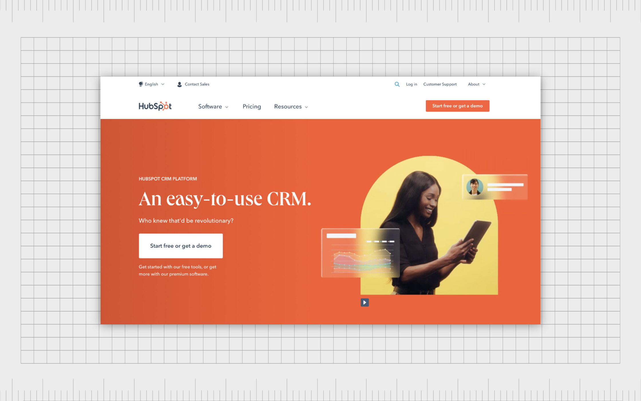
Similarly, the heavier weight of the CTA button on the top right helps to balance the various tab titles on the top left of the page, creating a sense of serenity.
Starbucks
One of the biggest coffee companies in the world has an excellent example of graphic design balance in its logo. The emblem for Starbucks uses balance on both sides of a vertical plane to create a sense of symmetry in the image.
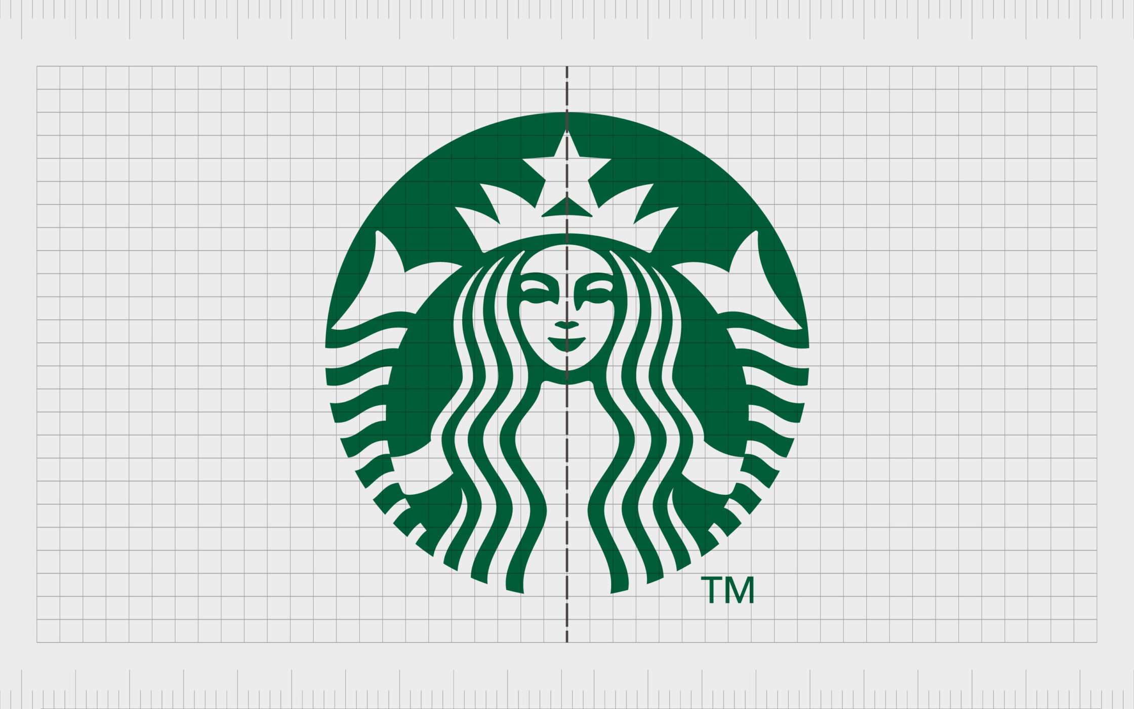
The design helps to convey the friendly and peaceful nature of the company, by ensuring the eye isn’t overwhelmed by confusing weights.
Apple iPhone
The Apple website showcasing the latest iPhone 13 (at the time of writing), demonstrates how symmetrical balance in graphic design doesn’t always mean using the exact same elements on each side of the page.
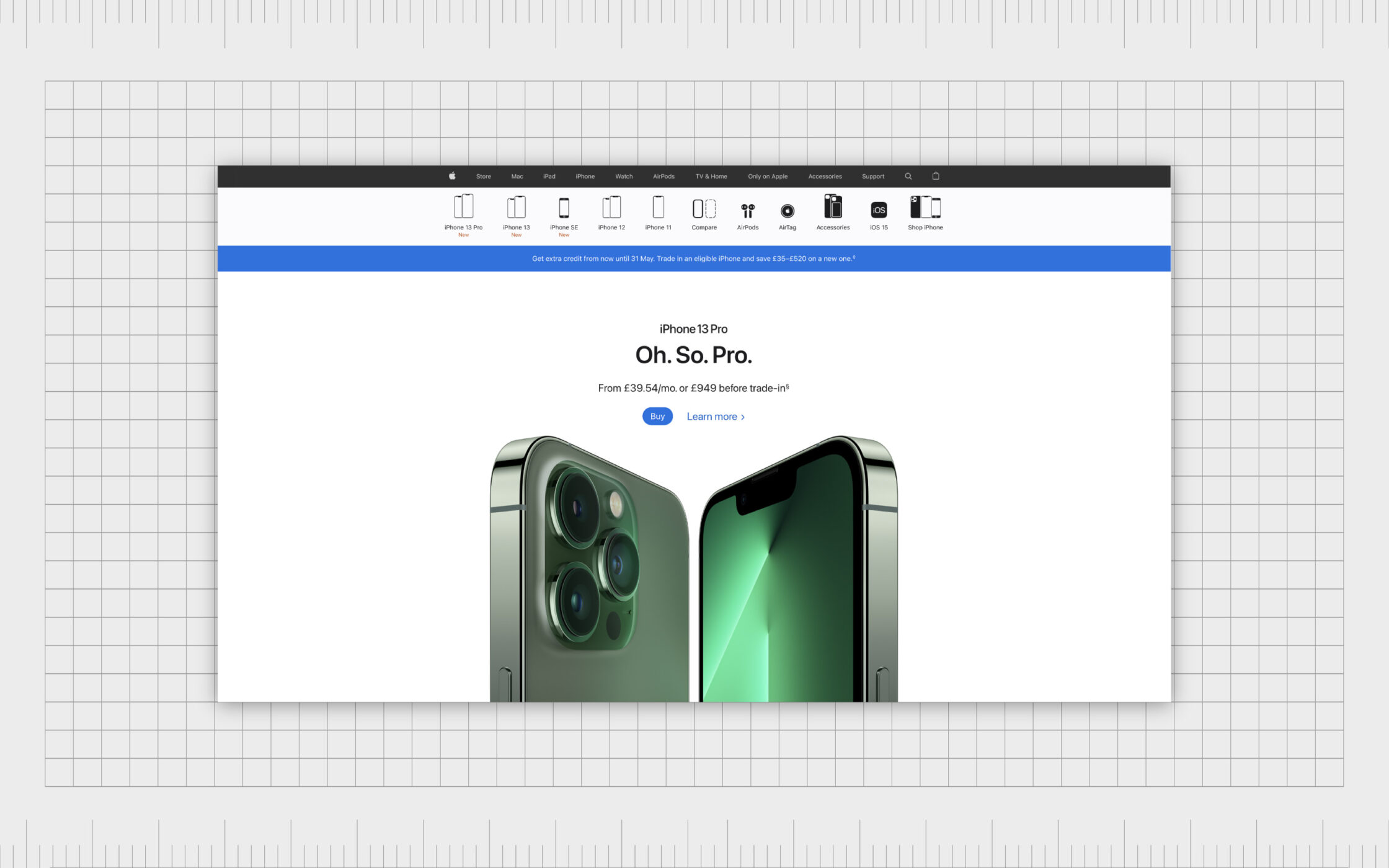
The reflective imagery shows different sides of the phone, but both assets carry the same visual weight, to create a sense of balance.
Chanel
The Chanel logo is another phenomenal example of balance in graphic design. Though the “C” in the interlocked logo is mirrored, and therefore facing backwards on one side, the design creates a perfect sense of balance.
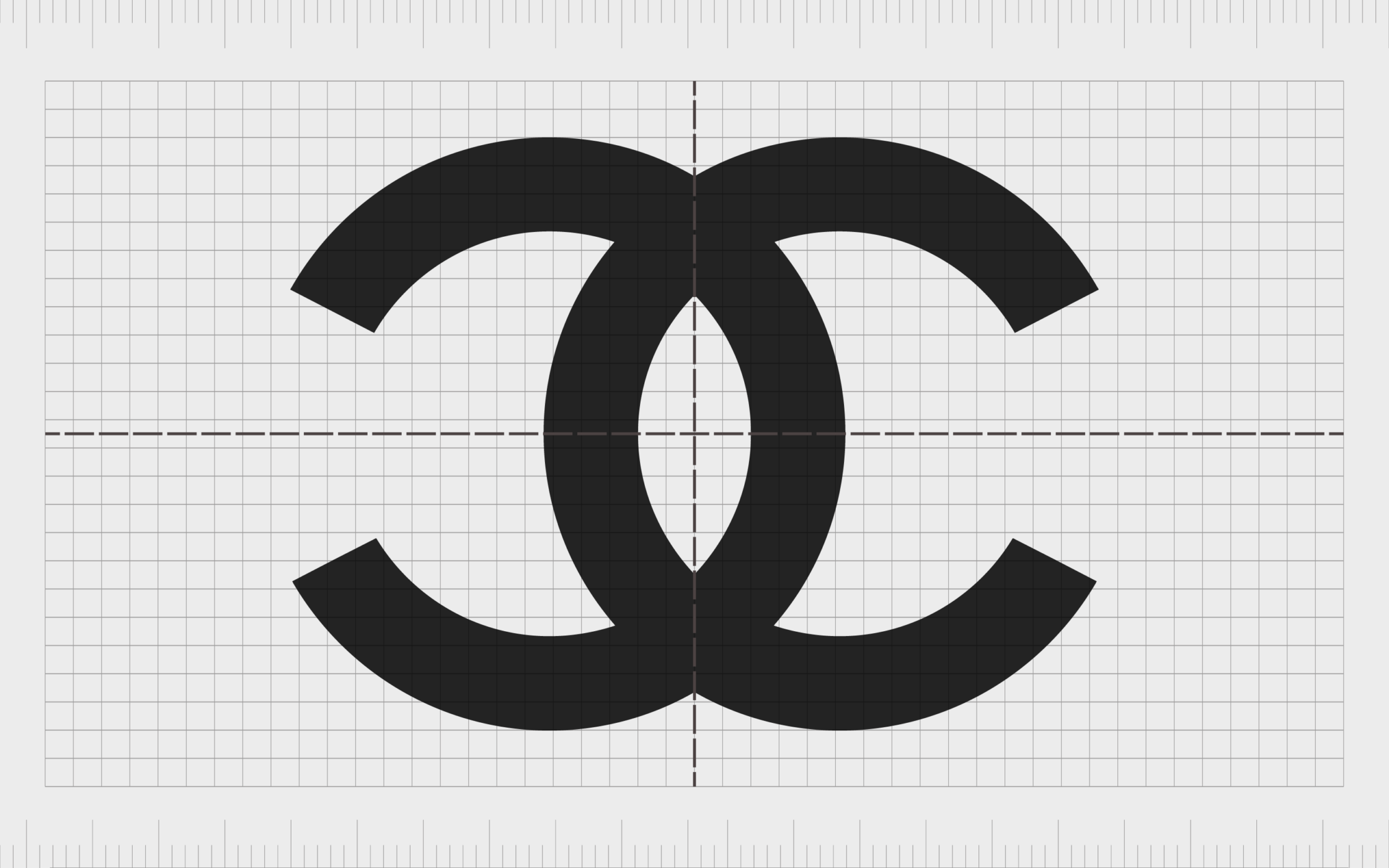
The emblem in the combination logo is also perfectly positioned above the “Chanel” wordmark, to give the image a sense of centering.
Home Société
The Home Société website achieves a sense of balance by pairing a sliding image gallery on the left-hand side against extremely large text over on the right-hand side of the screen. Though the images may differ in composition, size, color and contrast from one slide to another, the overall experience is balanced.
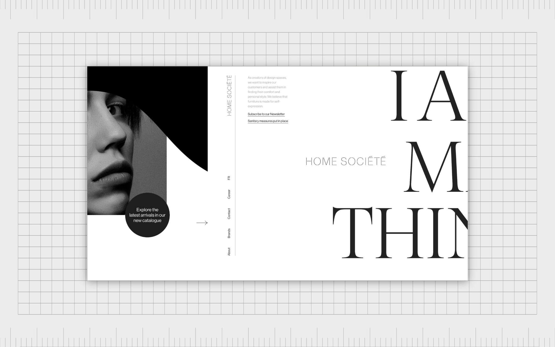
The weight of the assets on each side of the page are equally attention-grabbing.
Other ways to achieve balance in graphic design
In the sections above, we’ve discussed some of the various ways designers can experiment with the concept of balance in logo design, website design, and countless other visual compositions.
However, there are times when a designer might need to rely on specific elements within a design to create balance, such as color, lines, texture, and position.
Here are some of the other ways to achieve balance in design…
Balance from color
Designers can achieve balance through the use of specific colors throughout a page or composition. For instance, you could use the same shades of pink and blue through various portions of the page, ensuring the balance of one color to another is the same on each side of the composition.
To achieve balance from color correctly, designers need to understand the basics of color psychology, and how different colors work together. Designers may also need to pick analogous color schemes to complement each other.
Balance from shape
Designers can create balance in a composition by combining various complex shapes. In a webpage, for instance, a designer could use multiple shapes like blocks of texts and lines on one side of the page, then balance these with shapes of a similar weight on the other side.
Balance from shapes can help to create a sense of rhythm and harmony in a page too, making it an important consideration for many web designers creating product pages, home pages, and similar content.
Balance from position
One of the best ways to create a balanced design is to position the elements of your composition carefully. In the example of the HubSpot website shown above, the positioning of the image on the homepage is strategically selected to help offset the block of text next to it.
Balance from positioning can also be particularly effective in radial design, as it helps to ensure all of the elements are positioned in a way that connects them to a central point in a page.
Balance from texture
Texture can be another powerful tool for creating balance in graphic design. However, it’s often difficult to find various textures capable of working together to maintain the overall balance of the image.
It’s most common to use a large area of solid texture or smooth color. This is then combined with small areas which contain a more interesting texture.
Balance from eye direction
With balance from eye direction, the focus is on directing the visual attention of someone viewing your composition in a way capable of creating balance.
For instance, pointed shapes flowing to a central point in an image can create a sense of radial balance, and shift the attention away from less important parts of a page.
With balance from eye direction, it’s easier to create powerful website pages and landing pages to help push a customer or viewer in a specific direction. Light colors and smaller elements can also help to draw attention with the eye.
Balance from lines
The size of the lines used in certain designs and graphic compositions can also play a significant role in creating visual balance. Thicker lines are typically heavier and have more weight than thinner lines.
This means designers will often use a selection of thicker and thinner lines distributed around a page to create a sense of balance and harmony.
Balance from size
Another way to achieve visual balance in designs is to increase or decrease the size of different elements. A large picture on one side of a page, say, could balance out the presence of various smaller blocks of text on the other side of the page.
The larger your visual elements, the more weight they hold from a visual perspective. This is why it’s common to create a mixture of small and larger elements in visual design, to ensure the elements of a page aren’t too overwhelming.
Too many large or small elements at once would make it difficult for viewers to determine where they should be focusing their attention.
How is balance used in graphic design?
Balance in graphic design is just one of the key principles embraced by experts to ensure visual appeal and aesthetic impact in a composition. However, the importance of finding the right balance for your designs can’t be overstated.
Without the right degree of balance, your images and assets will end up looking confusing, cluttered, and overwhelming.
Balance in design is a critical part of logo design, website creation, and countless other processes for branding. It’s also an important concept for artists creating new compositions from scratch. After all, without balance, the entire impact of the image starts to fall apart.
For designers, learning what kind of balance to use to create different results or outcomes is one of the most important steps in ensuring a successful composition. You can even use concepts of balance in graphic design in the creation of infographics, videos, and other elements in branding.
Mastering balance in graphic design
Balance in graphic design is one of the most important elements ensuring the success of your visual composition.
If you’ve ever looked at the design of a logo or webpage and felt like something was off, even if you couldn’t truly put your finger on what it was, the chances are it was a problem with balance in the design.
Graphic design balance is a concept all logo designers, website creators, and other artistic experts will keep in mind when creating the perfect asset for your business. However, it can be something you might have trouble grasping on your own.
If you need to make sure your graphic design strategy has the correct amount of balance, reach out to Fabrik today for access to our expertise.
Fabrik: A branding agency for our times.
Now read these:
—Introducing the principles of graphic design
—Discover the alignment principle of design
—What is the hierarchy principle of design?
—Exploring the unity principle of graphic design
—Getting to grips with contrast in graphic design
—Understanding the emphasis principle of design
—Discover the repetition principle of graphic design
—What is the pattern principle of graphic design?
—Exploring the rhythm principle of graphic design
—Get ahead with the movement principle of design
—Why variety is an important factor in design
—How to bring harmony to graphic design projects
—The principle of white space in graphic design
—How to use the proportion principle in design

Clarity starts with a conversation.
Thanks—we’ll get back to you shortly.
Whether you're navigating a rebrand, merger, or simply need a clearer identity—we’re here to help. No hard sell, just honest advice from people who know the sector.
Let’s start with a simple question…
Prefer to email? Drop us a line.
Fabrik’s been helping organisations rethink and reshape their brands for over 25 years. We’ve guided companies through mergers, rebrands and new launches. Whatever stage you’re at, we’ll meet you there.