


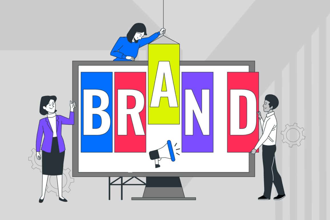


Essential elements: Let’s get back to the graphic design basics

Graphic design is more than just combining beautiful pictures or pulling shapes together to create the perfect logo. The ever-evolving nature of visual trends, combined with a constantly changing digital landscape means that the design discipline never stays the same. In fact, professional designers are constantly learning, growing, and improving to serve their clients.
If you’ve ever asked yourself: “What are the elements of graphic design?” then you might be surprised to discover how complex the basics are. The principles of graphic art have been refined over centuries, all the way from history scrawled on cave walls, to the intricate digital images you see today.
From an outsider’s perspective, great graphic design can seem like magic. After all, the right artist has the power to connect seemingly disparate elements into a comprehensive expression of personality and purpose. However, sensational design isn’t sorcery. Graphic designers use a set of rules and resources called the “elements of design” to create the perfect image.
In a world where every line, shape, and colour can be the difference between brand loyalty, and customer confusion, designers are masters of manipulation. Let’s explore the building blocks of good graphic design.
Drawing the line: Graphic design lines
What are the elements of graphic design?
While your education will differ depending on where, and how you hone your skills, the basics of graphic design will always start with one simple thing: the line.
Lines are present in your website, your logo, and your marketing materials. Even if you don’t notice them, they’re there holding things together, separating different elements, and drawing the eye to specific points. In recent years, you may have even noticed that the minimalist style of web design has begun to eliminate lines completely. However, even this is a conscious choice made by graphic designers to create an open-plan atmosphere.
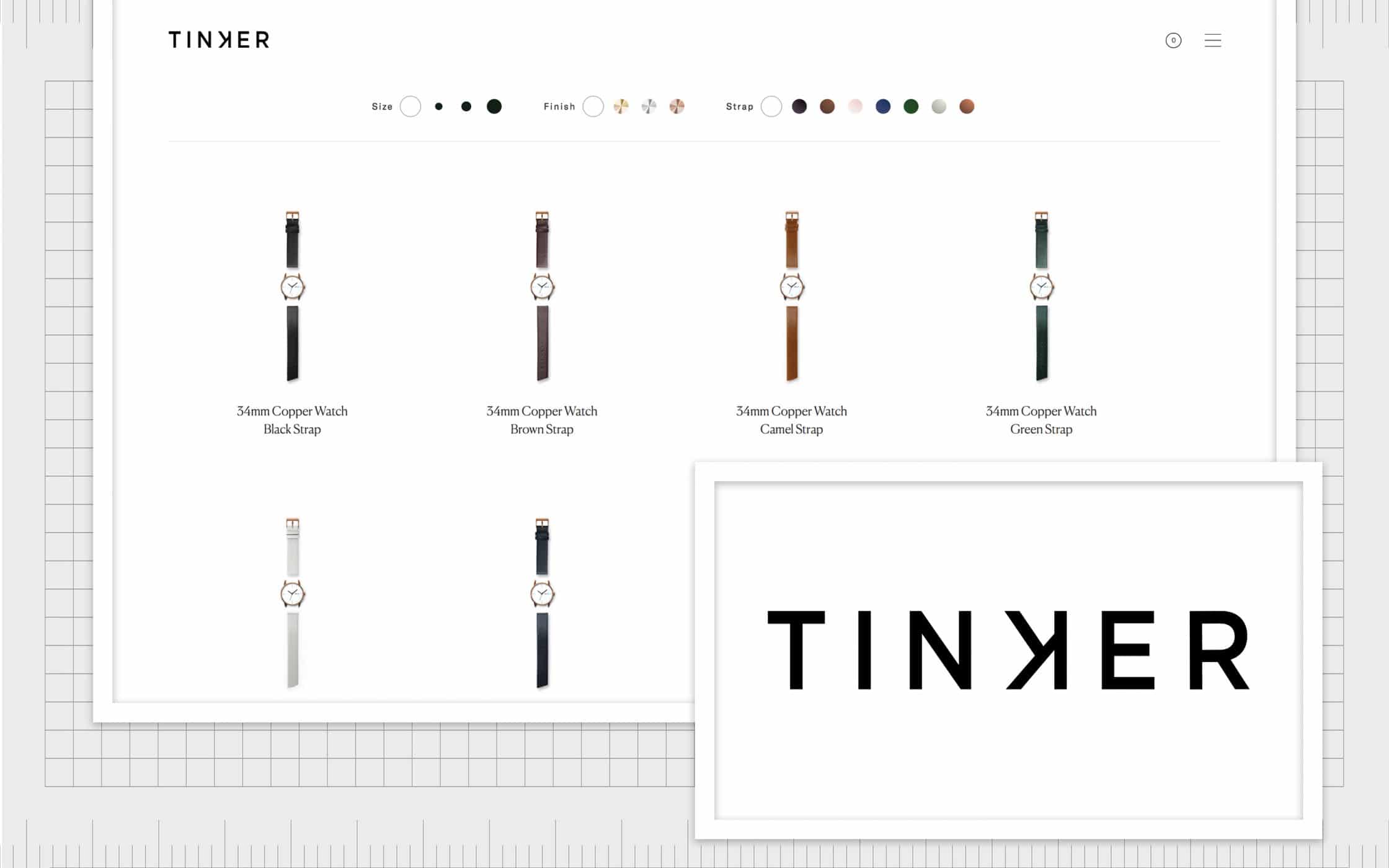
In the past, solid lines were popular because they indicated power, structure, and rigidity. However, as styles have changed, some aspects of graphic designs have started to use the “invisible” line instead. For instance, on Tinker’s website, there are no lines separating products on a page, but items are still organised into neat rows.

Lines also have a part to play in logo design. Horizontal lines are tranquil and calming, while vertical lines demonstrate innovation and creativity. The IBM logo famously uses lines to highlight their consistency and reliability to clients.
Going geometric: Shape in graphic design
Lines bring us to the next focus in elements of graphic design: shape. Shape in graphic design can be as complex or simple as the designer chooses. For instance, logo shapes for companies hoping to achieve an art deco or minimalist look might feature thin, or even dotted lines. On the other hand, bolder shapes can help to identify the values or personality of a company.
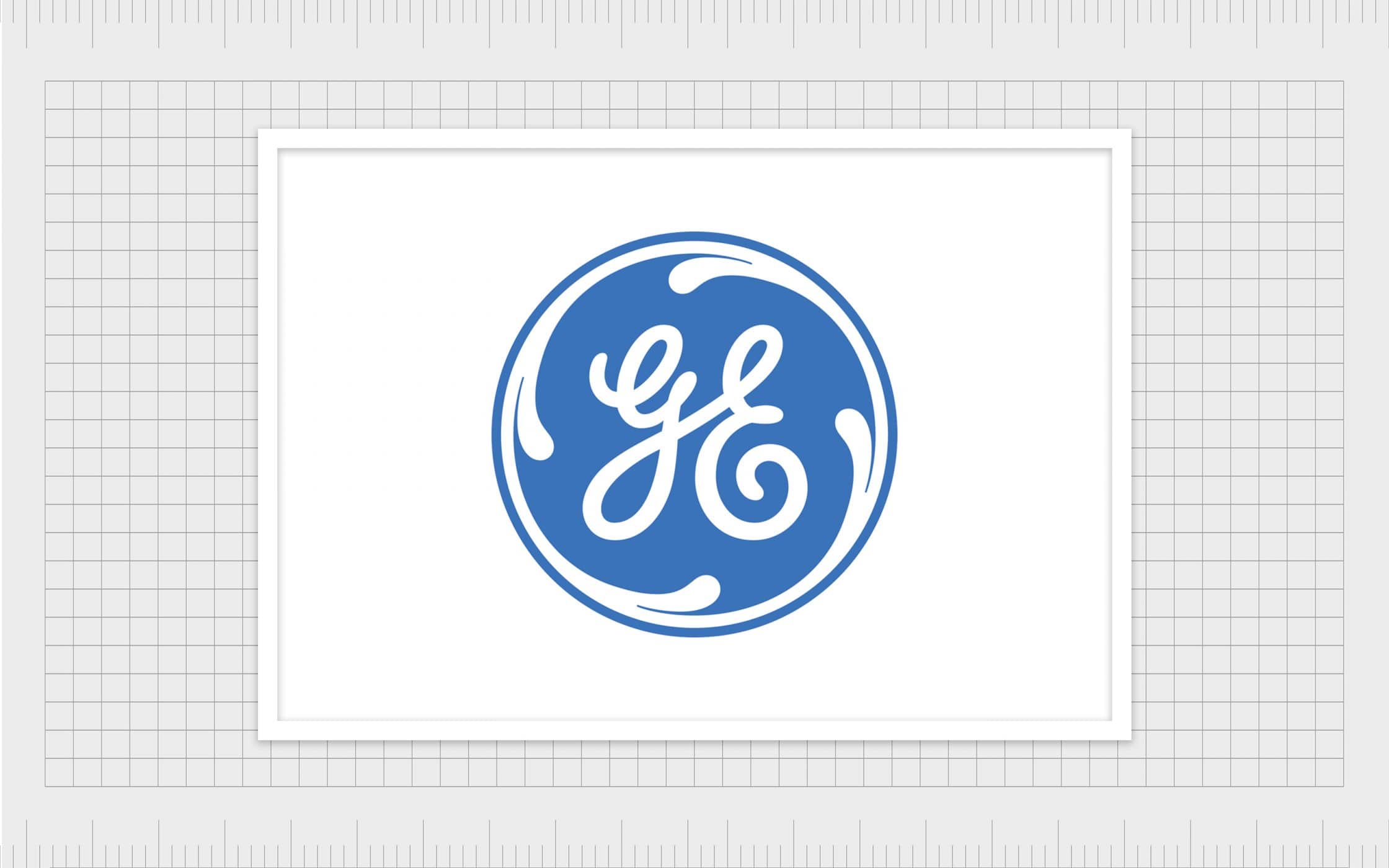
Just like with lines, the human brain responds to graphic design shapes in different ways. For instance, circles are often associated with feelings of inclusion and community, while squares are structured and solid. When it comes to geometric graphic design, the surrounding elements of website or logo shapes can have an impact on the viewer’s perception. For example, the solid colour in the General Electric logo, combined with its artistic font conveys a solid, yet creative brand.
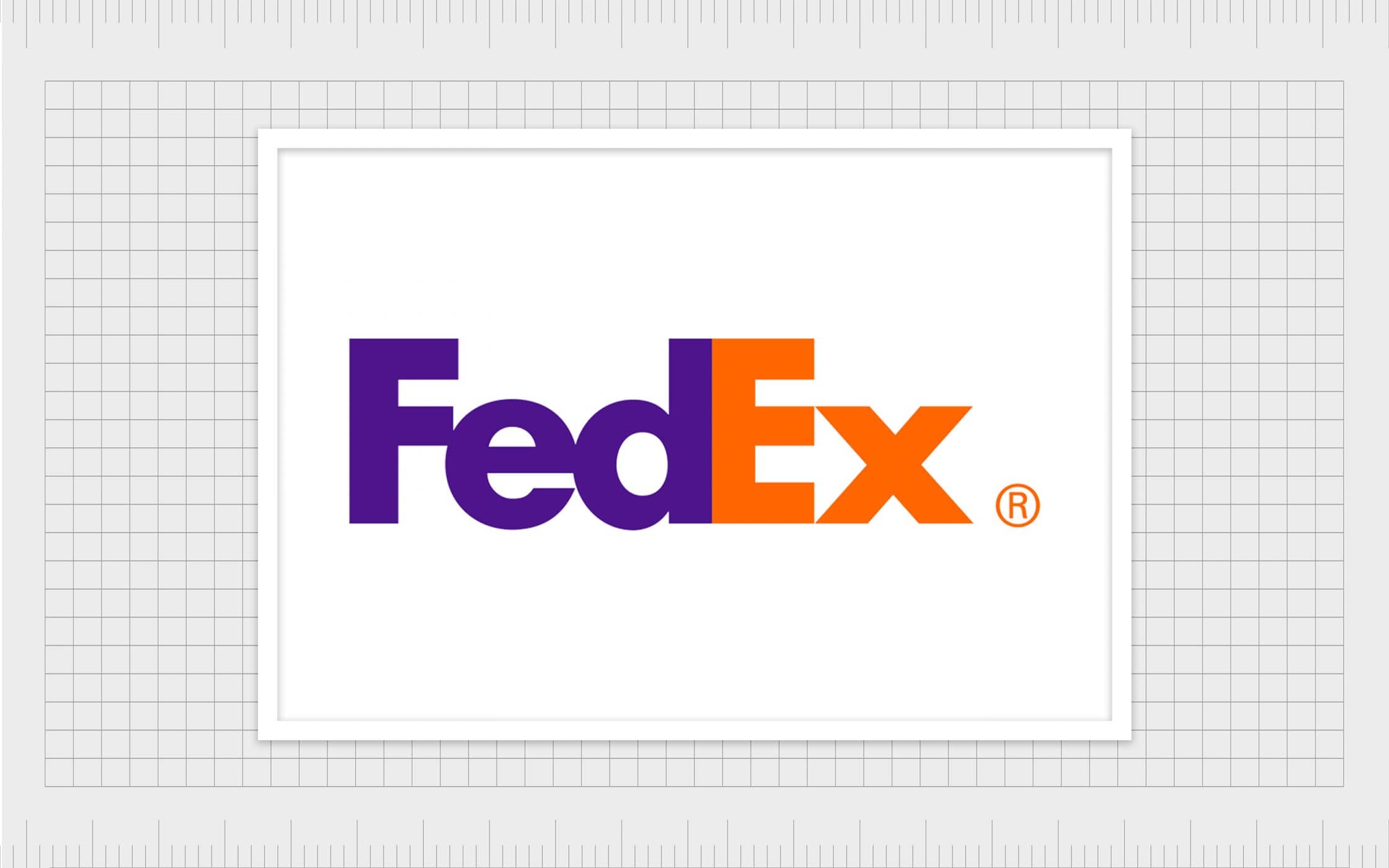
Graphic design shapes are often a complex part of an artist’s creative process. Designers need to think about not only the shapes that they’re deliberately incorporating into a logo or website (the positive shapes) but also the shapes that naturally form in the negative space. One of the most famous examples of shapes in negative spaces can be seen in the FedEx logo. The simple arrow conveys the nature of the brand while giving additional depth to the logo itself.
In web design, experts often turn to grid systems in graphic design to help them place and organise shapes carefully according to a preset hierarchy. A grid system can help with many of the underlying principles of graphic design, including balance, contrast, and alignment.
Sensational shades: Colour in graphic design
Imagine how boring many brand identities would be without colour.
Many of the most famous logos in the world rely on colour to evoke specific feelings and thoughts within their target audience.
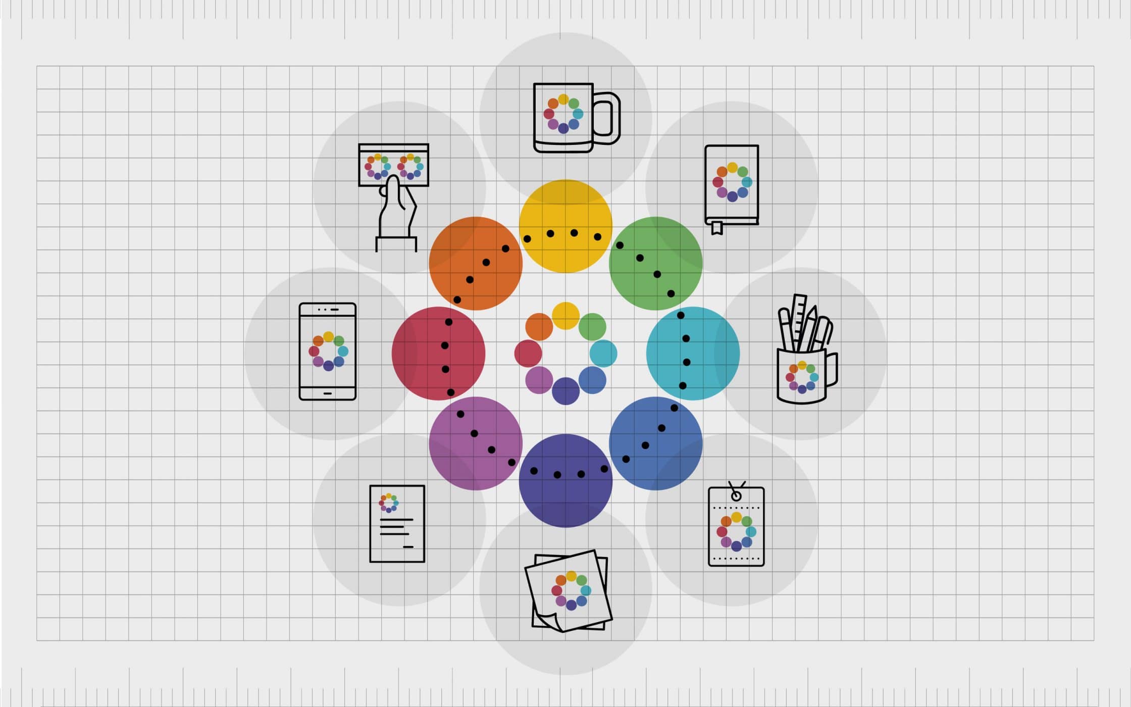
Most experts agree that colour became a part of the basics of graphic design thanks to Sir Isaac Newton, who created the first colour wheel in 1706. Newton examined the spectrum of shades that appears when light passes through a prism and arranged them into a circle that designers now use to help with things like contrast.
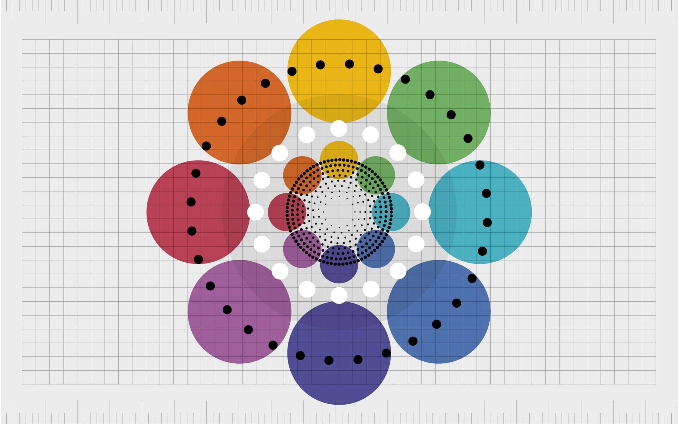
Over the years, this simple system for colour in design was adopted, expanded, and optimised by artists around the world until it became the comprehensive colour wheel we know today. The more we know about colour theory in graphic design, the easier it is to choose shades that naturally work well together in a logo or web page. Similarly, a knowledge of contrasting colours helps those learning the elements of graphic design to make certain elements of an image stand out.
For instance, if you wanted a call-to-action button on your website to stand out, then it makes sense not to make that button the same shade of blue as the rest of your page. Design principles suggest that a colour like red, orange, or yellow would show up best on a blue background.
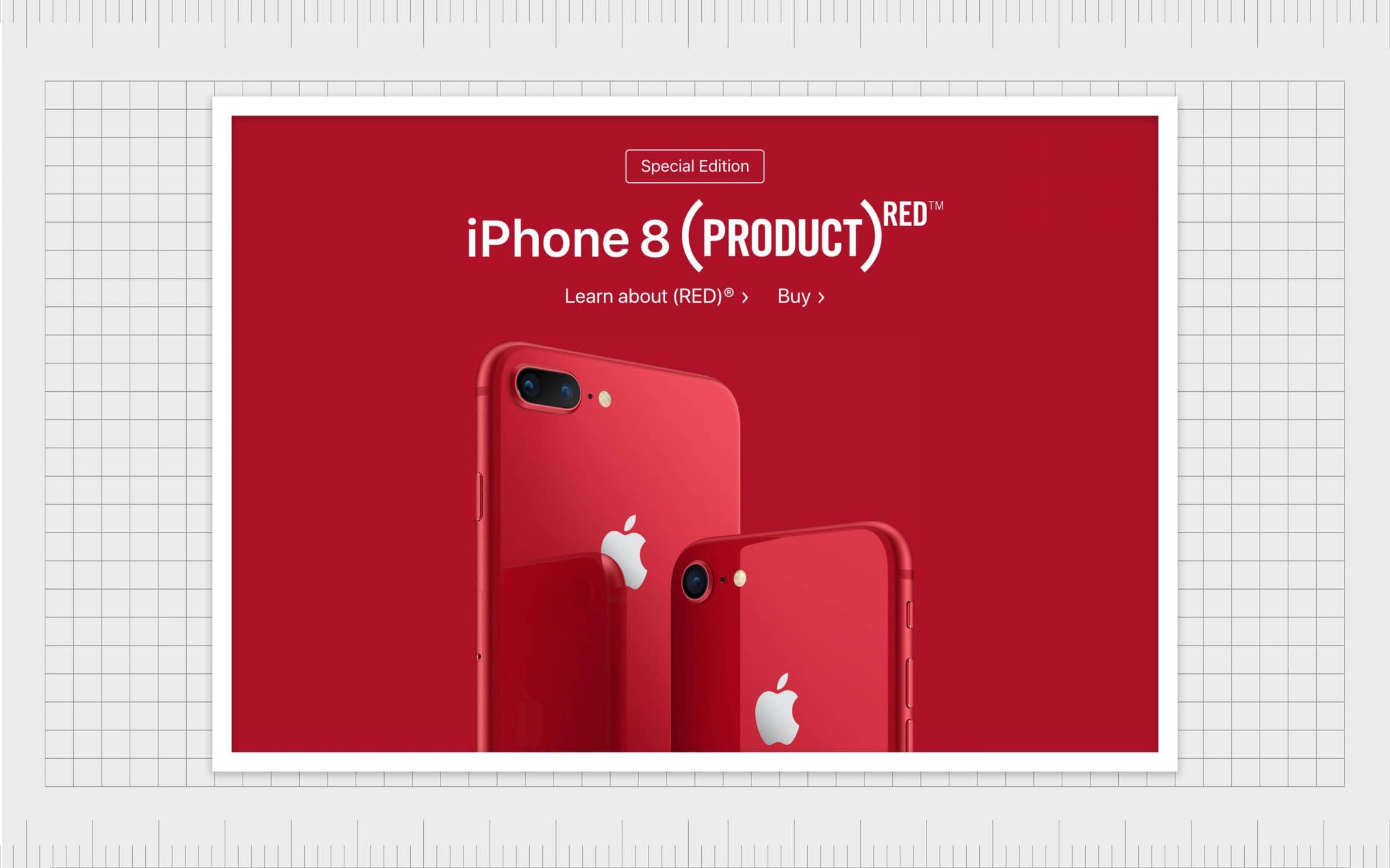
Graphic design also involves thinking about the impact colour has on a person’s mind. While you might not realise it, the different shades that brands use in their websites and logos are specifically chosen to make you think and feel a certain way. For example, while red indicates passion and heat, blue makes us feel safe and serene. 33% of the top 100 brands in the world have blue in their logo.
Graphic design typography: Finding your font
Font is the next port we come to on our tour of graphic design basics. Typography is one of the most important elements of graphic and web design. Like shapes and colours, the fonts you choose will tell a story about your brand. While a serif font might highlight a serious news magazine, a sans-serif type would be more likely to indicate playfulness and informality.
The art of graphic design typography has become increasingly difficult to master over the years, but it’s something that artists and brands can’t afford to ignore. While the words you say are important, the style you show those words in can be equally important.
As you begin to learn more about the elements of graphic design, one of the first things you’ll learn is that graphic design fonts, and “typefaces” are two different things. Back when the world wasn’t digital, people had to create different font styles with metal plates. The unique style that we identify now by names like “Times New Roman” would be the typeface. On the other hand, when you adapted that typeface to be a certain style, font, or shape (italic), it became a font.
Just like any aspect of graphic design, the right typography demonstrates your company’s nature. For instance, the Harley Davidson logo uses bold modern type to indicate strength, durability, and passion. Even the arrow shape at the top of the “T” in motor helps to highlight the forward-thinking nature of the company and the fact that it helps customers to get to their destination.

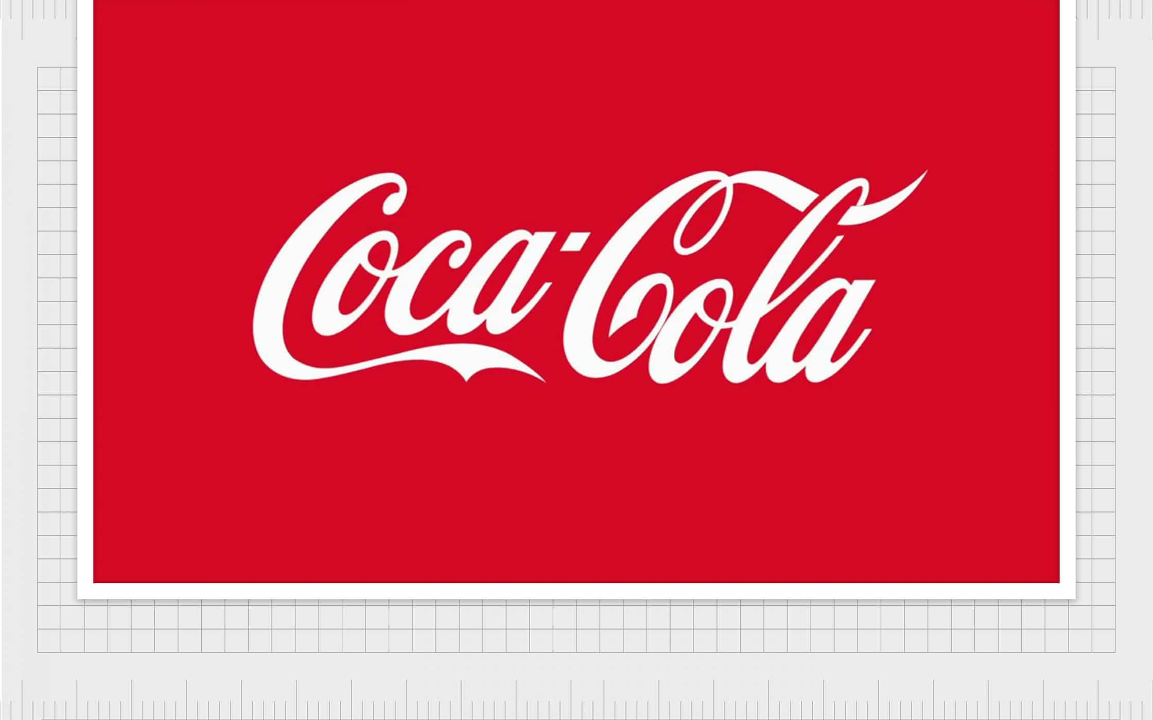
On the other hand, the swirling decorative font of the Coca-Cola logo is both fun and refreshing. It indicates the luxury of delicious flavour, while the flowing letters evoke images of liquid. Combined with the bright red colouring, the typography is eye-catching and exciting – perfect for the personality of the brand.
For many designers, choosing the right graphic design typography is like choosing the right outfit. You wouldn’t go to a wedding in the jeans you wore last week, just as you wouldn’t wear a tuxedo to work. Like many of fundamental principles of graphic design, context matters. Different fonts are appropriate for different things, and the right designer will be able to choose a style that suits your audience, your position in the marketplace, and the image you’re trying to create.
Picture perfect: Photography and graphic design
While you might not see many photos in brand logos, that doesn’t mean that photography and graphic design don’t go together. Many of the basics of graphic design resonate with the essential elements of professional brand photography. During a shoot, a photographer needs to make sure that the light, balance, and contrast of elements within each picture is perfect. The same is true for a graphic designer.
Additionally, graphic design and photography work particularly well together when it comes to things like web design and advertising. Ever since photography first entered the mainstream, it’s been a powerful part of marketing. Look back at early advertising, and you’ll see that while many companies started off with illustration, they moved to photography as quickly as they could.
While illustration has always been important to graphic design, photographic images capture emotion unlike anything else. They resonate with an audience and help customers to visualise themselves in the same situations as the people in the image. This might be why even the illustrations used by companies before photography was available are as realistic as possible.
In today’s digital era, photography in graphic design is more popular than ever. Now that it’s easier to upload and use digital images on everything from social media campaigns to blog strategies, we’re seeing photographs wherever we look. After all, a picture really can say a thousand words.
The only problem is that many of today’s designers still rely on stock photographs to support the pieces they create for their clients. Unfortunately, clients often see stock photos as inauthentic and outdated. When it comes to telling the story of a unique brand, the best graphic design experts know that they need one-of-a-kind images for their narrative.
A quick note on graphic design and illustration
In the first part of this article, we’ve covered some of the basics of graphic design, stretching all the way from shapes, to colours. However, before we go any further and start looking at design principles, we thought it might be worth talking about the difference between graphic design and illustration.
A lot of companies get confused when they start looking for a graphic design agency to help them with their branding strategies. They assume that a designer and an illustrator are one of the same – but this isn’t the case. While both practices can overlap at times, graphic design is a commercial art form, while illustration is a discipline of fine art.
While there are many elements of graphic design and illustration that correlate with each other, the average graphic designer is now capable of far more than any basic illustrator. In the past, all companies had was illustration to get their point across. In a world without digital processes and photography, organisations relied on illustration to communicate the values of their service.
In the same vein, today’s graphic designs attempt to communicate messages through a carefully-structured combination of text and visuals. The difference is that this communication can come in many different forms aside from the standard sketch.
Graphic design professionals can use hand-drawn illustrations to demonstrate the heritage and vintage nature of a company. On the other hand, they could use cutting-edge animations on a logo and website to help a brand appear more forward thinking. Graphic designers don’t just work with a pen and paper. They use comprehensive programmes, unique languages, and complex methods to create an identity for their client.
In simple terms, a graphic designer is someone who’s constantly evolving and constantly adopting the latest strategies to polish the visual side of their customer’s identity. Graphic design takes illustration to the next level.
The basic principles of graphic design
While the basic elements of graphic design include things like colour, shape, typography, lines, and even photography, the principles of design are something else entirely. Once designers have come to learn how different elements can work together to convey a message for their clients, they begin to explore how they can combine those features in the most effective way possible.
The principles of graphic design include:
- Balance.
- Alignment.
- Space.
- Hierarchy.
Even if you aren’t aware of these concepts in your marketing materials or brand logo, they’re still there. Design principles help to separate the good graphic designers, from the truly great ones.
1. Balance
Balance gives graphic design stability and form. It helps to distribute elements evenly throughout a logo or webpage by ensuring there’s plenty of space around all the right elements. While some designs use several different elements to portray a brand’s identity, each of those things needs to be perfectly balanced if they want to have the right impact.
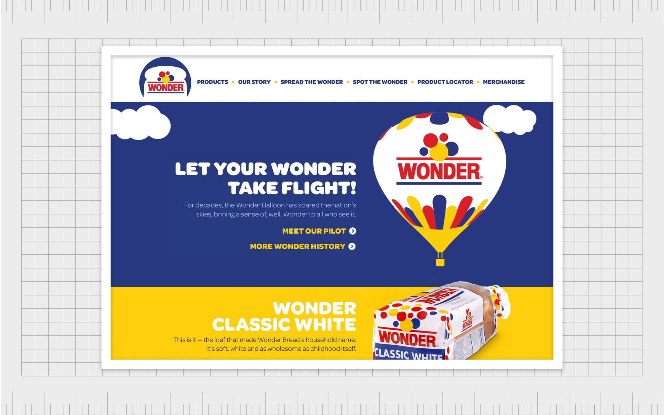
Look at the Wonder bread website for instance. There are various elements at play here, including different fonts, colours, shapes, and even photography. Without balance, these features would be jumbled together without rhyme or rhythm, leaving the viewer uncertain of where to look. However, because the designer has balanced light colours with dark, bold fonts with simple typography, everything looks organised.
2. Alignment
Alignment is another fundamental principle of design. It helps to create an ordered and sharp appearance by ensuring that each element has a logical connection. The concept of “alignment” doesn’t just have to relate to where products appear on a page, or how your content is organised. Colours can be aligned too. For example, designers might choose shades that naturally flow well together to draw the eye down a page.
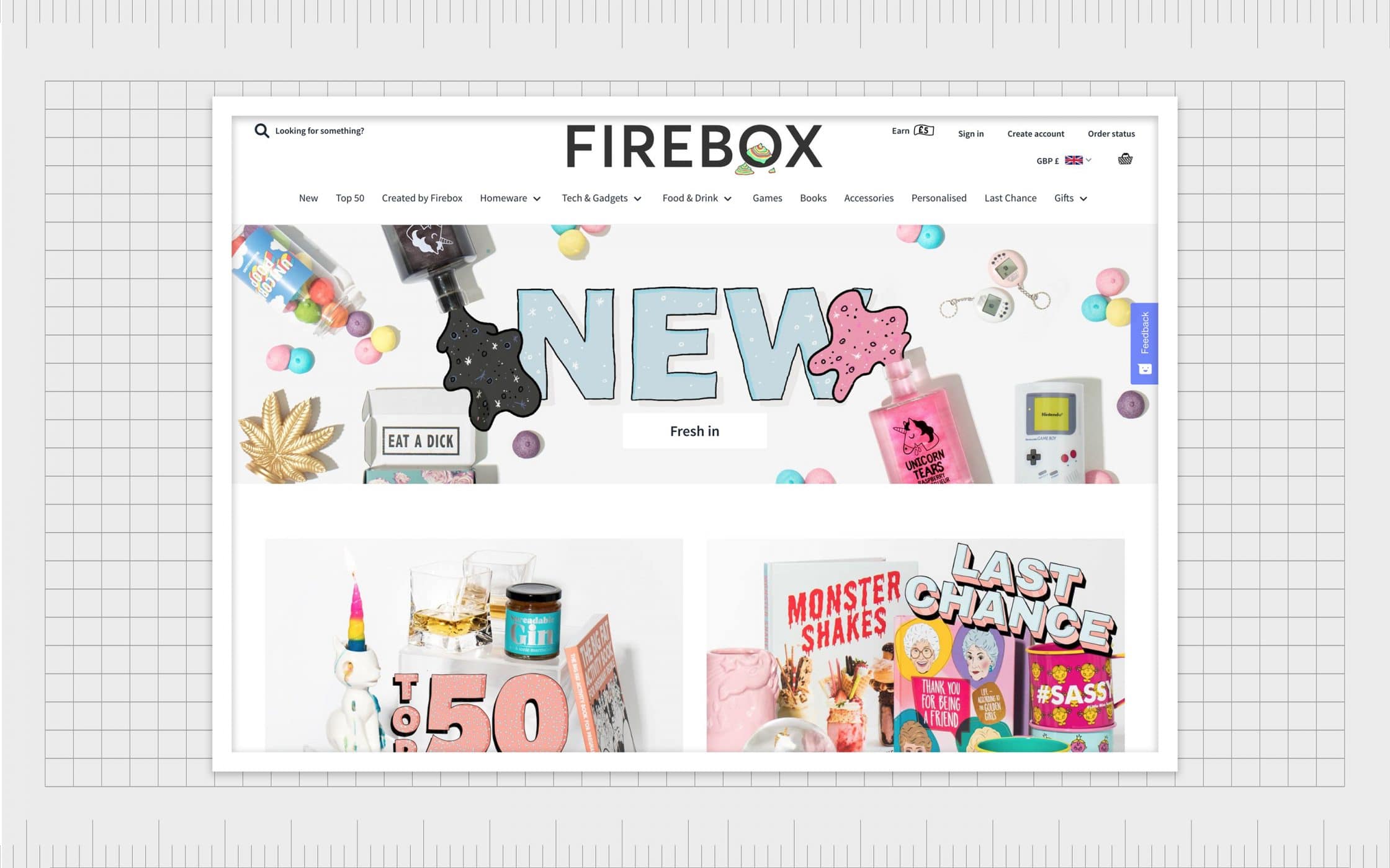
The Firebox landing page is a great example of alignment. The homepage links out other pages on the website with a different image for each segment. Those images are perfectly sized and shaped to create order for viewers, and everything is centred for a focused appearance.
3. Space
Space is one of the most important design principles in graphic design – and for good reason. If everything was connected in a logo or a page, then it would be nothing but a heap of mess. The white space and empty areas between elements in a design help to give more focus to the right places.
White space helps web pages to look uncluttered. It offers them clarity and ensures that viewers don’t feel overwhelmed. The more white space on a page, the easier it is to consume each element. Keep in mind that space doesn’t necessarily have to be “white” to be effective. It simply needs to be free from any other elements that might clutter the environment and draw the eye. Look at the Apple homepage for instance. The photo of the iPhone is centred in the middle of the page, with plenty of space between the image, and the title above.
4. Hierarchy
Finally, great graphic design involves organising multiple elements into a cohesive whole. When you’re working with a range of different features, you need to make sure that you’re giving more weight to the most important parts of your design. This is a design principle called “hierarchy” and it’s something that can be applied in a range of ways.
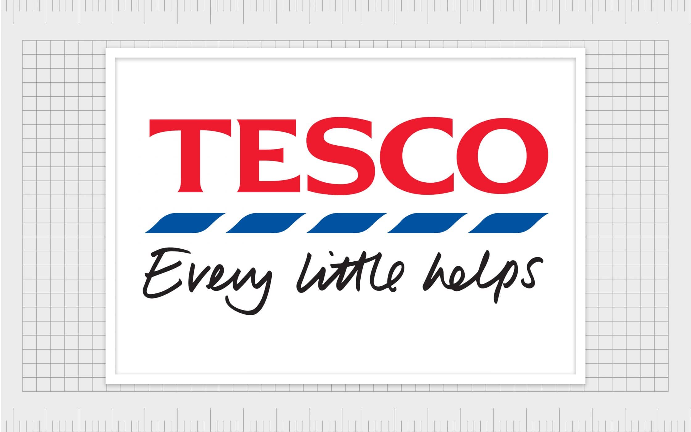
In a logo that contains both an image and typography, the image might be packed full of colour, which draws the attention of the eye first. On the other hand, if a logo has a tagline, the graphic design team would want to make sure that the viewer sees the logo first, before they start reading the text below it. With that in mind, the logo would be larger and more interesting than the font underneath. Look at Tesco’s logo for instance:
Hierarchy can have a part to play in web design too. The most important details on a page are often located at the top, or “above the fold”. However, lower-down elements can be highlighted to capture the attention of a viewer as they move through a page. A colourful call to action button, subheadings, or even the use of photography can pull the eyes to specific places at different times.
Making the most of graphic design online
Graphic design online or offline is all about conveying the right messages in the most compelling way according to the context of the brand in question. In a world where marketing campaigns are growing more complex by the day, it’s easy to overlook the importance of graphic design. However, without it, no company would be able to create a truly memorable image for themselves.
65% of the world is made up of visual learners. This means that we often build familiarity with brands based on their appearance before we ever have chance to get to know their values, background or story. Graphic design basics are the elements that designers use to ensure that they’re conveying the right initial messages to your customers so they decide that they want to learn more about you.
The right logo can be all it takes to spark an affinity in your customer that convinces them that you could be the perfect partner. Of course, in today’s digital world, there’s more to graphic design than logos and brilliant marketing campaigns. Every element of your presence, online and off, needs to be tailor-made to suit a specific personality. Graphic design is how brands speak to their audience before they have a chance to say anything at all.
Using the elements of graphic design, experts in the branding world have learned how to communicate with customers and prospective clients in an instant. Through shapes, colours, typography, and even principles like alignment, graphic design has the power to make a brand shine. It sets brands apart from their competitors, convinces customers of a brands value, and builds the foundations for an unforgettable identity.
If you enjoyed this article, you might enjoy these too:
— The future, present, and history of graphic design
— Getting in shape: The psychology of logo shapes

Clarity starts with a conversation.
Thanks—we’ll get back to you shortly.
Whether you're navigating a rebrand, merger, or simply need a clearer identity—we’re here to help. No hard sell, just honest advice from people who know the sector.
Let’s start with a simple question…
Prefer to email? Drop us a line.
Fabrik’s been helping organisations rethink and reshape their brands for over 25 years. We’ve guided companies through mergers, rebrands and new launches. Whatever stage you’re at, we’ll meet you there.