


Movement in graphic design: The movement principle of design

Movement in graphic design is one of the key principles designers use to give meaning, depth, and impact to a composition. Through movement in design, artists can create a sense of dynamism and life in a piece, even if you’re really just looking at a static image.
Used correctly, the illusion of movement draws us into a piece, creating excitement and intrigue. Elements of movement can also elicit an emotional response, pushing us towards a specific outcome or action.
Often, visual movement in web design is one of the tools designers use to push visitors towards a CTA button or checkout.
Though the movement principle of design is only one of the many elements designers need to consider when producing an impactful work, it’s something which needs to be addressed carefully. Learning how to use movement in graphic design correctly can be an extremely powerful skill.
Today, we’re going to explore the principle of graphic design movement, and how it works.
What is movement in graphic design?
Motion or movement in graphic design is one of the various elements designers use in everything from logo design, to web design, advertisement creation and more.
Whenever a designer needs to guide a viewers eye, illicit an emotional response, or give the illusion of motion in a piece, they turn to the principle of movement.
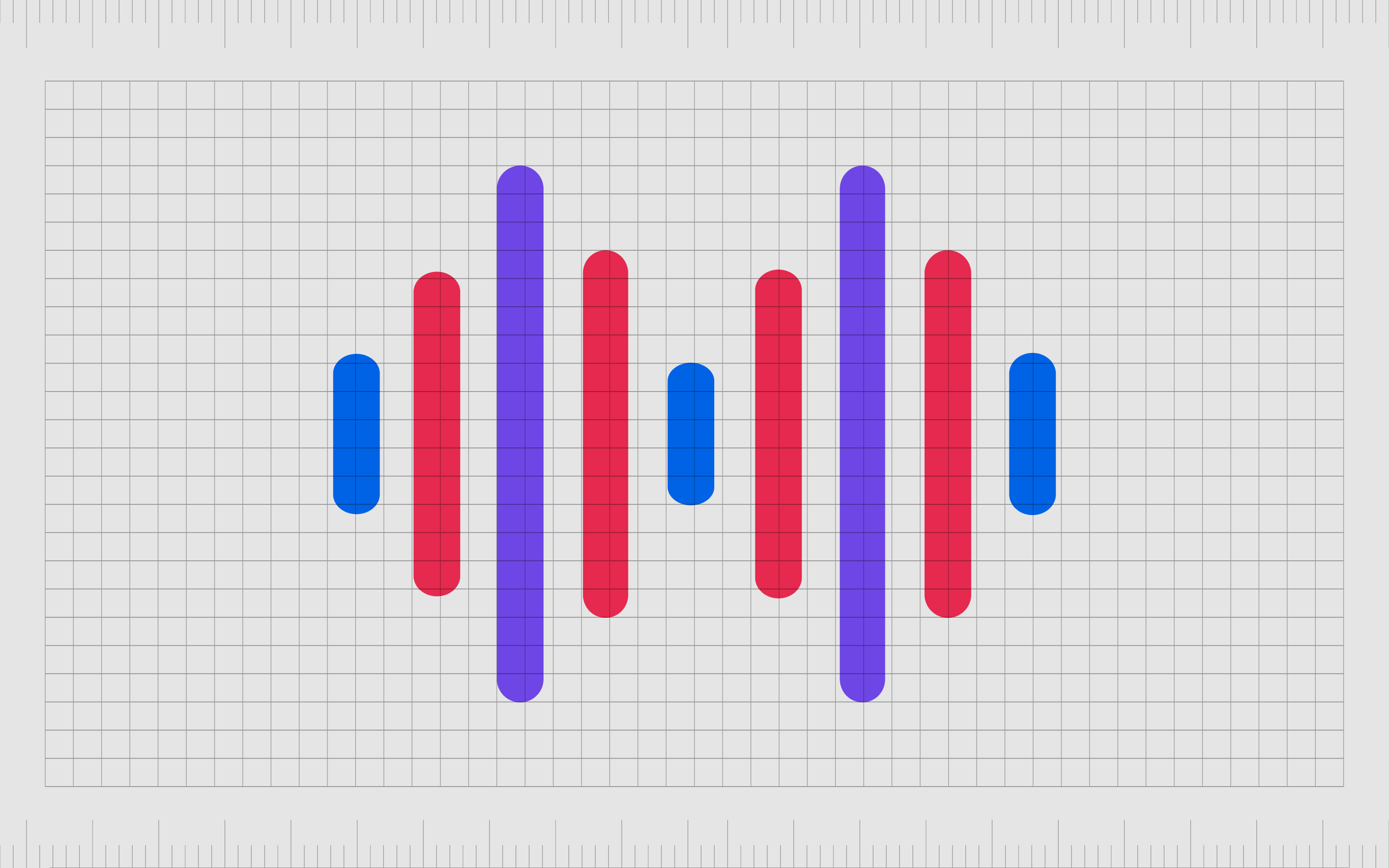
Movement in design can make it seem as though components within a composition are actually in transit. Optical illusions can trick the mind into perceiving motion when there is none.
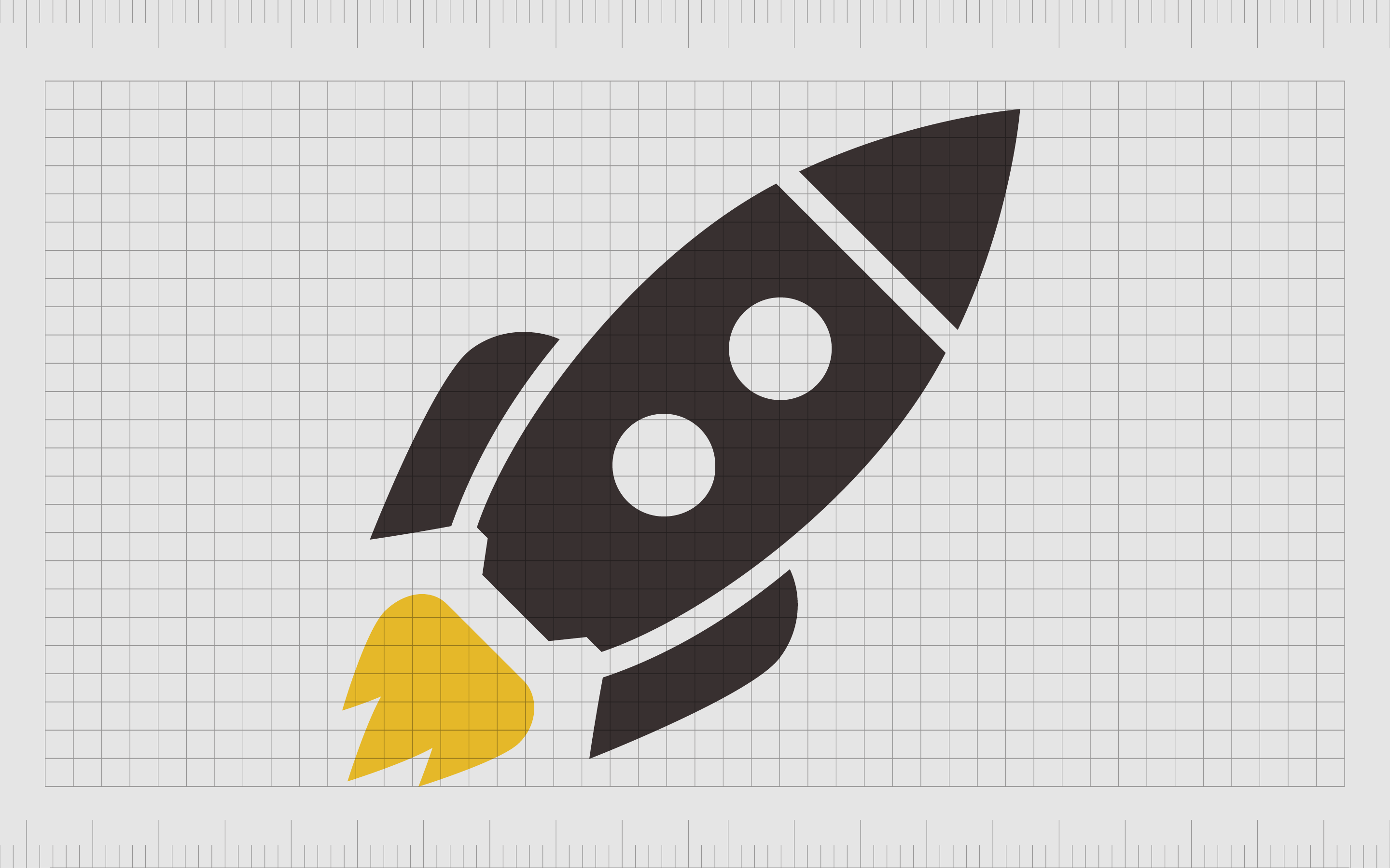
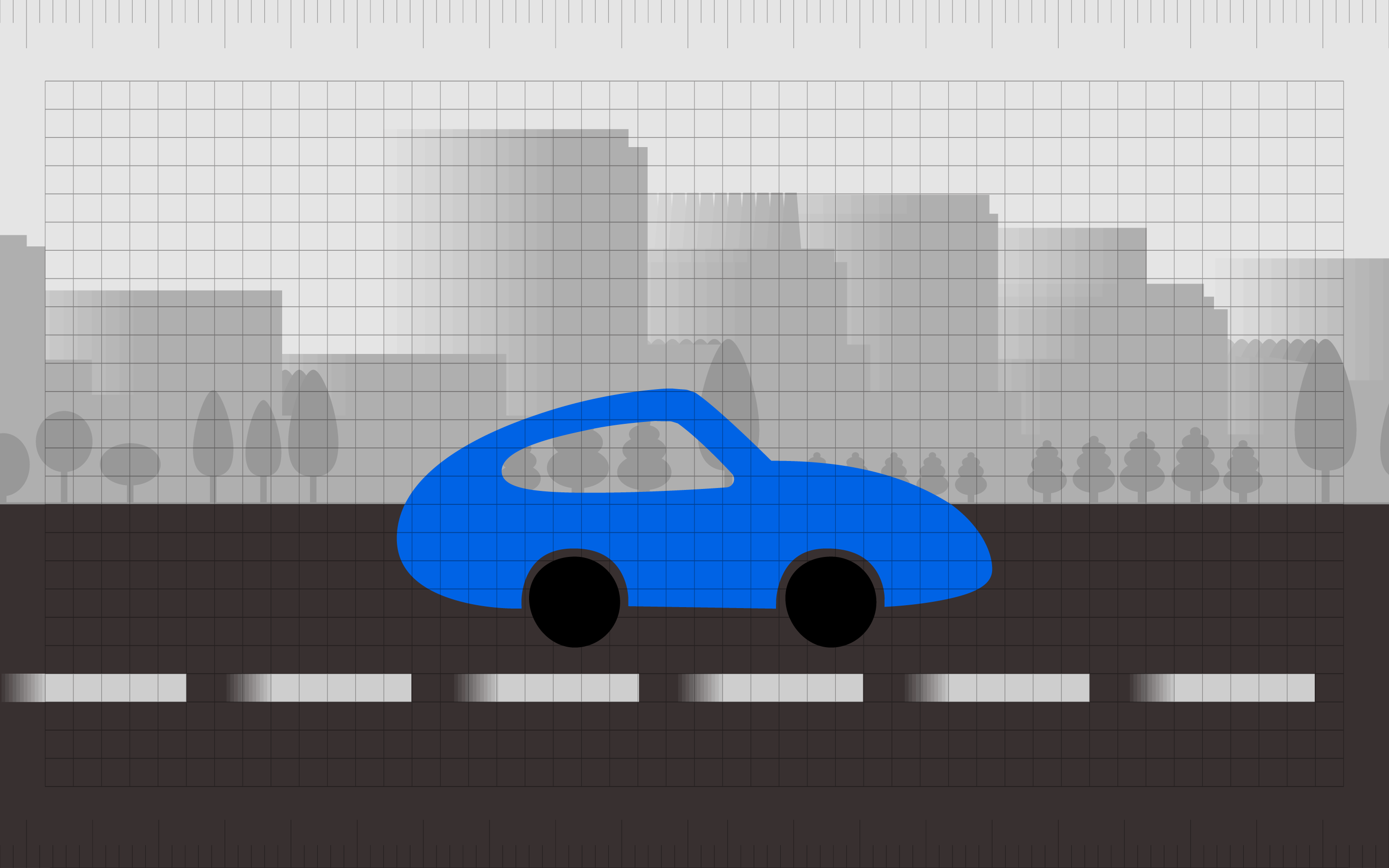
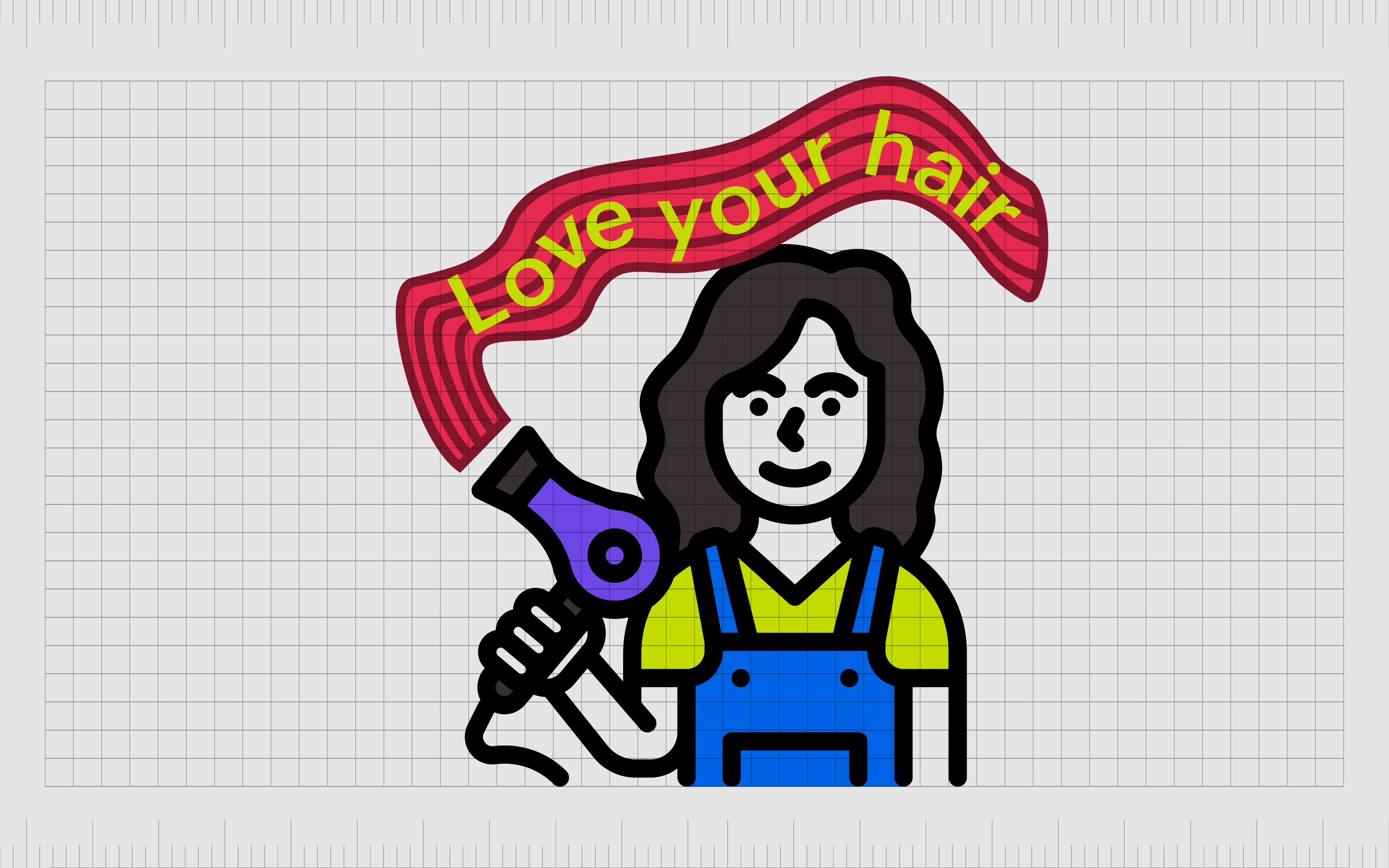
Alternatively, designers can also use graphic design movement to suggest action. For instance, when we see lines placed around a car on an image, these lines indicate the direction and speed of the vehicle.

Indeed, lines often possess their own movement. Curved lines feel graceful and elegant, while lines placed towards the left of a piece demonstrate an item moving forward.
Movement is typically used alongside and in conjunction with a number of other principles in graphic design, such as emphasis, repetition, and alignment.
Definition of movement in graphic design
Looking at a flat image or photograph, we logically know we’re not seeing any actual motion in certain colors and shapes. However, with the right use of color and other components, designers can convince our brains to perceive motion.
The illusion of motion allows designers to reach their audience through a psychological phenomenon, known as kinesthetic empathy. Essentially, this is a cognitive action wherein an observer reproduces a sense of motion when looking at an image.
In some cases, the illusion of visual movement is so great, it actually promotes action, nudging the viewer forwards or backwards. On a very basic level, graphic design movement can tell your audience where you want them to go.
Like many of the principles of graphic design, movement can be a very powerful tool. Indeed, too much motion in a piece is often overwhelming, and even uncomfortable. If a designer uses multiple elements of movement at once, it can end up confusing the eye and creating a sense of nausea.
Even color and shade combinations in motion need to be handled with care. Brighter shades and hotter colors tend to stand out, while cooler ones recede naturally into the background.
This is something a designer needs to be aware of, as the use of different colors can influence the motion or movement you create.
Why is movement important in graphic design?
For virtually all forms of design, the primary goal of the artist is to elicit a response. Motion can be an excellent tool for prompting specific actions and behaviors.
The natural tendencies of our brains mean the movement of our eyes over a composition is usually quite predictable. The human eye typically follows linear paths automatically, such as dotted and solid lines.
The eyes can also follow paths from dark to light elements, large to small elements, and unusual to usual shapes.
Through the movement principle of design, experts can influence the motion of our eyes, and direct how we move through a page of composition.
Movement also allows for far more dynamic, engaging images.
While movement might not be necessary for all projects, it can be a powerful tool for infusing your composition with life, and even providing potential customers with more information.
For instance, if you’re illustrating a poster for a theatre show, you’ll want to convey movement to help your audience understand the kind of excitement they’re going to feel in each scene.
Movement can even create an almost psychedelic effect, pulling an audience into a composition with mind-altering and unique experiences. By influencing the mind of your viewers, you almost immediately guarantee you’re going to create a more memorable experience.
What is the principle of movement?
The principles of design are the various “rules” today’s designers and creators use to have a specific impact on their target audience. Movement, alongside concepts like alignment, repetition, and contrast, is one of the most powerful tools for guiding a viewer’s eye through, and into a composition.
Movement influences the path the eyes follow when looking at a work of art.
Used correctly, movement adds significant compositional interest to a piece. It prevents an image from being static and boring and gives your visual identity an air of life.
If you want to create a landing page for your website capable of jumping out and grabbing the audience’s attention, you need movement. If you’re looking to design a logo which immediately stands out from the competition and sticks in the minds of your audience, motion in design will help.
Infusing your designs with elements of movements makes them feel more alive, dynamic, and impactful – making it a perfect tool for taking your designs to the next level.
How is movement used in graphic design?
A great designer can manipulate the experience a viewer has when taking in a composition.
Rhythm, line, color, space, and balance all work together to create a sense of movement and strengthen the impact of your design. With movement, you control the way your user’s eyes move across a screen or page, and ensure they get the right impact from the overall design.
Controlling movement is an important part of ensuring your users experience the final product of whatever you’re creating in the best possible way.
There are various ways designers use movement in graphic design, such as:
To guide the viewer
Using repetition and movement in conjunction can help to guide a viewer from one area of a composition to another. Repetition is a valuable tool for creating a sense of familiarity and comfort.
For instance, a number of lines or arrows pointing downwards creates a clear and consistent direction for the movement of an eye on the screen. The right movement strategies can even improve user experience.
Creating excitement
Motion combined with concepts like emphasis and rhythm can create a sense of excitement. Progressive rhythm and motion can make it feel like an element of a page is getting bigger or coming towards you as you scroll from the top to the bottom of the website, or vice versa.
This can generate intrigue.
Infusing a piece with life
Most of the compositions we see in the graphic design world are static, from the images on a webpage, to the posters on the street. The elements of motion in graphic design can replace this dull, and somewhat boring stillness with a sense of life.
Motion can make us imagine more depth in a piece, from dancing people, to jumping animals, and crashing waves, making the design more memorable.
What are the types of movement in graphic design?
As with most principles of graphic design, there are various ways to create the illusion of movement in a composition. Each methodology requires regular practice and caution. As mentioned above, the principles of design movement can be some of the hardest to grasp.
If you go too far with your elements of movement, you may end up confusing and overwhelming the audience.
The movement principle of design can usually be defined by three primary types:
Kinetic motion in design
Kinetic motion in design refers to how components in a composition physically change their position in space and time. An animation on a webpage uses kinetic movement to actually demonstrate something movement.
GIFs and similar concepts have become increasingly attractive in some parts of web design, but they can also be easily overwhelming.
Too much kinetic motion in design can make it difficult for a user to understand where they should be directing their attention. Kinetic movement can also have an impact on the performance of a website or application, slowing it down.
Rhythmic movement in design
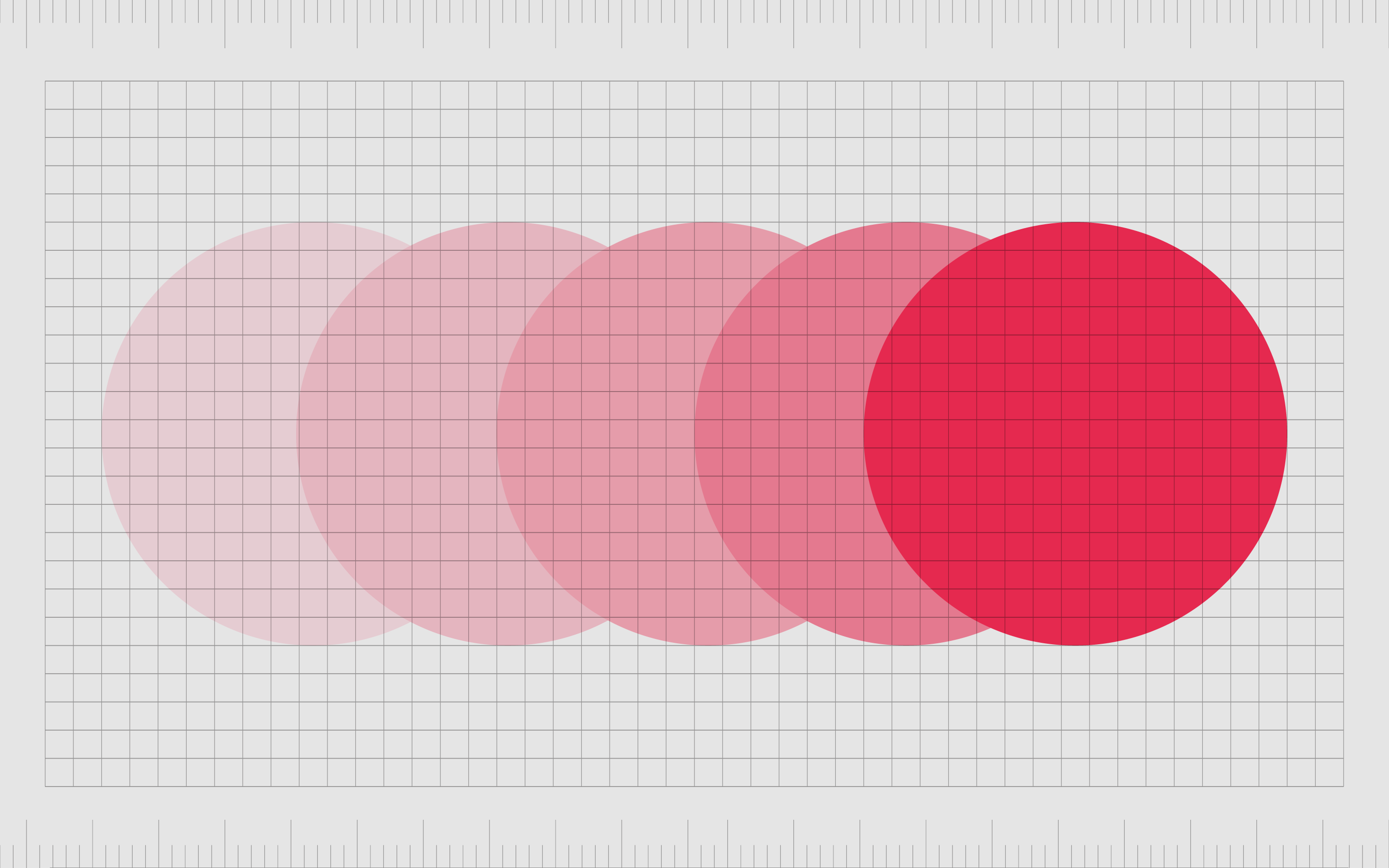
Rhythmic movement builds on the concept of rhythm and repetition in the principles of design. While there’s no actual motion present in rhythm design, the use of certain lines, curves, colors, and shapes guides your eye in a specific way.
Rhythmic motion is one of the most common ways designers leverage motion in their compositions. It’s easy to use lines, curves, and other design elements to change the way the eye naturally consumes content and add more visual interest to a project.
The key to success with rhythmic motion in design is knowing exactly how your customer’s eye will move through a composition. It’s worth keeping in mind some customers may be drawn to certain colors over others, for instance.
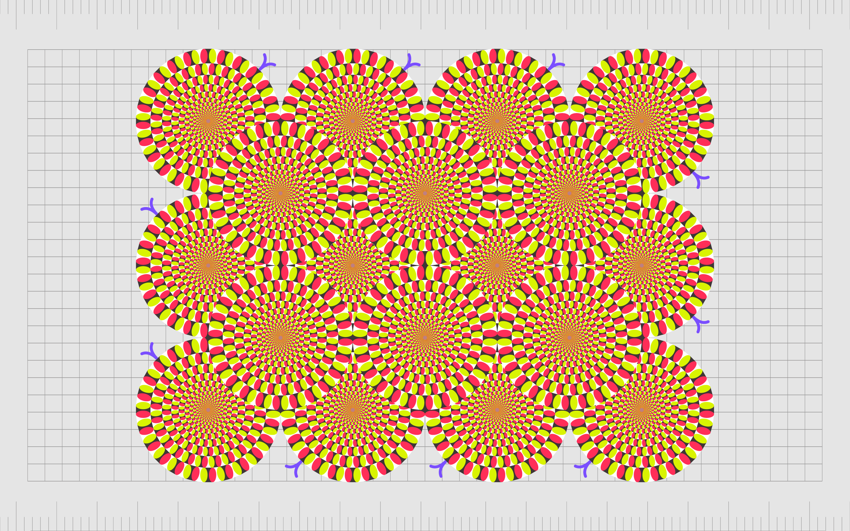
Illusion of movement
The concept of motion illusion or illusory motion applies to how elements can interact with each other in a composition to imply motion. The most common example of this is in optical illusions.
There are countless different instances of optical illusions where you might think you can see objects pulsing or rotating on a screen or page when they’re actually standing still.
Creating an optical illusion in this style can be a complex process. It takes time to carefully consider how the various elements of a composition will work together with the natural movement of the human eye.
Not all optical illusions will automatically create the right result.
How to use movement in graphic design
The complexity involved in the principles of design movement often mean designers need to work particularly hard to master this skill. Movement is often influenced heavily by other principles of graphic design too, like rhythm, unity, emphasis, and repetition.
With this in mind, designers will often need to hone their skills in all principles to truly master movement.
As you’re practicing your use of visual movement, some of the most common strategies you can use include:
Working with lines
Lines are some of the simplest and most common elements of movement in graphic design. An object which would otherwise seem flat, and static can be imbued instantly with a sense of movement, just by placing lines in a specific space.
The chances are you’ve used lines to indicate movement before when sketching random cartoons and designs. Lines automatically direct the movement of the eye and tell us something is in motion, even if there’s no genuine action to consider.
Medium disturbance
Disturbances are a clear indication of movement. When you run your hand through some water and see the ripples separating, you have evidence of movement. Similarly, breaking through other mediums in graphic design can also help to demonstrate movement.
Medium disturbance is a similar process to using motion lines. The idea is to use emphasis, color, and shapes to essentially separate your design from the rest of the composition, and make it appear as though it’s in motion.
Certain shapes, like the illusion of flames, can be particularly useful for conveying motion, because we associate flame with movement and flickering.
Anticipated movement
Anticipated movement is yet another common example of motion in design. This technique uses psychology to essentially have us “expect” motion. If you see a cat with its shoulders hunched down, for instance, you automatically expect a pounce.
Building an image which conveys the initial stages of a movement your audience will be familiar with is a great way to convince their brain to imagine the rest of the motion on its own. The key to this process is making sure you know what kind of movement your audience is familiar with.

Using multiple images
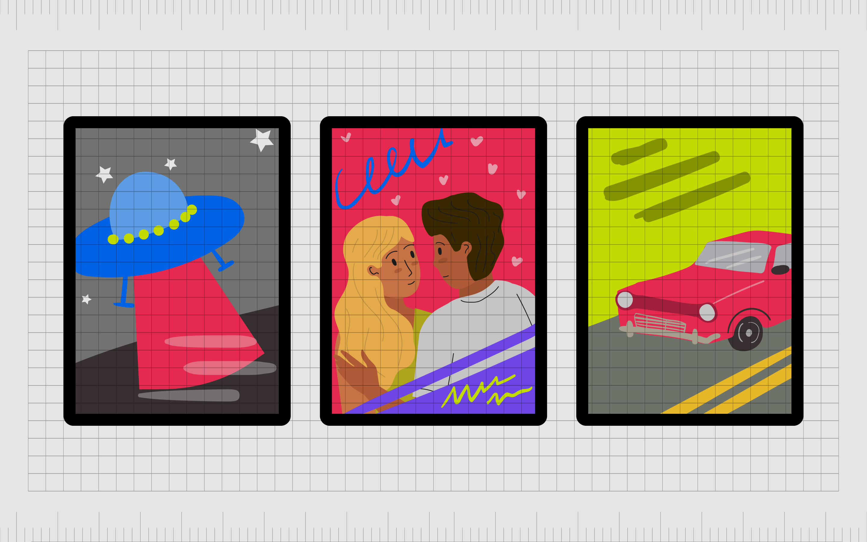
To create old-fashioned cartoons, designers and artists used to work with hundreds of slightly-changed images, all combined together to create the illusion of movement. Any motion in the world, slowed down, is a series of slightly altered images.
By using multiple images in one environment, we can highlight the elements involved in a movement, and allow viewers to naturally combine those components. For instance, if you show countless pictures of a bird flapping its wings on a website, your audience will naturally imagine the flight.
Transparency
Transparency is a technique similar to another form of motion called “blurring”. The idea is that when components of a composition are completely static, they’re also solid.
However, movement is naturally more blurred and complex. A hummingbird’s wings, for instance, look like an almost transparent buzz of motion.
Adding transparency to different elements of your composition can create the illusion of motion. It makes your audience feel as though they’re seeing a slightly slowed-down version of a rapid action.
Blurred outlines
Similar to transparency, blurred outlines mimic the natural experience of motion we get in everyday life. Objects moving quickly often appear somewhat blurry, as its harder for our eyes to focus clearly on something not standing still.
Because we’re used to seeing less solid outlines with items in motion, we automatically associate blurry images with motion.
Lines of force
Lines of force are a slightly more complex way of using lines to create a sense of graphic design movement. Rather than simply using straight lines on one side of an image to indicate something moving in a specific direction, you use a series of lines to direct the movement of the eye.
A series of lines can also use a sense of rhythm, getting larger or smaller, or gradually embracing a greater amount of white space, to make it feel as though you’re moving through an image.
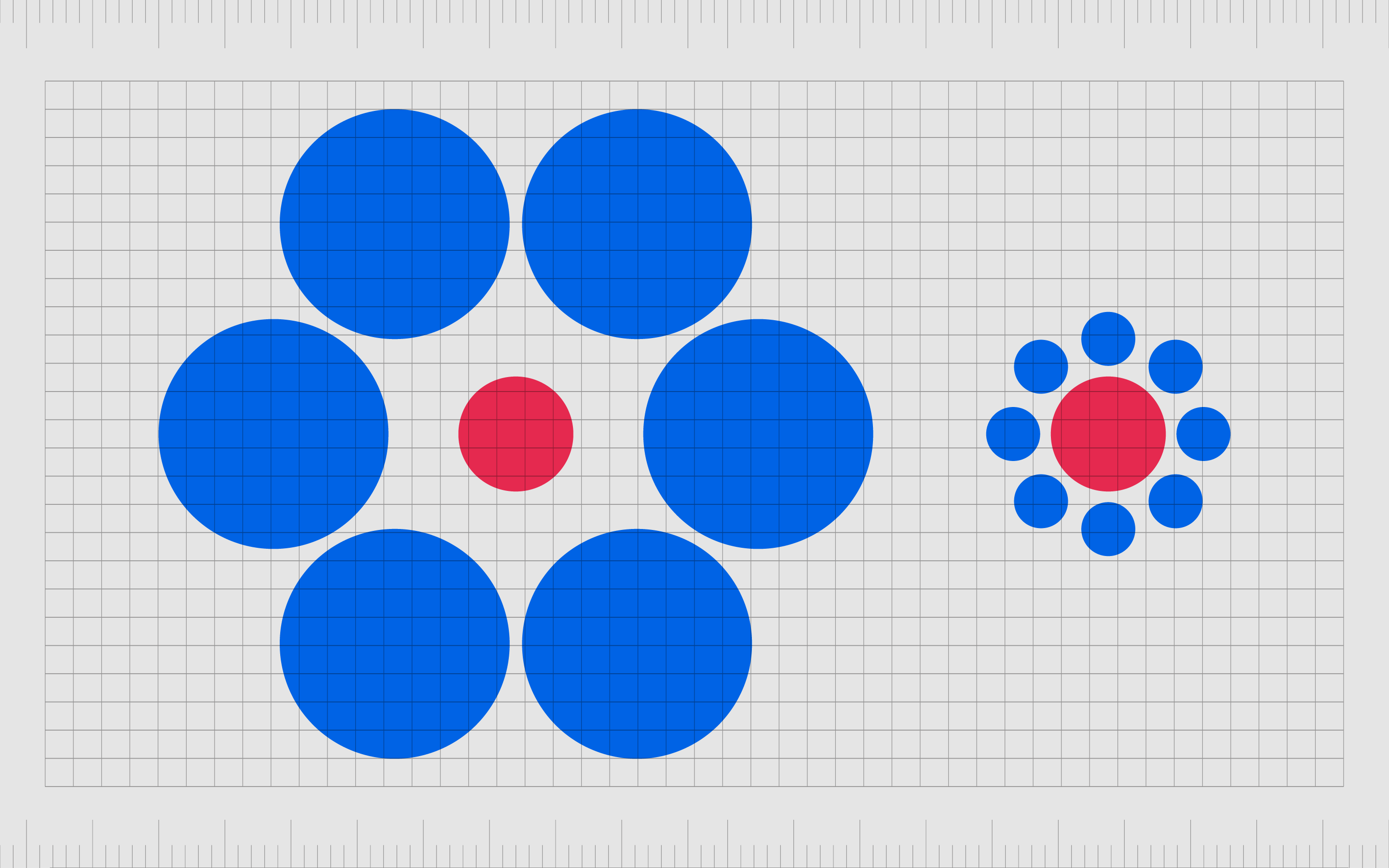
Optical movement
Optical movement is another concept in graphic design which combines the two elements of rhythm and motion. Optical movement involves understanding how the eye perceives certain shapes and components in a specific way.
For instance, curved shapes tend to direct the eye in a circle around a composition.
With curved lines, just like straight lines, you can tell your audience where you want their vision to go, and even force your user to look at something differently to how they normally would.
Optical illusion
Optical illusion is probably the most dramatic version of movement in graphic design, but it’s also one of the most memorable. With optical illusion, you leverage the use of white space and the positioning of different elements to create the idea of motion.
Optical illusions trick the brain into seeing movement between patterns, because of things like contrast, and emphasis. The use of rapid geometric repetition can also interact with our brains in a unique way, causing us to imagine movement where there is none.
Optical illusion can be w powerful way to fool the mind with color and shapes, but it can also be nausea-inducing in the wrong circumstances.
Learning from examples of movement in graphic design
Above, you’ve seen various examples of movement in graphic design, created with everything from lines and shapes, to contrasting shades of color.
Motion in graphic design is a compelling design principle which can have a significant impact on any audience, driving their attention to certain parts of a composition, and influencing an emotional response.
However, motion can also be a dangerous thing. Using too many elements of motion in graphic design will often lead to a sense of overwhelm and confusion in your target audience.
Designers need to think carefully about how they’re going to manipulate the movement of their viewer’s vision, and what sort of impact this movement will have overall.
In the right circumstances, movement can encourage action and push your customers to remember your brand for longer.
Used incorrectly, movement will cause your customer to hit the back button on your website or delete your app, simply because looking at a composition for too long makes them feel unwell.
As with all principles of graphic design, if you’re unable to master the skill of movement for yourself, it’s best to seek help. A specialist designer can show you how to leverage motion more effectively.
Fabrik: A branding agency for our times.
Now read these:
—Introducing the principles of graphic design
—Understanding balance in graphic design
—Discover the alignment principle of design
—What is the hierarchy principle of design?
—Exploring the unity principle of graphic design
—Getting to grips with contrast in graphic design
—Understanding the emphasis principle of design
—Discover the repetition principle of graphic design
—What is the pattern principle of graphic design?
—Exploring the rhythm principle of graphic design
—Why variety is an important factor in design
—How to bring harmony to graphic design projects
—The principle of white space in graphic design
—How to use the proportion principle in design

Clarity starts with a conversation.
Thanks—we’ll get back to you shortly.
Whether you're navigating a rebrand, merger, or simply need a clearer identity—we’re here to help. No hard sell, just honest advice from people who know the sector.
Let’s start with a simple question…
Prefer to email? Drop us a line.
Fabrik’s been helping organisations rethink and reshape their brands for over 25 years. We’ve guided companies through mergers, rebrands and new launches. Whatever stage you’re at, we’ll meet you there.