


The most complex logos in the world today

Complex logos aren’t nearly as common today as they were several decades ago.
In the past, many companies attempted to convey as much information in their logo as possible. They wanted to differentiate themselves from the competition and connect with their audience emotionally. This meant filling a brandmark with visual depth.
At that time, ensuring a logo was suitable for digital mediums wasn’t as crucial. Brands didn’t need to worry about whether a logo would translate well to a tiny app icon or smartphone screen. This gave them more scope to work with complicated logos.
Over the years, complex logos have grown less popular as companies have attempted to simplify and refine their brand image. Most brandmarks today are simple shapes or wordmarks with very few added embellishments. But there are still some more complicated logos out there.
Here’s your guide to the most complex logos in the world today.
Is a complex logo good for a brand?
Deciding whether to use a complex or simple logo can be a challenging process for many brands. In certain industries, it’s more common to see complicated logos.
As an example, the automotive landscape is packed full of more detailed designs, particularly in the luxury sector. Companies like Porsche and Lamborghini have inspired more depth from competing brands.
In other spaces, such as technology, it’s more common to stick with simple geometric shapes and abstract logos. Think of Slack, Spotify, or Airbnb.
Generally speaking, most brand experts recommend a simple logo over a complex alternative. Usually, any logo aims to create recognizable images that consumers can easily define. The fewer elements in a logo, the less there is for your audience to remember.
At the same time, simplistic logos generally work better on a range of different platforms.
It’s much easier to convert a basic logo into an icon for a smartphone screen or app. However, this doesn’t mean complicated logos don’t serve a purpose. A complex emblem can convey heritage, sophistication, and professionalism in the right circumstances.
As with any logo design, the key to success is thinking about what you want to achieve with your brand image and identity.
Complex logo examples: Today’s complicated logos
As discussed earlier, there are fewer complex logo examples in the world today than there once were. Many companies have gradually simplified their emblems over the years.
Apple has eliminated almost all of the complexity from its logo, and even the Starbucks design has grown more refined. However, some images could still be defined as complicated by today’s standards.
Here are some of the best complicated logo examples in the modern world to give you an insight into how companies use detail and depth in their images.
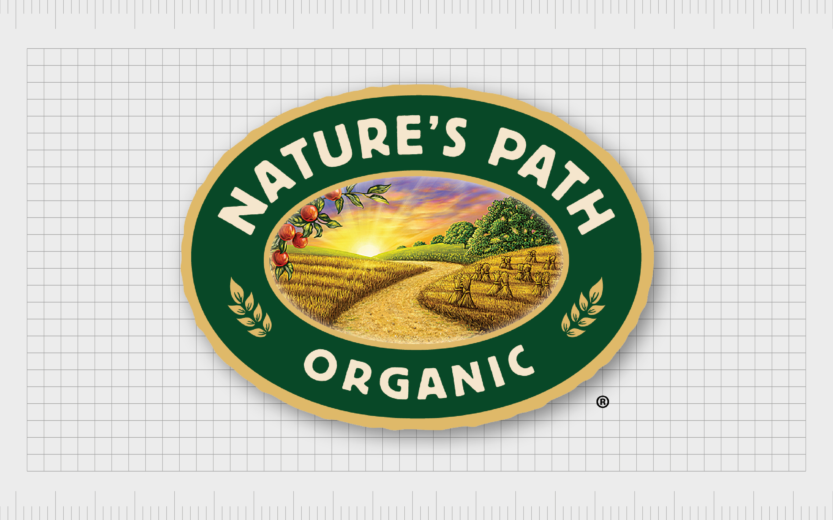
Nature’s Path
Nature’s Path is an organic food company with a strong family background. The organization is best known for its breakfast cereals as well as a range of other products, like granola bars. Since launching in 1985, the business has retained a lot of the elements of its original logo.
In the current emblem, we see an oval-shaped badge with a detailed scene inside, depicting a winding path through a natural setting.
The image is intended to give context to the company’s name while drawing attention to the organic ingredients the business uses in its products. The reassuring design is also fantastic for conveying a family-owned brand.
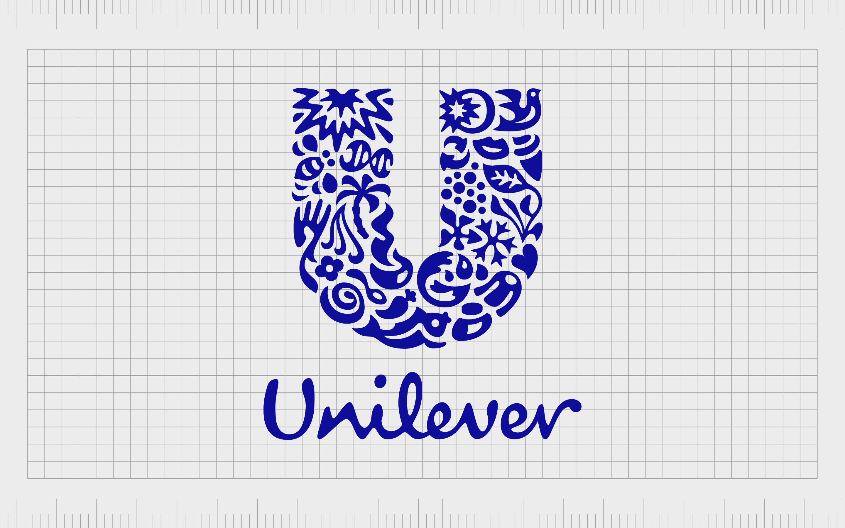
Unilever
Perhaps one of the best-known examples of complex logos in the world today, Unilever’s emblem is complicated because of the sheer amount of detail involved in the image.
The British multinational company is responsible for producing a huge range of different items, from ice cream and food to cleaning agents and beauty products.
Unilever’s logo has remained the same since 2004 and aims to provide insight into the various types of items the product has to sell. There are countless hidden pictures within the large “U” shape, including a DNA spiral, a set of lips, and a leaf.
The design highlights just how diverse the brand is and keeps customers staring at the picture for longer than a few seconds.
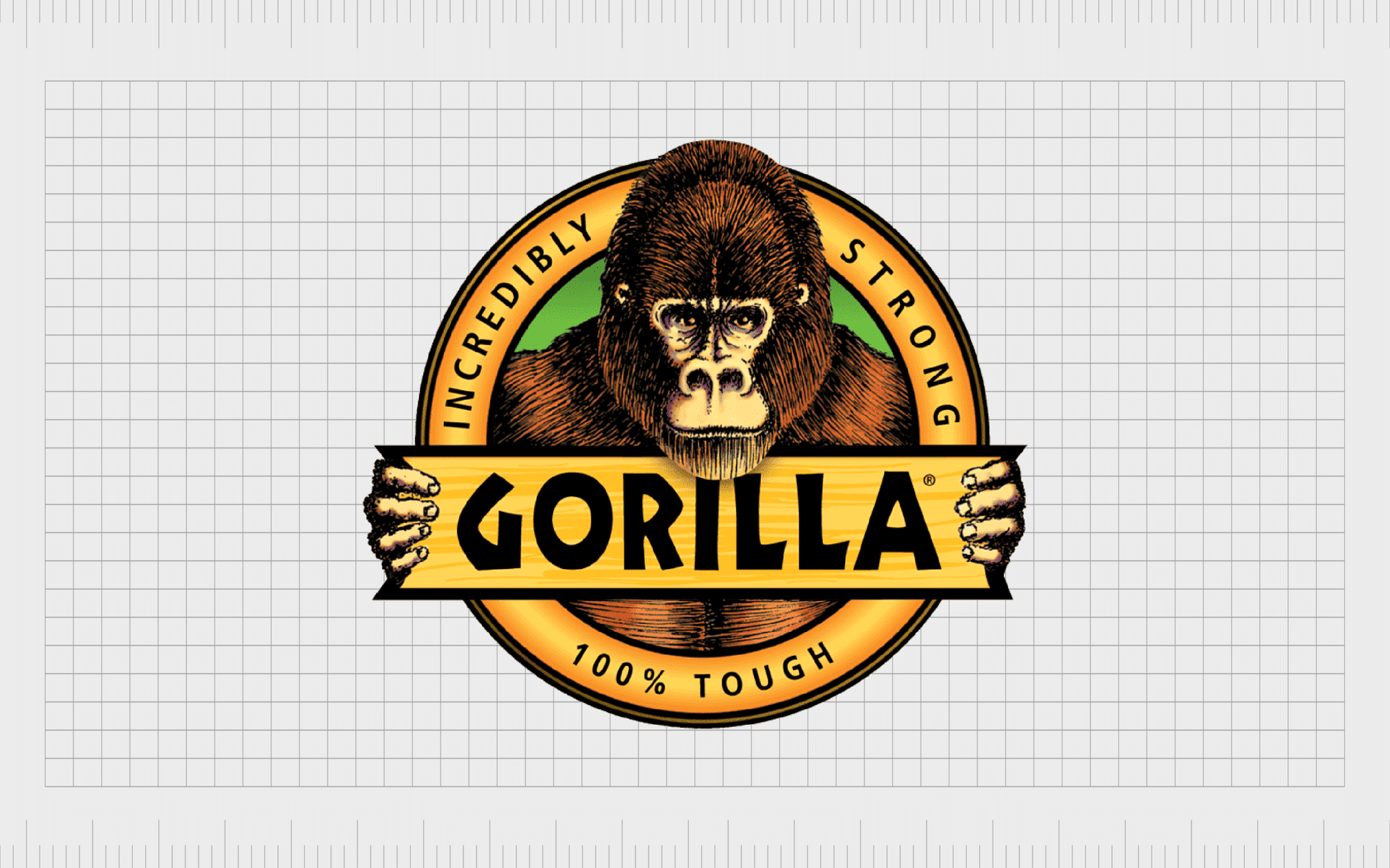
Gorilla Glue
An American brand of well-known adhesives, Gorilla Glue is best known for the original Gorilla Glue product, which was first sold in 1994. The company also makes a host of different products, like epoxies and tapes. For years, the image of this business has remained pretty consistent.
The Gorilla Glue logo features a detailed image of a gorilla inside of a circle badge displaying some of the unique selling features of the product.
The Gorilla is holding onto a banner showcasing the business’s name in bold, block font. It’s an eye-catching image intended to grab the attention of people browsing store shelves.
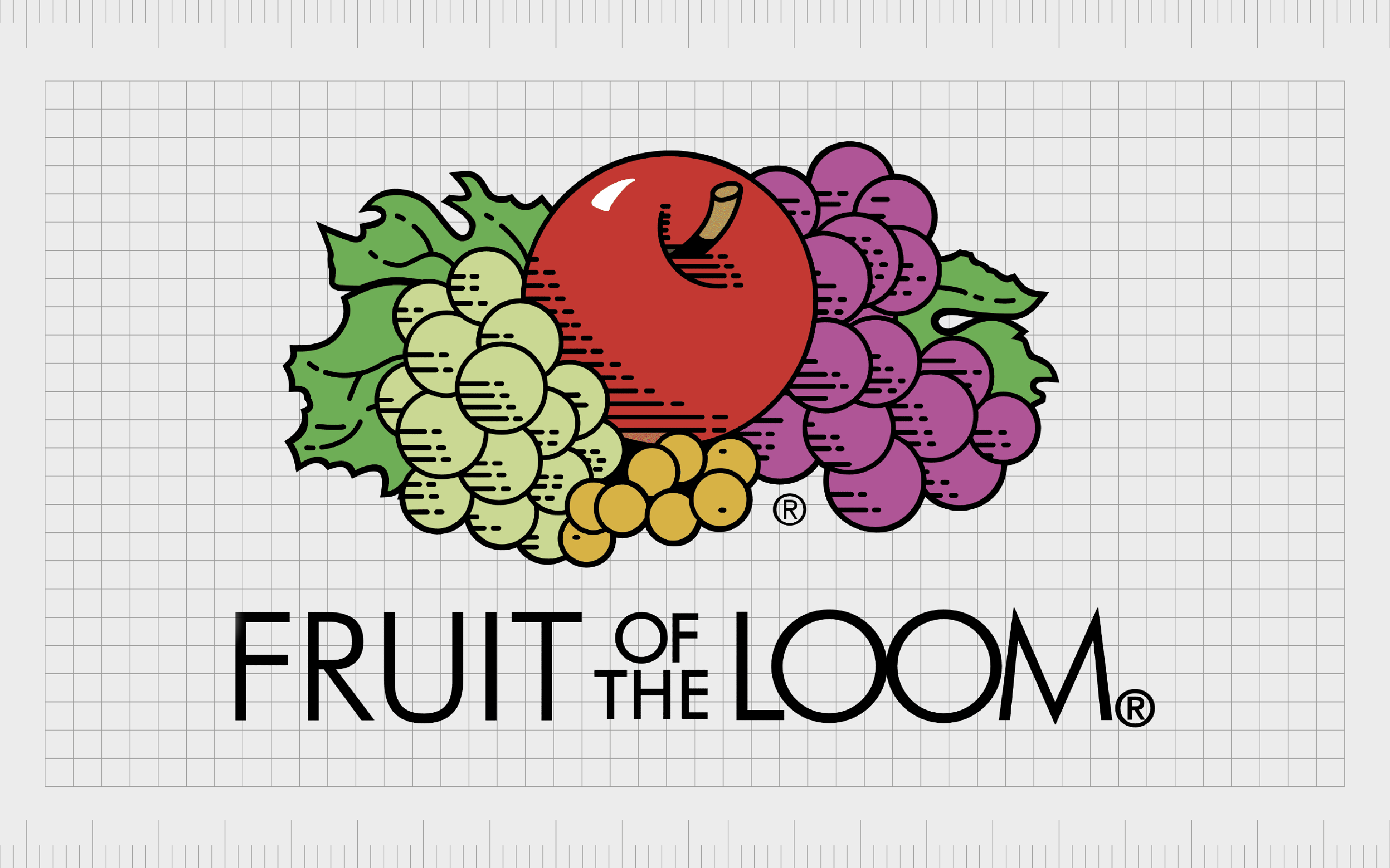
Fruit of the Loom
One of the best-known textile companies in the world today, Fruit of the Loom started life more than 171 years ago in 1851.
The American company manufactures a range of different clothing items, including products for corporate wear. Over the years, the imagery for this business has remained pretty consistent, with plenty of detail included.
Today, the Fruit of the Loom logo is a bright and eye-catching image, displaying a number of different types of fruit, with varying levels of detail and shading. Underneath the selection of fresh produce, we also see the name of the company in a relatively modern, lightweight sans-serif font.
The image still has quite a modern appearance despite its detail.
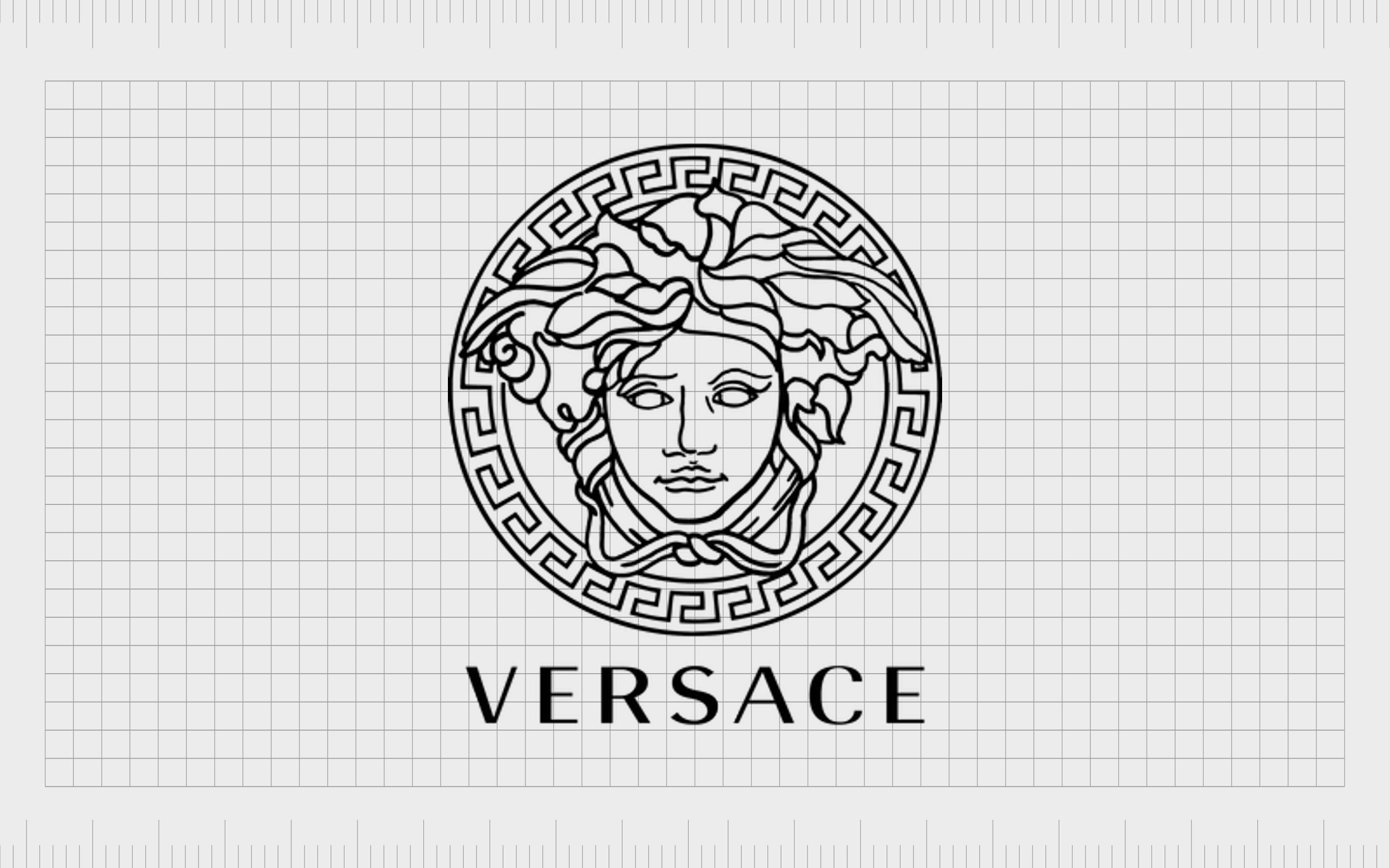
Versace
If you’re familiar with the fashion world, then you’re probably aware of the Versace brand.
First launched in 1978, this Italian luxury fashion company is best known for its bright colors and flashy prints. The company’s logo is particularly unique compared to many of the simplistic emblems used by fashion companies today.
According to the Versace business, the logo is inspired by Medusa, and the idea that the right imagery can stop a person in their tracks. The design is extremely detailed, with a patterned circle around the head of the woman and a wordmark presented underneath.
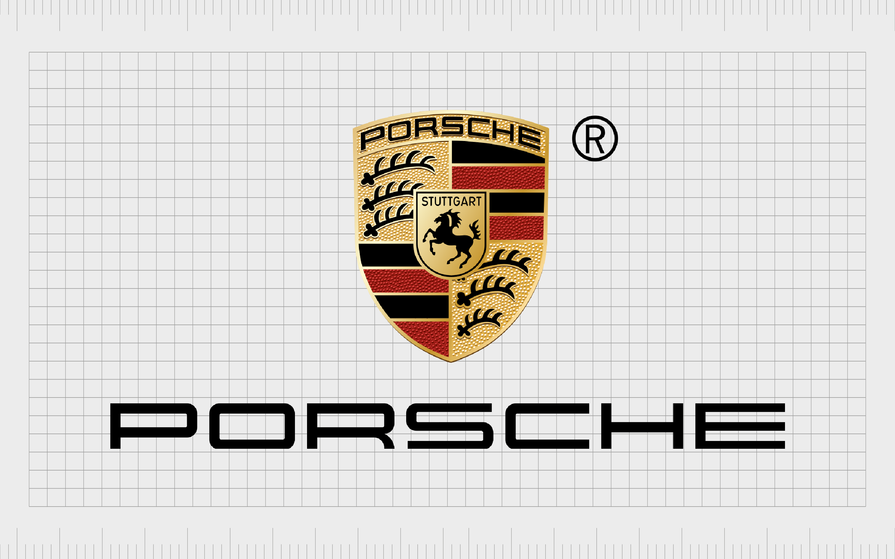
Porsche
If you’re a fan of luxury car brands, you’re probably familiar with the Porsche logo. The image the company uses today isn’t quite as complicated as it once was, but it still involves a lot of detail. The Porsche company built its image as a testament to its history and heritage.
The various elements of the logo are references to the crests of different locations in Porsche’s history. The larger shield represents the Wurttemberg colors and details, while the central shield is a reference to the Stuttgart coat of arms.
Learn more about the Porsche logo here.
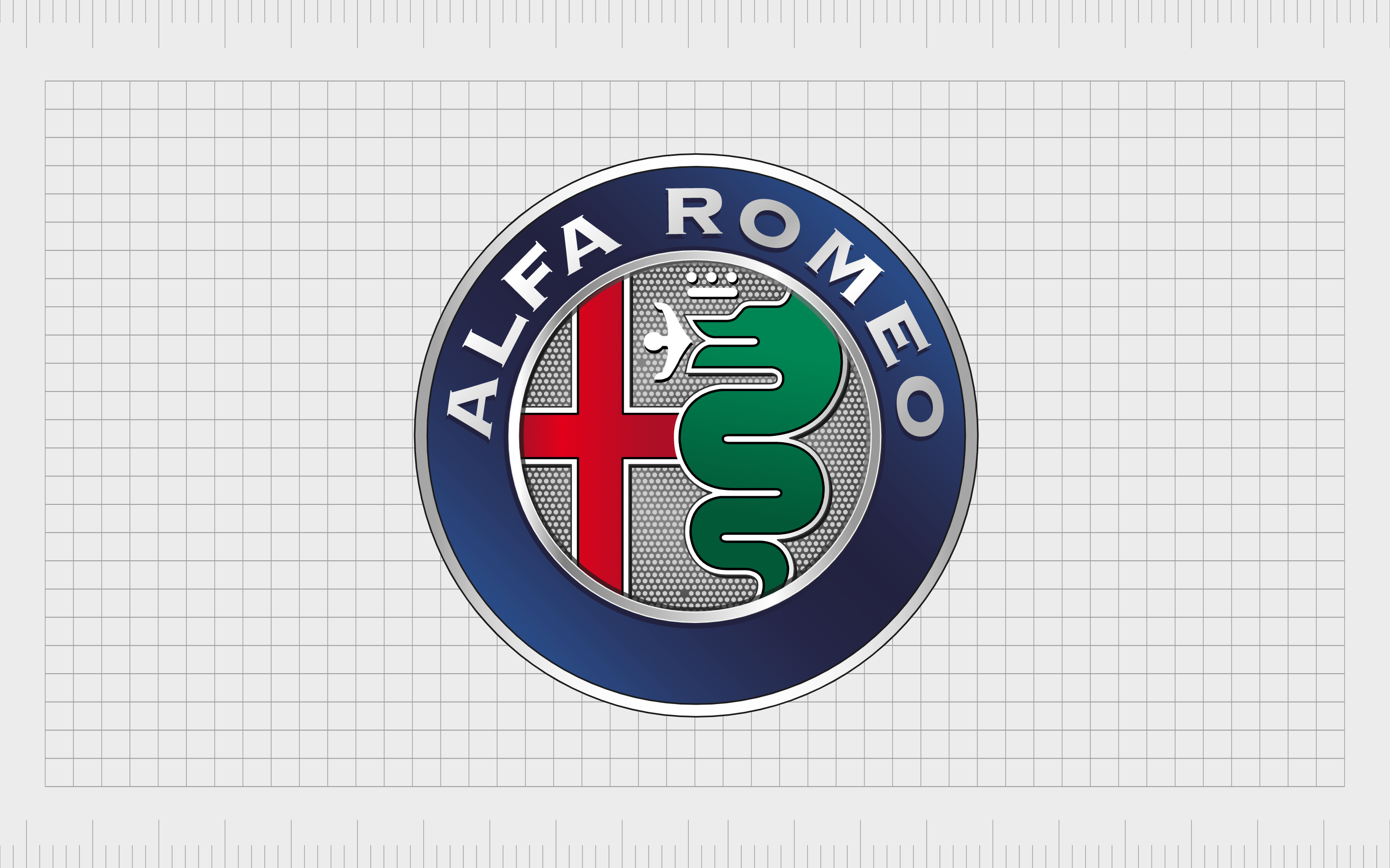
Alfa Romeo
Another automotive company with quite a lot of detail in its logo is Alfa Romeo. The company first launched in 1910 and has used similar elements for its brand image for a number of years. Although, like Porsche, many components have been refined over the decades.
The Filarete Tower of Biscione Visconteo inspired the brand mark.
The Biscione snake remains an important part of the Alfa Romeo logo today. It highlights the company’s connection with Milan and the story of a man being eaten by a huge snake. The design has quite a unique history and differentiates the brand from the competition.
Learn more about the Alfa Romeo logo here.
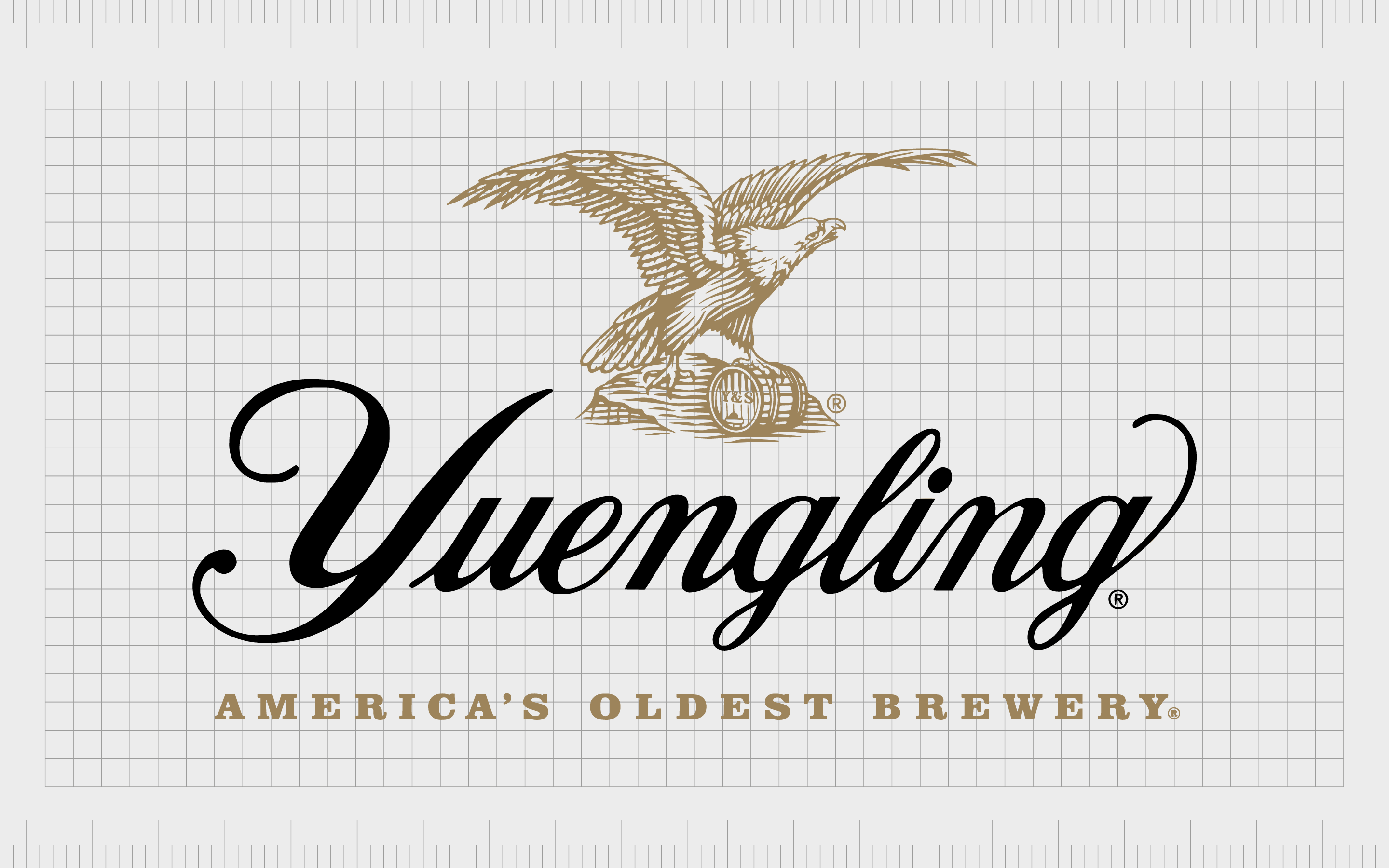
Yuengling
We can find quite a few examples of complex logos when heading into the beer and brewing space. Many brewing companies have used these images as a reference to their history.
The company Yuengling and Son launched in 1829, making it one of the oldest breweries in the craft beer space. It maintains a reference to this heritage in its logo.
The logo features the company’s name in a scroll-style golden and yellow banner. Underneath this wordmark is an artistic image of a stunning landscape, complete with trees, mountains, and a stream. Detailed hops and barley surround the central image.
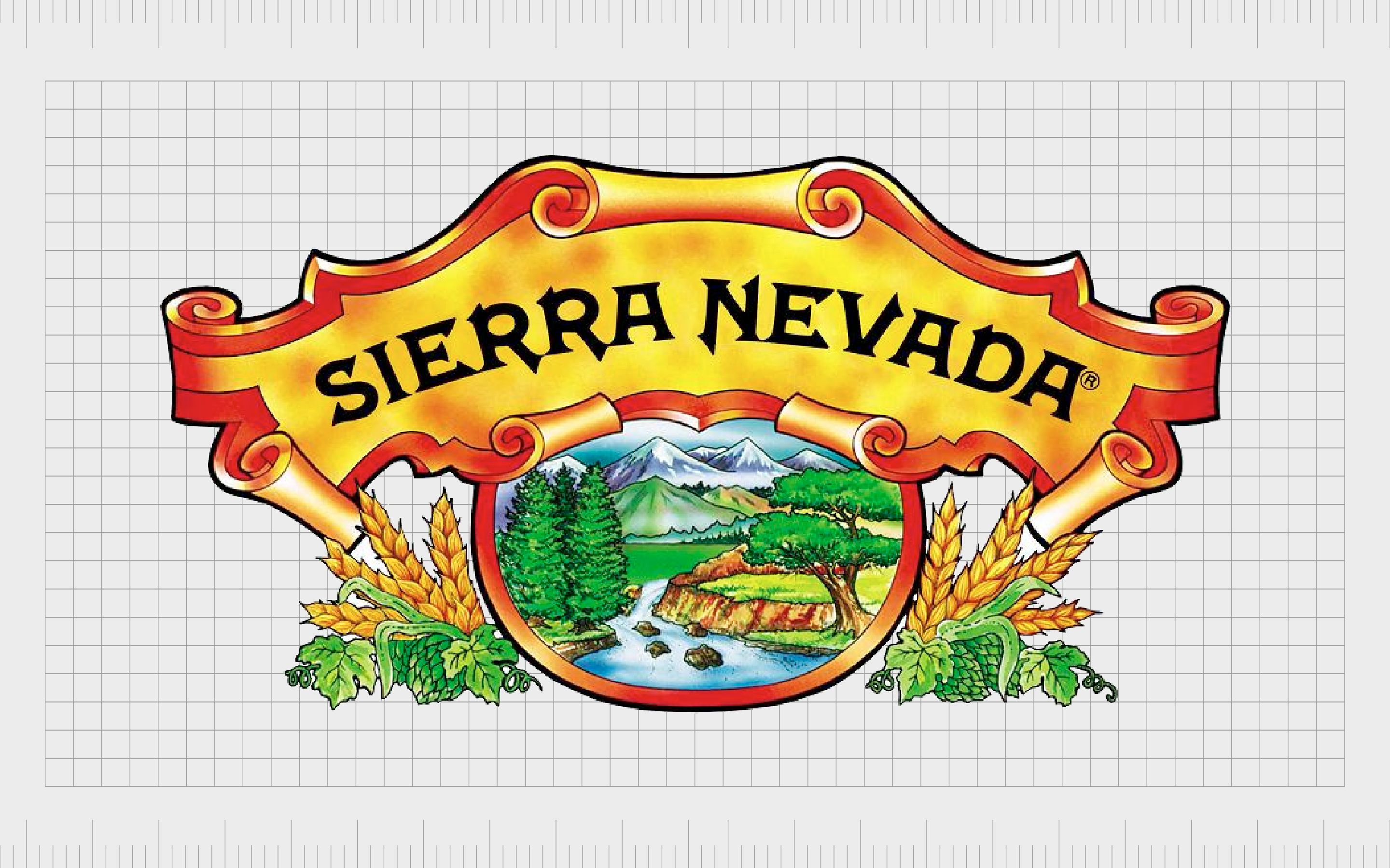
Sierra Nevada
Another company worth mentioning in the brewing and beer landscape is Sierra Nevada.
First launched in 1979, this company isn’t quite as old as some of the other craft beer brands around, but its emblem gives it a deeper sense of history. The image is extremely traditional, with various details brought together to create an eye-catching design.
The logo features the name of the company in a scroll-style golden and yellow banner. Underneath this wordmark, we see an artistic image of a stunning landscape, complete with trees, mountains, and a stream. The central image is surrounded by detailed hops and barley.
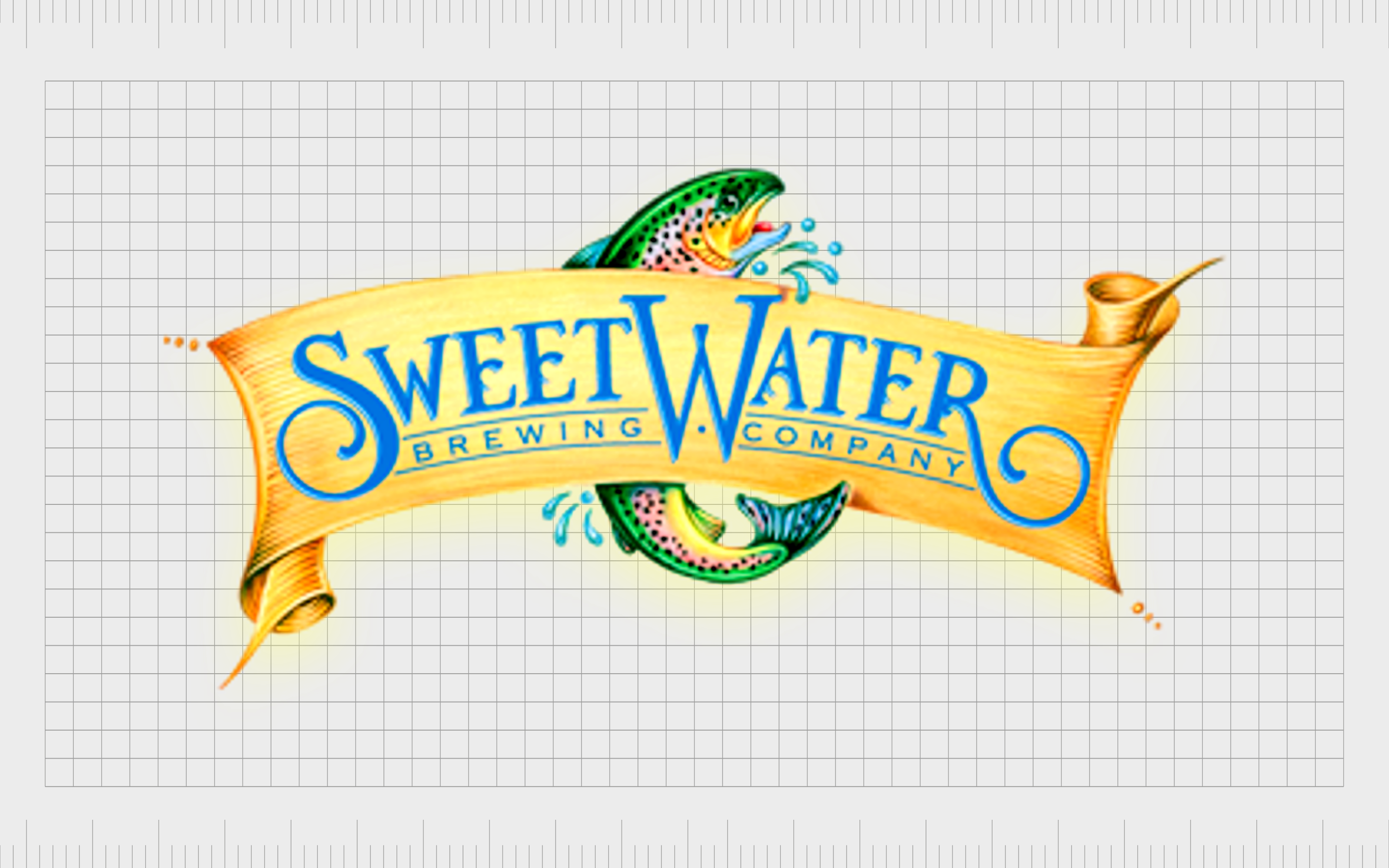
Sweetwater Brewing
Another popular choice for complicated logos in the beer world, Sweetwater Brewing launched in 1997. The company is unique thanks to its selection of unpasteurized beer formulas.
Named after Sweetwater Creek, where one of the group’s founders spent their time kayaking, the organization uses a lot of nostalgic imagery in its logo.
The design of this company’s logo is a little old-fashioned and complex by today’s standards, featuring a highly detailed image of a fish behind a scroll-style banner. The logo’s historical components help draw attention to the company’s unique background.
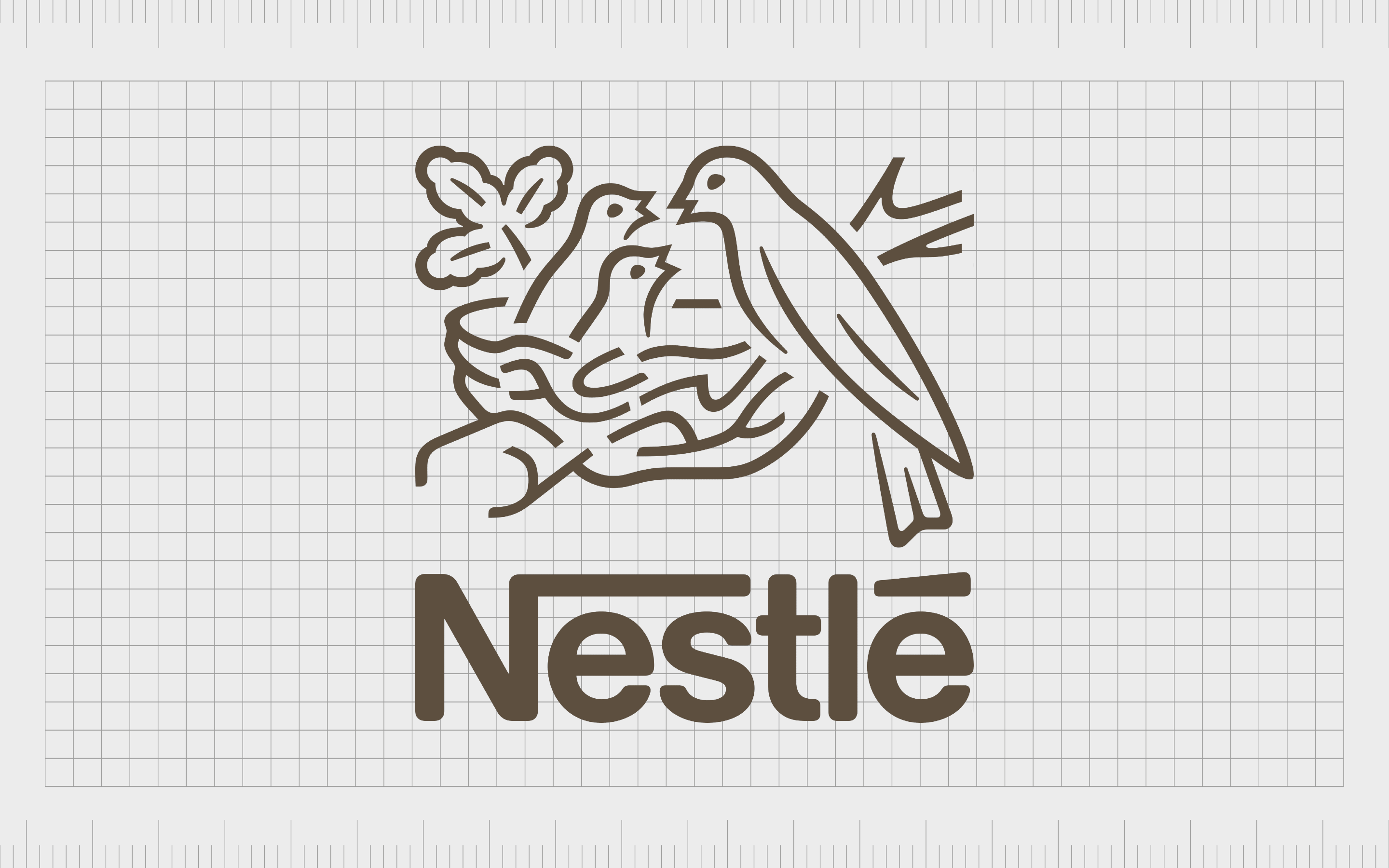
Nestle
The Nestle logo might seem relatively straightforward compared to some of the other complex logos on this list. Since launching in 1866, the chocolate brand has updated and refined its image quite a lot, but there are still some complex parts.
The main component of the logo features a mother bird feeding her two children. Apparently, the inspiration for the image came from the family crest of the founder Henri Nestle. The original design was much more complicated than it is today, but many of the elements remain.
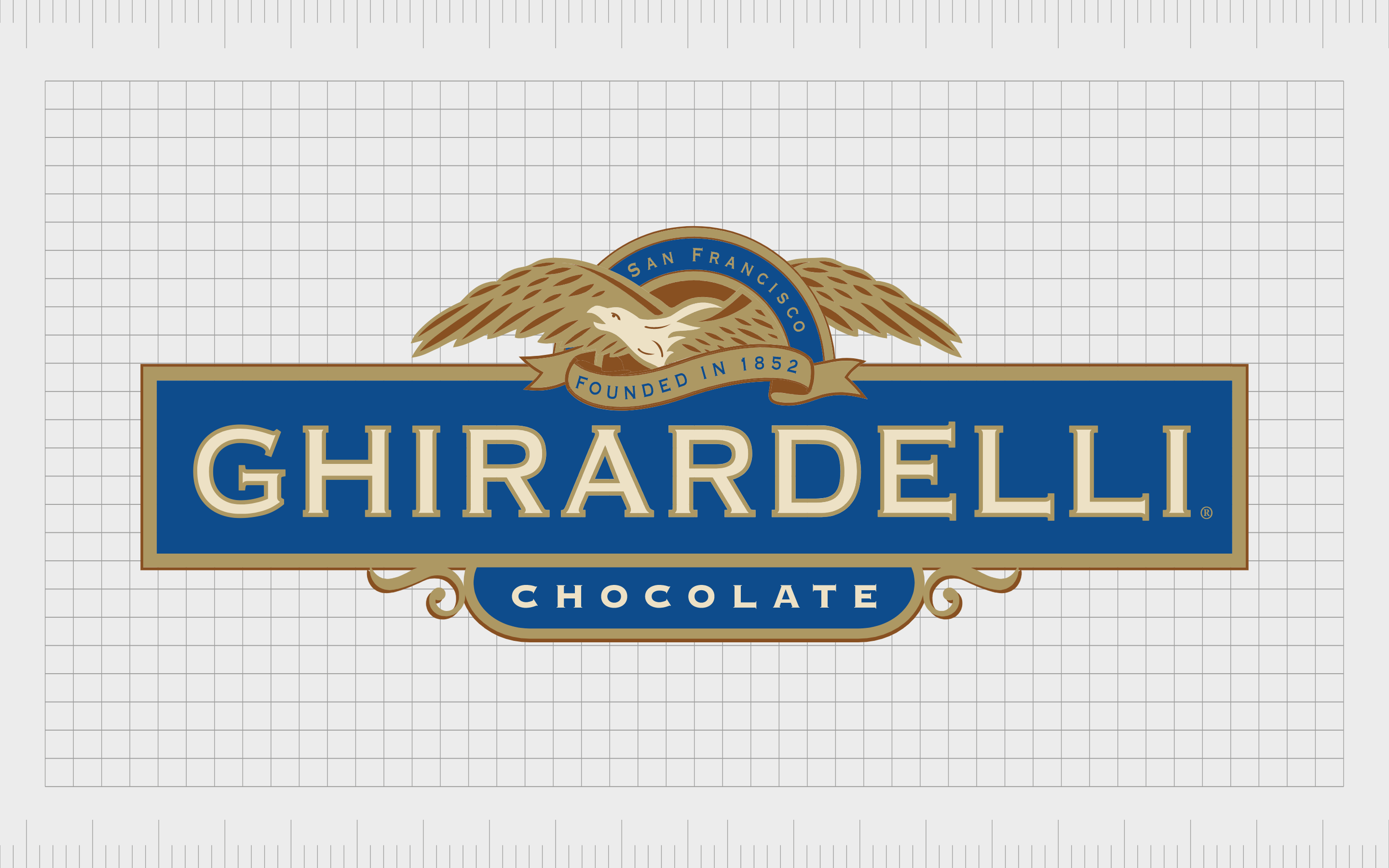
Ghirardelli
Another complicated logo from the world of chocolate, the Ghirardelli company, first launched in 1852 and remains a popular choice throughout America today. Currently, the business is owned by the Lindt and Sprungli brand.
The image for Ghirardelli chocolate is quite complex, featuring a banner-style wordmark with a picture of a highly detailed bird above. The design includes a lot of extra elements, including the word “San Francisco,” relating to where the company first launched and the date when it was first founded.
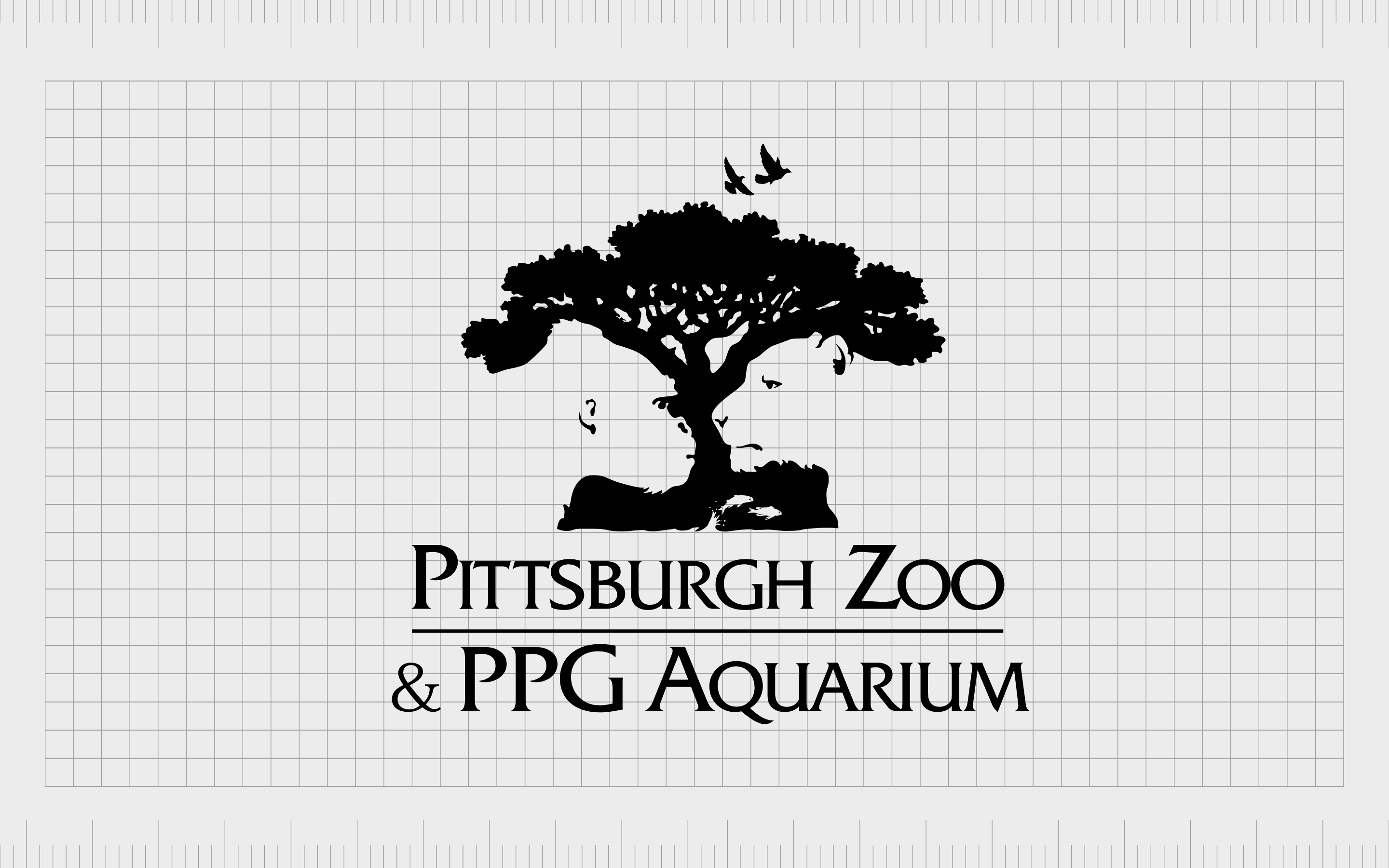
Pittsburgh Zoo & Aquarium
Complex logos can be quite common in the zoo landscape, too. The Pittsburgh Zoo and PPG Aquarium was first established in 1898, and remains one of the most popular zoos in the United States today. The location has more than 4000 animals across 475 species.
The logo has various unique elements, including a highly detailed image of a tree and various birds in flight. However, perhaps the most engaging part of the logo is the white space, which has been used to create the picture of an ape and a lion looking at each other.
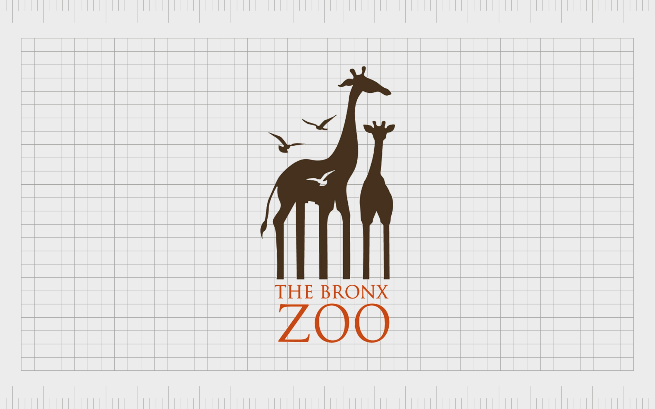
Bronx Zoo
If you like the hidden detail in the Pittsburgh Zoo logo, you’re sure to love the imagery in the Bronx zoo emblem too. This zoo launched in 1899 and has emerged as one of the largest locations for viewing amazing animals in the United States.
Like the Pittsburgh Zoo, the Bronx zoo logo features images of animals like giraffes and birds. However, hidden within the legs of the giraffes, we can also see the skyline of the New York Manhattan region. This is a fantastic image for encouraging viewers to look a little closer.
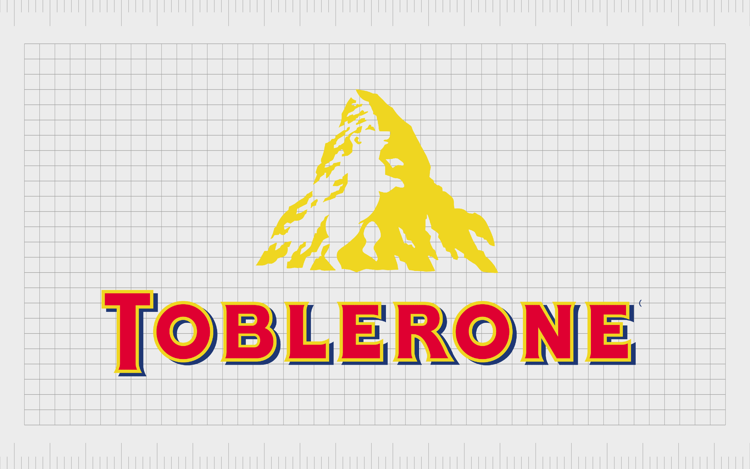
Toblerone
Speaking of complex logos with an excellent use of white space, the Toblerone logo is often one of the most talked-about emblems in the chocolate landscape.
Toblerone was first launched in 1908 in Switzerland, which is why the company uses the image of a mountain as a core part of its visual identity.
Although there’s not as much detail in this logo as some of the others on this list, there are still some eye-catching components. Hidden within the golden mountain, we can see the image of a white bear standing up on its hind legs.
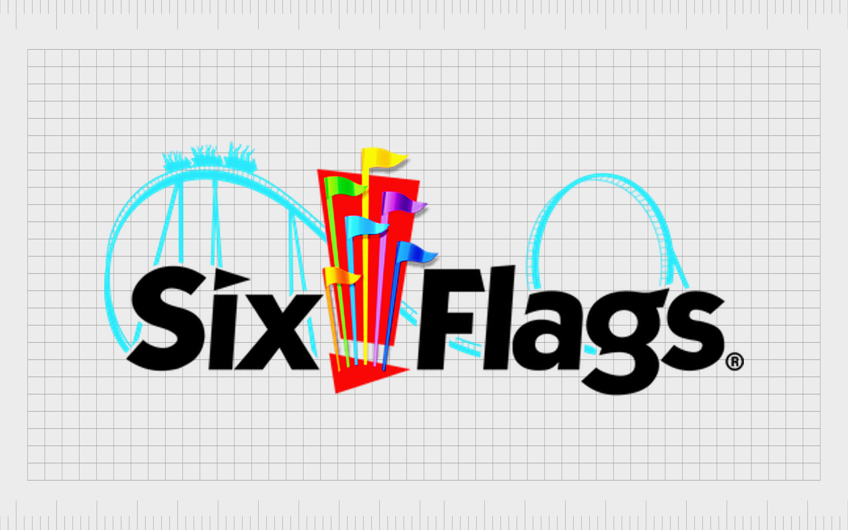
Six Flags
A well-known theme park destination in the United States, Six Flags was launched in 1961 and is headquartered in Texas.
Today, the brand has a presence across multiple parts of the US, as well as Mexico and Canada. In fact, the location owns the most theme parks and waterparks of any company in its industry.
The Six Flags logo has a lot of detail to unpack, including the design of a rollercoaster in the background behind the wordmark.
There are also six different colored flags between the two words in the logo, designed to represent the six countries whose flags were associated with Texas throughout the state’s diverse history.
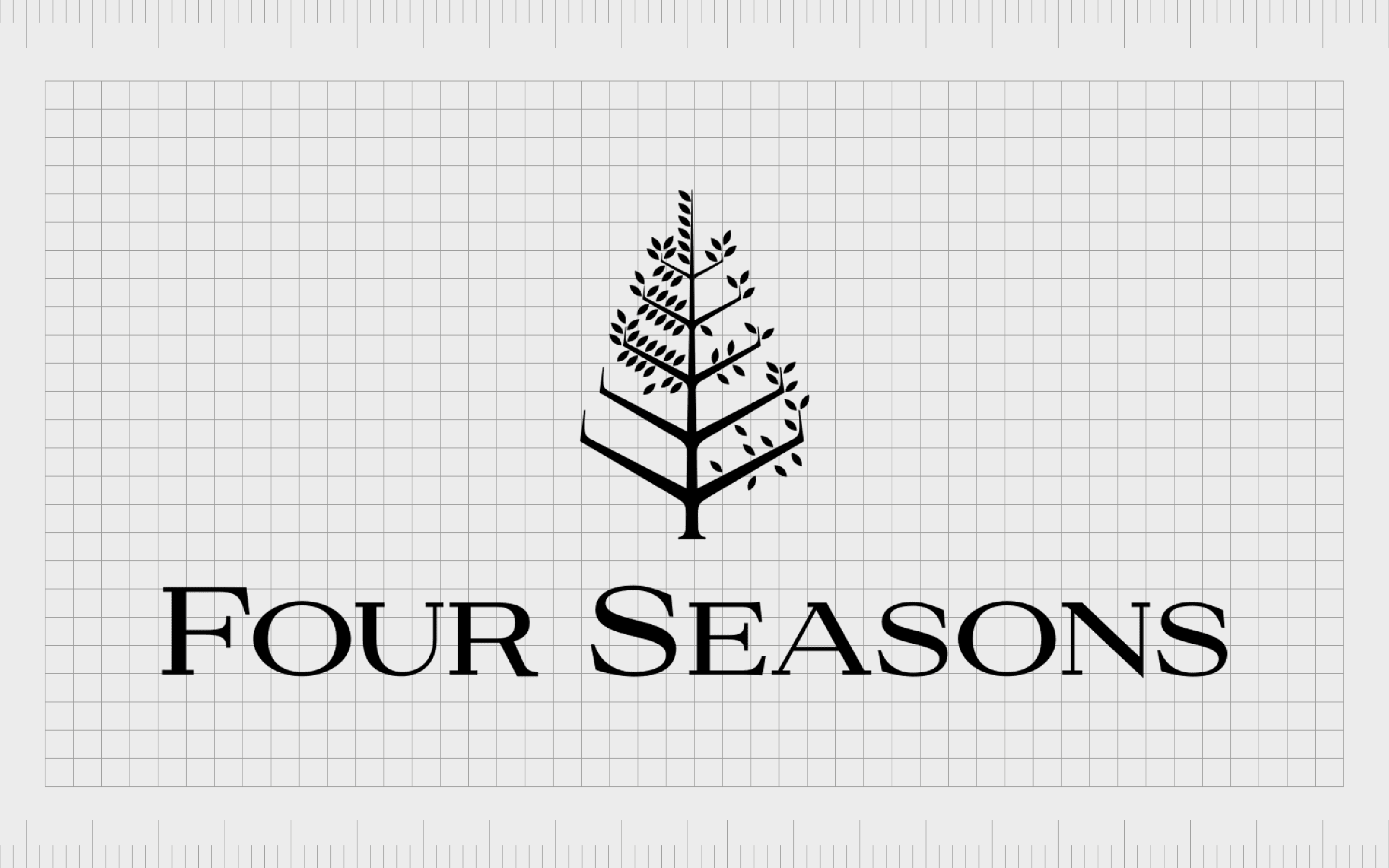
Four Seasons
One of the best-known hotel and resort companies in the world, Four Seasons started life in 1961. Today, the luxury hotel company has more than 100 locations to visit worldwide and has attracted a host of superstar guests.
The name of the company, “Four Seasons,” is a reference to the incredible seasons we experience around the world and the fact that visitors can enjoy four seasons of hospitality no matter the time or weather.
Within the Four Seasons logo, we see a serif-style wordmark with the image of a tree above it. The leaves on the tree in various segments represent the different seasons.
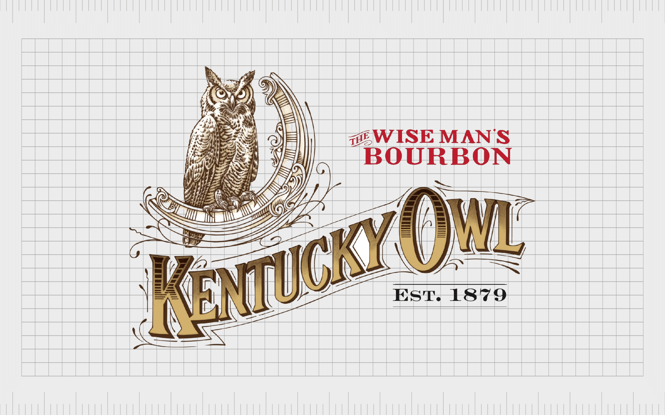
Kentucky Owl Bourbon
One of the most old-fashioned logos on this list, the Kentucky Owl Bourbon logo is brimming with more detail than most of the emblems we’d expect to see today. This old-fashioned bourbon company wanted to convey significant history and heritage with its complex logo.
As a result, there’s a very detailed wordmark combined with the picture of an owl.
The owl has a lot of shading and components to it, making it difficult to recreate on a smaller screen. The spectacular imagery combined with the unique wordmark gives the company a somewhat regal and historical presence.

Collingwood Fighting Owls
Sports teams logos can often be quite complex compared to some of the more common emblems we might see in the e-commerce or retail landscape.
These designs are specially made to attract the attention of a wide audience, and inspire an emotional response. The Collingwood Fighting Owls logo is an excellent example.
The Collingwood Fighting Owls are a college football team with an eye-catching owl as the mascot for their logo. The group has added significant detail to their owl emblem. The combination mark makes it appear as though the owl is engaged in flight, swooping toward the viewer.
There are even lines around the animal to depict motion.
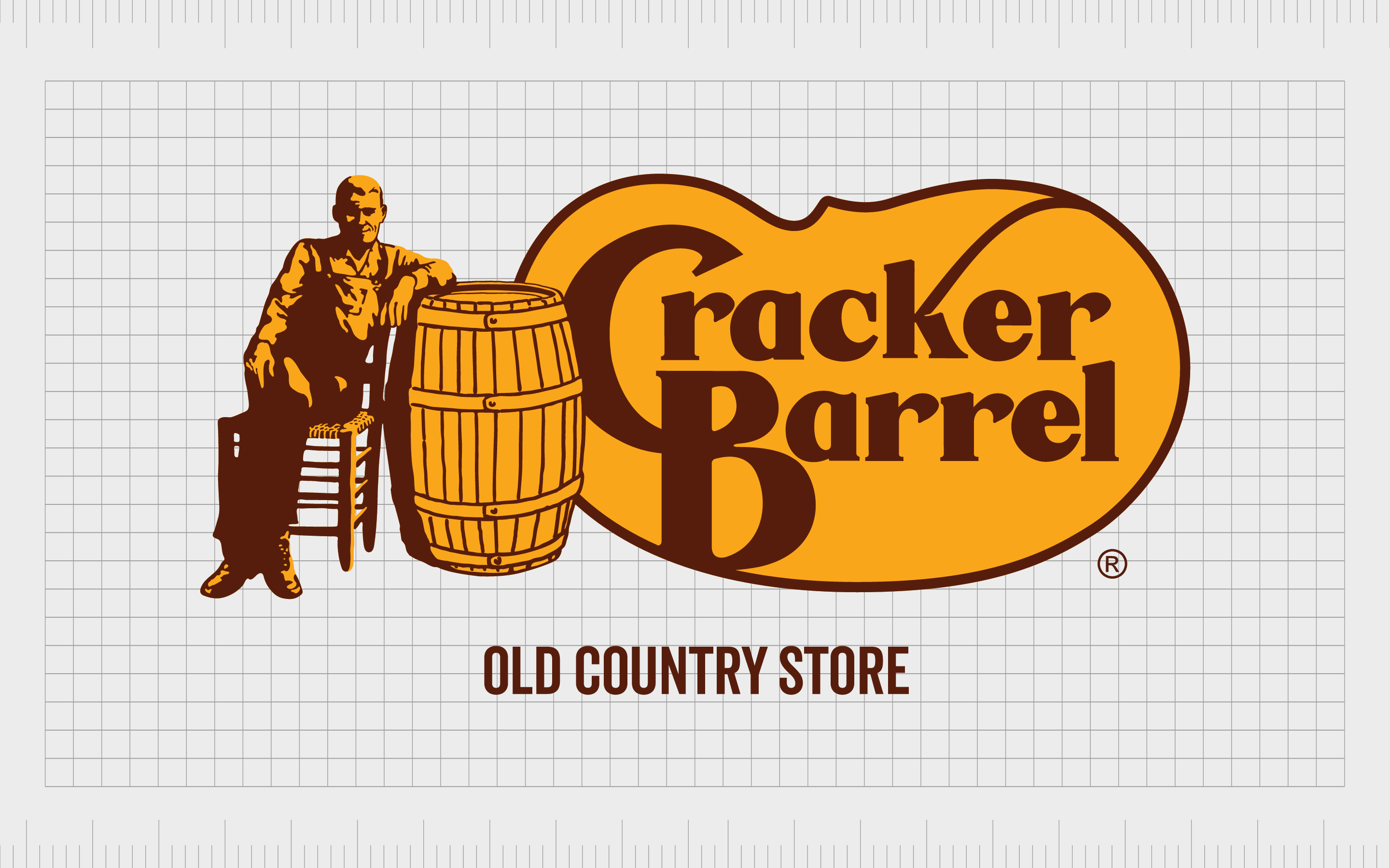
Cracker Barrel
Compared to most American restaurants, Cracker Barrel has one of the most complicated logos around. The Cracker Barrel company first launched in 1969 and today offers customers a place not only to get Southern country-style foods, but also to purchase a range of accessories and gifts.
The menu is based on traditional Southern cuisine, and even the décor within the restaurants follows this theme.
Using warm colors of brown and gold, the Cracker Barrel logo depicts a man on a wooden chair leaning against a large barrel. There’s significant detail in the design, highlighting the various components of the man’s old-fashioned clothing.
Next to the image, we also see an eye-catching stylized wordmark, wherein the letters “B” and “C” appear to be combined.
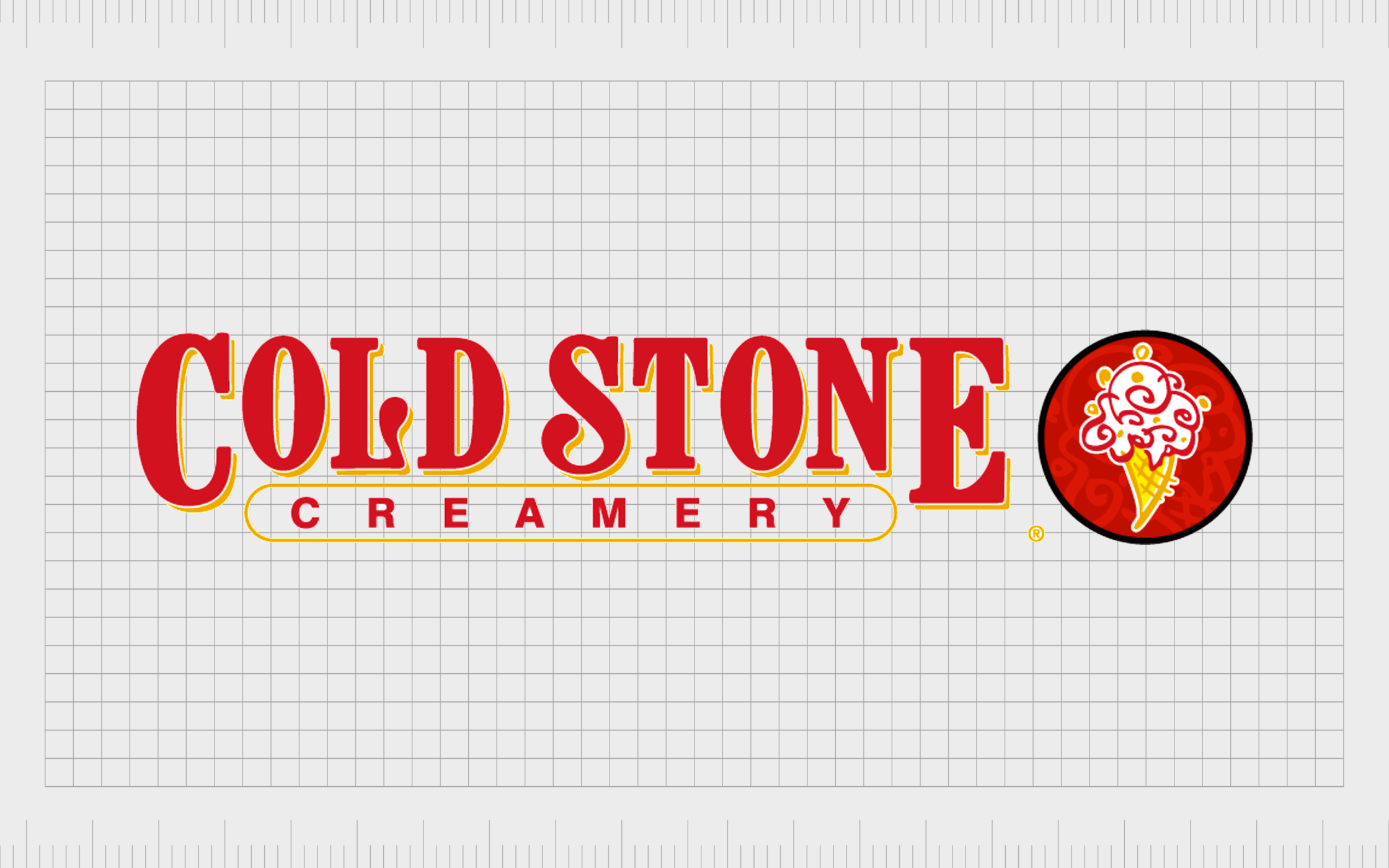
Cold Stone Creamery
If you’re a fan of ice cream, you’re probably familiar with the Cold Stone Creamery logo. This is one of the better-known images in the United States for people who love frozen treats.
The international ice cream parlor chain was first launched in 1988, but its old-fashioned and traditional logo helps to make the company appear a lot older.
The Cold Stone Creamery image is a combination mark featuring a highly detailed picture of an ice cream cone with various red swirling elements. The image of the ice cream is placed alongside a decorative serif-style wordmark depicted in red.
The color choices and design convey a sense of passion and excitement.

Swarovski
Compared to some of the other complex logos we’ve looked at so far, the Swarovski logo may appear somewhat straightforward and modern at first. However, there’s significant depth to this image.
The crystal, jewelry, and fashion company first launched in 1895 and is best known for producing eye-catching crystal gems and accessories.
Within the Swarovski logo, we see the image of a swan used as a mascot for the company to convey elegance and sophistication. Upon closer inspection, we see the swan is made up of hundreds of tiny dots, intended to represent the crystals sold by the organization.
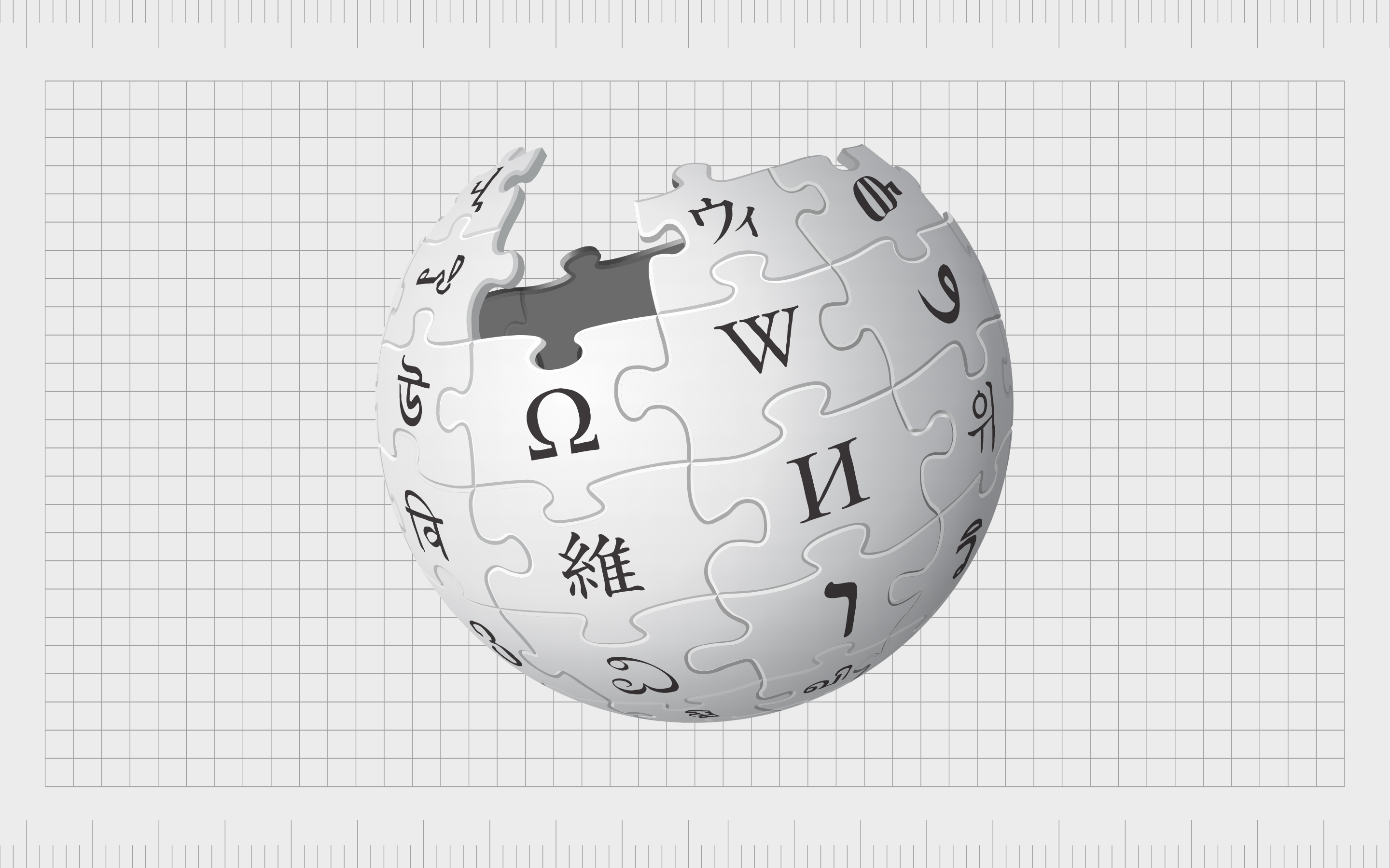
Wikipedia
Best known to those in the digital landscape searching for information about a range of topics, Wikipedia is a free and multi-lingual online encyclopedia. Launched in 2001 to help people share and find knowledge, the online service is one of the best-known in the world today.
The logo for the service is quite complex, featuring a globe made up of various puzzle pieces, each with its own unique glyphs.
The various glyphs are intended to demonstrate the website’s versatility, which offers information on various topics and constantly grows with new information submitted regularly.
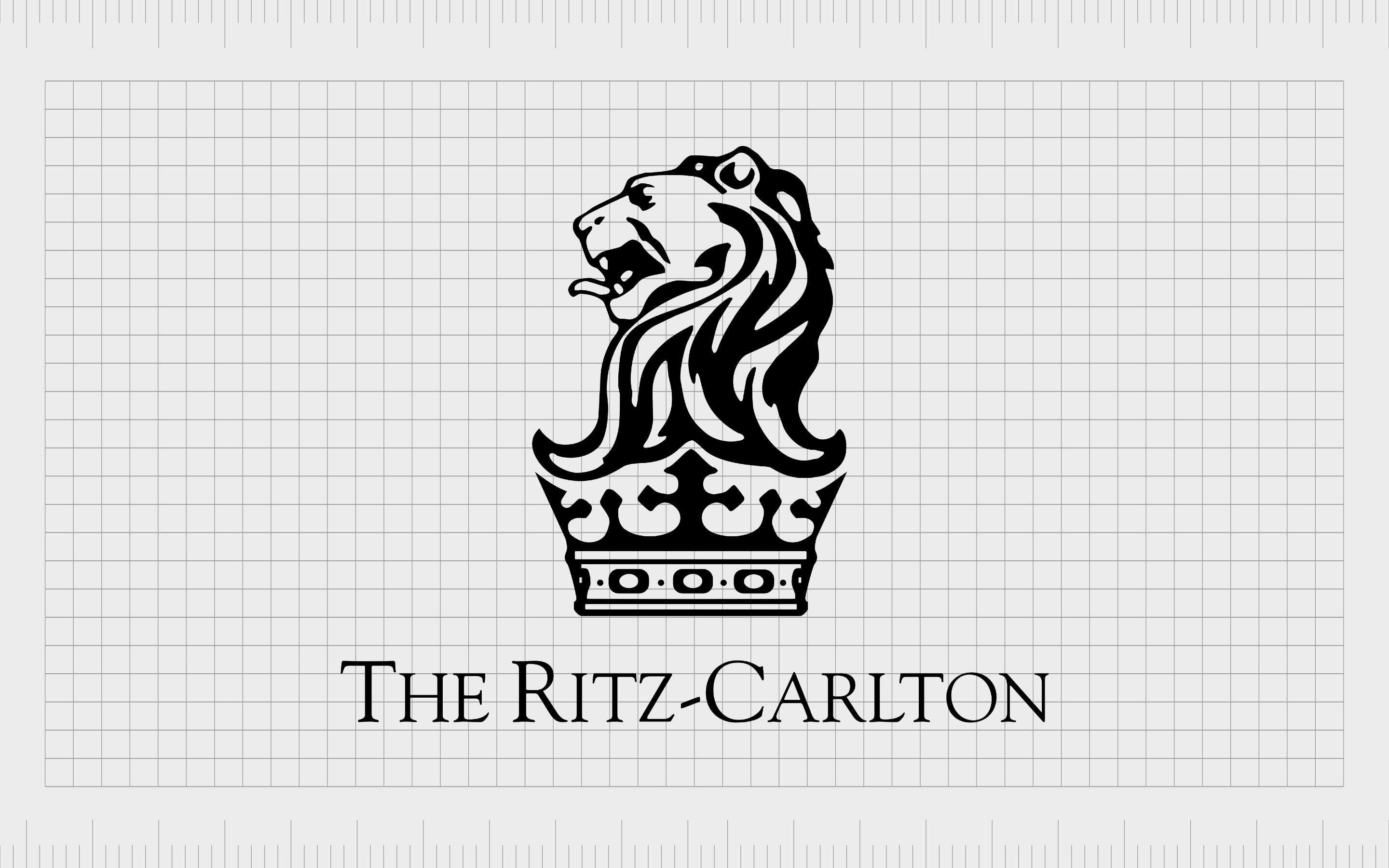
Ritz-Carlton
One of the world’s better-known hotel and hospitality companies, the Ritz-Carlton hotel is an American multinational brand specializing in luxury hotels. The company was founded in 1983 after the previous owners sold the Ritz-Carlton name and a hotel in Massachusetts to new owners.
Owned by Marriot International today, the Ritz Carlton brand uses an eye-catching logo with a detailed lion sitting atop a crown. The design is intended to demonstrate heritage, sophistication, class, and excellence.
The enduring presence of complicated logos
Although complex logos might not be as common today as they once were, they still offer a fantastic insight into the power of detail in the right brand emblems.
Not every business will benefit from a complicated logo. However, in some cases, extra detail can help to tell a complete story about the nature and personality of a brand.
Ultimately, as with any logo design project, companies considering a complex logo must think carefully about the essence they’re attempting to convey with their logo.
Those searching for a design demonstrating power, sophistication, and heritage may benefit from a complicated logo design.
Fabrik: A branding agency for our times.

Clarity starts with a conversation.
Thanks—we’ll get back to you shortly.
Whether you're navigating a rebrand, merger, or simply need a clearer identity—we’re here to help. No hard sell, just honest advice from people who know the sector.
Let’s start with a simple question…
Prefer to email? Drop us a line.
Fabrik’s been helping organisations rethink and reshape their brands for over 25 years. We’ve guided companies through mergers, rebrands and new launches. Whatever stage you’re at, we’ll meet you there.