


Famous abstract logos: The definitive guide to abstract marks
Famous abstract logos aren’t difficult to come by. For companies striving to demonstrate an essence of creativity and innovation, abstract marks are extremely powerful. The right combination of lines, color, and shapes can often make a more emotional impact than a simple wordmark or organic image.
Abstract company logos aim to convey a significant level of meaning and feeling with a single symbol. This makes the designs popular among brands who have a lot to say, and companies who would struggle to showcase their identity using a recognisable graphic.
Abstract symbols also come in a range of different styles and forms. There are symmetrical logos intended to convey balance, as well as symbols constructed entirely from geometric shapes and lines.
At the core of all of these creations is a desire to communicate the unique message of a brand using less literal imagery.
Today, we’re going to be exploring the nature of abstract logos, what they look like, and how to identify some of the most famous abstract logos in the world.
What is an abstract logo? Abstract marks in branding
An abstract logo is an alternative to a descriptive brand mark. The intention behind these logos is to create a strong feeling of emotion in the target audience, without necessarily telling your customer what your business does.
This type of logo aims to express something unique about a business, while remaining as versatile as possible.
Abstract logos are flexible, which means they’re more likely to evolve with the company, even as the business begins selling new products or venturing into different markets.
Many of the logos we see today are “abstract” in nature. While you might be able to identify what the company is trying to say with the logo, the meaning is subtle.
The Toyota image, for instance, is an abstract logo. It looks similar to a “T”, but the three ovals actually represent core parts of the company’s identity and vision.
Some of the core components of an abstract logo include:
An icon or shape
An icon or shape in an abstract logo aims to convey multiple concepts and emotions. It might be something subtle, like a collection of lines, or something a little more identifiable, like the Nike Swoosh.
Color
Color psychology is an important concept in any form of logo design, but it can be particularly important with abstract logos. When you’re not directly telling your customers what you do or what you sell, you can instead use color to convey emotion.
Typography
Many abstract logos are combined with wordmarks to make the business more identifiable. Over time, many bigger companies will eventually remove the wordmark entirely so they can focus exclusively on the abstract symbol.
Famous abstract logos: Examples of abstract logos
Abstract logos are common in the world of logo design because they’re versatile, scalable, and meaningful. Used correctly, an abstract brand mark can express a lot of information about a brand and its values, without being too obvious about what the company does.
While there are hundreds of abstract logos out there, we’re looking specifically at the most famous abstract marks today.
Here are some compelling abstract company logos to inspire you…
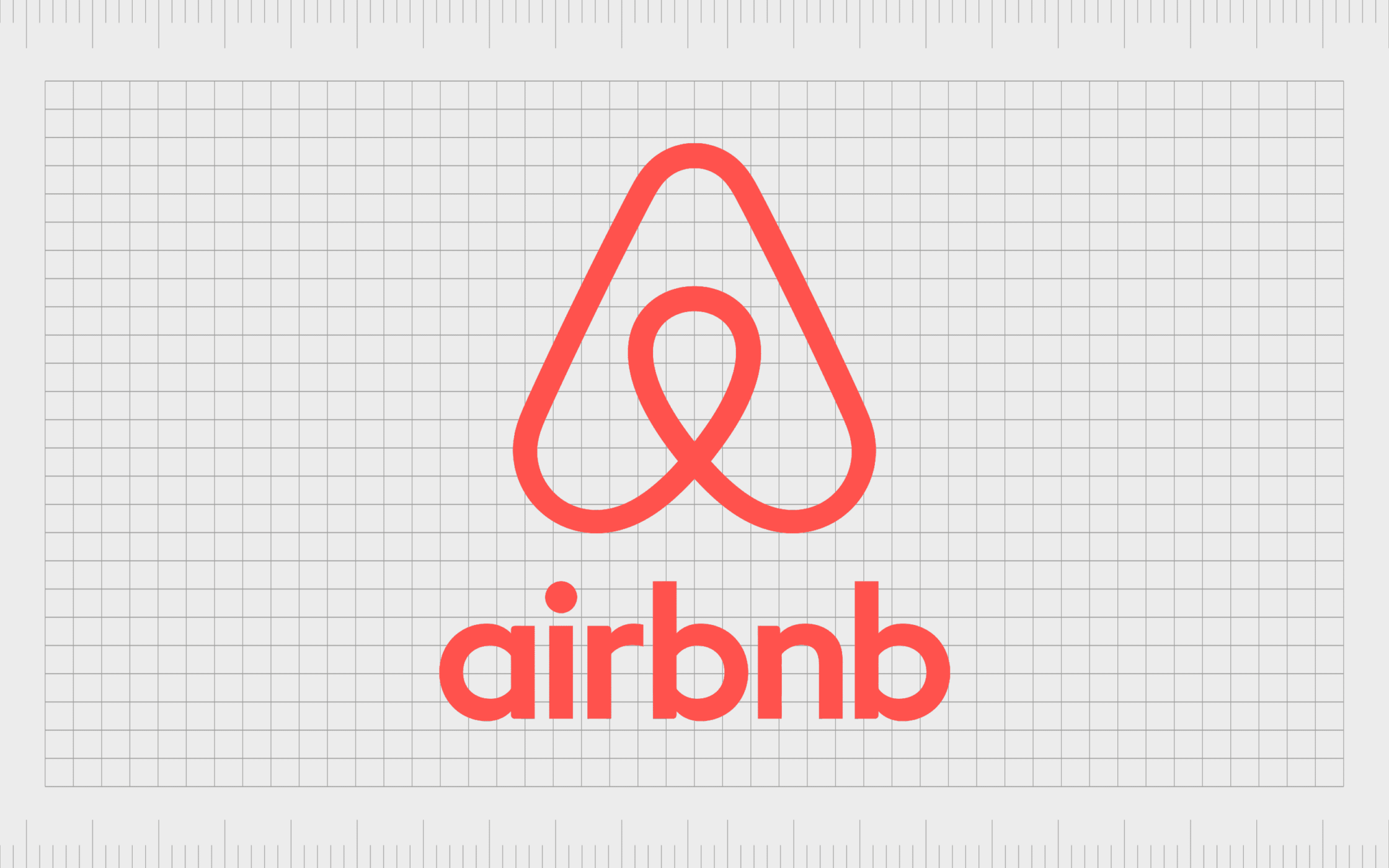
Airbnb
One of the most famous abstract symbols in the world today, Airbnb’s logo packs a lot of meaning into a simple image. The design looks similar to an upside-down heart, as well as the letter “A”, which reminds us of the name of the company.
You could even connect the image to the symbol of an arrow, pointing to the location you want to visit.
Airbnb’s logo conveys ideas of community and compassion into an elegant design, enhanced by the use of a lower-case wordmark, and a soft pink/orange color palette.
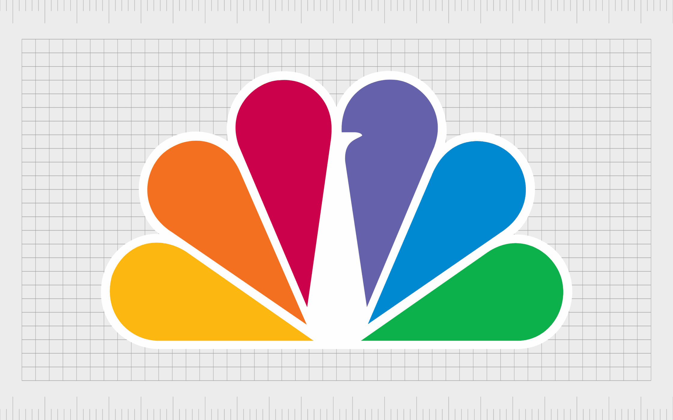
NBC
As a world-leading television company, NBC’s logo has captured the attention of customers all around the globe. The image may look like a burst of color initially, but we can quickly see the abstract visual of a peacock on closer inspection.
According to the brand, the six colors in the plumes of the bird represent the six divisions of the company. Furthermore, the colorful design choice helps to highlight the company’s decision to embrace color television back in the 1950s.
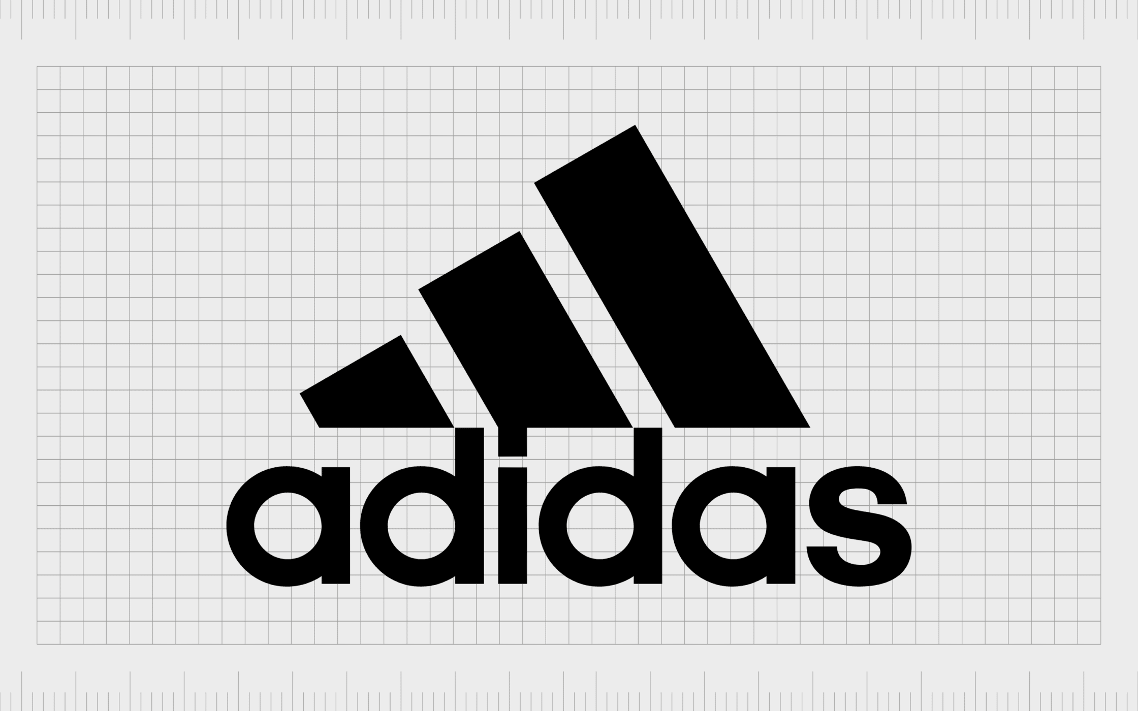
Adidas
If you’re looking for a memorable abstract logo mark, it doesn’t get much more famous than the Adidas logo. Though this image has changed a few times over the years, it has long leveraged the benefits of abstract design. The current logo is an excellent choice for the sporting industry.
At first, all you see is three lines in different sizes. However, the image also looks similar to a mountain, helping to draw attention to the ideas of ambition, challenge, and perseverance. Though simple, the design is powerful and engaging.
Find out more about the Adidas logo here.
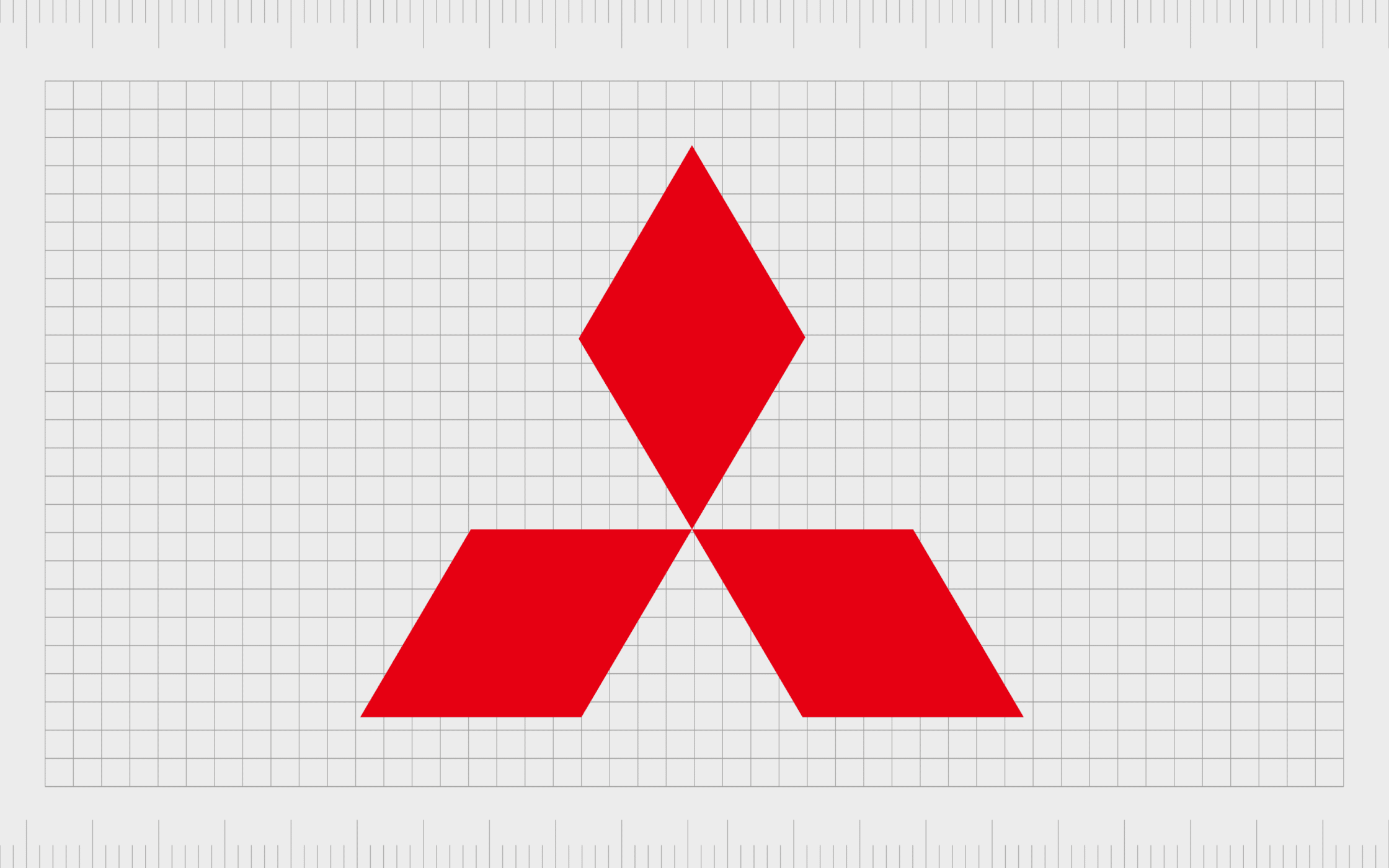
Mitsubishi
While famous abstract logos exist in almost every industry, they’re particularly popular in the automotive landscape. The three diamonds in the Mitsubishi logo create an impactful image, particularly when combined with the company’s bright shade of red.
Insights into the brand’s history tell us the three diamonds also have their own hidden meaning. The image is a fusion of Yataro Iwasaki’s family crests. They’re also a way to highlight the core values of the company: success, reliability, and integrity.
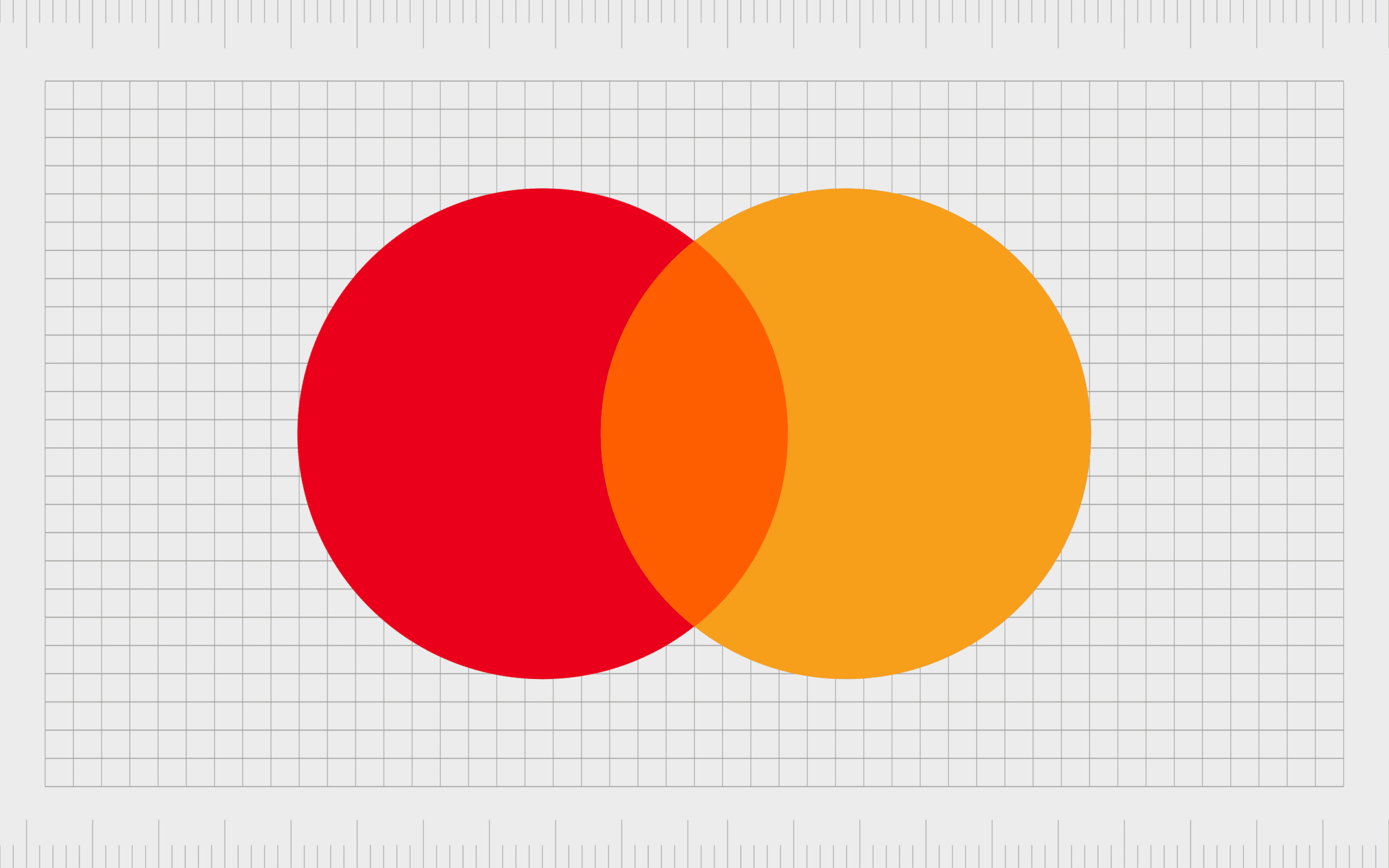
Mastercard
A great example of a more minimalist logo for the financial industry, the Mastercard logo relies on a simple selection of colors and shapes to convey meaning. The design is intended to represent community and connectivity, highlighted by the overlapping of the two circles.
The interlocking circles are excellent for drawing attention to the focus of the company of bringing people and technology together. Though a wordmark is available for this design, the company frequently showcases the abstract mark on its own.
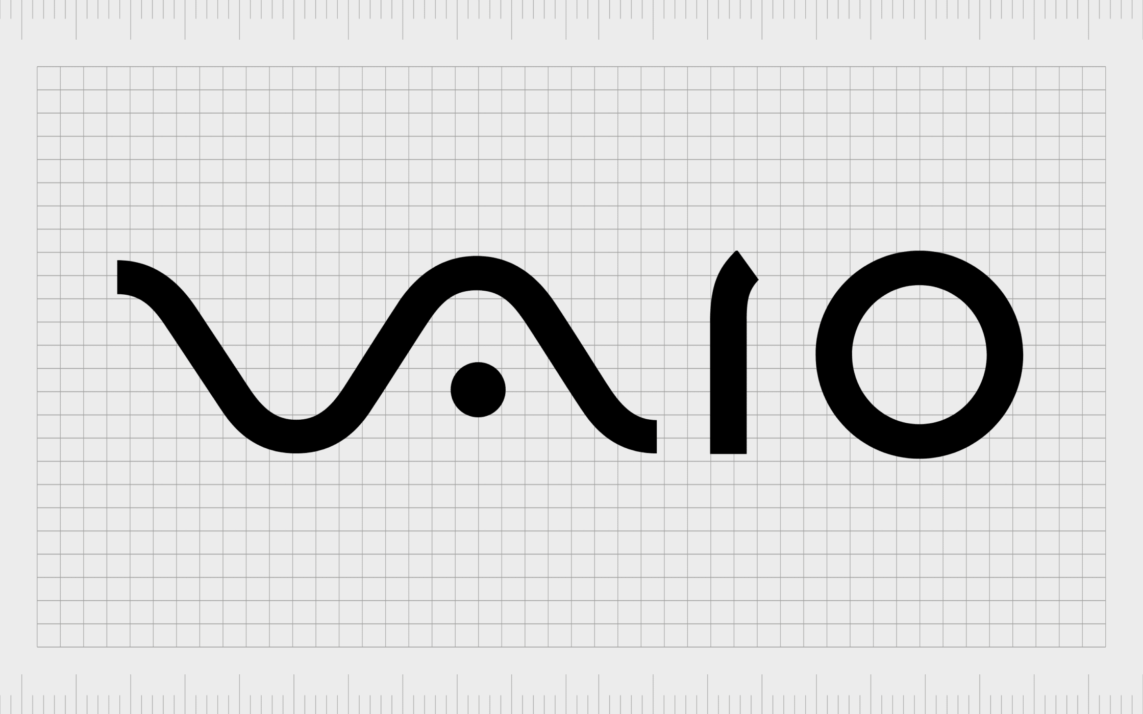
Vaio
Created by the Sony company, the Vaio logo represents a famous audio company. To convey additional meaning while maintaining minimalism, the organization transformed its wordmark into recognizable audio symbols.
The “VA” represents the shape of a sine wave, while the IO represents the 1 and 0 of binary code.
The combination of different forms of audio technology in the Vaio logo highlights the company’s focus on futuristic technology, and transformation.
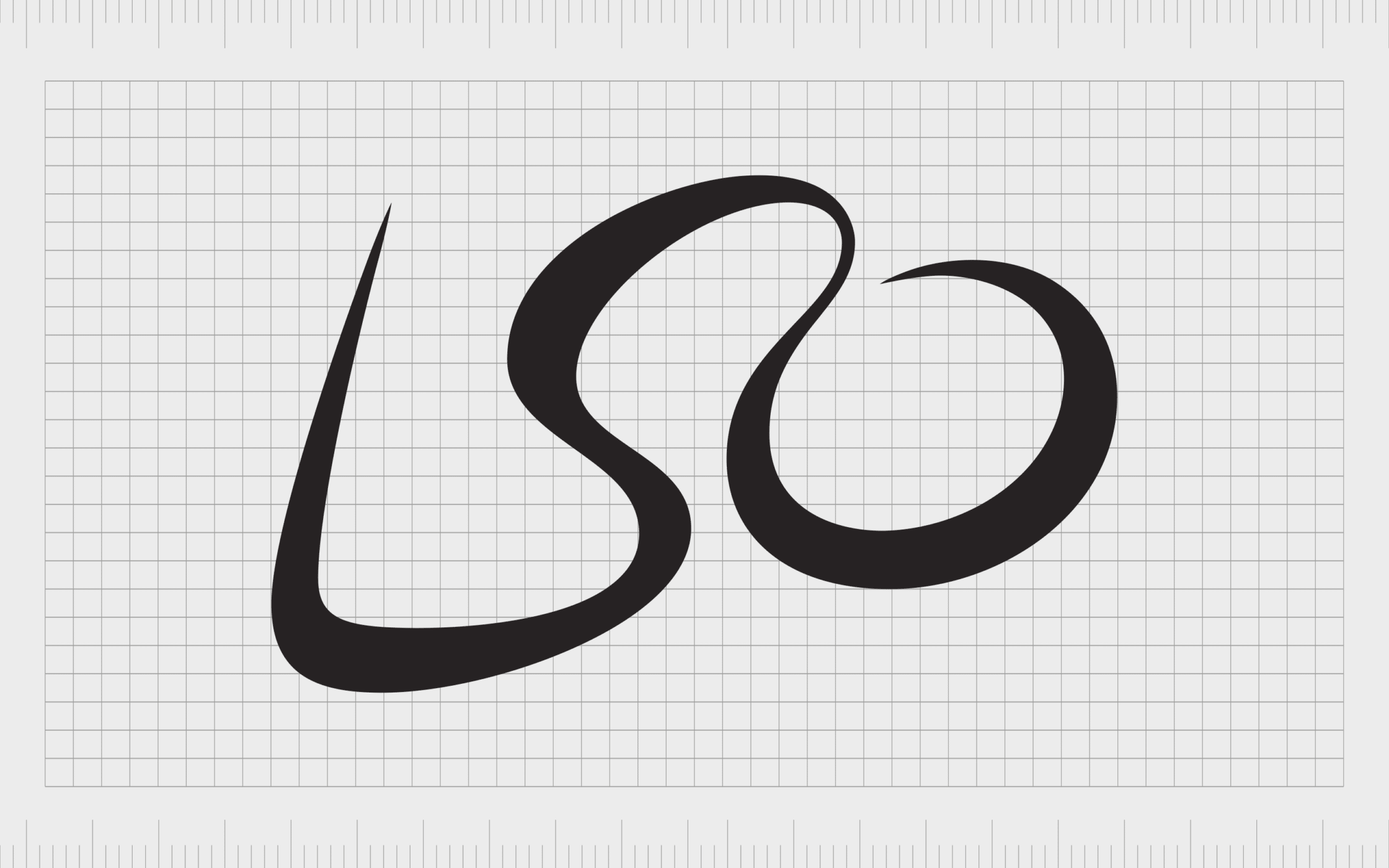
London Symphony Orchestra
Another of the top abstract company logos in the world today, the London Symphony Orchestra’s symbol is both modern and engaging. The design combines the letters used to represent the company “LSO”, into a sleek and sophisticated shape.
While the design might look senseless at first, closer inspection shows we’re actually looking at a traditional conductor, one arm raised to help direct the flow of the music.
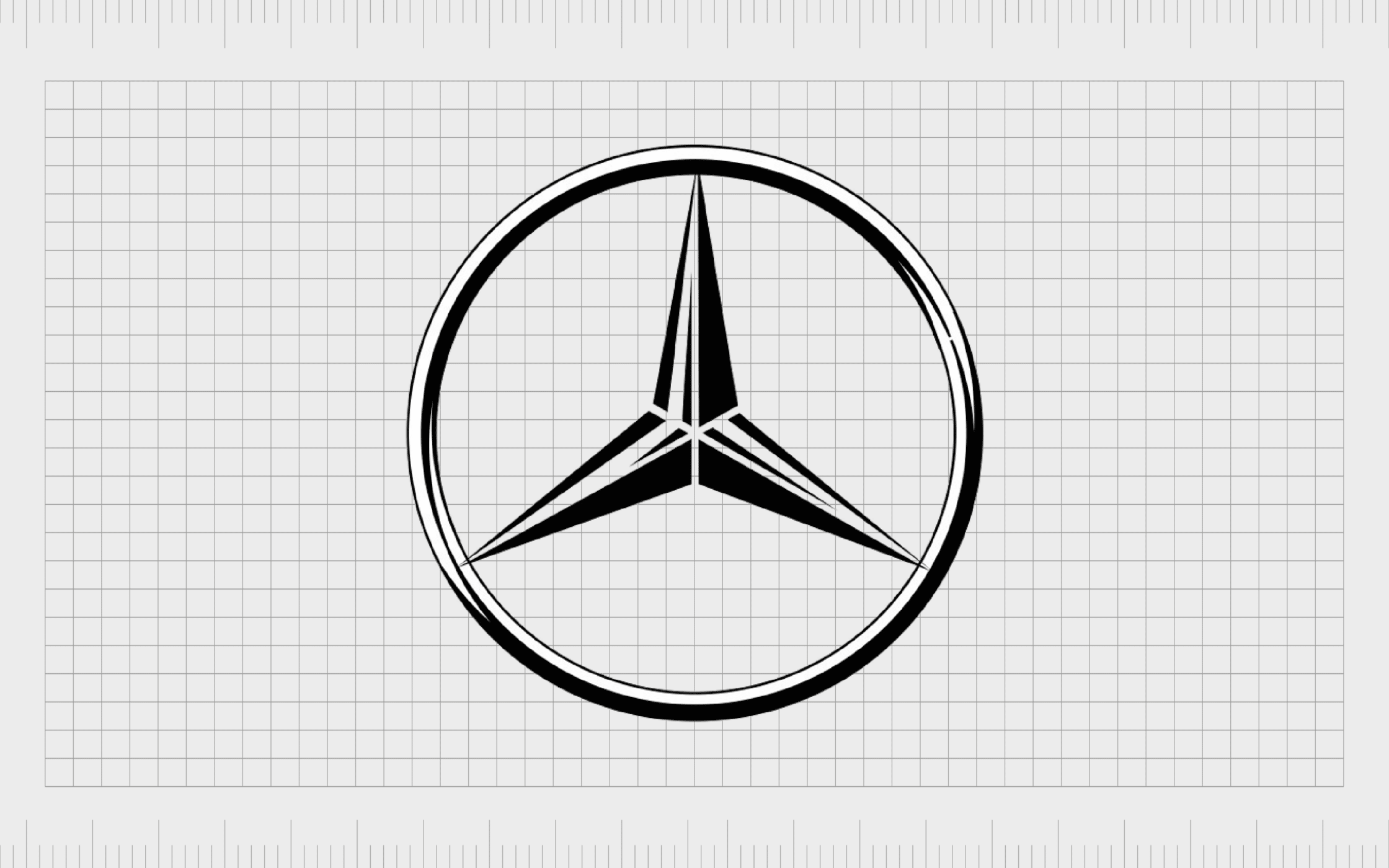
Mercedes Benz
If you’re a fan of the automotive industry, you’re probably familiar with the Mercedes Benz logo. Like many famous abstract logos, this image is often used on its own, but also comes with a wordmark attached to it in some branding assets.
The Mercedes Bens 3 point star in the center of a circle represents community, and the organization’s drive for universal motorization. Each point represents a different concept (land, sea, and air), to help highlight the history of the company.
Find out more about the Mercedes logo here.
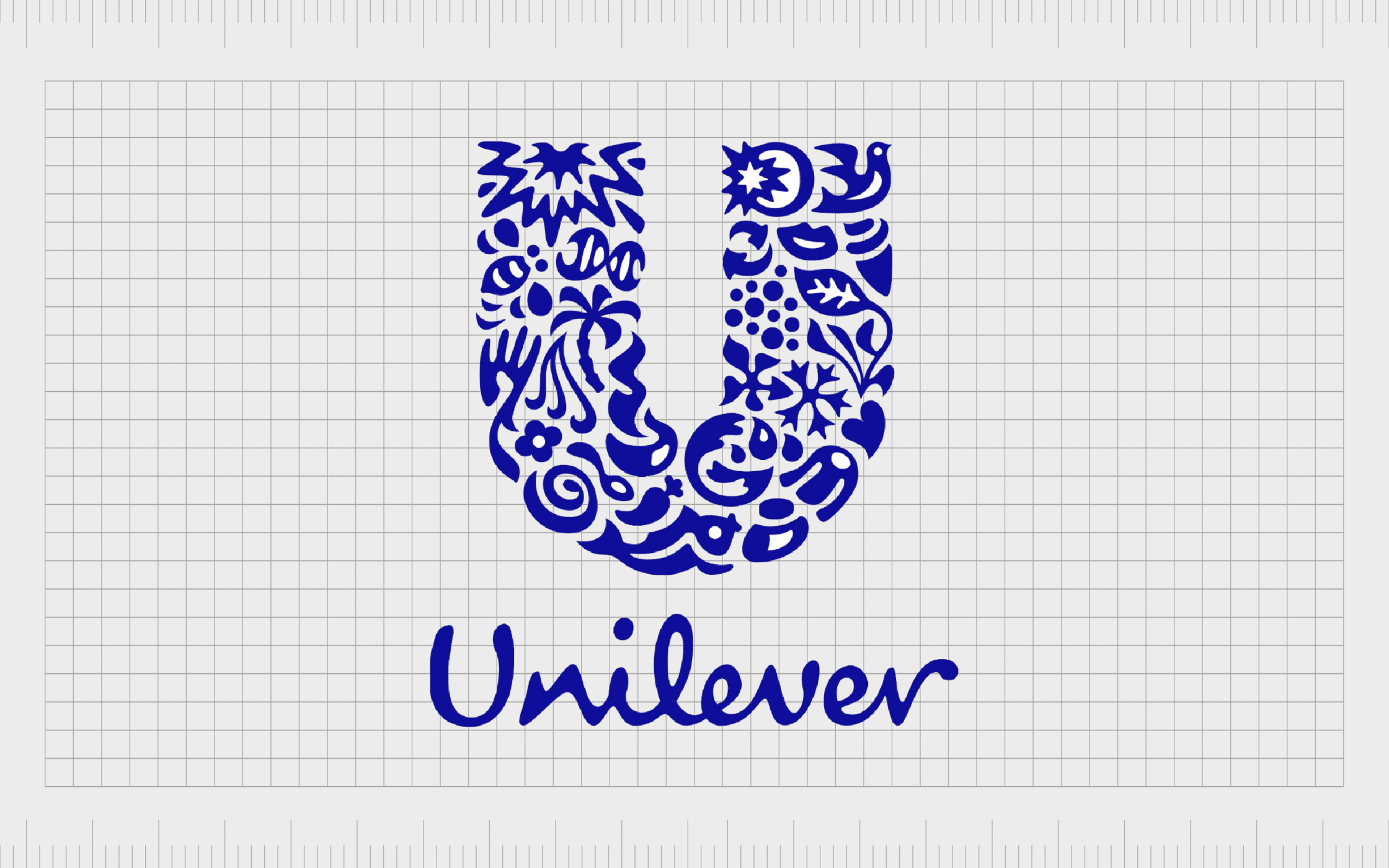
Unilever
One of the more complex examples of abstract logos in our list, the Unilever symbol is brimming with meaning and depth. Within the large “U” used to represent the brand, we can see a host of different images and shapes to convey different meanings.
The “U” includes trees, fish, and various other shapes, intended to draw attention to the wide range of products sold by Unilever sub-brands. It’s an excellent way for an organization responsible for a huge range of products to bring depth and meaning to its image.
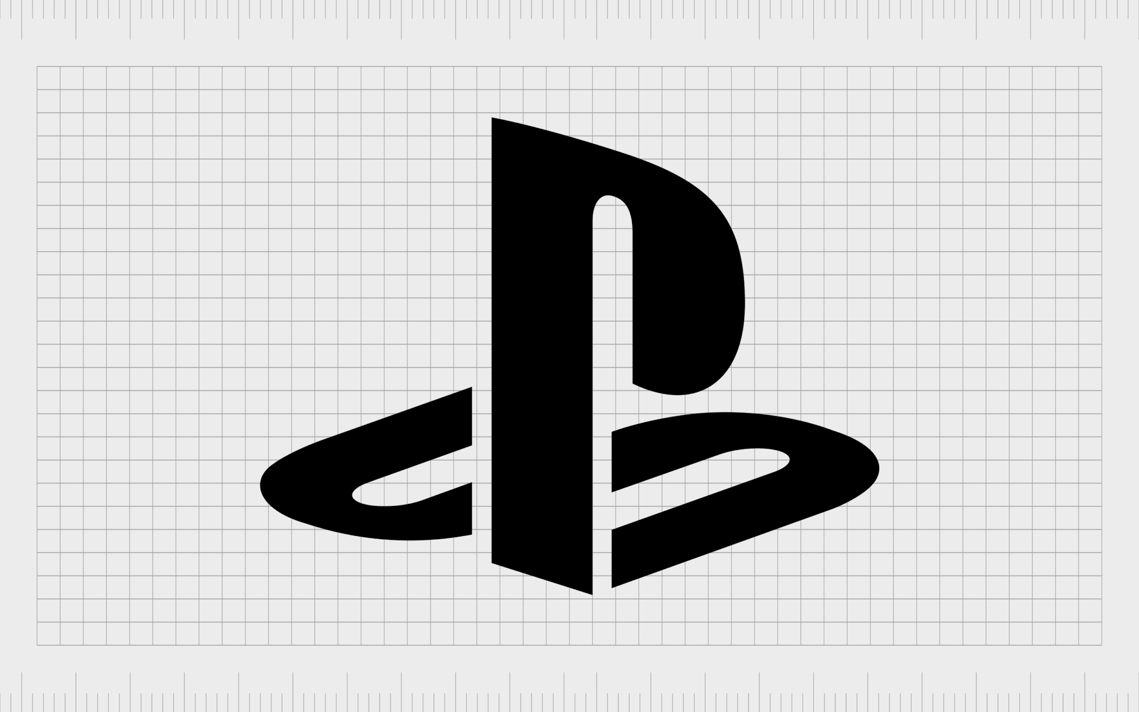
PlayStation
It’s hard to find anyone who doesn’t recognize the PlayStation logo today. The image features a custom typeface overlying a letter “P” on top of an “S” laying flat. The design might just look like a series of curved lines at first glance, but it’s an excellent way to showcase the creativity of the brand.
PlayStation’s logo also used include a variety of colors which referenced the different buttons on the company’s video game console controllers.
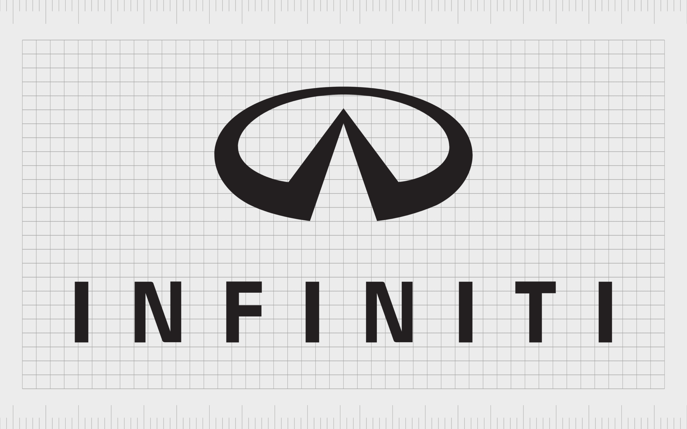
Infiniti
Another excellent example of famous abstract logos from the automotive industry, the Infiniti symbol is a simple but compelling image, ideal for showcasing the forward-thinking nature of the brand. The design was inspired by the infinity symbol used by mathematicians.
The triangular shape cut out of the middle of Infiniti’s oval emblem also looks a little like a road leading into the distance, helping to remind us of the freedom the right vehicle company can deliver with a reliable car.
Find out more about the Infiniti logo here.

Spotify
Immediately eye-catching and vibrant, the Spotify logo is a symbol of all things creative, with a tech-savvy twist. This logo uses a bright green circle to convey ideas of discovery and innovation, while the three lines in the middle remind us of soundwaves.
Like a number of the famous abstract logos mentioned here, the Spotify logo can also come accompanied by a wordmark. However, the image has become some iconic on its own, the name of the brand isn’t always necessary.
Find out more about the Spotify logo here.
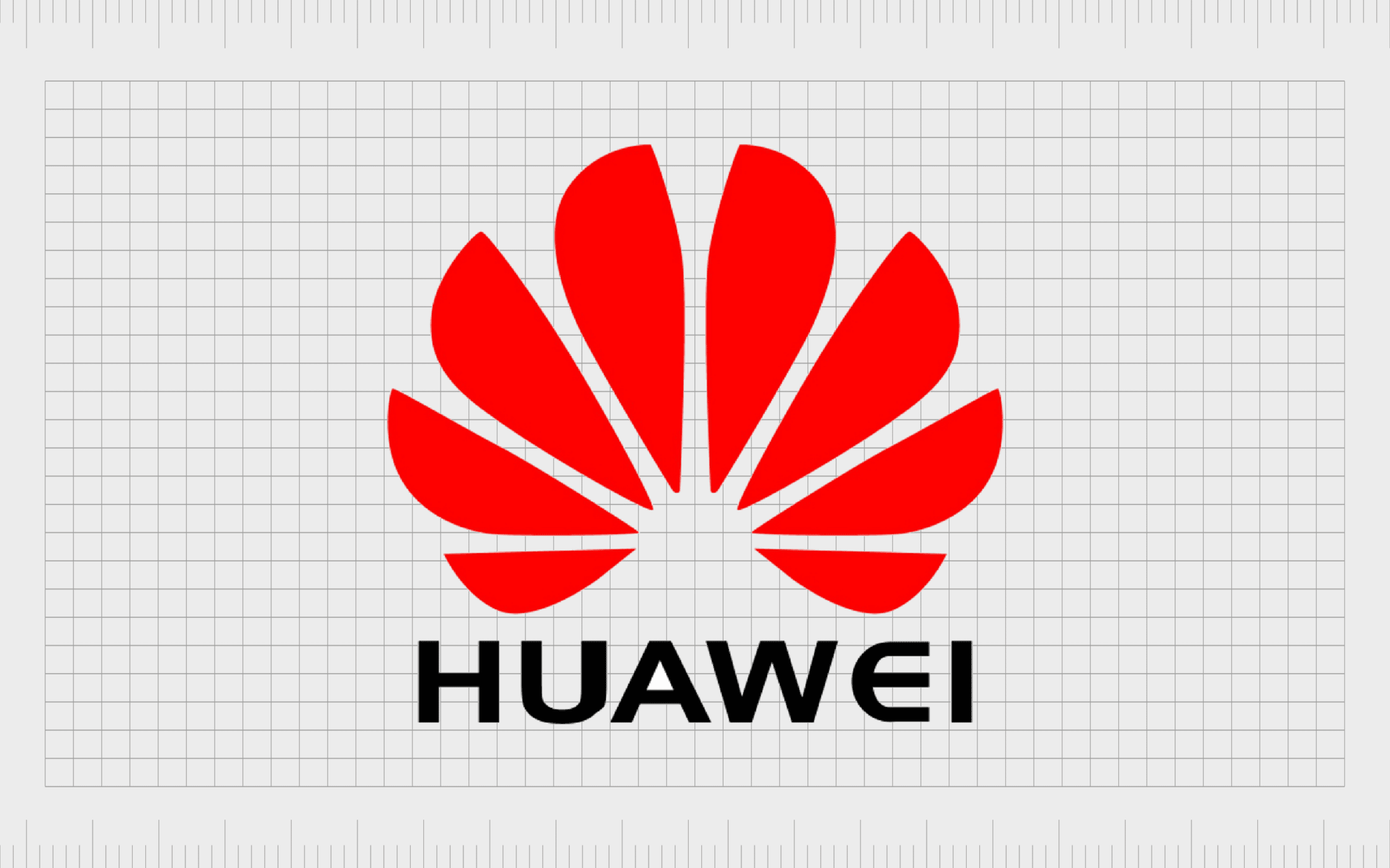
Huawei
The technology industry is yet another area where abstract logos thrive. Often, tech brands choose this type of logo design because they need to convey a complex message with something simple and accessible.
Huawei’s logo is an abstract flower shape, representing the “Hua” word in the name which means petals in Chinese.
The second part of the company’s name “Wei” represents achievement or action. The bright red shade for the brand mark helps to draw attention to the passion and ambition behind the organization.
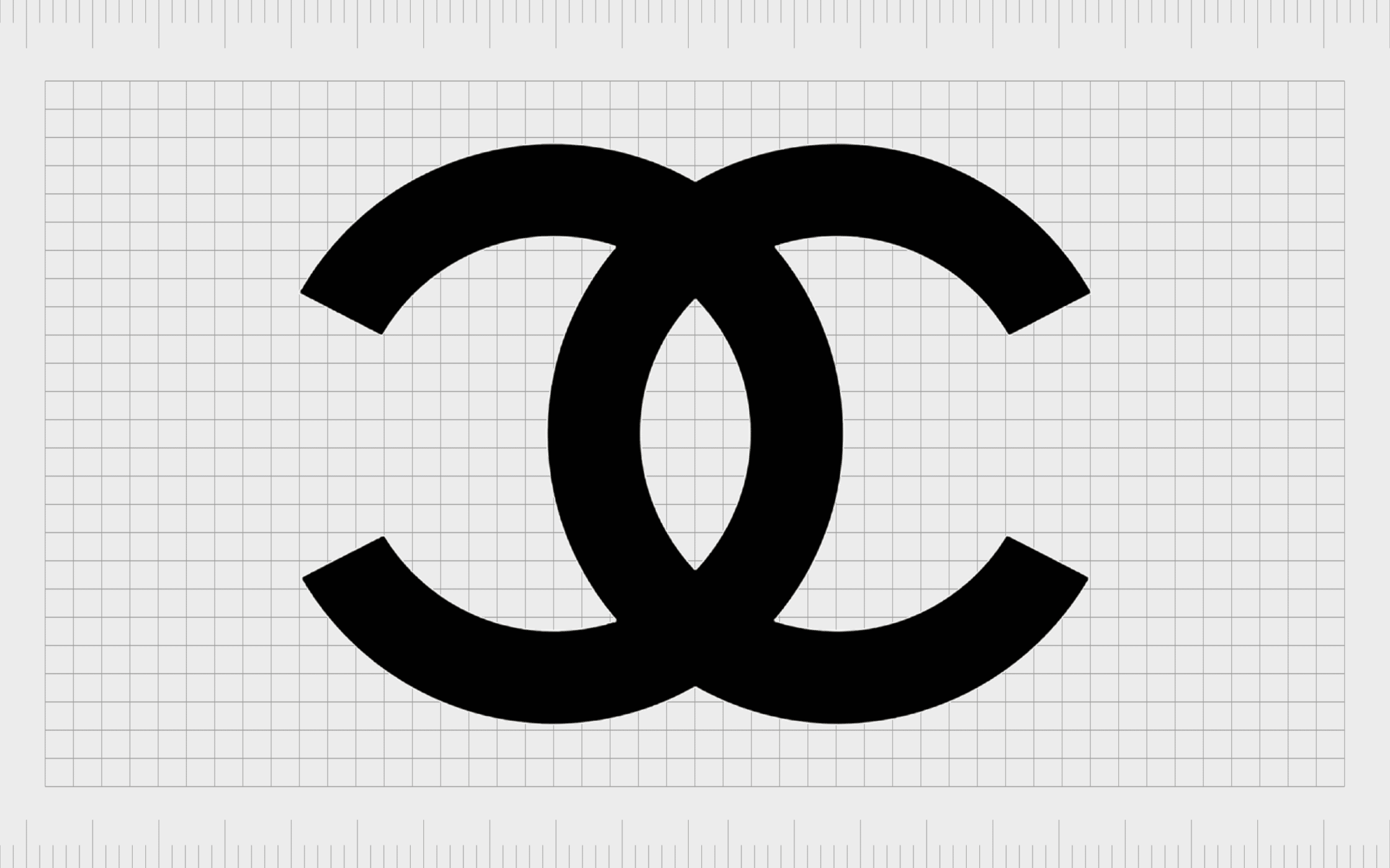
Chanel
Composed of two interlocking “C” characters facing in opposite directions, the Chanel logo has emerged as one of the most memorable images in the fashion industry. This iconic logo is intended to stand for the name of the creator “Coco Chanel”.
However, according to the people behind the Chanel brand today, the symbol also has a deeper meaning. The decision to use balance and reflection in the image was made to represent the principles of Chanel, such as comfort and geometry.
Find out more about the Chanel logo here.
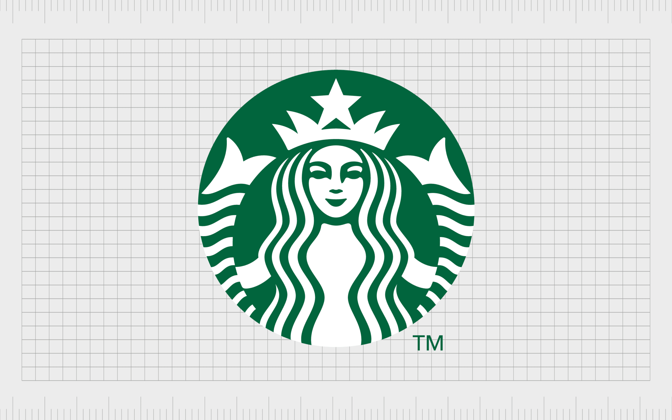
Starbucks
At a glance, the Starbucks abstract mark might seem like an unusual choice for a company responsible for selling coffee and snacks. However, there’s a deeper meaning behind the simplified shapes and lines.
According to the history of the brand, the company wanted to convey the passion and draw behind a siren’s call.
Starbucks’ creators chose the image of a mermaid to convey how coffee tends to call to us when we need a pick me up. The smiling figure also helps to enhance the friendly and welcoming image of the brand, while the color green represents nature.
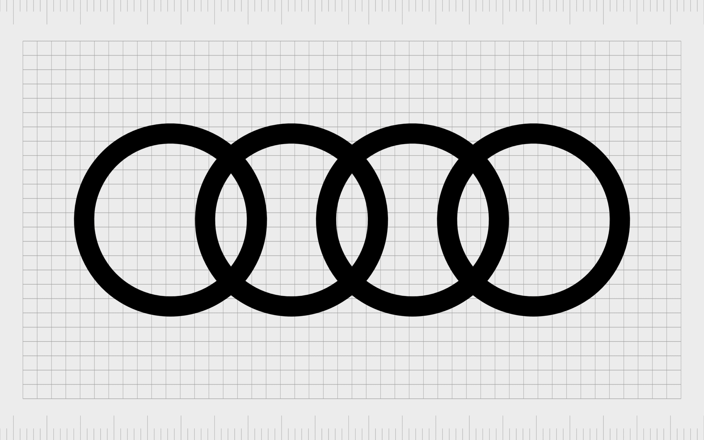
Audi
One of the most recognizable abstract marks in the automotive industry, the Audi logo consists of four interlocking rings. While some people may connect this image with the four wheels on a typical car, there’s actually a lot more meaning hidden within the symbol.
According to the company, the interlocking rings actually represent the merger of the four major automotive companies which came together to create Audi in the first place. Horch, DKW, Wanderer, and Audi all combined to create the company we know today.
Find out more about the Audi logo here.
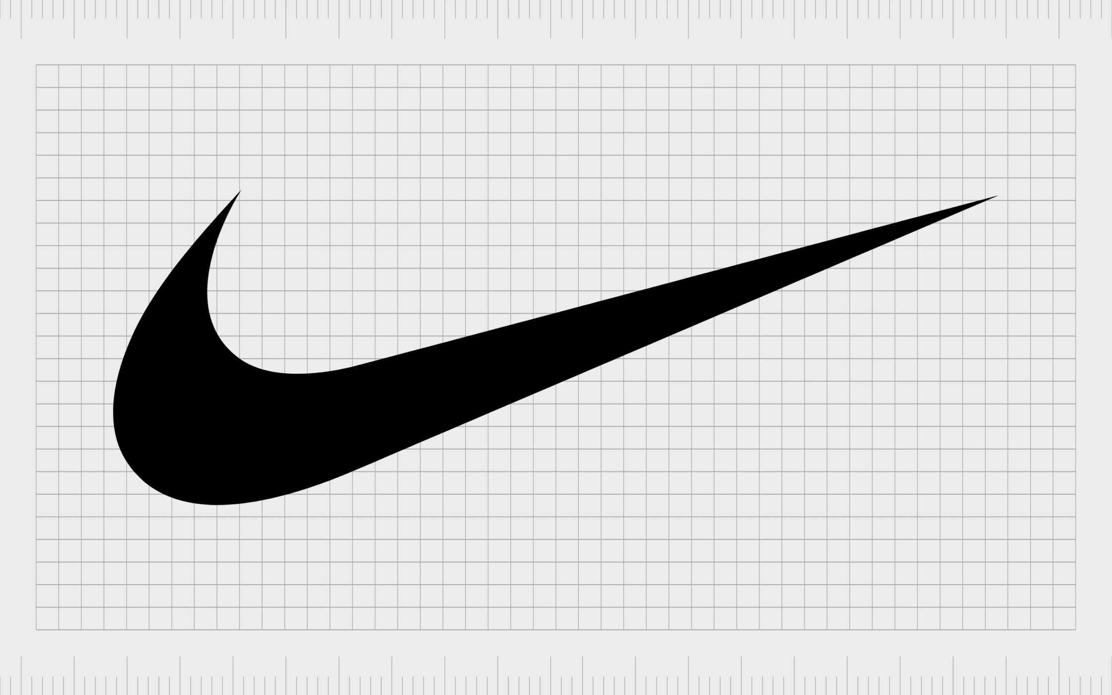
Nike
Probably one of the most famous images in the world of branding today, Nike’s logo has captured the attention and interest of athletes across the globe. The image first looks like a checkmark, something we associate with accomplishment and success.
However, the design of the “swoosh” is also intended to draw attention to the shape of the wings of a Greek Goddess named Nike. The Goddess was linked to concepts like victory, and the connection with her history helps to pull attention to the values and vision behind the athletics brand.
Find out more about the Nike logo here.
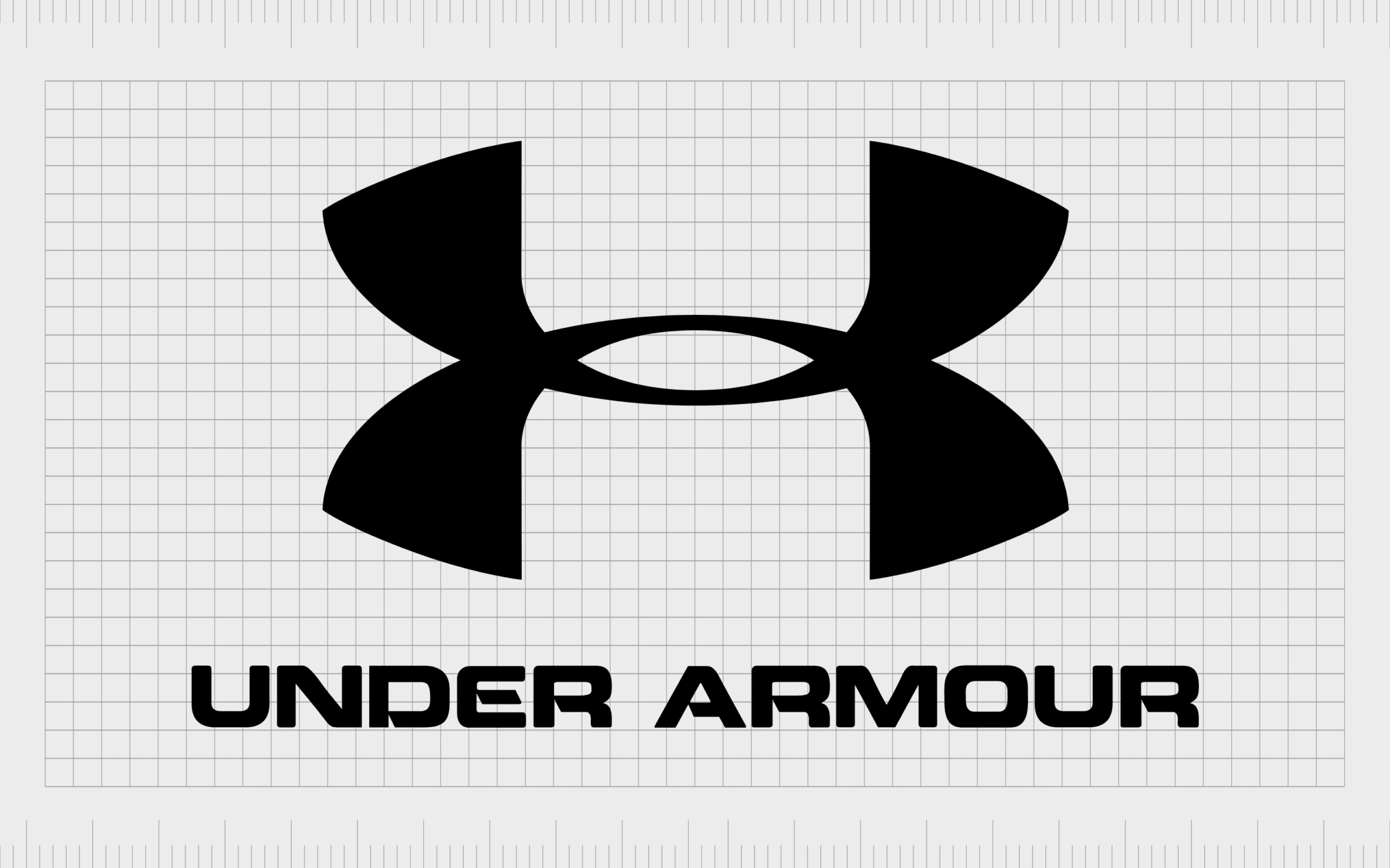
Under Armour
Another excellent example of famous abstract logos from the sporting and apparel landscapes, the Under Armour logo is recognizable across the world today. There’s a significant amount of meaning behind this simple image.
Not only do the two connected shapes look like a “U” and an “A”, but they can also symbolize the shape of a person.
When studied, the Under Armour image depicts a person with their two arms raised to the sky. According to the company, it’s a symbol of strength, achievement, and athleticism.
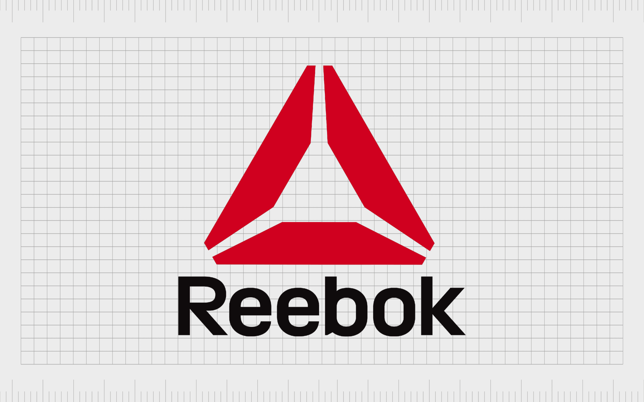
Reebok
Reebok is one of the world’s most well-known athletics brands. The company has changed its image a few times over the years, but the most recent design is known as the “Delta” symbol. According to the company, this image, depicted in a passionate shade of red, highlights transformation.
The Reebok Company wanted to use its abstract mark as a way of drawing attention to the transformative and positive change fitness can have on a person’s life.
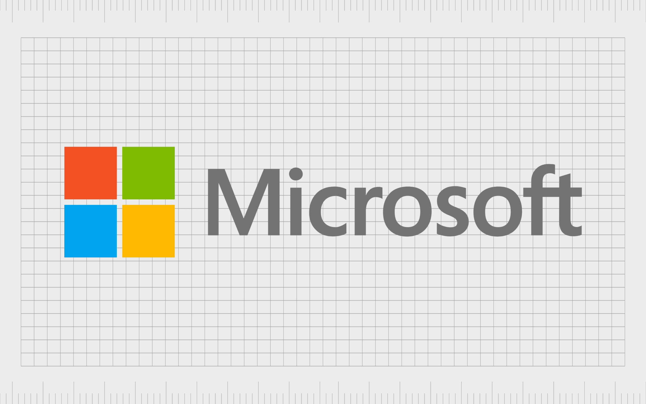
Microsoft
One of the simplest abstract logos in our list, the Microsoft symbol is a colorful and attractive choice for a technology company. The four squares combined together look a little like the traditional windows in an old home, highlighting one of the company’s most famous products.
Additionally, the separate colors chosen for the logo are representative of the company’s core focus areas. Green stands for Xbox, while orange highlights the “Office” suite of productivity apps. Yellow is connected to Bing, and blue is for Windows.
Find out more about the Microsoft logo here.
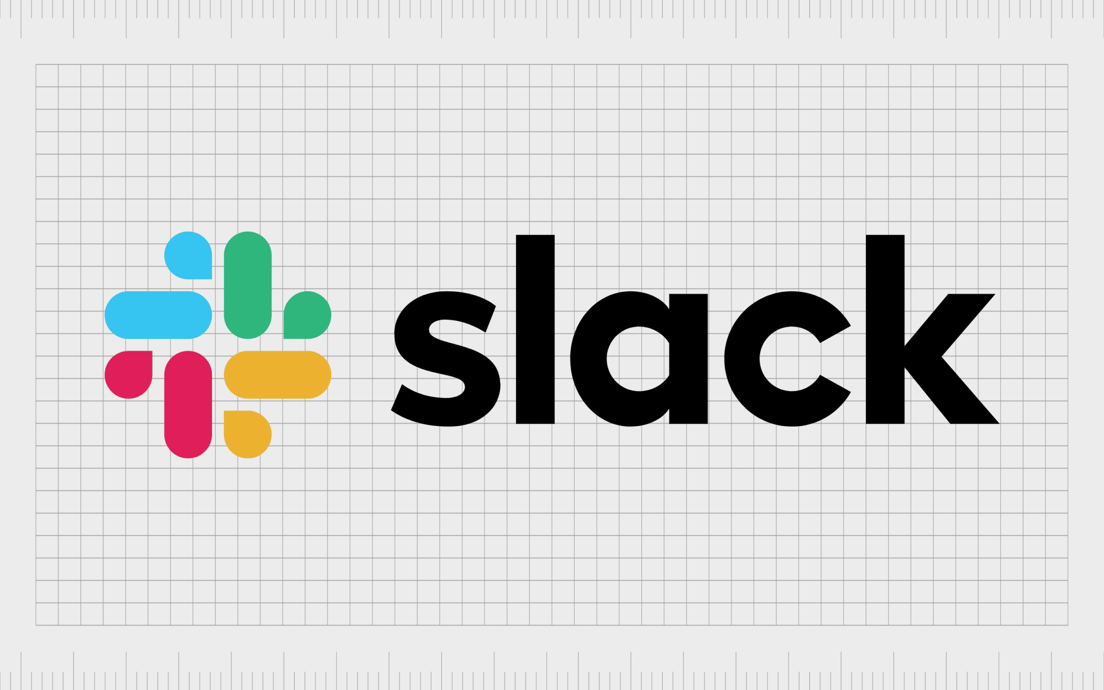
Slack
If you spend a lot of time online in today’s digital world, you’re probably familiar with the Slack logo. Though this image has changed a lot over the years, the design today is extremely memorable. The various colors in the vivid logo are intended to represent different teams coming together.
According to Slack, the simple nature of the logo is also a deliberate choice. The company wanted to highlight the ease of use in its product with a minimalist design.

Google Drive
Another excellent abstract logo for the digital world, the Google Drive logo is a symbolic image. The triangle represents data protection, and is often used as a symbol in the IT world for security. The various colors in the logo also have their own distinct meanings.
Like the famous Google logo, each color highlights something different in the Google collection of products, from Google Sheets (Green) to the Google Docs environment (Blue).
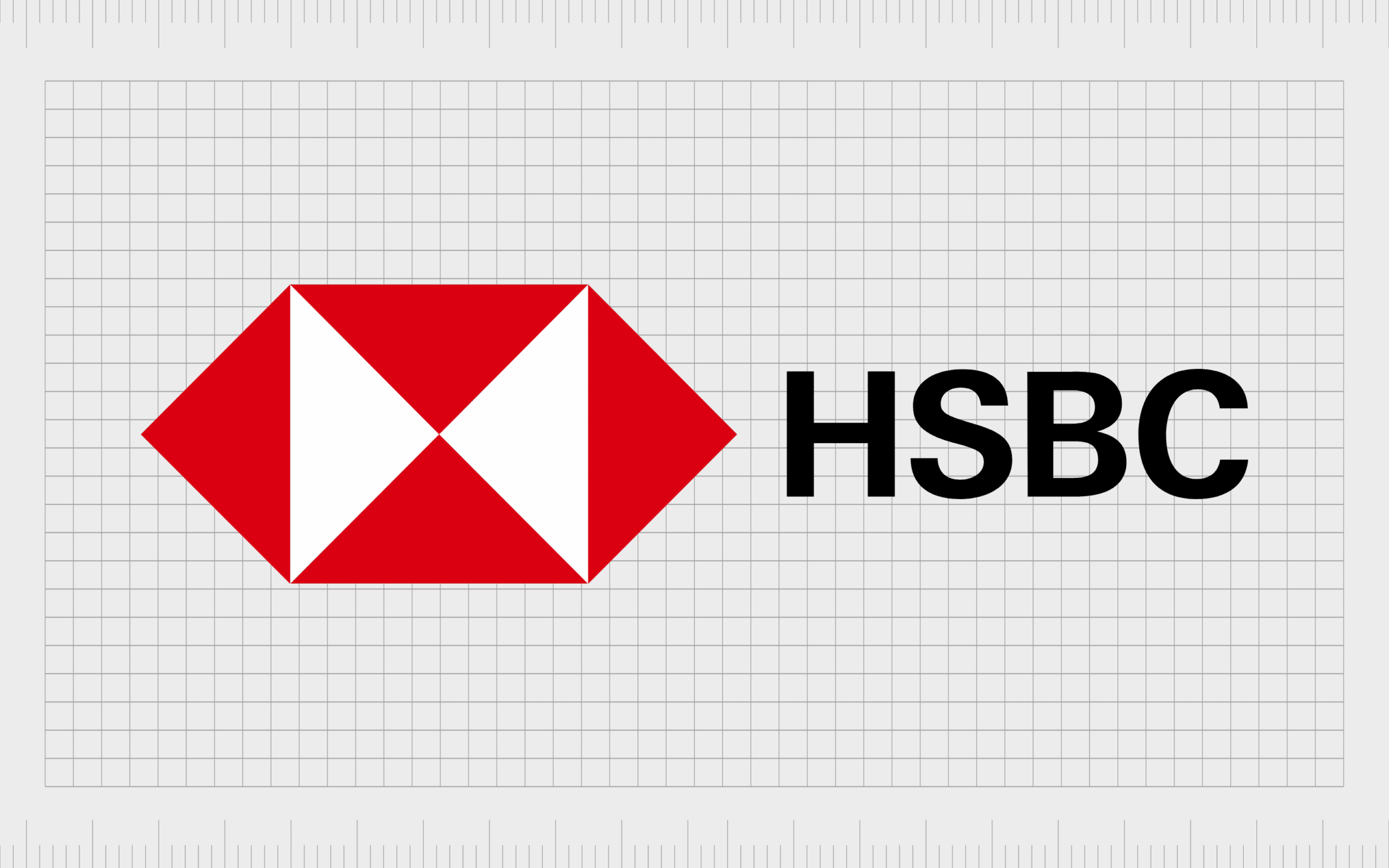
HSBC
One of the most famous abstract logos in the banking landscape, particularly in the UK, HSBC’s image is well-known throughout Britain. The symbol was actually based on the bank’s house flag, which included a red hexagon with a white hourglass inside.
The image is apparently also a reference to the Scottish flag, and the cross of St Andrew. This was a decision made by Thomas Sutherland, who wanted his heritage to be represented in the overall branding for the company.
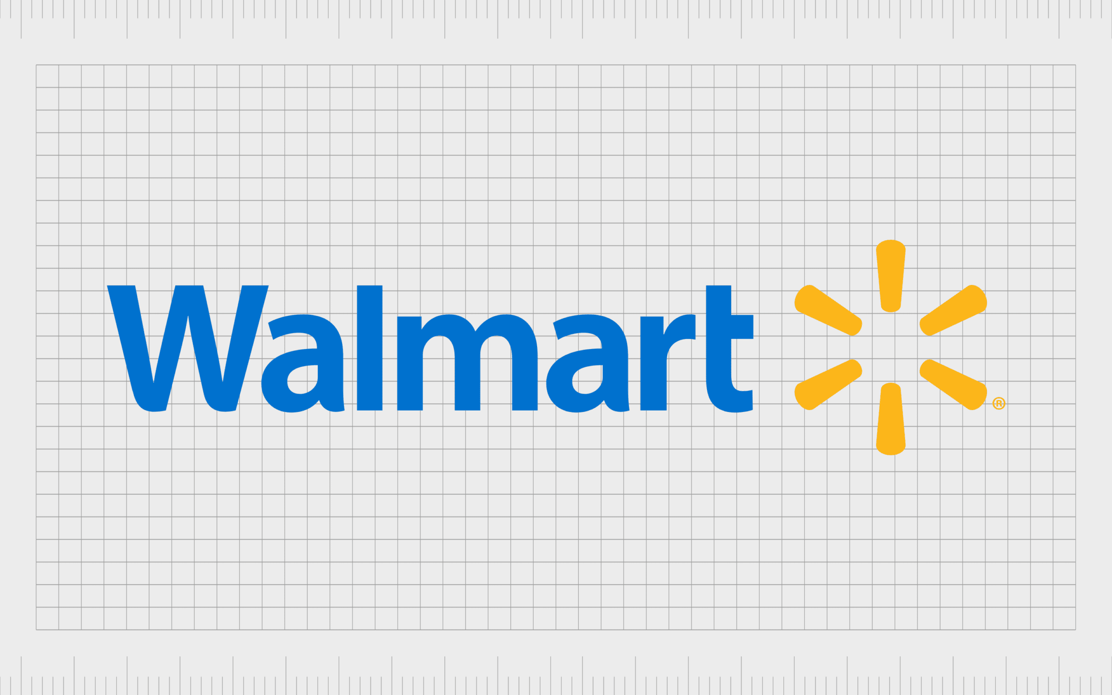
Walmart
Like many of the abstract logos listed here, the Walmart symbol has changed a few times over the years with the evolution of the company. The design today features a star-like sunburst shape, which is intended to symbolize all the great ideas developed by the company over the years.
According to Walmart, its new logo is all about inspiration, joy, and accessibility – some of the key values the company wants to convey with its image.
Find out more about the Walmart logo here.
The benefits of an abstract company logo
An abstract logo is an excellent way for any company to employ modern design trends like simplicity and minimalism, while visually reflecting core product differentiators and values.
With an abstract logo, it’s possible to highlight a number of valuable meanings and messages behind your business.
While not every company will benefit from using abstract logos in their brand identity, some of the major benefits of this form of branding include:
Flexibility
Because abstract logos don’t tell your customers what you sell or what your company does, they can easily evolve at the same pace of your business. This makes it easier to scale a company in today’s transformative world.
Emotional impact
A combination of the right colors and shapes can be an excellent way to connect with your customers on an emotional level. Certain shapes and shades have different associations which are ideal for branding.
Ownership
Abstract logos are often easier to copyright and trademark than more obvious images. You can infuse your abstract logo with all the meaning you like, and preserve it as a unique image for your business as long as you like.
Differentiation
Abstract logos can be an excellent way to differentiate yourself from other companies with a unique visual and message. You can set yourself apart from other brands, while connecting your business to universal ideas.
Memorable
An abstract logo is often more memorable than a descriptive logo. It can push us to think a little deeper about what a company is trying to convey with its image, which also embeds the brand further into our minds.
Embracing cool abstract logos: Do you need an abstract symbol?
Abstract logos are popular throughout virtually every industry and country. The abstract logo is one of the most versatile and flexible images a company can choose. When a literal logo doesn’t make sense, or you need to convey more complex ideas, an abstract mark could be the perfect choice.
The biggest challenge is actually designing an abstract logo with the right amount of depth and meaning. Because the options for shapes and colors are practically endless, it’s easy to get lost in the search for the perfect image.
Working with a logo designer is often the best way to make sure your abstract logo sends the right message, while remaining as simple and memorable as possible.
Fabrik: A branding agency for our times.

Clarity starts with a conversation.
Thanks—we’ll get back to you shortly.
Whether you're navigating a rebrand, merger, or simply need a clearer identity—we’re here to help. No hard sell, just honest advice from people who know the sector.
Let’s start with a simple question…
Prefer to email? Drop us a line.
Fabrik’s been helping organisations rethink and reshape their brands for over 25 years. We’ve guided companies through mergers, rebrands and new launches. Whatever stage you’re at, we’ll meet you there.