


Oversimplified logos: Clarifying the simplified logo trend
Oversimplified logos are everywhere. Over the last decade or so, we’ve seen an increasing trend towards more simplified logos, leveraging concepts like flat design and minimalism. The question is, is logo simplification really a good thing?
In the design world, “less is more” is often a common belief. Too much visual information can lead to complexity and confusion, which is the last thing you want from a logo.
Yet, at the same time, a logo has a lot of pressure riding on it. These simple graphics need to tell an important story about an organization, its values, and its mission, all without a single word.
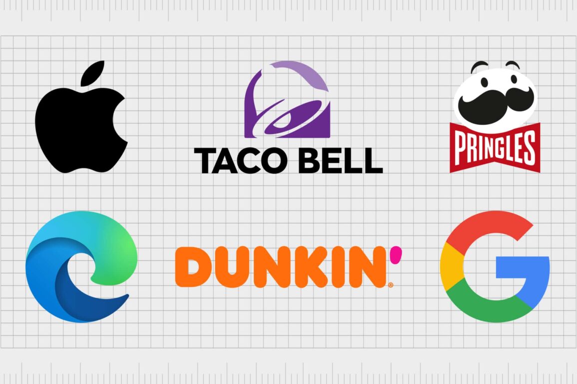
The logo oversimplification trend, influencing everyone from Burger King and Google to Pringles and Dunkin’ Donuts, certainly reduces the visual strain on customers, but it may also be diluting some of the meaning behind our favorite business emblems.
Today, we’re going to take a closer look at the simplification of logos, and how to decide whether it’s a good or bad idea for your brand.
What is an oversimplified logo? How do you simplify a logo?
An oversimplified logo is essentially any brand emblem with a flat, highly minimalistic design.
The idea with oversimplification is to remove anything and everything from a logo except from the most important visual elements. This often means getting rid of gradients, borders, wordmarks, and various other components meant to give a logo depth.
Oversimplified logos are generally chosen to make a brand more instantly recognizable and memorable, particularly in a digital world, where visual space for branding is limited. Established brands also strip their logos of excessive details to highlight their strong position in their field.
Simplifying a logo is a relatively straightforward process. It may involve stripping your design down to include nothing but simple shapes or colors or removing extra components like letters and words.
The key to success is finding the balance between simple, and generic.
When simplifying a logo, companies need to find one key concept or brand personality to communicate. For instance, when Dunkin Donuts became Dunkin’, they focused on the first part of their name, to highlight donuts were no longer the only product they sold.
Once you have a specific idea to communicate:
- Purge unnecessary elements: Remove all details, textures, shadows, and gradients.
- Remove secondary components:If the brand mark or wordmark is enough to define your company on its own, remove any accompanying elements.
- Verify at scale:Determine whether all the details of your logo are still evident when you adjust the design to different sizes.
- Reduce colors:Minimize the number of colors in your design, keeping the basics.
Why are logos being oversimplified?
The oversimplification trend in logo design is nothing new. For years now, we’ve seen a number of companies gradually making their logos less complex. Look at Google, for instance, or Yahoo. It’s common for companies to gradually filter and refine their logos over time.
Cleaner lines and fewer components can make a design seem more approachable and user-friendly.
Simplification also makes life easier for a lot of brands. In the automotive industry, a simpler design is easier to craft into a badge for a car. In apparel, the same is true, with simple logos making it easier to spread your image across multiple landscapes.
While there are many factors influencing the rise of simple logo design, most experts believe the real purpose behind this trend is shifting technology and markets.
From a technology perspective, the tech we have today makes it easier to experiment with graphic design, and explore new modes of simplification. At the same time, the way we use technology, such as with smartphones and smaller screens, is pushing designers to prioritize less complexity.
From a market perspective, oversimplification also helps to ensure your company can appear as modern and up-to-date as possible. If all other logos in your industry are becoming simpler, a complex design can make you look old-fashioned.
Why are companies oversimplifying their logos? The benefits
Minimalist, flat, and simple graphic design has been on the rise for some time now. Everywhere you look, there are examples of logos growing simpler, from the fast food industry to the tech landscape.
So why exactly are companies making this transition?
While every brand has its own reasoning for shifting to a more simplified logo, there are some common benefits championed by many companies.
Visual and user comfort
Complex logos can say a lot about a brand. However, the more complicated your logo is, the more overwhelming the image becomes. In a world where your customers are constantly overwhelmed by endless examples of branding and marketing, a simple logo can cut through the clutter.
Flat, simple logos are easy to consume and remember. They help to break your design down into something customers can easily absorb and file away for later. These logos also remove anything which may detract from your main company message, helping you to clarify your identity.
Digital transformation
As mentioned above, the way customers interact with brands is changing. We’re moving towards an increasingly digital world, where many people get their first impression of a company online, rather than in person. In the digital world, there’s less scope for what a brand can do with its image.
Most digital platforms have limitations on what you can do with your logo. Your design can only be so big when placed in the header on your website pages, or in your email signature. On social media, there are also a number of rules and restrictions about image size.
Scaling a logo down and removing excess components means it’s easier to fit your primary message into a range of digital landscapes.
Greater flexibility
Oversimplified logos are much more flexible. As we mentioned above, it’s easier to transform a simple logo into an emblem for a car or a hat. You can convert your image into a range of different mediums, etching it into metal and embroidering it on cloth, when there are fewer elements.
A simpler logo also means companies can more easily stand out on smaller screens, taking advantage of trends like mobile browsing and the rise of the apps culture.
With the oversimplified logo trend, companies can adapt their image to suit different environments and materials, without losing any important elements of their brand identity. The more complex your logo is, the harder it is to leverage in different spaces.
Brand strength
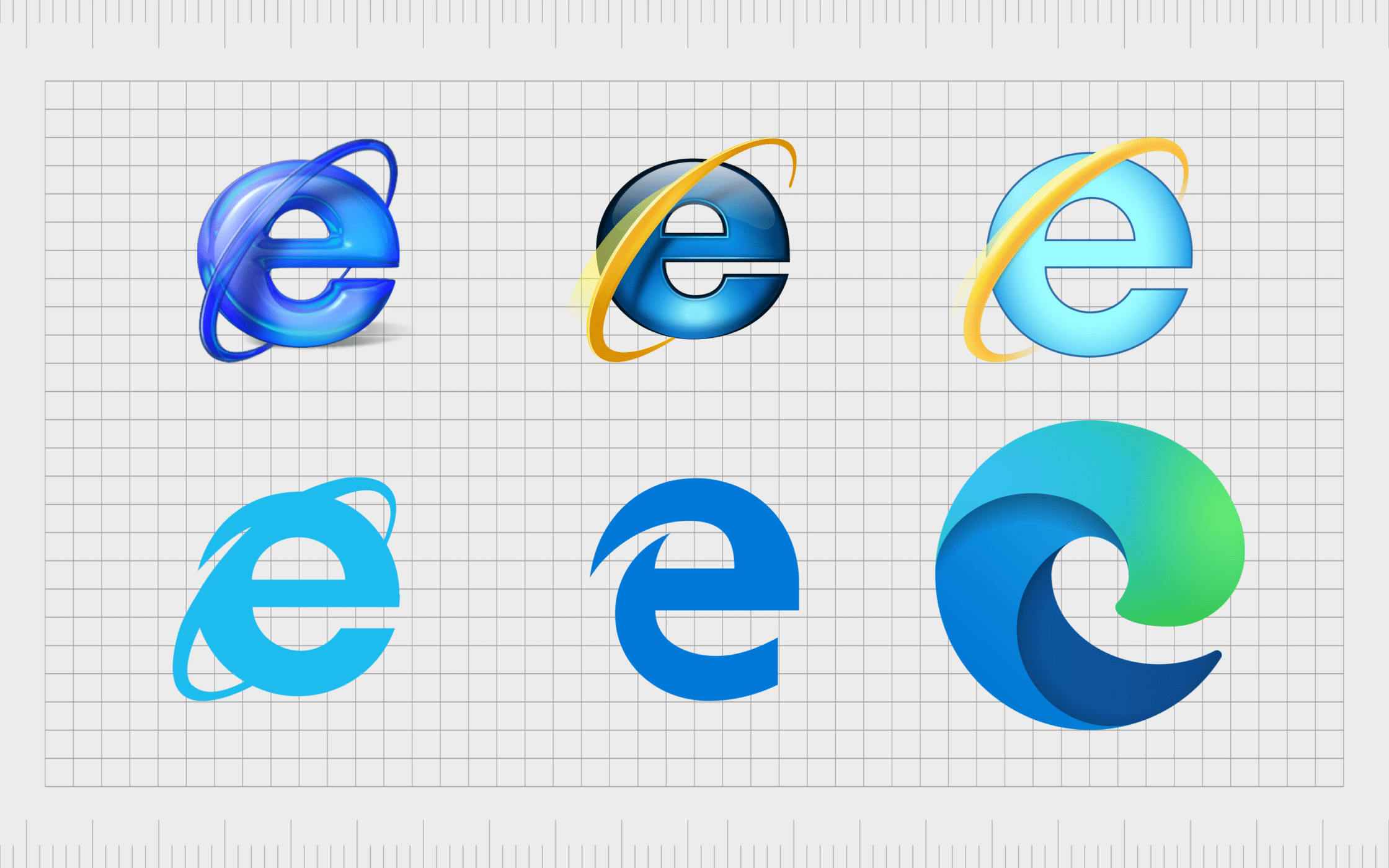
While many companies are embracing the simplification of logos these days, the trend started among bigger, more recognized companies, like Google, and Internet Explorer. As such, simple logos have become increasingly connected with concepts of credibility and brand strength.
A simple and clean minimalist logo can convey confidence, while helping to send a more streamlined brand message. It also ensures you’re not falling behind your competitors when it comes to brand image, so you can continue to compete in your industry from an aesthetic perspective.
Used correctly, logo oversimplification can make a brand look stronger, more refined, and even more sophisticated.
Cost savings
While it does cost money for a company to refresh its image or invest in a rebranding process, a simpler logo can actually save a lot of money over time. This is particularly true in industries where your logo needs to be displayed on your product or packaging.
Consider the apparel industry, for instance, if a fashion company needed to embroider their logo on every shirt and dress they made, they would want to use as few threads and colors as possible. The more complicated the logo, the more involved and expensive the production process becomes.
The same rules can apply when companies are simply printing their logos onto product packaging, as fewer colors and complex printing requirements usually leads to less expense in the long-term. This can make a simpler logo a great cost-saving mechanism for some companies.
When is the simplification of logos a bad thing?
There’s no one-size-fits-all when it comes to logo design. While some brands will thrive with an oversimplified logo, others may end up rubbing their customers the wrong way.
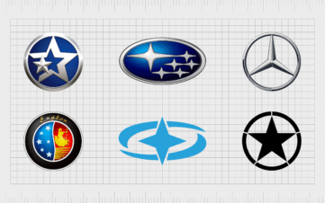
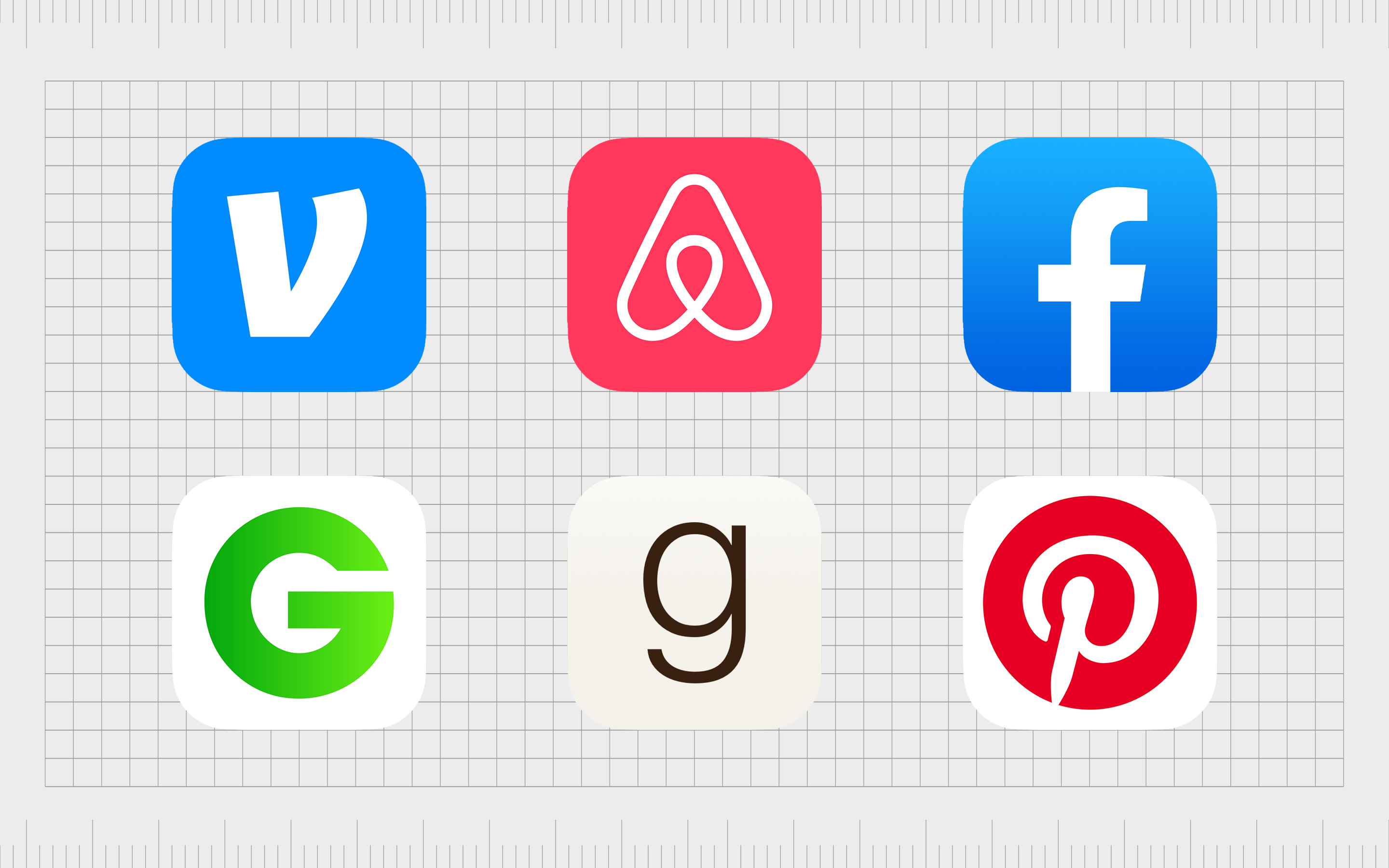
In some industries, the oversimplified logo trend has prompted an increase in generic images. Many of the companies in the technology landscape, beauty industry, and many others are starting to lose some of their unique elements through the process of simplification.
Oversimplification can also lead to homogenization, where all logos look more or less the same.
While it’s important your brand image fits with your chosen industry, the last thing you want is to look exactly the same as everyone else.
Notably, any redesign for a logo or brand mark will always meet some form of controversy. According to studies, consumers form perceptions of brands through years of relationship building and experience.
As such, we form a certain connection to brand logos over time, and can often feel unhappy when a design suddenly changes.
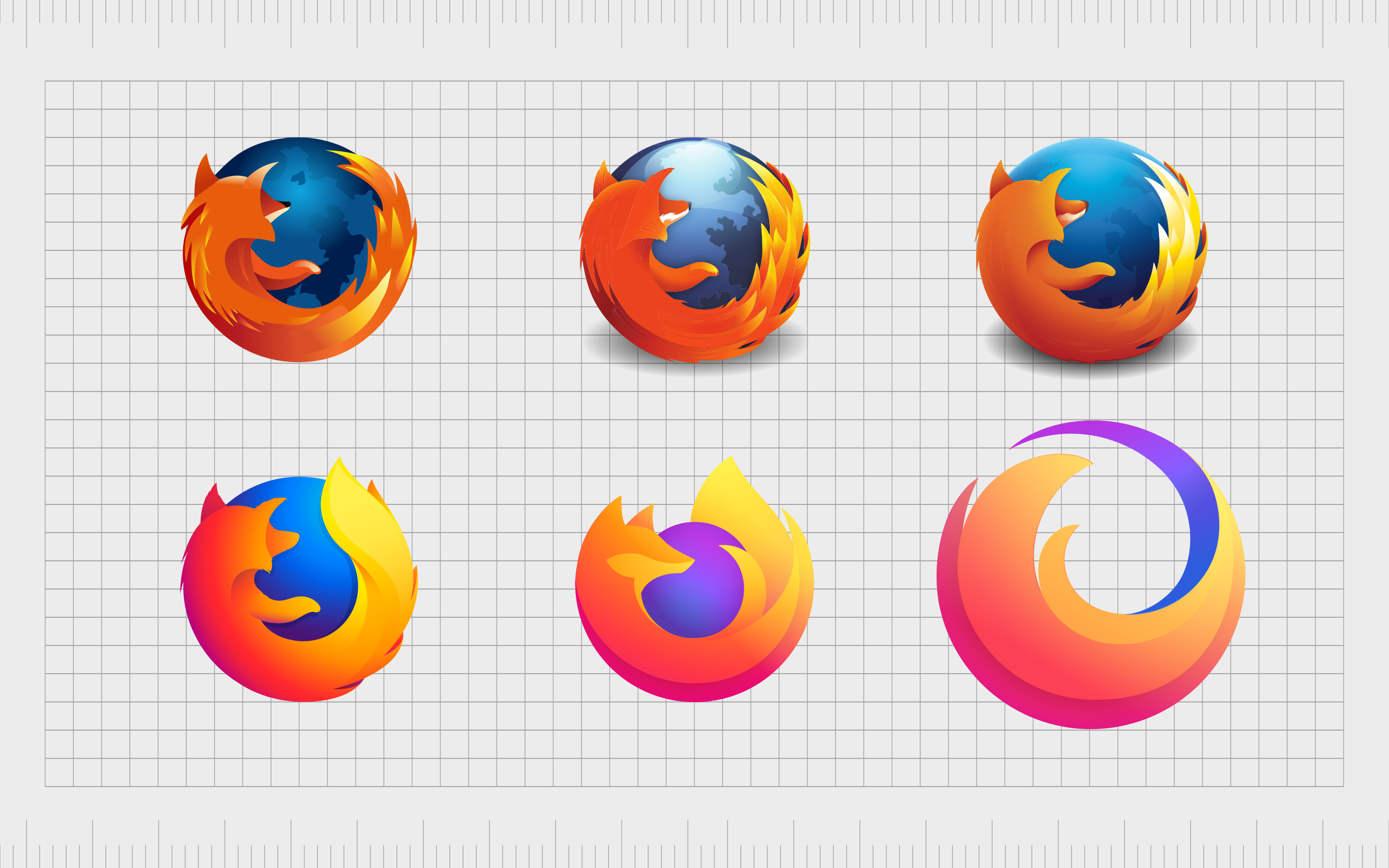
While some logo redesigns, like that of Burger King, have been met with approval, others have sparked harsh criticism. For instance, when Firefox decided to change its logo, and lose the fox.
Oversimplification can sometimes lead companies to remove too much of the crucial elements of their logo, to a point where important elements of the brand identity are abolished.
Do customers like the oversimplification logo trend?
There’s nothing inherently wrong with a flat and simple approach to logo design. Many companies like Coca-Cola, IBM, and Shell have definitely created better logos over time through the use of logo simplification.
However, a growing cynicism towards corporations can make it difficult for customers to embrace a simple logo design.
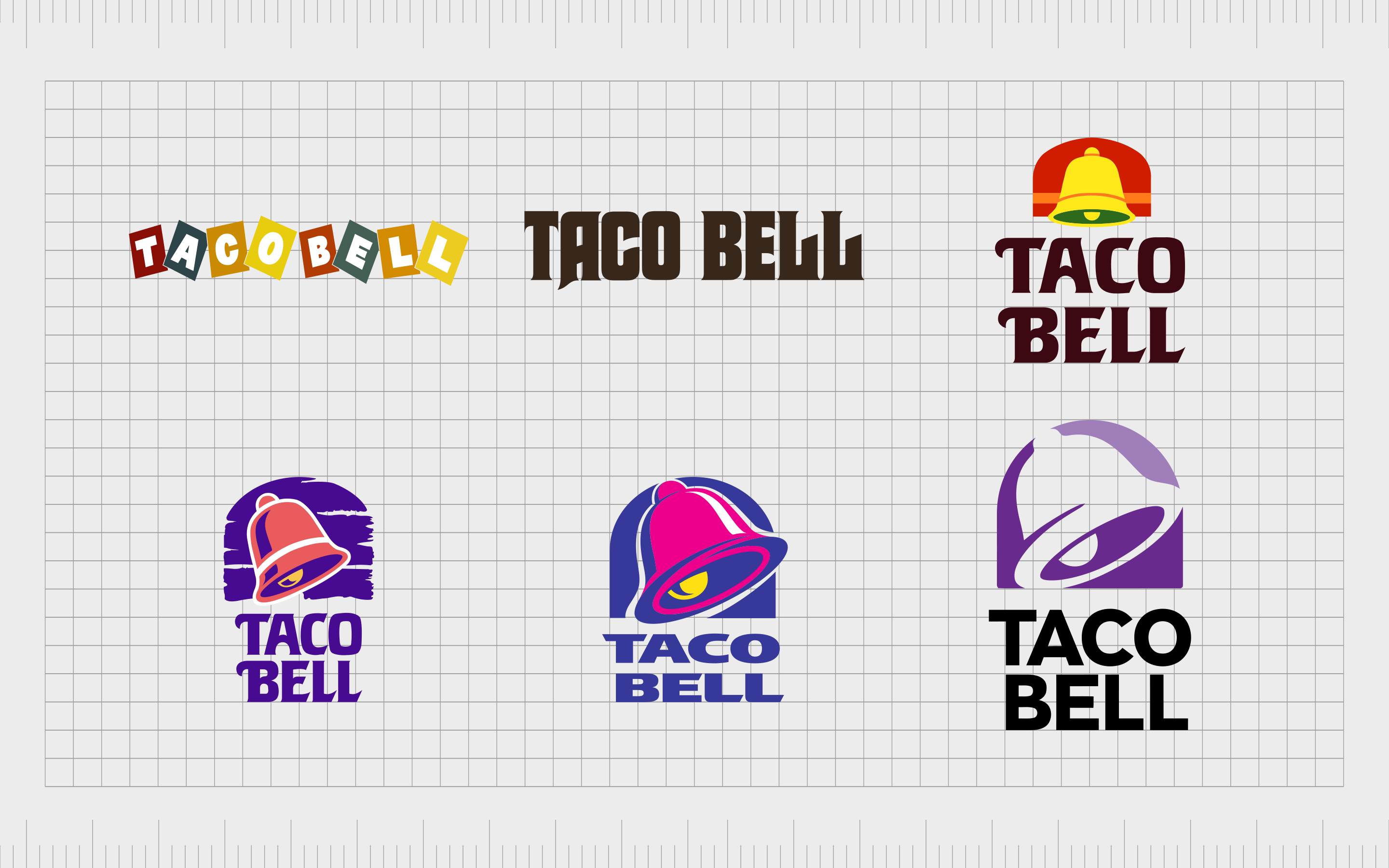
Some consumers see oversimplified logos as bland and “clinical”, having removed all of the elements which previously made them unique. Just look at how the Taco Bell logo has grown increasingly less colorful and playful over time.
Studies have also highlighted a growing distaste towards minimalist logos.
An original study conducted by the Harvard Business Review, published in the Journal of Marketing Research, examined the emotional impact of almost 600 logo designs. The images were split into categories based on how descriptive they were.
According to this research, around 60% of major companies are now using non-descriptive, oversimplified logos, usually with flat design. Around 40% use a more descriptive logo.
Participants in the study were asked to evaluate companies, using their logos to assess components like likeability and authenticity. In every category, descriptive logos got higher ratings.
The study found while oversimplified logos might be easier to remember and more “tuned in” to the technology landscape, they’re also widely regarded as less emotive and authentic.
The only time customers didn’t have a negative response to oversimplified logos, was when the images belonged to extremely well-known brands. Some companies don’t necessarily need a complex image to connect with their audience, like McDonalds.
However, up-and-coming brands may need to avoid oversimplification until they’ve captured the trust of their customers.
Oversimplified logo examples
Clearly, there are pros and cons to the oversimplified logo trend. While some companies will be able to benefit from shifting to a less complicated logo design, others could find they lose some of their emotional impact and unique identity if they go “too simple”.
To help understand how logo simplification can influence a brand’s identity, let’s look at some oversimplified logo examples.
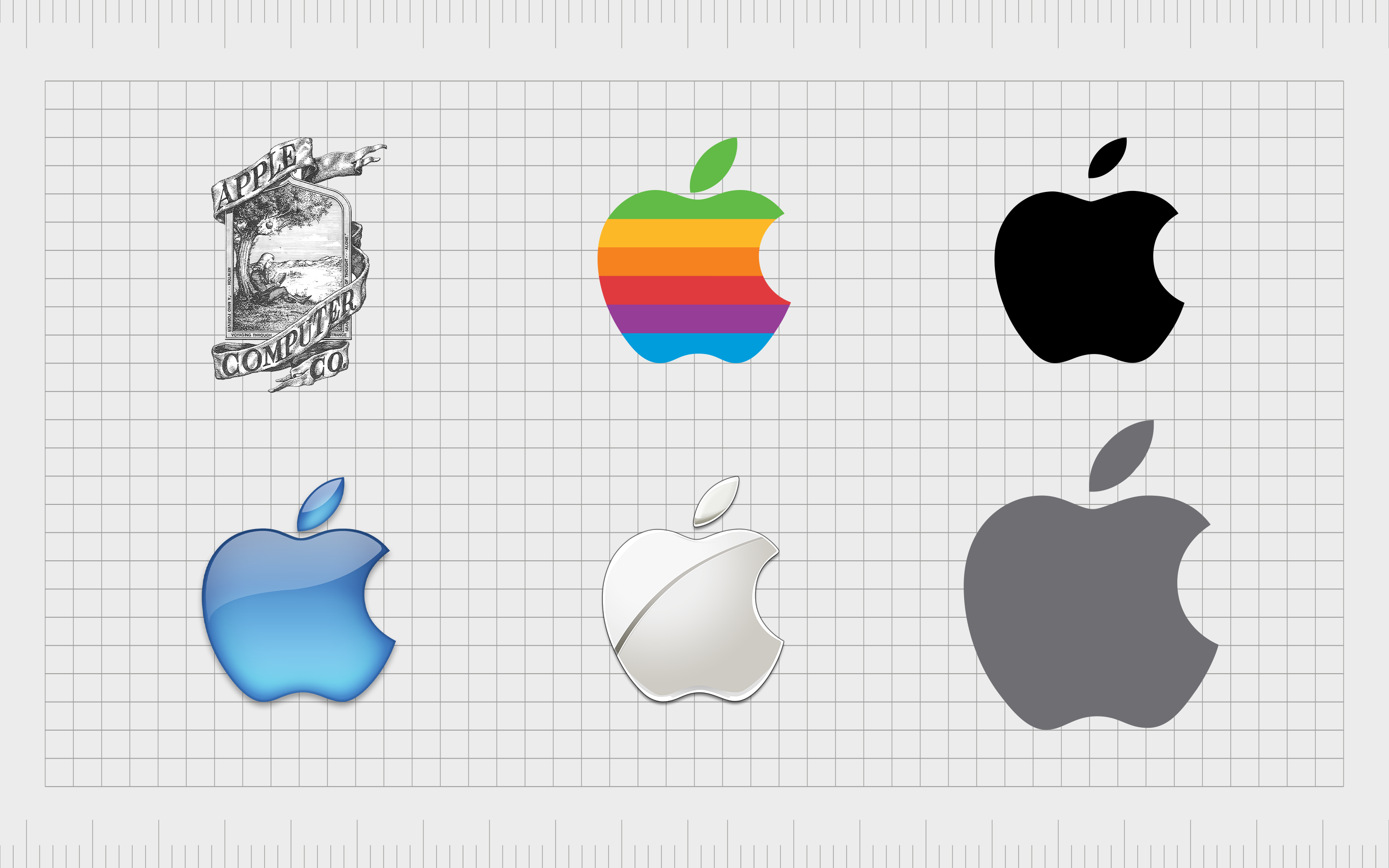
Apple
One of the most commonly referenced examples of logo oversimplification, Apple’s logo in 1976 was a world away from the logo we know today.
The first logo featured Isaac Newton sitting beneath an apple tree. While this was certainly a creative insight into Apple’s brand identity, it was far too complex.
Switching to the iconic Apple in 1977 was clearly a good step.
Since the new Apple design emerged in 1977, very little has changed, though the company has experimented with different gradients and textures from time to time.
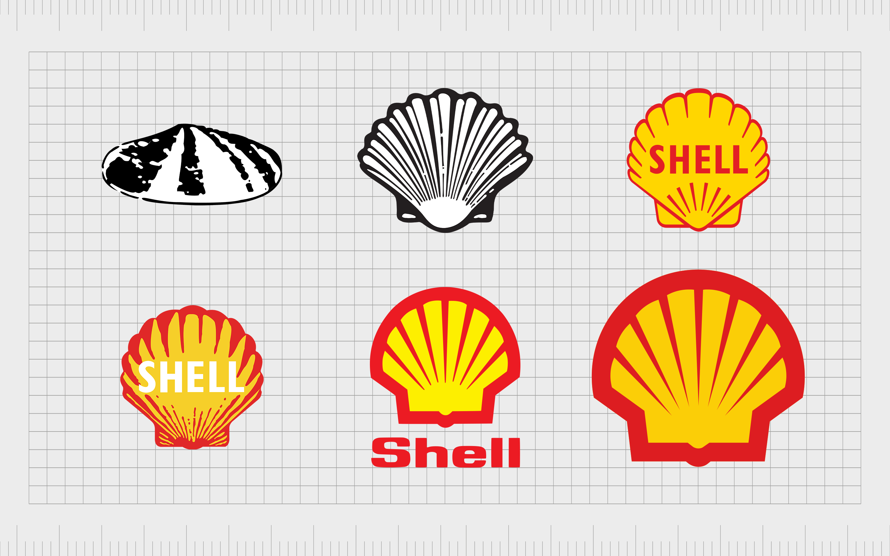
Shell
The Shell logo design is one of the most common examples of oversimplification done well. Drawing inspiration from the sea, Shell has always used the same primary shape in its logo. However, for many years, the company experimented with more complex, photo-realistic images.
Now, the Shell logo is a much bolder, cleaner, and more refined design, ideal for demonstrating the authority and sophistication of the brand. There’s no need for the word “Shell” when the image itself is so descriptive, so the company decided to remove the wordmark entirely.
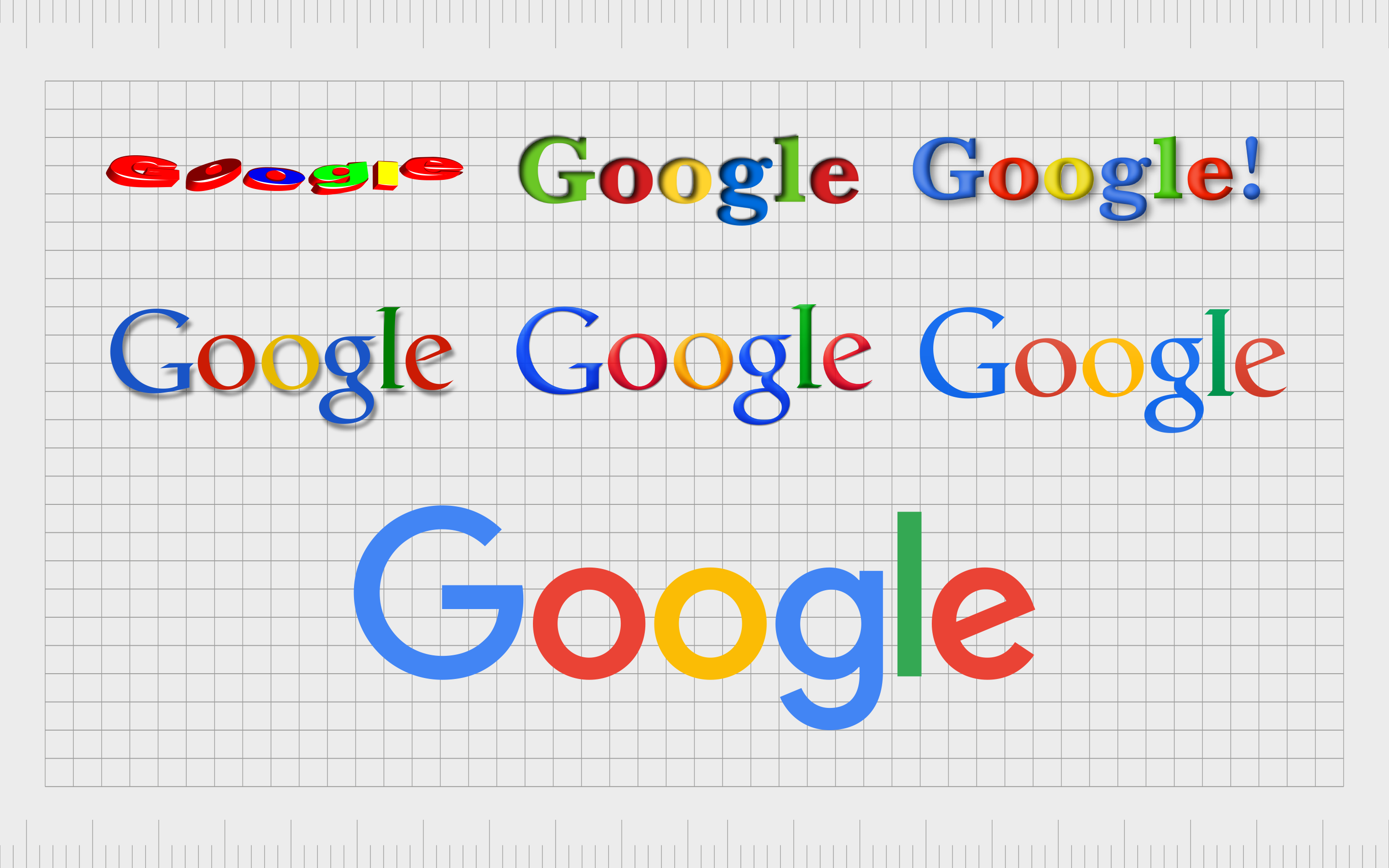
Probably one of the most commonly referenced companies when talking about oversimplification in logo design, Google has significantly reduced its image over the years. The company is an excellent example of how logo design trends often change with the technology available at the time.
Over the years, Google’s logo has become almost a benchmark for common trends in the technology logo design landscape. The current design is definitely friendlier, and easier to appreciate on a range of digital channels than previous versions.
Netflix
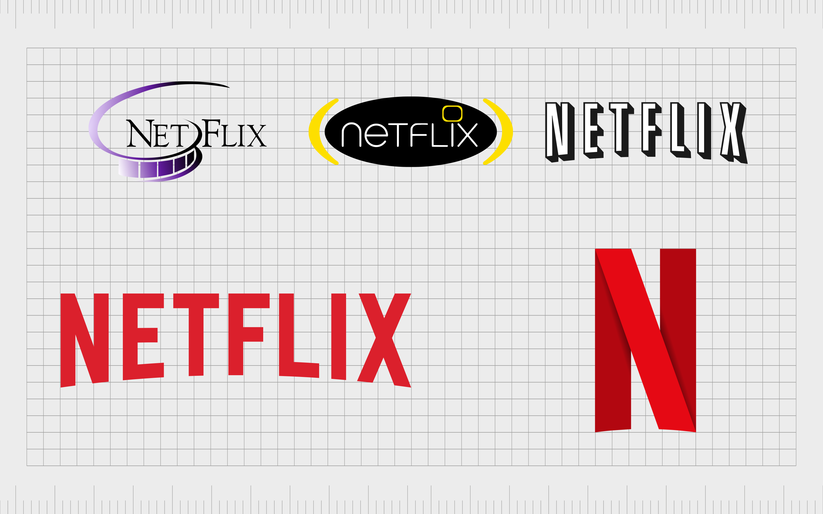
Netflix might be one of the newer companies on this list, but it’s still a good insight into how effective logo oversimplification can be. Created in 1997, the company initially focused on delivering DVDs and media to customers by mail.
When the brand started off, its logo was far more complex, and a little more elegant than the one we know today.
Over the years, as Netflix discovered its new digital brand identity, the image of the company evolved to offer something more simplistic, and in line with it’s modern identity.
The new logo is fantastic from a practicality perspective, because it works well on the range of devices where customers can access the Netflix app.
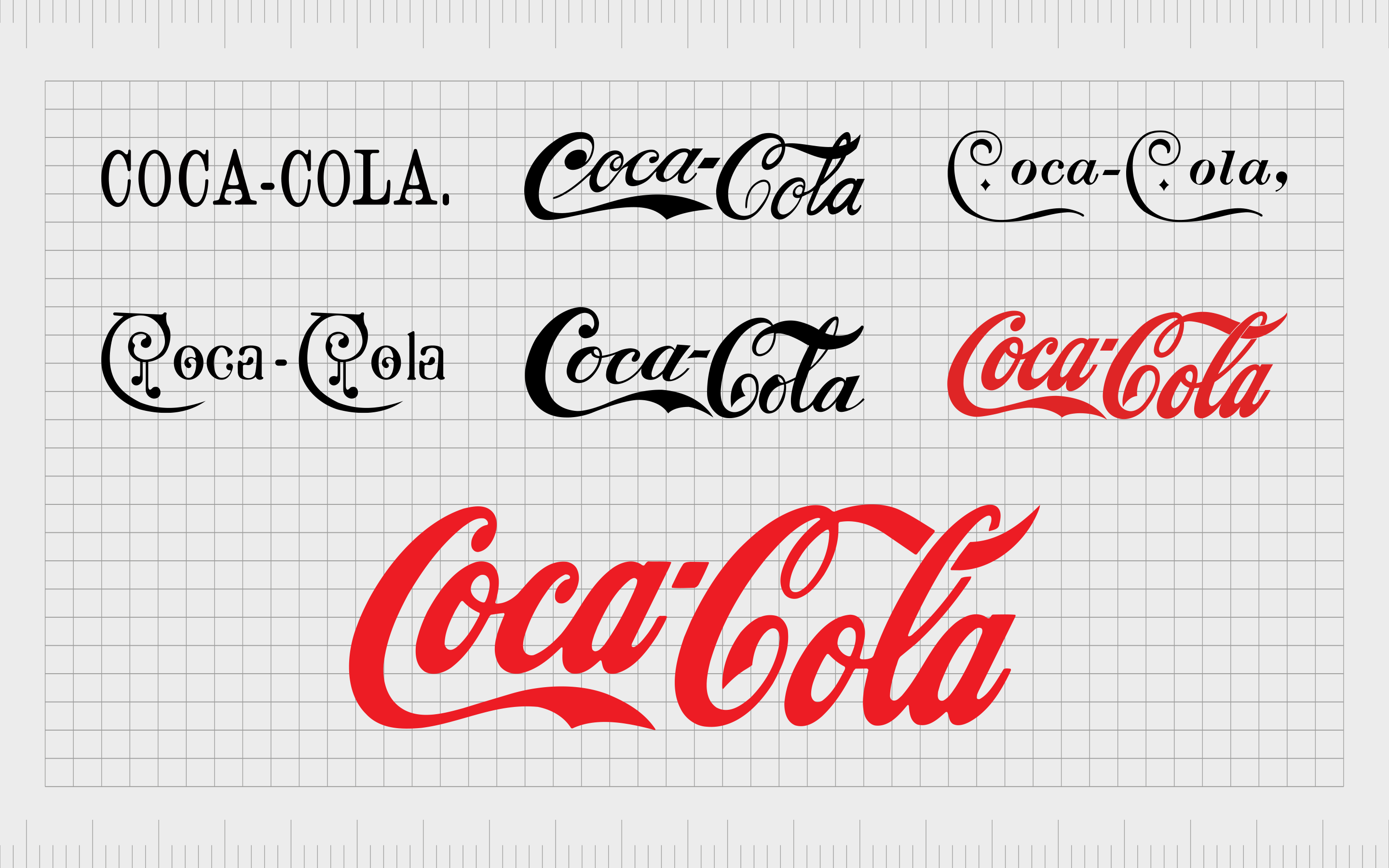
Coca-Cola
Interestingly, the version of the Coca-Cola logo we know today actually isn’t the simplest design we’ve ever seen from the brand. However, it is much simpler than many of the variations that came before it.
Over years of discovery and exploration, the company learned the most iconic part of its visual identity was its flowing, cursive font, and red coloring.
Eventually, Coca-Cola decided to remove everything else drawing attention from the central elements of its image, leading to a far more visually appealing design.
The image appeals to the nostalgic parts of customers who have grown up with the brand, while still keeping the company modern.

Ford
Logo oversimplification is very common in the automotive industry, and for a lot of good reasons. Perhaps most importantly, car companies need to produce their logo, usually in various forms of metal, to place on the bonnets and hoods of cars.
As such, the logo needs to be simple enough to translate into different mediums.
The Ford logo wanted to maintain the hand-drawn signature of Henry Ford as the primary element of its visual image, but they also knew they needed to make their design simpler.
As a result, we’ve seen a gradual reduction in the number of visual elements included in the Ford logo over the years.
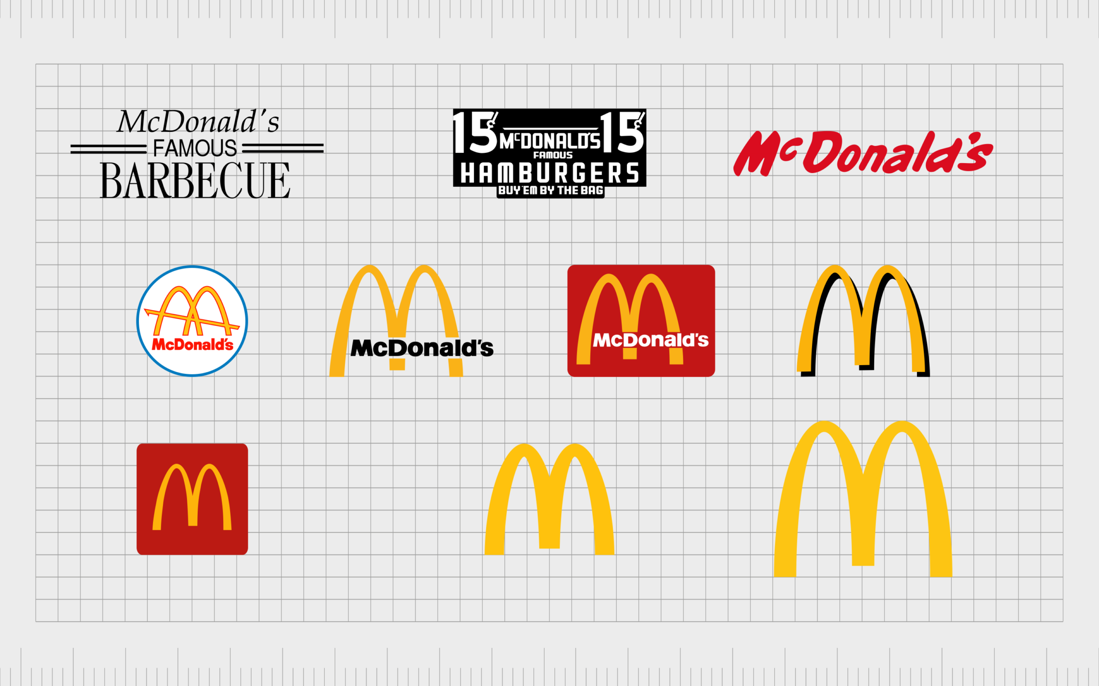
McDonalds
Fast food companies also have a practical reason for embracing logo oversimplification. Many of these companies need to display their logos in large signs and billboards, to attract customers driving by the store on the highway.
A complex logo would be too much to take in for a driver trying to keep their attention on the road.
The McDonalds logo has grown increasingly simplified the more our familiarity with the brand has grown. The company has actually used the “golden arches” as the primary element of their logo a number of times over the years.
However, the latest variation of the logo is perhaps the simplest version we’ve seen so far.
Considering the logo oversimplification trend
The trend of oversimplified logos has been evident in the branding landscape for quite some time now. It’s uncertain whether this trend will continue into the future, but it’s safe to say a number of companies have discovered the benefits of a simpler, flatter, and more minimalist brand aesthetic.
On one hand, simplified logos have a lot of distinct advantages to offer. With logo simplification, it’s possible to reduce the amount you spend on the production of branded products, make your logo more versatile, and boost your brand image.
However, too much simplification in a logo design can have issues too.
The challenge for most brands will be finding the right balance between logo simplification, and losing the unique elements which help to distinguish their brand. A simple logo can easily make your company feel less authentic and approachable in some cases.
Ultimately, there’s no one-size-fits-all for logo design. The best thing you can do to determine whether an oversimplified logo might be suitable for you, is to discuss your options with a branding expert.
Fabrik: A branding agency for our times.
Now read these:
—Descriptive vs non-descriptive logos
—What is a non-descriptive logo?
—Your guide to descriptive logos

Clarity starts with a conversation.
Thanks—we’ll get back to you shortly.
Whether you're navigating a rebrand, merger, or simply need a clearer identity—we’re here to help. No hard sell, just honest advice from people who know the sector.
Let’s start with a simple question…
Prefer to email? Drop us a line.
Fabrik’s been helping organisations rethink and reshape their brands for over 25 years. We’ve guided companies through mergers, rebrands and new launches. Whatever stage you’re at, we’ll meet you there.