


Audi logo history and meaning of the Audi emblem
Are you familiar with Audi logo history? The Audi logo is one of the most recognizable symbols in the automobile industry, combining simplicity with deeper meaning.
Though the Audi logo emblem has evolved somewhat since the launch of the brand in 1909, the four circles originally appeared during the 1930s. These circles are now fundamental to the Audi brand image.
Like many popular companies through the years, Audi has refined, updated, and enhanced its logo to capture the hearts and minds of future and existing clients.
Today, we’re going cover some of the details you should know about the Audi symbol.
What does the Audi logo mean?
The Audi symbol meaning
The Audi insignia today is one of the better-known images in the industry. The four circles of the well-known German car manufacturer have a deeper meaning than most people realise. More than just a sleek design, the 4-ring car logo depicts four companies that merged in the 1930s.
The companies, Horsch, Audi, Wanderer, and DKW combined to form the “Auto Union”. Later, the newly created companies took on the name of “Audi”. The enhanced business quickly became one of the top automobile companies in the world.
Today’s Audi logo is a simple design featuring four interlaced rings. The design is sometimes accompanied by the wordmark for “Audi” in a sleek font.

Audi: Brand overview
| Founded: | July 1909 |
| Founder: | August Horch |
| Headquarters: | Ingolstadt, Germany |
| Website: | www.Audi.com |
| Logo downloads: |
Audi AG, or Audi is a German automotive company known for designing luxury vehicles. Today, Audi is a subsidiary of the Volkswagen group, and produces vehicles in nine facilities worldwide. The origins of the brand are quite complicated, dating back to the very early 20th century.
As mentioned above, the Audi we know today is the result of a merger between four companies, including the original Audi brand. The combination of the companies created the Auto Union, which was acquired by Volkswagen in the 1960s.
After relaunching the Audi brand, the Volkswagen company helped to establish the Audi logo most people know now.
Audi’s name comes from the surname of the founder, “Horch”, which means “listen” in German, and translates to “Audi” in Latin. Audi uses the slogan “Being ahead through technology” in some of its marketing efforts.
Audi logo evolution: Audi logos over the years
Audio logo changes throughout the years have largely been influenced by the Company’s changing ownership and position in the marketplace.
Though the 4-ring car logo is the design most commonly associated with the brand, this image didn’t appear until more than 20 years after the launch of the business.
Let’s take a closer look at the Audio logo through the years.
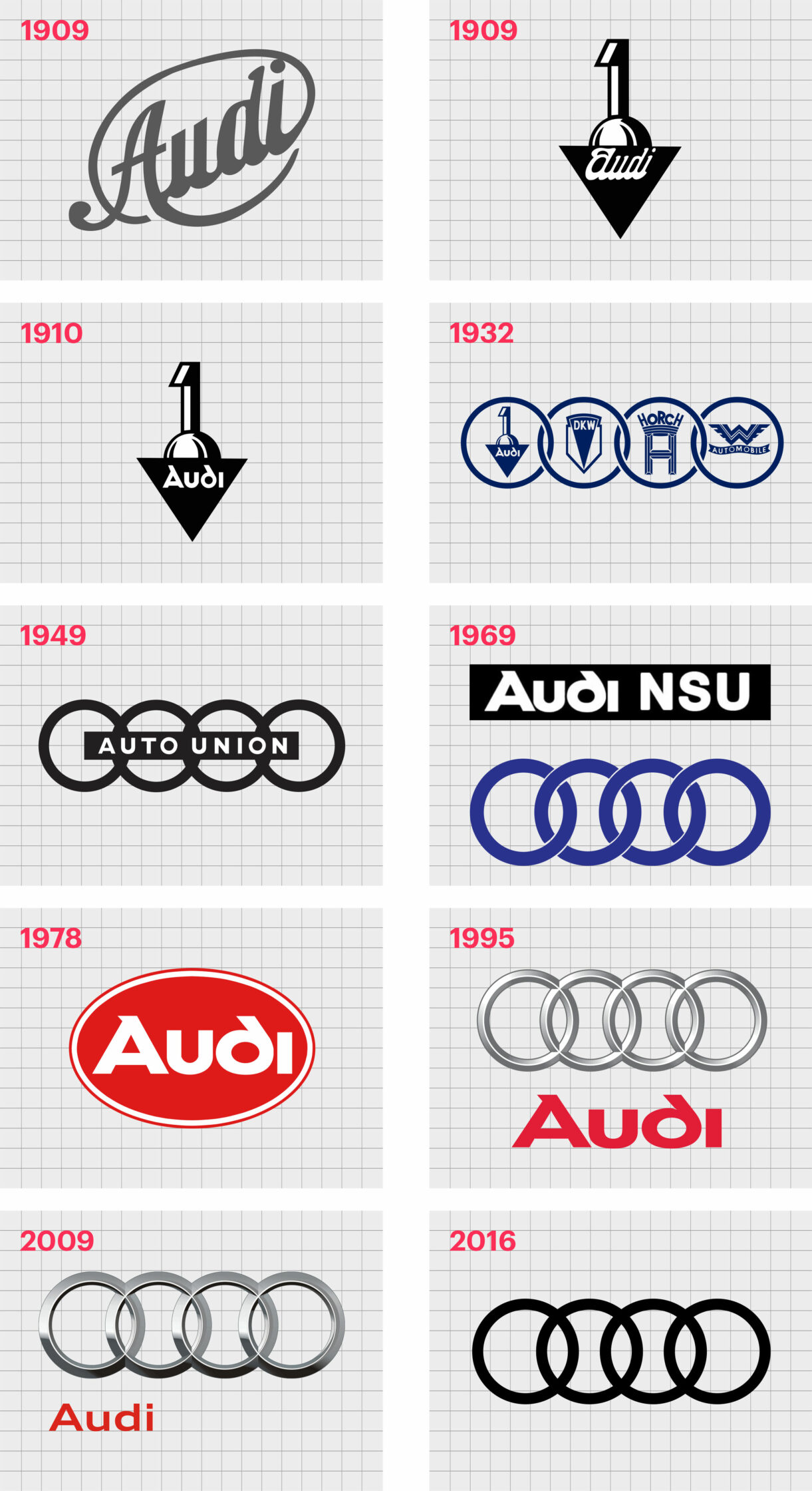
1909
The Audi logo designed for the pre-launch of the Company is nothing like the one we know today. Instead, we see a cursive wordmark tilting upwards within an oval outline. The logo featured a dark grey color palette, excellent for exuding sophistication and professionalism.
Before the Company officially launched in 1909, however, the Audio logo emblem changed. The new badge looked like a number one sitting on top of a semi-circle and upside-down triangle. The word “Audi” still appeared in an italic font.
Later in the same year, the Audi logo design team made another change, updating the “Audi” wordmark to something similar to the design on Audi marketing collateral today. This logo remained part of the Audi image until the formation of the Auto Union in 1932.
1932
1932 marked one of the most important instances of the Audi logo changes we’ve seen throughout the years. The merger of four different brands created the “Auto Union” and a new logo.
This new design, though complex, held a lot of meaning. Four connected circles linked together, showcasing the previous logo designs of the standalone brands.
The complexity of this emblem began to diminish over the years. In 1949, a version of the Audi symbol without the separate logos appeared.
The emblems in this logo were removed from within the circles and replaced by a horizontal rectangle featuring the words “Auto Union” in simple sans-serif text.
1969
In 1969, after the name of the Auto Union officially changed to “Audi” the symbol evolved again. The simplistic design built on one of the original Audi wordmarks, and the rectangle in the middle of the four connected circles of the previous logo.
This Audi insignia combined the word “Audi” with the letters “NSU” on top of a black rectangle. Later in the same year, Audi also created an alternative version of its logo. This insignia removed the rectangular banner from the previous logo and kept just the four rings.
The rings were chained together to represent the connected brands, and they featured a dark blue color palette.
A wordmark to accompany the four rings also appeared during 1969. This featured the Audi wordmark with the well-known Audi font. The word appeared in white bold letters, on top of a black oval shape.
1978
In 1978, the version of the logo featuring the wordmark in an oval shape changed again. This design was now in red and white, and included a thinner white border around the initial red oval, followed by a sleek red outline.
The Audi wordmark and four circle emblems merged together in 1995, creating the logo many Audi fans are familiar with today. The rings in this insignia took on a three-dimensional shape with metallic shading.
The Audi wordmark used the same bright red of the previous oval logo.
Audi also experimented with a version of the four-ring logo which combined glossier, larger metallic rings with a smaller, sans-serif wordmark, placed in the lower left-hand corner.
2016
Following in the footsteps of many popular brands in 2016, Audi simplified its logo yet again, removing the wordmark and the shading for the metallic rings. The connected circles are now bold and black.
The Audi symbol meaning today
As mentioned above, the biggest Audi logo changes occurred due to the changes in the Company’s ownership and structure. The Audi symbol meaning today remains the same as for the initial launch of the Audi brand.
When Audi joined forces with three other companies to create the Auto Union, the four-ring design was a way to represent all the contributing companies.
Although the Auto Union brand decided to use the name “Audi” officially going forward, the four-circle design remained a testament to the origins of the business.
Today’s four-ring logo is an excellent insight into Audi’s history. The simplicity of the Audi symbol also means it’s much easier to remember than some alternative designs.
Audi logo colors
The Audi logo color scheme today is a simple combination of bold black circles on a white background. The color black represents sophistication, strength, and power.
Previous Audi logo colors featured a lot of chrome and silver-style designs for the 4 rings. This was a common choice among car manufacturers who wanted logos to resemble the actual badge on a car.
The most recent version of the Audi wordmark was written in a bold red, although this design isn’t always used alongside the four-ring symbol.
When the wordmark does appear on the logo marketing collateral, it’s an excellent example of color psychology. The bright red combines feelings of power with passion and excitement.
What font is the Audi logo? Audi logo font
Audi uses the unique Audi Type font when adding its wordmark to its marketing collateral. The font was created specifically for the business. The previous Audi font was also a custom creation and remained a consistent component of the brand image for many years.
This previous Audi logo created a sense of synergy between the “A” and “D” in the Audi wordmark, through the use of parallel lines.
When Audi simplified its logo, the parallel lines in the wordmark disappeared. Today, the sans-serif typography is a lot more subtle.
The Audi logo today
Today, the Audi logo represents one of the most memorable and better-known car logos in the industry. The simple but powerful design is easy to recognize, whether you see it via an online ad, or on the back of a car when queuing on the motorway.
Now read these:
—Which car companies own which car brand?
—Famous car brands, their names and logos
—The ultimate list of French car brand logos
—The 50 best-known car logos with wings
—The definitive guide to German car logos
—Famous car logos and emblems with stars
—Top American car brands and their logos
—Your ultimate guide to Italian car brands
—American car companies that went bust
—The conclusive guide to British car logos
—The essential list of Japanese car logos
—A decisive guide to car logos with circles
Fabrik: A branding agency for our times.

Clarity starts with a conversation.
Thanks—we’ll get back to you shortly.
Whether you're navigating a rebrand, merger, or simply need a clearer identity—we’re here to help. No hard sell, just honest advice from people who know the sector.
Let’s start with a simple question…
Prefer to email? Drop us a line.
Fabrik’s been helping organisations rethink and reshape their brands for over 25 years. We’ve guided companies through mergers, rebrands and new launches. Whatever stage you’re at, we’ll meet you there.