


Hotel brand logos: Memorable hotel logos and names
Hotel brand logos are an opportunity for hotel companies to capture the trust and attention of their target audience with one simple image. Perhaps more than brands in other industries, hospitality companies are relying on their logos to make them appear as credible as possible.
After all, hotel organizations aren’t just asking us to buy a product; they’re asking us to trust they can provide safety and comfort to us when we’re away from our homes.
There are countless memorable hotel brand logos out there to highlight just how valuable these images can be. Today, we’re going to be taking a closer look at some of the most memorable hotel logos and names on the market, and what makes them so special.
Common themes in hotel company logos
Before we proceed to our list of famous hotel brands and their logos, let’s start by considering the common trends and themes of hotel logos in general. Take a closer look at the brand marks in any industry, and you’re bound to notice some commonalities.
There are dozens of car logos with wings, for instance, and beauty logos tend to use a combination of luxurious-looking fonts with deep colors.
Some of the themes you might notice when we’re sorting through our hotel company logos include:
Rich, saturated colors
Deeper colors of green, blue, and purple are common in hotel logo design. Deeper colors are often associated with luxury and indulgence, so they’re more common among famous hotel logos linked to higher-class resorts.
Golden icons
Similar to rich colors, icons and designs in gold create a sense of class, credibility, and indulgence for hotel brands. The use of the color gold helps you to believe you’re getting the highest possible standard of care.
Custom lettering
Unique fonts and custom letting are often a common practice in hotel logos because they help to demonstrate the creativity of the company. Your hotel brand wants to make sure you know they can think out of the box when it comes to taking care of you.
Curved lines and circles
Curved lines and circles in hotel logos are excellent for drawing the mind to the sun, and the concept of a sunrise or sunset – ideal for somewhere you’re going to be spending the night.
Defining sublines
Many hotel logos include not just the name of the company in the image, but the words “hotels”, “resorts” or “suites”. This helps to ensure customers know exactly what they can expect from the brand.
While each famous hotel logo we explore below will have its own distinct characteristics and elements, it’s worth noting all hotel companies will strive to give you a sense of comfort or luxury when you see their brand designs.
Luxury hotel brand logos
There’s no shortage of luxury hotel brands around the world today. One thing you’re likely to notice when you’re exploring the brand logos of these companies is they tend to use either serif fonts, or cursive writing to demonstrate sophistication and indulgence.
Let’s take a look at some of the designs you might know from around the world…

Park Hyatt
Park Hyatt is a sub-brand of the larger Hyatt Hotel Group. This luxury-focused brand specifically creates high-end hotel and hospitality experiences for customers across the globe. The wider Hyatt hotels and resorts company is one of the largest businesses in America.
Park Hyatt’s logo is sleek and simple, ideal for a company hoping to create an image of modernity and class. The serif font shows sophistication, while the lines above and below the wordmark give the company an air of strength.

St Regis
Originally developed in 1904, the St Regis hotel brand began life in New York City and has since evolved to spread across the globe. Today, St Regis has 60 branded hotels worldwide, with a round 10,000 rooms. The brand is known for producing some of the most luxurious hotels around.
Designed to convey the luxury and indulgence behind the company, the St Regis logo combines a serif, stylized wordmark, with a unique monogram featuring the letters “S,” “t,” and “R.” The overall image comes across as royal, sophisticated, and elegant.

Four Seasons
Beloved by celebrities and influential elites worldwide, Four Seasons is probably one of the best-known famous hotel brands on this list. Headquartered in Ontario, Four Seasons has more than 100 hotels and resorts around the world. Bill Gates has even been a majority owner in the company.
Easily recognisable anywhere in the world, the Four Seasons logo combines a serif wordmark for reliability and class, with the image of a unique tree graphic. The design of the tree is intended to represent the four seasons of winter, summer, spring, and autumn.

Marriott
One of the few examples of famous hotel logos which doesn’t use the classic black and white coloring, the Marriott hotel brand is well-known across the globe. As of 2020, the Marriot name was responsible for more than 582 hotels worldwide, with plenty of additional buildings planned for development.
Though not always considered a hyper-luxurious brand by all hospitality fans, the Marriot hotel line is known for class and elegance. The logo featuring the stylized “Marriott” name in sans-serif letters, and the large red “M” conveys passion and luxury.

Ritz-Carlton
The Ritz-Carlton company is an American multinational brand operating a luxury hotel chain. The company currently has around 108 luxury hotels and resorts spread across 30 countries. The chain was initially founded in 1983, when the previous owners sold the brand name in Boston Massachusetts.
Today, this brand is a subsidiary of Marriott International.
This famous hotel logo features a lion atop a crown, with the Ritz-Carlton wordmark underneath in a serif font. The incredible image is excellent for conveying a sense of luxury, heritage, and class. Ritz-Carlton’s image is widely associated with strength and excellence.

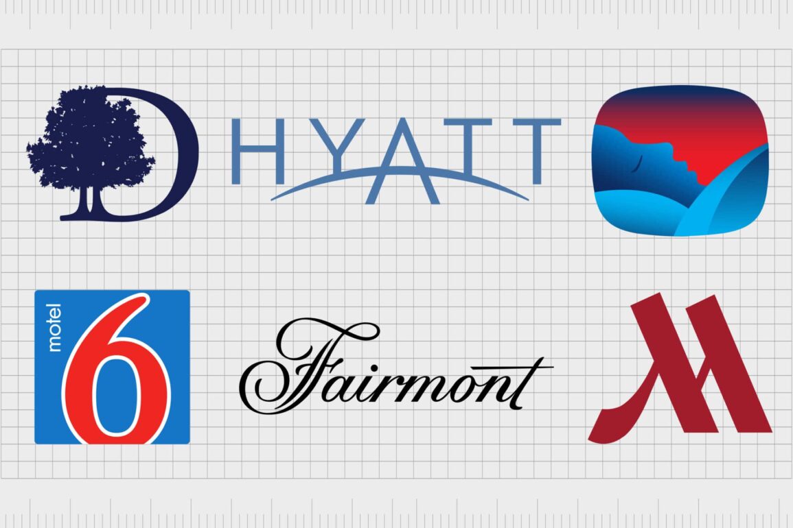
Fairmont
Fairmont Hotels and Resorts, first launched in 2001, is a global chain of luxury hotels, operating around 70 properties around the globe. The company actually originated from two hotel companies which merged together in the late 19th century.
Like many famous hotel logos, the Fairmont brand mark is easy to remember, and brimming with luxury. A cursive-style wordmark is ideal for creating an image of indulgence and class. The use of monochrome black and white coloring adds to the elegance of the design.

Rosewood Hotels
An international luxury hotel and resort company currently operating across 16 countries, Rosewood Hotels and Resorts might not be the largest brand, but it’s well-known among fans. The Rosewood Hotel Group produces some of the most attractive and opulent hotels in the world, and the brand has remained successful for over 40 years.
The Rosewood Hotels and Resorts brand uses a simple but effective wordmark as the basis for its logo. The design, written in serif font, is all about professionalism, credibility, and class. The “Hotels & Resorts” line beneath the name of the brand is a common theme in many hotel logos.
Mid-range hotel brand logos
Mid-range hotel brands have earned a lot of popularity among consumers across the globe, for the perfect combination of luxurious experience, and budget-friendly pricing. Many mid-range hotel companies belong to larger organizations, like Hilton, or Marriot.
Let’s take a look at some of the most memorable hotel brand logos…

DoubleTree Hilton
Another example of a famous hotel brand created by a larger company (Hilton Hotels), DoubleTree by Hilton is a leading luxury hotel chain, with suites around the world. The brand first launched in 1969 and has established a name for itself as a market leader over the years.
The DoubleTree logo combines the sophistication of a serif wordmark with the image of a pair of trees, stylized with a curved line to make the shape of a “D”. The image is often shown in deep bronze brown, or black, to highlight sophistication.

Four Points by Sheraton
Four Points by Sheraton is a multinational brand operated by the Marriot International organization. The company mainly targets small conventions and business travelers and has around 291 properties worldwide. The Four Points brand is best-known for offering mid-level, high-quality hotel experiences, for affordable prices.
Designed to combine accessibility with sophistication, the Four Points logo is modern and eye-catching. The design uses a sans-serif font, unlike the majority of hotel brands, along with a multi-colored graphic which draws the eye to the middle of the word mark.

Ramada
Owned by Wyndham Hotels and Resorts, Ramada is a large American multinational hotel chain, with around 811 hotels worldwide and 114,614 rooms across 63 countries. The Ramada name comes from the Spanish term “brand” which means “branch”.
Ramada’s logo is a simple, eye-catching, and welcoming wordmark, ideal for a company trying to capture the attention the attention of potential customers around the world. The decision to use a bold red font helps the company stand out as being passionate and powerful.

Mercure Hotels
A brand by Accor, Mercure hotels are famous for their distinctly European feel, and their approach to affordable luxury. The company started life in France but has since evolved to place hotels all across the globe.
Most of the hotels are somewhat traditional in style, but Accor has begun to revitalize some of the offerings with more modernized amenities, like rooftop bars.
Like many hotel company logos, the heart of the Mercure logo is a wordmark. The sans-serif design helps the company to appear friendlier, and more universal than some of the more luxurious famous hotel brands on this list.

Best Western
Best Western Hotels and Resorts, owned by the larger Best Western International brand, is responsible for more than 4,700 hotels worldwide. The Franchise was founded 76 years ago in 1946 and has remained a popular feature of the hospitality industry ever since.
The company also has a “Premier” brand for more luxurious vacations.
The Best Western Hotel logo is an effective wordmark, featuring the name of the company in a stylish sans-serif font. The term “Hotels & Resorts” is displayed underneath the name of the company, while the monogram letters “BW” appear alongside the primary image.

Hyatt
Commonly known as Hyatt Hotels & Resorts, the Hyatt Hotels Corporation is responsible for a wide of business hotels, vacation properties, resorts, mid-range hotel brands, and luxury facilities.
One of the better-known hotel companies in the world, Hyatt launched in 1957, and has over 1175 hotels worldwide as of 2021.
The Hyatt Hotel logo is a wonderfully memorable wordmark, featuring the name of the company in a sans-serif typography. The “A” in the name stands ahead of the rest of the letters slightly, with the line in the center curved to look like a rising or setting sun.

Wyndham
Described by many as the largest hotel franchiser in the world, the Wyndham Hotels & Resorts brand is one of the biggest names in hospitality. The company is responsible for a range of smaller hotel brands, including Baymont, Howard Johnson, Ramada, and even Travelodge.
Wyndham Hotels and Resorts uses a sans-serif wordmark to capture the attention of its audience. Written in an eye-catching blue color, the shading of this logo is perfect for conveying ideas of trustworthiness and credibility.
The use of a curved line underneath the Wyndham name may also remind you of a sunrise or sunset.
Budget hotel brand logos
There are dozens of budget hotel brands out there for us to cover in this list. Designed to provide people with a more affordable place to sleep when they’re traveling for business or pleasure, budget hotels are extremely popular.
You may also notice that the famous hotel brands we list in this category often take a slightly different approach to logo design.

Travelodge
Otherwise known as Travelodge Hotels Limited, Travelodge is a private company in the hospitality industry with hotels all around the world. There are a total of 570 limited service hotels belonging to the Travelodge brand in the UK alone.
The company is best known for the production of affordable, and consistent hotel experiences worldwide.
The Travelodge logo features the name of the company in an approachable sans-serif font, with the image of a sleeping person in an icon above the lettering. This eye-catching logo helps to convey the simple nature of the company’s brand mission.

Holiday Inn
It’s hard to find anyone with a knowledge of budget hotel brands who doesn’t know about Holiday Inn. An American chain of hotels with locations across the globe, the brand is one of the biggest in the world. As of 2018, the company had more than 1173 hotels worldwide.
Best known for its affordability and great location options, Holiday Inn is a trendy hotel business.
Similar to many other budget hotel logos, the Holiday Inn wordmark switches the more common serif font for approachable sans-serif typography. There’s also a hand-drawn “H” which acts as the emblem for the company in many branding instances.

Days Inn
Another popular budget hotel chain located in the United States, the Days Inn brand appeared first in 1970, introduced by Ceil B. Day. Today, the company has more than 1,728 hotels spread around the globe.
Days Inn also belongs to the wider Wyndham Hotels and Resorts brand.
Ideal for making you think of nights spent in distant locations, the Days Inn hotel brand logo features the name of the company in a friendly sans-serif font, with a rising sun behind it. The use of blue represents the sky, as well as reliability, while the shining sun makes us think of joyful experiences.

Motel Six
Easily one of the better-known budget hotel brands in the United States, Motel Six is a privately-owned hospitality company with a chain of budget motels throughout the US and Canada.
The Motel 6 company is also responsible for the Studio 6 brand, which operates a chain of extended-stay hotels for people who need an alternative to renting an apartment.
The Motel 6 logo is simple but effective, updated to suit a modern audience. The image features a large red “6”, outlined in white, with the word “motel” placed next to it. The use of red highlights passion and power, while the blue and white are ideal for conveying reliability.

Microtel
A chain of franchise hotels with around 343 locations worldwide, Microtel is a company created by the larger Wyndham brand. The first location was introduced in 1989 in Rochester New York. Since then, countless people have become involved with the franchise, helping it to grow to become one of the better-known budget hotel brands around.
The Microtel logo is an eye-catching image, featuring a deep blue wordmark using a sans-serif font. The design above the wordmark looks a little like a crown or a blossoming flower, intended to convey ideas of reliability, trustworthiness, and credibility.

La Quinta Inns and Suites
One of the many sub-brands of hotels in the United States operated by the Wyndham brand, the La Quinta Inns and Suites company is a limited service hotel chain. There are around 914 properties belonging to this company so far, according to figures reported in 2018.
Today, the brand is best-known for delivering affordable locations for travelers.
Another example of a hotel brand using the image of the sun as a common theme in their logo, the La Quinta hotel brand features a rising sun with gold and yellow accents above a serif word mark. The serif typography depicted in green creates a sense of luxury and sophistication.

Red Roof
Otherwise known as “Red Roof Inn”, the Red Roof brand is a chain of economy hotels in the United States, with around 600 properties around the world. Red Roof is unique because not only does it give human beings an affordable place to stay, but it’s also a well-known company for welcoming pets.
As a unique kind of hotel brand, Red Roof has attempted to showcase its individuality in its branding. The Red Roof logo features a handwriting-style wordmark, with a line above the word “red” to look like a roof.
Celebrating famous hotel company logos
There are plenty of amazing hotel company logos out there to explore and discover. As you can see in the examples above, many hotel brand logos share similar themes depending on the kind of audience they’re trying to reach.
Hotel logos and names are generally more sophisticated and luxurious when companies are trying to appeal to customers who don’t mind paying a higher price for their stay. Luxurious hotel brands generally use serif fonts or cursive writing to showcase their indulgent approach to hospitality.
Mid-market hotel brands can use a combination of different font types in their designs, but they’re often more likely to use sans-serif fonts to try and make their image more approachable. The same applies to budget hotels, which use bolder fonts and more playful designs.
Don’t forget, you can learn more about some of the most popular logos in the world by checking out the other brands here on Fabrik’s Logofile.
Fabrik: A branding agency for our times.

Clarity starts with a conversation.
Thanks—we’ll get back to you shortly.
Whether you're navigating a rebrand, merger, or simply need a clearer identity—we’re here to help. No hard sell, just honest advice from people who know the sector.
Let’s start with a simple question…
Prefer to email? Drop us a line.
Fabrik’s been helping organisations rethink and reshape their brands for over 25 years. We’ve guided companies through mergers, rebrands and new launches. Whatever stage you’re at, we’ll meet you there.