


Superman logo history: The Superman symbol and evolution
If you’re a fan of comic books, or you love pop culture, you might know a thing or two about Superman logo history. Most people don’t realize how much the Superman emblems have evolved over the years. Over 75 years, the design has had no less than 25 changes.
While components of the Superman logo might have changed slightly over the years, many of the most significant features have remained consistent, from the red and yellow coloring to the central focus of the iconic “S.”
Today, we’ll take a closer look at the Superman logo, its evolution through the decades, and how it has transformed into the image we know today.
The original Superman logo: The rise of the Superman emblem
Today, the Superman logo is easily one of the best-known images in the comic book universe.
The character of Superman (Clark Kent) was one of the first in superhero history.
Created by Jerry Siegel and Joe Shuster and launched in “Action Comics #1” in 1938, the character has a firm place in the evolution of popular media.
Over the years, Superman, and his image, have evolved to suit a range of different types of media, from radio serials and novels to movies and television shows. With each new iteration, the visual of the Superman character evolved while remaining focused on the iconic “S” badge.
Joe Shuster designed the first Superman logo in 1938. This original Superman logo was very different from the image most people know today. Still, it contained many of the same defining elements, such as a shield border, a yellow background, and a large red “S.”
The shield resembled something similar to a police badge, helping to define Superman as a “hero.” Notably, this image didn’t appear in the story of Superman, but instead on the cover of the comic.
Superman logo history: Superman logos over the years
The Superman logo has been tweaked several times over the years. However, many initial changes happened during the design’s early years. During the same year when the initial shield emblem and comic were introduced, a triangle emblem also appeared.
This replaced the shield in the previous logo with an upside-down red triangle and a much larger, more refined “S.”
The elements of the logo also had a black outline. In 1939, the triangular “S” Superman emblem changed a little more, with the “S” growing more extensive and the top portion of the character growing more prominent than the bottom half.
1940
In the 1940s, several new versions of the superman logo were introduced. The 1940 Superman #4 logo used an entirely different color scheme and reverted to its previous shield border. However, this design only lasted two episodes before it was switched back to yellow and red.
Later in 1940, the triangle version of the logo changed slightly again. The red frame was replaced with yellow, and the “upside down” S became more distinguished.
1940 was also the year when we first began to see the diamond-style shield for the Superman logo. This image appeared for the first time in the Action Comics 26th edition. The design was similar to what we know now, with a red border, a yellow background, and a large “S” character.
1941-1944
Between 1941 and 1944, it underwent some elementary changes, experimenting with the color balance between yellow and red. The badge was refined slightly, and the shades of red and yellow became gradually brighter.
1944 – 1968
The same process of experimentation with the Superman logos from 1944 to 1986 took the emblem in a slightly different direction. The “S” became thicker and bolder, along with the border in the Superman shield. The yellow and red coloring also became somewhat softer and less aggressive.
1968- to today
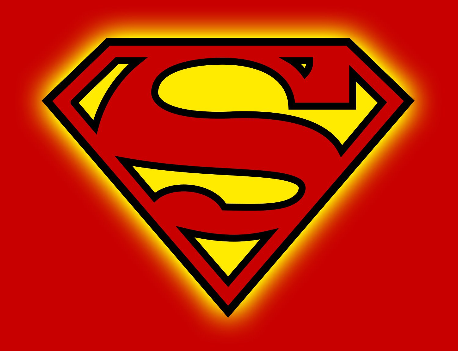
The black outline on the Superman logo first appeared in 1986, bringing a more distinctive air to the image and helping the overall elements to stand out. This image is one we continue to see today.
However, it didn’t stop the creators of Superman, and those using the branding from experimenting with different designs.
Alternative Superman emblems over the years
Although the new Superman logo we know today was introduced in 1986, the comic creators and media producers working with the Superman identity continued experimenting in several different environments.
Some alternate Superman symbols you may have seen include:
1986- 1999
From 1986 to 1999, a few variations of the Superman symbol appeared throughout the comics without the black outlining. These still looked very similar to the new Superman logo but also took elements from previous iterations.
The different iterations changed the design of the “S,” the thickness of the red border on the diamond shield, and the color palette.
1997 – 1998
An unusual and completely different version of the Superman logo appeared in 1997. The two variations of the Superman logo here wholly changed the color scheme and the style of the patented “S.” The overall image was sharper and more aggressive.
One version of the logo was depicted in white, red, and black, while the other was silver and blue. The two images both made the “S” barely legible.
2001- 2011
In the early 2000s, the designers of the Superman logo experimented with the color palette again. Most dramatically with the black and red Superman logo, which appeared in 2001. This image placed the diamond and the S in red on a black background with a black outline.
The following yellow and red logos were closer to the earlier superman logos, but the yellow coloring was much paler and less dramatic.
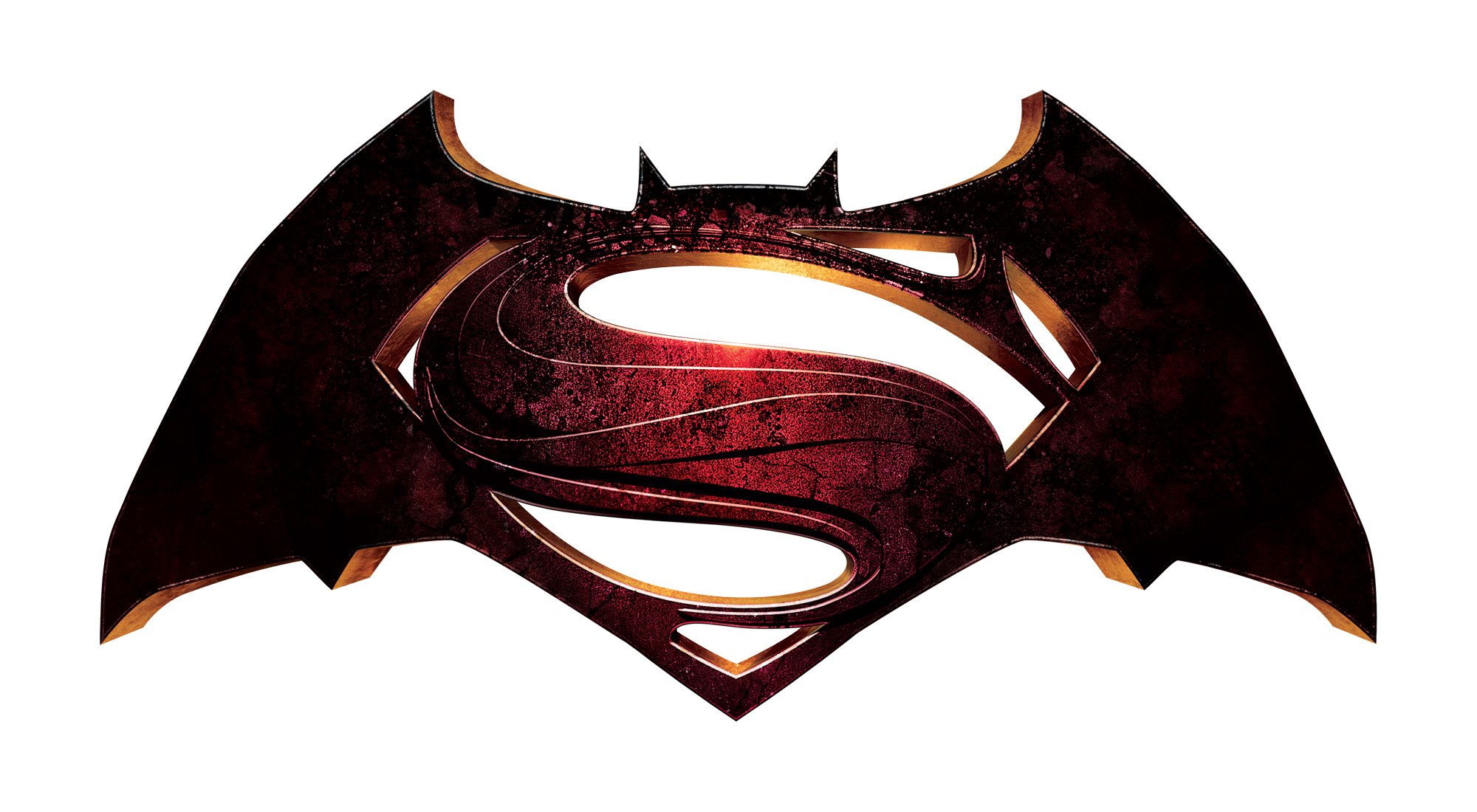
2014
A version of the Superman logo combined with the iconic Batman logo was introduced two years before the official Batman v Superman: Dawn of Justice Movie. This design incorporated the red of the Superman logo and its iconic shield with the darker shape of the Batman logo.
Superman symbol meaning, colors, and typography
If you’ve watched the Superman movie or read some of the more recent comic books, you’ll know the “S” in the logo doesn’t just stand for “Superman.” Throughout the story of Superman, the “S” has been defined as an essential part of Superman’s family crest.
There’s also a story about it being the Kryptonian symbol for “Hope,” which was conveyed in the Superman movie.
Whatever the meaning, the Superman logo’s bright, bold, and impactful image is a fantastic one for a superhero – one clearly representative of life, power, and good.
What color is the Superman logo?
The official Superman logo colors are black, yellow, and red. Yellow and red have been essential components of the Superman logos for some time. The red represents passion, power, and strength, while the yellow symbolizes joy and enlightenment.
According to the story, yellow and red also have their own distinct meanings. Red reminds Superman of the sun of Krypton – his home planet. Alternatively, the yellow coloring represents our sun here on earth, which activates Superman’s powers.
The official colors are:
Red:
Hex: #C80000
RGB: (200, 0, 0)
CMYK: (15, 100, 100, 5)
PANTONE: PMS 186 C
Gray:
Hex: #FFEB00
RGB: (255, 235, 0)
CMYK: (3, 2, 98, 0)
PANTONE: PMS 3945 C
Black:
Hex: #000000
RGB: (0, 0, 0)
CMYK: (60, 40, 40, 100)
PANTONE: PMS BLACK 6 C
What font does the Superman logo use?
As you can see, throughout Superman’s history, the exact typography of the “S” in the logo has changed many times. The image doesn’t come from any existing typefaces. This character was created entirely to be in the Superman logo.
While the Superman logo font has undergone several changes, it has almost always made the top part of the “S” more prominent than the bottom. There are also distinct serifs on most of the Superman “S” versions. At the bottom, the letter appears curved, while at the top, it has a squared edge.
Celebrating the Superman logo today
Superman logo history shows the world’s favorite superhero went through several image changes over the years, much like many brands trying to find the proper visual identity.
However, many of the most significant elements of the Superman logo have remained consistent, from the color choices to the use of a surrounding “badge” border.
The Superman logo today stands as a beacon of all things good and powerful in the comic book world and continues to inspire people around the globe.
If you’d like to learn more about the Superman logo, the following resources may be helpful:
Fabrik: A branding agency for our times.

Clarity starts with a conversation.
Thanks—we’ll get back to you shortly.
Whether you're navigating a rebrand, merger, or simply need a clearer identity—we’re here to help. No hard sell, just honest advice from people who know the sector.
Let’s start with a simple question…
Prefer to email? Drop us a line.
Fabrik’s been helping organisations rethink and reshape their brands for over 25 years. We’ve guided companies through mergers, rebrands and new launches. Whatever stage you’re at, we’ll meet you there.