


Hyundai logo history and symbol meaning
Are you familiar with Hyundai logo history? Though sometimes confused with the Honda logo by non-automobile fans, most recognize the slanted “H” anywhere. The Hyundai symbol is an attractive symbol capable of conveying speed and innovation on any car.
Though the Hyundai car logo we know today isn’t the same as the old Hyundai logo, its evolved to become something a lot more universal in the eyes of road warriors.
Today, we’re going to walk you through the basics of the Hyundai symbol, it’s meaning, and where the image originally came from.
Hyundai history: The Hyundai logo today
The Hyundai logo today is a simple and attractive design. The image features a stylized, slanted “H” in an oval border. When displayed in marketing assets, the Hyundai symbol usually includes the name “Hyundai” underneath written in angular, sans-serif font.
To many people, the Hyundai logo is as simple as it gets. Similar to the Honda emblem, most assume the “H” of the Hyundai symbol stands for the “H” of the company’s name. While this is true to some extent, the Hyundai logo meaning actually goes a little deeper than this, representing acceptance, community, and teamwork.

Hyundai logo history: Brand overview
| Founded: | December 1967 |
| Founder: | Chung Ju-Yung |
| Headquarters: | Seoul, South Korea |
| Website: | www.hyundai.com |
| Logo downloads: |
Hyundai, or the Hyundai motor company is the largest car manufacturer in South Korea. The seventh largest car maker in the world, Hyundai first launched on the 29th of December 1967, in South Korea.
The multinational automotive company grew rapidly to become one of the biggest car makers in the world, producing a huge selection of commercial vehicles, luxury cars, engines, and even electronic vehicles.
The Hyundai brand is also responsible for Ioniq, Genesis, and Kia.
Hyundai logo evolution: Hyundai symbols over the years
Though there’s likely to be a single Hyundai symbol you recognize more than others, the Hyundai logo design has changed a few times over the years.
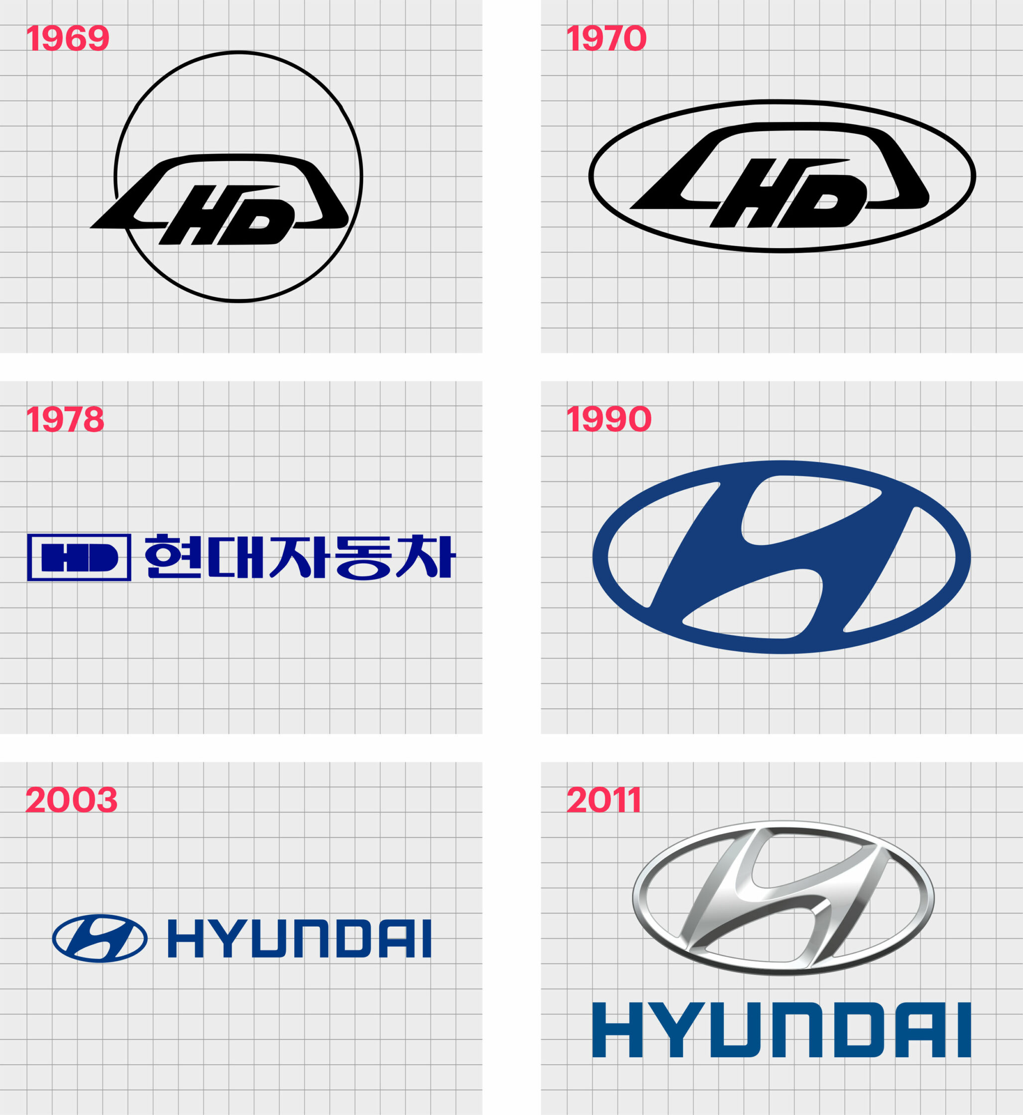
1969
In 1969, the old Hyundai logo appeared for the first time. This interesting logo featured an angular oval shape (similar to a car window), overlaid on a circle. The letters “H” and “D” appeared in stylized font over the bottom line of the odd oval shape.
Compared to other car logos in the 1960s, this was quite an unusual one, with a lot of geometric shapes working together in the minimalist colors of black and white. The “H” in the logo also featured a line extending towards the upper right, perhaps to represent a road.
In 1970, the company updated this logo slightly, moving the positioning of the inner section of the Hyundai symbol to fit fully within an oval border. This Hyundai car logo seemed a little closer to the vehicle badges of the time, but it was still far removed from what most auto lovers were used to.
1978
In 1978, the Hyundai logo took an entirely new route, moving away from the geometric shapes to focus on a wordmark. The name “Hyundai” at this point was written in Korean, due to this being the location of the company.
The fresh new logo was a lot smoother than the previous iterations, featuring simple, blocky lettering.
The letters “HD” were still present in this symbol, placed to the left of the monogram. The sleek shapes seemed to represent the professionalism and reliability of the company, while the deep blue and white coloring conveyed trustworthiness.
1990
In 1990, we saw our first version of the Hyundai logo as we know it today. The visual identity changed entirely, eliminating the “HD”, as well as the name of the company. This new logo seemed to feature a slightly slanted “H” in the same oval the company used for it’s previous logo in the 70s.
The coloring for the image stayed as white and dark blue.
According to the company, the “H” was chosen not just as a representation of the name of the company, but to convey meaning too. The shape of the H is intended to look like two people shaking hands – a symbol of respect.
In 2003, the elegant new Hyundai logo design updated again slightly, this time choosing a different shade of blue. The company also added the name “Hyundai” underneath the emblem, in English.
The wordmark and the symbol were both in the same shade of blue. Hyundai chose a sans-serif font for the logotype, with a modern flare. This is the same Hyundai logo font in use today.
2017
In 2017, the version of the Hyundai logo most people recognize today was introduced. Again, the company chose a slightly different shade of blue for its wordmark and updated the coloring of the “H” symbol to silver.
The features of the Hyundai logo are now much sharper and more modern, with shading used within the symbol to give the appearance of multiple dimensions.
Today’s Hyundai logo maintains the same visual appeal of the previous design, with a significant amount of sleek sophistication. However, this time, the symbol looks more like the kind of thing you would see placed on the back of a Hyundai car.
The lines remain untouched, and the logotype continues to be the same, with its distinctive, angular appearance.
What does the Hyundai symbol mean?
As noted above, it’s easy to assume the Hyundai symbol just means “Hyundai”. It’s not unusual for a brand to use the first letter of its name in the creation of a logo. This is something we’ve seen from other car brands like Honda, for instance.
However, while the “H” in the Hyundai car logo does stand for the name of the business, it’s also intended as a stylized image of two people shaking hands.
According to the marketing team at Hyundai, the two “people” connected in this logo are supposed to be a sales person, and a satisfied customer, shaking hands over a deal.
The “H” is also slanted slightly towards the right, which indicates movement and speed, as well as positive growth in the “right” direction. A slant in the opposite direction might seem too passive and calm. The oval around the two figures apparently represents the global expansion of the company.
Hyundai logo colors
Hyundai logo colors have always been relatively straightforward. The branded started off using a simple white and black image, and eventually upgraded to various shades of deep, sophisticated blue.
In the latest version of the Hyundai logo, we have the dark blue for the wordmark, and the multi-dimensional silver of the Hyundai symbol.
Despite the color of the symbol being silver, most would still probably say the main Hyundai logo color is blue, as it’s been associated with the company for longer. The choice of silver and blue highlight modernity, sophistication, and reliability.
What font is the Hyundai logo? Hyundai logo font
Like many of the most popular logos of all time, Hyundai’s logo font isn’t one you’ll find in a font library. The Hyundai font is a custom type created specifically for the brand. At a glance, it seems like a very simple and angular sans-serif, which may pay homage to some of the geometric shapes in the old Hyundai logo.
Hyundai logo meaning today
The Hyundai logo today is an excellent example of how a simple but effective automobile logo can take the world by storm, The Hyundai logo is also a fantastic insight into how a logo can have meaning beyond what most people would initially recognise.
Don’t forget to check out some of our other logo articles for more information on some of the most amazing logos in the world.
Now read these:
—Which car companies own which car brand?
—Famous car brands, their names and logos
—The ultimate list of French car brand logos
—The 50 best-known car logos with wings
—The definitive guide to German car logos
—Famous car logos and emblems with stars
—Top American car brands and their logos
—Your ultimate guide to Italian car brands
—American car companies that went bust
—The conclusive guide to British car logos
—The essential list of Japanese car logos
—A decisive guide to car logos with circles
Fabrik: A branding agency for our times.

Clarity starts with a conversation.
Thanks—we’ll get back to you shortly.
Whether you're navigating a rebrand, merger, or simply need a clearer identity—we’re here to help. No hard sell, just honest advice from people who know the sector.
Let’s start with a simple question…
Prefer to email? Drop us a line.
Fabrik’s been helping organisations rethink and reshape their brands for over 25 years. We’ve guided companies through mergers, rebrands and new launches. Whatever stage you’re at, we’ll meet you there.