Honda logo history and meaning

How much do you know about Honda logo history? Honda’s logo might not be the most complex of all the car logos out there, but it’s one many people can recognize instantly today. The Honda symbol is an immediate identifier of affordability and reliability for many customers.
Since the inception of the brand, the Honda logo emblem has remained largely the same, focusing around the first letter of the Company’s name (H), rather than the whole brand name like other competitors.
Today, we’re going to give you an insight into an often-overlooked part of Honda history, by discussing Honda logo evolution.
Here’s everything you need to know about the Honda logo.
Honda history: The Honda logo today
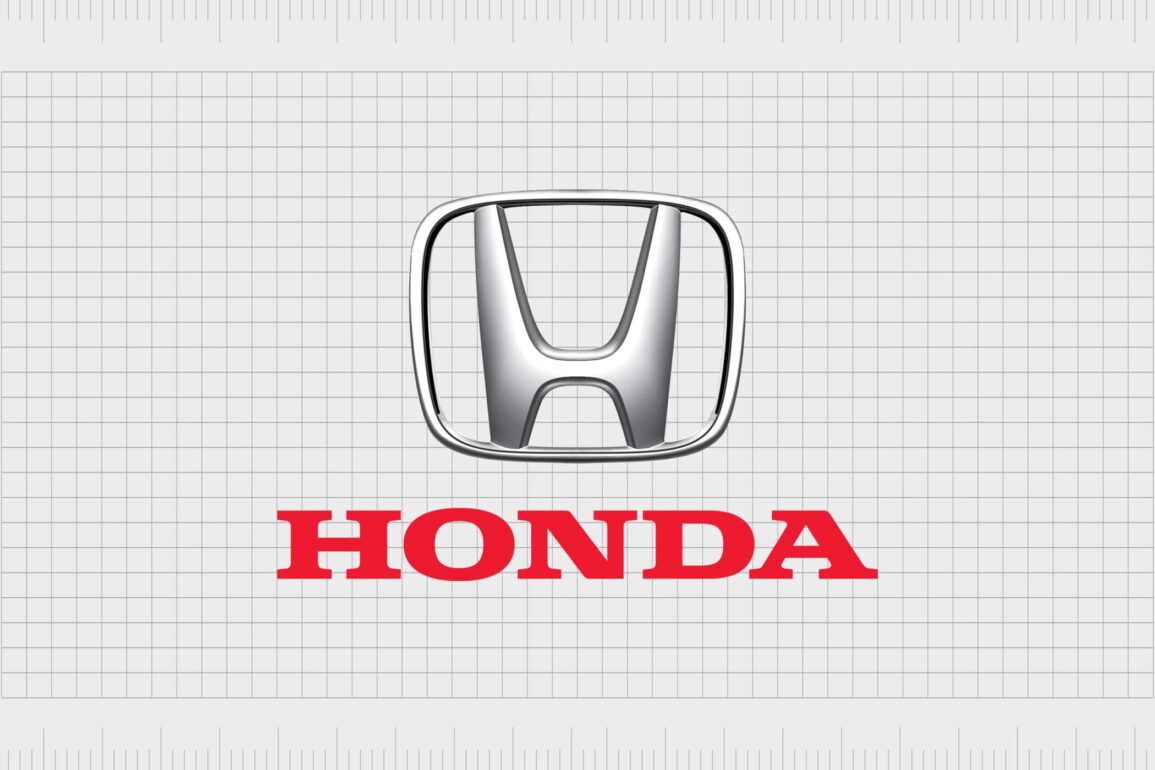
The Honda logo is one of the easiest to recognise in the world. Remaining mostly unchanged throughout the course of its life, the Honda symbol includes a capital “H”. In some variations of the Honda logo, the name “Honda” will also appear underneath the emblem in a bold red font.
Honda’s logo is simple but eye-catching. The capital H comes from the name of the Honda brand, and the Founder of the Company, Soichiro Honda. In the official emblem, the H is narrower on the bottom than it is on the top.
Some people say the shape looks a lot like someone raising their arms to the sky.
| Founded: | October 1946 |
| Founder: | Soichiro Honda and Takeo Fujisawa |
| Headquarters: | Minato, Tokyo, Japan |
| Website: | www.honda.com |
| Logo downloads: |
Honda, or the Honda Motor Company is a Japanese conglomerate manufacturer of power equipment, motorcycles, and automobiles. Currently headquartered in Minato, Japan, Honda has grown to be one of the largest companies in the world, since its original inception in 1946.
The Honda brand was the first automobile manufacturer from Japan to create a dedicated luxury brand called Acura in 1986. Today, the Company is the sixth largest automobile manufacturer worldwide.
Honda logo evolution
Where did the Honda symbol come from?
The old Honda logo and the newest design for the brand’s emblem are very similar, as both revolve around the use of the capital letter “H”. The decision to use the “H” as the official symbol of Honda was a simple one, as the Company wanted to quickly remind customers of its name.
The Honda brand began life creating small pick-up trucks for commercial purposes, which featured the initial Honda logo on the hood. The second production car from Honda was a sportscar in the style of a 2-door roadster.
Since then, the Company has produced various devices and automobiles, each sporting a version of the Honda logo design.
1961
The first version of the Honda logo emblem doesn’t look much like the design we know today. The badge stayed with the Company for eight years. This old Honda logo came with a burgundy red background and a light blue “H” at the center of the red rectangle.
The H was unusual in style, with a much wider top half and a narrower bottom half.
The word “Honda” also appeared underneath the enlarged and stylized letter “H”. The original typeface was a simple serif choice, with very clean, easy-to-read capital letters.
1969
The 1969 Honda symbol was a dramatic change from the original. Here, the emblem (or capital H) was the only element of the Honda cars logo remaining. The name was removed from the insignia, as was any coloring. Instead, the H was displayed in white on a black background.
This version of the Honda logo design made the “H” a lot narrower, but the upper portion of the capital letter was still much broader than the lower half.
1981
In 1981, the Honda logo changed again, this time to something quite similar to the design we know today. The lines of the logo were redefined, and the “H” was written in black on a white background with a black border. The emblem was a kind of rectangle in shape, with curved edges.
Underneath the official Honda emblem, the Company once again showcased its name in bold, black font. The typeface was a thick serif choice, written entirely in capital letters.
2000
For the year 2000, Honda added more color and texture to its design. The name “Honda” now appeared in a bright red shade. The red Honda wordmark sat underneath a stylized version of the previous logo, where the H took on a 3D silver design.
The silver arms of the Honda “H” are also slightly elongated towards the top.
What about the Honda motorcycle logo?
When Honda released a motorcycle version of its brand, it also created a new logo. The design started as something a lot more complex than the original Honda cars logo, with the word “Honda motor” written on a blue background with a gold and white outline.
Over time, Honda also refined its Honda motorcycle logo, experimenting with everything from winged people to a set of standalone wings, similar to the Harley Davidson logo. The motorcycle logo for the Honda brand is a simplified version of its previous designs.
Today, Honda bike fans can instantly recognize the stylistic red evident in all Honda wordmarks. Unlike the Honda cars logo, there’s no “H” emblem, but a simplified wing shape above the word “Honda” for the motorcycle image.
The iconic red of the Honda logo extends into the wings on the motorcycle logo, creating an eye-catching image which immediately captures customer attention.
Honda symbol meaning: Honda emblem
The Honda logo emblem has always been a version of the stylized letter “H” on all products for the brand. The sign is symbolic of the “Honda” name, but it has meaning beyond this too. According to some experts, the symbol is also intended to look like a classic armchair, to symbolize safety.
The Honda logo emblem can also look similar to a man from a distance, holding his arms up to the sky in an exclamation of discovery or excitement.
Unlike other car logos, Honda’s emblem remained relatively unknown for the first few years of its life. Before the 1960s, people saw the image as little more than a blurry image on the hood of a car. Fortunately, as the business developed, it’s iconic emblem transformed too.
Honda logo color: What is the Honda logo colors?
The Honda logo colors have differed over the years, originating in black and white, then gradually evolving to take on a more metallic, silver style, similar to many competing brands.
The shades of the Honda car logo today are the classic bright red for the Honda typography, which first emerged in the year 2000. The “H” of the Honda emblem is usually in a stylized greyscale, intended to look like gleaming silver or chrome.
The red of the Honda logo is often deemed its defining color. This shade is usually associated with royalty, and it’s a popular shade in Japan too.
What font is the Honda logo?
The Honda logo font is a simple but effective serif type written in deep red. The word is fully capitalized to make it more legible – even from a distance. This iconic font is similar to many classic serif fonts on the market today.
The “H” of the Honda logo is a stylized typography designed specifically to identify the Honda cars brand.
The Honda logo today
The Honda logo today is an unforgettable emblem of quality and reliability. Known around the world for the development of eye-catching cars and motorcycles, Honda has earned its place in automobile history. While the logo might not be the most eye-catching in the world, it has served the business well over the decades.
Now read these:
—Which car companies own which car brand?
—Famous car brands, their names and logos
—The ultimate list of French car brand logos
—The 50 best-known car logos with wings
—The definitive guide to German car logos
—Famous car logos and emblems with stars
—Top American car brands and their logos
—Your ultimate guide to Italian car brands
—American car companies that went bust
—The conclusive guide to British car logos
—The essential list of Japanese car logos
—A decisive guide to car logos with circles
Fabrik: A branding agency for our times.
Clarity starts with a conversation.
Thanks—we’ll get back to you shortly.
Whether you're navigating a rebrand, merger, or simply need a clearer identity—we’re here to help. No hard sell, just honest advice from people who know the sector.
Let’s start with a simple question…
Prefer to email? Drop us a line.
Fabrik’s been helping organisations rethink and reshape their brands for over 25 years. We’ve guided companies through mergers, rebrands and new launches. Whatever stage you’re at, we’ll meet you there.


