


Cadillac logo history and emblem meaning
How familiar are you with Cadillac logo history? The Cadillac emblem has had a few redesigns over the years. After all, Cadillac first launched in 1902, and the trends surrounding automobile badges and logos have evolved a few times since then.
The emblem of Cadillac, best-known as the “wreath and crest” has changed around 30 times over the decades, reflecting significant changes in the company’s artistic direction, ownership, and branding. Of course, some changes to Cadillac’s aesthetic appearance have been more significant than others.
Here’s what you need to know about the evolution of the Cadillac logo.
Cadillac history
The Cadillac logo is one of the best-known vehicle logos in the world. Today, the icon is an eye-catching image, similar in style to a shield or coat of arms. The Cadillac emblem builds on the original visuals chosen to represent the brand.
Throughout the years, Cadillac has even referred to its design as the “Cadillac crest”.
Sometimes displayed alongside an italic handwritten wordmark, the Cadillac symbol combines various geometric shapes to create a blend of an ancient shield with a modern car grill.
Perhaps the most memorable components of the Cadillac emblem today are the selection of colors in blue, black, silver, gold, and red. All of these colors and shades have their own unique meaning, with gold standing for luxury, silver for modernity, red for passion, and blue for reliability.
With this image, the Cadillac company has taken the world by storm, producing, and selling over 350 thousand automobiles per year.

Cadillac logo history: brand overview
| Founded: | 1902 |
| Founder: | William Murphy, Henry M. Leland, Lemuel Bowen |
| Headquarters: | Warren, Michigan, United States |
| Website: | www.cadillac.com |
| Logo downloads: |
Cadillac logo history began with the launch of the company in 1902, more than 100 years ago today. The Cadillac logo evolution has since built upon the definition of an image as a kind of “family crest” for the company. Cadillac often calls its car symbol the “wreath and crest.”
As mentioned above, the company has changed its logo multiple times over the years to suit changes in brand direction. The company was named after the founder of Detroit, Antoine de la Mothe Cadillac – the manufacturing capital of the USA for cars.
Since the beginning, Cadillac has always been dedicated to delivering exceptional design and quality, which is perhaps why the evolution of the Cadillac logo has been so important to the brand.
Cadillac car symbol
Cadillac logos over the years
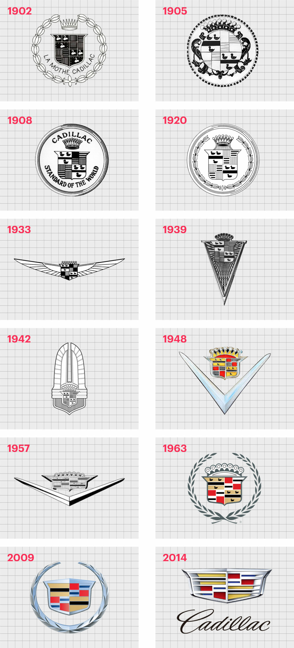
Since there have been a large number of Cadillac logo changes over the years, we’re only going to cover some of the most important alterations to Cadillac’s design. Starting with the old Cadillac logo first introduced in 1906.
1906
In 1906, the Cadillac logo looked more like the crest of a royal family than the logo of a car owner. The shield, featuring a set of swans and parallel lines, indicated the family’s descent from the royal counts of Toulouse.
The ornate circular framing and crown atop the shield helped to demonstrate the luxury nature of the company. The wordmark “La Mothe Cadillac” appeared at the bottom of the image.
Various versions of this logo appeared between 1906 and 1955, including an image featuring a circular border of tiny crowns, and fewer angular shapes.
The longest-standing logo in the early 1900s was the Cadillac “Standard of the World” image introduced in 1908. This Cadillac emblem replaced the initial wordmark with the name of the brand above the crown, and “Standard of the world” written underneath.
1920
In the 1920s, Cadillac once again embraced an element from one of its earlier images, the “tulip bulb wreath”. The crown also changed slightly, now featuring seven points until the previous nine.
In 1933, the Cadillac brand attempted to modernise its logo, adding a set of refined, angular wings to either side of the shield, and eliminating the circle and wreath entirely. The legendary crests took on darker shades, and the seven points of the crown were minimized.
The wings were drawn in thin black lines while the six swans on the shield remained the same.
1939
At the end of the 1930s, the Cadillac emblems once again moved in a different direction. The wings disappeared, and shield was instead placed on a sharp, narrow triangle with an elongated point. The crown on this version of the Cadillac logo was also more prominent.
Seemingly ready to experiment with a new slew of Cadillac logo changes, in 1942, the team introduced a totally different shape for the badge once again. The logo in the 1940s took on an almost “Art Deco” style, resembling a kind of feathered crown.
This was a new concept for both Cadillac and the world of automobiles.
1948
The end of the 1940s was the start of a prolific time for the Cadillac logo. The old Cadillac logo began to disappear, with new, more modern elements falling into place. The shield was removed from any other background decoration and placed above a V-shaped symbol in silver.
The angular and sharp lines of this Cadillac design helped to strengthen the modern image of the brand.
In 1957, the new V-shaped Cadillac logo changed slightly again, stretching slightly to create a broader shape. The design of the crown changed, and the coat of arms transformed too, making it harder to see the swans in the crest at all.
1963
Perhaps one of the most famous images in Cadillac logo history was the design which appeared in the 1960s. This logo brought back the wreath style, surrounding the central Cadillac shield. This modern, sleek, and easily memorable image stayed with the Cadillac brand for over 40 years.
This is also where we began to see the memorable colors of the Cadillac symbol.
2009
In 2009, the Cadillac symbol had another modern update. The image was composed of a colorful crest with a silver wreath frame. The crest featured colors like blue, fuchsia, and yellow. Black and white details helped to give depth to the design, so it appeared highly textured on any marketing campaign.
The color choices for this Cadillac emblem changed a little tool. Brighter shades of yellow and red were toned down to softer, more traditional hues. The swans disappeared entirely.
2014
Once again deciding to leave the wreath component of the Cadillac symbol behind, the team upgraded the design once more in 2014. In this logo, we see a far more futuristic image, built to make the coat of arms look almost like the grille on the front of a car.
The shades and shapes remain largely the same as the previous logo, but they’re somewhat more refined.
Though the Cadillac symbol doesn’t always appear with an accompanying wordmark today, there is a version of the symbol available with the “Cadillac” name. When used, the Cadillac wordmark appears in an elegant, cursive font, placed underneath the central shield.
What does the Cadillac symbol mean?
Cadillac emblem meaning
The meaning of the Cadillac logo is open to interpretation. Most people believe the decision to use a wreath and shield-type image was based on the company’s desire to be associated with royalty, excellence, and attention to detail.
The coat of arms originally chosen by the Cadillac team was also a reference to the family crest of Antoine de la Mothe Cadillac, the reason behind the Cadillac name.
The emblem today can either appear on its own, or with the Cadillac wordmark. Though this symbol is a little more complex than some of the other car logos on the market, it benefits from being instantly recognizable.
Modernized for the new age, the depth given to the mosaic of colors in the shield makes the Cadillac logo look almost like part of a car.
Cadillac logo colors
According to Cadillac, the Cadillac symbol meaning comes mostly from the careful choice of color. Cadillac logo color became increasingly important to the brand over the years, as it searched for a way to define itself in the automobile market.
According to Cadillac, the black against the gold in the image represents wisdom and wealth, as well as luxury. The red in the logo is intended to stand for boldness and confidence in action.
The silver elements in the image symbolize purity, virtue, and charity, while blue is supposed to be associated with valor and reliability.
What font is the Cadillac logo?
As mentioned above, the Cadillac logo font won’t always appear on every variation of the logo used in marketing and branding strategies. When you do see the wordmark, it will be written in a simple and elegant cursive, made specifically for Cadillac.
According to experts, the type is similar to English 157, a font created by Vladimir Yefimov.
The Cadillac logo today
It’s hard to overlook the value of the Cadillac logo today. The symbol is one of the most recognisable in the world, featuring incredible depth and history.
Although Cadillac has changed its logo several times over the years, it’s always been dedicated to demonstrating the right values through its choice of shapes and colors.
Now read these:
—Which car companies own which car brand?
—Famous car brands, their names and logos
—The ultimate list of French car brand logos
—The 50 best-known car logos with wings
—The definitive guide to German car logos
—Famous car logos and emblems with stars
—Top American car brands and their logos
—Your ultimate guide to Italian car brands
—American car companies that went bust
—The conclusive guide to British car logos
—The essential list of Japanese car logos
—A decisive guide to car logos with circles
Fabrik: A branding agency for our times.

Clarity starts with a conversation.
Thanks—we’ll get back to you shortly.
Whether you're navigating a rebrand, merger, or simply need a clearer identity—we’re here to help. No hard sell, just honest advice from people who know the sector.
Let’s start with a simple question…
Prefer to email? Drop us a line.
Fabrik’s been helping organisations rethink and reshape their brands for over 25 years. We’ve guided companies through mergers, rebrands and new launches. Whatever stage you’re at, we’ll meet you there.