


Mazda logo history: The origin and meaning of the Mazda symbol
Even if you don’t know much about the Mazda logo, you can probably easily identify the Mazda symbol, and recognize its unique design. The Mazda car symbol is one of the best-known in the world, despite having changed numerous times over the years.
Mazda is a Japanese car manufacturing company, established first in 1929. Since introducing its first automobile in 1931, Mazda quickly shot to fame, and earned a position with drivers worldwide. Now, you can see the Mazda symbol all over the world.
The Mazda brand has become one of the 15 top automakers in the world by volume, and it’s one of the highest-selling car brands in Russia and Asia too.
Here’s your guide to the amazing Mazda emblem, and its previous logos.
Mazda history: The Mazda logo today
Easily recognizable, the Mazda brand symbol is one of the simplest, but most effective in the world. Created by the Mazda Motor Corporation, this emblem helps to identify the brand throughout the world as the company continues to expand.
The Mazda symbol is inspired somewhat by the name of the company, which is derived in part from the name of the company’s founder, Jujiro Matsuda, which has a European pronunciation of Mazda.
There’s also another meaning linked to this name.
In Asian communities, a God of wisdom, light and harmony is named Ahura and Mazda. Since the founder was a very spiritual man, it makes sense he’d choose this name. Today, the Mazda emblem features an oval shape with an almost bird-like “V” layered on top of it.
The shading of the design also makes the pattern look like an “M” for Mazda.

Mazda: Brand overview
| Founded: | 1920 |
| Founder: | Jujiro Matsuda |
| Headquarters: | Hiroshima, Japan |
| Website: | www.mazda.com |
| Logo downloads: |
The evolution of Mazda logos began in 1920 with the creation of the company. In the first years of its history, the company initially focused on creating manufacturing tools and heavy machinery, rather than cars.
The logo was quite simple and straightforward in this time.
Over the years, the old Mazda logos evolved to become more modern and engaging, with hidden meanings designed to inspire buyers and fans. Today, Mazda is one of the most popular automotive companies in the world, with millions of vehicles produced worldwide.
Mazda logo history: The old Mazda logo
The Mazda emblem has come a long way over the years, covering a number of different styles to drive different responses from car enthusiasts.
Let’s take a look at the original Mazda logo, and how it evolved into the symbol we know today.
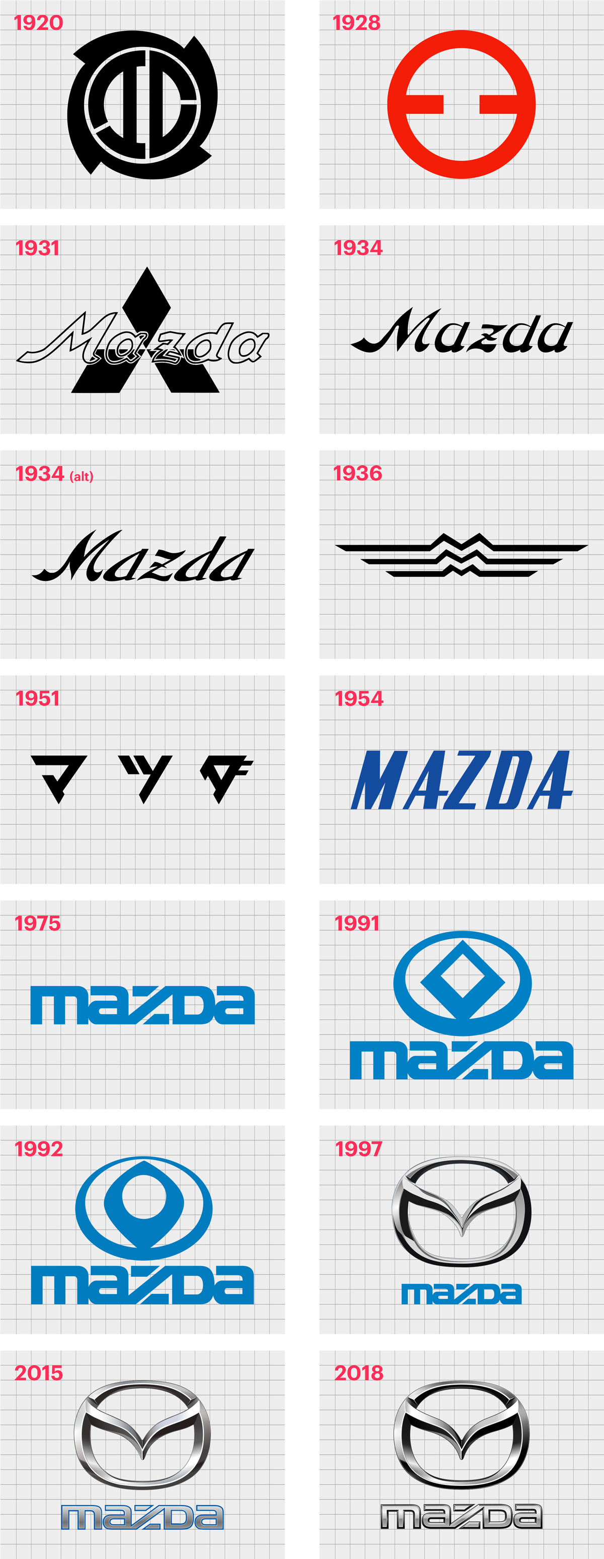
1920
The original Mazda logo was nothing like the one we know today. This image was a powerful abstract badge with a number of geometric shapes. The circular shape of the logo was actually quite similar to a Shuriken – a famous weapon for a ninja.
In 1928, the Mazda logo became more minimalistic, but it took on a brighter appeal with a vibrant red color scheme. The clean circular shape with two thick horizontal lines helped to identify the company as a modern manufacturer.
It wasn’t until 1931 when the Mazda symbol also began using the Mazda name in the icon. This icon used a new Mazda logo font in a kind of outline, placed on top of a Mitsubishi diamond emblem, featuring three rhombus shapes connected at the corners.
The blue and white logotype was placed over the top of the badge.
In 1934, Mazda got rid of its shape and kept the logotype only. This image was very similar to the previous, but the wordmark had slightly thinner lines, and featured solid black coloring, rather than just outlines.
The name “Mazda” included an exotic, stylized “Z”.
In 1934, a slightly updated version of this image appeared, with slimmer font again, a dark blue coloring instead.
1936
In 1936, Mazda replaced the wordmark symbol with a logo featuring three lines with arched hills in the middle, mimicking the shape of “M’s”. The three parallel lines forming the letter “M” apparently stand for Mazda Motor Manufacturer.
1951
The black and white geometric badge for the Mazda logo was introduced in 1951, featuring a composition of three triangles pointing towards the floor. These triangles are actually characters from the Japanese Katakana alphabet.
Together, they spell out: Ma-Tsu-Da: creating the Japanese name for the company.
Mazda also introduced a new wordmark in 1954 which was much simpler and more agile than previous versions. The narrowed uppercase font in a sans-serif type had bold lines in the two “A’s” to help it stand out.
In 1975, the Mazda logo wordmark evolved again – to something similar to the design we know today. The letter mark logo featured a simple font, with lowercase “A’s” and a capital M, D, and Z. The “Z” in the center of the word mark is the most eye-catching element.
1991
During 1991, Mazda introduced a badge to go alongside the wordmark. This badge featured an oval shape in blue (the same shade as the wordmark). The oval appeared to get thinner towards the top and thicker towards the bottom.
In the center of this logo was a diamond-shape, used to represent sunlight and innovation.
In 1992, this image changed very slightly, becoming softer and more refined. The shapes were cleaned to become thinner and rounder, with fewer aggressive angles and points. However, the coloring of the font and the logo remained the same.
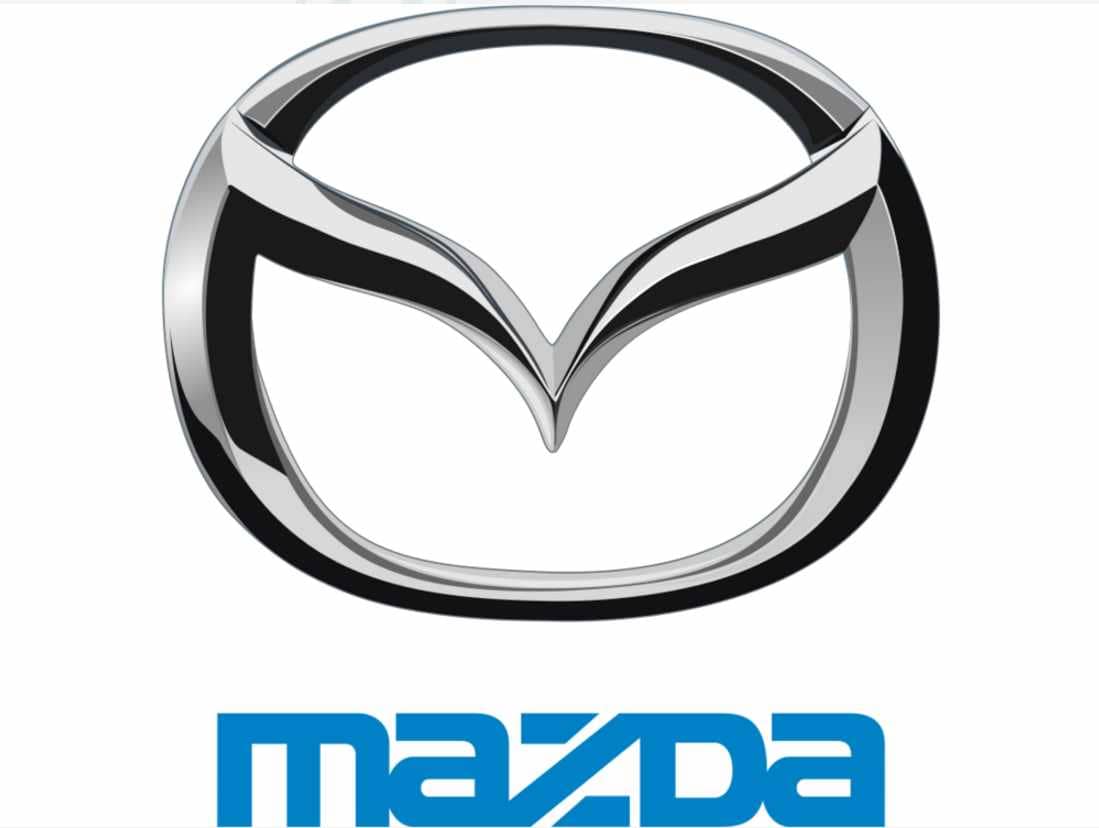
In 1997, the first version of the new Mazda logo most people know today emerged. This showed the “M” shape in the oval background in a textured, metallic design.
Though the shape in the oval is intended to represent an “M” for the most part, it also looks like a set of wings, which reflects the flexible and creative thinking of the brand.
The Mazda car logo nameplate from the 70s also appears in this version of the logo, underneath the emblem. The bright blue coloring helps to highlight the sense of freedom and flight created by the overall image.
In 2015, Mazda did experiment with a matte version of this logo, which also included an updated style of wordmark, this time in silver with a thin blue outline.
Today, the official logo is the silver Mazda emblem with the blue wordmark beneath designed in 1997. However, you may occasionally see versions of the logo with a slightly different color scheme – such as those using silver in the wordmark.
What is the Mazda symbol? Mazda symbol meaning
The meaning of the Mazda logo is simple enough. The oval shape of the badge helps to represent a sense of community and global growth, while the “V” shape in the middle can have a number of meanings.
Some people believe the curved V symbolizes wings for flight, while others feel it’s simply a stylistic way to show the letter “M” for Mazda.
A close look at the Mazda emblem does show a set of legs for the “M” attaching and blending with the rest of the oval.
The use of colors like silver and blue highlight ideas of sophistication, creativity, modernity, and trustworthiness – all elements crucial for a car brand.
Mazda logo colors
The Mazda logo color differs depending on who you ask. Typically, most designers say the current logo features shades of silver and grey created to represent depth and texture.
The 6 hex colors include:
Mercury:
Hex: #E6E6E6
Gray:
Hex: #808080
Shark:
Hex: #2A2E33
Nobel:
Hex: #B3B3B3
Silver:
Hex: #CCCCCC
If you also include the blue shading for the font frequently shown on a number of Mazda logo designs and assets, this color is named Lochmara, and has the hex code #0080C5.
What font is the Mazda logo? Mazda logo font
Like most car manufacturers, Mazda uses a unique font for its logo – one designed specifically for the brand. Some people say the typography looks similar to the SF Automation type. The font is completely sans-serif, often written in all lowercase letters.
There’s very little space between the letters in this font and a unique Z shape.
Celebrating the Mazda logo today
The Mazda logo might not be the most complex image we’ve seen in the automobile world – but it’s definitely memorable. This attractive yet simple symbol has helped Mazda to become one of the most memorable car brands in the world.
Don’t forget to check out our other Logofiles for more information about the amazing car logos we know and love today.
Fabrik: A branding agency for our times.

Clarity starts with a conversation.
Thanks—we’ll get back to you shortly.
Whether you're navigating a rebrand, merger, or simply need a clearer identity—we’re here to help. No hard sell, just honest advice from people who know the sector.
Let’s start with a simple question…
Prefer to email? Drop us a line.
Fabrik’s been helping organisations rethink and reshape their brands for over 25 years. We’ve guided companies through mergers, rebrands and new launches. Whatever stage you’re at, we’ll meet you there.