


Saab logo history: Your guide to the Saab emblem
Are you familiar with Saab logo history? The Saab emblem is one of the more recognizable images in the vehicle manufacturing landscape. However, many people still aren’t familiar with the history of Saab, or where its symbol came from.
Saab was one of the most respected car manufacturers in Europe. Ever since the company first launched in 1937, it’s been attracting the attention of vehicle lovers worldwide. Part of what makes Saab so memorable, is the iconic Saab emblem.
Today, we’re going to take you on a journey through Saab history, to discover where the symbol of this company first began, and what it means.
Saab history: The Saab logo today
The Saab logo is a simple but memorable image today. Similar to many of the top car logos in the world, the design is intended to look just as great emblazoned onto a vehicle as it does on any marketing asset.
The Saab car symbol today is an attractive circular badge, with a deep blue background. In the center top of the Saab car logo is the name of the company, written in all capital letters, in a bold sans-serif font.
The font kerning is extremely close together, making the letters look connected.
Perhaps the most eye-catching component of the Saab car logo is the red griffin in the center. The mythical creature is outlined in silver and wears a golden crown. Notably, this griffin originates from the official coat of arms held by the founder of the company, Count von Skane.

Saab: Brand overview
| Founded: | 1945 |
| Founder: | Marcus Wallenberg Jr., Axel Wenner-Gren and Sven Gustaf Wingqvist |
| Headquarters: | Stockholm, Sweden |
| Website: | www.saab.com |
| Logo downloads: |
Saab, otherwise known as Svenska Aeroplan AB, is a Swedish defence and aerospace company today. Crucially, the automobile element of the company is now defunct, as it officially stopped making cars in 2016.
The official automobile segment of Saab began in 1945, when the parent company “Saab AB” began a project to create a small new automobile.
In 1989, the vehicle manufacturing part of Saab-Scania branched off into an independent company. An American manufacturer (General Motors) took 50% ownership of this new brand. After many years, however, the company began to struggle, and Saab eventually shut down in 2016.
However, the Saab car logo is still recognisable around the world today.
History of Saab logos: The Saab griffin logo
Saab car logos didn’t begin to emerge from the larger Saab brand until a little while after the company was officially founded. This is because the original Saab company was an aerospace business. It wasn’t until the Saab and Scania merger that the first Saab griffin logo appeared.
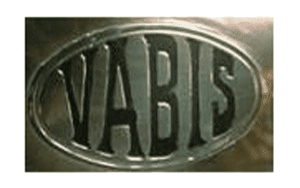
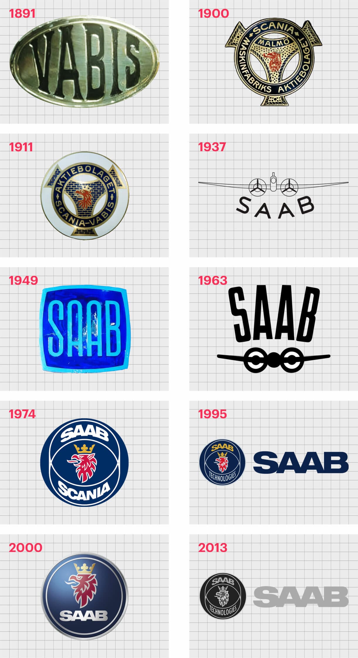
1891
The old Saab logo first used on the vehicles created by the company wasn’t a “Saab” logo at all. Instead, the image featured the word “Vabis”, in a serif typeface, written inside of an embossed oval.
The silver metallic logo created a strong, masculine, and simple image.
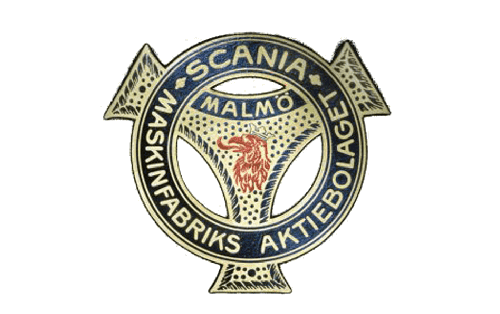
1900
The very first Saab red griffin appeared within the logo in the 1900s. This image featured a small head drawn on a golden and blue badge, with a three-pointed star in the middle.
The word “Scania” was present on the Saab badge, as well as the words “Maskinfabriks” and “Aktiebolaget”. “Malmö” also appeared in a sans-serif font in the middle of the image.
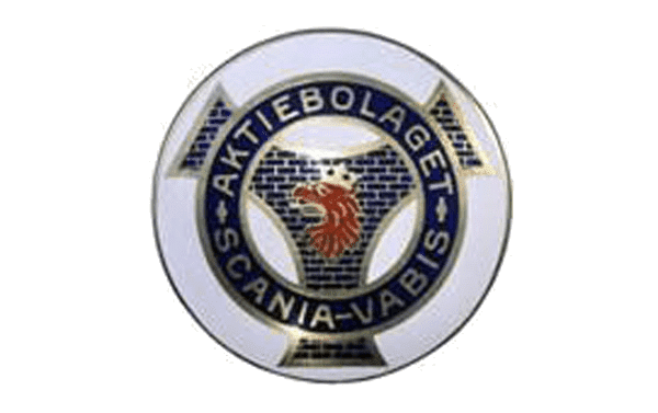
1911
The redesign of the Saab logo in 1911 made the head of the griffin larger, and the colors in the image more intense. The badge began to focus more heavily on the central element of the griffin.
The contours and geometric elements of the emblem where also cleaned and enhanced here, with a slightly thicker set of golden outlines.
1937
An official wordmark for Saab appeared in 1937, alongside a schematic image of a plane, intended to reference the focus of the company. The logo was simple but effective, with a unique appeal for the aerospace industry.
The letters were clear, legible, and very spaced out.
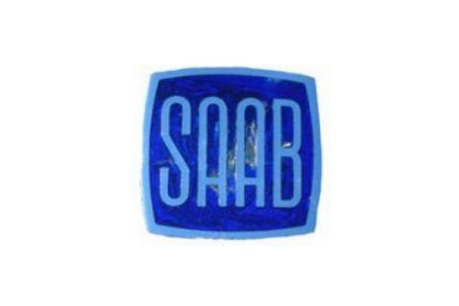
The company experimented with a couple of different images during the 1940s and 50s. Perhaps one of the best-known iterations of the Saab logo was a blue square, in which the word “Saab” appeared in all capital sans-serif letters.
There was another version of this logo present in silver.
1963
During the 1960s, Saab reverted back to its silver coloring, and once again focused on the aeroplane imagery. These symbols placed the word “Saab” above the plane, still in all capitals.
During 1967 the company also experimented with placing this logo within a blue square with rounded edges and a silver outline.
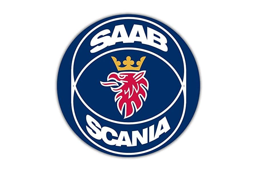
1974
The image most of us associate with the Saab car logo didn’t appear until the Saab and Scania merger in the 1960s-70s. The Saab company initially used the word “Scania” on its own as an adopted logo, but quickly created a new image, featuring the iconic red griffin many fans know today.
This eye-catching badge was created for the Saab company by Carl Frederick Reutersward, and was introduced first in 1984, before becoming official three years later. The design includes a clean and simple wordmark for both Saab and Scania, similar in style to the font we know now.
In 1995, the logo was simplified somewhat, with the word “Saab” now written in gold, and the word “Scania” replaced with “Technologies”. Saab also created a simple wordmark logo featuring the name of the company in bold, sans-serif font.
2000
The Saab logo became cleaner in the year 2000, replacing the two connecting circles in the centre with a circular border. There are two circular silver borders on the Saab symbol, creating a striped effect of silver, blue, then silver.
The use of gradients within the colors creates a 3D effect, which makes the Saab badge appear more dynamic and vivid. This is the badge most people associate with the Saab car logo today.
2013
A final version of the logo was introduced for Saab in 2013, similar in style to the design from 1995. This image is available in color, matching the image outlined above, with the gold “Saab” font and the red griffin.
However, you can also see it in greyscale.
Saab symbol meaning: The Saab emblem
Saab car logos have undoubtedly changed a number of times throughout the years. Now the company is defunct, it’s unlikely we’ll see a new Saab logo emerge in the future, unless the brand is revived.
For now, we’re left with the color and greyscale versions of the most recent Saab logo.
While there are various notable elements to mention about the Saab logo, from its unique typography to the use of shapes, the most memorable component has to be the griffin. The head of the griffin has become an icon for the company, and a seal of approval for many of the company’s fans.
The winged car logo – featuring a monster with the body of a lion and the head of an eagle – originates from the coat of arms for the founder, Count von Skane.
Saab logo colors
The Saab logo color mix is either blue gold, red, and silver or a simple greyscale version. You’re more likely to see the color versions of the logo on a lot of the branding for the company, as well as on older articles about the defunct vehicle company.
Colors include:
Blue
Hex: #00285D
RGB: 0, 40, 93
Red
Hex: #DA2032
RGB: 218, 32, 50
Gold
Hex: #D1AC53
RGB: 209, 172, 83
Silver/grey
Hex: #D1D3D4
RGB: 209, 211, 212
Saab logo font
While there have been numerous Saab logo fonts over the years, the most well-known is the bold and weighty wordmark still present in the branding today. Saab Automobile uses “Gill Sans” in all of its advertising and marketing materials – the same as the typeface for the BBC.
Celebrating the Saab logo today
Though the Saab Car Company may be no more, the Saab car logo continues to impress in the branding world. There are countless people who can easily pinpoint the stunning Saab logo on any vehicle owned by a collector today.
Don’t forget to read our other Logofiles for more insights into leading brands.
Now read these:
—Which car companies own which car brand?
—Famous car brands, their names and logos
—The ultimate list of French car brand logos
—The 50 best-known car logos with wings
—The definitive guide to German car logos
—Famous car logos and emblems with stars
—Top American car brands and their logos
—Your ultimate guide to Italian car brands
—American car companies that went bust
—The conclusive guide to British car logos
—The essential list of Japanese car logos
—A decisive guide to car logos with circles
Fabrik: A branding agency for our times.

Clarity starts with a conversation.
Thanks—we’ll get back to you shortly.
Whether you're navigating a rebrand, merger, or simply need a clearer identity—we’re here to help. No hard sell, just honest advice from people who know the sector.
Let’s start with a simple question…
Prefer to email? Drop us a line.
Fabrik’s been helping organisations rethink and reshape their brands for over 25 years. We’ve guided companies through mergers, rebrands and new launches. Whatever stage you’re at, we’ll meet you there.