Mayhew
Revitalising Mayhew’s visual and verbal identity.
A legacy of compassion: Mayhew’s evolution.
Since 1886, the Mayhew Animal Home provided refuge to animals in need. More than a shelter, the organisation became a beacon in its community, providing guidance and support to animals and their carers. As a sanctuary of compassion, Mayhew is a champion of sympathetic, warm-hearted solutions for animal welfare.
The organisation helps four-legged friends of all sizes and breeds find their forever homes, while actively contributing to the fight against animal illness and disease. The team even offers accessible veterinary services, both locally and overseas. Their understanding of the enduring bonds between people and animals, make them an incredible resource for their supporters.
Paving the way to empathetic expansion.
Though Mayhew’s original mission has remained consistent, the charity’s scope has broadened over the years. Insights from volunteers, supporters, and stakeholders revealed Mayhew’s comprehensive commitment to animal welfare wasn’t being fully communicated. The team turned to Fabrik, to encapsulate the evolving ethos with an updated name, messaging strategy, and image.
The goal was simple: create a brand that resonated with Mayhew’s current supporters and core values, while paving the way for continued growth. The shelter needed new foundations, capable of supporting its transformation into an international beacon of hope for animals, and their human companions.
Highlighting the heart of the Mayhew brand.
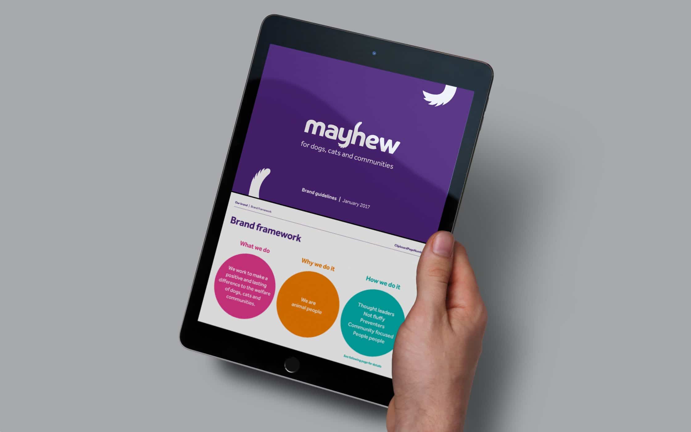
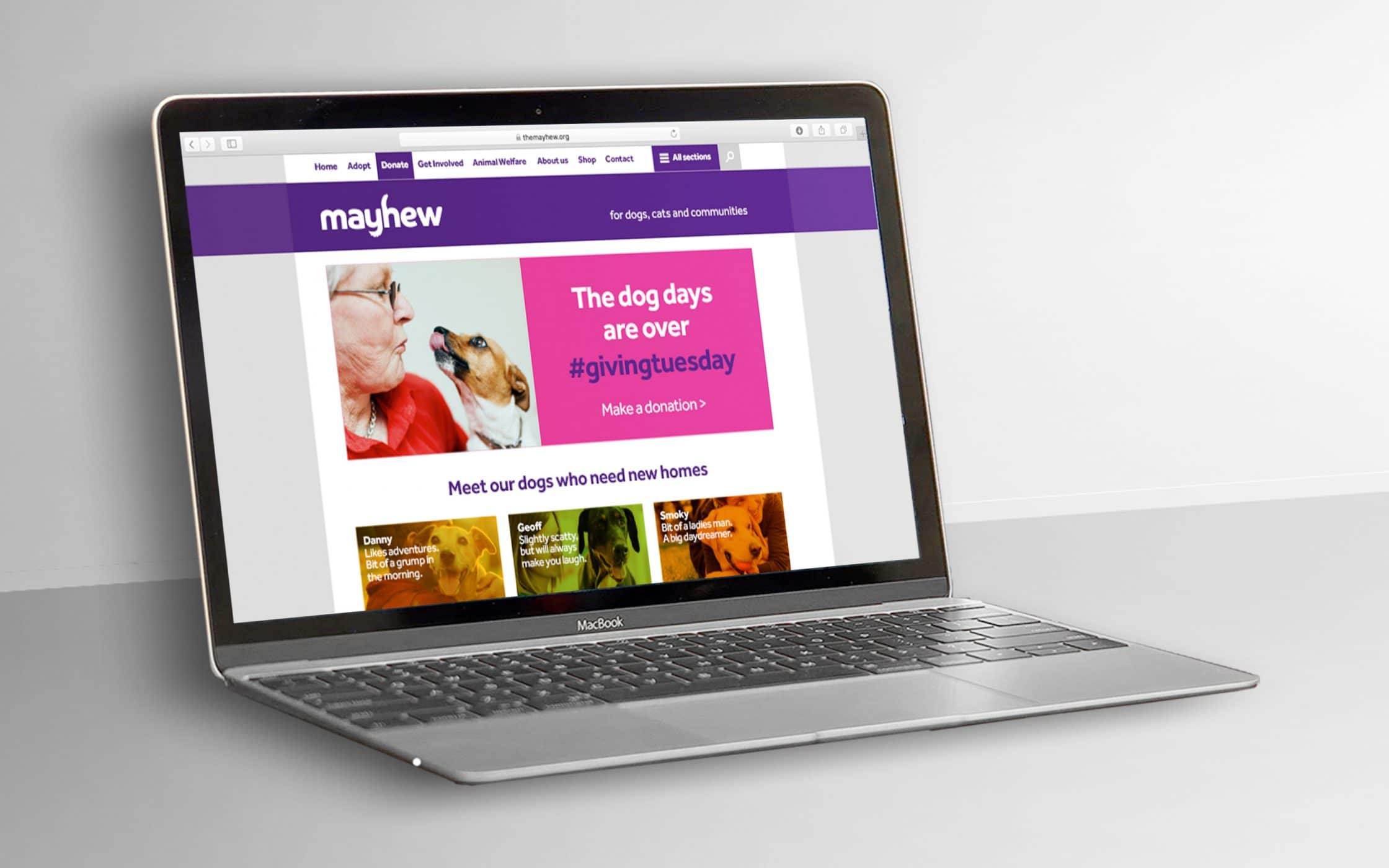
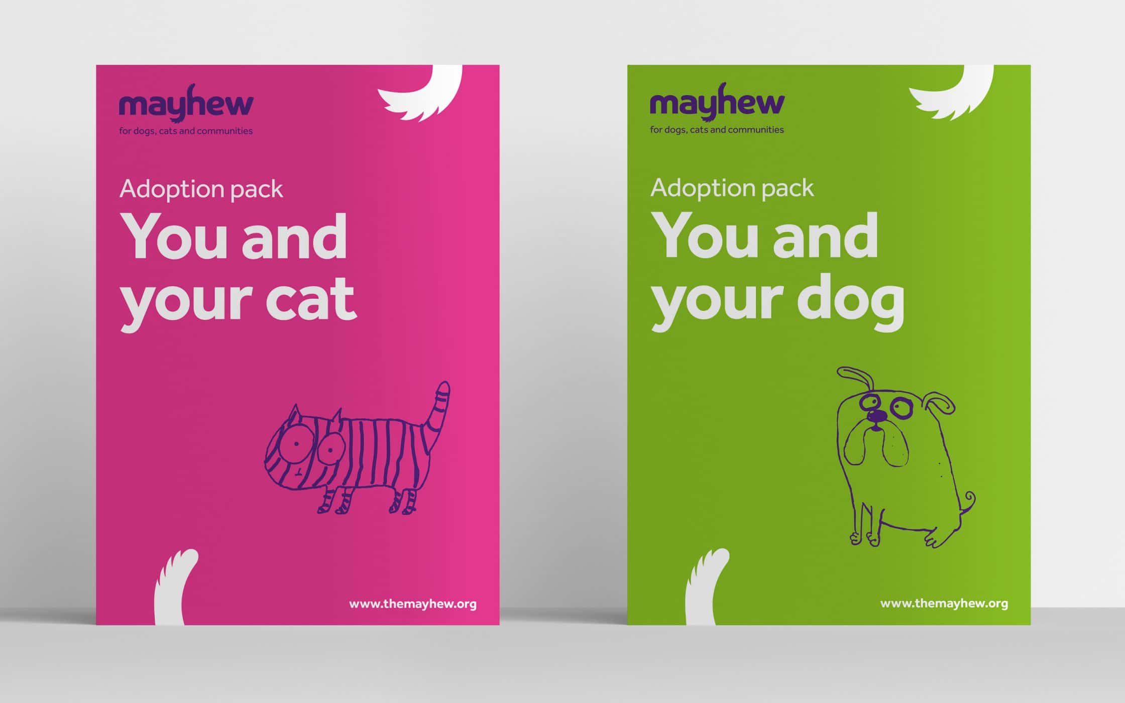
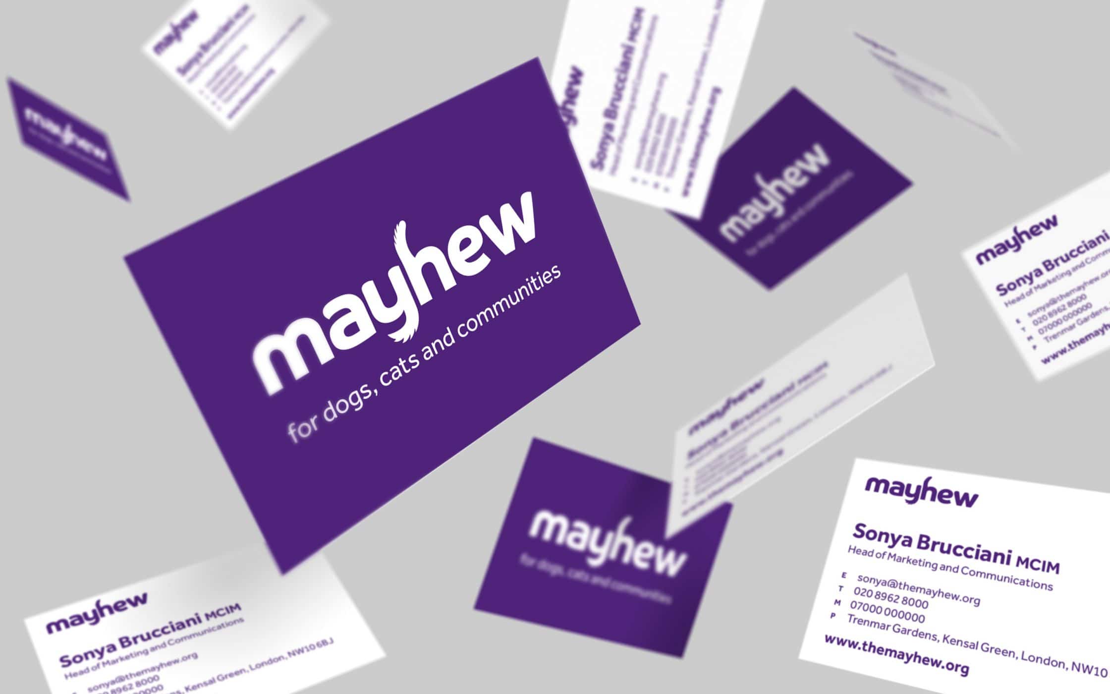
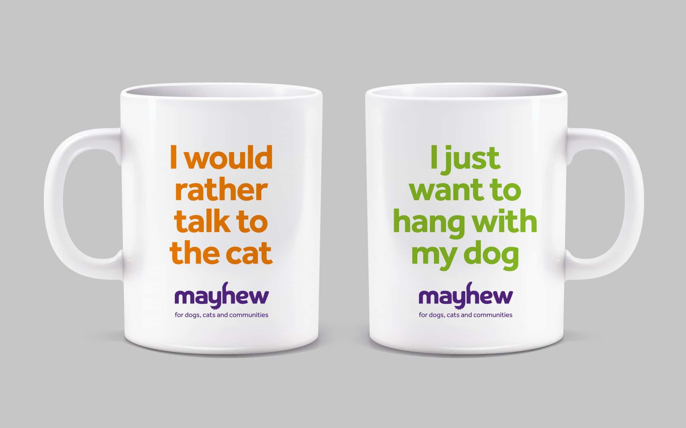
Following in-depth consultations with the Mayhew team, and its surrounding community, Fabrik created a plan for a comprehensive brand refresh. We suggested simplifying the organisations’s name to “Mayhew”, retaining the heritage of the brand, while removing the boundaries for future growth. We then added a strapline to elevate the company’s proposition: “For dogs, cats, and communities”.
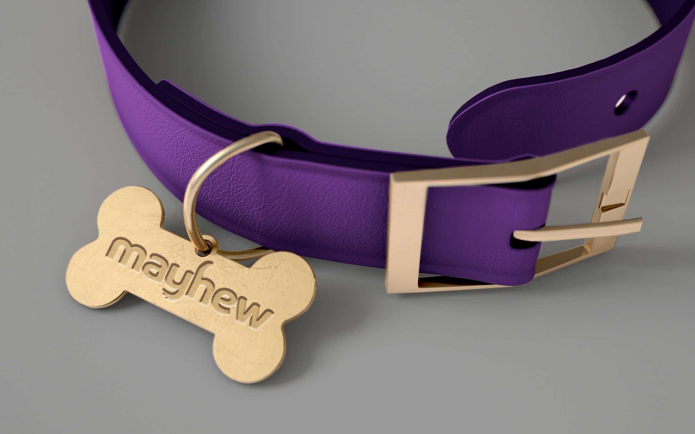
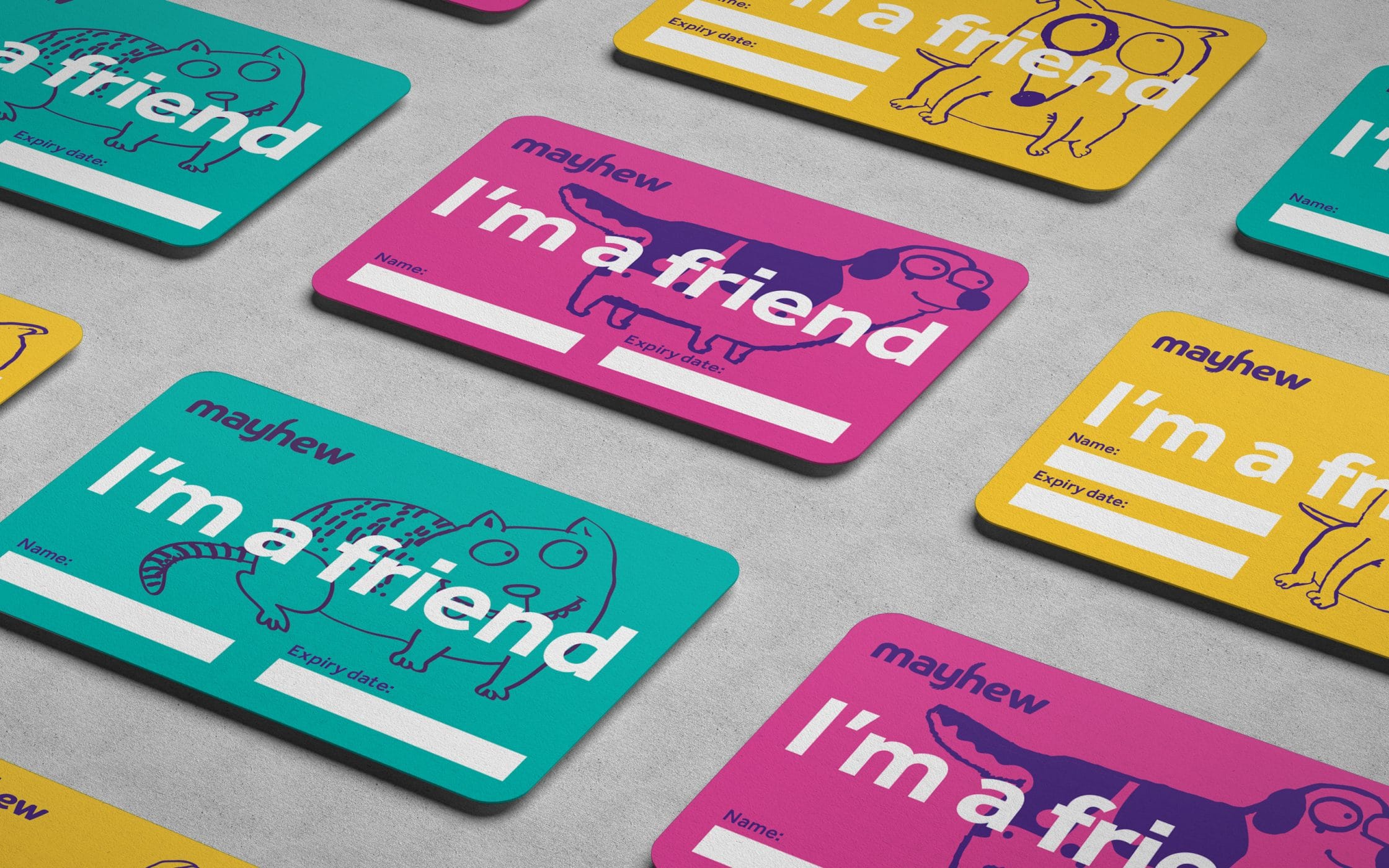
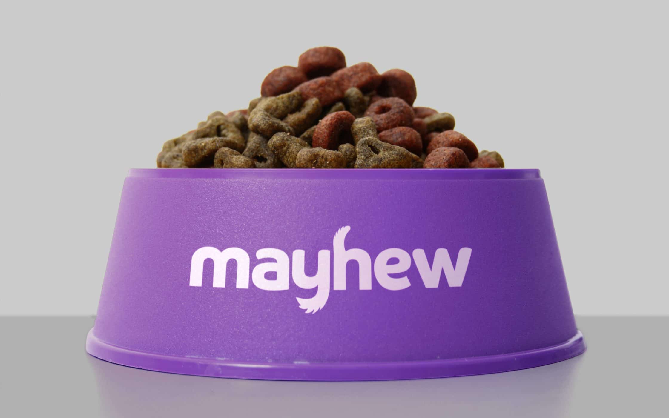
With a new name and promise in place, the Fabrik team built a comprehensive manifesto, outlining strategy, positioning, and tone of voice. From there, we began the development of a new visual identity, incorporating graphical elements into a unique wordmark, representing feline and canine characteristics. The new purple coluor palette highlighted the group’s compassionate, warm nature.
A brand with heart, heritage, and potential.
Our work with Mayhew culminated in the development of a complete brand platform, combining all of the assets the group needed to inspire and engage a wider community. The shelter’s new strategy now highlights its diverse services, and its influence on the animal welfare landscape across borders. Today, Mayhew’s brand spotlights its sympathetic nature and love for animals.
The reimagined brand identity, from the compelling new logotype, emotive color palette to the new photographic style, aligns Mayhew and its community around a shared vision. The charity now stands as a true pioneer powered by a genuine love for animals, and the desire for a brighter future.
- What we did:
| —Research & analysis —Interviews & workshops —Strategy & positioning —Name development —Tone of voice & messaging |
—Logo mark creation —Branding & development —Visual & verbal identity —Communications planning —Identity guidelines |
More from our portfolio...
Load more projects


What do you need?
Please tell us about your requirements, and we'll be in touch.
"(required)" indicates required fields