Lumeon
Creating a new name and identity for a healthcare pioneer.
Enhancing healthcare with transformative technology.
Lumeon, formerly Qinec, is a healthcare technology pioneer. The company was born from a desire to solve the challenges facing today’s healthcare organisations. Lumeon crafts advanced management resources that streamline processes, and reduce costs, while optimising the patient journey.
Though the company was driven by a clear vision, it was struggling to build a brand that resonated with its target audience. It needed the support, expertise, and creativity offered by the team at Fabrik to create a truly unforgettable brand.
Illuminating the branding opportunities for Lumeon.
Lumeon came to Fabrik with a simple request. They needed help attracting and engaging their target audience in the competitive healthcare landscape. They knew a branding update was necessary, but they needed our help determining which parts of their identity to refresh. During our initial consultation period we discovered the ideal starting point: a new name.
We discovered that the company’s previous name failed to strike the right chord with their audience. Plus, their current identity didn’t drive enough attention to their unique value proposition. Lumeon needed to update its name, brand strategy, and visual identity to focus on its innovative approach to creating bespoke, future-proof solutions for healthcare groups.
Shaping Lumeon’s brand: Strategy and creativity.
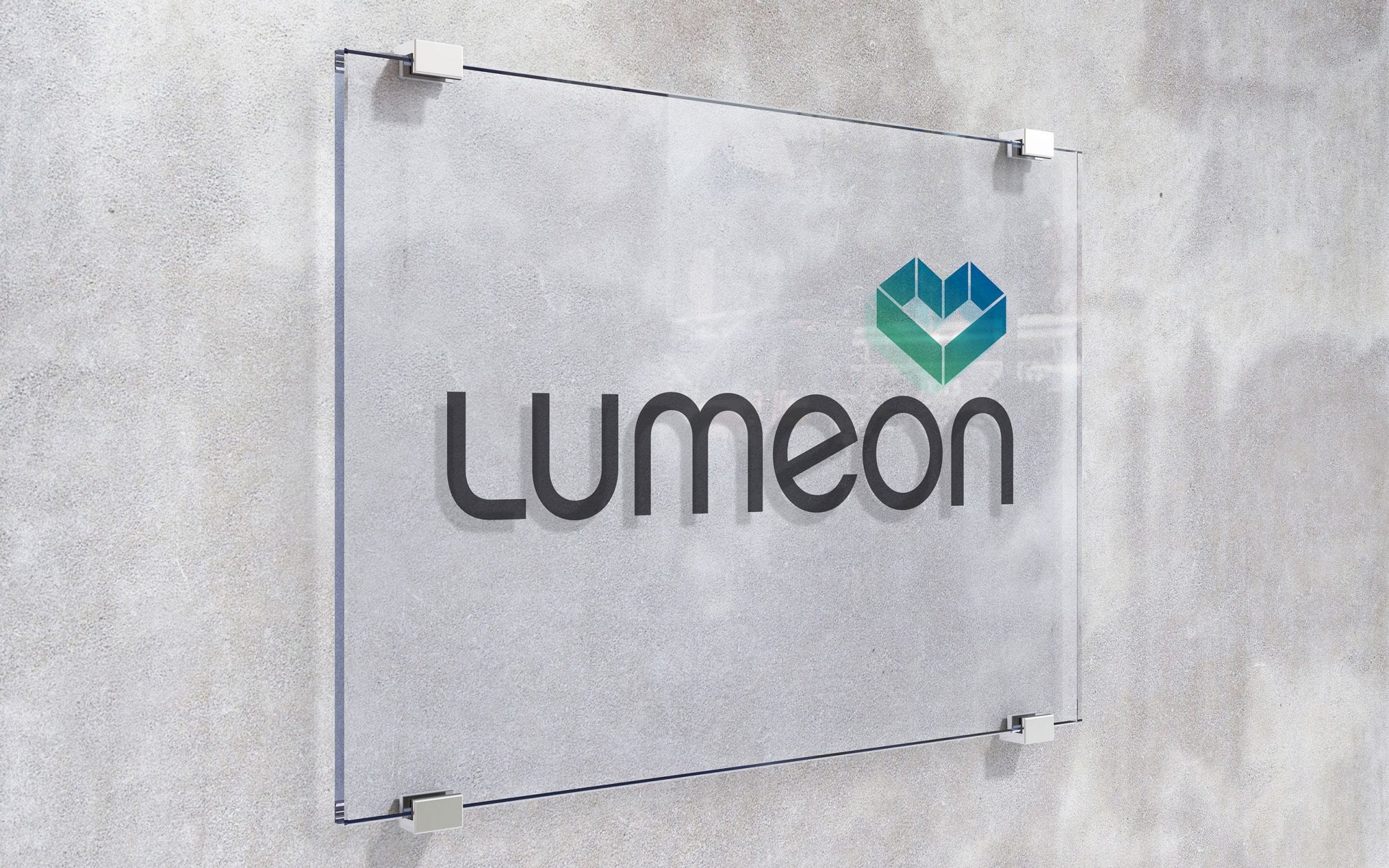
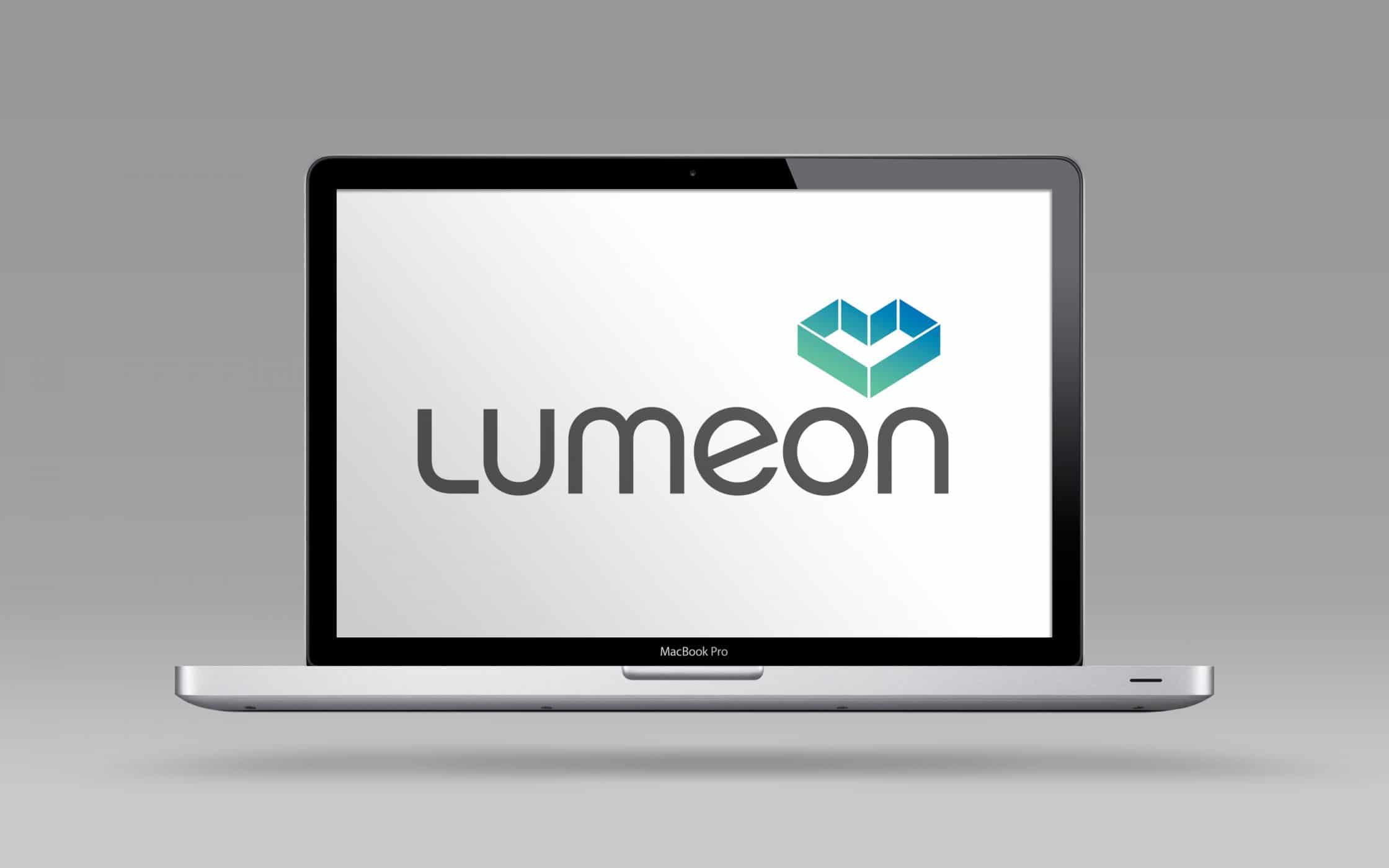
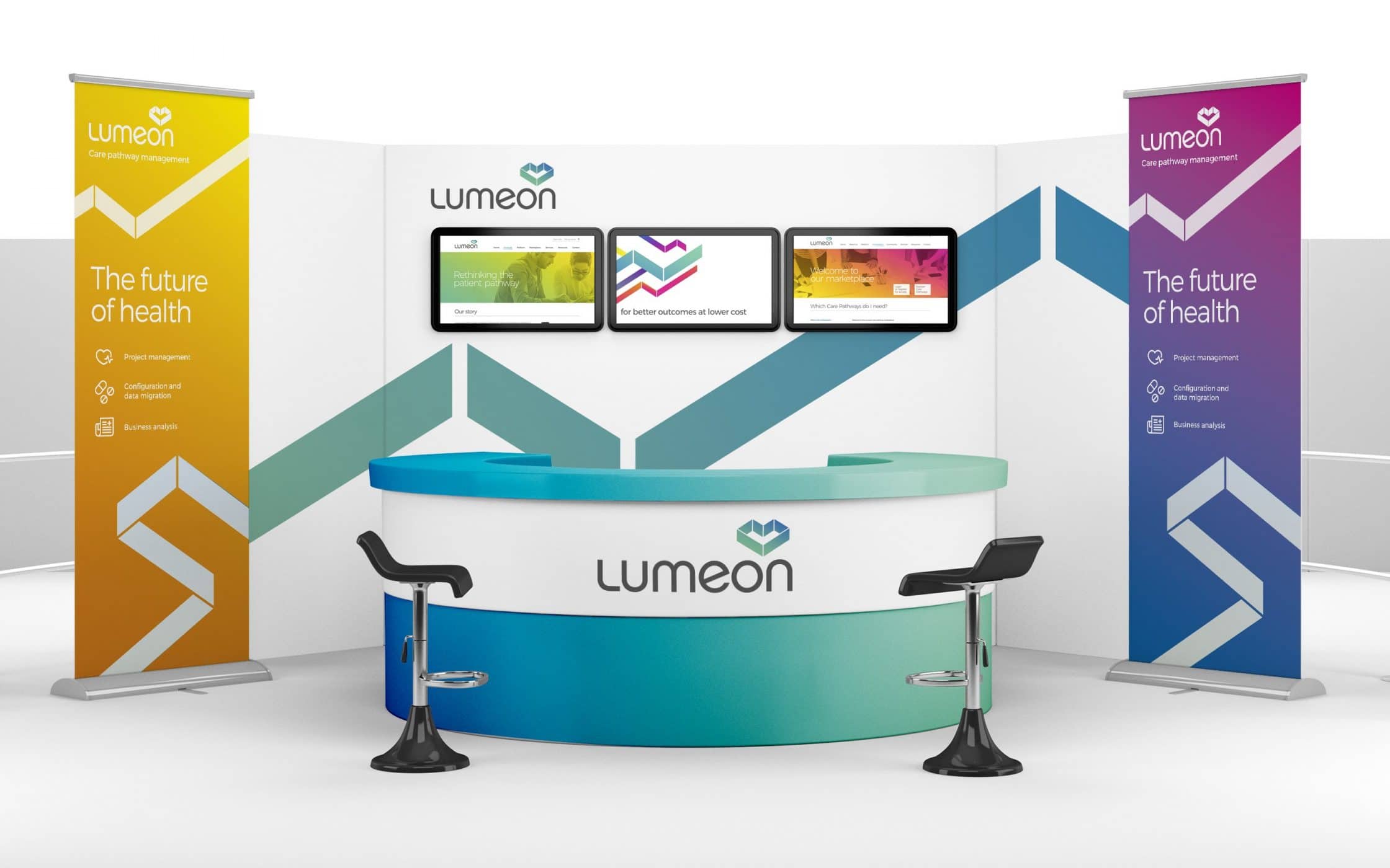
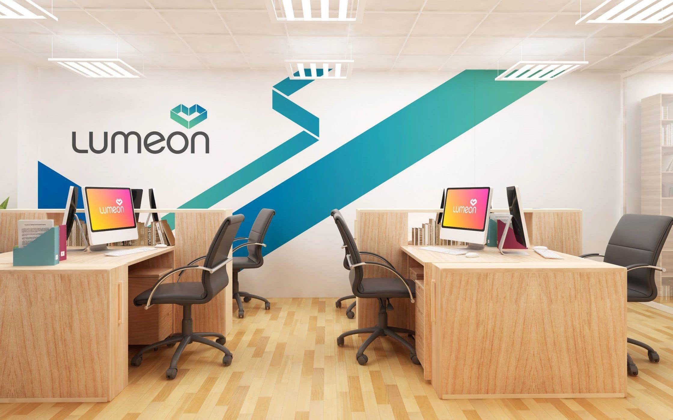
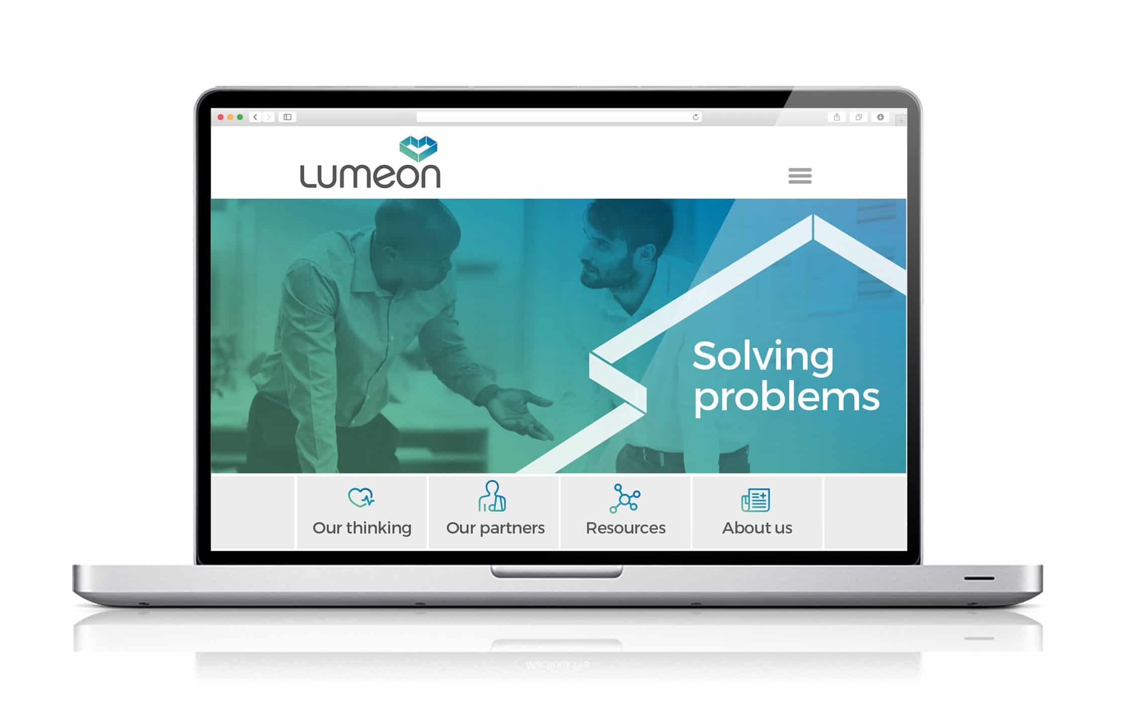
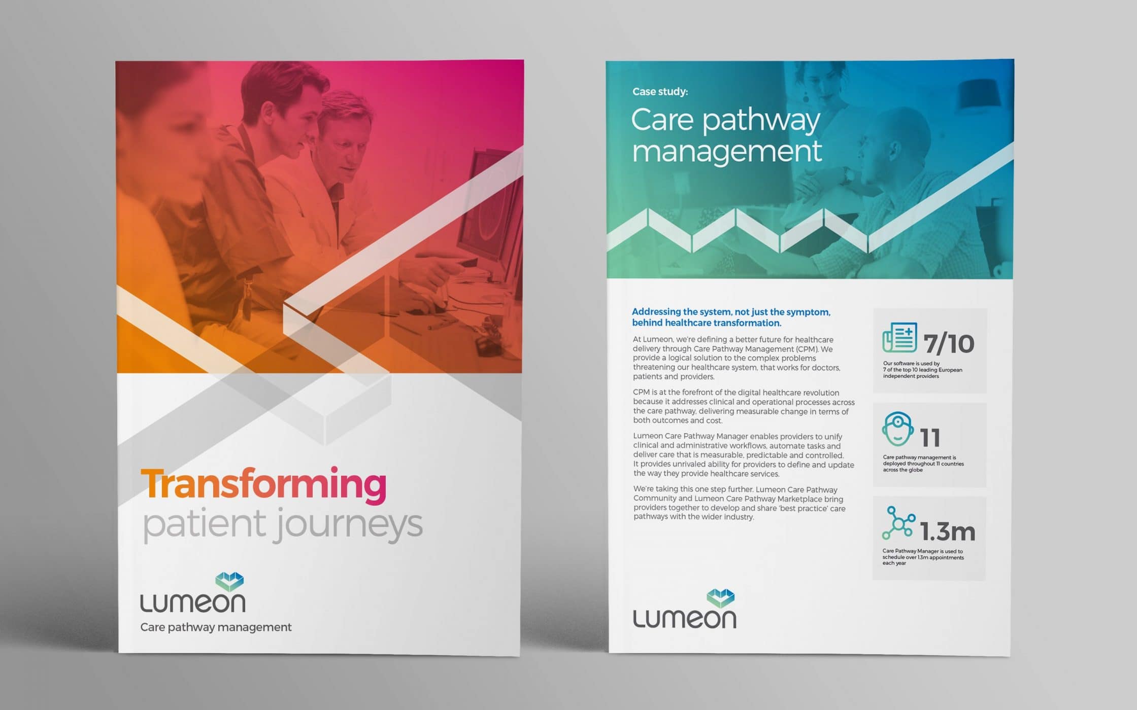
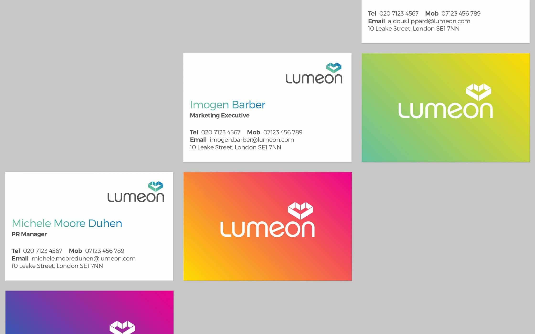
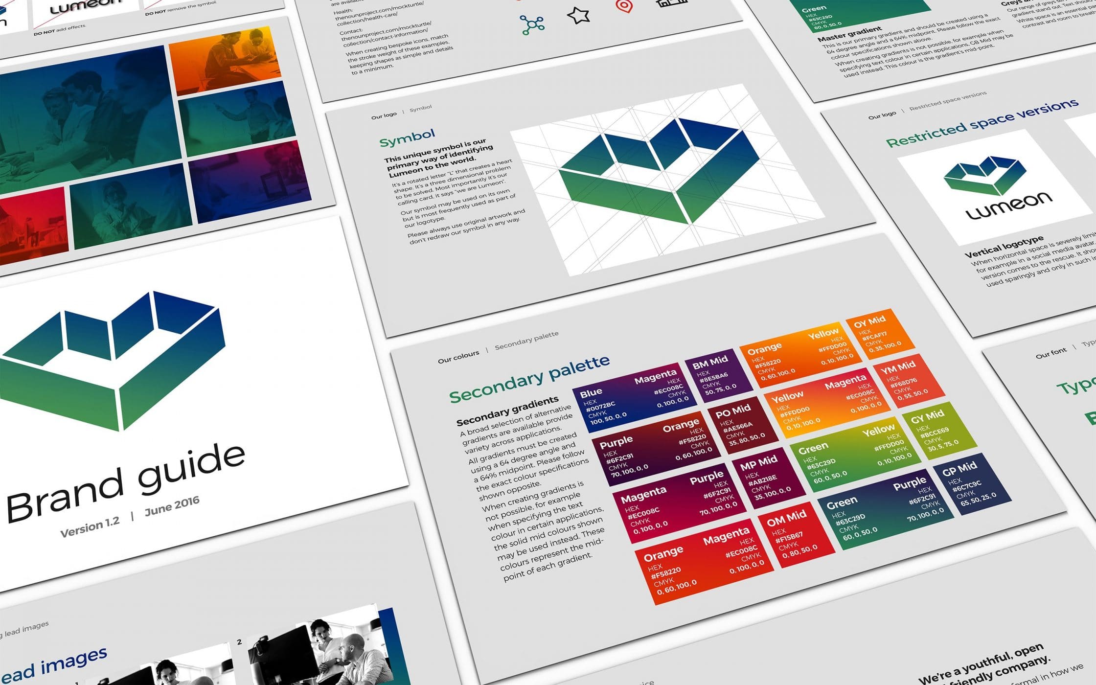
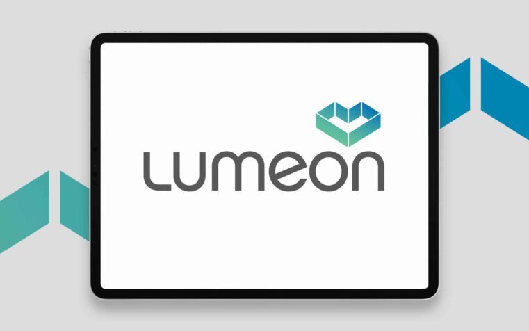
Following a period of fact-finding and research, we dove into the process of building a comprehensive brand for Lumeon. This began with the introduction of a new name, chosen to reflect ideas of illumination, and discovery. We also crafted a new strapline: “enabling the future of healthcare”. We then started work on a new visual identity, producing a distinctive symbol for the brand.
Rotated ‘L’ characters in the new logo form the shape of a heart, symbolising compassion, and vitality. This symbol sits alongside a modern typeface, with a gradient color palette chosen to demonstrate the company’s combined focus on people and technology. The updated image and name work together to reflect Lumeon’s mission: bringing a heartbeat to the tech sector.
Delivering excellence: An evocative identity for Lumeon.
Though Lumeon’s client base was already impressive, our rebranding efforts revitalised the brand and paved the way for future growth. We went beyond mere aesthetics, to create a new identity for Lumeon, built to resonate with existing and future customers. Now, Lumeon has the name and image it needs to shine as a leader in the healthcare technology landscape.
With comprehensive guidelines for tone of voice, messaging, typography, colour, imagery, and design, Lumeon has the resources it needs to outshine the competition. This pioneering company finally has a brand identity that matches its unique position in the market. Plus, it’s prepared to extend its offering to new sectors and markets, both nationally and overseas.
What we did:
| —Strategy & positioning —Branding & naming —Logo development —Visual & verbal identity |
—Tone of voice & messaging —Application guidelines —Digital design templates —Website development |
Kind words…

More from our portfolio...
Load more projects


What do you need?
Please tell us about your requirements, and we'll be in touch.
"(required)" indicates required fields