


What are the principles of design? Introducing the elements and principles of design

The principles of design are the golden guidelines a designer must follow to ensure an effective composition in any project. Without these rules, it’s common for pieces to look unbalanced, cluttered, or simply visually unappealing.
In a way, the elements and principles of design are what separate “design” from simply being “art”. With art, you have freedom of expression to create anything you choose. In design, each project has a specific purpose, which makes following certain rules more critical.
Today, we’re going to list the principles of design, and discuss why they’re so important to the professional designer.
What are the principles of design?
The principles of design are the rules designers are required to follow to ensure a project looks good and delivers the right visual experience. Principles of design don’t just improve the aesthetics of a composition or page; they can also make whatever you’re creating easier to look at.
For instance, principles like “balance” and “white space” ensure the eye isn’t too overwhelmed, causing visual fatigue. Alternatively, variety and emphasis help to show a viewer where they should be concentrating their attention.
While the various principles of design we’ll cover below are often referenced separately by designers, they generally work as part of a unified whole. Each principle or “element” reinforces, supports, and supplements the other to create a specific effect.
How many principles of design are there?
There’s some debate around the concepts included in the fundamental “principles of design”.
Some people believe there are 12 essential principles, while others say there are fewer (7). There are also additional principles of design which can apply to specific projects, like the Gestalt principles of design.
In many cases, professional designers will be required to assess which principles of design are most important for any given project they’re working on.
The main principles of design often include:
- Balance in design
- Hierarchy in design
- Alignment in design
- Unity in design
- Emphasis in design
- Contrast in design
- Repetition in design
- Pattern in design
- Movement in design
- Rhythm in design
- Variety in design
- Harmony in design
- White space in design
In certain instances, a designer may deliberately ignore the best practices of a specific principle to achieve an experimental effect. For instance, changing the alignment in design can make a project look unusual, and draw the eye for a different reason.
Let’s take a closer look at some of the most important principles of design.
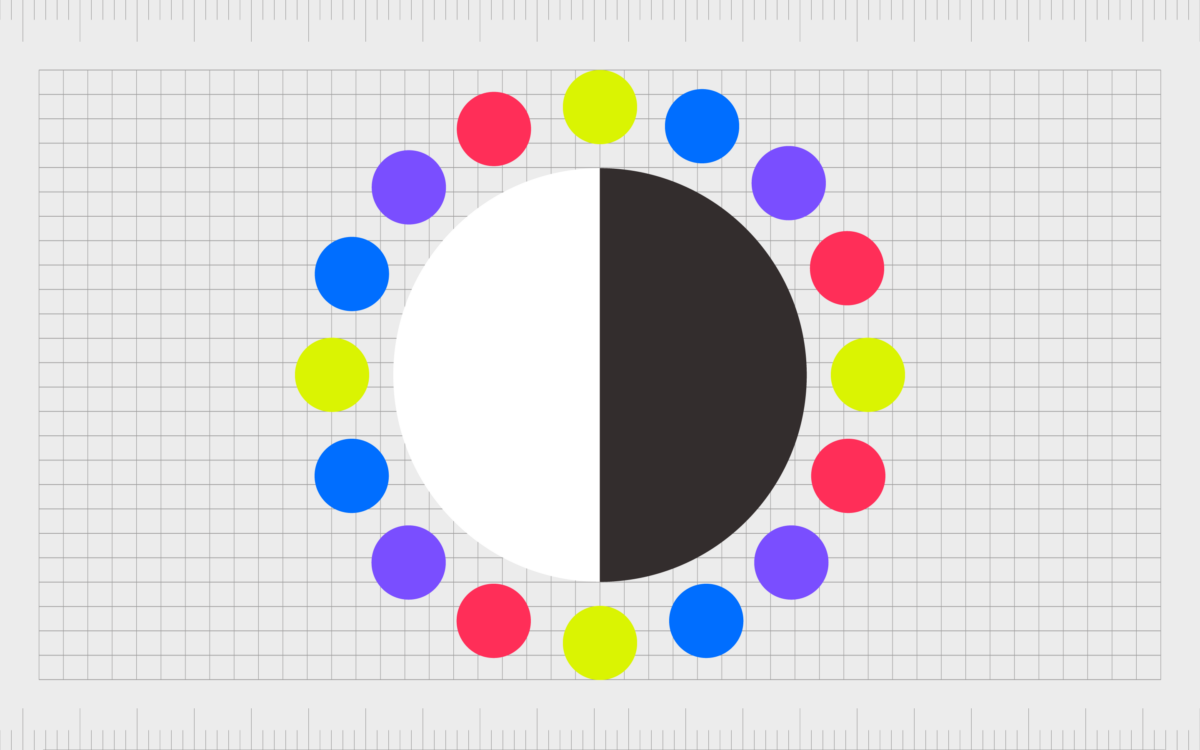
Balance in design
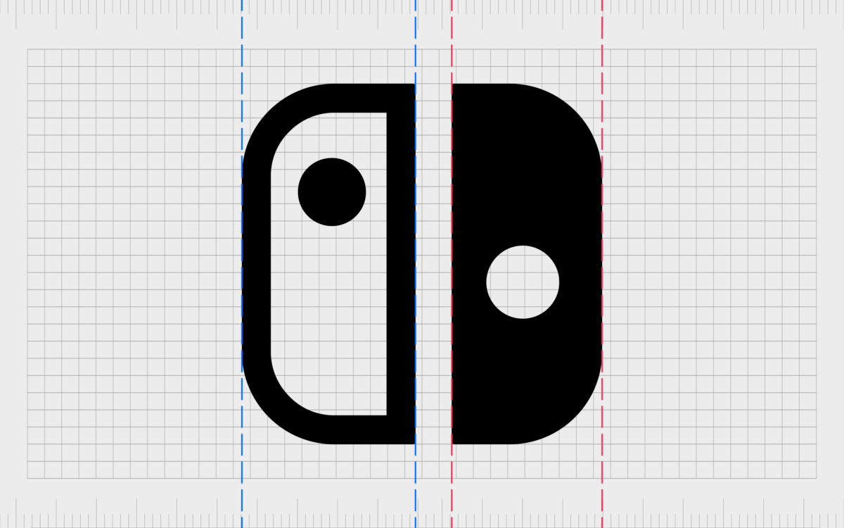
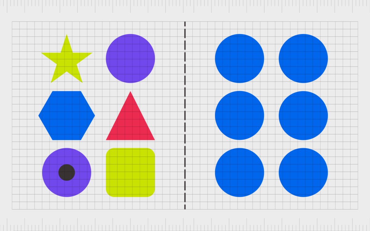
Balance is one of the most commonly mentioned principle of design. Any visual element placed in a project carries a visual weight, depicted by its texture, color and size. The elements in the image need to follow a certain scale to make a design feel stable.
Consider the Nintendo switch logo for instance, the designers deliberately chose to make one side of the emblem a little smaller than the other, to ensure the full image appeared balanced. This is because block colors can often consume a different amount of space than an outline.
The ideal with balance in design is making sure every element in your design carries the same level of visual weight, so things look evenly spread across a page or space.
Find out more about balance in graphic design here.
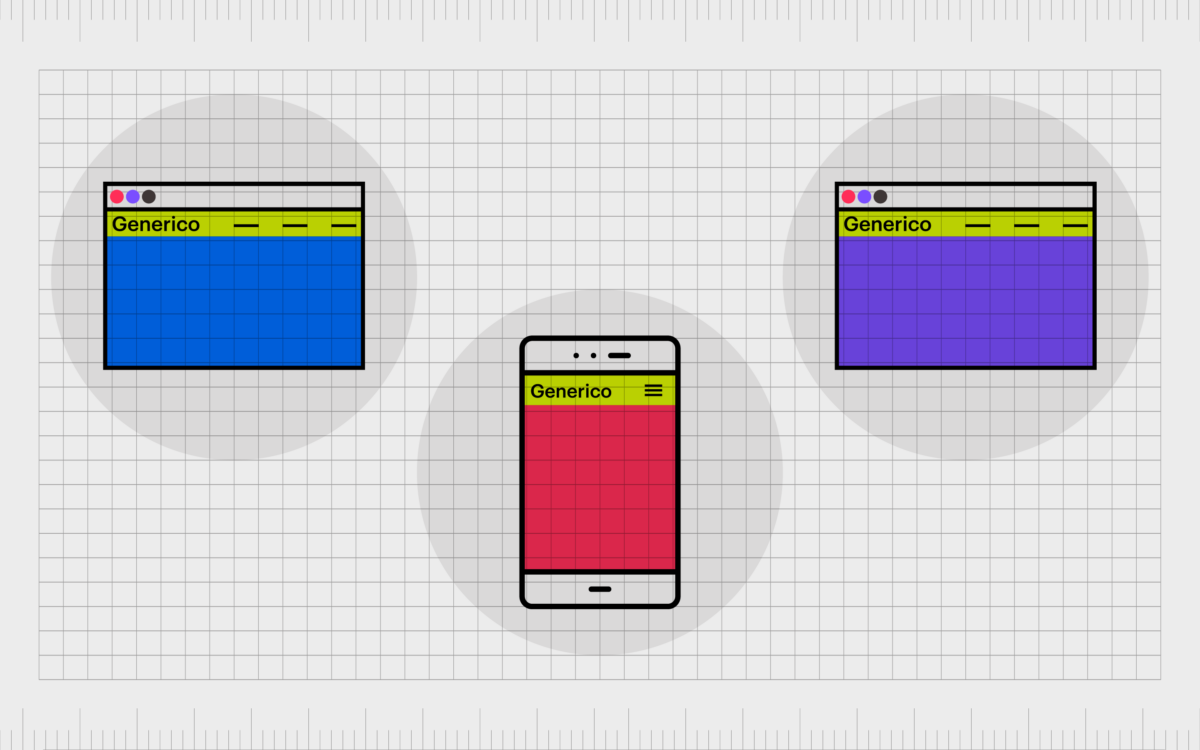
Unity in design
Unity in design is the harmony created when all elements in a design space work well together. Using similar colors that match and integrating elements organically makes it look like they belong perfectly together on a page.
Unity is achieved by creating clear relationships between visual elements. Different parts of a design might carry the same shape or use the same color scheme. Everything in a design with “unity” should appear organized and clearly aligned.
When the elements of your design have unity, they don’t fight for attention on a page. They work together to make the entire message appear stronger. However, too much unity can sometimes make it difficult to determine which parts of a design are most important.
Find out more about unity in graphic design here.
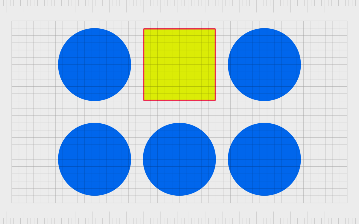
Contrast in design
Where unity in design helps things to blend together, contrast helps to create specific visual hierarchies. Contrast can develop emphasis on a page, ensuring some elements stand out more than others.
You can apply contrast through the use of different textures, colors, shapes, and sizes.
In layout, contrast is usually applied to create a sense of hierarchy between the font sizes, with larger text often being read before smaller text and so on. Contrast can also create a specific focal point around certain elements to draw the eye of the viewer.
Aside from directing the attention of the viewer, contrast can also be a powerful tool in making a design appears more legible and easier to consume. Heavy contrast between the background of a webpage and the font, for example, ensures you can read the text easily.
Find out more about contrast in graphic design here.
Emphasis in design
In the principles of design, emphasis is an important tool for all kinds of creations. The purpose of emphasis is to pull the viewer’s attention to a specific element of a design. This can be anything from a button on a website, to a certain image.
Emphasis appears naturally with contrast, when you use various different shapes, colors, and sizing choices to change the impact certain elements have on your audience.
You can create a sense of emphasis with:
Color
Contrasting colors create emphasis in design. Buttons for CTAs are usually emphasized with the use of vibrant contrasting colors intended to encourage clicking.
Lines
Lines, arrows, and even “highlighted” spaces of text provide direction on a page and show users where they should be directing their attention.
Shapes
Using a group of similar shapes on a page then breaking the flow with a different shape will help to draw the eye.
Texture
Textures create emphasis in the offline world. An embossed font on a business card will naturally draw more attention than the rest of the card. Texture can also appear in a digital world with the use of shadows.
Space
Extra white space around an object can help to create a sense of emphasis or encourage greater focus on that object.
Find out more about emphasis in graphic design here.
Repetition in design
Repeated elements in design are attractive because they naturally work well together. Repetition is often an important part of design because it stops a project from becoming overwhelmed with too much contrast and variety.
While variety is useful in a design, it can cause visual confusion by making it harder to determine where a user should focus their gaze.
Using one or two elements consistently throughout a design, like the same font, or a specific shape, helps to create a sense of unity in your overall creation.
In website design, we often see repetition used as a tool to improve user experience. For instance, placing the menu on the same part of every page in the same website will ensure your customer will always know where to go when they want to click into a new part of the website.
Repetition can also create familiarity with your brand. Consistent exposure to the same brand colors and logos gives you a more refined image.
Find out more about repetition in graphic design here.
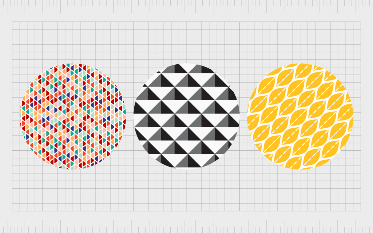
Pattern in design
Pattern in design is a concept which builds on the importance of repetition. With pattern, you’re also repeating certain elements, but usually the focus is on recreating a number of elements, rather than one.
Pattern appears frequently in the creation of backgrounds and wallpapers.
An effective pattern in design is a repeated set of consistent elements which flows without flaw.
For example, on a website design, the background pattern on your site should remain consistent as your customer scrolls through the page, so it emphasizes the rest of the site, without drawing the eye.
The use of patterns can enhance the overall appearance of a final design and create a sense of visual satisfaction, but it’s rarely intended to create emphasis or contrast. Patterns blend well into the overall composition, to support the specific image or aesthetic you’re trying to create.
Find out more about pattern in graphic design here.
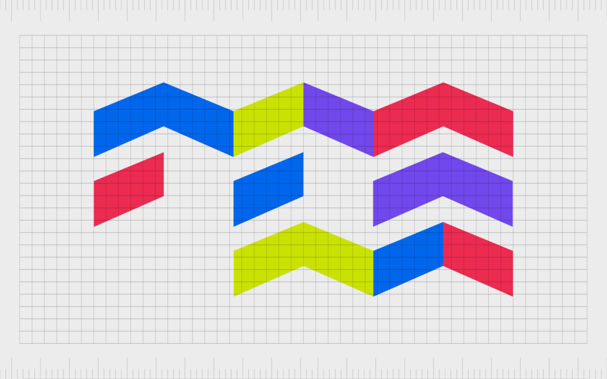
Rhythm in design
Rhythm in design is an interesting concept, which connects frequently to pattern and repetition. With repetition and pattern, the same elements or elements are applied to a design consistently, without break, to create a consistent appearance.
Rhythm is the visual tempo professionals can use when applying a combination of elements repeatedly. As an example, you might use a long line, followed by a short line, followed by a long line to create a sense of movement.
Similar to a pattern, rhythm is usually a hidden element in design works, performing in the background to bring a sense of depth and vitality to a piece. Rhythm isn’t overly obvious until you know what you’re looking for.
However, when used correctly, rhythm can support the other principles of design in a project to create a more eye-catching and engaging experience.
Find out more about rhythm in graphic design here.
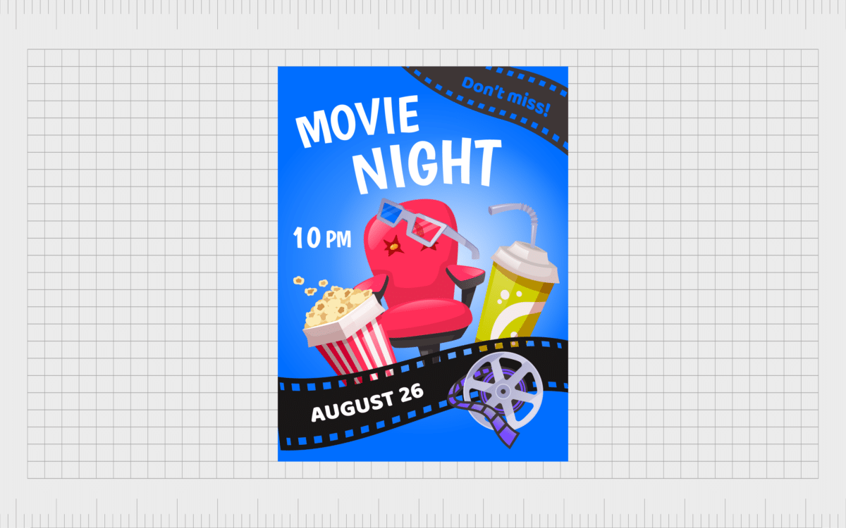
Movement in design
Another interesting principle of design, movement refers to the visual strategies companies and designers can use to manipulate the path a viewer’s eye takes through a composition. In an image, various elements can affect how your eyes move.
If, say, you wanted a customer to pay attention to the name of a band on a poster first, you’d usually place it on the top of a page, using various types of movement to make it stand out from the rest of the page.
In the example below, the font is curved to show it bouncing off the page.
Usually, contrast and rhythm can help with movement. Color can help to enhance the feeling of movement, creating energy on a page.
Curved and diagonal lines also create more movement, particularly when used to pull the eye to a specific focal point.
With successful movement in design, experts can make it feel like the elements on a page have their own distinct life.
Find out more about movement in graphic design here.
Proportion in design
Proportion is design is an important part of the visual hierarchy and balance of a piece. It’s the sense of unity you create when all of the weights and sizes of an element within a composition relate well to each other.
To achieve successful proportion, you’ll need to think about the scale and size comparisons of different elements on your page.
Proportion is something designers need to think about carefully when ensuring the hierarchy of the page pulls the attention correctly. For instance, the headlines on your page and the most important pieces of information may need to be comparatively larger than other pieces of text.
With proportion, you can determine which elements of a page are the most important and deserve the most attention. Grouping related items can give them a sense of importance at a smaller size point too, provided you know how to use your layout properly.
Proportion is only achieved when all elements of a design are sized correctly and appropriately placed. Once you master concepts like balance, alignment, and contrast, you’ll achieve proportion naturally too.
Find out more about proportion in graphic design here.
Harmony in design
Similar to unity, harmony in a design is a sense of ongoing cohesiveness between the elements of your composition. The elements in a design don’t need to be completely the same to achieve harmony, but they should always maintain a specific link.
Harmony in design on a website is often seen in the way companies continue to use the same color palette or fonts on a page, even when the contents of each page might change.
Similar textures used in a design can also create a sense of unity and harmony, alongside similar shapes like ovals and circles.
Harmony, like unity, is something designers need to approach with caution. While not enough harmony on a page can make it look chaotic and confusing, too much can be boring. Variety is still needed to make something visually interesting.
Find out more about harmony in graphic design here.
Variety in design
Variety in design is how you keep your image or creation visually engaging and interesting. Too much unity or consistency throughout an entire design can make the image appear boring. It also means your viewer won’t know where they should be focusing their attention first.
Variety and contrast help to capture a viewers attention and guide them through the composition in the most effective way. Variety adds something interesting to the overall experience, like mixing different shapes in a website design, or using more than one type of font.
The important thing to remember with variety, is there still needs to be a level of unity and consistency. Too many disparate elements with no obvious connection will make a composition seem haphazard and confusing.
Find out more above variety in graphic design here.
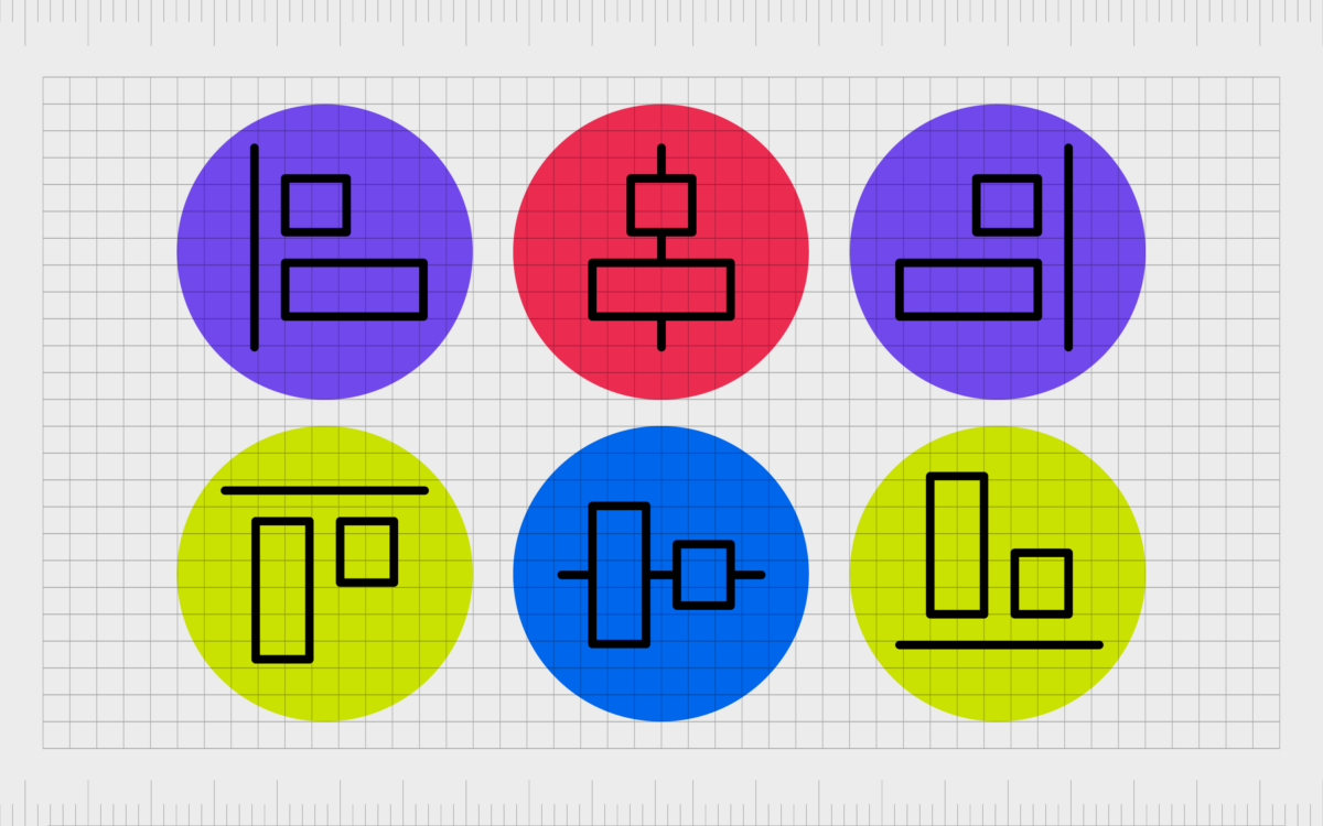
Alignment in design
Like unity and hierarchy, alignment in design helps to create an ordered appearance for an ultimately better appearance overall. If you’ve ever designed a website, for instance, you’ll know most web designer tools have grids to help you ensure the borders of different elements line up.
Ensuring different segments of font and imagery exist within the same invisible grid makes your design look more contained and cleaner.
With alignment, the elements in an image seem to naturally flow, and exist within the same consistent space. If something looks off with a piece of text or the pictures on your design, there may be something wrong with the alignment.
Find out more about alignment in graphic design here.
Hierarchy in design
Probably the most commonly mentioned of all the principles of design, hierarchy in design ensures you can guide your viewers through a composition using the path you’ve chosen.
With hierarchy, you determine which parts of your design are going to get the most attention first, second, and so on.
Hierarchy involves using contrast, variety, and various other elements to make certain parts of your design stand out more than others. On a webpage, for example, you would use larger text at the top of the page to draw attention to a headline first.
The use of colors and various shapes throughout your web page will then draw the customer’s attention down the page, drawing emphasis to one element at a time.
The purpose of hierarchy in design is to frame the most important information as the components your viewers see first. This helps to ensure users can get the insights they need quickly and effectively on a page, a menu, or a leaflet.
Find out more about hierarchy in graphic design here.
White space in design
Finally, we come to one of the most crucial principles of design, particularly in a digital world. While other elements and principles of design focus on “adding” things to a composition, white space focuses on what you don’t add (deliberately).
White space is essentially the empty area around the various elements in your design.
While the space doesn’t have to be specifically white, it does have to be devoid of anything which would capture a viewer’s full attention.
For beginner designers, this concept can be quite complicated, as it’s tempting to try and fit plenty of eye-catching elements on a page.
However, white space isn’t there for no reason. Giving the components of a composition more room to breathe upgrades a standard design from being complex and cluttered, to visually stunning. White space helps to contribute to hierarchy and organization in an image.
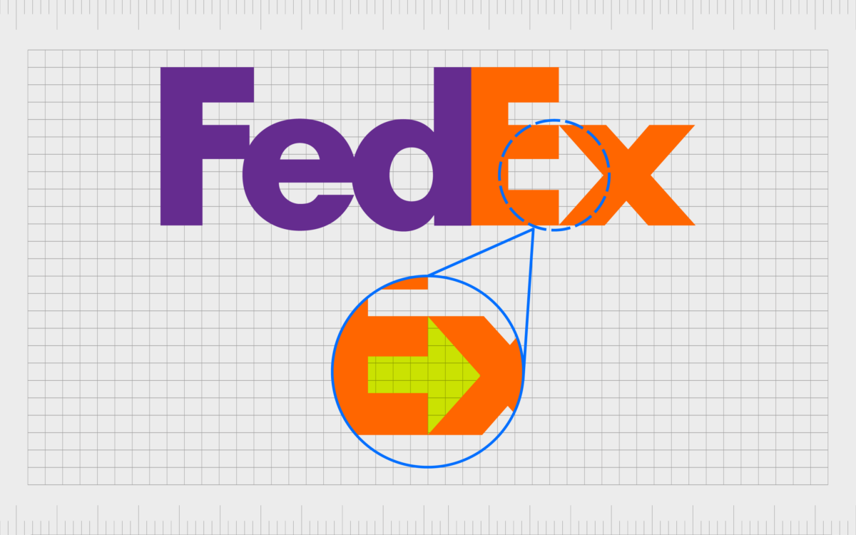
Used correctly, white space in an image can help to give each part of a composition more focus and depth. Negative space in design can even help to convey additional information, like the arrow appearing in the FedEx logo.
Find our more about white space in graphic design here.
Mastering the elements and principles of design
The principles of design might seem complex at first, but they’re an important concept to understand if you want to master your skills as a graphic artist.
Using the right principles gives more structure to your composition, and ensures the images you create aren’t visually overwhelming or exhausting.
This means people are more likely to want to interact with whatever you make.
Learning how to use graphic design principles means learning how to guide an individual or group of users through your graphic creations in a convenient and eye-catching way.
When you look at a design composition, you should be thinking about what you’re building with the principles mentioned above in mind.
To learn more about the principles of graphic design and the various elements capable of making your creations more compelling, you can find additional content on this website.
If you want someone to master the complex elements of design on your behalf, reach out to the Fabrik team.
Fabrik: A branding agency for our times.
Now read these:
—Understanding balance in graphic design
—Discover the alignment principle of design
—What is the hierarchy principle of design?
—Exploring the unity principle of graphic design
—Getting to grips with contrast in graphic design
—Understanding the emphasis principle of design
—Discover the repetition principle of graphic design
—What is the pattern principle of graphic design?
—Exploring the rhythm principle of graphic design
—Get ahead with the movement principle of design
—Why variety is an important factor in design
—How to bring harmony to graphic design projects
—The principle of white space in graphic design
—How to use the proportion principle in design

Clarity starts with a conversation.
Thanks—we’ll get back to you shortly.
Whether you're navigating a rebrand, merger, or simply need a clearer identity—we’re here to help. No hard sell, just honest advice from people who know the sector.
Let’s start with a simple question…
Prefer to email? Drop us a line.
Fabrik’s been helping organisations rethink and reshape their brands for over 25 years. We’ve guided companies through mergers, rebrands and new launches. Whatever stage you’re at, we’ll meet you there.