
JECT.AI
A new visual identity for a champion of AI content generation.
The intersection of creativity and technology.
JECT stands at the forefront of intelligent content creation. Committed to inspiring and elevating creativity, the company creates tools that empower creators to achieve their goals. Combining smart algorithms with interactive features, JECT’s platform diminishes the challenges of creative block. It helps writers explore new angles, voices, and tones for content creation.
Born from a desire to improve and optimise the creative process, JECT’s technology has emerged as an indispensable resource for creators worldwide. The brand even offers training resources to beginners, to help them unlock the skills they need to thrive in a competitive landscape.
Crafting a cohesive identity for a creative brand.
Though JECT’s mission and vision were clear, the team needed help establishing an identity that would resonate with its audience across all channels, and highlight its unique proposition. The business turned to Fabrik’s creative and strategic experts, to initiate a comprehensive branding journey. They asked us to assist them in capturing and showcasing the essence of their brand.
The extent of the brief became clear during our initial discovery sessions, where we identified the core proposition of the solution, the problem it solves, and the aspirations of the company. We learned about the firm’s target audience, and began working on an image, tone of voice, and communication strategy for the launch of the new product.
Clarifying the components of the JECT brand.
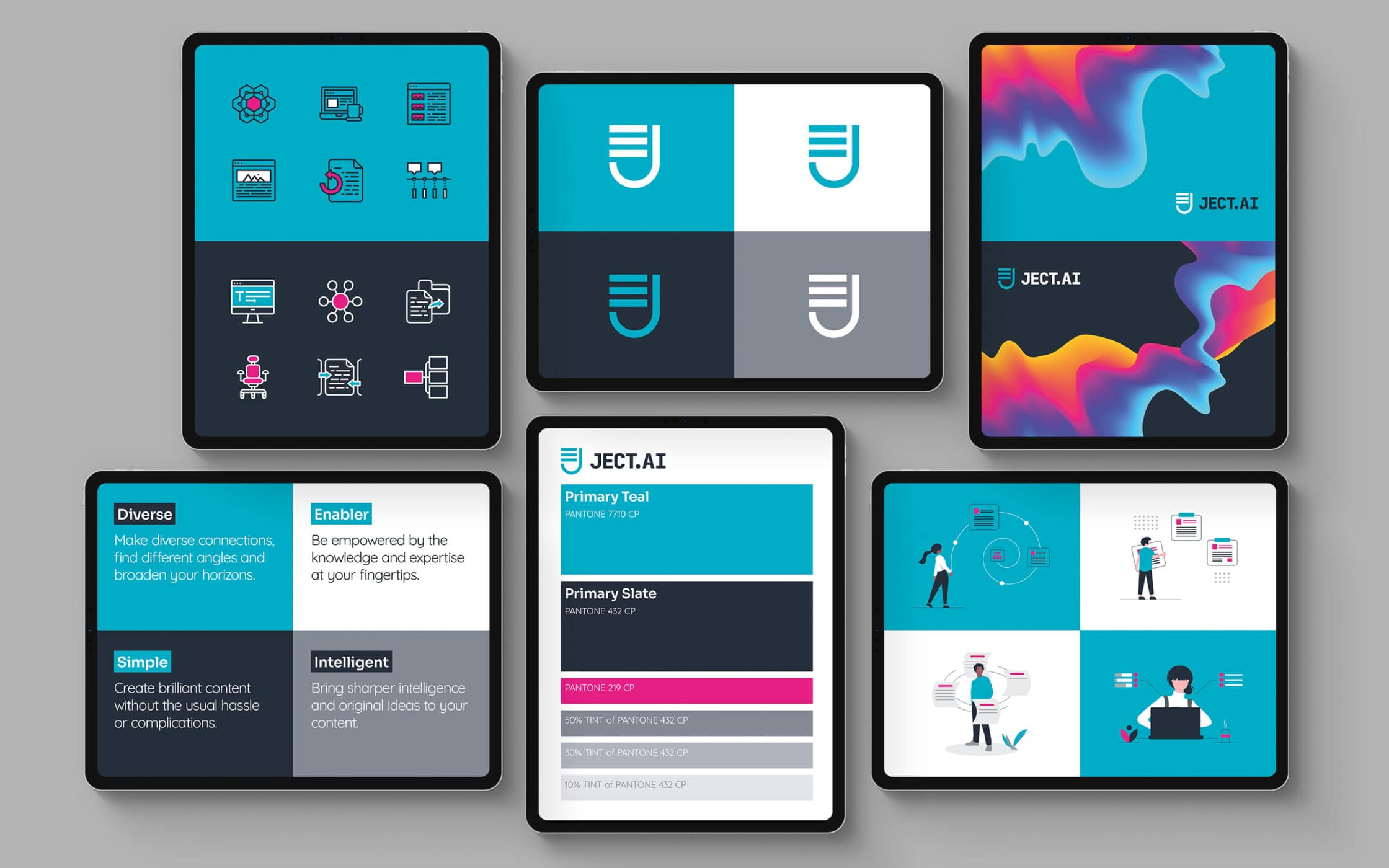
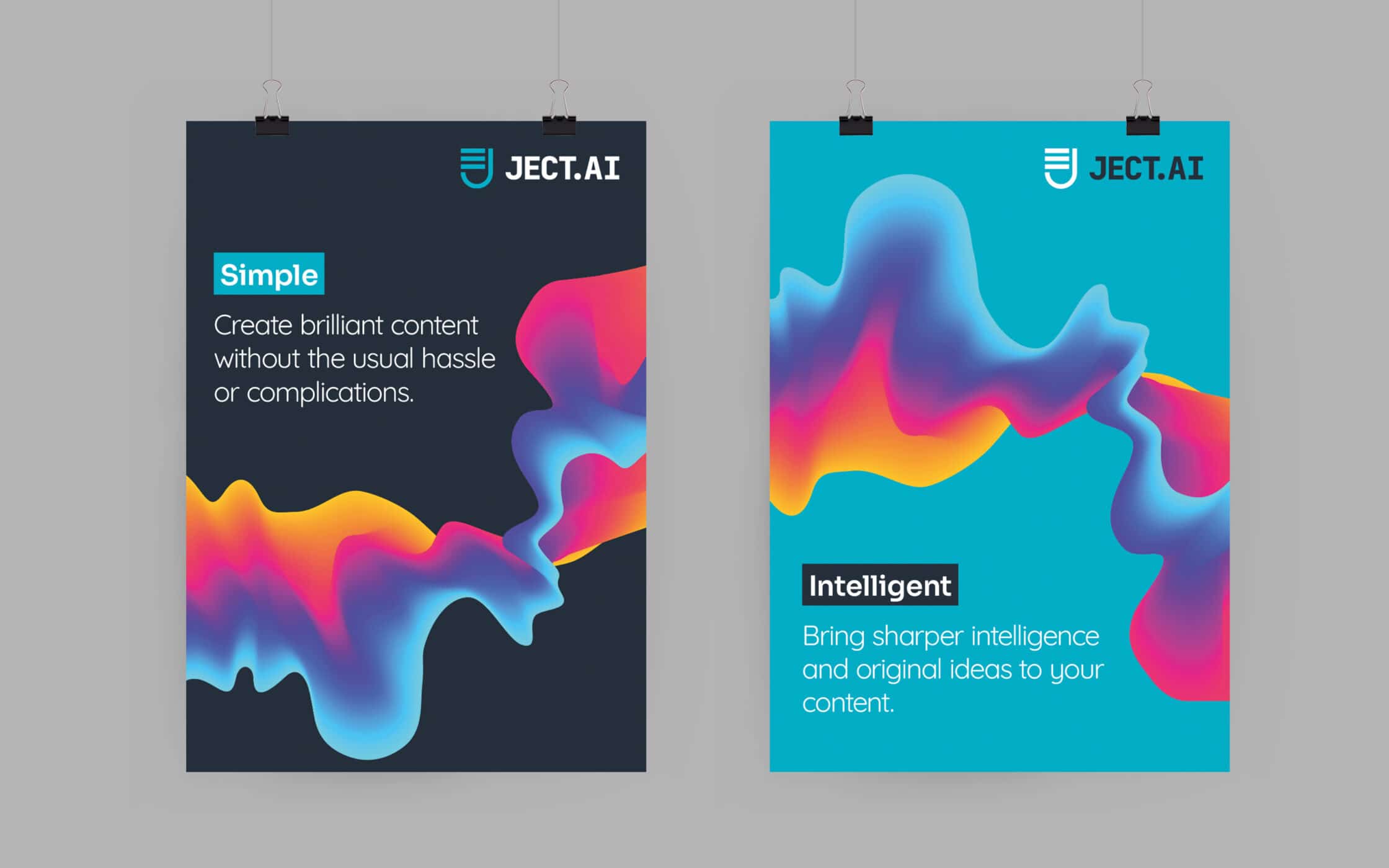
Following meticulous research sessions, we developed a message bank and tone of voice to highlight JECT’s proposition. We wanted to show the brand’s customers that the AI solution would augment, not replace their creativity with statements like “Bring sharper intelligence and original opinions to your content”. From there, we moved onto the visual identity.
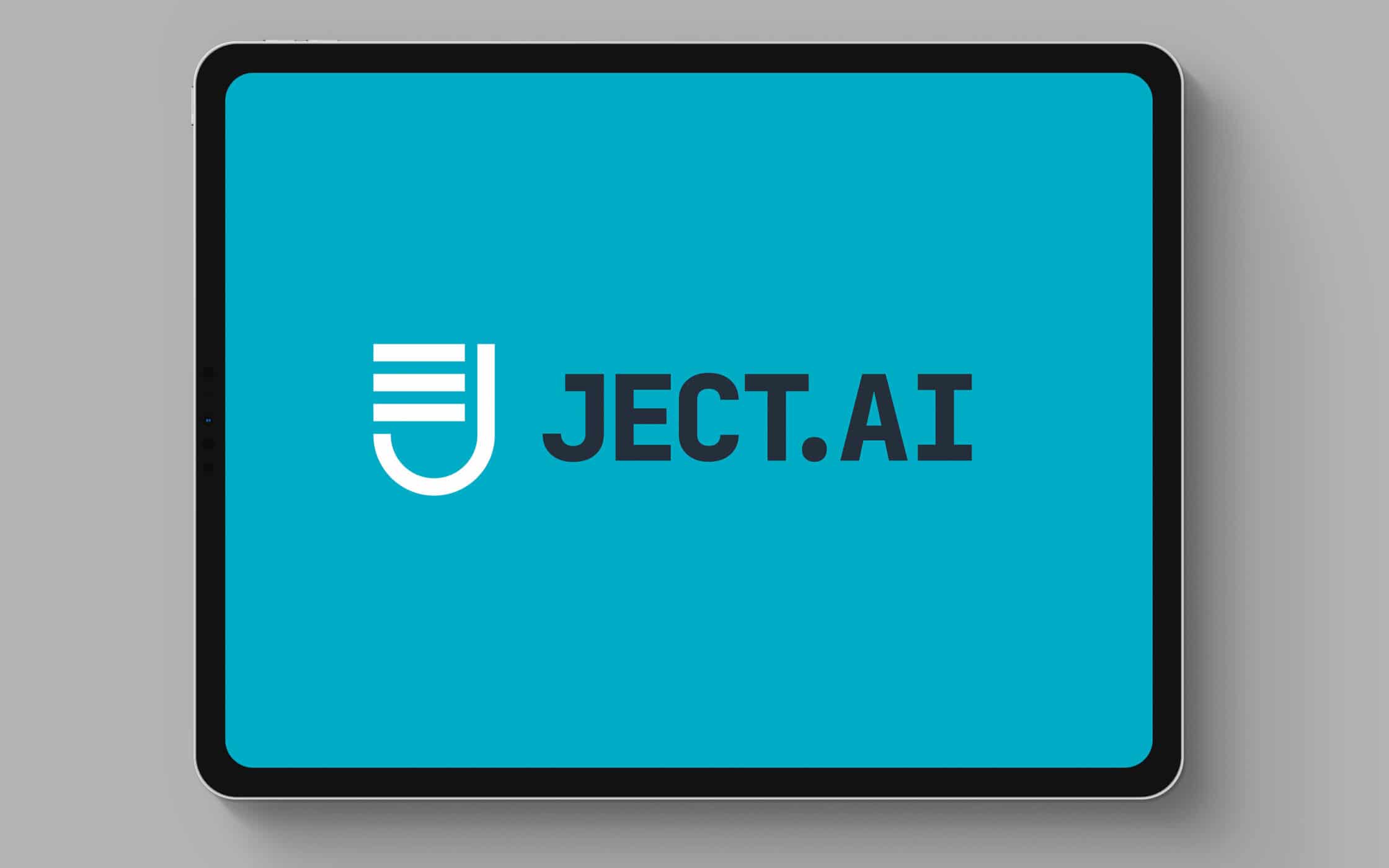
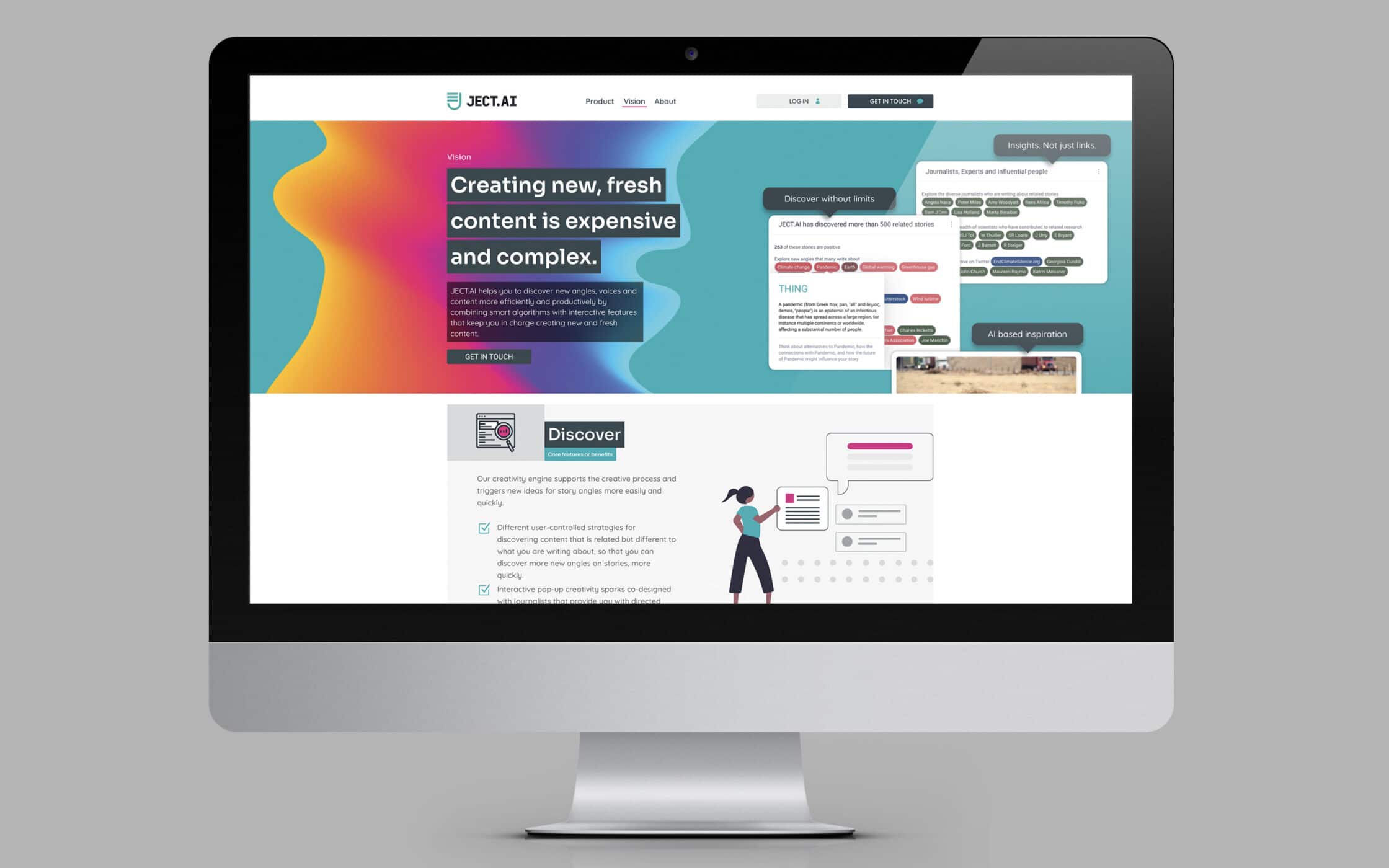
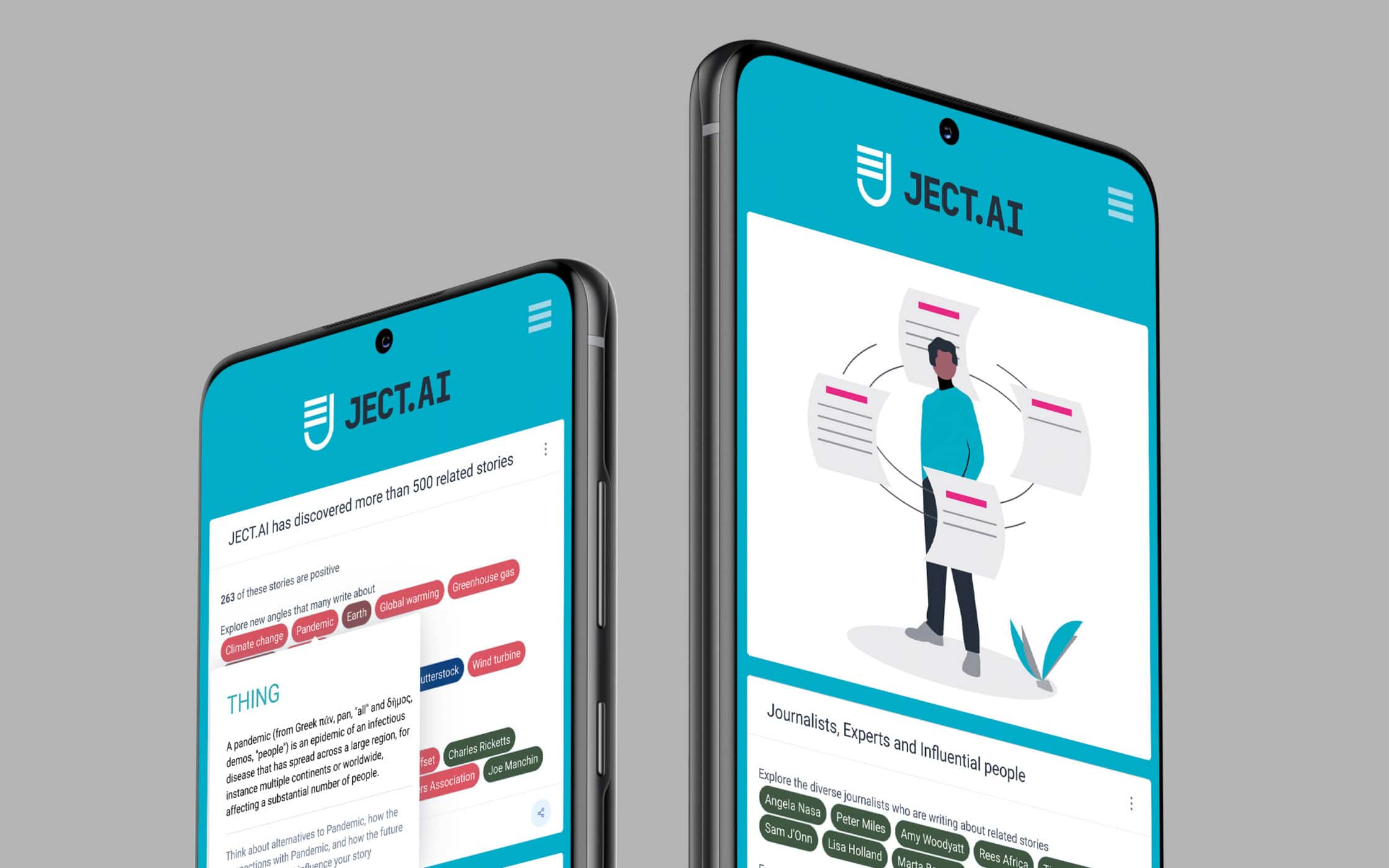
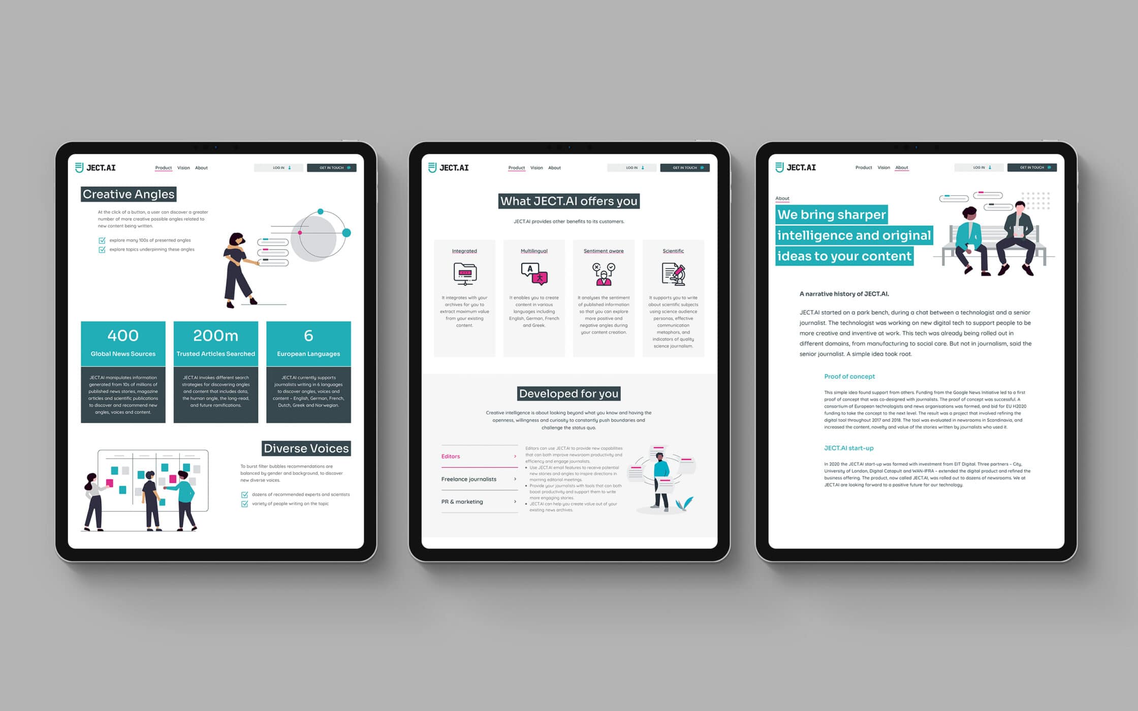
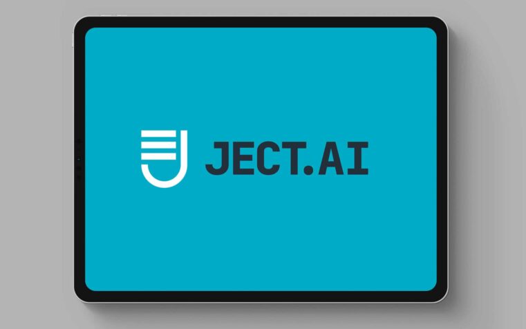
The Fabrik team explored a range of abstract and recognisable symbols for the new logo, settling on a straightforward and modern symbol, incorporating the letter “J” and a recognised text symbol. This was complemented by a strong dual-colour primary palette in blue, with a bright pink accent. We also introduced vector illustrations, animations, and abstract graphics for the JECT website.
A new voice and brand image for JECT.
Our work with JECT resulted in a comprehensive suite of branding assets, encapsulating the company’s vision and ethos. The distinctive logo is simple but memorable, demonstrating the accessibility of the company’s solution. A set of clear messaging guidelines ensures the firm can inspire and engage its audience, showcasing its unique proposition.
To complete our work with the team, we also produced a new user-friendly website. Using the WordPress CMS, we built a bespoke online presence, complete with custom graphics and animations. This site brought all of the core components of JECT’s new identity together in a cohesive way, to resonate with content creators worldwide.
What we did:
| —Initial consultation —Research & context setting —Tone of voice —Message brand |
—Visual identity —Animation —Website planning & wireframes —Website design & build |

More from our portfolio...
Load more projects


What do you need?
Please tell us about your requirements, and we'll be in touch.
"(required)" indicates required fields