
Bridging gaps and cultivating connections.
In today’s complex digital world, authentic human connection has never been more vital. This is especially true in leadership, where building meaningful relationships often separates good leaders from exceptional ones.
When an experienced humanitarian professional approached us to create a brand identity for their leadership coaching business, we connected with the vision immediately. Touching Distance was conceived as a coaching practice helping individuals and teams develop leadership through trust, courage, and authenticity.
The brand needed to reflect a warm, reflective space for leaders to explore their potential, while remaining pragmatic and action oriented. Our challenge was creating an identity that felt both professional and human-centred – spanning humanitarian and corporate sectors while remaining accessible to emerging leaders of all ages.
Fostering human-centred values.
Our branding process began with a comprehensive workshop to understand the values and vision behind Touching Distance. We discovered the name itself was born during the pandemic – representing the feeling of being physically distant yet emotionally connected, and the ongoing human need to close gaps between ourselves and others.
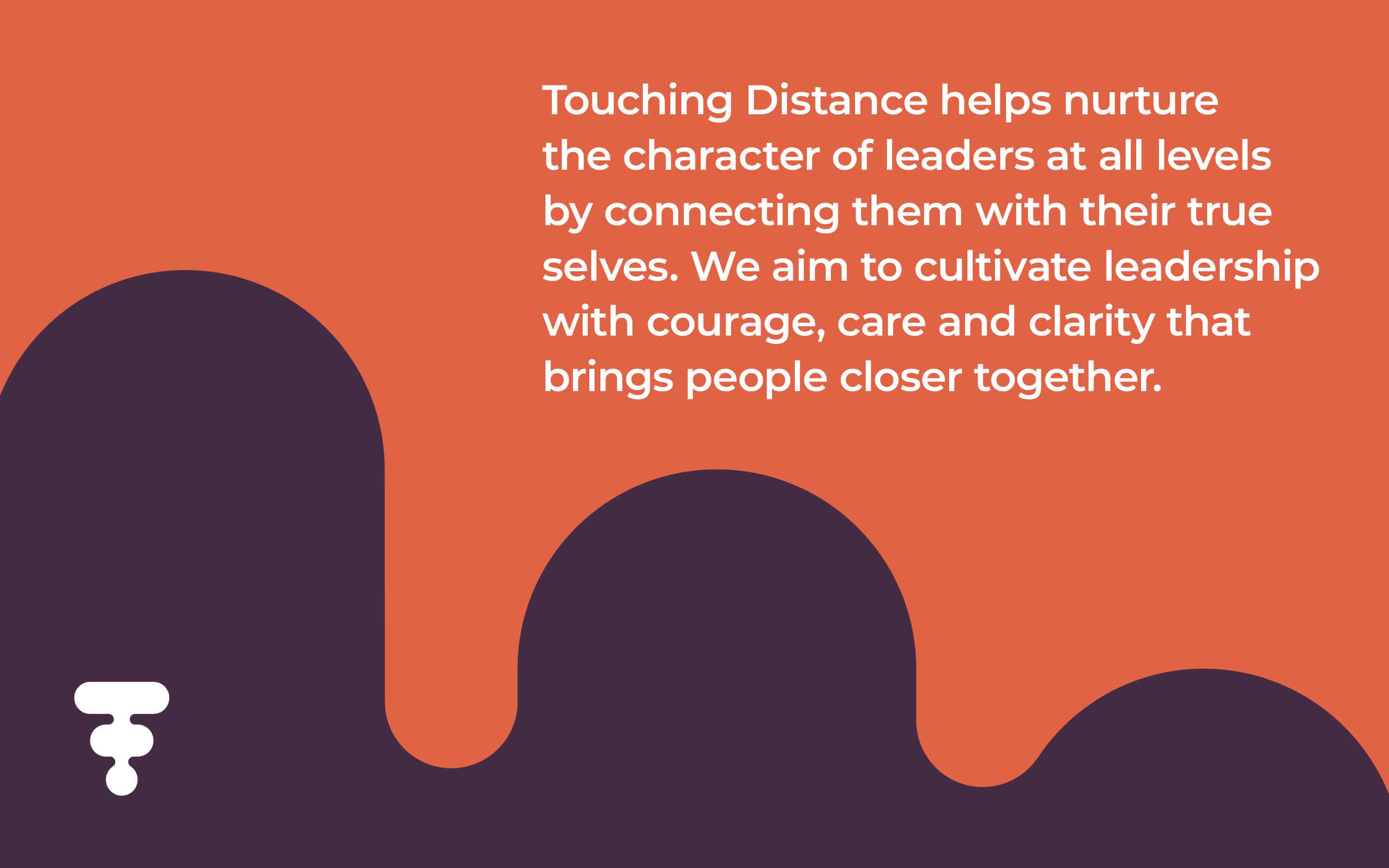
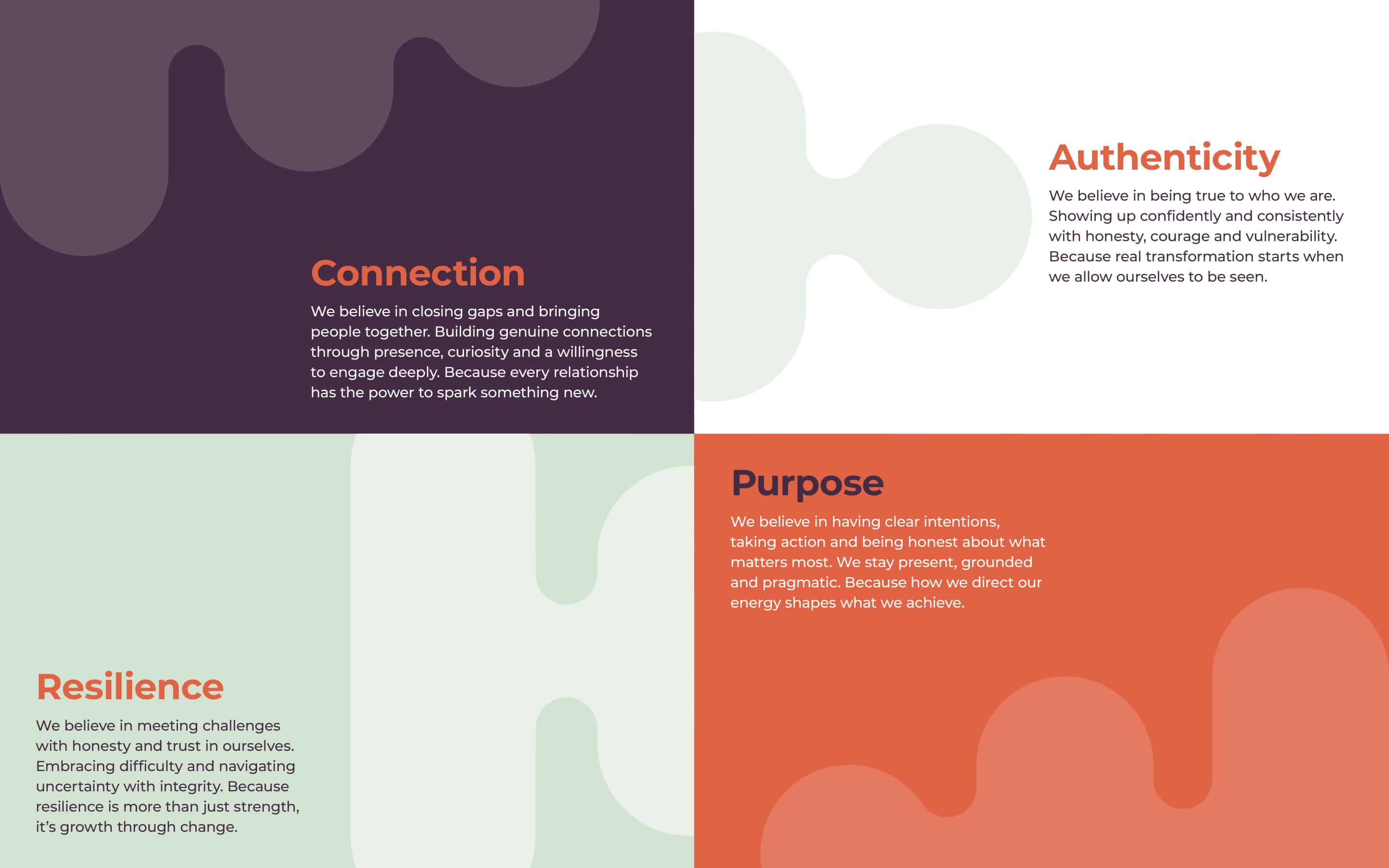
The core purpose that emerged was “to cultivate leadership with courage, care and clarity that brings people closer together.” This became the foundation for developing a brand framework built around four key values: Connection, Authenticity, Purpose, and Resilience.
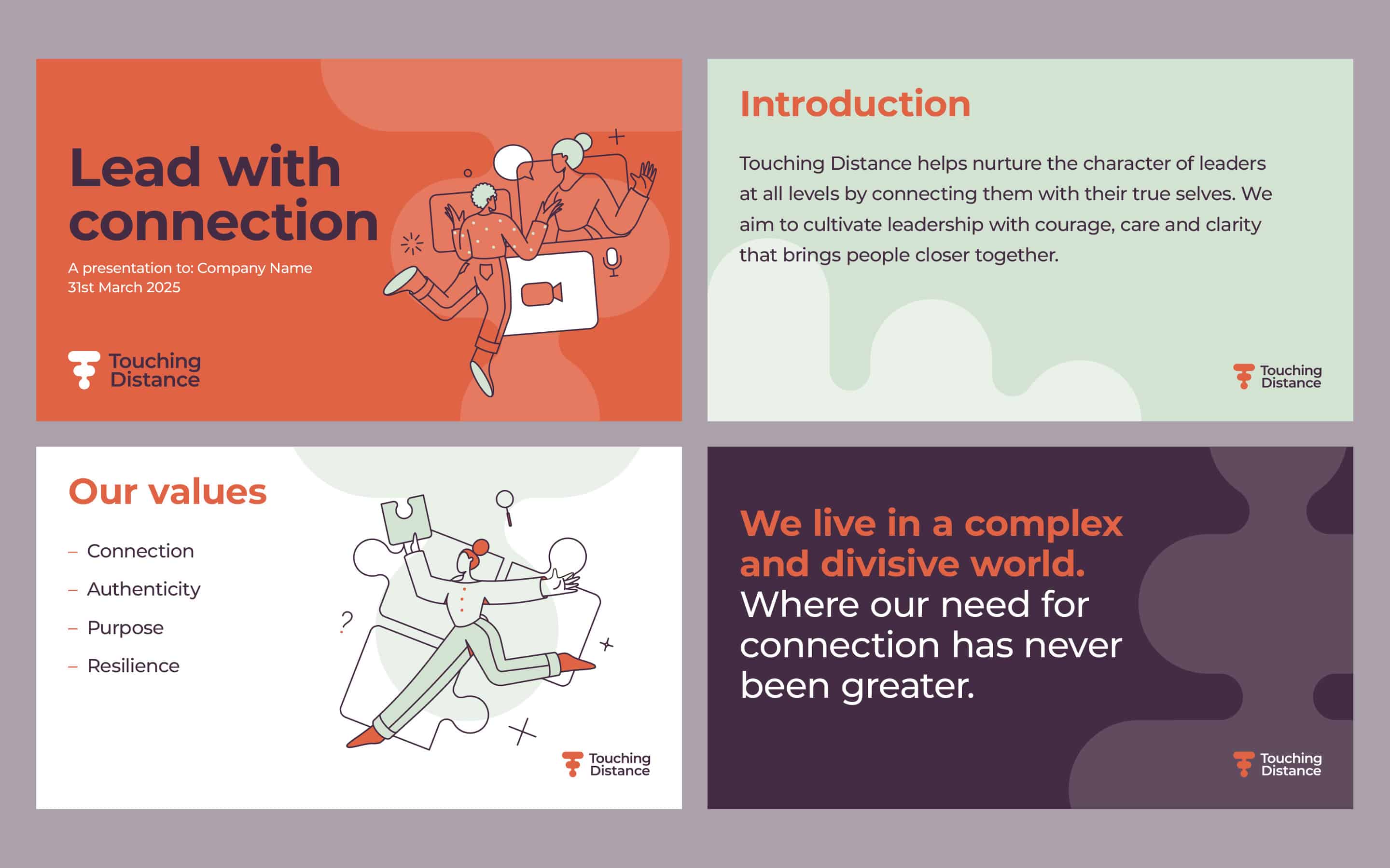
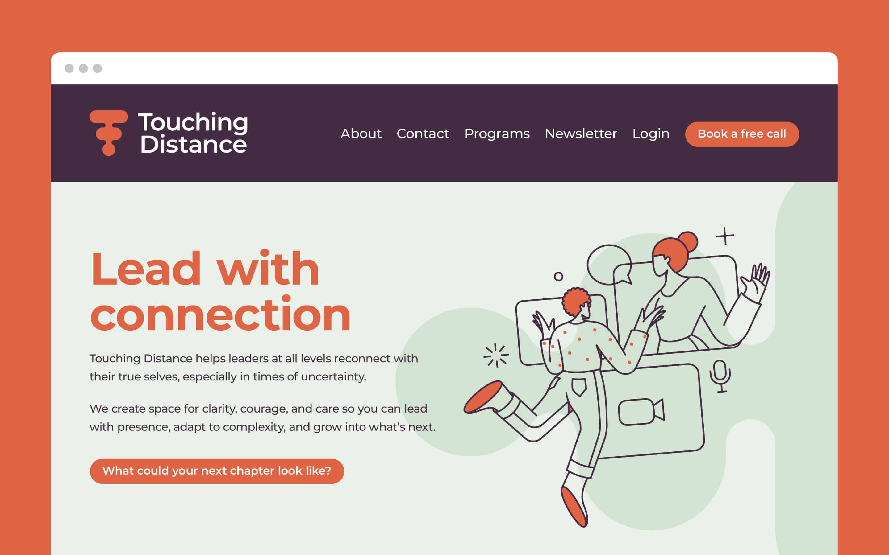
We crafted a brand personality that felt warm, respectful, and engaging – creating a safe space where leaders could connect with their true selves. The simple yet meaningful tagline “Lead with connection” encapsulated the essence of what Touching Distance offers.


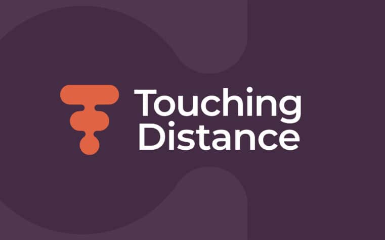
A visual symbol loaded with meaning.
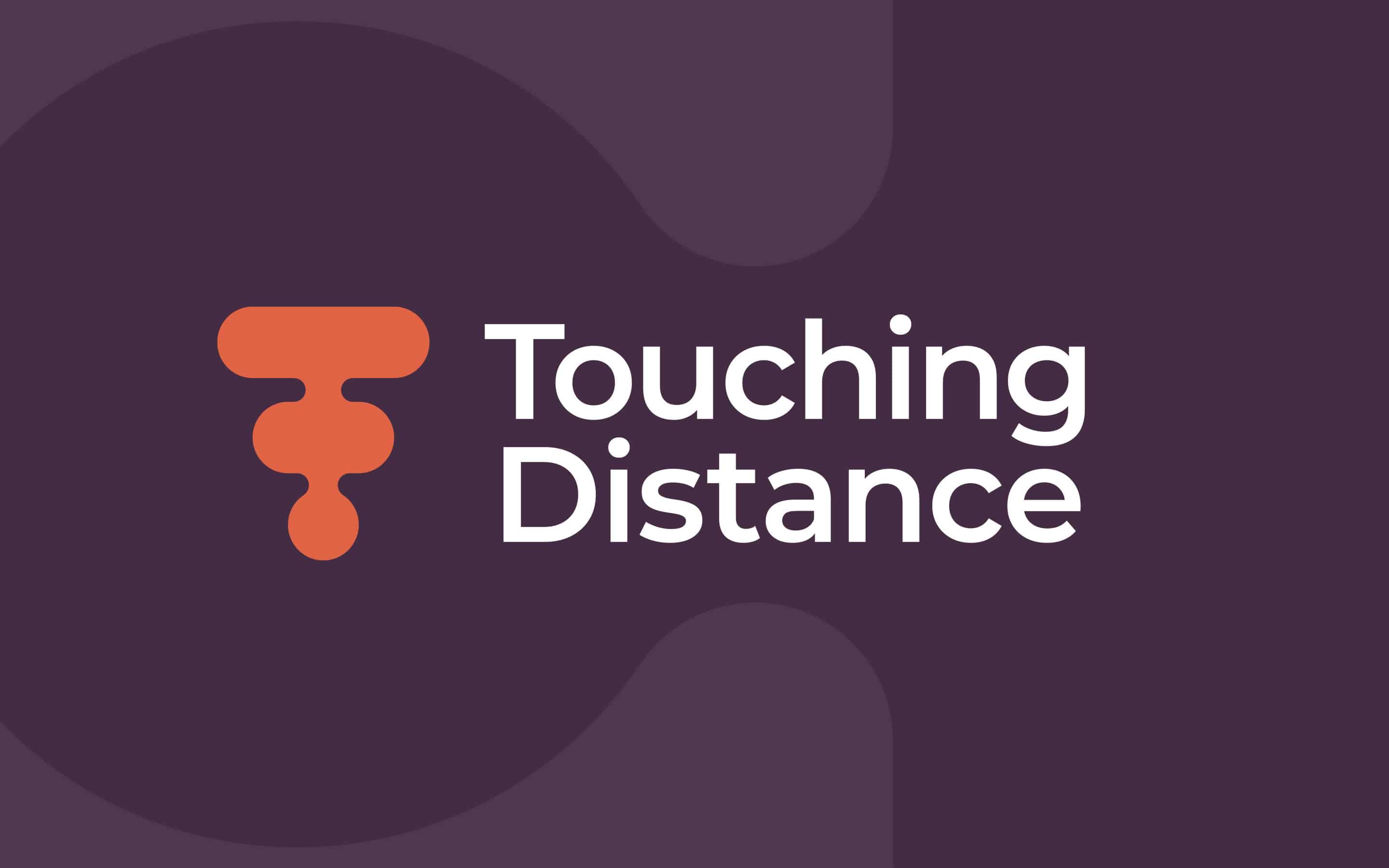
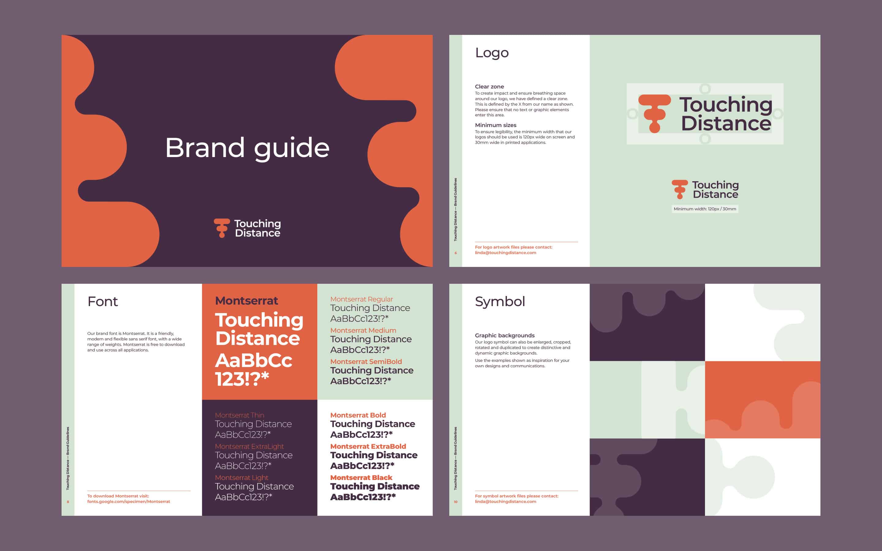
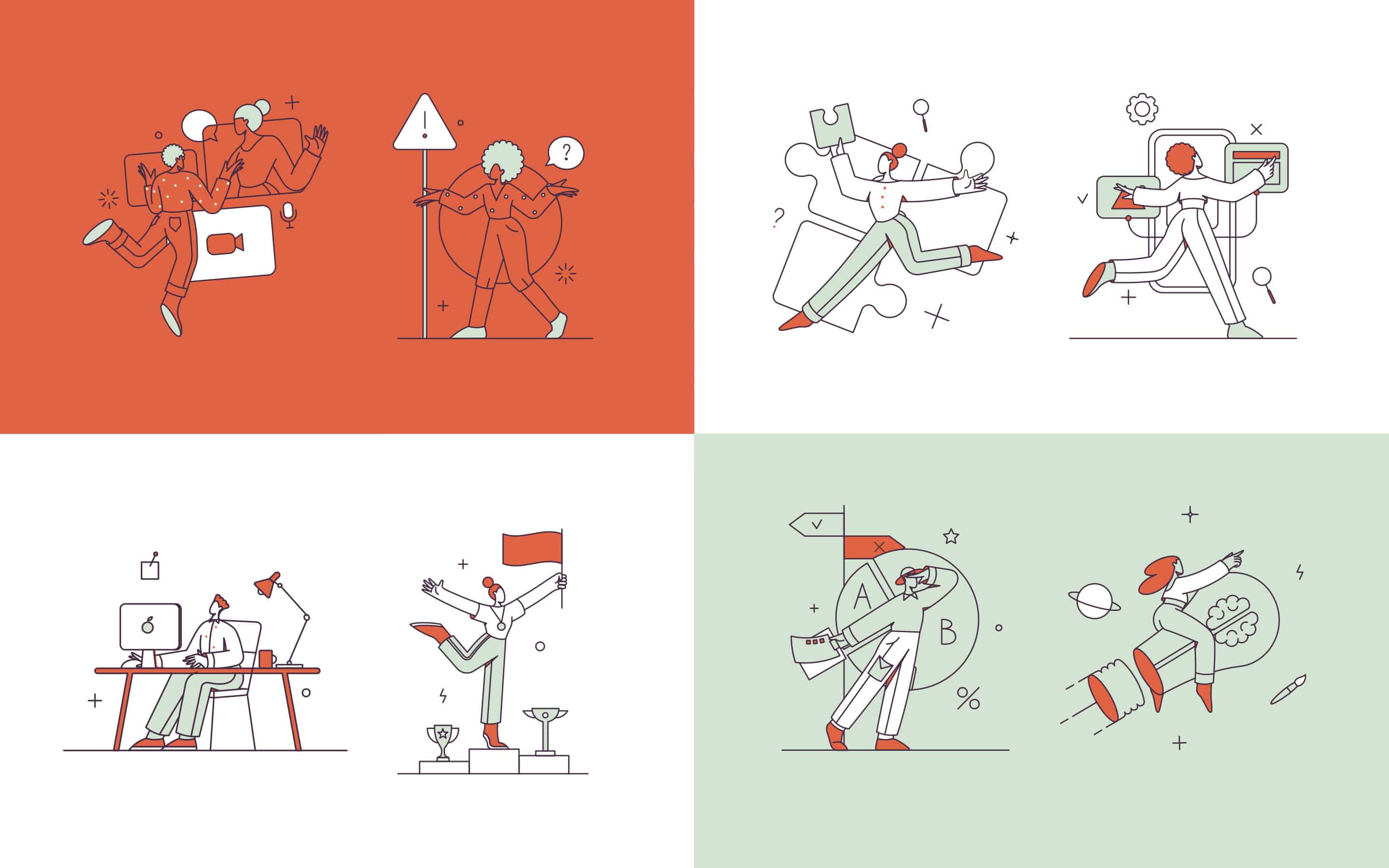
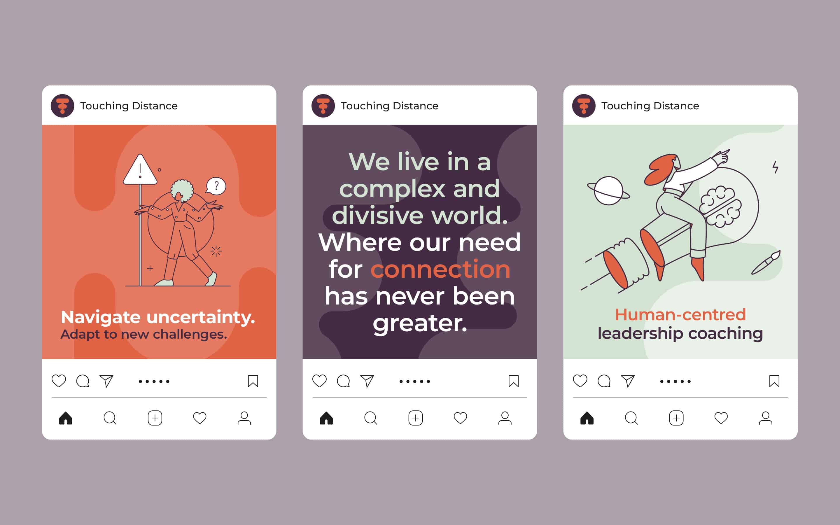
The visual identity needed to embody the brand’s ethos while remaining distinctive and versatile. We developed a symbol featuring an organic “T” shape that represents connection, touching, communication, and growth – paired with a friendly sans-serif font that allows the symbol space to breathe.
The colour palette balances warmth with depth: a terracotta orange that conveys warmth and energy, a deep aubergine that provides depth and reflection, a soft sage green that offers calmness and growth, and white for clarity and simplicity. These colours work in harmony to create a brand that feels both grounded and uplifting.
To complete the identity, we selected Montserrat as the brand font – a modern, friendly, and flexible sans-serif with a wide range of weights that works across all applications. We also established an elegant linear illustration style that combines people, objects, and icons with simple geometric shapes to visually communicate complex ideas.
Establishing a framework for growth.
The final brand identity provides Touching Distance with all the elements needed to build a strong presence in the leadership coaching space. From a comprehensive brand framework and manifesto to practical applications across social media, presentations, and digital platforms, the identity is designed to resonate with leaders at all levels.
The brand successfully captures the essence of Touching Distance – creating a warm and human-centred presence that reflects connection, depth, and transformation. It provides a solid foundation for growth as the business expands its reach across different sectors and age groups, always with the mission of nurturing the character of leaders by connecting them with their true selves.
What we did:
| —Brand workshop —Strategic research —Brand strategy —Positioning framework —Brand manifesto —Tagline development |
—Logo design —Visual & verbal identity —Brand guidelines —Digital asset creation —Communication assets —Ongoing guidance |
Kind words…

More from our portfolio...
Load more projects


What do you need?
Please tell us about your requirements, and we'll be in touch.
"(required)" indicates required fields