Looking to the future of foldable bicycles.
Crosshead Bikes is a pioneering brand, committed to revolutionising the urban travel landscape. Based in Deak, Kent, the company develops state-of-the-art foldable bicycles, offering a unique combination of practicality, style, and performance. The Company’s commitment to innovative design and engineering has led to the creation of an incredible line-up of proprietary products.
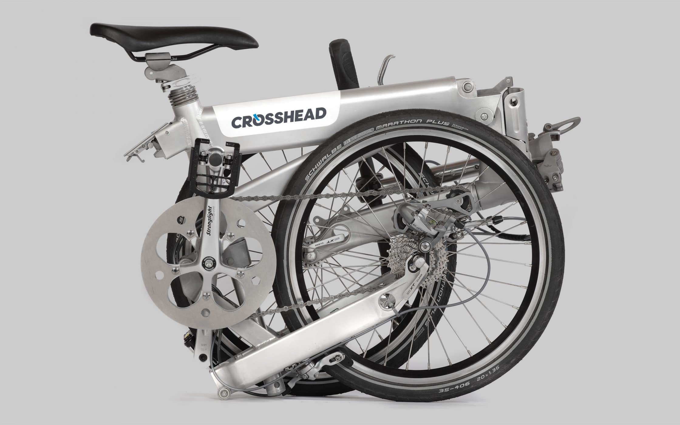
Featuring Z-fold technology, Crosshead bikes contradict the idea that folding bikes can’t deliver a rewarding travel experience. The Company’s range of solutions are small enough for convenient transportation and storage, while still offering exceptional user experience. Crosshead now stands as a champion in modern mobility for an entire community.
Crafting an identity for a market innovator.
Crosshead Bikes were launching their product collection at an exciting time in the industry. The market for cycling products was growing, with usage in London alone increasing by 63% over a ten year period. Consumers were searching for new solutions that matched their busy lifestyles, and need for practicality. Crosshead was ready to deliver.
They already had the pioneering technology needed to revolutionise the cycling landscape, and an excellent vision for the future. The only thing missing was a brand identity capable of distinguishing them from their competitors, and highlighting its focus on quality and craftmanship. That’s where Fabrik stepped in to help.
Shaping a visual identity for a cycling champion.
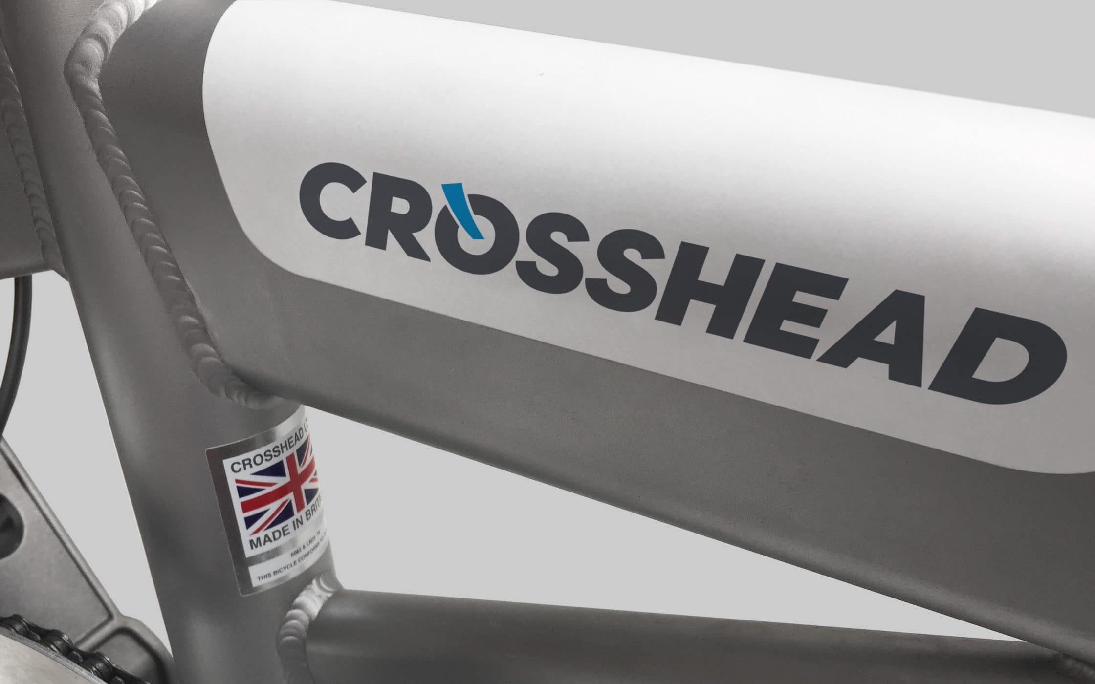
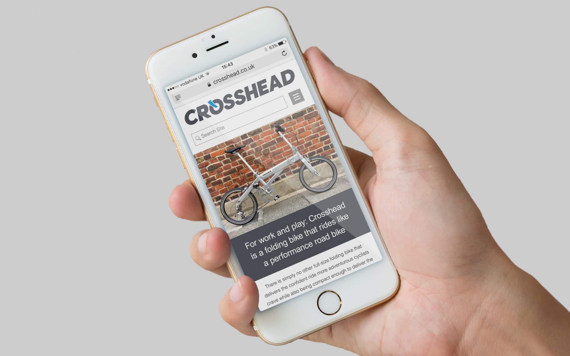
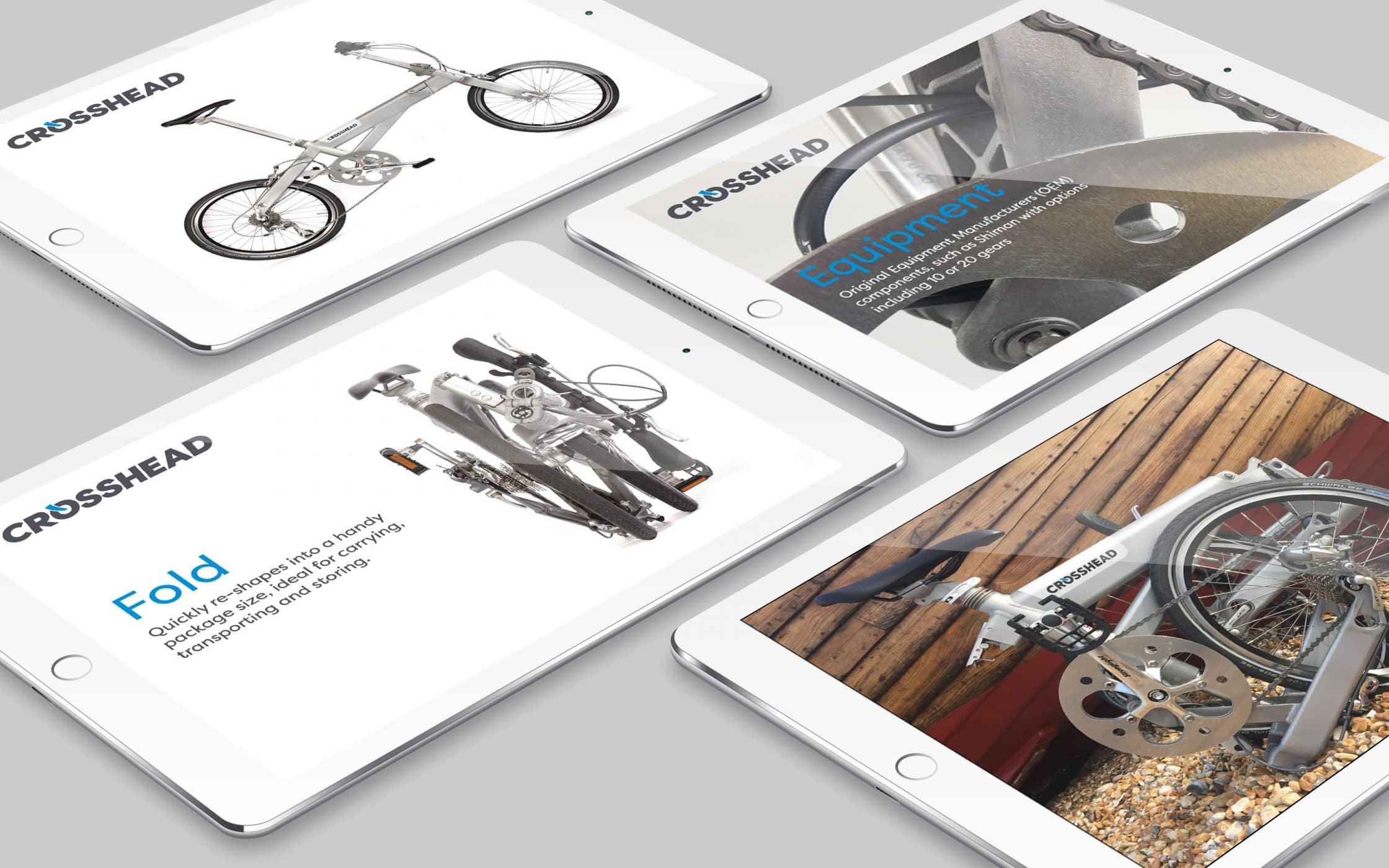
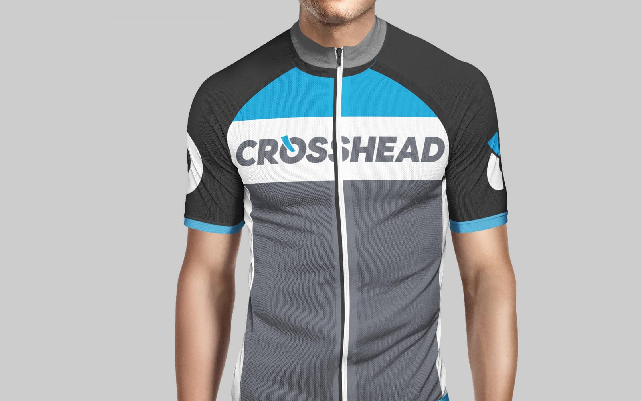
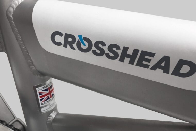
Working closely with Crosshead’s inventor and managing director, Stuart Lambert, Fabrik began developing a new logotype for the Company. This was combined with the creation of a broader set of visual identity guidelines, applied to the website, promotional videos, and marketing communications. The challenge was in creating consistency, while also highlighting the unique benefits of each distinct model in the portfolio.
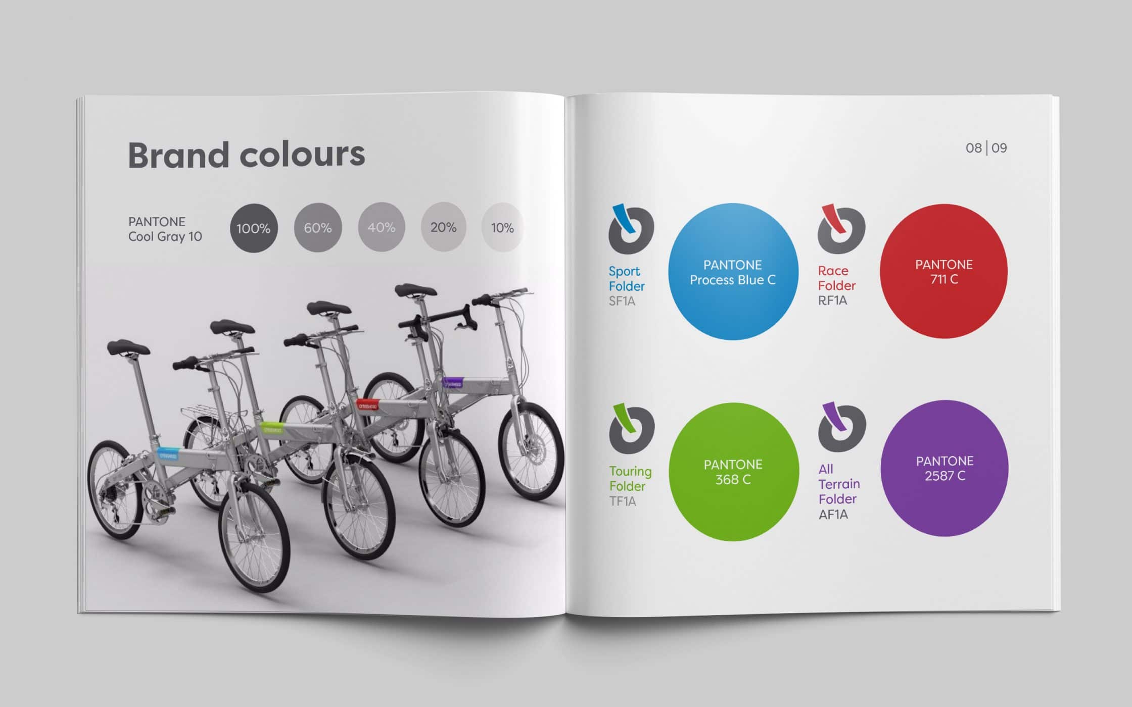
To distinguish between the various products in the range, from all-terrain, to sport and touring models, Fabrik introduced a distinctive colour palette. This ensures each product shares the same primary logo features, but also has its own distinctive personality. We agreed these logos should be displayed on the headtube of each bicycle, creating a sense of pride among owners.
A cohesive but distinctive brand experience.
Our collaboration with Crosshead Bikes led to the development of a comprehensive set of brand identity guidelines. We not only created a new logo for the company, conveying ideas of modernity, excellence, and precision. We also ensured this logo could flex to suitably distinguish each of the incredible products in the Crosshead line-up.
With our logo design services and a new set of strategic visual guidelines, the Crosshead brand now has the assets it needs to stand out as a leader in the cycling industry. It can now capture the loyalty and pride of its customers, with a logotype users are proud to display on their bicycles.
What we did:
| —Research —Strategy —Colour palette |
—Typography —Logo design —Guidelines |
Customer testimonials
More from our portfolio...


What do you need?
Please tell us about your requirements, and we'll be in touch.
"(required)" indicates required fields