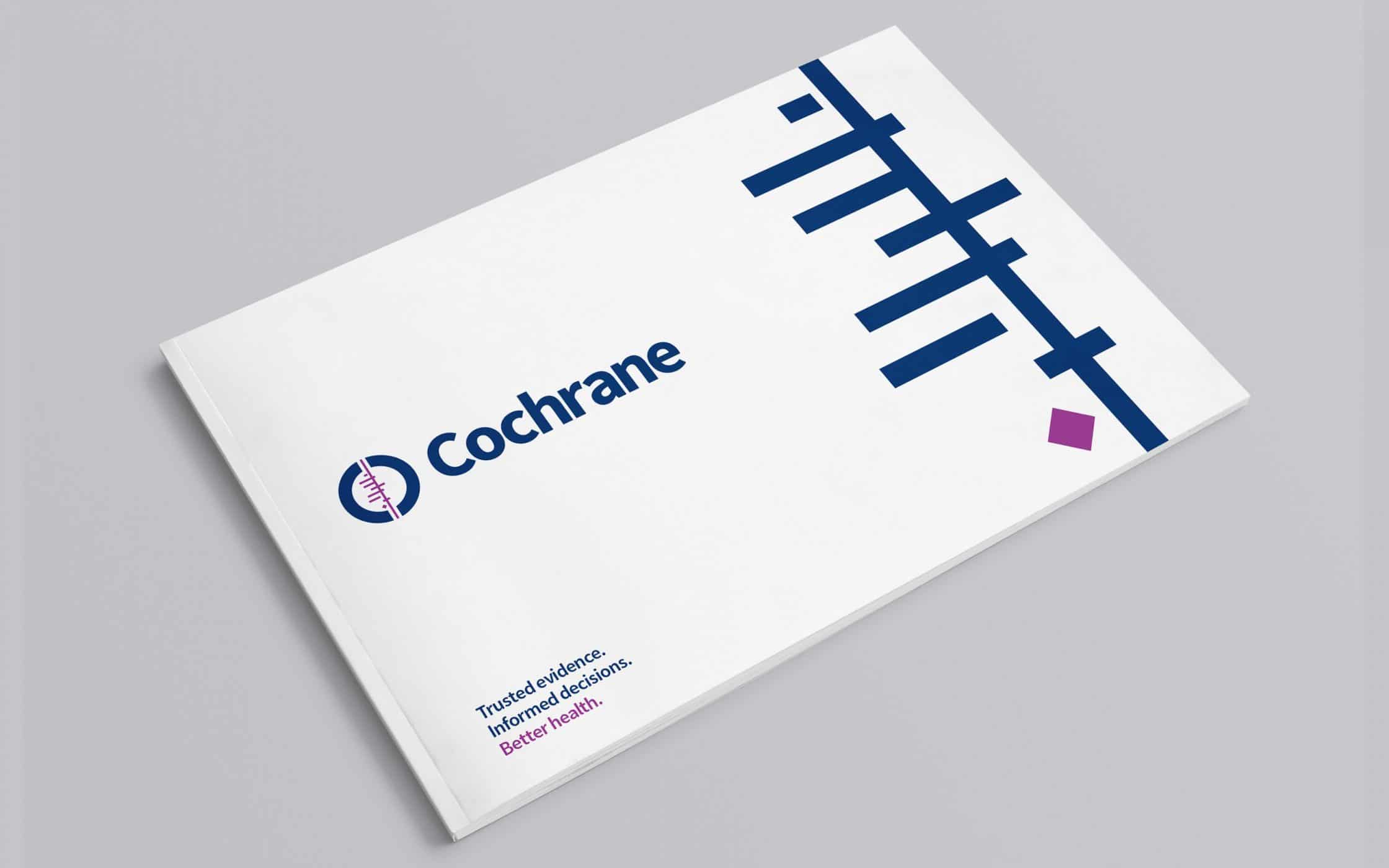

An evidence-based approach to healthcare success.
For more than two decades, Cochrane stood as a go-to source of support and guidance for anyone navigating the complex healthcare landscape. Empowering individuals to make informed decisions with evidence-based medical research, the firm influences lives worldwide. The legacy brand, known for its expertise and transparency, is actively reshaping the medical industry.
Powered by an independent network of researchers, professionals, patients, and carers, Cochrane facilitates evidence-based choices about health interventions. To help highlight its unique vision to a global community, the company needed to update and optimise its brand. That’s where Fabrik stepped in, offering strategy, creativity, and expertise.
Helping to build a brighter future for Cochrane.
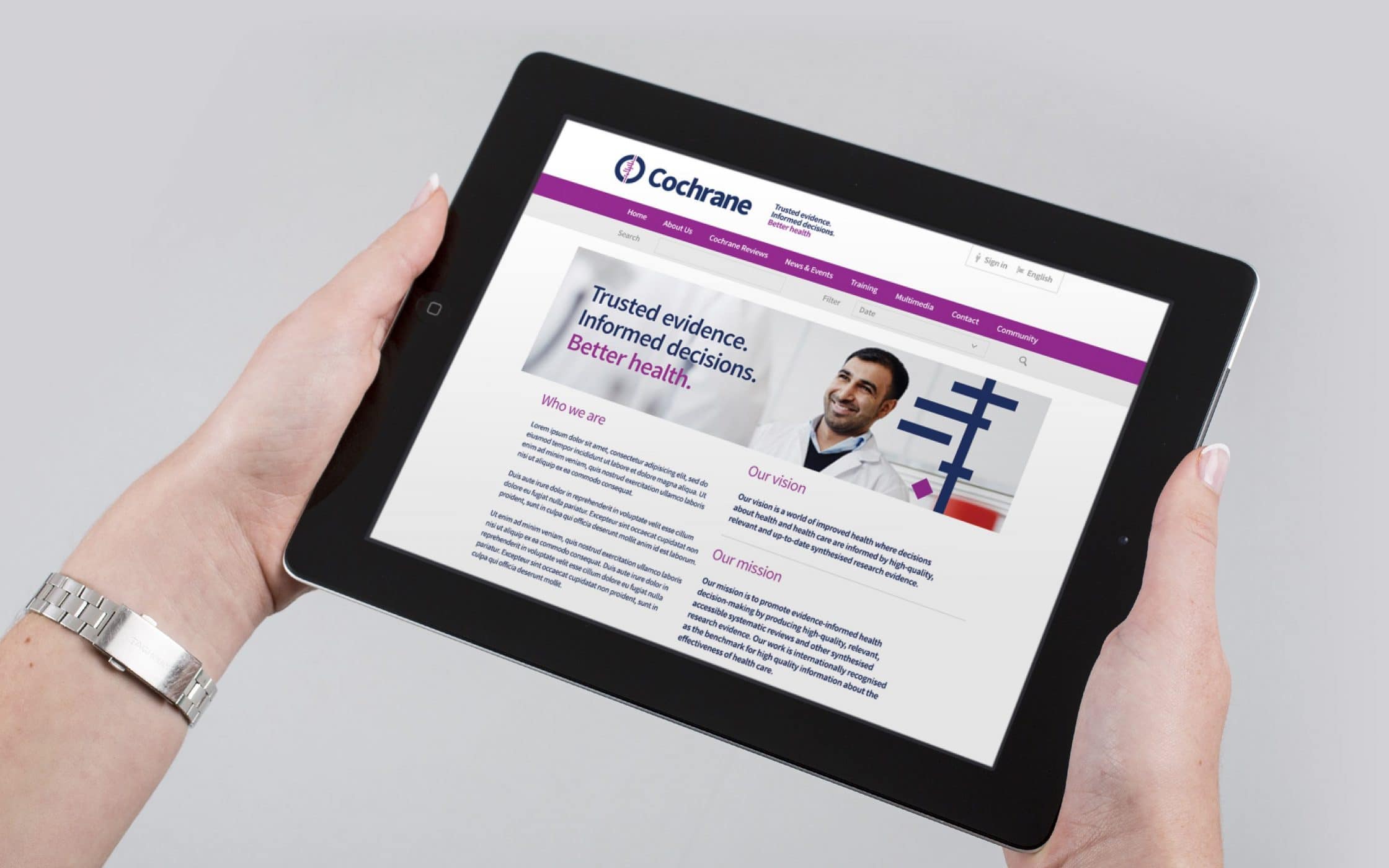
Despite a fantastic reputation in the medical and healthcare landscapes, Cochrane needed to refresh its branding to maintain a fresh, relevant image in the digital world. They needed to present a more united front, with a consistently modern, but inspiring image across all mediums. The team turned to Fabrik, for bespoke advice and guidance.
Our extensive background in the branding and graphic design space made us the perfect choice for Cochrane’s branding journey. With a deep understanding of digital dynamics, global brand cohesion, and secrets behind customer engagement, we were ideally positioned to reach the brand’s goals.
Crafting a unified and inspirational visual identity.
The rebranding initiative began with a careful evaluation of the core assets Cochrane wanted to retain from its previous brand identity. The company boasted strong brand equity already, and wanted to maintain its relationships with an existing customer base. With this in mind, we refined the organisation’s visual identity, with a focus on preserving its heritage and spirit.
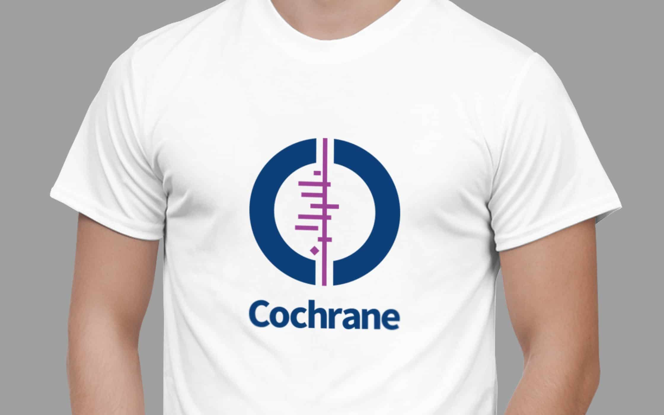
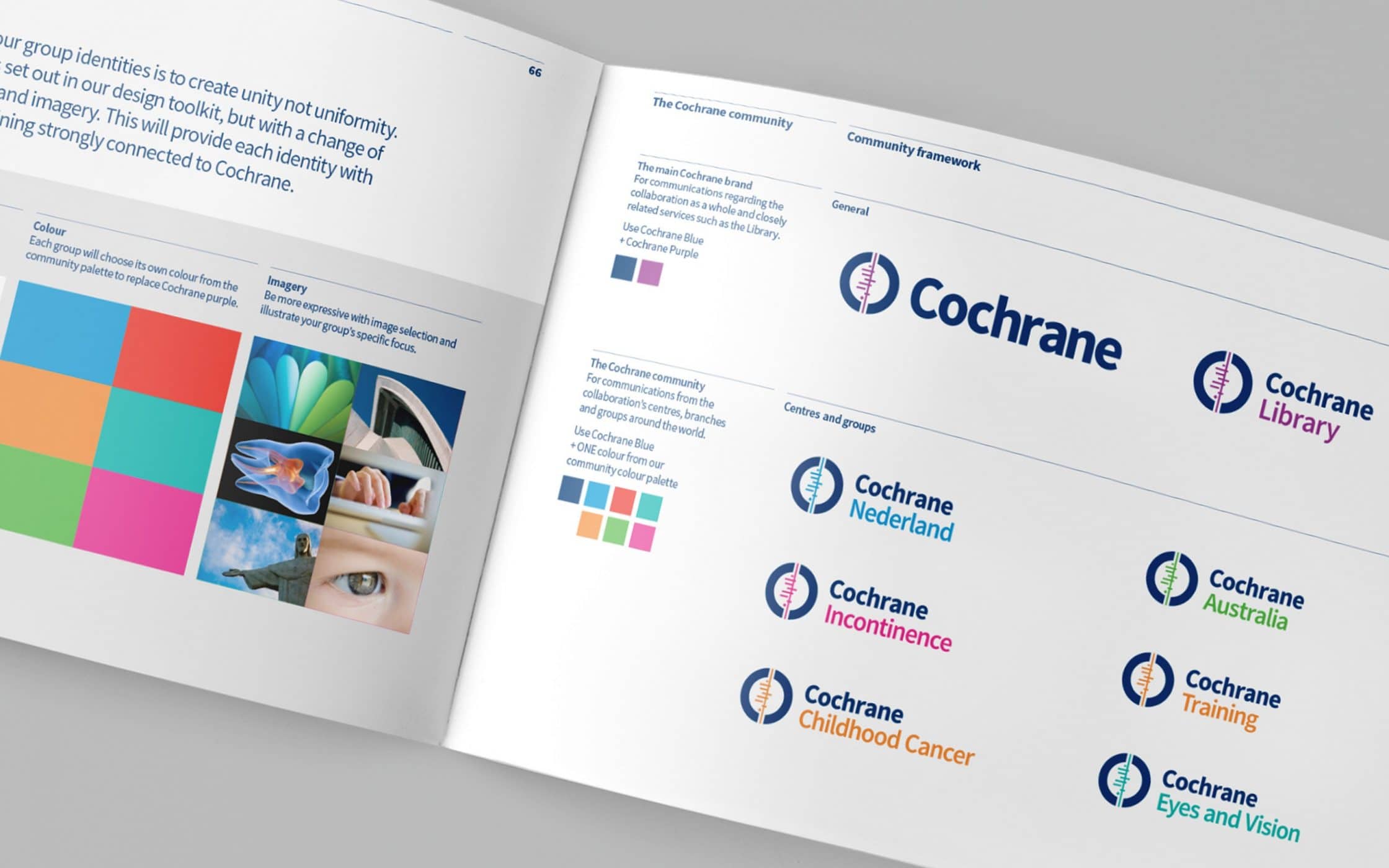
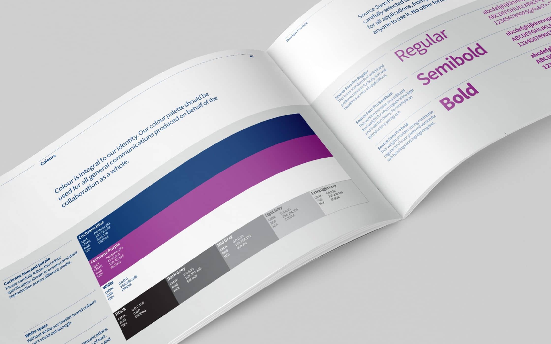
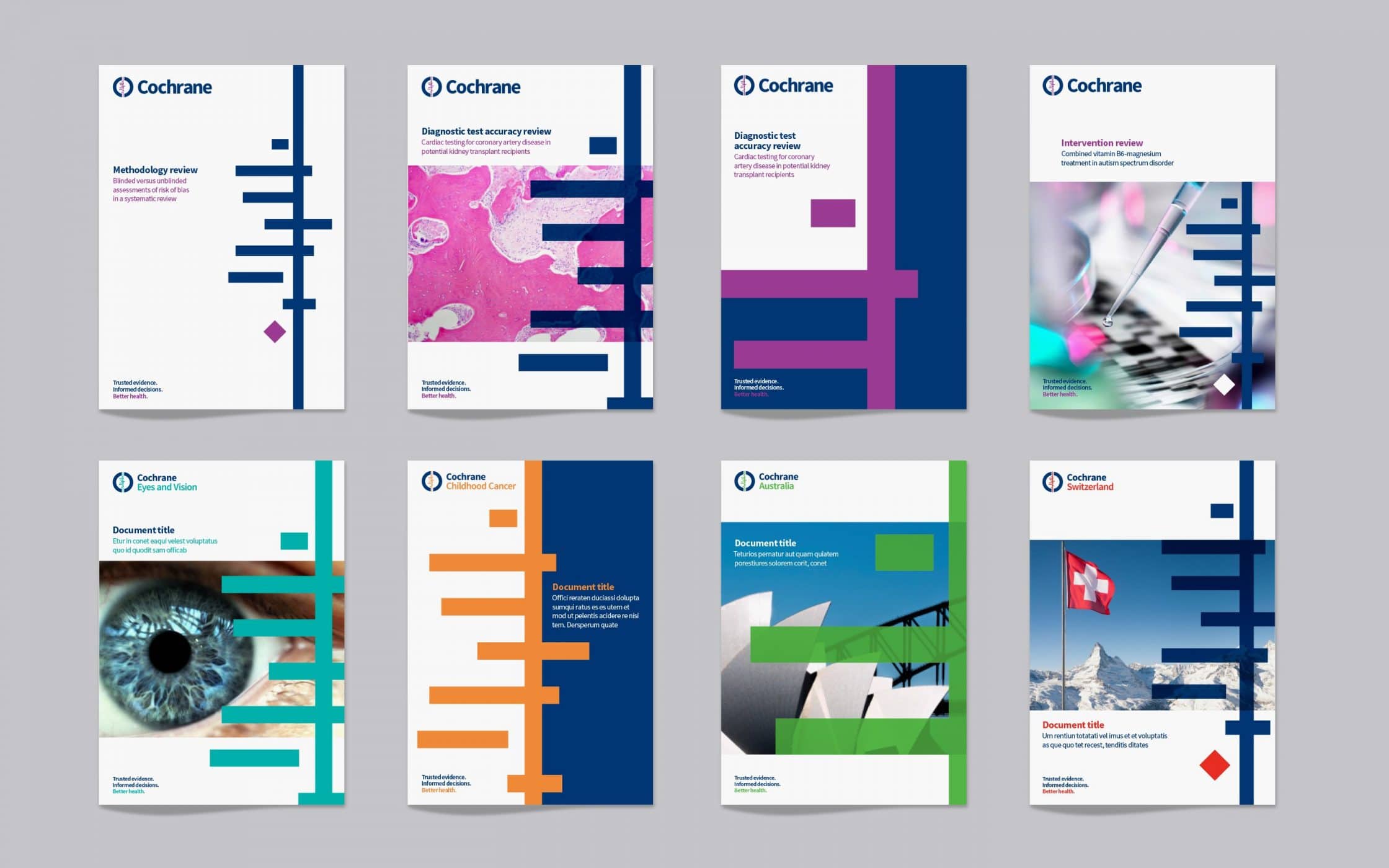
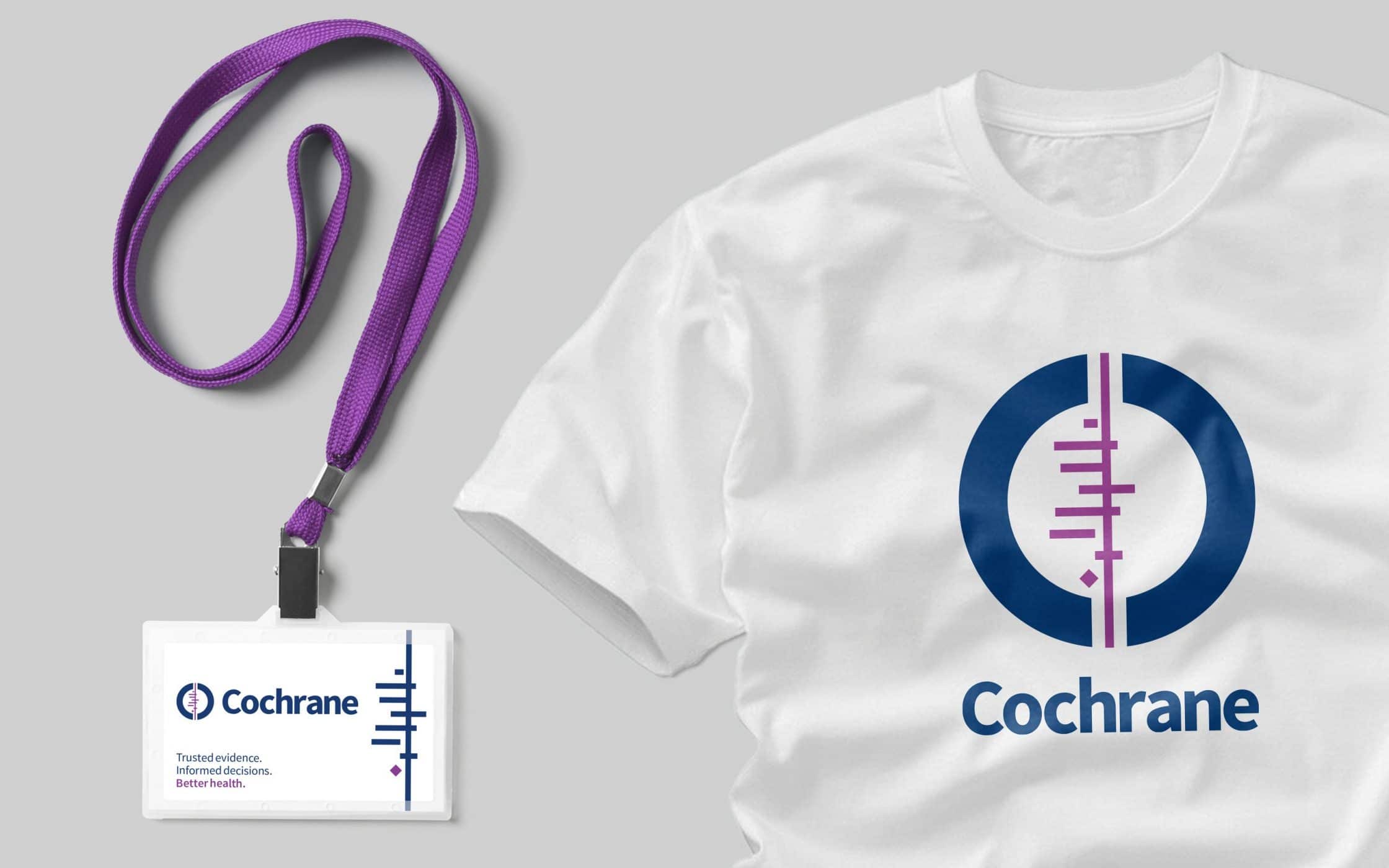
Our team created a new logo with two C’s to represent global collaboration. The inner lines highlight the company’s focus on data, while the new colour palette conveys ideas of community and trust. To accompany this logo, we built an extensive identity toolkit, covering everything from tone-of-voice, to digital templates for marketing materials.
A resilient and cohesive brand
Our work with Cochrane led to the development of a truly unified brand identity, capable of spanning both online and offline channels. We equipped the organisation with the resources they needed to preserve a consistent voice and image across every touchpoint, paving the way for stronger recognition.
The rebranding journey not only elevated Cochrane’s digital footprint, but also strengthened its global appeal, ensuring its unique value resonated with new and existing consumers. We ensured Cochrane had the foundations it needed in place, to transform into a sustainable, resilient brand.
What we did:
| —Research —Consulting —Interviews —Workshops —Positioning —Tone of voice |
—Brand strategy —Logo design —Branding —Visual identity —Brand guidelines —Digital templates |
Kind words…
More from our portfolio...
Load more projectsWhat do you need?
Please tell us about your requirements, and we'll be in touch.
"(required)" indicates required fields


