A high-altitude voyage of brand evolution.
Airtickets, a leading pioneer in the travel industry, has been supporting adventurous spirits for numerous years, with a convenient approach to simplifying air travel. The global travel business simplifies the process of finding and booking the best hotels, flights, transfers, and car rentals, focusing on both versatility and affordability.
Known for its dedication to incredible user experiences, Airtickets combines customer service and technology to transform the travel sector. With significant brand equity in its native Greek market, the Company was ready to expand into new landscapes, with an updated brand identity.
A new chapter for the Airtickets brand.
From its headquarters in Athens, Airtickets had already established a valuable relationship with a huge network of Greek customers. It wanted to retain the brand recognition and reputation it had worked hard to achieve in this landscape, while simultaneously unlocking opportunities for expansion. The Company turned to Fabrik for our brand revitalisation expertise.
The mission was to consolidate the organisation’s existing branding assets, breathing fresh life into the Company’s image, without alienating a loyal consumer base. Airtickets wanted to preserve the core elements of its ethos, but also ensure it could continue to expand into new environments, without restrictions.
Charting a new path for brand growth.
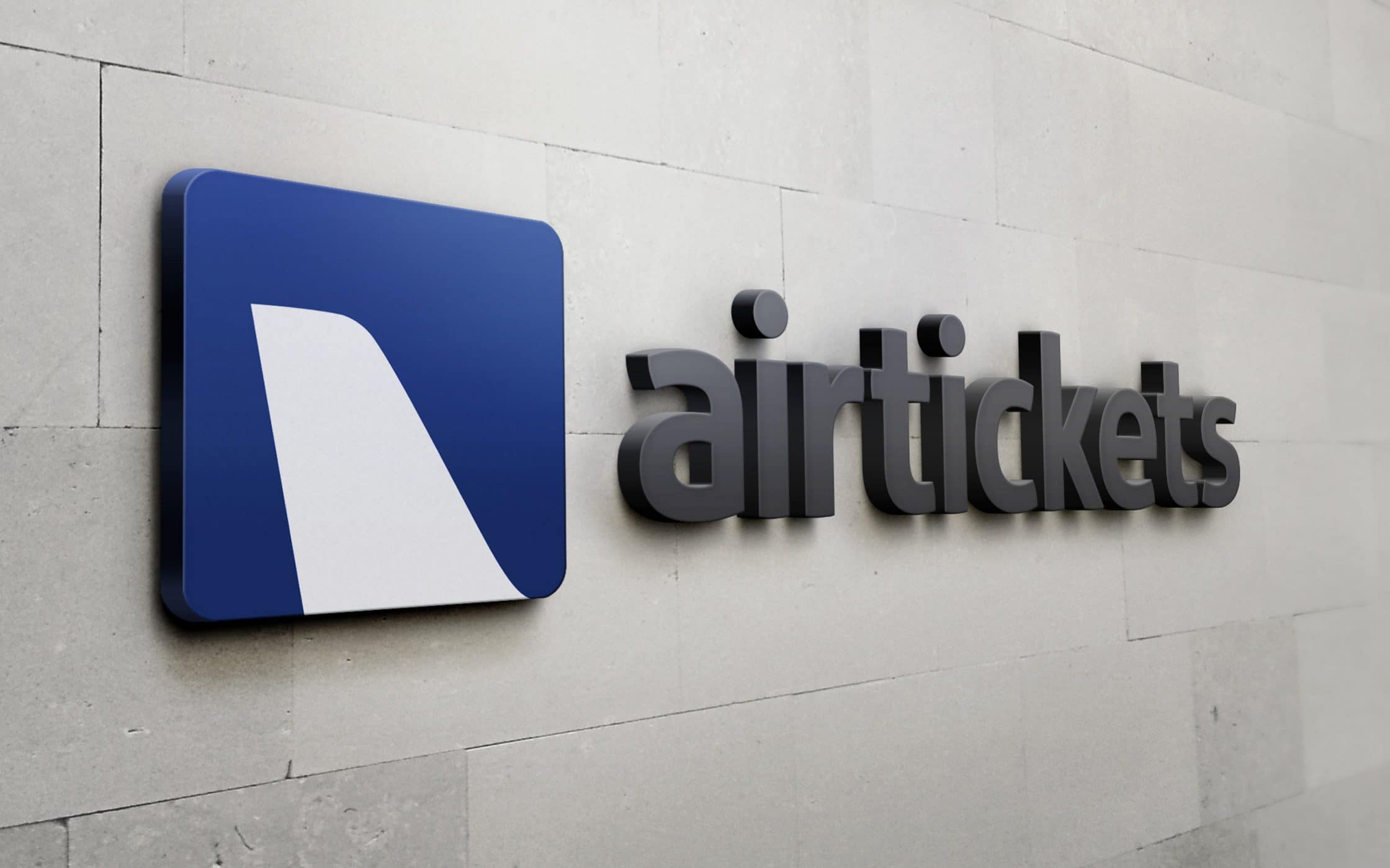
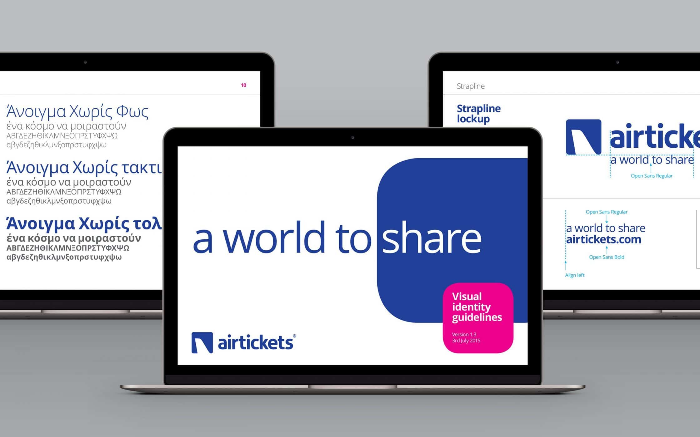
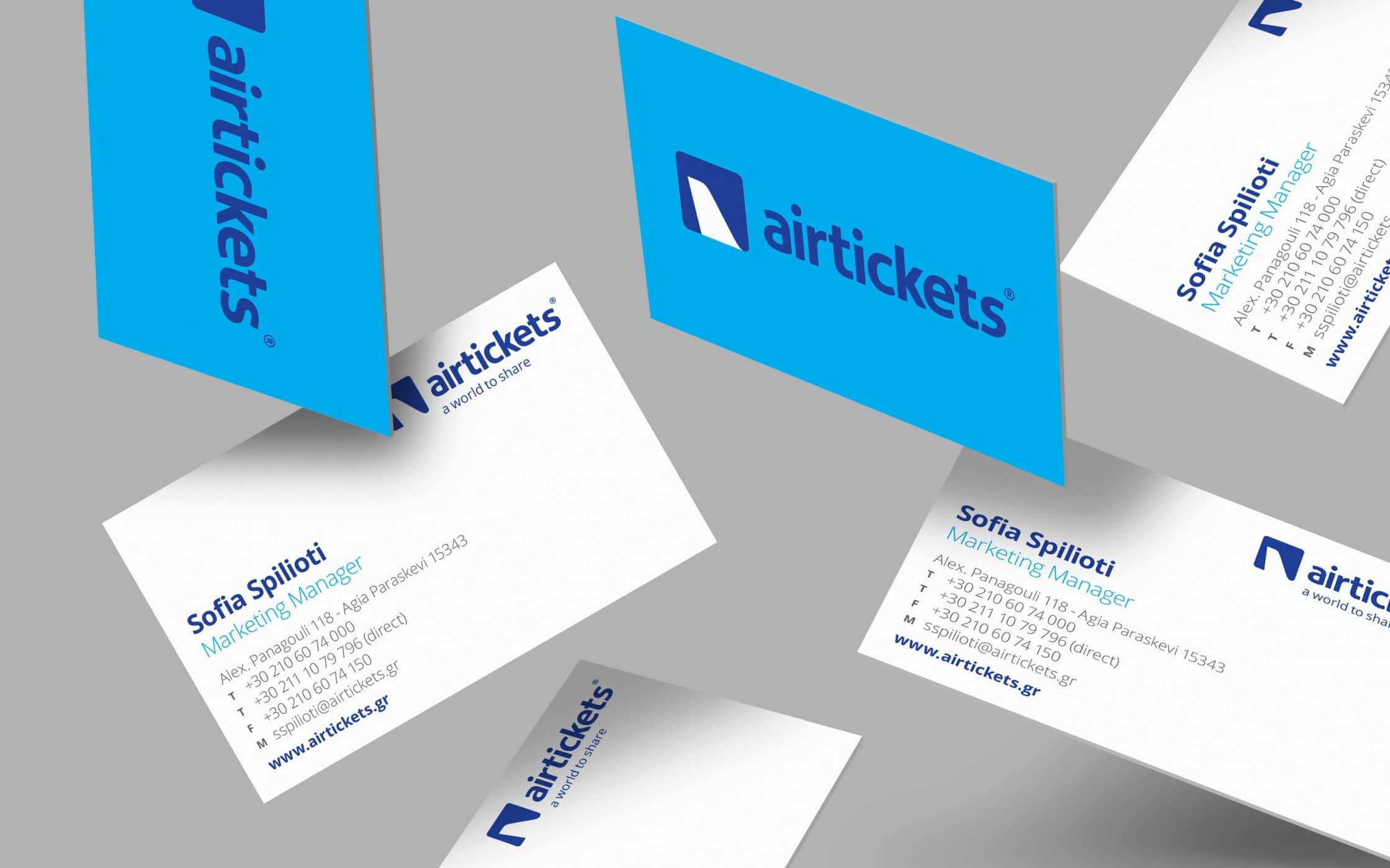
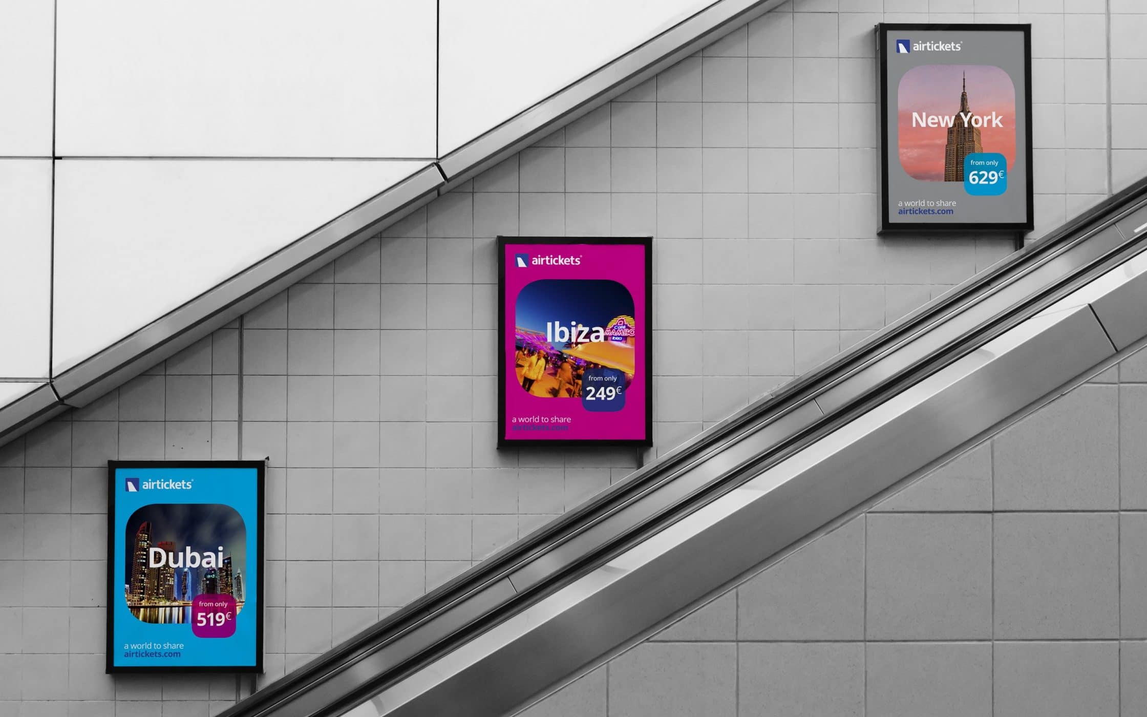
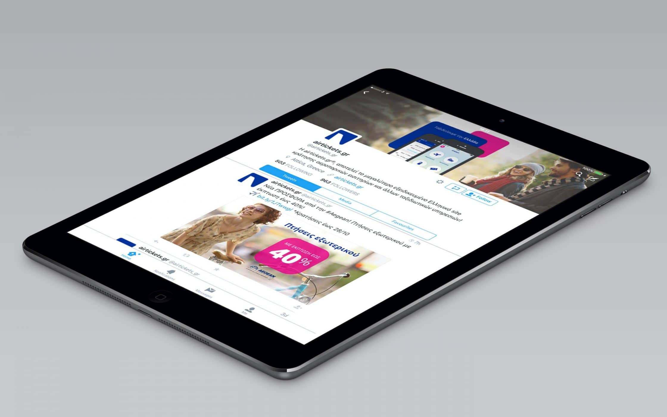
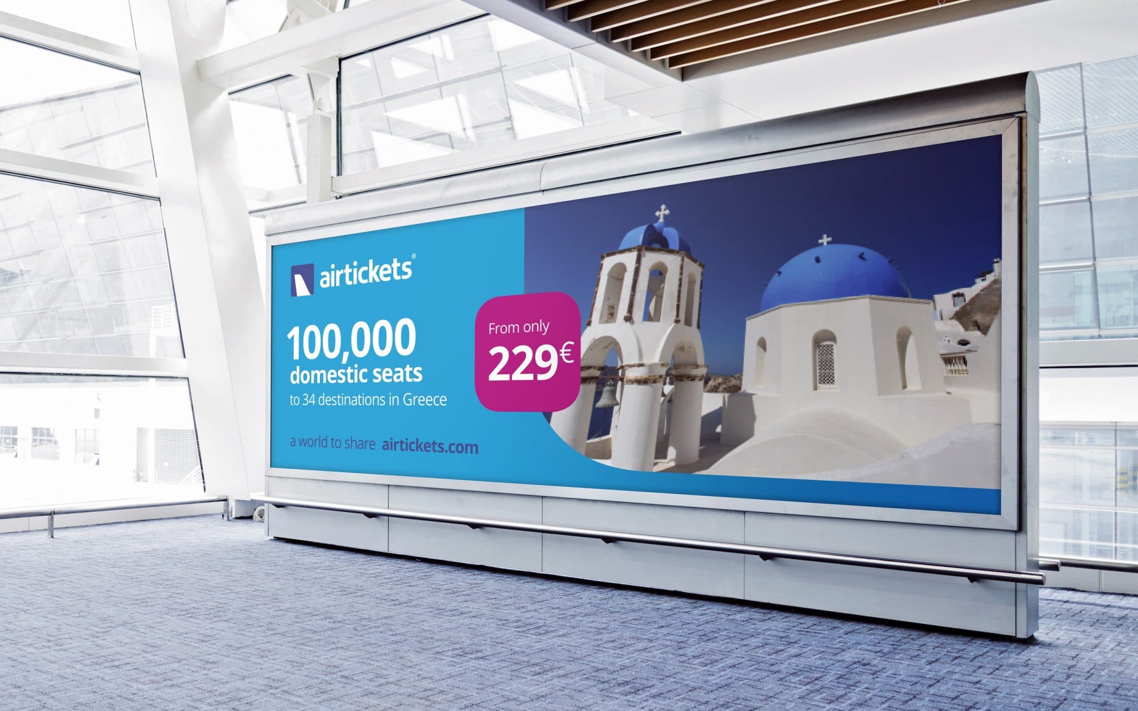
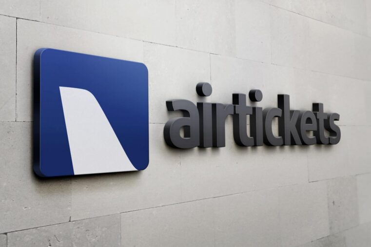
Following a comprehensive consultation with the Company’s leadership team, Fabrik began working on the brand’s visual identity. We updated the Airtickets logotype with an abstract tailfin design contained in a flexible background. The reimagined logo, while distinct, retains a connection to Airtickets identity, through the strategic use of the colour blue, complemented by strong accent shades.
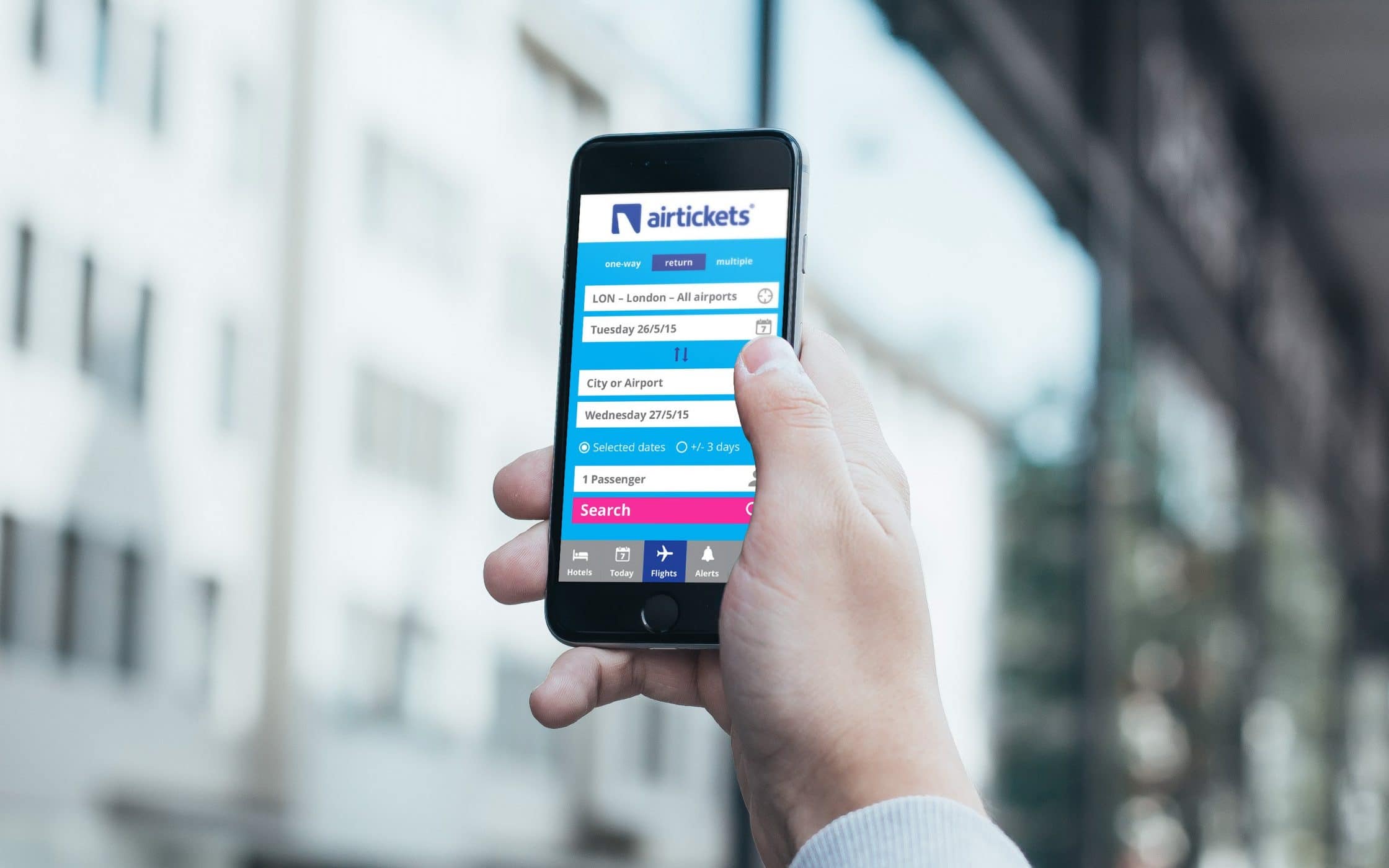
We built on this enhanced logo with an evocative strapline “A World to Share”. This immediately highlights the unique value proposition of the company and its adventurous personality. Combined with the logo, it conveys the concept of limitless adventure. Our team also introduced a new set of photographic guidelines, to enhance future marketing materials for the brand.
Looking beyond the horizon with Airtickets.
Bridging the gaps between the strong legacy and heritage of the existing Airtickets brand, and its future aspirations, we gave the Company the resources it needed to soar into a new era. The updated logo and vibrant colour palette draws from the organisation’s previous identity, while giving it a contemporary and modern appeal for new audiences.
The additional assets we developed for the brand, from the engaging strapline to the strategic photography guidelines, ensures Airtickets is ready to share the right message with its evolving audience. The Company is now perfectly positioned to expand into new regions, without compromising on the relationships it already built in the Greek market.
What we did:
| —Logo design —Visual identity —Tone of voice |
—Digital design —Advertising —User guidelines |
More from our portfolio...


What do you need?
Please tell us about your requirements, and we'll be in touch.
"(required)" indicates required fields