An ecumenical beacon of excellence and hope.
Liverpool Hope University is the only university foundation in both Europe and the United States that bridges the gap between Catholic and Anglican colleges. When three colleges in Liverpool joined forces, the result was “Liverpool Hope”, an educational institution committed to charting a holistic path to personal and professional growth for its students.
The Institution is driven by a philosophy that exceptional education comes from nurturing the mind, body, and spirit. Over the years, the University has evolved from a college into a fully recognised university campus, attended by students from all over the globe, in search of true transformation.
Marking the start of a transformative journey.
In 2006, Liverpool Hope University entered a new chapter of its narrative, gaining full university status, and taking its place alongside some of the most prestigious academic institutions worldwide. This evolution coincided with a Government agreement allowing universities to charge tuition fees. To mark this period of change, the educational group approached Fabrik, for help with a comprehensive rebranding programme.
The University wanted to re-imagine its visual identity and personality, demonstrating its position as a bold, resilient, and reliable investment for prospective students. We needed to create an identity that would stand the test of time, while emphasising the Institution’s unique positioning as the only ecumenical university in the United Kingdom.
Crafting an identity with spirit and purpose.
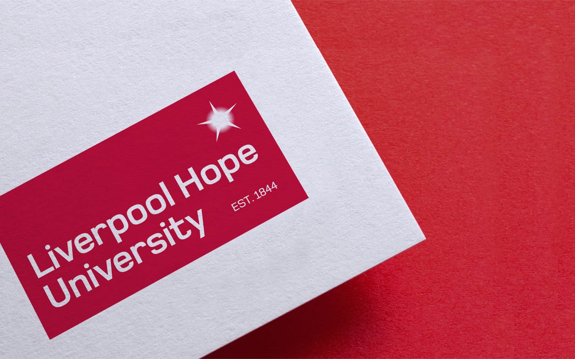
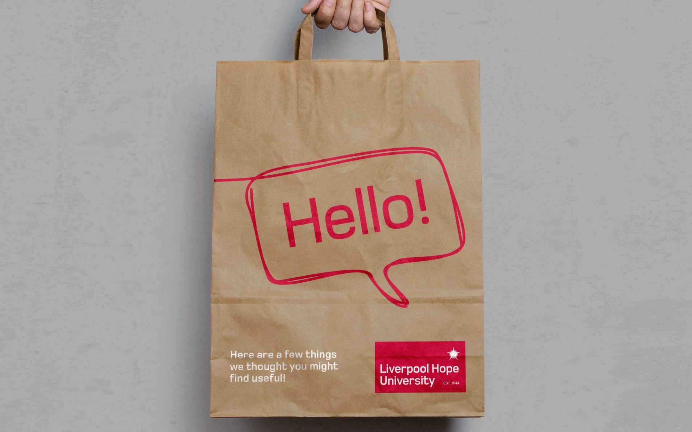
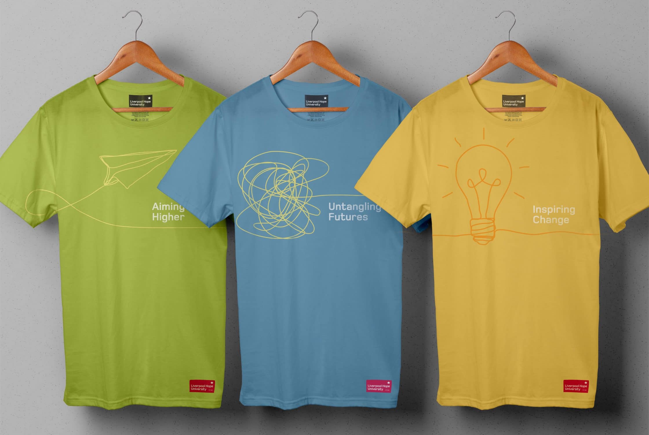
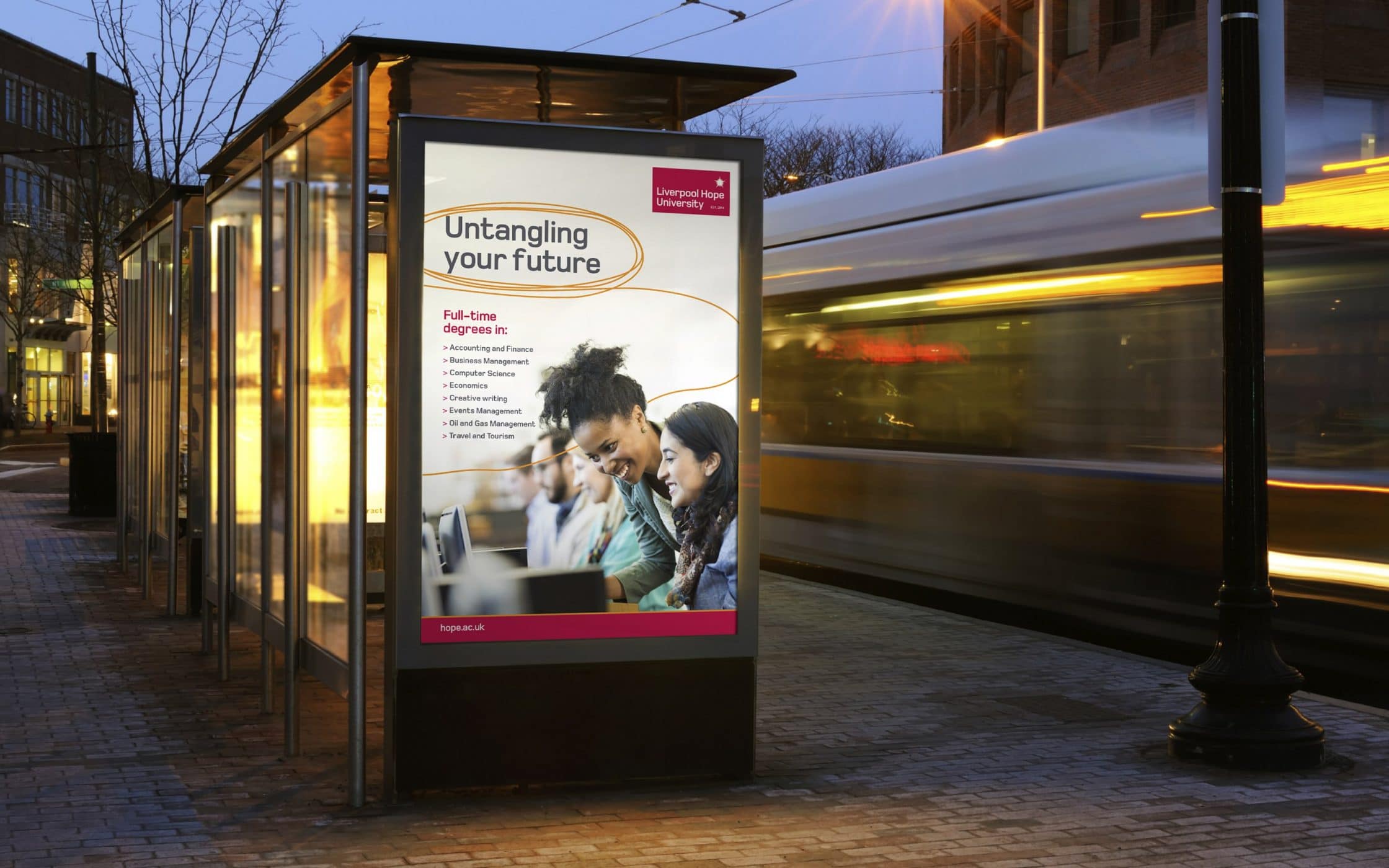
Liverpool Hope instils a sense of purpose and meaning in its students. At the beginning of the rebranding project, we redesigned the University’s logo to reflect this concept, and introduced an evocative red and white color palette. The distinctive light burst shape represents theological connections with Christian foundations, as well as demonstrating a commitment to inspiration and enlightenment.
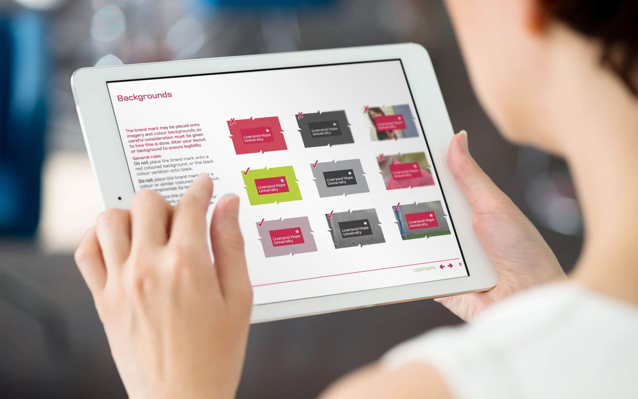
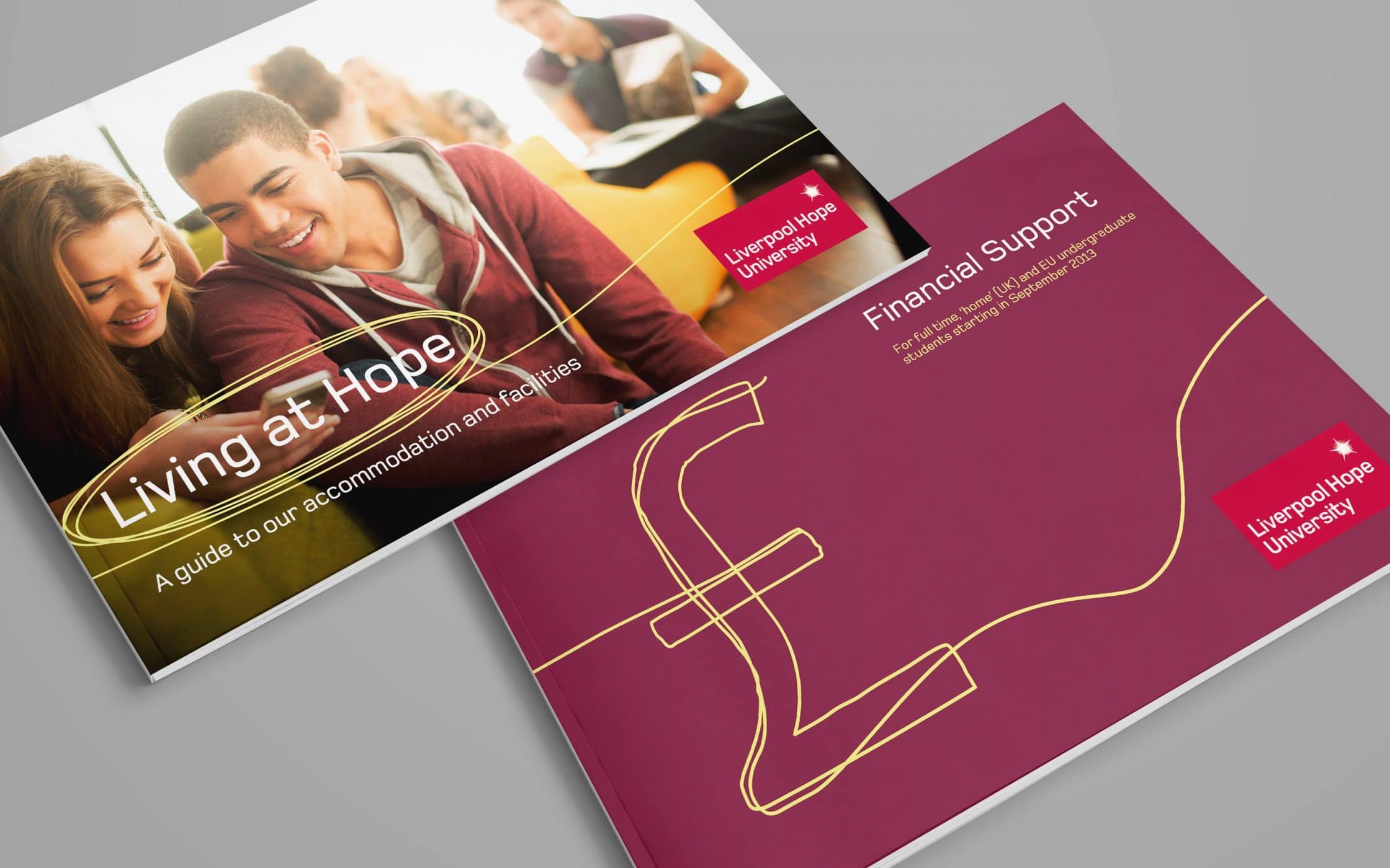
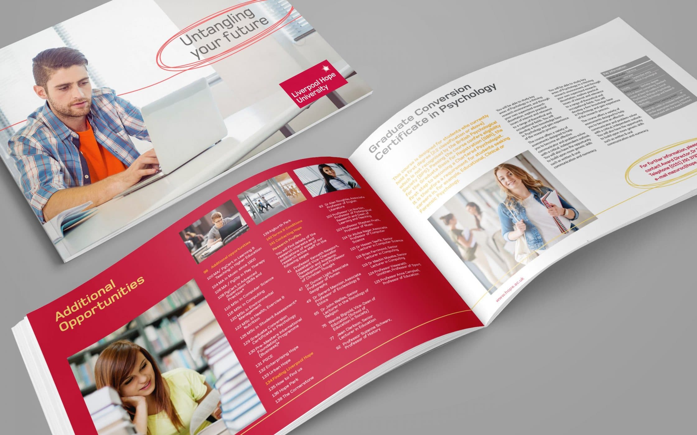
We built on this logo with concepts for the broader visual and verbal identity of the Institution, using various stylised illustrations to give a modern edge to its marketing campaigns. Using our knowledge of the Institute’s vision and values, obtained through comprehensive research, we provided the team with comprehensive guidelines for an identity that would stand the test of time.
An evocative identity for an education leader.
Combining competitive research and analysis with focus groups, workshops, and one-to-one interviews, we developed a clear insight into the message and image Liverpool Hope wanted to convey to its community. This insights guided us towards the development of a comprehensive brand positioning strategy, impactful visual assets, and a new, resilient tone of voice for the institution.
With our support, the University has positioned itself as an authority in the academic field, combining history with a bright view of the future. Today, the Institution has the resources it needs to clearly convey its commitment to excellence, inclusivity, and innovation in education.
What we did:
| —Research —Focus groups —Workshops —Interviews —Positioning —Brand strategy |
—Tone of voice —Logo design —Visual identity —Design templates —User guidelines —Implementation |
More from our portfolio...
Load more projects


What do you need?
Please tell us about your requirements, and we'll be in touch.
"(required)" indicates required fields