


Popular bank logos: Banking logos and names
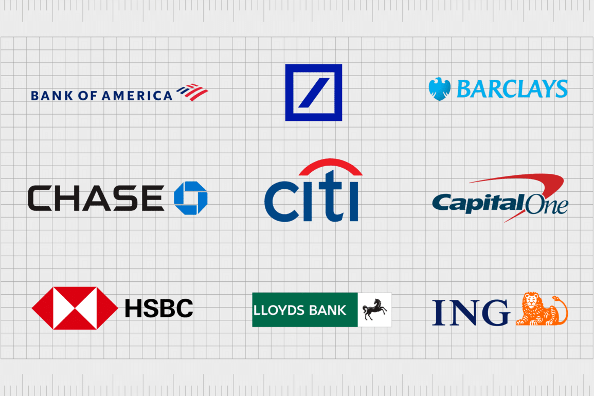
Popular bank logos from around the world aim to leave a lasting, emotional impression on customers. The logos of financial institutions are particularly crucial to the growth of the company, as they can inspire trust and credibility, long before a customer ever interacts with the business.
The topic of money is often a sensitive one for customers. Many consumers, whether they’re looking for business banking, investment opportunities, or simple savings, spend significant time researching the right banks.
A good logo can be the difference between a bank attracting a new customer, or sending them running to a competitor.
Bank logos need to present an image of stability, consistency, strength, and transparency, to capture the attention of the right people. As such, most banks are extremely cautious about the designs, colors, and typography choices they make.
Today, we’re going to be exploring some of the most popular and well-known banks from around the world, and how they influence customers with their logos.
An introduction to popular bank logos
Trust is everything to a banking company. It needs to be established from the moment a consumer starts interacting with the business. This means the most popular bank logos need to be emotive, meaningful symbols, capable of capturing the hearts and minds of clients.
While the banking logos and names we’re going to be looking at today are extremely varied, they all take certain elements into account when choosing the right logo. For instance, blue is perhaps the most common color used among Banks in the US, the UK, and other regions of the world.
This is because blue is considered to be the most conservative and trustworthy shade.
Outside of careful color choices, banks also select their typography with care. Sans-serif fonts are very common among banks today, as they’re often seen as welcoming and modern. However, some companies opt for serif typography as a way of demonstrating heritage and sophistication.
Many bank logos also focus heavily on symbolism. The most effective banking institutions use specific shapes and images in their logos to send an important message. A square can be a simple of strength and stability, while a diamond can showcase wealth.
The most well-known US bank logos
To begin our exploration into the most popular bank logos, we’re going to focus on banks in the US. There is certainly no shortage of excellent American bank logos to consider, each with their own distinct imagery and impact.
Here are some of the top options to consider…
1. Bank of America
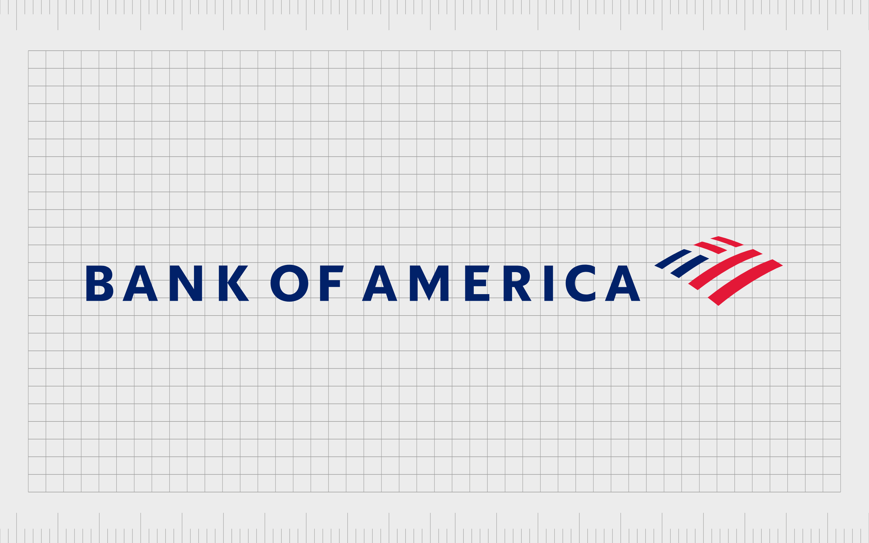
Perhaps the biggest of the American banks on our list, the Bank of America is a multinational financial service holding company and investment bank, first founded hundreds of years ago.
The “Massachusetts Bank” initially launched in 1784, before becoming BankAmerica in 1959, and the Bank of America in 1998.
The Bank of America’s logo takes its colors from the US flag, to symbolize patriotism and community. The image used alongside the wordmark is a reference to a farm field, and the US flag, which helps to highlight the bank as a company for the everyday American person.
Learn more about the Bank of America logo here.
2. Chase Bank
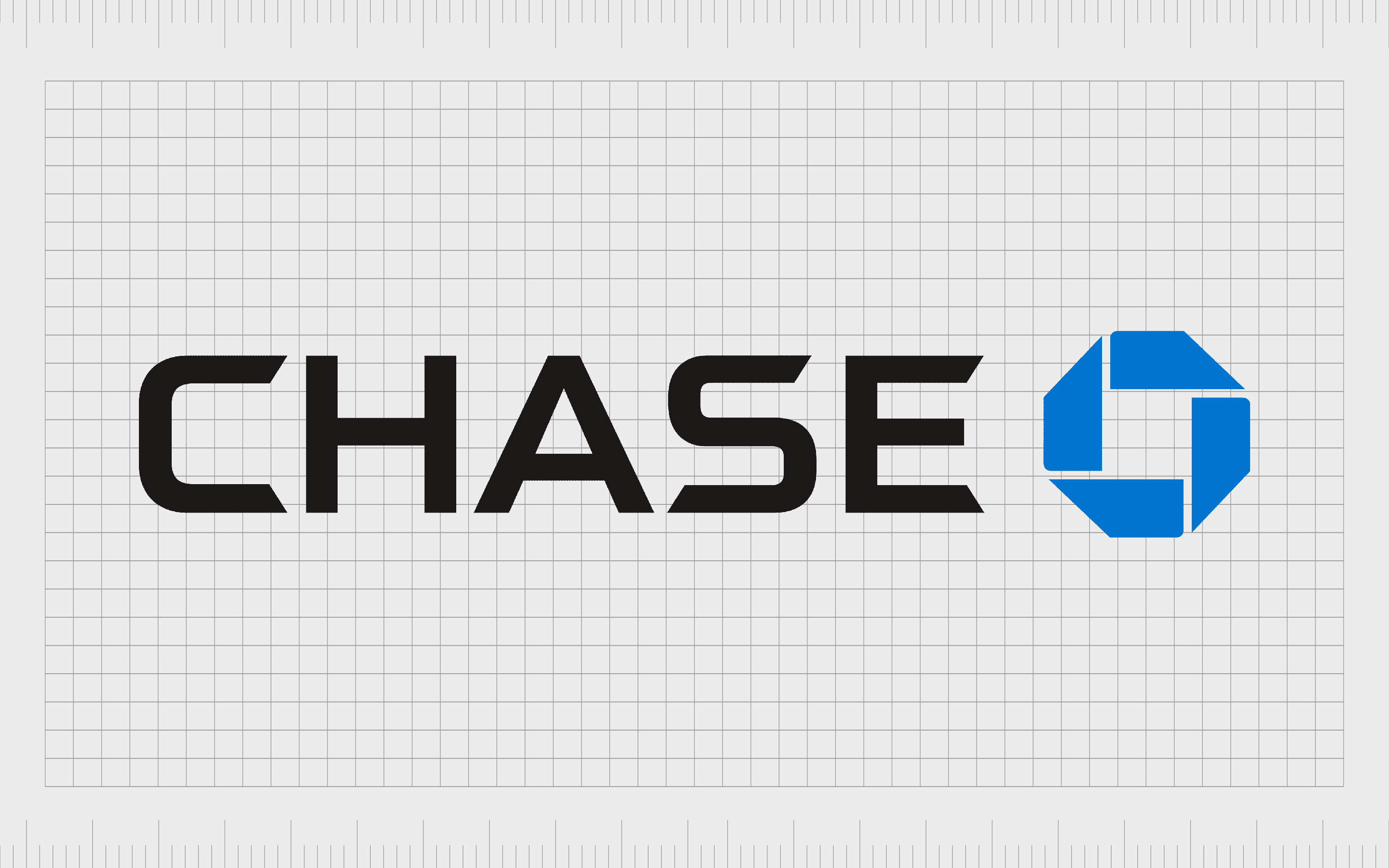
Owned by the financial services company, JPMorgan Chase, Chase Bank was initially introduced in 1799, more than 200 years ago. The company is one of the biggest in America, with more than 5,100 branches across the country.
The logo for this bank is extremely modern and eye-catching.
Alongside a bold wordmark, written in all capital sans-serif letters, Chase Bank uses a geometric shape similar to a circle, with a square on the inside. This sends a message of both unity and strength.
The abstract shape also seems to be in perpetual motion, highlighting a focus on ever improving services and support for customers.
Learn more about the Chase Bank logo here.
3. Citi Bank
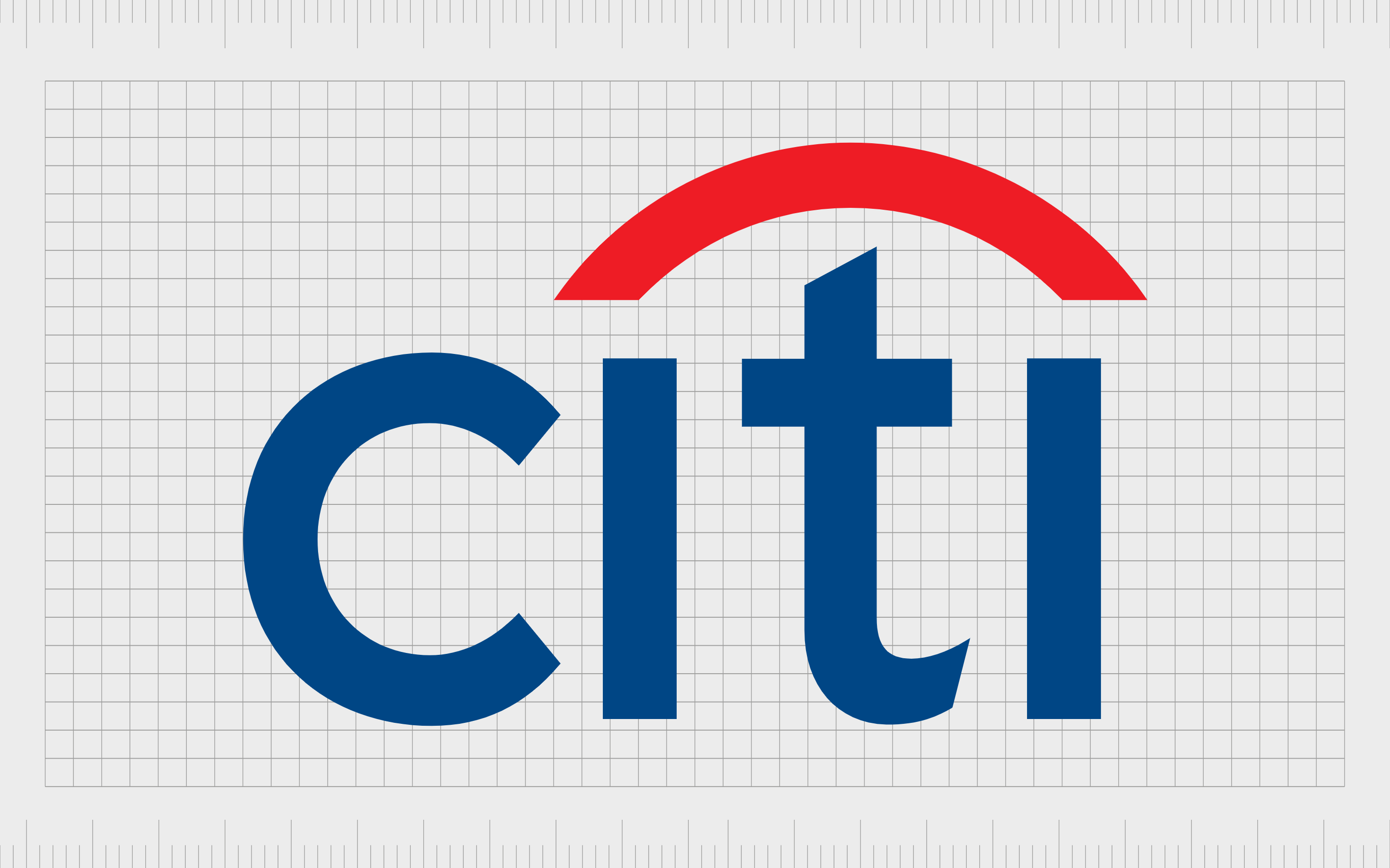
Initially founded as the bank of New York, Citi Bank was introduced in 1812, and has since become a massive international entity. This phenomenal company has achieved great success over the years, with more than 2649 branches across 19 countries.
Similar to other American banks, Citibank uses the colors of blue and red in its logo, to symbolize the flag. The shape of a curved line connecting the two “I’s” is meant to look like an umbrella, demonstrating the company’s ability to shield its customers and offer excellent protection.
The sans-serif font is also modern, accessible, and friendly.
Learn more about the City Bank logo here.
4. Truist

One of the many logos of banks with names in the image, Truist bank is a popular financial holding company, first launched in 1872. The organization has 2,781 branches across 15 states, and offers both consumer and commercial banking services.
Truist uses a stylized wordmark as the core part of its logo, written in a shade of deep purple to showcase luxury and excellence. The symbol of a square with two rotated “T’s” alongside the image is intended to represent a lock box, giving customers a sense of security and protection.
Learn more about the Truist logo here.
5. Capital One
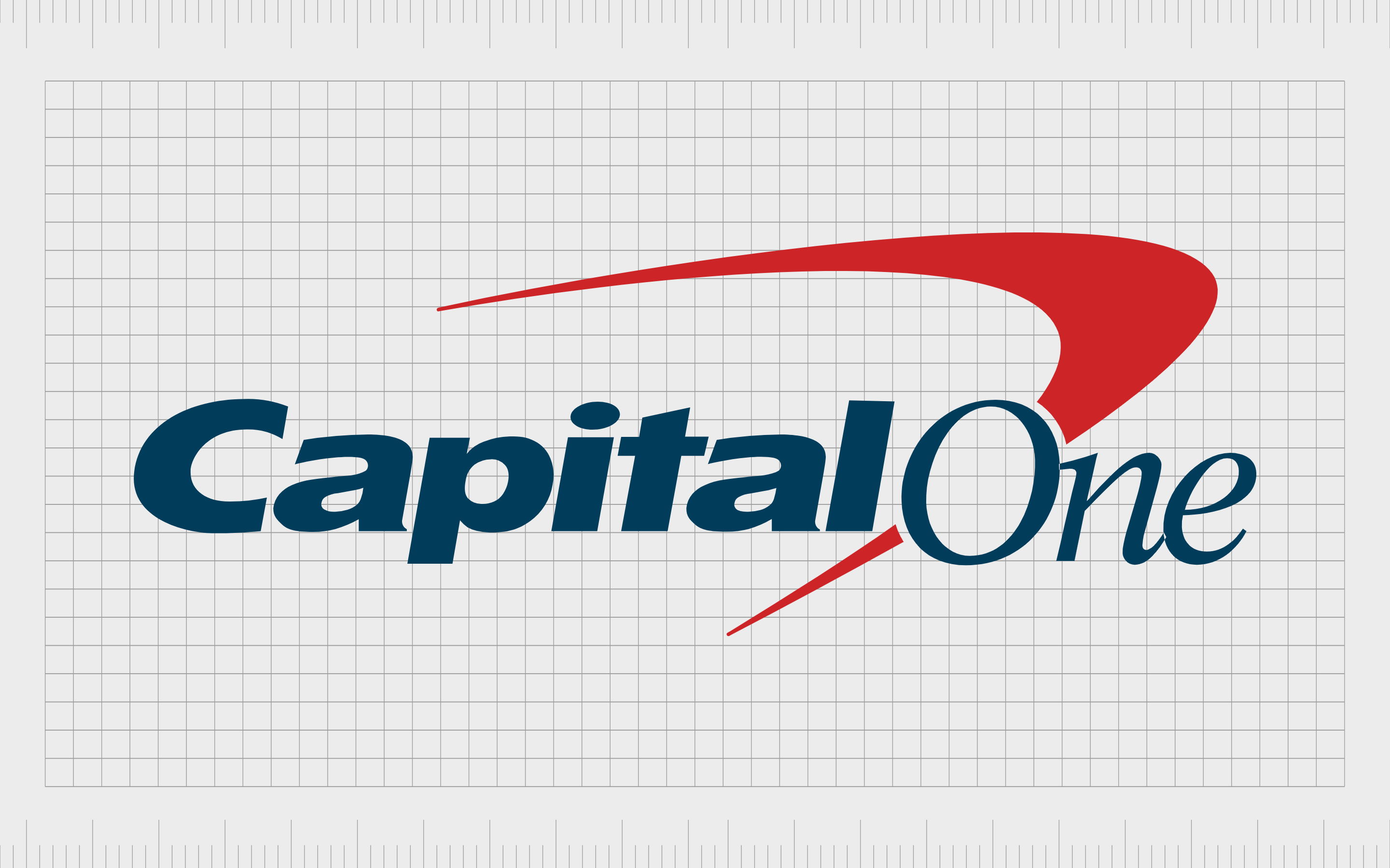
Perhaps one of the most famous financial services logos of all time, Capital One is a bank holding company offering savings accounts, banking, credit cards, and loans. The company initially launched in 1994, making it one of the younger banks on this list.
However, it still has more than 755 branches.
Capital One’s logo features the colors of the US flag (blue and red), combining an eye-catching wordmark with a swooshing symbol. The wordmark is in both serif and sans-serif font, to demonstrate modernity and stability.
The angled symbol pointed towards the right and up highlights the forward progression and future focus of the company.
Learn more about the Capital One logo here.
6. BNY Mellon
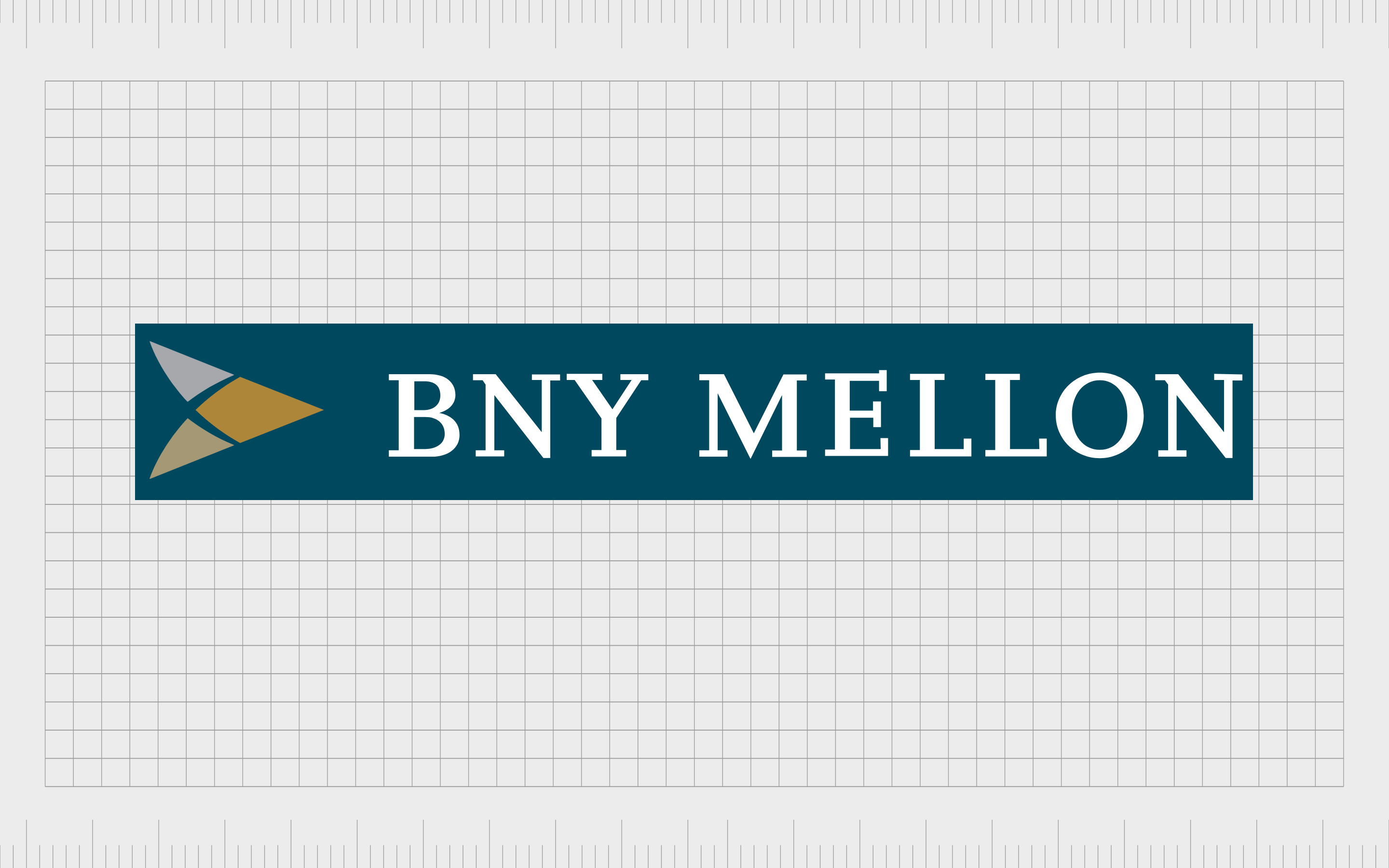
The Bank of New York (Mellon Corporation), known commonly as BNY Mellon is an investment banking company, formed by the merger of multiple other banking brands. The company was initially launched in 1784, and has updated a number of times throughout the years.
The logo of BNY Mellon is highly traditional, with a deep grey word mark written in serif font, to demonstrate sophistication. The symbol used alongside the wordmark is the shape of an arrow, which is usually indicative of forward motion and growth.
The colors of gold also remind us of the financial focus of the company.
Learn more about the BNY Mellon logo here.
7. US Bancorp
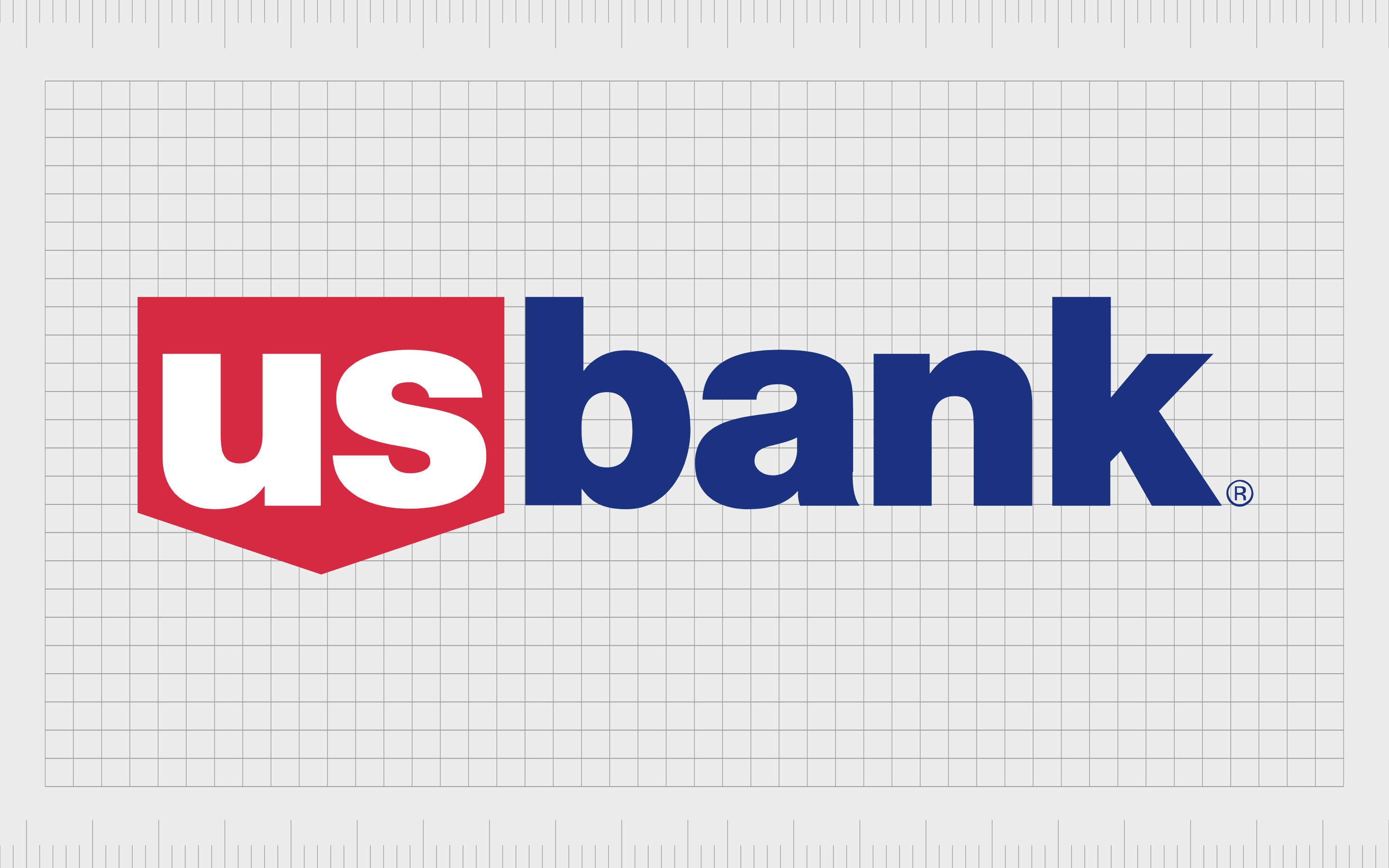
US Bancorp is an American holding company first launched in 1863. The company has over 3,100 branches throughout the United States, primarily in the Western and Midwestern states. It’s also one of the leading banks throughout the country.
The US Bancorp logo is all about stability and strength. The bold sans-serif font is written in all lowercase letters to improve the friendliness of the institution.
The colors of red, white and blue symbolize the American flag, while the shape of the blocky shield behind the “US” component of the logo highlights protection and safety.
Find out more about the US Bancorp logo here.
8. TD Bank
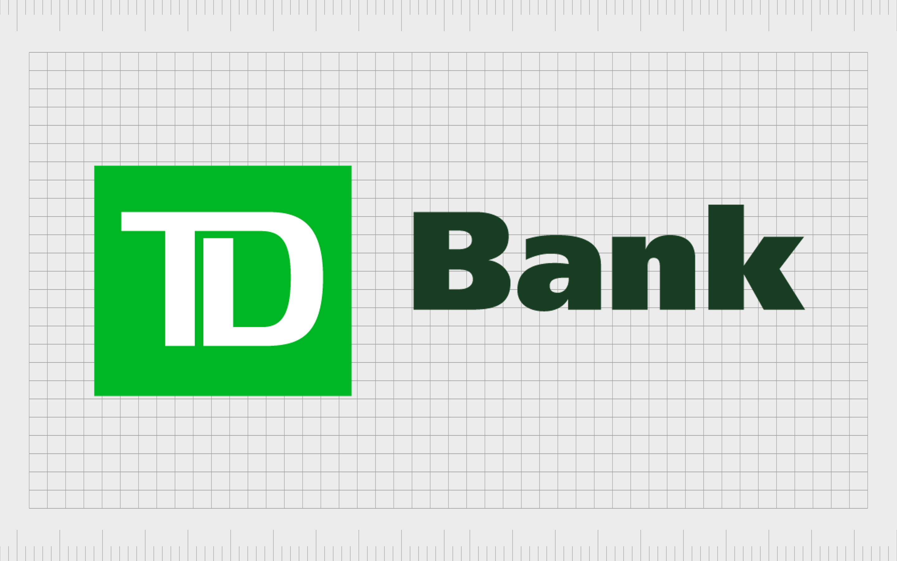
A rather modern example of the most popular bank logos, TD Bank is an American national bank. The company primarily operates across the East Coast, and is one of the largest banks in the country by deposits and total assets.
The brand initially launched in 1852.
This logo uses the color green, which is an unusual choice for American banks, but often helps to highlight ideas of wealth and growth. The bold font choices showcase confidence and strength, while the connected elements of the “TD” image symbolize community.
Find out more about the TD Bank logo here.
Popular UK bank logos
One of the biggest differences between British banks and American banks is a slight change in the color scheme. While various American banks use references to the American flag, British banks are more likely to use shades which demonstrate stability and confidence.
1. Lloyds Banking
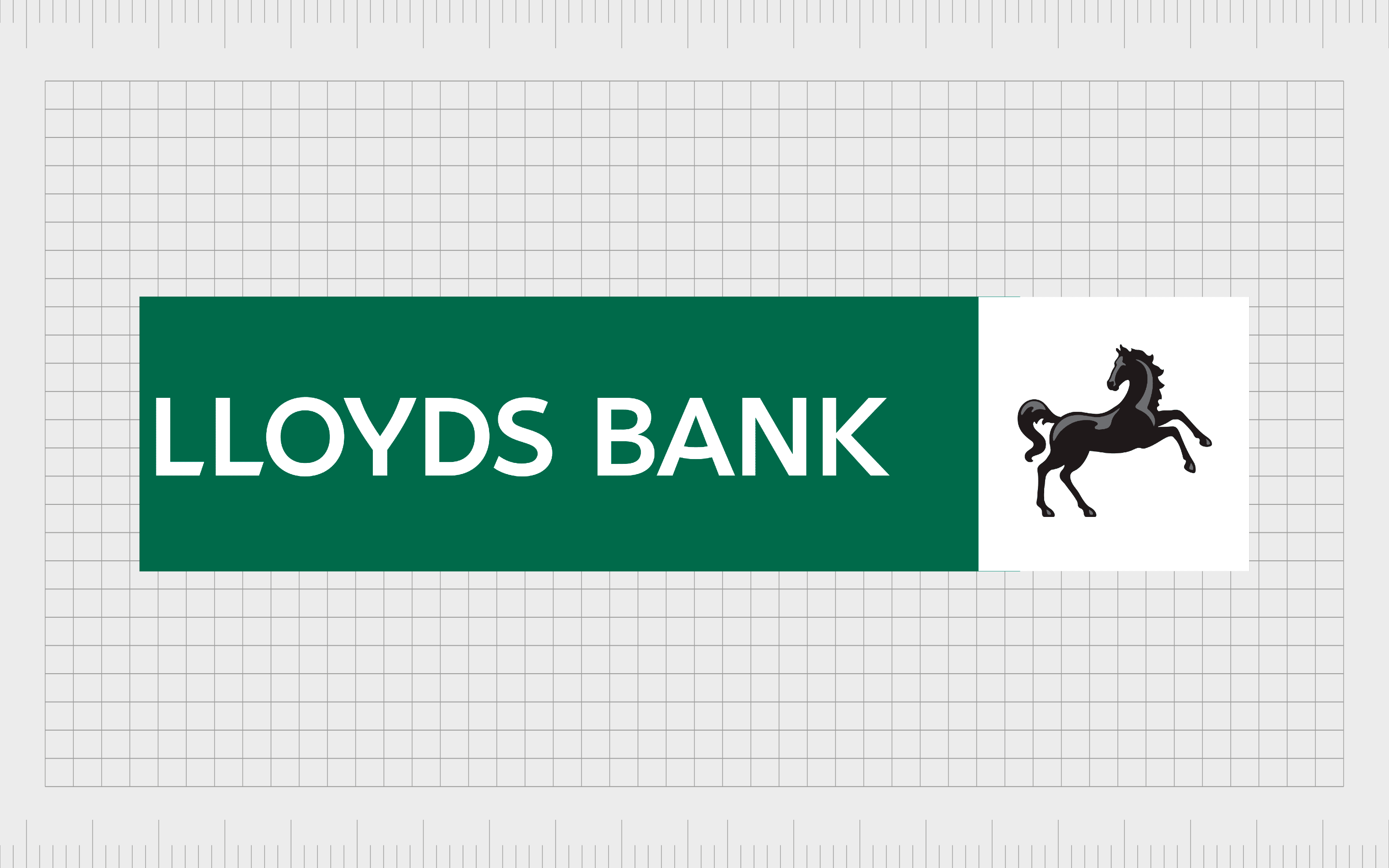
One of the best examples of British bank logos, and an excellent insight into the top contenders in the British financial services space, the Lloyds Banking Group first launched in 1765. The company is one of the largest in the UK, with a headquarters in London.
The color green is one of the stand-out elements in the Lloyds Banking Group logo, intended to symbolize wealth and growth. The image of the prancing horse also highlights motion, power, and strength – all crucial elements for a banking business.
Find out more about the Lloyds Bank logo here.
2. HSBC
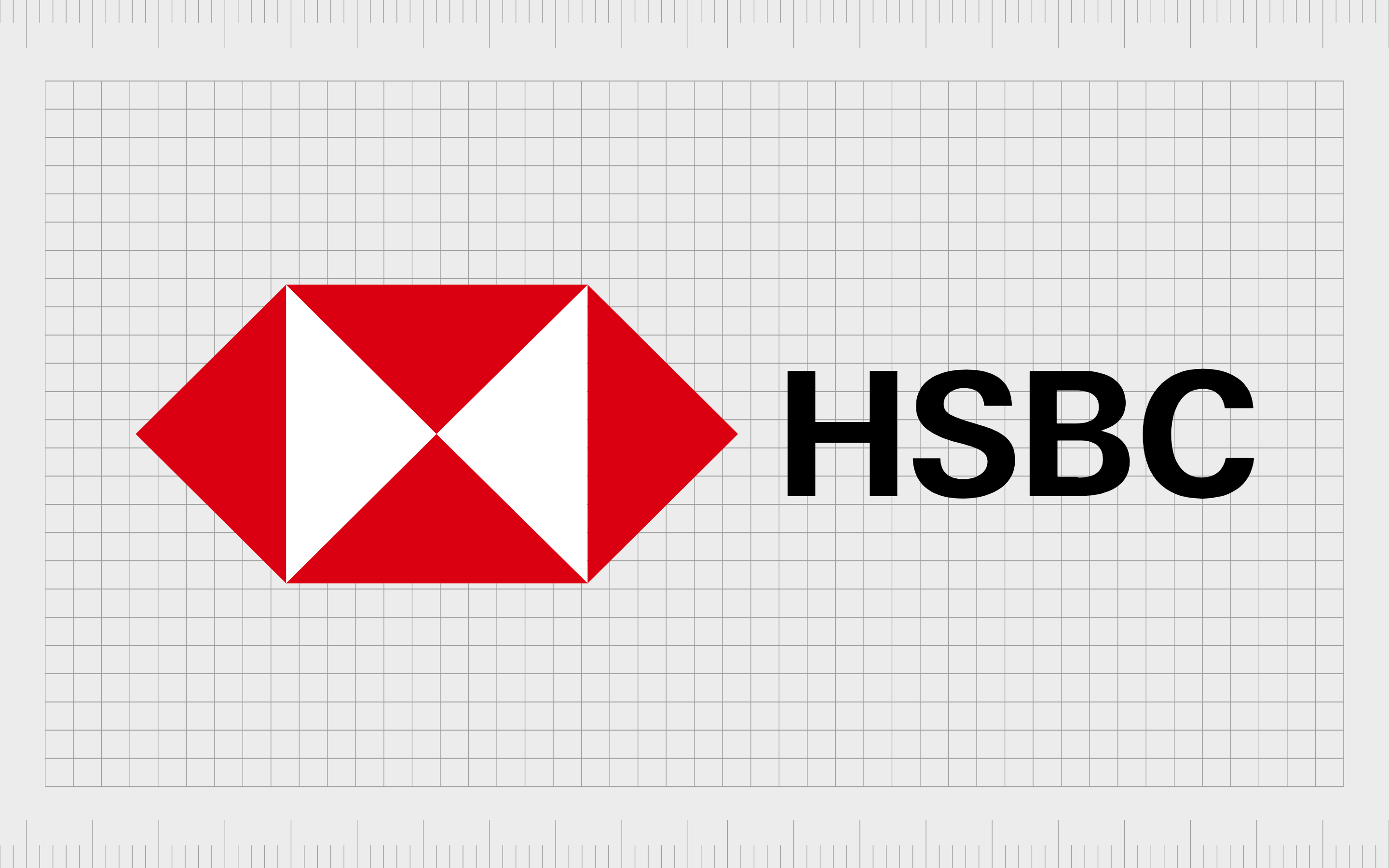
A multinational financial services company and banking group, HSBC Holdings was first established in 1865. Today, it stands as one of the largest banks not just in the UK, but also throughout Europe.
The company has quite a unique image compared to other British banks.
Featuring a red and white shape made up of multiple triangles, the complex design of the HSBC logo looks a little like a box being opened.
The square and triangle shapes are also fantastic for demonstrating stability and strength. A sans-serif wordmark in bold font helps to further convey the power of the institution.
Find out more about the HSBC logo here.
3. Barclays
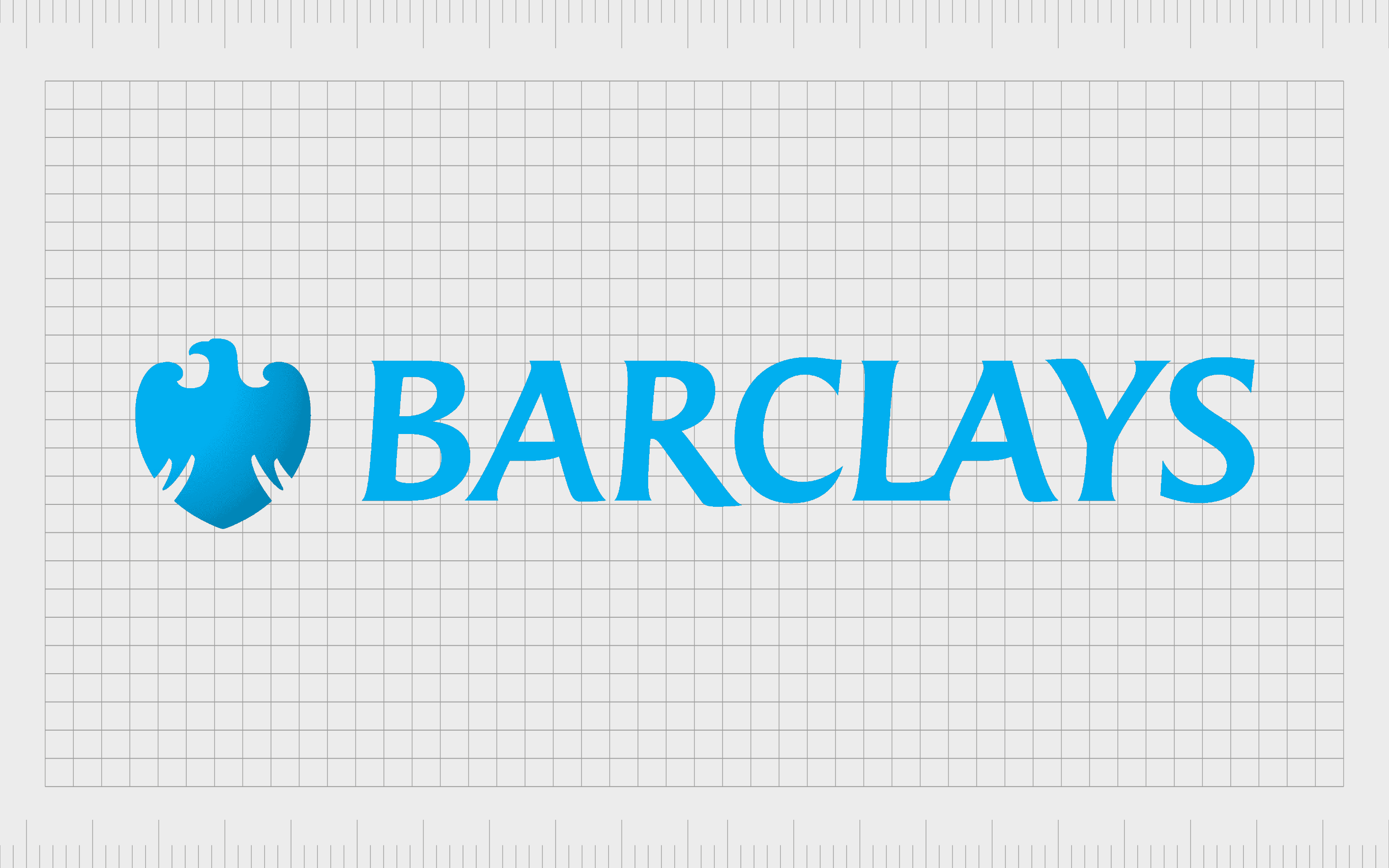
A British multinational Universal bank with headquarters in London, Barclays traces its origins all the way back to 1690. The company is one of the biggest in the UK, and it’s also known for launching one of the world’s first cash dispensers.
Barclays uses the traditionally reliable color of blue in its logo, to symbolize trustworthiness and peace of mind. The lighter shade is excellent for creating a friendly appearance.
The image of the eagle aims to demonstrate strength, and it’s also stylized into the shape of a shield, to highlight thoughts of protection and safety.
Find out more about the Barclays logo here.
4. NatWest

Otherwise known as National Westminster bank, the NatWest Group was first launched in 1958, making it one of the newer banks in the UK market. The company is part of the Royal Bank of Scotland Group, and is currently owned partially by the British Government.
The NatWest logo is an interesting alternative to many British bank logos, as it uses colors of red and purple, rather than blue. The red boxes in the geometric logo are meant to symbolize both stability and community. The purple coloring is a reference to luxury and sophistication.
Find out more about the NatWest logo here.
5. Royal Bank of Scotland
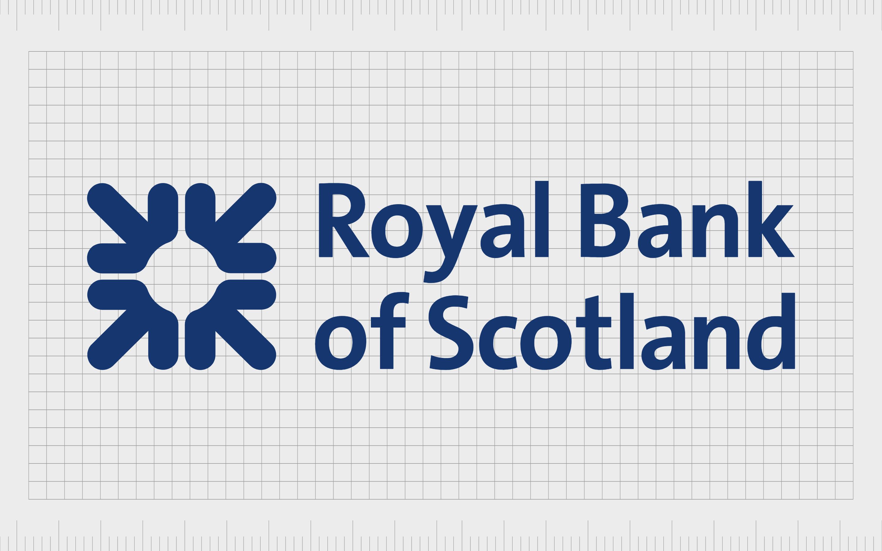
The Royal Bank of Scotland is a major commercial and retail bank in Scotland, and one of the subsidiaries of the NatWest Group. It was first launched in 1724, almost 300 years ago.
The company offers an interesting insight into one of the best British bank logos today.
The image used by the Royal Bank of Scotland takes inspiration from the “Daisy wheel,” intended to highlight an arrangement of 36 coins in a square. The image represents the accumulation and careful management of wealth by the company.
We also see the traditional color of deep blue to symbolize credibility and trustworthiness.
Find out more about the Royal Bank of Scotland logo here.
6. British Business Bank
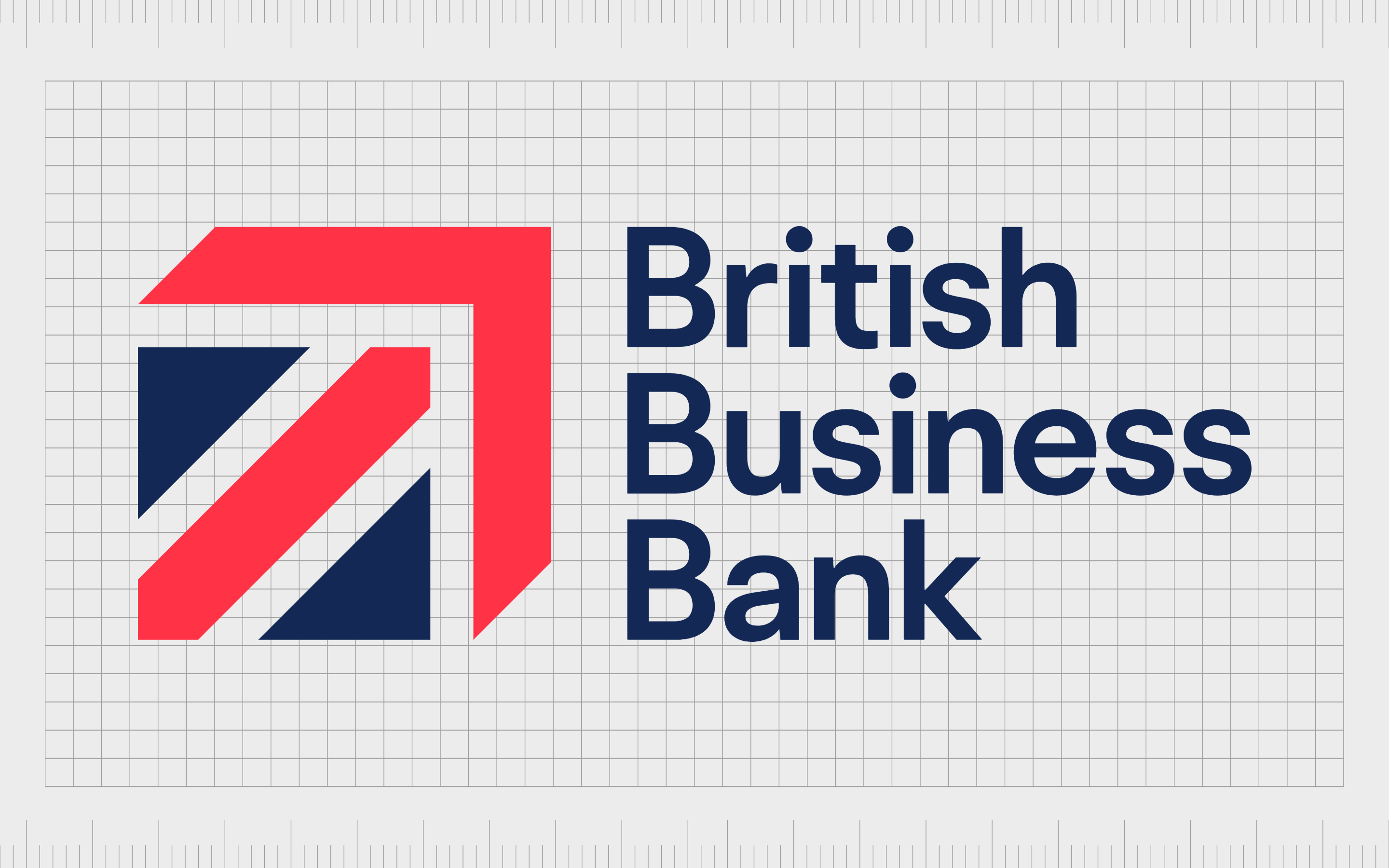
A state-owned economic development bank created by the UK Government, the aim of the British Business Bank is to support the growth of new organizations in the UK with credit and funding. The organization first launched in 2014.
The British Business Bank logo combines the colors of the British flag in a combination mark logo. This insight into popular bank logos focuses heavily on the idea of growth and momentum.
Alongside the traditional shape of a square for stability, there’s also an arrow pointing upwards, highlighting the development of the UK business world.
Find out more about the British Business Bank logo here.
7. Halifax
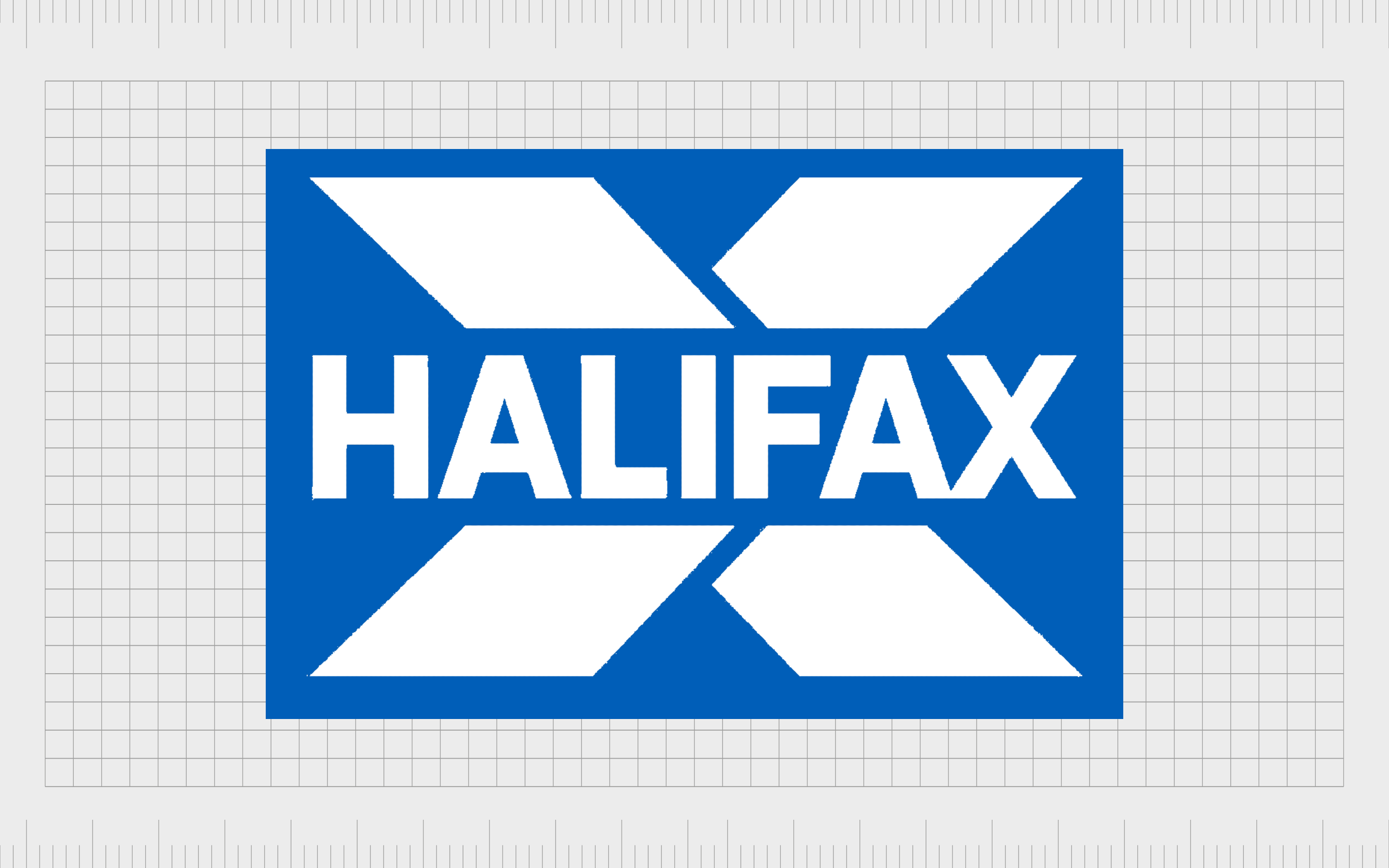
Otherwise known as Halifax Building Society, Halifax is a leading British banking brand. The company is actually named after a specific town in West Yorkshire, where it was initially launched in 1853.
The company is one of the biggest UK building societies around.
Halifax uses the traditional color of dark blue as an important element in its logo, to showcase strength, stability, and reliability. The cross shape behind the wordmark is intended to be a symbol of confidence and protection, while also referencing the name of the bank.
The image also looks a little like a set of arrows, symbolizing movement.
Find out more about the Halifax logo here.
Other iconic banking logos and names
Popular bank logos appear in regions all over the world, outside of the UK and the US. There are countless amazing examples to discover across multiple countries, all demonstrating common ideas of strength, growth, and innovation.
Here are some of the other top bank logos worth learning from…
1. Deutsche Bank
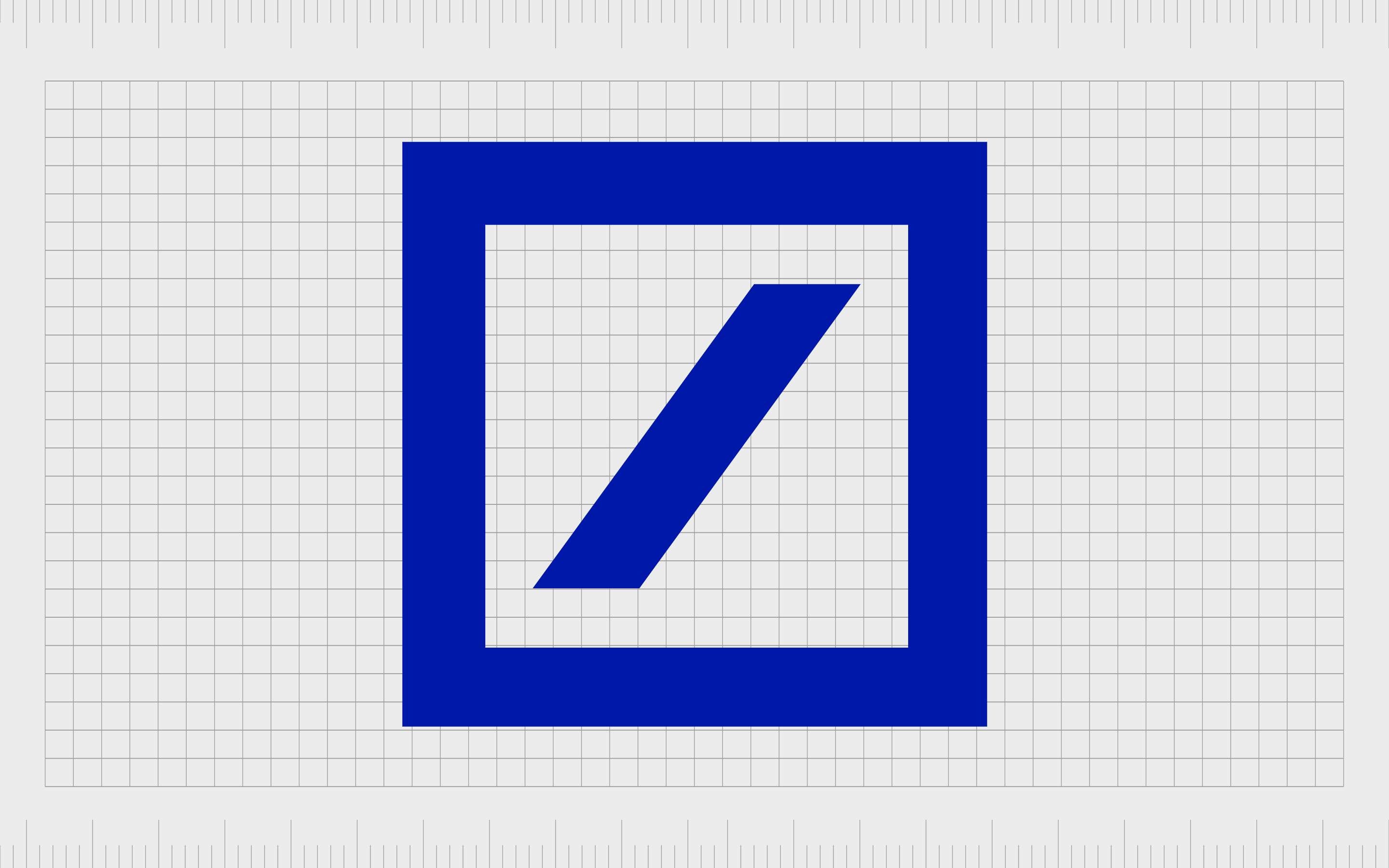
One of the few popular bank logos without the use of a name in its imagery, Deutsche Bank AG is a financial services company and investment bank from Germany. The network of the organization spans across the world, making it one of the biggest banking companies around the globe.
Deutsche Bank simply uses a picture of a square with a slash-style line in the middle. This is intended to represent a deposit or savings box. The dark blue coloring is a popular choice for banking brands, as it’s often connected to professionalism and trust.
Find out more about the Deutsche Bank logo here.
2. ING Bank

Another leading bank around the world today, ING bank is a Dutch multinational financial services company, originally founded in 1743 under a different name. The ING Bank now has a massive following around the world, with total assets in the trillions.
The ING Bank has a highly traditional logo, combining a serif wordmark with the image of a lion in bright orange. The lion is a symbol of courage, strength and authority, while the color orange references the Netherlands and the origins of the organization.
The lion is also a national symbol from the Netherlands.
Find out more about the ING Bank logo here.
3. Societe General

Societe General is a multinational investment bank from France. The company was first founded in 1864, and is currently the third largest bank in the French landscape. The company also has a strong presence around Europe, and is considered a “systemically important” institution.
For a logo, the Societe Generale uses a combination mark, which includes a sans-serif wordmark in black, and the image of a square in two halves, with both black and red coloring. The two halves are intended to represent harmony between passion and seriousness.
The white slot in the middle also draws attention to old-fashioned deposit boxes.
Find out more about the Societe Generale logo here.
4. MUFG
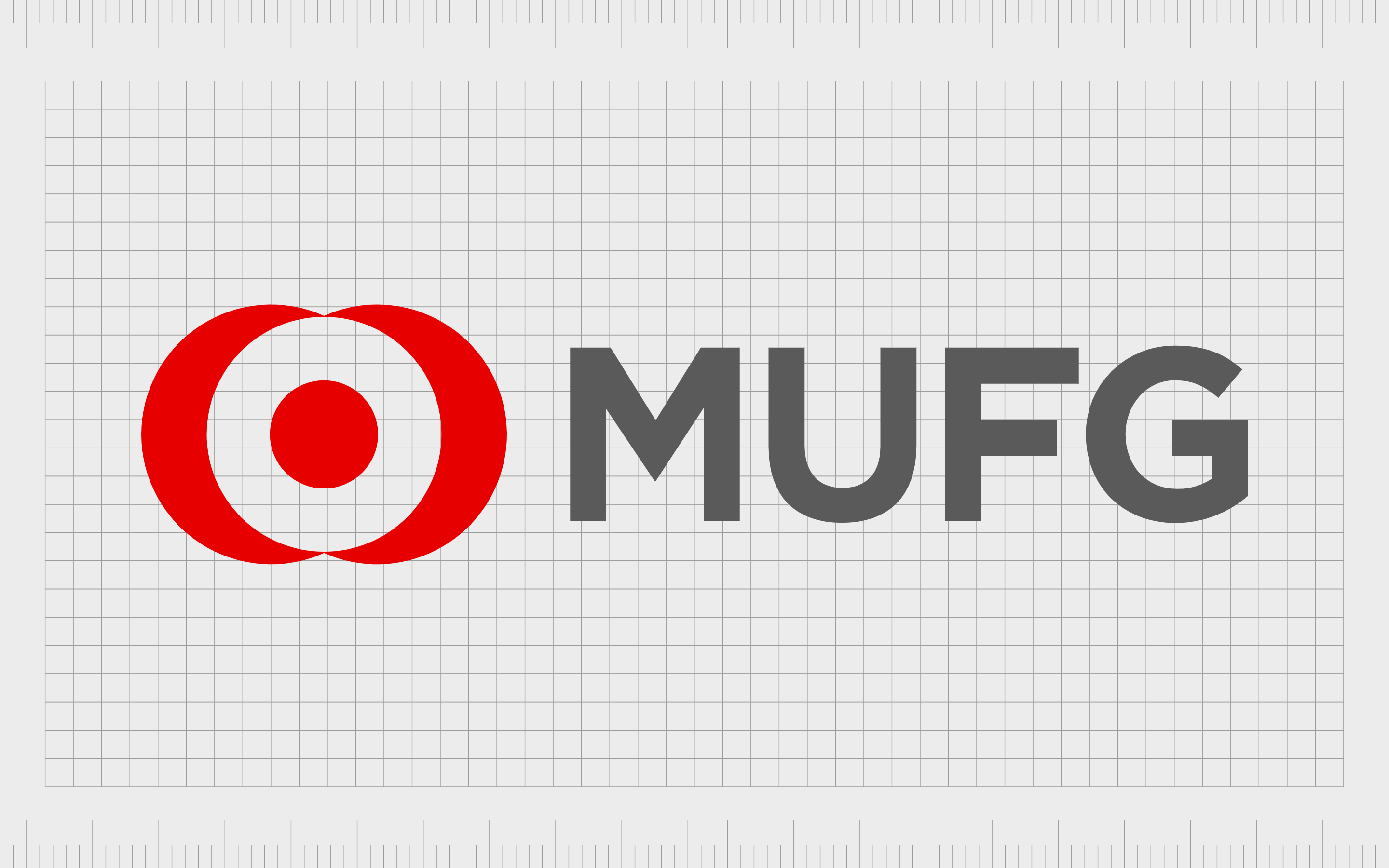
Otherwise known as Mitsubishi UFJ financial, MUFG is a Japanese bank with a huge impact on its target audience. Though a relatively young institution, founded in 2006, the company has become one of the largest banks in the world within a short space of time.
The MUFG Bank logo is highly symbolic. The image looks simple and modern at a glance. However, it’s actually a reference to the “all seeing eye” in Japan, demonstrating stability, strength, protection, and confidence.
The color red is also quite commonplace in Japan as a symbol of fortune.
Find out more about the MUFG Bank logo here.
5. BNP Paribas

Another leading French international banking group, BNP Paribas was formed in 2000 after the merger of the Paribas Company and the BNP organization.
The venture is currently listed as the second largest banking group in all of Europe, just after HSBC. It’s also the ninth largest banking company in the world.
An interesting alternative to some of the other popular bank logos we’ve seen so far, this company uses a green square for stability, with a series of 4 white stars inside. The stars appear to gradually transform into a bird, showcasing freedom and creativity.
The stars are also a symbol of the European Union, where the bank serves.
Find out more about the BNP Paribas logo here.
6. UBS Bank

The UBS Group is a multinational financial services company and investment bank, based in Switzerland. The company has a major presence in all major financial centers, as the largest private bank in the entire world.
The company has a traditional looking logo with a lot of meaning behind it.
First, we have the serif logo, symbolizing heritage and sophistication. The three keys in the image are representative of safety and security. However, they also stand for the three core values of the business, which are confidence, security, and discretion.
Find out more about the UBS logo here.
7. Raiffeisen Bank
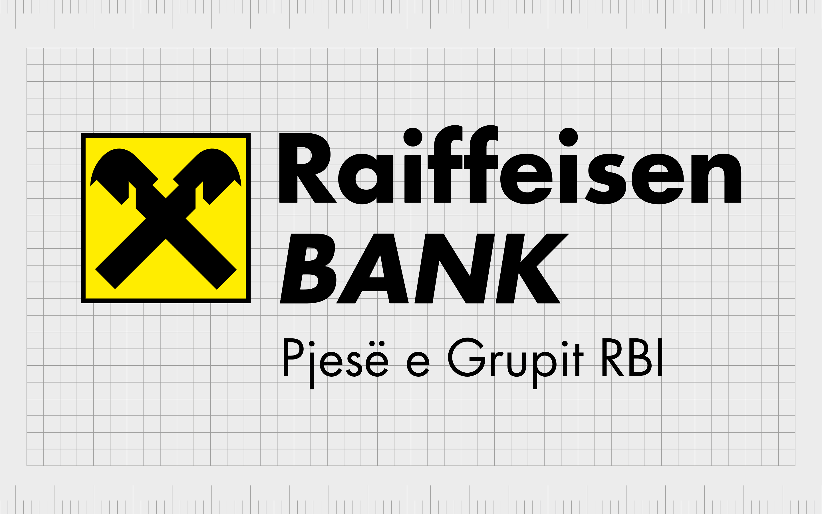
The only bank logo on this list to have bright yellow coloring in its emblem, the Raiffeisen Bank image is certainly an interesting one. This company was launched first in 1927, and is based in Austria, as one of the major banks of the region.
According to the company, the symbol used in its logo is called the Gable cross, and features two crossed horse heads, intended to stand for protection and safety.
Apparently, the symbol which initially inspired the logo used to appear on the roofs of various European houses.
Find out more about the Raiffeisen Bank logo here.
Understanding the logos of financial institutions
Ultimately, there are plenty of great and popular bank logos from around the world worth looking at if you need inspiration for a financial services brand. Like any company, a bank relies on its logo to send the right message to its target audience.
For banking groups, the correct image is crucial to establishing a sense of trust among potential investors and consumers.
As you can see in the examples above, many organizations use similar symbols, shapes, typography, and even colors to make the correct impression on their audience.
Fabrik: A branding agency for our times.
Now read these:
—How to brand a financial services product
—The history of the Bank of America symbol
—How the HSBC UK logo evolved over time
—Explore Fabrik’s financial branding services

Clarity starts with a conversation.
Thanks—we’ll get back to you shortly.
Whether you're navigating a rebrand, merger, or simply need a clearer identity—we’re here to help. No hard sell, just honest advice from people who know the sector.
Let’s start with a simple question…
Prefer to email? Drop us a line.
Fabrik’s been helping organisations rethink and reshape their brands for over 25 years. We’ve guided companies through mergers, rebrands and new launches. Whatever stage you’re at, we’ll meet you there.