Lloyds Bank logo history: The bank with the horse logo

The Lloyds Bank logo is one of the more recognizable emblems in the financial landscape, largely thanks to its animal-focused imagery. Even if you’re unfamiliar with Lloyds as a banking institution, you may have asked, what bank has a horse logo?
For any company, choosing the right logo is crucial in ensuring a brand resonates with its target audience. Selecting the right logo for banking and financial organizations can be particularly important.
After all, bank logos need not just to differentiate the business from other competing brands but also to earn the trust of the group’s target audience.
If you’ve ever found yourself looking at the Lloyds Bank logo and wondering why the company chose a horse as the primary component of its emblem, you’re in the right place.
Today, we will be taking a closer look at Lloyds banking history and how the Lloyds Bank logo has evolved over the years.
Let’s dive in.
Who owns Lloyds banking? An Introduction to Lloyds Bank
Lloyds Bank is a British commercial and retail bank with branches located throughout Wales and England. It’s regarded as one of the “Big Four” banks in the clearing sector by financial leaders, and it’s also the largest bank in the retail sector within the UK, with a wide selection of branches.
The origins of Lloyds Bank date back to 1765 when a button maker named John Taylor started a collaboration with an iron producer and dealer named Sampson Lloyd.
The two created their own banking business in Birmingham, and the first branch of the bank opened around 100 years later, in 1864. The initial symbol adopted by the “Taylors and Lloyds” bank was a beehive intended to represent hard work and industry.
In 1995, Lloyds Bank joined forces with the company Trustee Savings Bank and began trading as Lloyds TSB Bank from 1999 to 2013.
In 2009, Lloyds also began trading as the number one subsidiary for the Lloyds Banking Group, which was created by the acquisition of the HBOS brand by the Lloyds TSB Group.
Today, Lloyds Bank is owned by the Lloyds Banking Group, alongside Lloyds Bank International Limited and Lloyds Bank Gibraltar Limited.
Lloyds Bank logo history: The Lloyds Banking Group logo
While not a lot of historical evidence remains of the Lloyds Banking Group symbol over the years, there have been various versions of the Lloyds Bank logo. Virtually every logo variation introduced across the centuries has included a black horse.
1890

The earliest version of the Lloyds Bank logo available on the web today dates back to 1890. This image featured a black horse with a shadow beneath it. The horse looks very similar to the design most of us know today, with the animal raising its two front legs.

In 1920, the horse logo was updated slightly, featuring an intricate circular pattern around the primary image. In this variation, the flooring beneath the horse was slightly more detailed. There were also two straps added to the horse’s back, which also appeared in later versions of the logo.
1930

During the 1930s, a version of the Lloyds Bank logo was designed to feature the company’s name in double-lined serif typography.
The word “Limited” was also included under the company’s name. This was when it was more common to show the legal standing of a business in a logo. Some logo variations deleted the ring around the horse and the wordmark.
1980

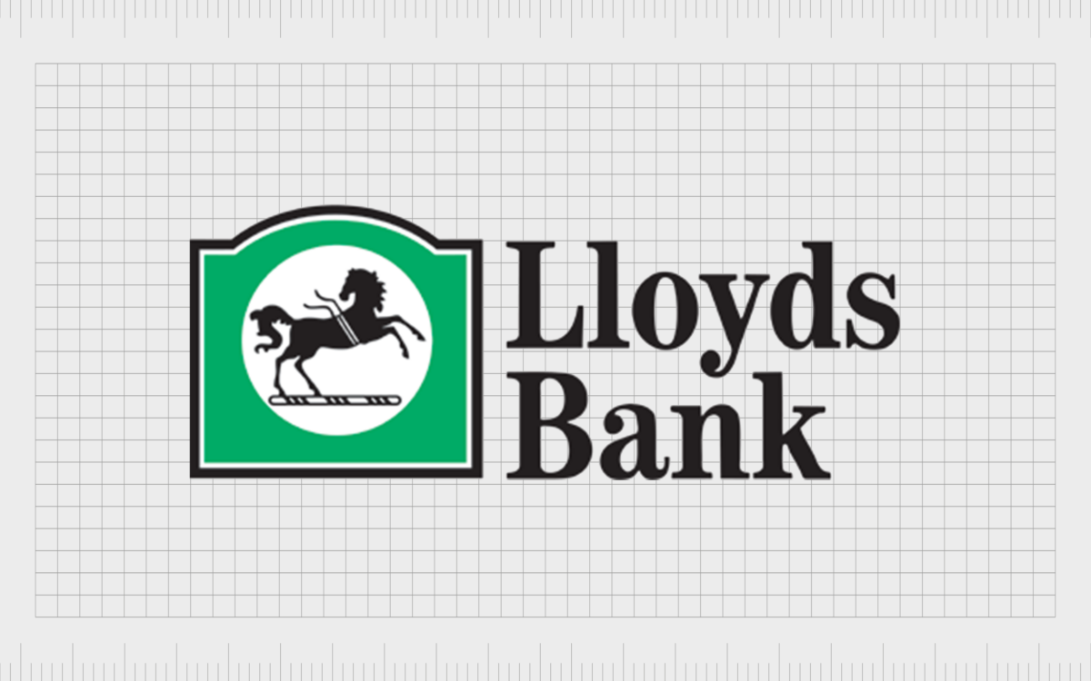
During the 1980s, Lloyds updated its logo to feature the first color besides black and white. The horse was placed in a white circle on a green background shaped like a traditional banking building.
In this logo, the straps on the horse’s back are a ribbon intended to represent victory or success.
The Lloyds logo from the 80s also featured the name of the company again, this time written in sentence case, with a bold serif font.

From the end of the 1900s to the beginning of the 2000s, Lloyds began experimenting with different styles for its iconic horse emblem. Multiple variations of the logo appeared, this time with the ribbon removed.
At one point, the company used a blue and green background behind the horse before removing it and replacing it with a transparent white background.
2013

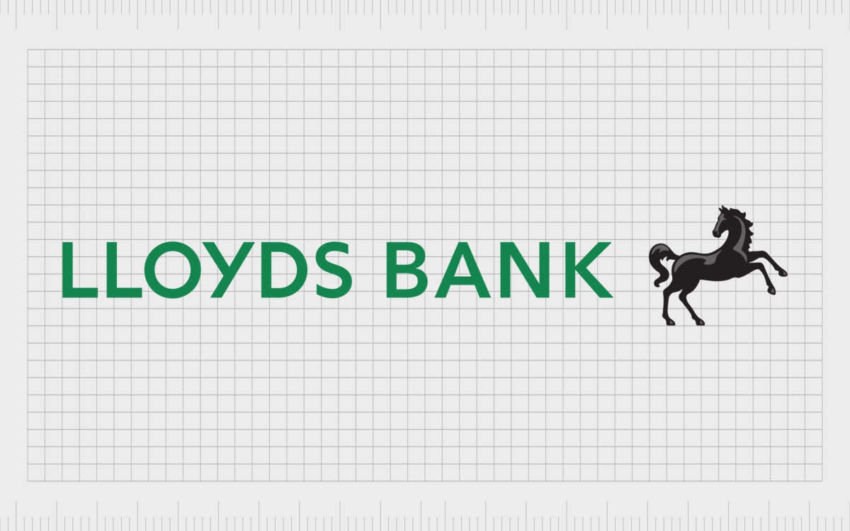
In 2013, Lloyds Bank introduced the logo most of us are familiar with today. This modernized version of the previous horse logo showed a more detailed animal, with its front legs raised slightly higher in the air.
The horse appears to be looking back at the name of the company, which now appears in a bold sans-serif font. The bottle green coloring for the typeface is intended to symbolize wealth.

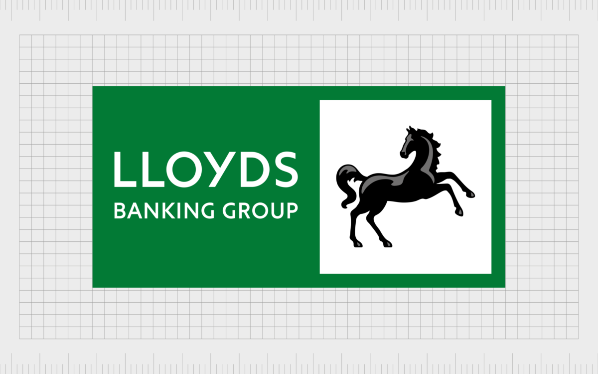
The Lloyds Banking Group, the parent of Lloyds Bank, also began using a similar logo. However, in the case of the Lloyds banking group, the green and white colors are inverted, so we see the white font on a green background. The horse has also been placed within a white square to help it stand out.
What bank has a horse logo? Why is Lloyds Bank logo a horse?
At first, a horse may not seem like the most obvious animal of choice for a banking company. Horses are often associated with grace, elegance, power, and speed. However, the famous black horse logo has long been part of Lloyds’ visual identity.
According to historical texts, the symbol originally belonged to a jeweler in the 1600s; the symbol was also used in place of a wordmark on the signs for stores, as many people during this time still couldn’t read.
Over the years, other jewelers adopted the horse logo, creating a connection between the animal and the concept of value and wealth.
Lloyds’ history of the horse logo began in 1728 when a goldsmith named John Bland chose the emblem for his store. In 1884, Bland’s firm was taken over by Lloyds Bank.
At that point, Lloyds decided to add the black horse to its own logo alongside the beehive emblem. By the time the 20th century emerged, the horse had remained.
The Lloyds Bank logo color and fonts
Today, the Lloyds Bank logo and the Lloyds banking group logo are both excellent symbols of strength, charisma, passion, and confidence.
The black horse, associated with the financial world and concepts like speed, agility, and elegance, has remained a consistent and powerful part of the company’s identity for more than a century.
Alongside the horse emblem, perhaps the most important part of the Lloyds Bank logo is its color palette. The color black is often associated with sophistication and power, while the color green is typically associated with wealth and money.
If you’re interested in exploring the Lloyds Bank logo further, you can find some valuable resources here:
What color is the Lloyds banking logo?
For a long time, the primary Lloyds banking logo color was black, thanks to the black horse on a white background.
Over the years, the company experimented with different color options, including blue and green, for a short time. Eventually, the company settled on a powerful bottle green shade for its primary hue, alongside a black wordmark.
Bottle green:
Hex: #016846
RGB: 1 104 70
CMYK: 99 0 33 59
Pantone: PMS 3415 C
What font does the Lloyds banking logo use?
Just as the Lloyds banking logo colors changed over the years, so too made its font choices.
The company experimented with a variety of different fonts, to begin with. Today, the Lloyds Banking logo font is a straightforward sans-serif typography intended to demonstrate the contemporary nature of the brand and its strength in the financial industry.
The Lloyds Bank font is a customized version of the FS Jack font produced by Fontsmith.
The powerful Lloyds Bank logo
The Lloyds Bank logo is an eye-catching and compelling emblem, perfect for demonstrating the financial brand’s strength, excellence, and sophistication.
The core elements of the logo are its compelling black horse, which has remained with the company for centuries, and its bold wordmark, written in a fantastic shade of deep green.
The Lloyds Bank logo and the Lloyds banking logo are both excellent examples of how companies can use animals in their imagery to connect with consumers on an emotional level.
Fabrik: A branding agency for our times.
Clarity starts with a conversation.
Thanks—we’ll get back to you shortly.
Whether you're navigating a rebrand, merger, or simply need a clearer identity—we’re here to help. No hard sell, just honest advice from people who know the sector.
Let’s start with a simple question…
Prefer to email? Drop us a line.
Fabrik’s been helping organisations rethink and reshape their brands for over 25 years. We’ve guided companies through mergers, rebrands and new launches. Whatever stage you’re at, we’ll meet you there.


