


Chase Bank logo history: The story of the chase bank symbol
You’re probably aware of the Chase bank logo if you’re familiar with the US financial sector. Otherwise known as the JPMorgan Chase logo, the symbol is an iconic component of the financial landscape, representing stability and peace of mind to consumers across the United States.
But how much do you know about Chase bank logo history?
The visual identity of Chase bank has evolved significantly over the years as the company has changed names and ownership.
The original Chase bank logo dates back to the late 1700s when the organization that would one day become Chase bank was still operating as the Bank of the Manhattan company.
Today, the Chase bank logo offers an interesting insight into the evolution of the financial and banking sector from a branding perspective. In this post, we will look at the core elements of Chase Bank’s visual identity and how it has evolved over the years.
Is Chase the same as JP Morgan? Introducing Chase Bank
Before we explore the Chase bank logo history, let’s start with a brief introduction to the company itself. Known as JPMorgan Chase Bank officially, the Chase Bank is an American national bank headquartered in New York City.
The organization serves the consumer and commercial sectors and is a subsidiary of the larger financial services holding company, JP Morgan Chase.
The first iteration of the Chase bank launched in September 1799, more than 220 years ago.
The “Bank of the Manhattan Company,” as it was known then, maintained its original name until 1955, when it officially merged with “Chase National Bank,” a separate business founded in 1877. The resulting bank was called the “Chase Manhattan Bank.”
In 2000, the combined “Chase Manhattan” bank also completed the acquisition of J.P. Morgan and Co in one of the largest banking mergers in history. The combined company eventually took on the name “JPMorgan Chae.”
Later, in the early 2000s, the newly formed Chase Manhattan Bank entered into another merger with the Bank One Corporation. It also acquired many of the deposits and assets connected to the “Washington Mutual” financial company around the same time.
Today, Chase supports over 5,100 branches and 17,000 ATMs nationwide. The JPMorgan Chase company has 250,355 employees and operates in over 100 countries. Moreover, the organization reported over $3.31 trillion assets in 2022, making it the largest bank in the US.
Chase bank logo history: The evolution of the Chase logo
Over the years, the various mergers and acquisitions connected to the Chase bank corporation have led to several logo changes and transitions. Officially, Chase bank logo history dates back to the 1700s, making the Chase bank logo one of the most historical emblems in the financial space.
Despite a multi-century history, the Chase Bank symbol has yet to see many changes over the years. Let’s look at some of the major changes to the icon.
1799
Between 1799 and 1877, Chase bank was still known as the “Bank of the Manhattan Company.” During this time, the organization consistently used the same old-fashioned logo, which featured a significant amount of text, highlighting the bank’s credibility.
The ornate but someone complex logo included several different typefaces, with the name of the organization in the largest font. The emblem was a relatively simple monochrome composition, with the image of a person in the center of all the text.
1877
When the name of the Chase bank changed for the first time in 1877, the logo evolved. Much of the original design elements remained the same here.
Once again, the company chose a simple wordmark, this time only using three levels of text. The typography was refined and enhanced to improve legibility, making the typeface sleeker.
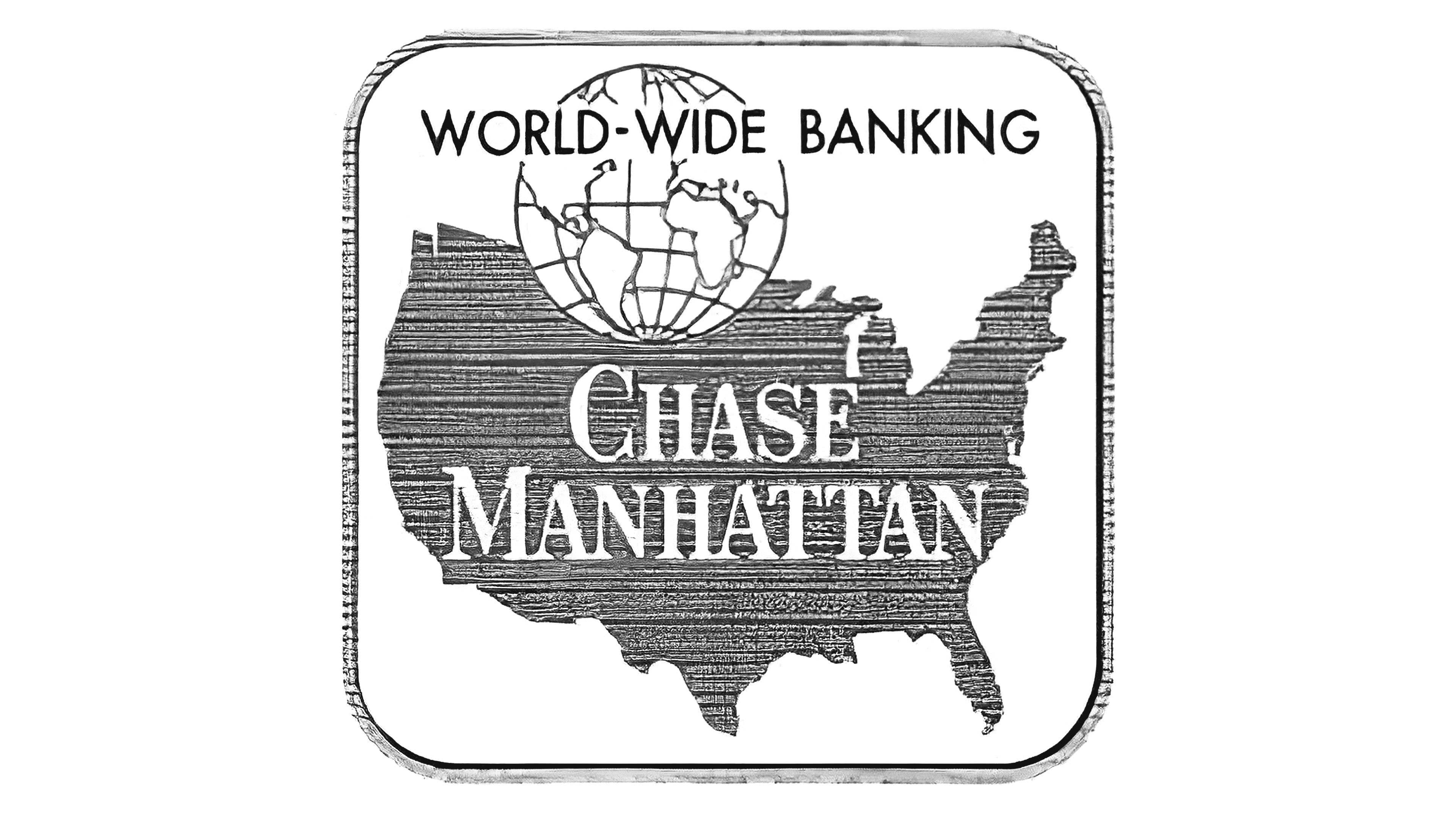
Introducing the “Chase Manhattan” merged bank identity brought another new logo. This one had many more graphical elements to it, intended to represent the company’s global reach and its origins.
A geographical representation of the United States appeared behind the words “Chase Manhattan” in a bold, serif font.
A picture of a globe was also included on the top of the image, with the words “World Wide Banking” across the top of a curved square frame.
The Chase Bank logo modernized significantly during the 60s, introducing the first iteration of the iconic octagon symbol many know today. This emblem was created by a design bureau and included a capitalized sans-serif inscription set across four levels.
The multi-color octagon emblem was intended to symbolize confidence, loyalty, professionalism, and unity, with various carefully chosen colors. In the same year, a monochrome version of the same logo was also introduced to simplify the design even further.
1976
During the 1970s, Chase introduced a more “patriotic” version of its logo and refined some graphical elements. The new emblem featured only the word “Chase”, in all capital letters, within a sans-serif font. The wordmark and emblem were placed inside a rectangle, colored blue and red.
The font and the octagon shape appeared in white. The overall image was intended to be one of confidence, strength, passion, and reliability.
Finally, in 2005, the Chase logo was simplified and refined even further and drawn in a new color palette. The rectangular blue and red background disappeared, replaced with a simple white. The “Chase” wordmark changed its design slightly, with a more angular sans-serif option written in black.
The octagon in this variation of the JP Morgan Chase logo was a color of light blue, a shade typically associated with loyalty and reliability.
What does the Chase bank logo mean? Chase logo meaning
Throughout Chase bank logo history, we’ve seen several different iterations of the company’s emblems intended to represent the different stages of the company’s lifecycle. The journey began in 1799 with the launch of the Manhattan company.
As the bank progressed through various mergers and changes, its image transformed with it.
However, despite the evolutions in design, Chase bank has always aimed to maintain a relatively consistent visual appearance that conveys professionalism, trustworthiness, and excellence. Today, the Chase bank symbol highlights the dependability and stability of the business.
The octagon was chosen to represent a bank vault and, by extension, the concepts of trust and security crucial to a financial institution.
The JP Morgan Chase logo fonts, and colors
The elements of the JP Morgan Chase logo have changed a couple of times over the years with the brand’s evolution. Initially, the company started out with a simple monochrome logo before eventually experimenting with various colors.
Similarly, we’ve also seen several different variations of the official Chase bank font.
In the first few decades, the font chosen was serif typography, often used to indicate expertise and sophistication. However, in recent years, the company has shifted to a more modern, sans-serif alternative. You can find some useful Chase logo resources here:
What color is the Chase bank logo?
As mentioned above, the Chase bank logo colors have seen a few changes over the years, from a simple monochrome palette to a patriotic design. Today, the Chase bank logo color palette was chosen to highlight the credibility and trustworthiness of the company.
The image features a simple black wordmark on a white background with a blue octagon.
The official colors are:
Eerie Black:
Hex: #211E1E
RGB: (33, 30, 30)
CMYK: 0, 0.090, 0.090, 0.870
Bright Navy Blue:
Hex: #117ACA
RGB: (17, 122, 202)
CMYK: 0.915, 0.396, 0, 0.207
What font does the Chase bank logo use?
The Chase Bank logo font is a simple sans-serif typeface with sharpened edges intended to showcase power and confidence. The font is similar in style to the Zekton bold font, available for free online. However, it is a custom typeface specifically chosen for the brand.
Cashing in on the Chase bank symbol
Though the Chase bank logo has seen quite a few changes over the years, the company’s overall image and essence have remained relatively consistent throughout a huge lifespan.
Over the centuries, Chase bank has only altered its logo a handful of times, usually in response to a major merger or a change in its name.
Today, the Chase bank logo is a powerful symbol in the financial industry and an excellent example of how branding can convey a company’s stability and strength.
Fabrik: A branding agency for our times.

Clarity starts with a conversation.
Thanks—we’ll get back to you shortly.
Whether you're navigating a rebrand, merger, or simply need a clearer identity—we’re here to help. No hard sell, just honest advice from people who know the sector.
Let’s start with a simple question…
Prefer to email? Drop us a line.
Fabrik’s been helping organisations rethink and reshape their brands for over 25 years. We’ve guided companies through mergers, rebrands and new launches. Whatever stage you’re at, we’ll meet you there.