


HSBC logo: How the HSBC UK logo evolved over time
If you’re familiar with the banking and financial world, you’re probably aware of the HSBC logo. One of the better-known banking companies in the British landscape, the HSBC brand has offered customers financial services for over 150 years.
At first glance, the HSBC UK logo might seem a little unusual. This geometric emblem is quite different from some of the other bank logos we see throughout the world.
However, modern design serves an essential purpose. It’s impactful, meaningful, and emotionally charged, designed to convey ideas of safety and confidence to its target audience.
If you’ve ever wondered where the HSBC logo came from, or you’re looking for inspiration for your own financial services logo design, read on for an overview of the HSBC logo history.
HSBC meaning: An introduction to the HSBC brand
Let’s start with an introduction to the HSBC brand. HSBC stands for the “Hongkong and Shanghai Banking Corporation.” This may seem like an unusual name, considering HSBC is best known for serving the United Kingdom, but it’s actually a reference to the company’s founding member.
The HSBC bank was founded by a Scottish banker, Thomas Sutherland, in the British colony of British Hong Kong, in 1865.
It was formally incorporated as the “Hongkong and Shanghai Banking Corporation” to begin with and maintained this relatively long name for a while before eventually switching to just HSBC.
HSBC Holdings (PLC) was a non-trading shelf company at first before it became the parent company of the Hongkong and Shanghai Banking Corporation in 1991. Since then, the HSBC headquarters has moved to London, in the United Kingdom.
Today, HSBC Holdings is the largest bank in Europe according to total assets. It currently has around $2.953 trillion in assets and offices in 64 territories and countries.
HSBC also serves around 40 million customers worldwide and is ranked as the 38th largest company in the world according to profits, sales, market value, and assets.
HSBC tagline and other brand details
Like most banking companies, HSBC’s brand identity consists of several factors. HSBC is organized into three business groups, one for commercial banking, one for global banking, and another for wealth and personal banking. However, all of these arms use the same logo and branding.
What is the new name of HSBC?
Technically, the new name of HSBC is “HSBC.” Initially, the company’s name was the Hongkong and Shanghai Banking Corporation. However, the name HSBC was chosen as a shorter, catchier, and easier-to-remember title when the company positioned itself within the United Kingdom.
Is HSBC a Chinese bank?
The initial company launched by HSBC was founded within the British Hong Kong region in China. However, the organization today identifies as a British multinational bank with financial services offered across the globe.
What is the HSBC tagline?
The HSBC tagline used to be “The World’s Local Bank.” However, the company has since stopped using this slogan in most marketing strategies. In some cases, the company does continue to use the phrase “Together we Thrive.”
HSBC logo history: The evolution of the HSBC logo
Despite its extremely long lifespan, the HSBC company hasn’t changed its logo significantly over the years. In fact, for a significant portion of the organization’s history, the logo was a complex, traditional, and relatively ornate crest-style emblem.
The only major redesign implemented by the company was introduced in 2018 to help refine and strengthen the organization’s identity.
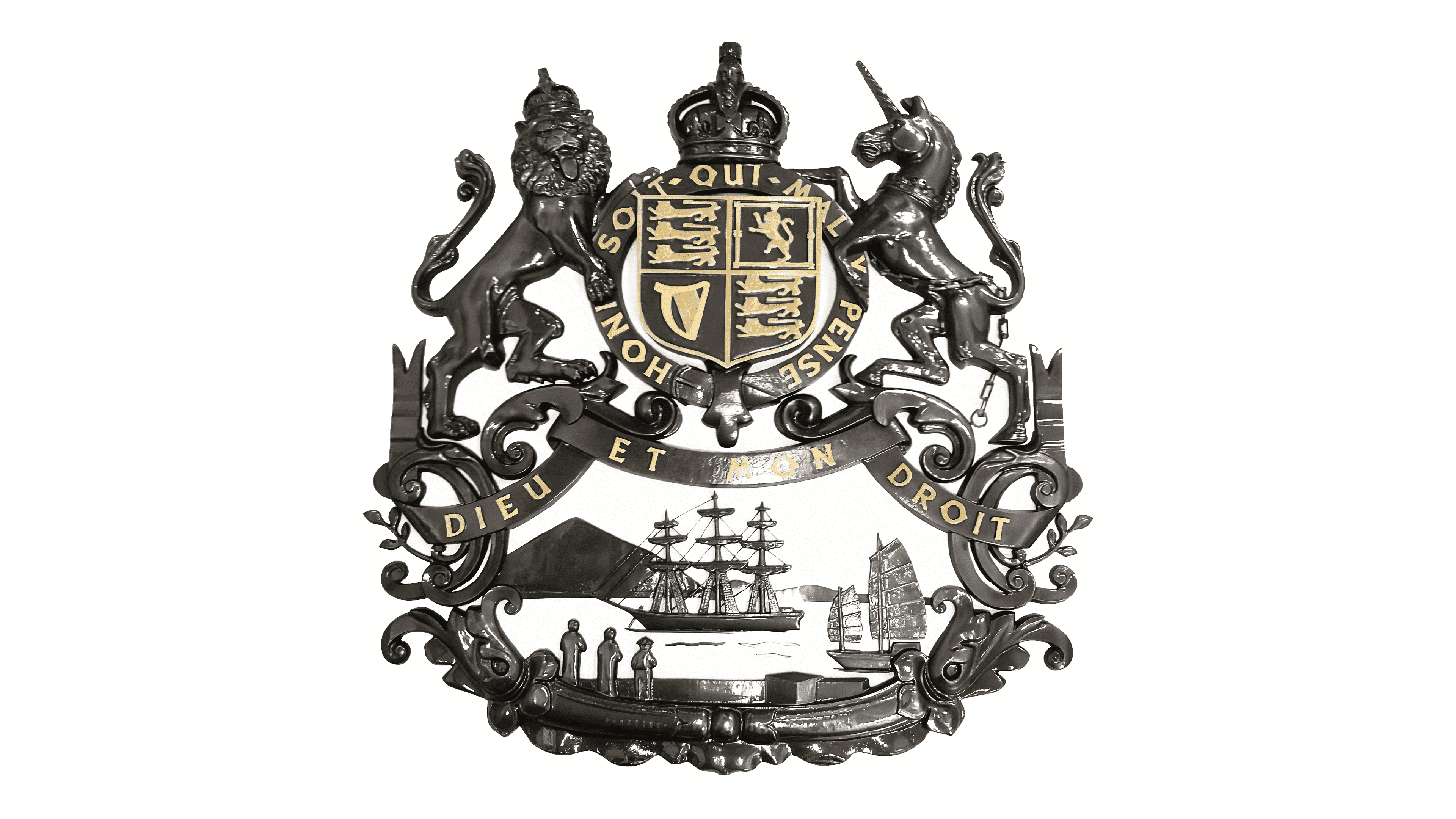
When HSBC initially launched, its logo was an extremely complex and classic emblem, full of heraldic symbols and ornaments. It looked similar to a family crest and was intended to showcase heritage, professionalism, and sophistication.
The crest included many features you might see on the traditional crest for the United Kingdom, such as a lion wearing a crown and a unicorn. Various other unique elements were also present, such as a mountain, a ship, and some variations of the British three lions’ flag.
This logo was beautiful but highly intricate and perhaps not suited to the modern world.
1983
In 1983, a brand-new logo was created for the HSBC brand, intended to demonstrate its transition into the modern world and focus on new customers.
This elegant design was the first to show the HSBC name, and it also introduced the geometric red and white emblem we associate with the company today. The image included the letters “HSBC” in a simple serif-style font.
To the right of the image, we see a unique shape of a series of four red triangles and two white triangles.
The design is intended to look similar to a box being opened on two sides. This geometric shape reminds us of concepts like discovery and protection. The color choices are particularly relevant in this logo.
The black and white typography shows sophistication and professionalism, while the red and white geometric shape highlights concepts like passion and strength.
2018
In 2018, HSBC updated its brand image while maintaining most of the original elements from the logo introduced in the 1900s. At this point, the company shifted its red and white box shape positioning, moving it to the left of the wordmark instead of the right.
The coloring for the red was also made slightly darker to make the image appear bolder and more serious.
Perhaps the most significant change made to the HSBC logo in 2018 was the introduction of a bold sans-serif font to replace the traditional serif alternative. Today’s HSBC logo features a fun, modern, and contemporary typeface, ideal for a more forward-thinking brand.
HSBC logo colors, and fonts
Today, the HSBC logo symbolizes creativity, passion, strength, and commitment. The font choice places HSBC alongside several other financial companies and business leaders who have switched to sans-serif, modern typefaces in recent years.
Sans-serif fonts are often considered stronger, more contemporary, and easier to read on digital screens.
For most people, the most compelling part of the HSBC logo is still the geometric design included alongside the wordmark. The red and white shape, which some call the “HSBC bow,” is a compelling yet simple image.
It reminds us of an opening box, promising enlightenment, discovery, and even security. If you want to explore the HSBC logo elements in greater depth, you can find some valuable resources here:
What color is the HSBC logo?
The HSBC logo colors have remained relatively consistent over the years. In the initial design, the logo featured a monochrome grey, black, and white appearance. When the company updated its brand visuals, it chose the colors black and red as its primary shades.
The lettering is black, demonstrating sophistication, power, and strength. The other HSBC logo color is a deep, powerful red. This shade is often associated with confidence, passion, and virality. Initially, the red in the HSBC logo was much brighter than the color we know today.
The shift to a slightly darker shade of red may have been based on the idea that this hue could appear more professional and less jarring.
The HBSC red has the following codes:
KU Crimson:
Hex: #DB0011
RGB: (219, 0, 17)
CMYK: 0, 1, 0.922, 0.141
What font does the HSBC color use?
Aside from the slight change to the HSBC logo color, the font change is perhaps the most significant alteration made to the HSBC logo in recent years. Originally, the font was similar to the classic Times New Roman, a popular serif font.
Today, the HSBC logo font is a custom cut of the classic font Unvers Next. According to HSBC, the font was carefully selected to appeal to a global audience.
The value of the HSBC logo
Despite a long and complex history, the HSBC logo has remained relatively consistent throughout the years, demonstrating the strength of the brand’s imagery.
HSBC has only made a few major changes to its logo throughout its lifetime, starting with switching away from the classic coat of arms style emblem.
Today, the HSBC logo is a modern, clean, and sophisticated symbol of strength, passion, and creativity. The beautiful yet minimalistic logo makes us think of enlightenment, discovery, safety, and security.
Fabrik: A branding agency for our times.
Now read these:
—How to brand a financial services product
—Discover popular bank logos and names
—The history of the Bank of America symbol
—Explore Fabrik’s financial branding services

Clarity starts with a conversation.
Thanks—we’ll get back to you shortly.
Whether you're navigating a rebrand, merger, or simply need a clearer identity—we’re here to help. No hard sell, just honest advice from people who know the sector.
Let’s start with a simple question…
Prefer to email? Drop us a line.
Fabrik’s been helping organisations rethink and reshape their brands for over 25 years. We’ve guided companies through mergers, rebrands and new launches. Whatever stage you’re at, we’ll meet you there.