


Deutsche Bank logo: The evolution of the iconic Deutsche Bank logo
If you’re familiar with the financial landscape, you may know the Deutsche Bank logo. One of the most recognizable emblems in the industry, the Deutsche Bank symbol is a simple, modern, and effective brand asset, ideal for conveying the strength of the brand.
However, even if you know the Deutsch icon today, you might not know much about where this image came from or how it made Deutsch Bank so famous.
Whether you’re interested in bank logos in general, creating your own financial emblem, or just want to know more about Deutsche Bank, we’re here to help.
Today, we will explore the history and evolution of the Deutsche Bank icon and discuss how it has helped the company to thrive over the decades.
Why is Deutsche Bank so famous? An introduction
Before we explore the components and history of the Deutsche Bank logo, let’s start with a basic introduction to the brand. Sometimes known as “Deutsche,” the Deutsche Bank is a German financial services company and bank headquartered in Frankfurt.
It was first launched in 1869, more than 150 years ago, and has grown throughout the years due to multiple acquisitions. As of 2018, the bank’s network spanned 58 countries. However, Deutsche Bank has a particularly strong presence in the European landscape.
According to the Financial Stability board, the organization is defined as a “systemically important” bank. However, the company has been the subject of significant scrutiny over the years.
The organization has something of an abject reputation, as it has been involved in various scandals across the years.
Over the years, the Deutsche Bank has been connected to everything from the financial crisis of 2007 and 2008. It has also played a role in various espionage and tax evasion scandals, conducted business with some unsavory characters, and even been involved in money laundering operations.
Deutsche Bank logo history: The evolution of the Deutsche icon
The Deutsche Bank, like many long-lasting financial companies over the years, has had several symbols connected to its name.
In the early years, the Deutsche Bank logo was a relatively complex design, similar to that of a crest. As the organization evolved, it experimented with various, more simplistic symbols. Let’s take a closer look at Deutsche Bank’s logo evolution.
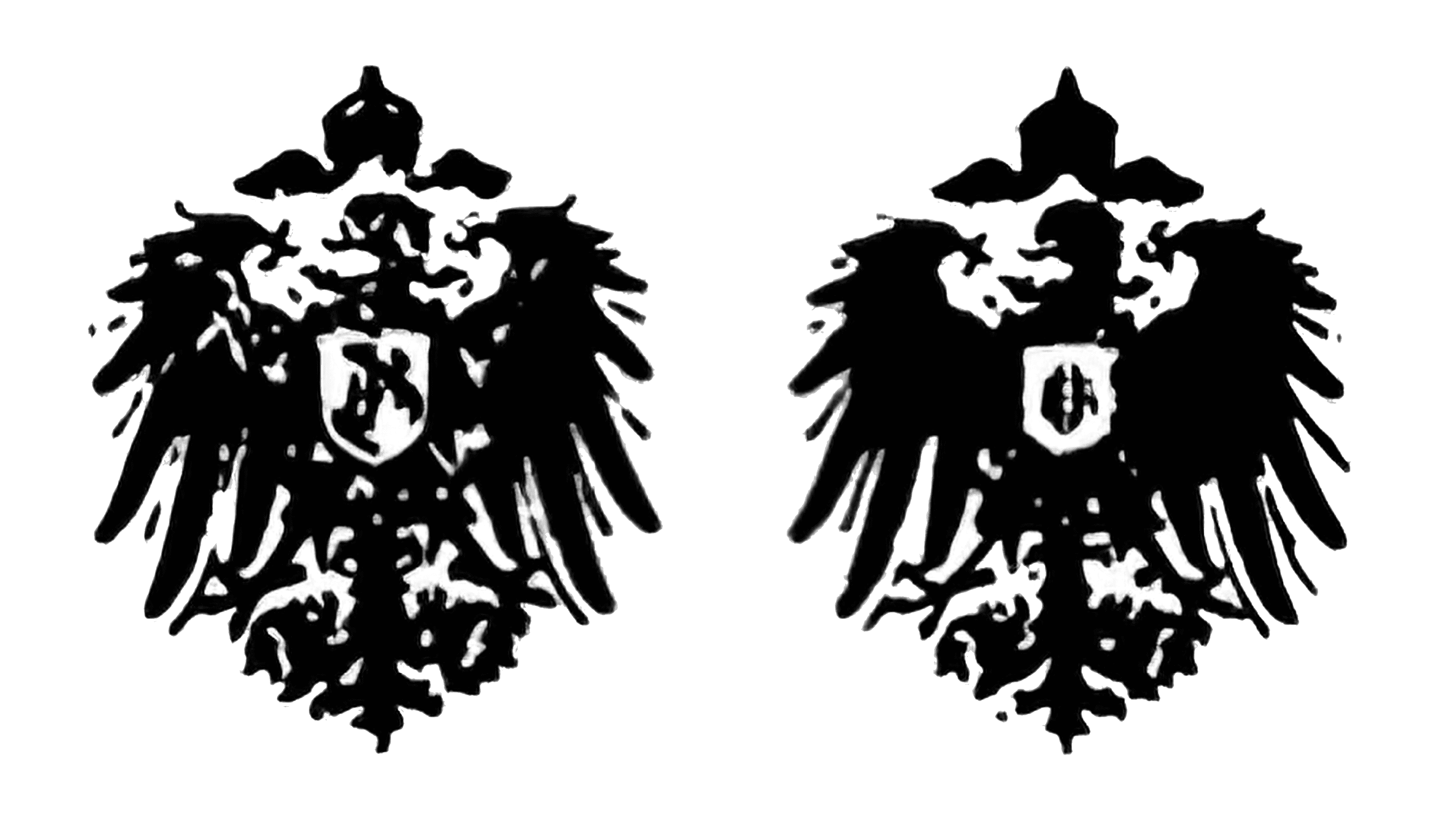
One of the earliest variations of the Deutsche Bank logo was introduced in the 1800s.
Similar to many traditional banks, the company used a crest-style symbol for its emblem at this time. The image featured an imperial eagle, which the company used for almost half a century. However, some changes were occasionally made to the shield on the eagle’s chest.
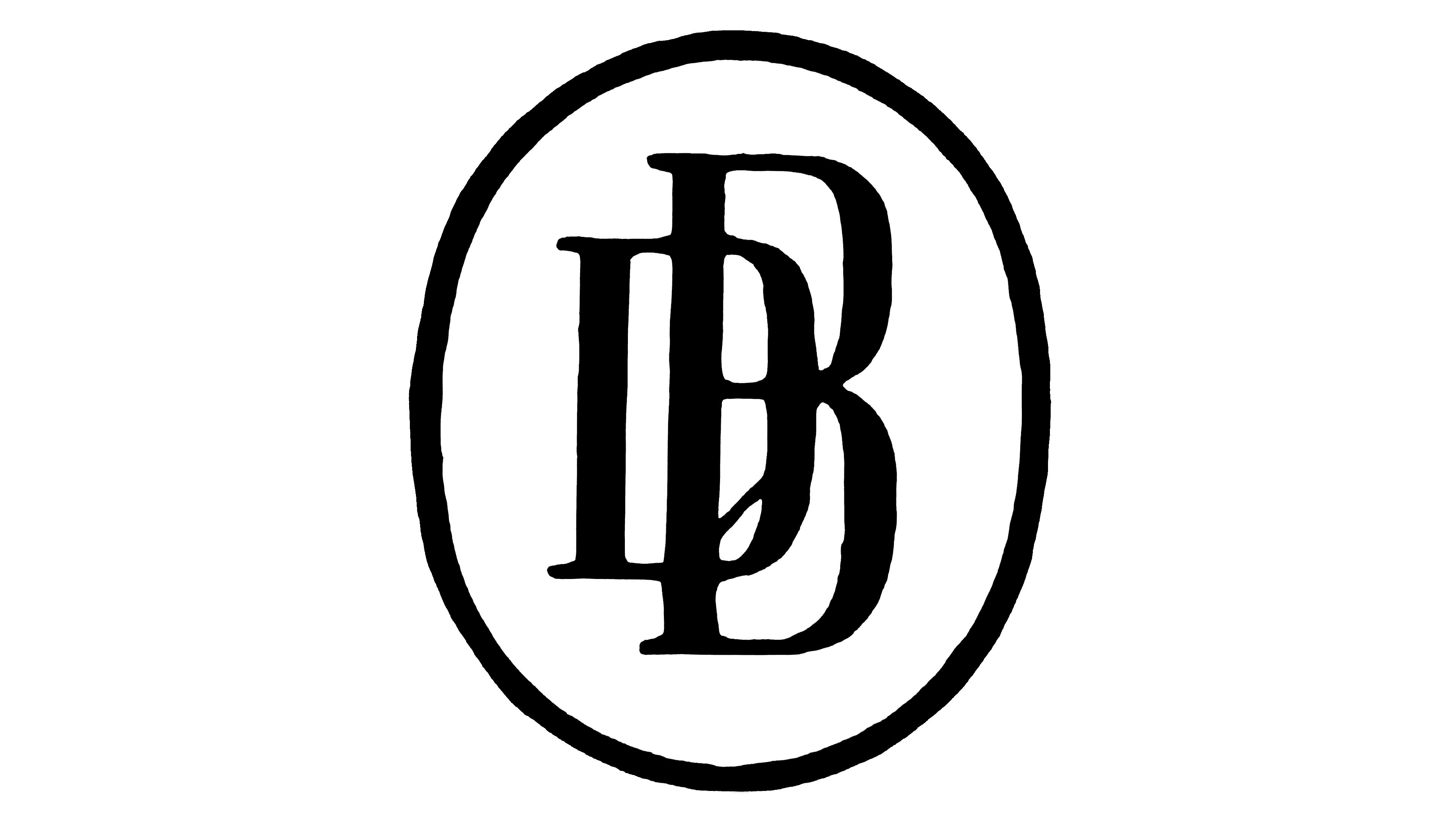
In 1919, the Deutsche Bank logo was simplified significantly. The company created a bold and elegant icon in a circular medallion. Within the circle, the two initials for the company’s name are made into an intertwined monogram.
The two letters were slightly stylized to convey a sense of sophistication and elegance.
The shape of the “G” tail is also similar to an arrow, which may have been the company’s way of highlighting its focus on growth and the future.
Following a merger with Disconto-Gesellschaft in 1929, the Deutsche Bank team updated their logo again, returning to the Eagle emblem. This variation shows a cleaner, more minimalistic version of the bird, which looks a little like an Eagle from a coat of arms.
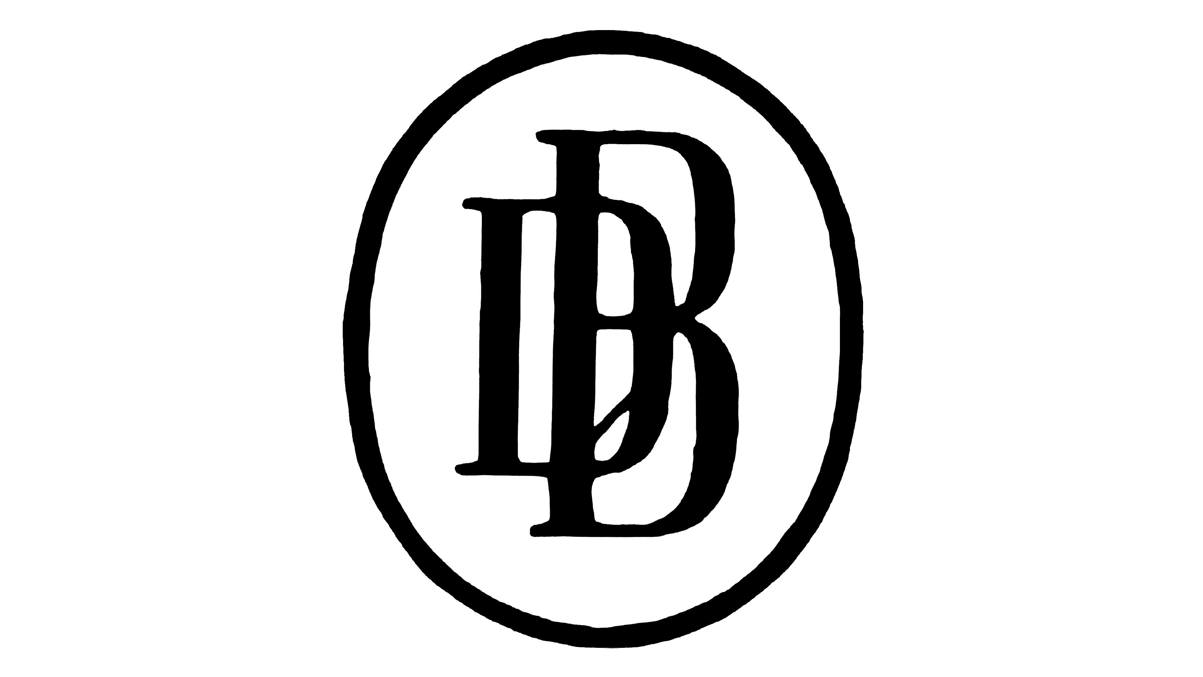
In the 1930s, the Deutsche Bank eliminated its eagle imagery yet again, once again returning to a simple icon with a circular border. The circle was a little more elongated and oval-shaped in this design, and the font for the monogram was updated.
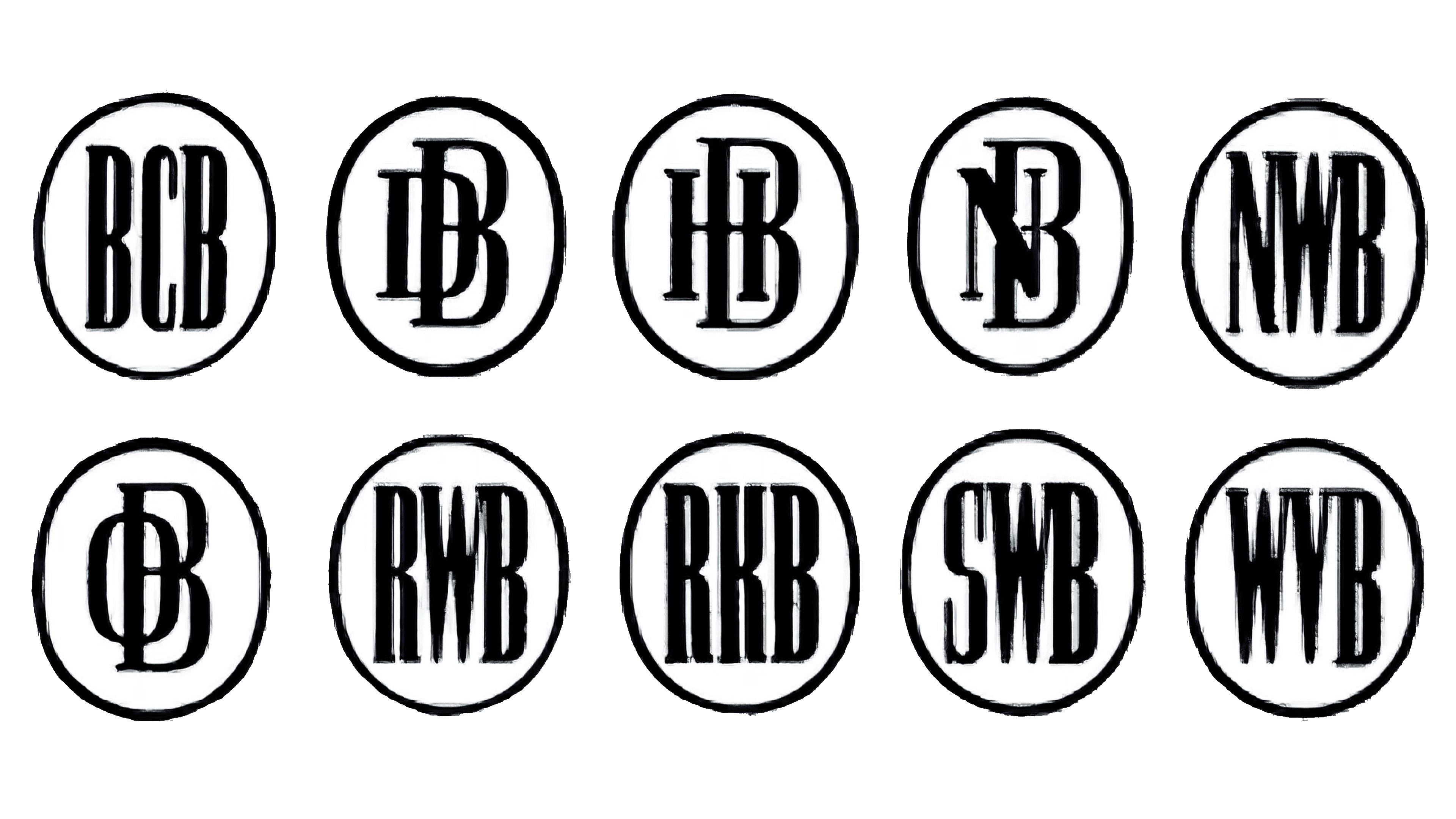
Throughout the 1940s and 50s, the company experimented with the placement of its letters with various designs.
The new versions of the logos were typically introduced following various mergers and incorporations. In the examples above, we can see several different partner banks making their way into the Deutsche Bank symbol, if only for a short time.
In 1952, the Deutsche Bank introduced a new version of its logo which would later inspire some of the designs we saw in the 2000s. These logos were composed of flat oval shapes, with letters in the middle. The oval outlines were separated into small square and rectangular shapes.
This design only remained with the company briefly before the brand eventually returned to the previous oval-shaped emblem. This design stayed with the company for approximately 20 years.
In 1974, Deutsche Bank introduced a version of its logo similar to the one we know today. This image included the full name of the company, written in English, with a sans-serif font choice. The design also introduced the graphic featuring a box with a diagonal line in the center.
2010
In 2010, Deutsche Bank updated the coloring of its logo to feature the popular shade of blue. Dark blue is often associated with reliability and credibility in the branding world, making it an excellent choice for a company focusing on finance.
The font choice for the company also changed slightly, becoming a little thinner and sleeker. In some cases, the company also began to separate the wordmark from its logo entirely, using nothing but the square with the slash in the center.
What does the Deutsche Bank logo mean?
The Deutsche Bank logo as we know it today is an interesting and eye-catching emblem created for a modern audience. The design was created by a graphic artist and painter named Anton Stankowski and was chosen out of a wide selection of emblems displayed at the bank.
The emblem today has several potential meanings, depending on how you look at it.
The blue coloring helps to identify Deutsche Bank as a reliable, credible, and professional brand. The box with the slash in its center looks similar to a lockbox, or money bank, which could be one of the reasons the company chose this design.
According to the Deutsche Bank branding team, the slash shape stands for consistent growth and dynamic development, highlighting the innovation of the business. On the other hand, the square shape is intended to symbolize security, strength, and protection.
Deutsche Bank symbol, colors, and typography
Regardless of how you feel about the Deutsche Bank’s reputation, it’s impossible to ignore the impact of its iconic logo. The slash symbol in the blue box has become so iconic, it no longer needs to be connected with the Deutsche Bank wordmark in some marketing materials.
Today, the symbol is a sign of authority and excellence for the company. It helps convey the brand’s commitment to strength and security and its focus on progress and innovation. The blue coloring also associates the brand with concepts like credibility and trustworthiness.
If you want to dive into the Deutsche Bank symbol a little further, here are some useful resources:
What color is the Deutsche logo?
The Deutsche logo color palette was presented simply in black and white for a long time. It wasn’t until recently that the company began experimenting with new Deutsche logo colors. Today, the company’s design features a dark blue image on a white background.
Pantone Blue:
Hex: #0018A8
RGB: (0, 24, 168)
CMYK: 1, 0.857, 0, 0.341
What font does the Deutsche logo use?
As mentioned above, the Deutsche logo font isn’t always present on every branding asset the company creates. However, it’s still a part of the company’s core visual identity. The Deutsche bank typeface is a simple, sans-serif option written in standard sentence case.
The typeface used is similar to Univers Next 630 and has been used in bold and straightforward variations.
Exploring the Deutsche Bank logo
The Deutsche Bank logo is an interesting example of how companies in the financial sector can enhance their identity and reach a new audience with the right branding.
Over the years, the Deutsche Bank changed its symbol several times before eventually settling on a highly contemporary and eye-catching design, as seen above.
Today’s Deutsche icon is compelling, attractive, and excellent at conveying trust and security. The image even works as a standalone emblem, with or without the wordmark.
Fabrik: A branding agency for our times.

Clarity starts with a conversation.
Thanks—we’ll get back to you shortly.
Whether you're navigating a rebrand, merger, or simply need a clearer identity—we’re here to help. No hard sell, just honest advice from people who know the sector.
Let’s start with a simple question…
Prefer to email? Drop us a line.
Fabrik’s been helping organisations rethink and reshape their brands for over 25 years. We’ve guided companies through mergers, rebrands and new launches. Whatever stage you’re at, we’ll meet you there.