NatWest logo history, meaning and evolution

If you’re familiar with banking institutions in the United Kingdom, you’ve probably seen this eye-catching three-dimensional symbol before. However, many people don’t know much about NatWest logo history and how the icon evolved into what we know today.
Like many iconic bank logos, the company carefully chose the NatWest symbol to highlight its core values and philosophies. Today, the emblem is intended to convey strength, connectedness, compassion, and community.
Although NatWest has altered its logo several times over the decades, the company has maintained a relatively consistent visual identity, using similar shapes and components. Today, we will take a closer look at the NatWest bank logo throughout the years.
Introducing the NatWest brand
Before we explore the core components of the NatWest logo, let’s take a closer look at the NatWest brand and how it has transformed throughout the years. Unlike other financial institutions in the UK, NatWest may seem like a relatively modern bank, officially launching in 1968.
Otherwise known as the National Westminster bank, the institution was established via the merger of two well-known entities, the National Provincial Bank and the Westminster Bank.
In 2000, the company became a part of the Royal Bank of Scotland Group, which updated its name to the NatWest Group within the same year.
Today, NatWest is owned both by NatWest Holdings and the British government.
It’s considered one of the biggest clearing banks in the UK and has a network consisting of more than 860 branches. The company has over 850,000 small business accounts and over 7.5 million personal customers. It also operates through the “Ulster Bank” brand in Northern Ireland.
NatWest logo history: The NatWest bank logo
Over 50 years of evolution, the NatWest bank has made a handful of changes to its visual identity. However, the branding for NatWest has almost consistently included a wordmark and a geometric shape, designed as the company’s core emblem.

After the National Provincial Bank and Westminster bank merger, NatWest unveiled its brand-new identity in 1968, with many elements similar to the branding we know today.
In this logo, the company used its full name, “National Westminster Bank,” presented in a simple, sans-serif font across three levels. The logotype is placed alongside a geometric emblem.
The three wide arrow shapes included in the emblem are said to represent the District Bank, Westminster Bank, and the National Provincial Bank, which all came together to create the new NatWest identity.
At the same time, the symbol symbolizes the endless circulation of the economy’s financial resources. The triangular lines are connected to form an eye-catching windmill-type shape in the white space at the center.

2003
After using the same logo for several decades, NatWest officially updated and refined its image in 2003, exploring a wider color palette for the first time.
The logotype on the design was updated to include the company’s shortened name, “NatWest,” in sleek sans-serif letters. The wordmark was presented in white on a bold purple background.
The colors conveyed sophistication and luxury, while the pink and red shades within the three arrows were intended to highlight the compassion of the brand. These colors formed the foundation of the new color palette for the NatWest company.

2014
In 2014, the NatWest logo was refined again. The background and font colors were inverted, so the name appeared in purple on a white background. However, the typeface remained the same.
The gaps between the arrows in the emblem were widened slightly, and the gradient coloring was removed to create a more impactful, simple image.

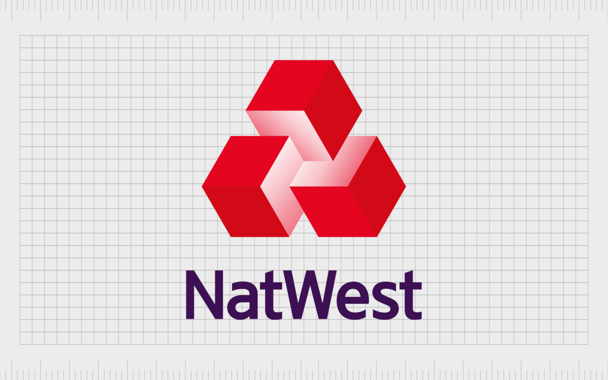
The most recent version of the NatWest logo was introduced in 2016. This version of the design transformed the arrows into three connected blocks. The three-dimensional image gave the company a sense of modernity and linked it to innovation and growth.
The designers also changed the positioning of the logo so the wordmark appeared underneath the volumetric cubes. The blocks in the logo were intended to convey the rich, complex, and diverse services offered by the NatWest banking group.
NatWest branding: What does the NatWest logo mean?
NatWest has consistently worked to convey meaning in its logo choices. Initially, the company’s three arrows were used to identify the core companies that came together to form the NatWest brand. They were also associated with ideas like innovation and movement.
The most recent NatWest logo removed the arrows in favor of three volumetric cubes representing the “building blocks” of the bank’s services. The connected boxes convey the company’s efforts to combine various banking services into one package.
The emblem isn’t the only interesting part of the NatWest logo. The color choices are compelling too. Purple is often associated with wealth and luxury, while pink and red convey ideas of compassion and power.
Even the typeface is carefully chosen, with a rich but simple sans-serif font intended to make the company appear modern and friendly.
Who designed the NatWest logo?
Futurebrand introduced the most recent version of the NatWest identity. According to the company, the blocks still represent the interlocking components of the NatWest company and the businesses that came before it.
What is the NatWest slogan?
The NatWest slogan, like many banking taglines, has gone through several changes over the years. The company has used phrases like “Helpful Banking” and “We are what we do” in the past, as well as “To Save and Invest, Talk to NatWest.”
The NatWest symbol: Colors and typography
The NatWest logo is a compelling design that connects the company to its heritage and its core values of innovation, compassion, and growth.
The three blocks in the logo represent the companies that came together to form the new brand and the diverse services NatWest can offer its consumers.
The color choices chosen by the brand help the company to stand out from its competitors in a world where many financial companies stick to shades like blue and black. They also connect the organization with ideas of compassion, strength, and confidence.
If you want to explore the NatWest logo in closer detail, you can find some useful resources here:
What color is the NatWest logo?
The NatWest logo colors evolved drastically over the years. Like many financial institutions, the company experimented with a simple black-and-white emblem, to begin with. Eventually, they upgraded their color palette to include red, purple, pink, and white shades.
Today, the NatWest logo color palette conveys ideas of passion, care, strength, security, wealth, and luxury. We can see all of the following colors within the NatWest bank logo:
American Purple:
Hex: #401664
RGB: (64, 22, 100)
CMYK: 0.36, 0.78, 0, 0.607
Amaranth Red:
Hex: #D71C2B
RGB: (215, 28, 43)
CMYK: 0, 0.869, 0.8, 0.156
Imperial Red:
Hex: #EE2033
RGB: (238, 32, 51)
CMYK: 0, 0.865, 0.785, 0.066
American Pink:
Hex: #F78E99
RGB: (247, 142, 153)
CMYK: 0, 0.425, 0.380, 0.031
Light Red:
Hex: #FBC9CF
RGB: (251, 201, 207)
CMYK: 0, 0.199, 0.175, 0.015
Piggy Pink:
Hex: #FEDFE2
RGB: (254, 223, 226)
CMYK: 0, 0.122, 0.110, 0.003
What font does the NatWest logo use?
NatWest chose a simple and streamlined sans-serif font for its logo. The official NatWest logo font is known as NatWest TextNormal Regular. It’s similar in style to the Interstate Regular or RN House Sans font options.
Exploring the NatWest logo
The NatWest logo is one of the most eye-catching and unique emblems in the financial sector. A world apart from most of the other banking logos we see throughout the landscape, this logo is a symbol of strength, versatility, and compassion.
Throughout NatWest logo history, the company has consistently set itself apart from its competition by combining modernity and heritage into a unique identity.
Fabrik: A branding agency for our times.
Clarity starts with a conversation.
Thanks—we’ll get back to you shortly.
Whether you're navigating a rebrand, merger, or simply need a clearer identity—we’re here to help. No hard sell, just honest advice from people who know the sector.
Let’s start with a simple question…
Prefer to email? Drop us a line.
Fabrik’s been helping organisations rethink and reshape their brands for over 25 years. We’ve guided companies through mergers, rebrands and new launches. Whatever stage you’re at, we’ll meet you there.


