BNY Mellon history: BNY Mellon logo evolution over the years

You don’t have to be a financial expert or investor to be familiar with the BNY Mellon logo. One of the most recognizable symbols in the money management world, the BNY logo has quickly captured the attention of countless consumers and corporations over the years.
Although the BNY Mellon bank may seem relatively new, the history of its logo and brand image goes back several years. In fact, over the decades, this company hasn’t just changed its logo but its entire brand identity, embracing various new names and color palettes.
Today, we will be taking a closer look at BNY Mellon history, and how the logo of the leading bank has transformed across the decades.
What does BNY Mellon stand for? BNY Mellon history
Before we start discussing the BNY logo, it’s worth getting a clearer insight into the BNY Mellon business. The term “BNY” in BNY Mellon stands for “Bank of New York.” The BNY Mellon company is an American investment banking services group headquartered in New York City.
This organization has officially been running as the “Bank of New York Mellon,” or BNY Mellon, since 2007, following the merger between the Mellon Financial Corporation and the Bank of New York.
However, before that, the elements of the company we know today existed for more than 200 years. The Bank of New York was officially founded in 1784!
Thanks to the ancient origins of its predecessors, BNY Mellon is one of the three oldest banking companies in the United States, and it’s also among the oldest banks in the world.
The Bank of New York, founded in the 1700s, stems from America’s first-ever bank, the “Bank of North America.” Alternatively, Mellon Financial Corporation was an investment firm launched in 1870 focusing on managing high-net-worth individuals.
In 2006, the Bank of New York and Mellon Financial announced their impending merger, which helped to create the world’s largest securities servicing brand, and one of the biggest asset management firms worldwide. The deal was valued at around $16.5 billion.
Is BNY Mellon the biggest bank?
Banks come in many different shapes and sizes, with unique services and areas of focus.
The BNY Mellon bank is currently regarded as the largest bank in the world for custodian and security services. It’s also considered to be a “systemically important” institution, according to the Financial Stability Board.
The bank holds over $46.7 trillion in assets under custody and $2.4 trillion under management.
Who owns BNY Mellon Bank?
The Bank of New York Mellon is owned mostly by Institutional Investors, who hold and control about 85.72% of the corporation’s shares. The shareholders receive a higher interest rate than almost any other bank in the industry.
Does BNY Mellon have a good reputation?
No matter how you feel about the BNY logo, it’s hard to overlook its fantastic reputation. BNY Mellon has been named one of the most admired companies in the world by publications like FORTUNE magazine.
BNY logo: The Bank of New York Mellon logo
The official BNY Mellon logo, created following the merger between Mellon Financial and the Bank of New York, is currently the corporation’s only emblem.
However, we can learn more about BNY Mellon logo history by looking back at some of the previous logos of the companies that formed the new corporation.

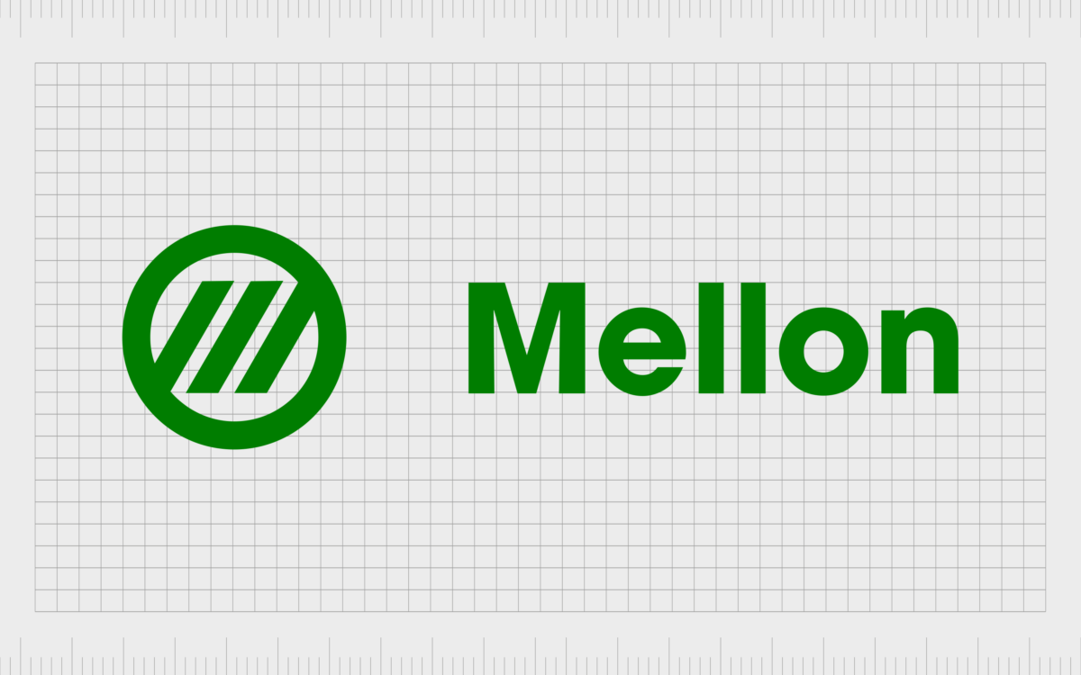
While the Bank of New York is a lot older than Mellon Financial, Mellon’s logo was one of the longest-lasting. Between 1869 and 2007, Mellon used the same logo, featuring a green sans-serif wordmark alongside a circular image with three diagonal lines in the middle.
The green coloring in the logo was a fantastic choice for Mellon, as the shade is often associated with concepts like money and wealth.

1937
One of the earliest examples of our logos for the “National Bank of New York,” the brand name used previously by the “Bank of New York,” offers an excellent insight into the nature of old-fashioned bank logos.
This symbol looks more like a crest than a modern emblem, with several unique components, including a wordmark in a bold serif font.
Various people are depicted within the emblem, which seems to be crowded around a kind of vault, drawing attention to the company’s service area.

One of the first recorded versions of the “Bank of New York” was a simple, serif-style wordmark on four levels, placed on a red background. The red and white logo was intended to symbolize strength, sophistication, and confidence for the organization.
Interestingly, the typography used in this logo is similar to the font style for the Bank of New York Mellon logo today. The serifs are almost the same, though this original logo’s kerning between the letters is a little tighter.

As the Bank of New York evolved, it began experimenting with different logo styles. In 2006, the company introduced a rather modern and eye-catching logo featuring a geometric graphic alongside a wordmark combining serif and sans-serif fonts.
The playful wordmark showed a creative and innovative side to the bank. The multi-colored square placed alongside the typography choice also helped the brand to seem more diverse, welcoming, and inclusive.

2007
When Mellon Financial and the Bank of New York joined forces, the company created an entirely new logo to represent sophistication, excellence, and expertise. Today’s image of the bank is a combination mark consisting of a serif-style wordmark and an arrow.
The arrow in the BNY Mellon logo is made up of three distinct components in colors of silver and gold, intended to represent wealth, progression, ambition, and innovation. The simple grey wordmark helps to highlight the sophisticated nature of the business.
The BNY Mellon logo meaning, colors, and fonts
Today, the BNY Mellon logo doesn’t include many of the initial elements we’ve seen in the previous companies that came together to form the new brand. The closest connection is the serif-style typography used in the older Bank of New York logo.
Rather than combining elements of the two previous company’s images into something new, BNY Mellon seems to have created a new image and identity from scratch.
Today’s components of the Bank of New York Mellon logo send an essential message about the personality and nature of the company to its customers and partners.
The gold and silver elements remind us of money and precious valuables, while the arrow is often used in logo design to represent innovation and progression. The serif font showcases the company’s traditional and sophisticated nature.
You can find some valuable BNY Mellon logo resources here if you want to explore the design further:
What color is the BNY Mellon logo?
The BNY Mellon logo colors are perhaps one of the most intriguing parts of the symbol. The choice to use metallic colors like gold, bronze, and silver in the imagery directly connects the company to the concepts of wealth management and value.
The soft grey in the BNY Mellon logo color palette also helps the company to appear more sophisticated and professional.
The colors included in the BNY Mellon logo are:
Quick Silver:
Hex: #A7A5A6
RGB: (167, 165, 166)
CMYK: 0, 0.011, 0.005, 0.345
Dark Silver:
Hex: #4F4C4D
RGB: (79, 76, 77)
CMYK: 0, 0.037, 0.025, 0.690
University Of California Gold:
Hex: #B07E25
RGB: (176, 126, 37)
CMYK: 0, 0.284, 0.789, 0.309
Light Taupe:
Hex: #A49668
RGB: (164, 150, 104)
CMYK: 0, 0.085, 0.365, 0.356
What font does the BNY Mellon logo use?
As mentioned above, the BNY Mellon logo font is similar to the typeface used by the previous Bank of New York logo. The design is very similar to classic serif fonts like Times New Roman. According to experts, the text on the logo is FF Scala Pro Bold Font, designed by Martin Majoor.
Banking on the BNY Mellon logo
Today, the BNY Mellon logo is a fantastic insight into how companies in the financial sector can create a sense of trust and credibility with the right image. Though relatively simple, the Bank of New York Mellon logo is an eye-catching and engaging emblem that hits all the right notes.
The serif typeface conveys professionalism and sophistication, particularly when paired with its grey coloring. The silver and golden elements of the logo remind us of wealth in the form of gold and silver coins.
Even the arrow shape in the emblem, pointing towards the right, tells us this company is focused on innovation and the future.
Fabrik: A branding agency for our times.
Clarity starts with a conversation.
Thanks—we’ll get back to you shortly.
Whether you're navigating a rebrand, merger, or simply need a clearer identity—we’re here to help. No hard sell, just honest advice from people who know the sector.
Let’s start with a simple question…
Prefer to email? Drop us a line.
Fabrik’s been helping organisations rethink and reshape their brands for over 25 years. We’ve guided companies through mergers, rebrands and new launches. Whatever stage you’re at, we’ll meet you there.


