ING Bank logo history: The evolution of the ING logo

Unless you’re an avid member of the financial landscape, you probably don’t know much about ING Bank logo history. After all, while many people are familiar with the iconic ING lion logo, only a handful can tell you where the famous emblem came from or why it has its distinctive color palette.
Like many bank logos, the ING emblem was designed with a purpose. Each element of the image, from the sophisticated lion to the bold serif font, is intended to convey a certain message. Specifically, ING uses its logo to position itself as an authoritative figure in the banking space.
The image is sophisticated and traditional, giving ING a fantastic sense of heritage.
If you’ve ever looked at the ING logo and pondered its meaning, or you simply want to learn a little more about the nuances of logo design, read on. Today, we’ll discuss the history, meaning, and elements of the ING Bank logo.
The ING lion logo: Introducing the ING Bank
To fully understand the ING Bank logo, we first need to identify the bank itself. The ING Group, as it is known today, is a multinational financial service and banking corporation with a headquarters in Amsterdam.
The Dutch company focuses primarily on direct, retail, commercial, wholesale, investment, and private banking.
Currently, ING holds around $1.1 trillion in assets, making it one of the largest banks worldwide. It’s also one of the top 10 European companies according to revenue. In 2020, ING had over 53 million clients worldwide. It’s also a member of the Inter-Alpha Bank group..
What does ING stand for?
ING stands for Internationale Nederlanden Groep, which translates to the International Netherlands Group. Although it appears to be a relatively old-fashioned bank thanks to its logo, the company only formed officially in 1991 due to a crucial merger.
Is ING a Russian bank?
ING is a Dutch bank, through and through, which helps to explain some of the key components in its iconic logo. The ING group actually traces its roots back to two large insurance companies from the Netherlands, as well as the banking services offered by the Dutch government.
In 1991, the NMB Postbank Group’s banking branch and the Nationale-Nederlanden company’s insurance branches joined forces, forming the new ING bank.
Since the group was founded, it has also made several other acquisitions throughout the insurance, banking, and asset management industries to further its expansion.

ING Bank logo history: What is the ING logo?
As a relatively new creation in the banking landscape, ING has little logo history to explore. Even the core companies that came together to form the ING company were components of larger organizations without much of a significant brand image to speak of.
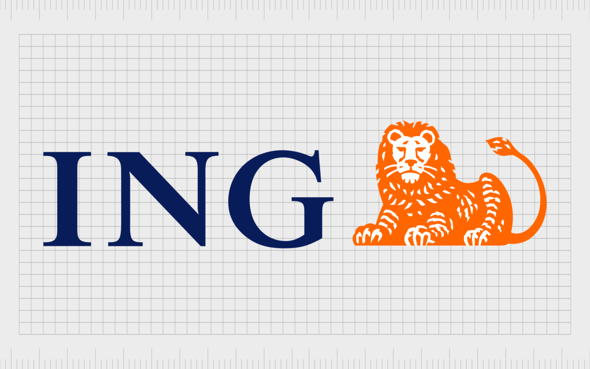
Since launching in 1991, ING has used the same consistent elements in its brand assets. The name of the company (shortened to an acronym) is present in a bold, serif font, written in a sophisticated shade of blue.
Blue is often associated with trustworthiness and credibility, making it a common pick in the insurance and banking space.
Alongside the wordmark, the other core element of the ING logo is the brightly colored orange lion. This is perhaps the most meaningful component of the ING logo for many. After all, the lion symbolizes courage, strength, and authority in most parts of the world.
However, it’s particularly meaningful for a Dutch group, as the lion is the national symbol of the Netherlands.
The color of the lion is crucial, too, as orange is also the Netherlands’ national color.
Notably, the insurance and banking companies that merged to form ING in the 1990s had previously used lion imagery in their logo designs. One used a lion emblem in a coat of arms style, while the other used a picture of a woman with a lion.

Interestingly, one of the branches of the ING brand uses an entirely different brand image. Voya Financial, the US branch of ING Bank, spun off to form a wholly new subsidiary.
However, the Voya Financial company still features elements of the ING brand image in its logo. For instance, we can still see the color orange on the company’s wordmark.
Why is the ING logo a lion?
Unlike many banks and financial institutions, the ING corporation has maintained a consistent visual identity for over 20 years. Part of the reason for this is that the original ING bank logo effectively conveys the right message to the company’s target audience.
ING chose a lion as the core component of its logo for several reasons.
First, it was a consistent element in the branding components used by the two companies, eventually forming ING.
Throughout the world, many of the original logos used by banks were initially taken from the coat of arms used for the country they served. This was true in the Netherlands too.
Both the Rijkspostspaarbank and the Nederlandsche Middenstandsbank, which would eventually evolve into the companies responsible for forming the ING bank, used lions in their logos.
When ING created its own brand image, maintaining the lion aspect was an excellent way to pay homage to its origins and history.
At the same time, the lion acts as a patriotic symbol for the company, connecting it directly to the Netherlands and making the brand seem more “local.” This is particularly true when we consider the use of orange coloring so common in the Netherlands.
Additionally, it’s worth noting that the lion is one of the most well-recognized animal symbols in the world today. It’s an image many of us associate with strength, courage, and authority. These are all characteristics any bank would be happy to portray in its brand image.
ING logo fonts and colors
Compared to other banking and financial company logos, the ING Bank logo may seem quite complex. There are a lot of components and details which may make it harder to translate this image into the digital world.
This may be why ING created a new brand with a much simpler logo when branching out into the United States.
However, despite its complexity, the ING logo still has a phenomenal impact. It reminds us of the heritage and history of the brand while also conveying ideas of strength and sophistication.
The design also sets the company apart from the other banking and insurance providers in the landscape, with its bright colors and bold mascot.
If you want to take a closer look at the ING logo, you can find some valuable resources here:
What color is the ING Bank logo
The ING Bank logo colors are among the most important aspects worth mentioning when examining the visual asset. As mentioned above, both colors used in this emblem convey a specific meaning.
The lion’s orange coloring symbolizes creativity and vitality but also links to the Netherlands’ national color.
The blue shading in the ING wordmark tells us the company is reliable and trustworthy. It also offers a fantastic contrast against the orange.
Navy Blue:
Hex: #000066
RGB: (0, 0, 102)
CMYK: 1, 1, 0, 0.6
Vivid Orange:
Hex: #FF6200
RGB: (255, 98, 0)
CMYK: 0, 0.615, 1, 0
What font does the ING Bank logo use?
Alongside the ING Bank logo color palette, the font choice is also worth mentioning when assessing the visual impact of the emblem. ING chose a simple serif font for its emblem to convey sophistication and traditionalism. The typography used in the design is simply Times New Roman.
Exploring the ING Bank logo
The ING Bank logo is one of the better-known financial emblems in the world today, thanks to its fantastic color choices and unique mascot.
Although this image may seem outdated compared to some of the more modern bank logos you can see from prominent financial leaders, it still has a wonderful impact.
The ING logo gives us an insight into the company’s history and heritage while sending important messages about strength and authority.
Fabrik: A branding agency for our times.
Clarity starts with a conversation.
Thanks—we’ll get back to you shortly.
Whether you're navigating a rebrand, merger, or simply need a clearer identity—we’re here to help. No hard sell, just honest advice from people who know the sector.
Let’s start with a simple question…
Prefer to email? Drop us a line.
Fabrik’s been helping organisations rethink and reshape their brands for over 25 years. We’ve guided companies through mergers, rebrands and new launches. Whatever stage you’re at, we’ll meet you there.


