


Famous logos with arrows: Top companies with arrow logos

There are countless companies with arrow logos around the world today. From Amazon and Subway, to FedEx, you can probably picture a handful of options instantly. But why are logos with arrows so common across the business landscape?
The simple answer is today’s companies use a variety of symbols and shapes in logo design to convey meaning. The arrow is one of the simpler examples, but it can hold a lot of meaning.
In many circumstances, an arrow can help to demonstrate the “direction” of a brand, giving it a sense of movement and life.
Arrows are something we frequently associate with progress and aspiration. They can also indicate expansion, and strength, thanks to their bold and pointed edges.
Today, we’re going to offer an insight into the power of the arrow in logo design, by looking at some of the better-known images in the world.
Logos with arrows in them
As mentioned above, arrow logos are relatively common, because they’re one of the most universally recognized symbols, and one of the easier to draw. The shape and nature of an arrow can give it additional meaning.
For instance, a curved arrow might indicate exploration, while a sharper arrow pointing upwards highlights growth.
Let’s take a look at some of the top logos with arrows…
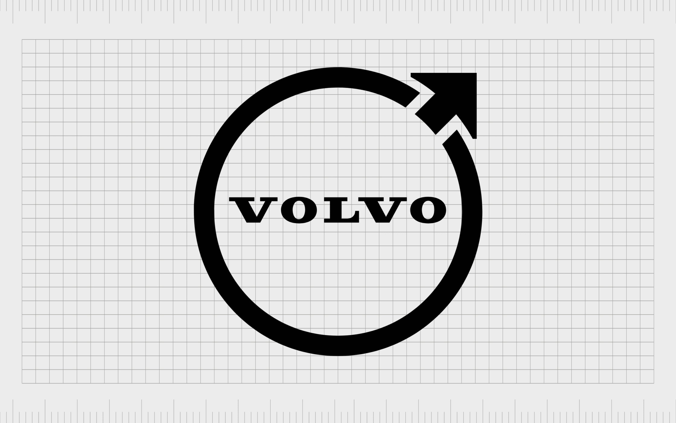
Volvo
One of the better-known logos with arrows in the automotive world, the Volvo image has frequently been confused as a symbol for the male gender. However, it’s actually intended to represent the chemical symbol for iron. This highlights the clear strength and stability of the brand.
The Volvo symbol’s positioning of its arrow, directed upwards and towards the right, also makes us think of forward progression and innovation.
Find out more about the Volvo logo here.
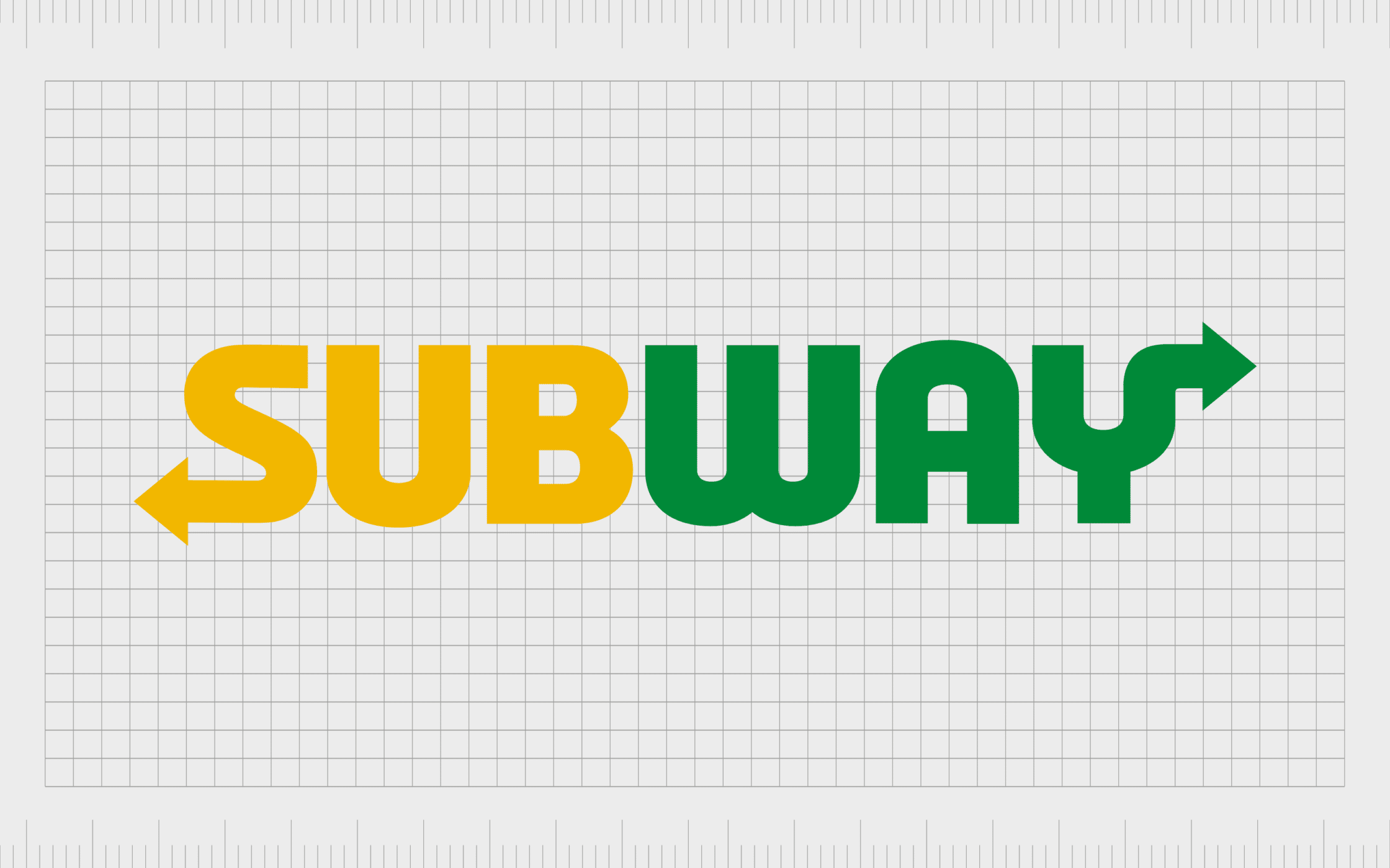
Subway
Another excellent example of one of the most famous companies with arrow logos, Subway’s image is recognized all over the world. The Subway fast food restaurant is best-known for selling “submarine sandwiches”, which customers can personalize to their preferences.
The Subway logo, in green and yellow highlights ideas of happiness and nature. The arrows at the front and back of the wordmark draw attention to the fast-paced nature of the company. It reminds us of entering and exiting the food company’s facilities quickly.
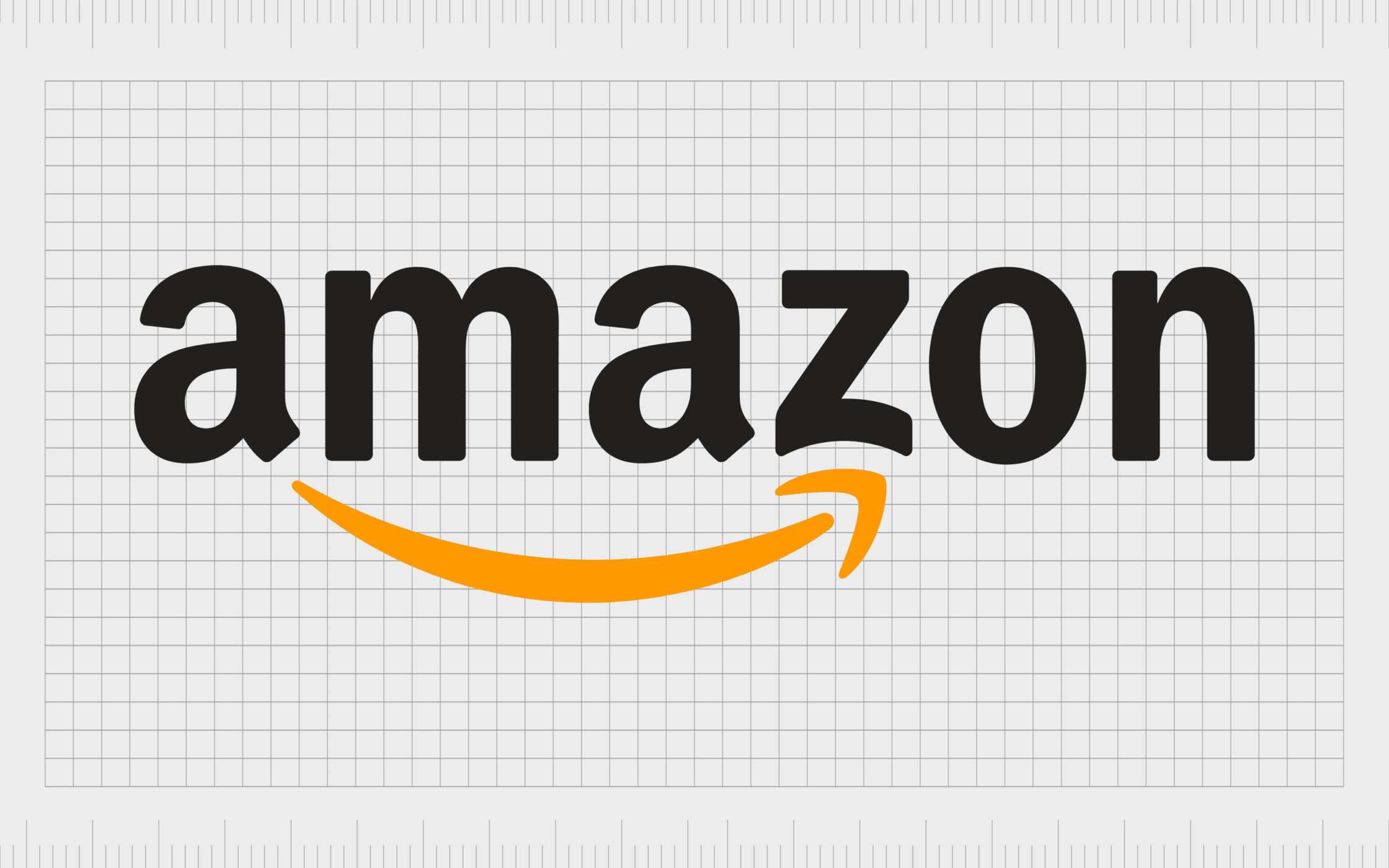
Amazon
It’s hard to list a selection of famous arrow logos without mentioning Amazon. One of the most famous logos in the world, the Amazon logo conveys significant meaning with its use of an arrow.
The symbol points from “A” to “Z”, to highlight the wide range of products sold by the company.
The orange coloring of the arrow, combined with its curved appearance also remind us of a smile. Even the bottom of the “Z” is dimpled slightly to look like a cheek. The overall image is friendly and charming, and appears in other Amazon products too, like the Amazon Alexa logo.
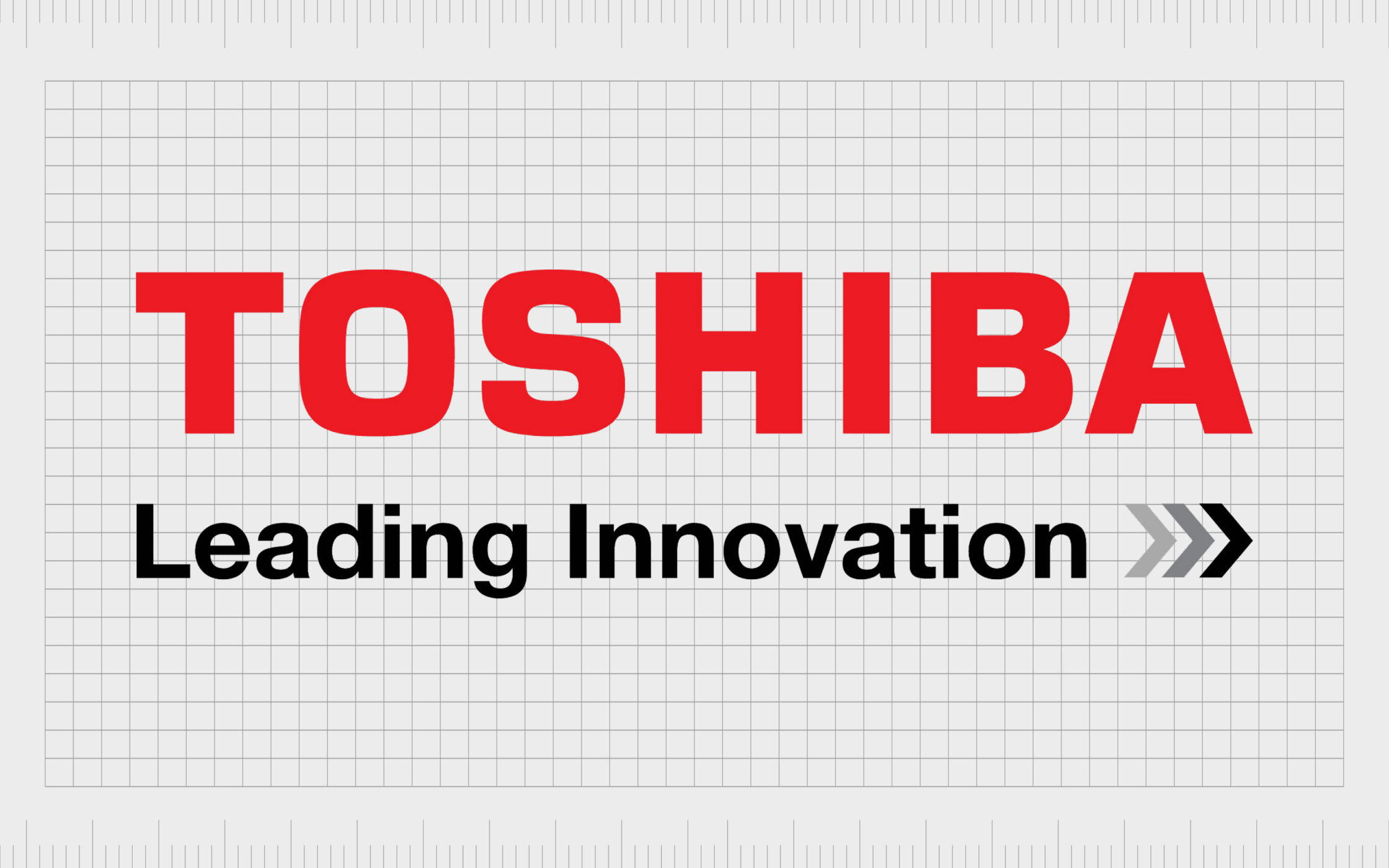
Toshiba
The Toshiba logo is an interesting example of a design with arrows included. Though the wordmark for the company doesn’t always include its tagline, the arrows appear when the secondary component is added. The “Leading Innovation” strapline includes three arrows pointing to the right.
This design is clearly an attempt by Toshiba to remind customers of the innovative products the business invests in, and their focus on the future.
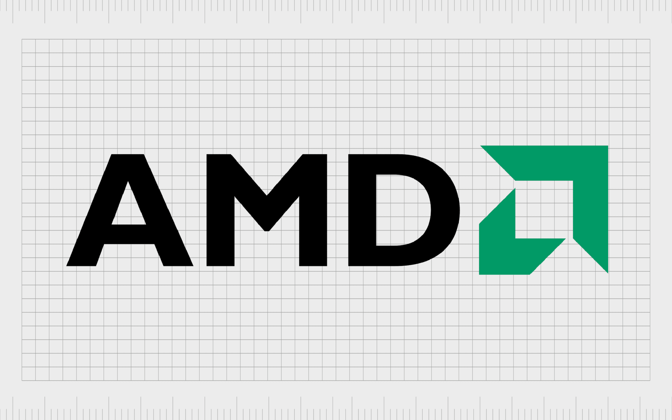
AMD
A wonderfully modern example of how effective arrows can be in logos, the AMD emblem defines and differentiates one of the world’s biggest manufactures of CPUs, adapters, graphics processors, and other tech products.
AMD’s arrow is a wonderfully geometric shape, with lots of sharp edges to highlight its bold personality.
The fact the arrow is designed in green helps to remind us of growth and other organic concepts. Like many companies trying to showcase their focus on the future, this arrow is pointing upwards and to the right.
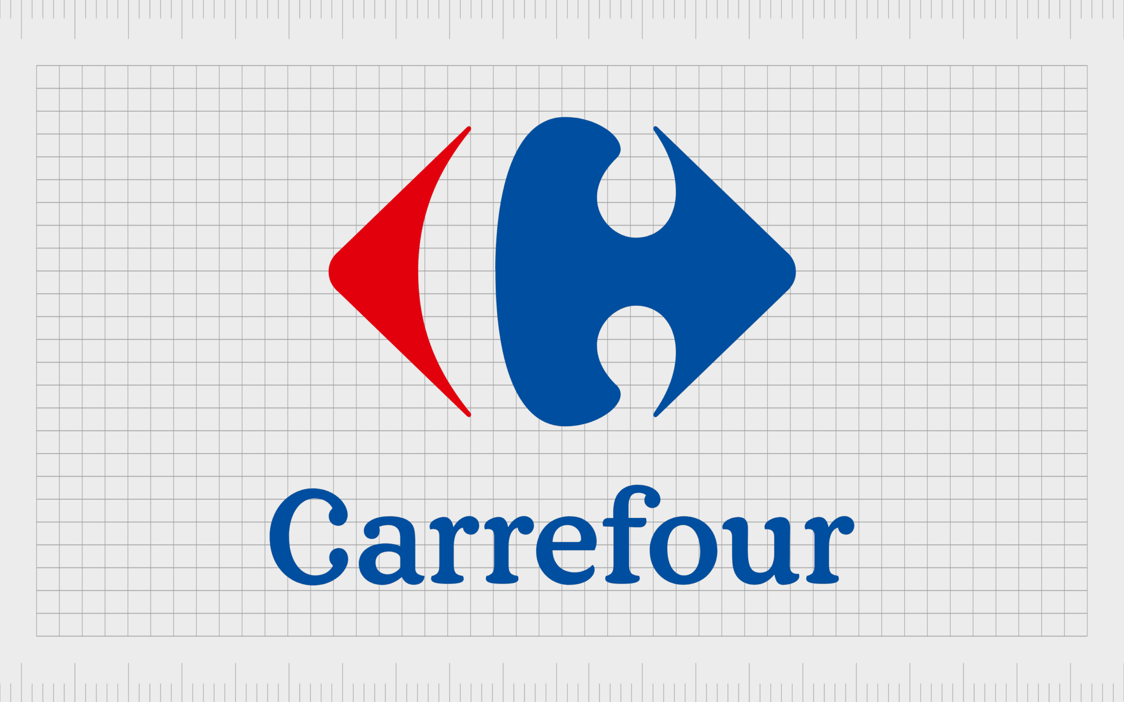
Carrefour
A leading French retail company, Carrefour uses a selection of two arrows in its logo, each pointing in opposite directions. This makes sense when you consider the name of the brand actually means “crossroads”.
The company also uses the negative space within the two arrows to create the letter “C”.
This is an attractive and elegant looking logo, for a company committed to offering a diverse range of products. The finished design even includes the colors of the French flag. This helps to pull attention to the origins of the brand.
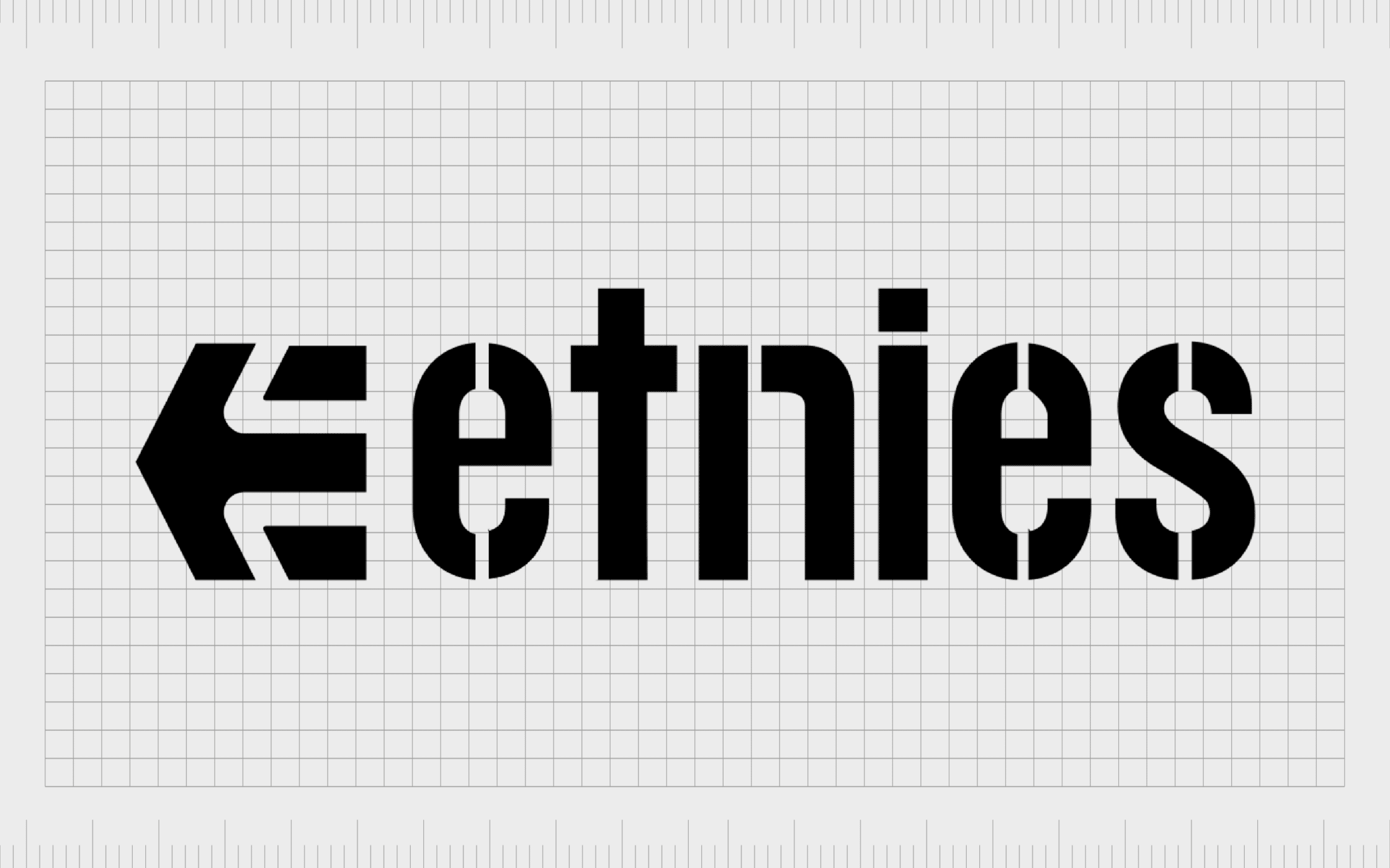
Etnies
If you’re a fan of skateboarding or sneakers, you’re probably familiar with Etnies, a shoe company located in California. This company has an arrow in its logo, situated to the left of the wordmark for the brand.
Interestingly, this arrow is pointing to the left, which is unusual for many brands, who prefer to point to the right to highlight progress.
The choice to point to the left could be an insight into the personality of the company, which is famous for creating more “alternative” styles of clothing.
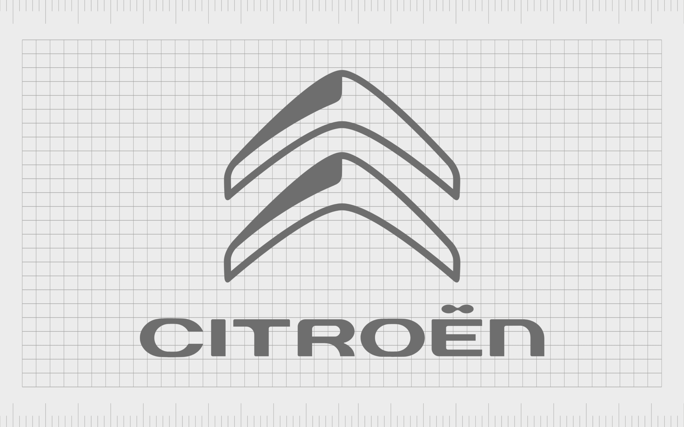
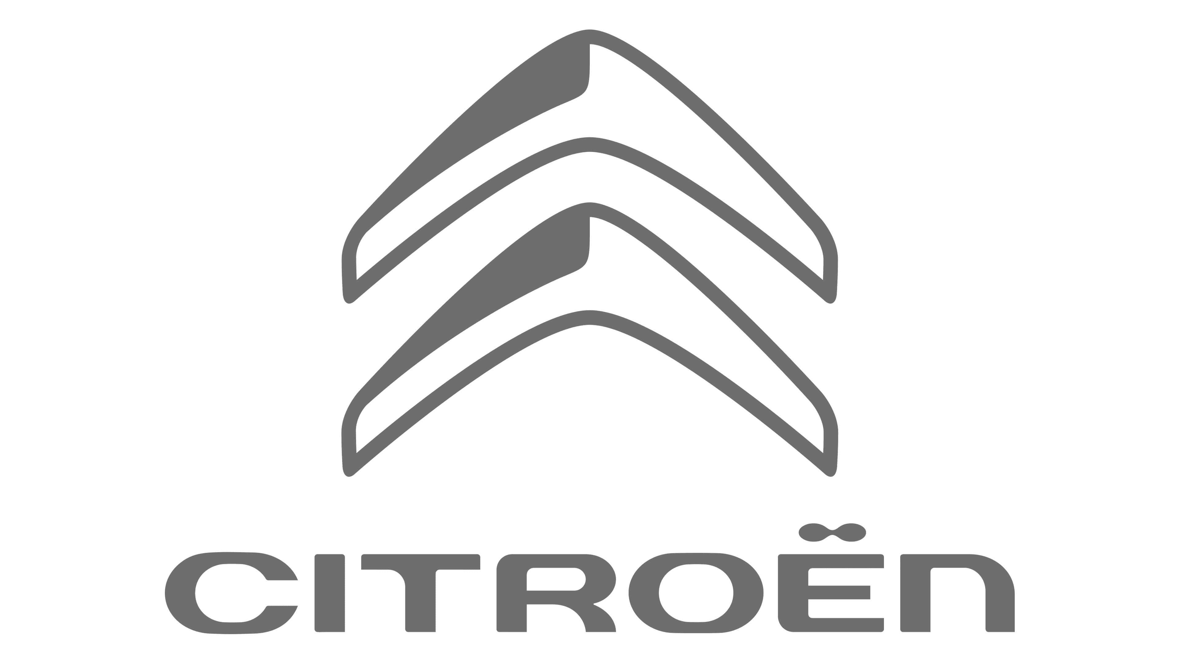
Citroen
Car logos frequently embrace the power of arrow logos to convey movement and direction, and the French company Citroen is no exception. The two arrows pointing upwards make us think of forward progression and innovation, ideal for an automotive brand.
The two arrows are simple yet instantly recognizable, highlighting the pioneering nature of the brand, and making us imagine concepts like adventure.
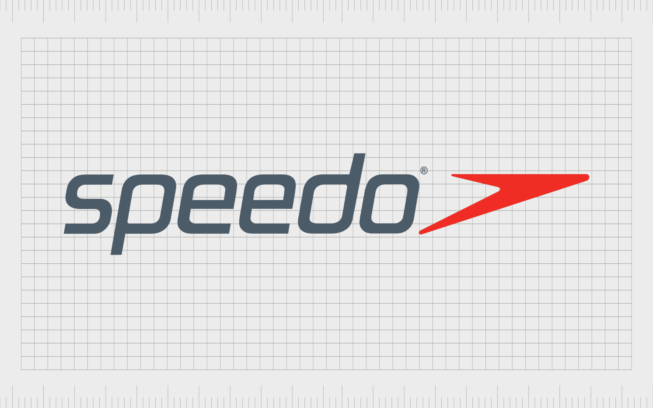
Speedo
One of the better-known sporting brands in the world, Speedo is best known for creating the products professionals use for swimwear competitions. A company committed to aerodynamics and agility; the Speedo brand works well with the natural impact of the arrow symbol.
The arrow in this logo is sharp and sleek, created in a color which contrasts the wordmark for the company. The arrow is both playful and elegant, drawing attention to the unique personality of the brand.
It also points to the right, to highlight progression.
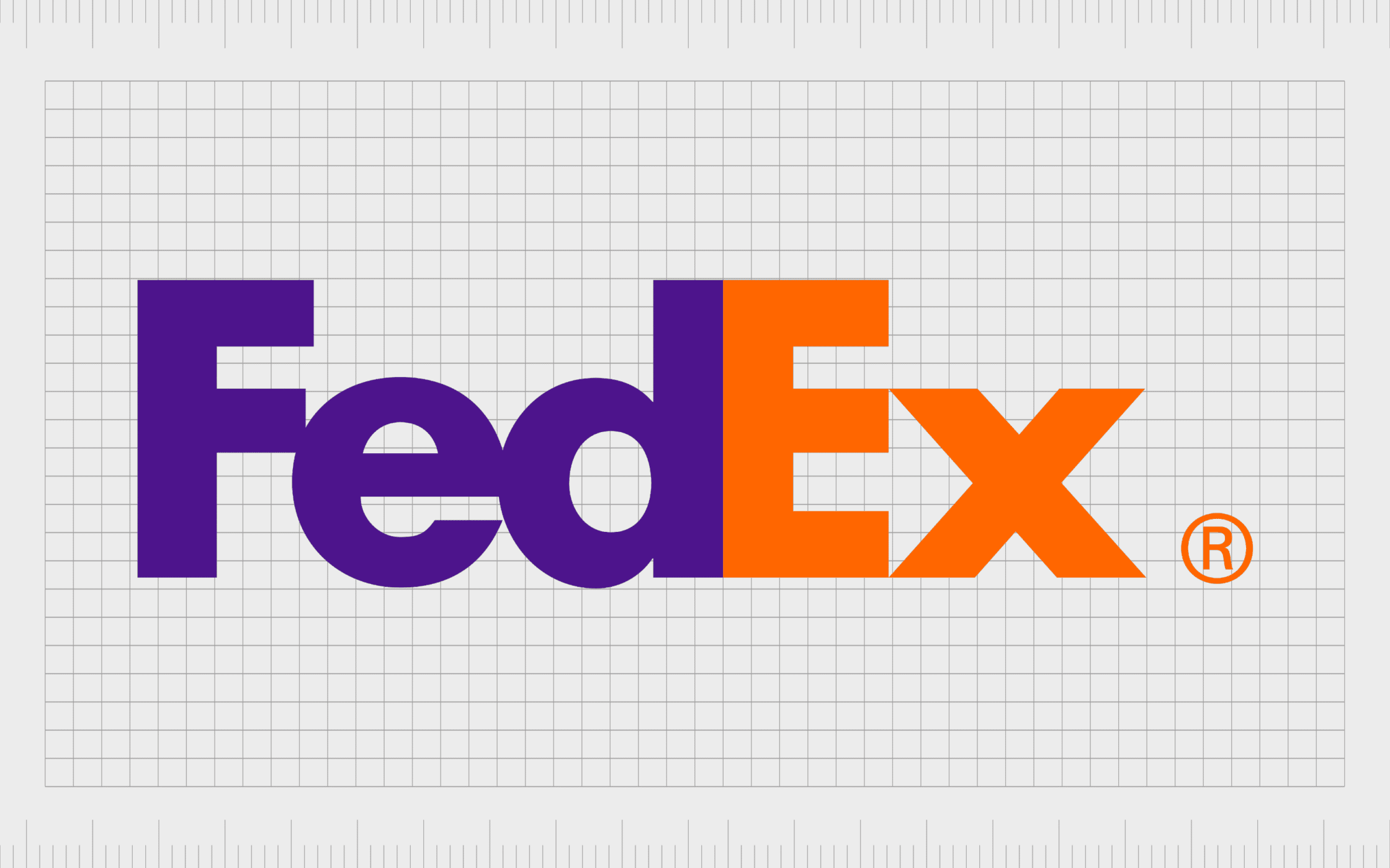
FedEx
The arrow in the FedEx logo is often overlooked in lists like this one. However, it’s something well-worth exploring. The FedEx logo uses the white space between the “E” and the “X” to create an arrow pointing to the right.
This is a deliberate choice to highlight the speed and progressive nature of the brand.
The FedEx logo offers a fantastic insight into how even the negative space in logo design can make a huge difference to how we perceive a company, and what we associate the brand with.

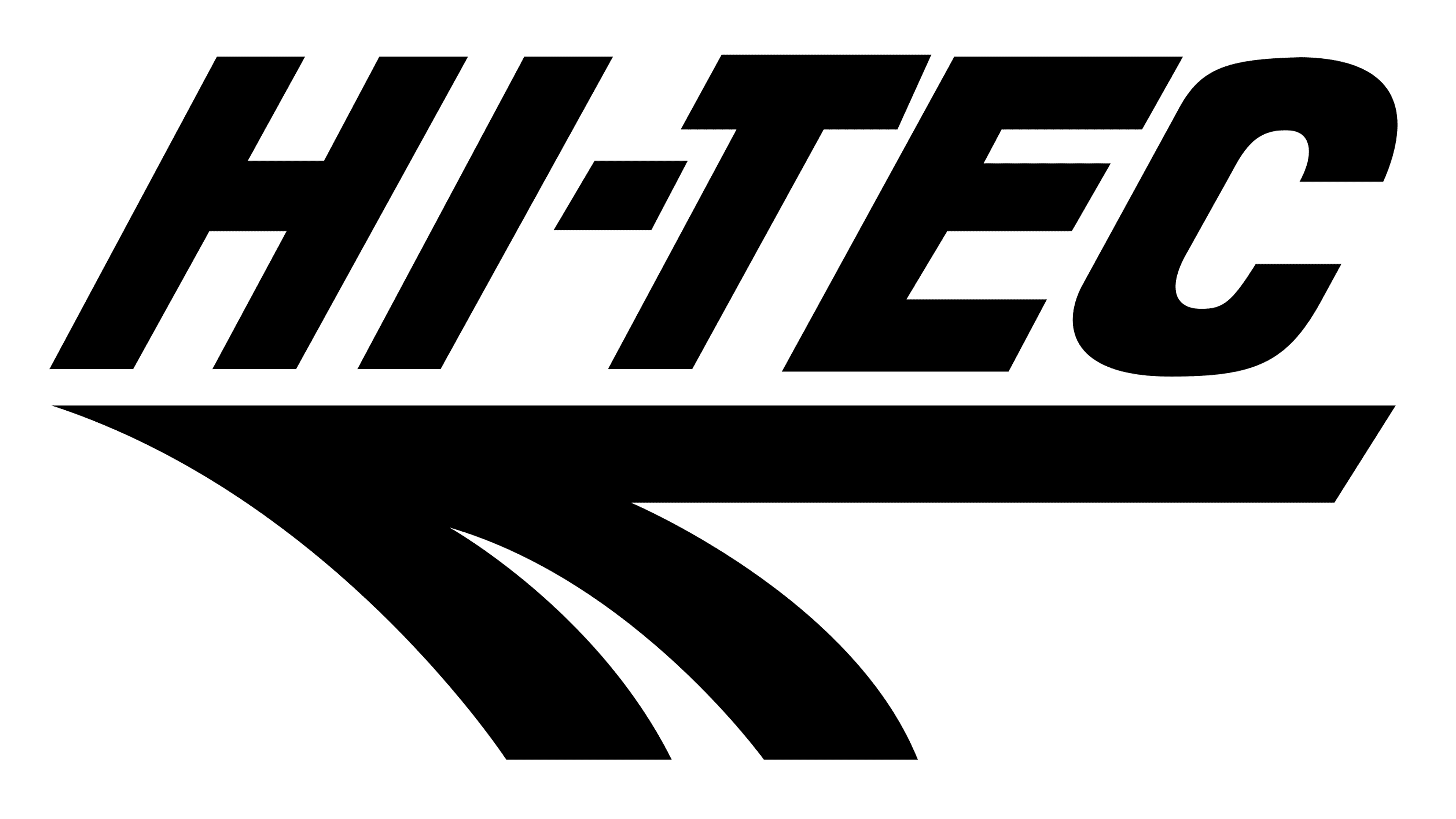
Hi-Tec
Another well-known company in the shoe brand landscape, Hi-Tec produces a range of footwear options and athletic clothing for hikers, and outdoor adventurers. The company’s arrow is a highly elegant and stylized creation, intended to demonstrate the innovative nature of the brand.
The shape points to the left, rather than the right of the logo, perhaps to remind us of the joys of venturing off the beaten path in life.
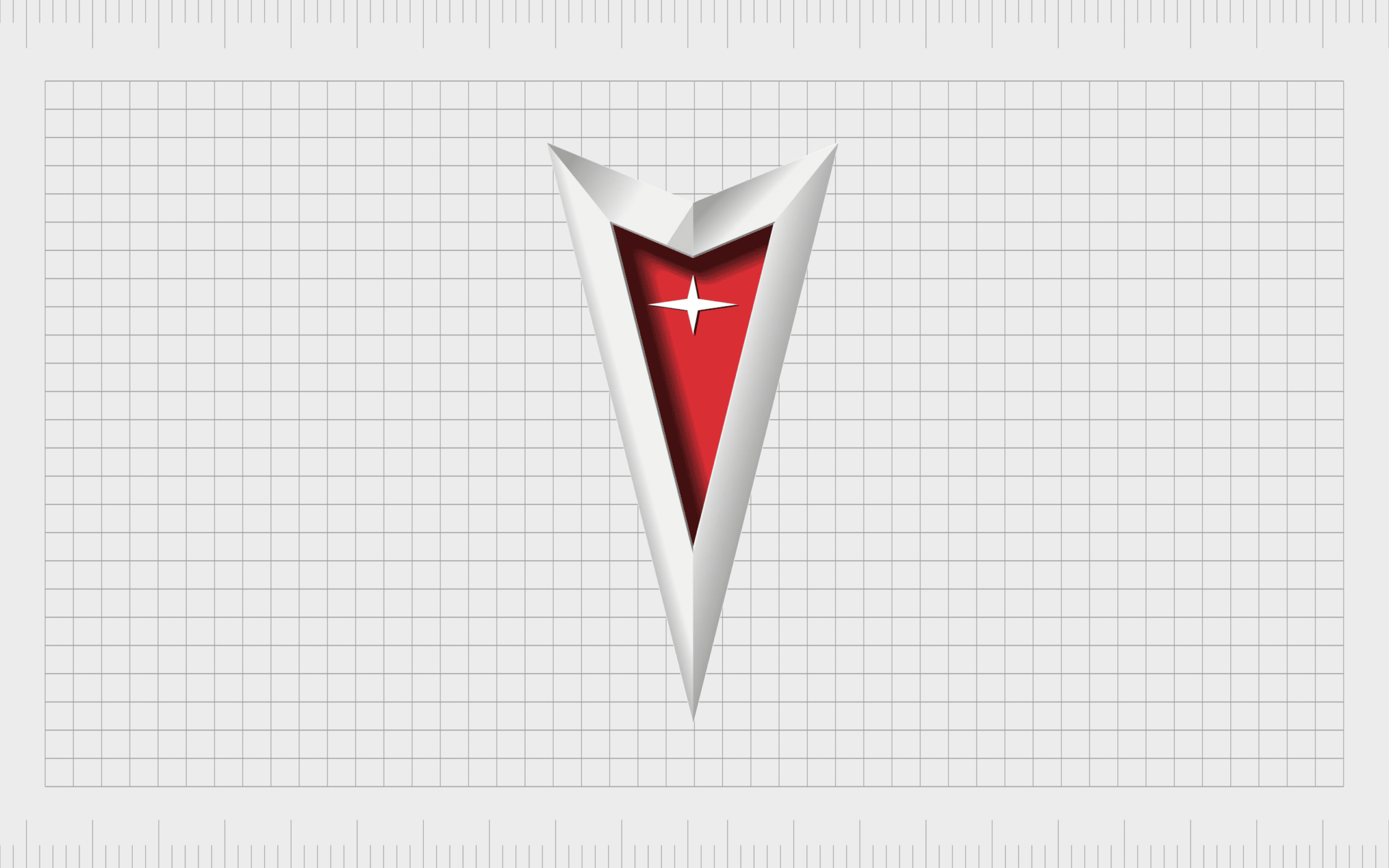
Pontiac
One of the more famous arrow logos, and a well known automotive logo with a star, the Pontiac emblem is sharp and confident. This now-defunct car brand manufactured some of the better-known vehicles in the US for a number of years.
The arrowhead conveys ideas of strength and power, as well as pulling attention to the Pontiac crest and the history of the business. This is an excellent example of how versatile the arrow shape can be when defining a company.
Skoda
At first glance, you might miss the arrow in the Skoda logo, as they’re not quite as obvious as some of the alternatives in this list. The Skoda logo is intended to look somewhat like a bird, flying towards its destination.
However, it also appears as an arrow, with the head pointing towards the right.
The Skoda image is both creative and inspiring, offering an insight into the automotive company’s focus on the future, and commitment to helping people explore.

Wrigley’s Spearmint
While the larger Wrigley’s Company doesn’t use an arrow in its logo, there are a clear set of arrows present on a specific sub-brand for the business. Wrigley’s Spearmint features a bold green banner to remind us of refreshing flavors like mint.
The arrows on this design point in either direction, perhaps to highlight the stretchy and malleable design of the chewing gum. Overall, the image is refreshing and eye-catching, ideal for a confectionary company.

Tangerine
One of a handful of financial companies with arrow logos, the Tangerine emblem is bright and eye-catching, ideal for bringing a positive edge to banking. The company is one of the most popular in the country for its banking services, thanks in part to its welcoming personality.
The bright coloring of the wordmark highlights the fruit we’re being reminded of with the name. At the same time, the arrow pointing upwards and to the right reminds us of growth and expansion, something we all want to achieve with our finances.

Avengers
If you’re familiar with superhero logos, then you might also recognize this famous arrow logo. The Avengers emblem features a subtle arrow within the “A” of the wordmark. This design is excellent for pulling attention to the fast-paced and progressive nature of the group.
The Avengers are constantly pushing forward in the fight for good, which is a concept the designers have clearly represented in this logo.
Find out more about the Avengers logo here.
Converse
A well-known shoe company known for creating a wide range of sneakers and skating shoes, Converse is popular all around the globe. The company’s iconic logo, which appears on many of its products, as well as in branding elements, comes with its own subtle arrow.
Like many of the arrows used by companies in logo design, this icon is pointing towards the right to suggest progress. The design is bold and eye-catching, well-suited to a progressive and confident brand.
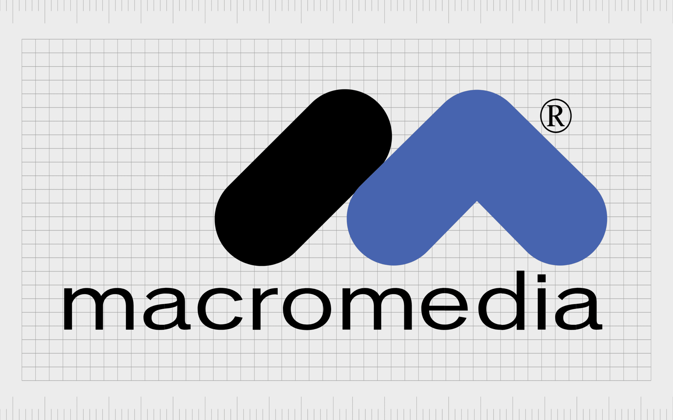
Macromedia
Now purchased by Adobe, Macromedia was an American company responsible for creating various kinds of web development software and graphics. The company produced products like Dreamweaver and Flash
Unlike many of the arrow logos mentioned so far, the arrow in this image is more curved and neutral, perhaps to highlight a friendly personality. The arrow also points upwards, which is usually something we associate with progress and innovation.
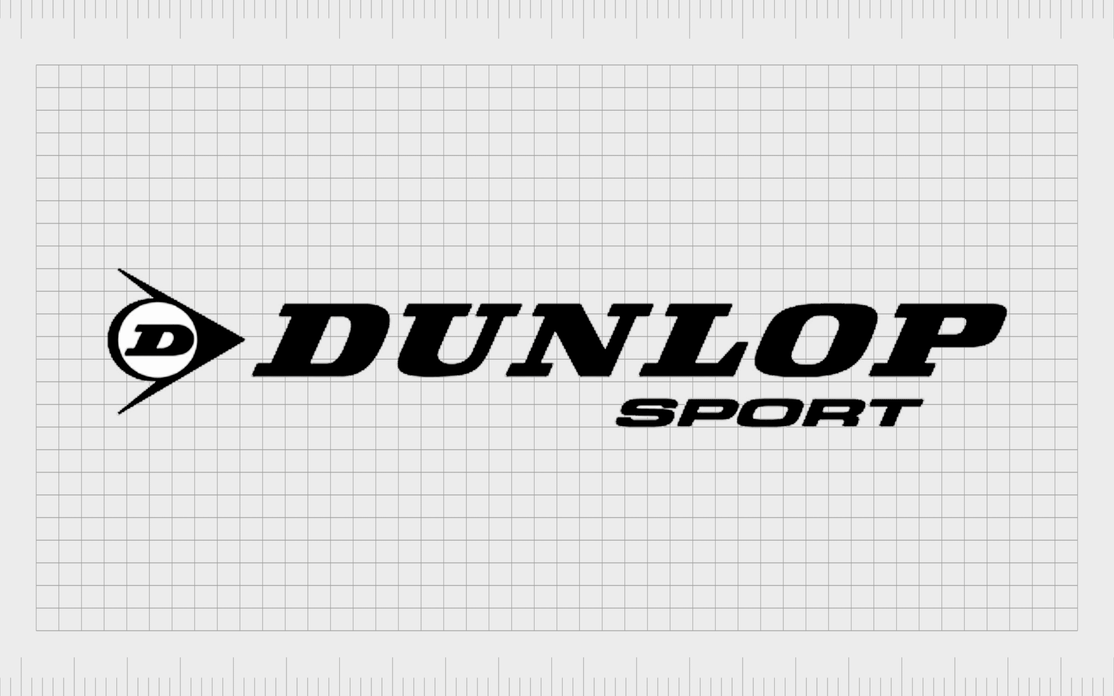
Dunlop Sports
Based in the UK, Dunlop Sport is a sports equipment manufacturer first founded in 1910. The company specializes in a range of racquet sports, including badminton, squash, and tennis. The products created by the brand usually feature its iconic logo.
The arrow in the Dunlop sport logo appears alongside the company’s wordmark, with a circular element and a “D” placed in the space between the two lines. The image almost resembles a bird, which reminds us of the flight of things like shuttlecocks.
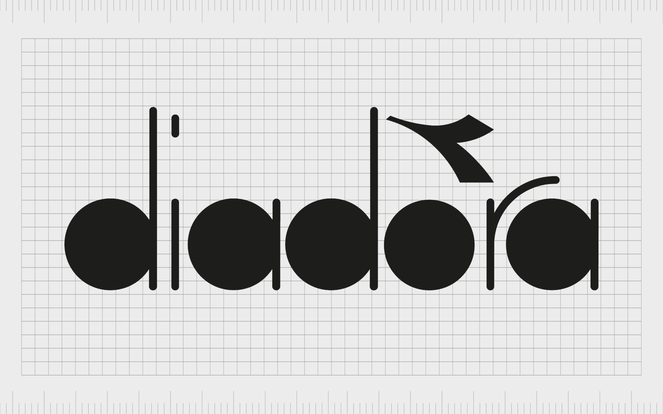
Diadora
An Italian company well-known for creating a wide range of footwear and sportswear for customers around the world, Diadora is a popular brand. This company was first launched in 1948, and has changed its logo a few times over the years.
The image almost consistently includes an arrow shape placed above the “O” on the Diadora wordmark. This stylized arrow is modern and eye-catching. It almost looks like an accent on the company’s name, which gives it a sense of Italian flair.
Find out more about the Diadora logo here.
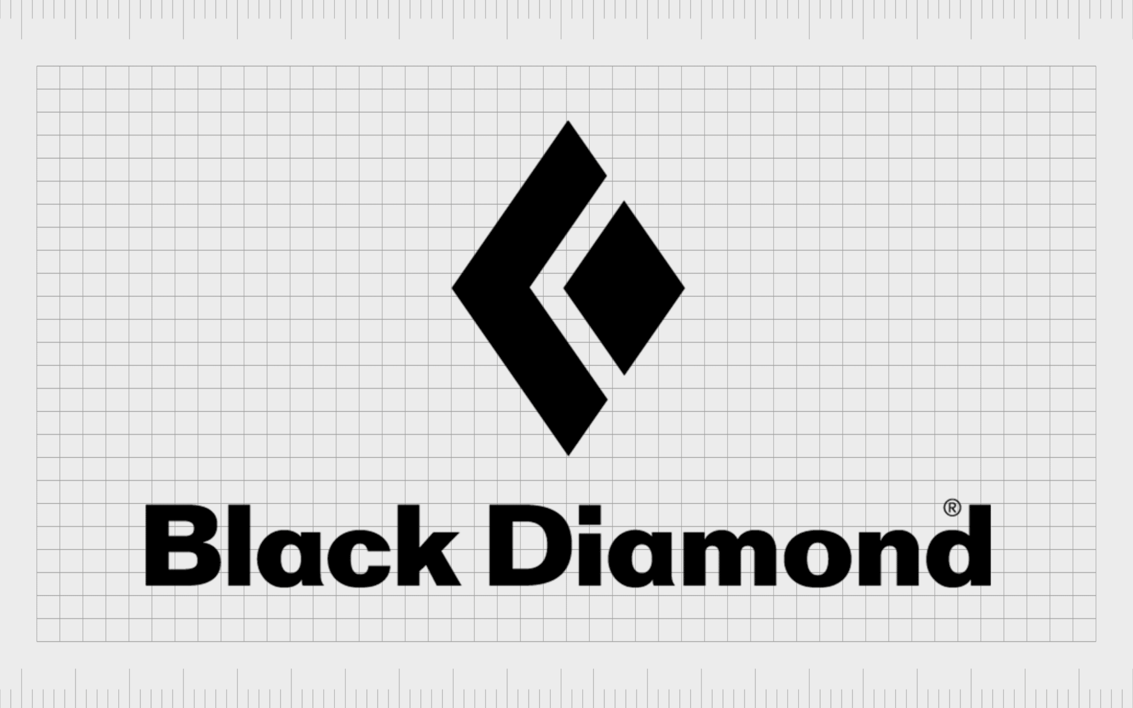
Black Diamond
Otherwise known as Black Diamond Equipment, Black Diamond creates skiing, climbing, and mountain sports equipment. Simple yet stylish, the arrow image in the black diamond logo helps to convey the modern nature of the business.
There are actually two arrows to speak of. One is created on the left-hand side of the diamond in a bold black outline. The other forms in the negative space between the larger arrow and the diamond itself.
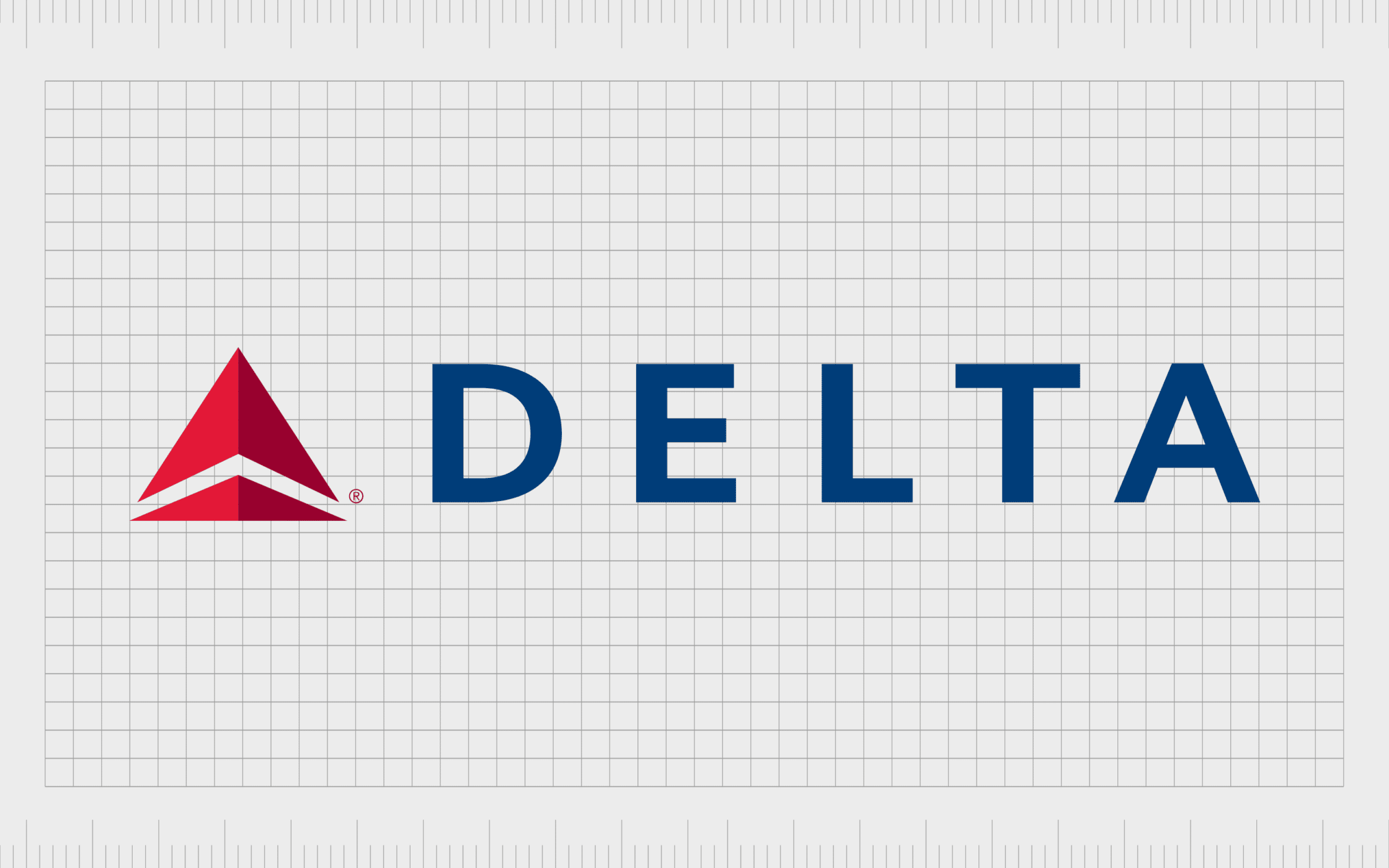
Delta Airlines
Famous arrow logos are more common in some industries than others. It’s not unusual to see arrow symbols in the airline landscape, as they’re often associated with exploration. The Delta brand, one of the most popular American Airlines, uses two types of arrow in its logo.
The first arrow is a bold red design which looks similar to a traditional arrowhead. Underneath this, we see a secondary arrow in the white space between the upper and lower portions of the red triangular shape in the logo.

Kodak
The Kodak symbol is a more subtle example of an arrow logo. This company is one of the best-known brands in the world for printing, graphic communications, and professional services.
The shape of the red geometric elements within the logo are designed to look like a “K”, but they could also be construed as an arrow.
The sharp nature of this arrow design helps to convey the precision in the technology and solutions produced by the business.

Asiana Airlines
Another excellent example of an airline taking advantage of the arrow symbol is Asiana Airlines. This South Korean airline flies to over 90 international destinations worldwide. It’s a member of the global passenger airline alliance too.
The arrows on this logo are pointing upwards and to the right, signifying speed, growth, and discovery. The overall emblem is also very minimalist in nature, which gives the airline a slightly more modern appeal.

Yonex
A well-known sports manufacturing company, Yonex creates badminton, tennis and golf equipment for customers around the world. The logo of the brand has a sporty edge to it, with two circles representing the various balls used in athletic games.
The arrows are quite subtle, but like many in this list, they point upwards and towards the right for a focus on innovation and growth.

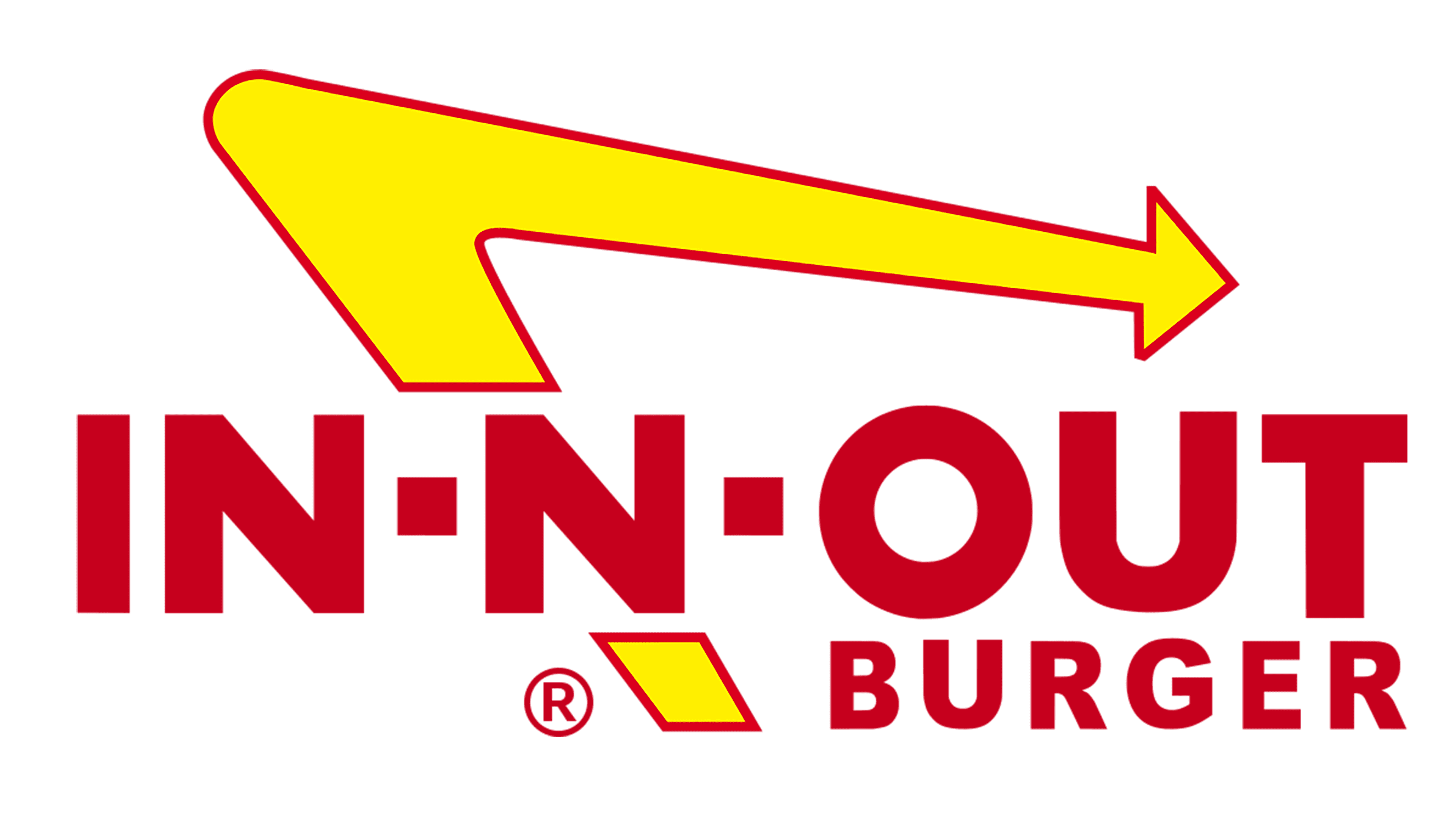
In-N-Out Burger
If you’re familiar with fast food restaurants then this is probably one of the most famous arrow logos you’ll be aware of. In-N-Out burger is a popular American fast-food restaurant chain, operating primarily in the southwestern United States.
The red and yellow color choices are excellent for reminding us of food, happiness, and speed.
The arrow in this image is intended to look a little like a boomerang, as well as the signs used to highlight fast food locations on various highways.
The arrow points to the right, showing forward progression, and reminding us of how quickly you can get your hands on some great food with this location.
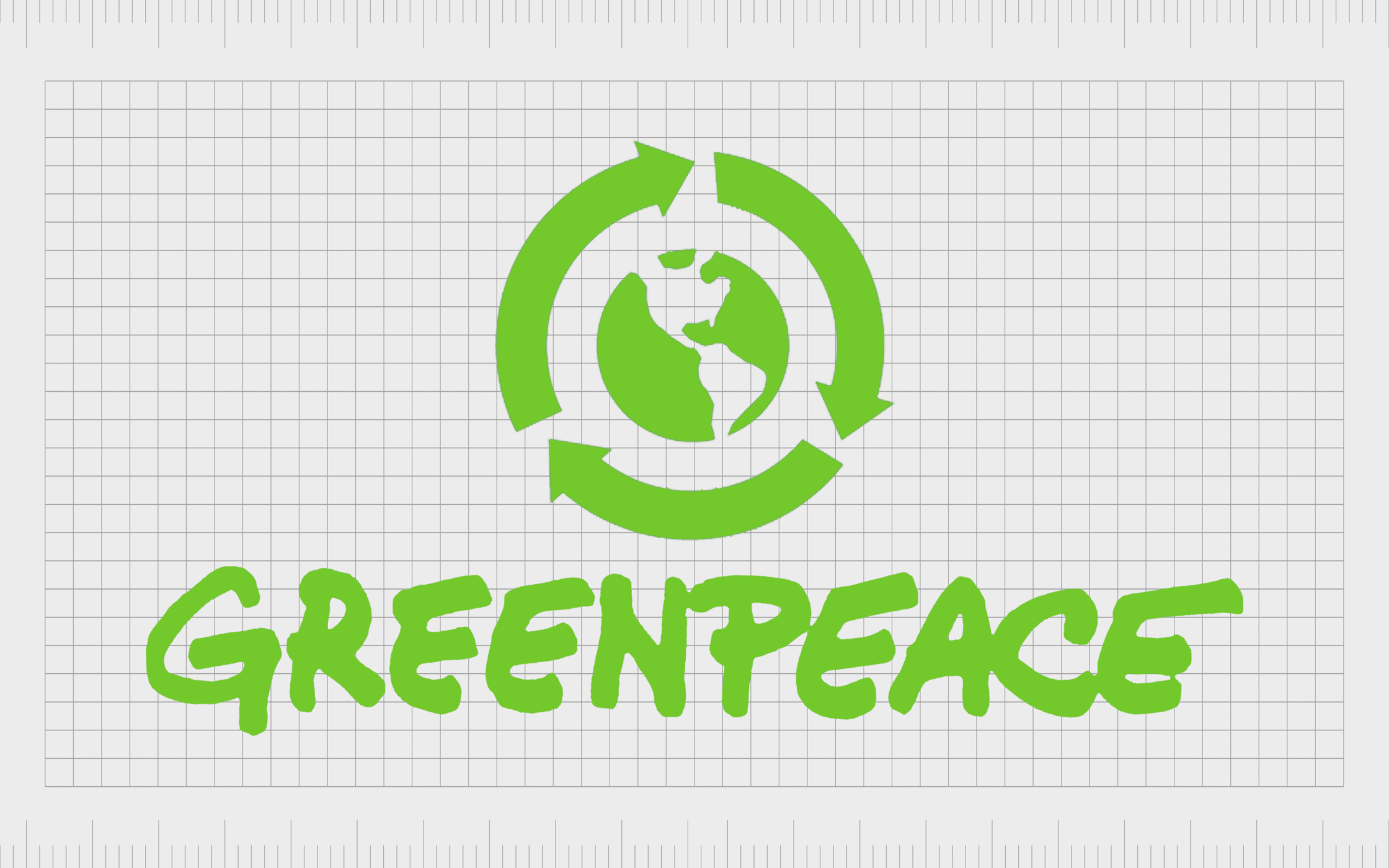
Greenpeace
Likely one of the most widely recognized and respected arrow logos on our list, Greenpeace is an international and independent organization founded in Canada. The company is committed to making the planet a cleaner and healthier place, which we’re reminded of by the planet in the logo.
The arrows around the planet highlight the turning of the earth and the progression of time. They also remind us of the stages of life, progress, and regrowth.
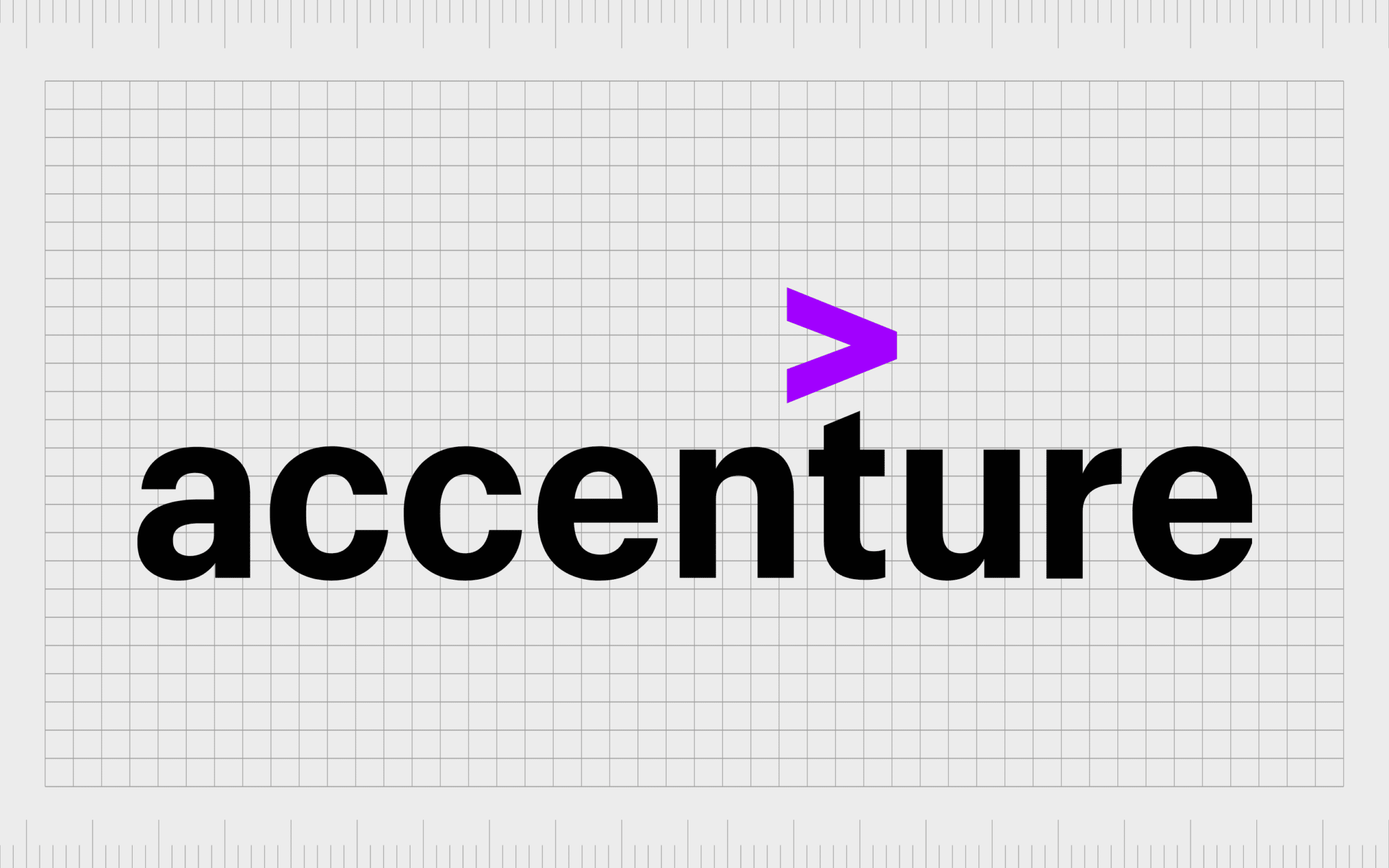
Accenture
A well-known technology company with a significant presence in the ICT landscape, Accenture was first founded in 1989. The company is focused on innovation and growth, so it’s unsurprising we see a clear arrow presented in the wordmark.
Like many technology companies, Accenture has chosen a relatively minimalist design for its logo. The wordmark is bold and eye-catching, with a contrasting arrow placed above it. The use of purple reminds us of the creative and compassionate nature of the brand.
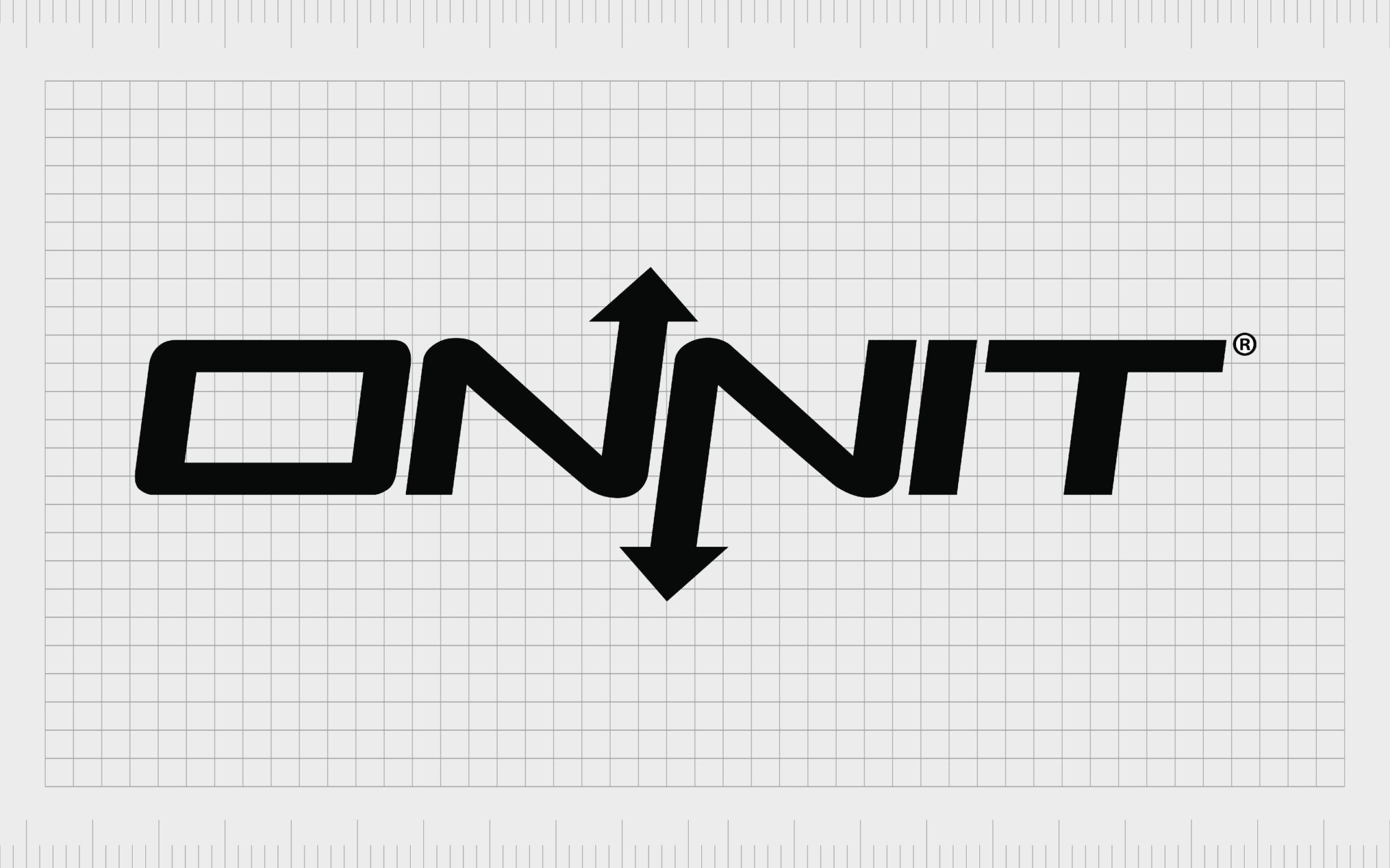
Onnit
In America, Onnit is a relatively well-known creator of food supplements, designed for mental and physical support. The company specializes in the growing landscape of nootropics. Onnit’s logo is a simple wordmark, tilting slightly towards the right to symbolize progression.
The two “N’s” in the word mark are designed with arrows pointing in opposite directions. This is a design choice often embraced by companies when they want to highlight diversity and variety.
Polestar
If you’re relatively familiar with the automotive landscape, you’re probably aware of Polestar. This Swedish car creators has been producing hybrid sports cars for a couple of decades now.
The logo looks similar to two arrows connecting together to create a cross. It might also look a little like two simplified birds to some viewers.
The simple and minimalistic logo is excellent for highlighting the modern nature of the brand and it’s commitment to innovation. The two arrows pointing towards eachother can also indicate community.
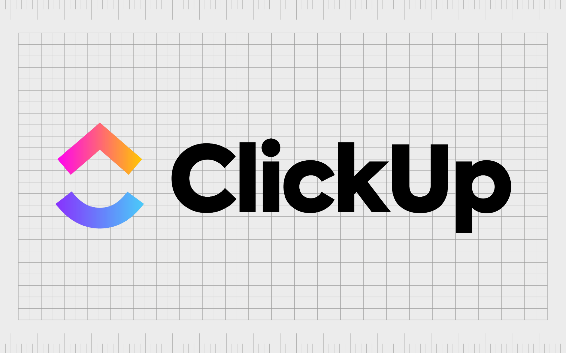
ClickUp
ClickUp is a project management software company committed to delivering solutions which make team members more efficient in the modern world. The solution allows organizations to assign tasks to users and keep track of their progress.
The ClickUp logo features an arrow pointing upwards alongside the wordmark. This arrow is placed above a curved line which looks a little like a “C”. The overall image is creative and innovative, ideal for the modern workforce.
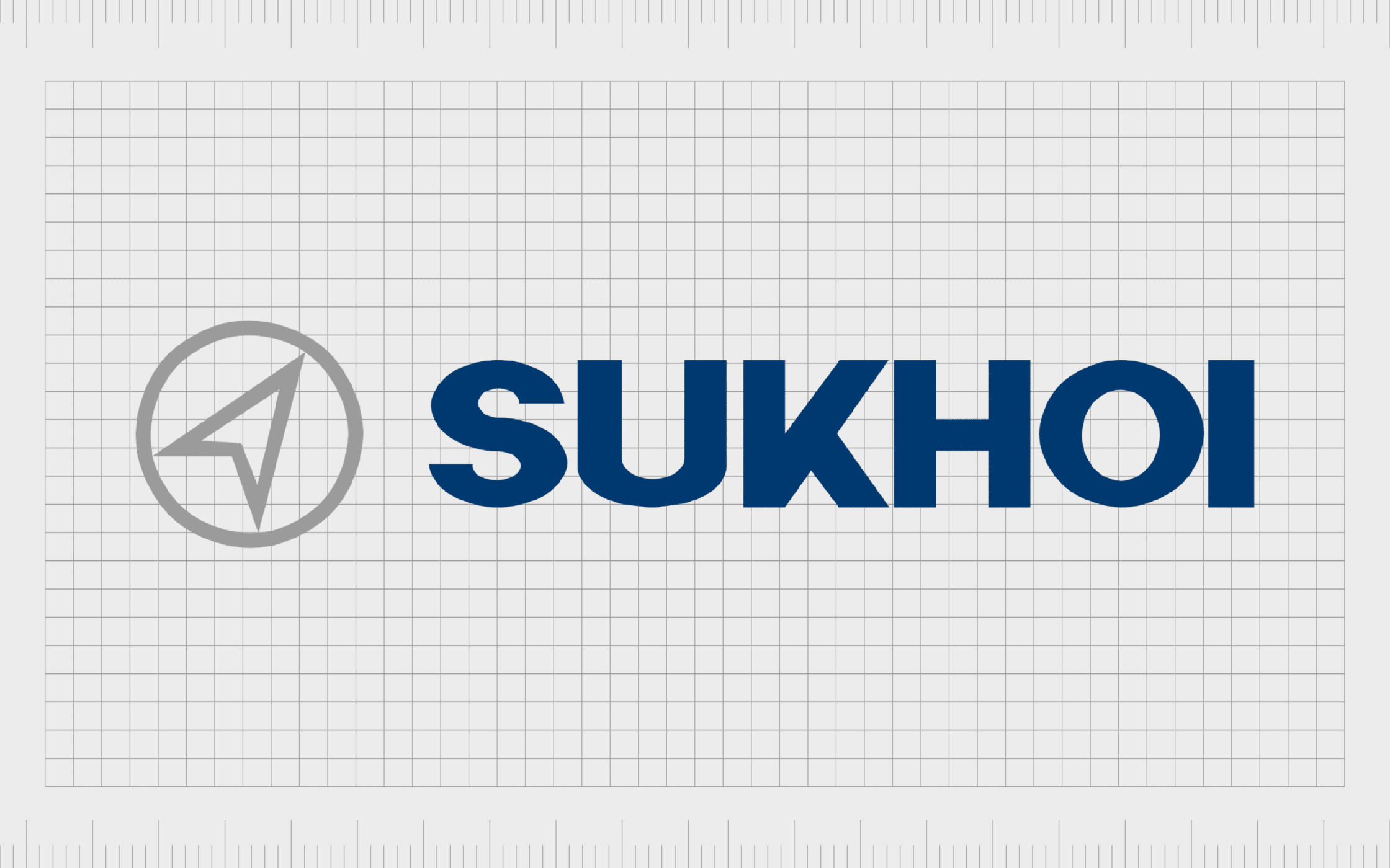
Sukhoi
Sukhoi is a well-known aircraft company, initially founded in 1934 in Russia. The brand follows a similar design pattern to a lot of automotive companies with its logo. There’s a bold and eye-catching wordmark in blue, to symbolize trustworthiness.
Next to the wordmark, we see an arrow placed within a circle, something that will remind many of us of a standard compass, highlighting navigation. The arrow also points upwards, which draws attention to the explorative nature of the brand.
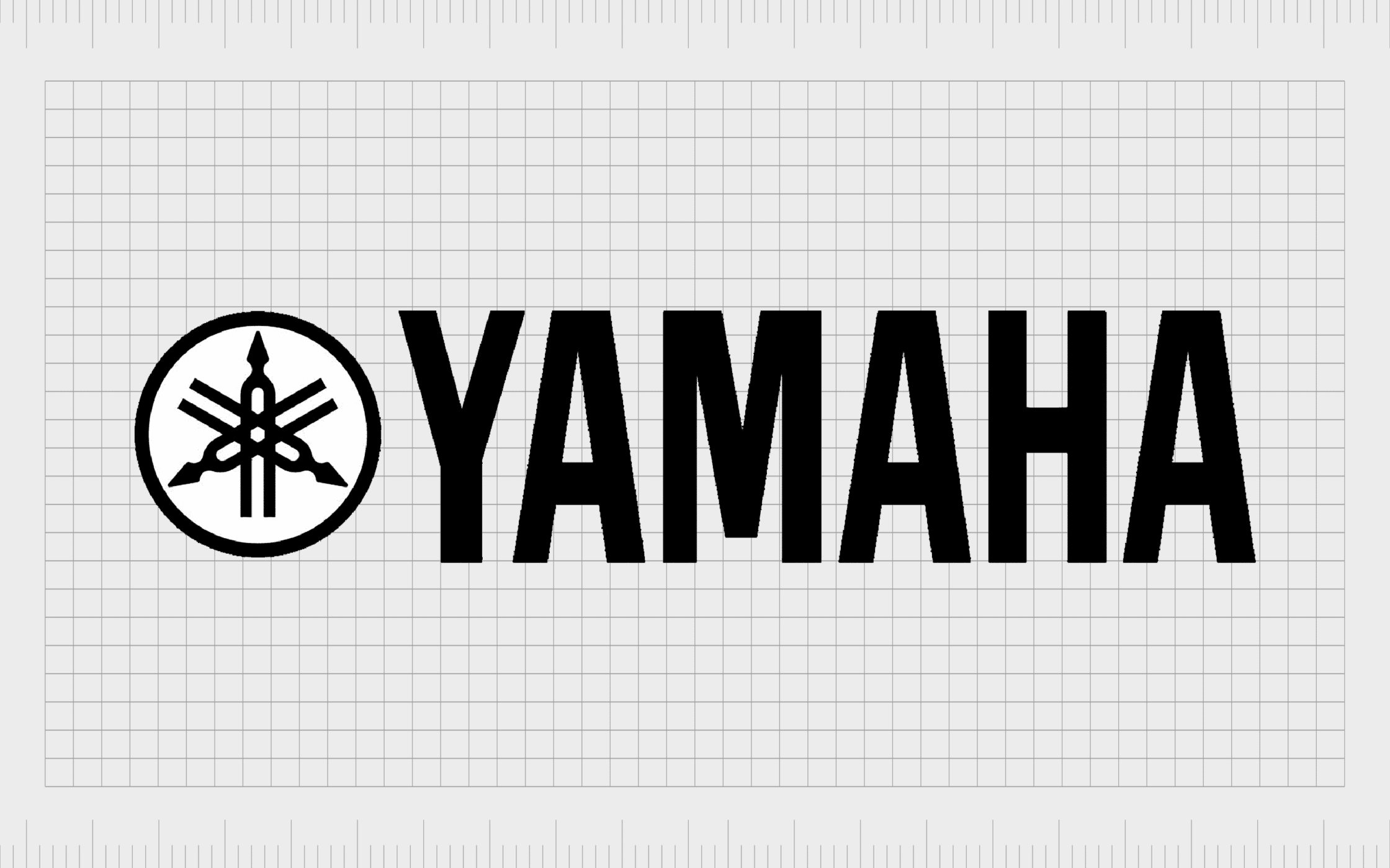
Yamaha
Yamaha is a company best known for selling musical products. The logo draws attention to the brand’s focus on sound, with a selection of three tuning forks laid over eachother to create a unique pattern. Each tuning fork also has an arrow, pointing in various directions.
The fact the arrows in this logo point in so many directions helps to highlight the creativity of the musical landscape. It also draws attention to the three pillars of the Yamaha business, which include production, sales and technology.
Exploring famous logos with arrows
Companies with arrow logos are in no shortage in today’s world. The arrow logo is popular because the symbol is so diverse and versatile. It can point in a number of directions to symbolize different things, and help to draw attention to a company’s personality.
Logos with arrows in them instantly make us think of progression and movement, helping to give life to a company’s image. The right arrow logos can also give strength and power to an image.
For companies looking for a simple but meaningful symbol to add to their logo, the arrow is one of the most effective choices available.
Fabrik: A branding agency for our times.

Clarity starts with a conversation.
Thanks—we’ll get back to you shortly.
Whether you're navigating a rebrand, merger, or simply need a clearer identity—we’re here to help. No hard sell, just honest advice from people who know the sector.
Let’s start with a simple question…
Prefer to email? Drop us a line.
Fabrik’s been helping organisations rethink and reshape their brands for over 25 years. We’ve guided companies through mergers, rebrands and new launches. Whatever stage you’re at, we’ll meet you there.