


Famous logos that use negative space: Why designers create negative space logos

Logos that use negative space creatively remind us how every element of an image contributes to the finished result. When designing a logo, it’s important to think about the positioning of white space between shapes and lines, and what this space might convey.
Negative space logos have a positive impact on your target audience. They not only provide additional depth and meaning, but also give viewers a thrill when they see the hidden image.
The human brain has an incredible ability to piece components together and discover patterns. By appealing to the inquisitive part of the brain, you can build a deeper connection between your customer and your company.
Today, we’re going to be looking at some of the most impressive examples of logos using negative space, and how they impact their audience.
Why do logo designers use negative space?
Before we begin looking at our negative space examples, let’s explore why designers use this strategy in the first place. In most types of logo design, the focus is on making an emotional impact and leaving a lasting impression. Negative space logos can help with this.
Taking advantage of negative space in a logo allows companies to send additional messages to their customers, while forming a stronger connection between the audience and the design.
By making the absence of something in a logo as important as the object itself, you can also bring “balance” to your composition in a way visually pleasing and engaging.
As an added bonus, negative space is an excellent way to get a customer to take a second look. It can be a wonderful tool for pushing people to actually pay attention to the image, rather than just scanning over it. After all, there are a lot of logos constantly battling for attention these days.
What is an example of negative space?
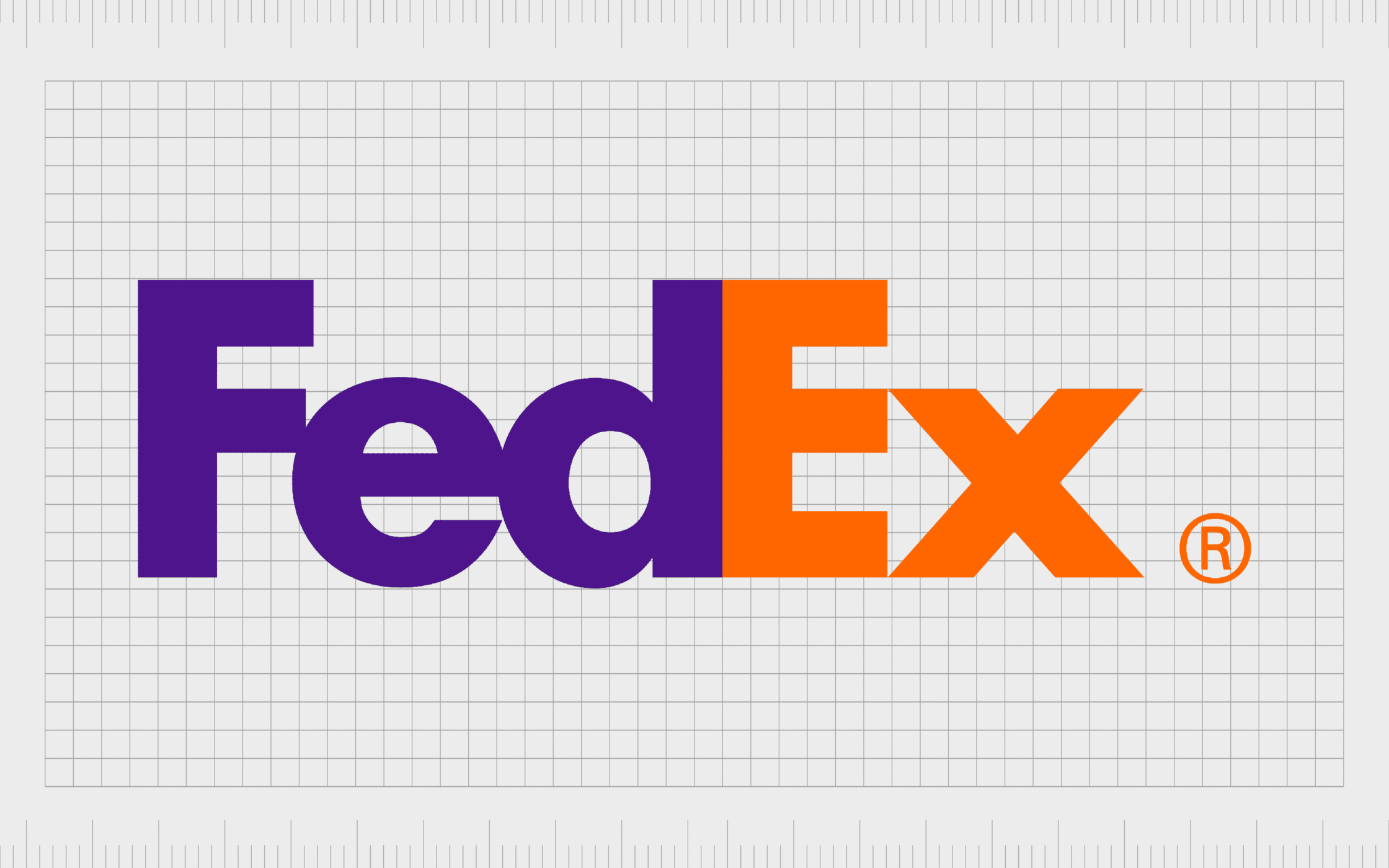
Probably one of the most famous examples of negative space is in the “FedEx” logo. Used subtly, negative space is a fantastic tool for emphasizing and defining the components of the positive space in an image.
In other words, it shows us where one shape ends, and another begins, helping to create clarity. However, the space between components can also do so much more.
Taking a look at the FedEx logo, we can see there’s very little space between letters in the wordmark. This is a deliberate choice by the designer, to leverage the power of negative space between the “E” and the “X”.
The white space between the two letters at the end of the logo creates a clear arrow. This arrow, pointing to the right, highlights the ideas of progress, motion, and speed – concepts FedEx wants us to associate with the brand.
How do you create negative space in a logo?
There are many examples of logos using negative space these days. In fact, the concept has become something of a trend over the years, with more and more companies taking advantage of all the different principles of design to capture audience attention.
While there are different methods of creating logos that use negative space, depending on your goals, some of the most common strategies involve:
1. Creating a hidden image
Just like in the example of negative space shown for FedEx above, the most common way to leverage negative space is to create a hidden image. Most of these images are likely to be quite basic, like an arrow.
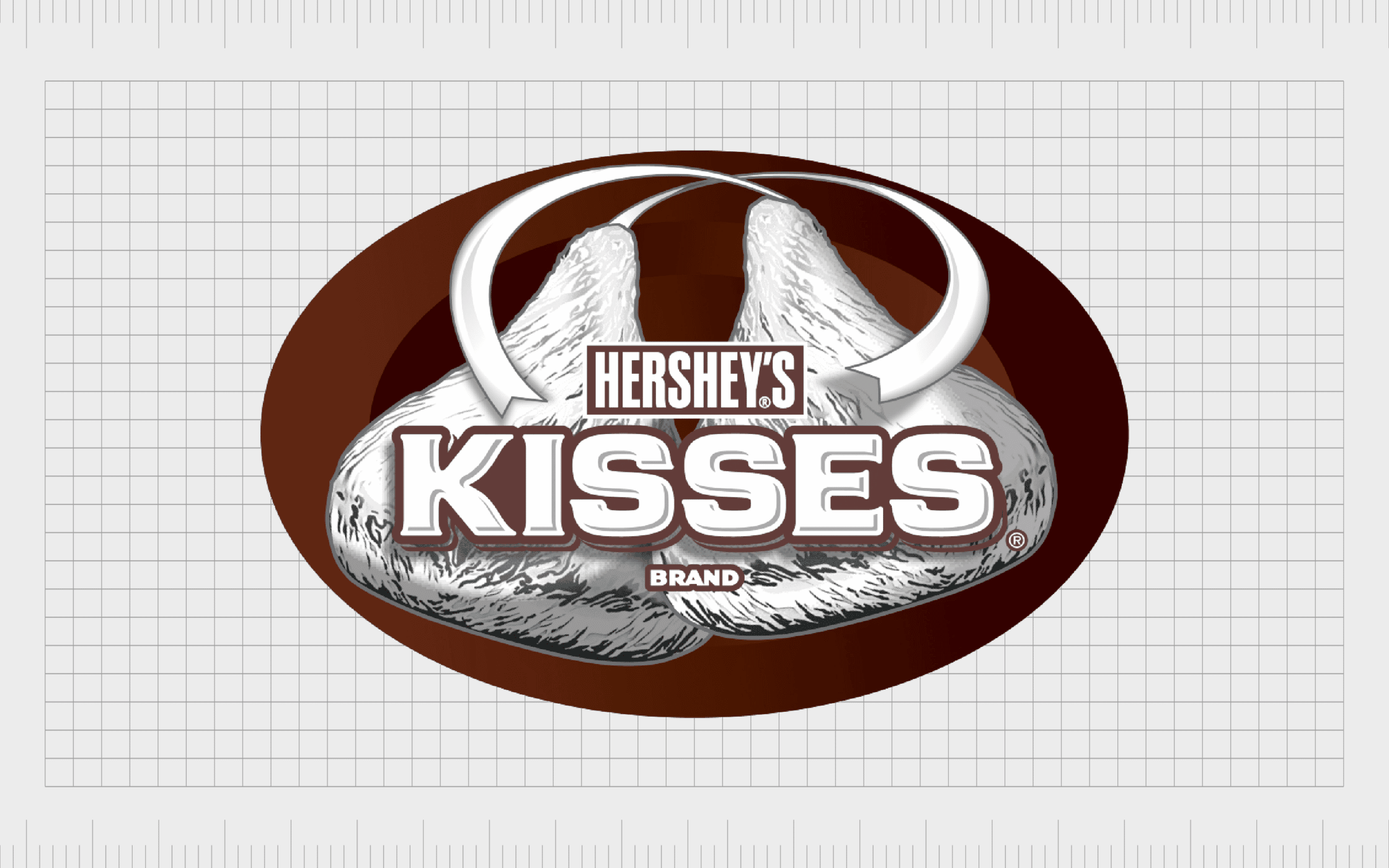
In the Hershey’s logo below, the space between the “K” and the “I” in the wordmark is carefully stylized to create the shape of a Hershey’s Kiss.
2. The law of closure
While most famous logos that use negative space to send additional information to their audience, some simply leverage the concept to create a modern, cohesive image. In the World Wildlife Fund’s logo, the panda’s head and torso are open shapes formed by negative space.
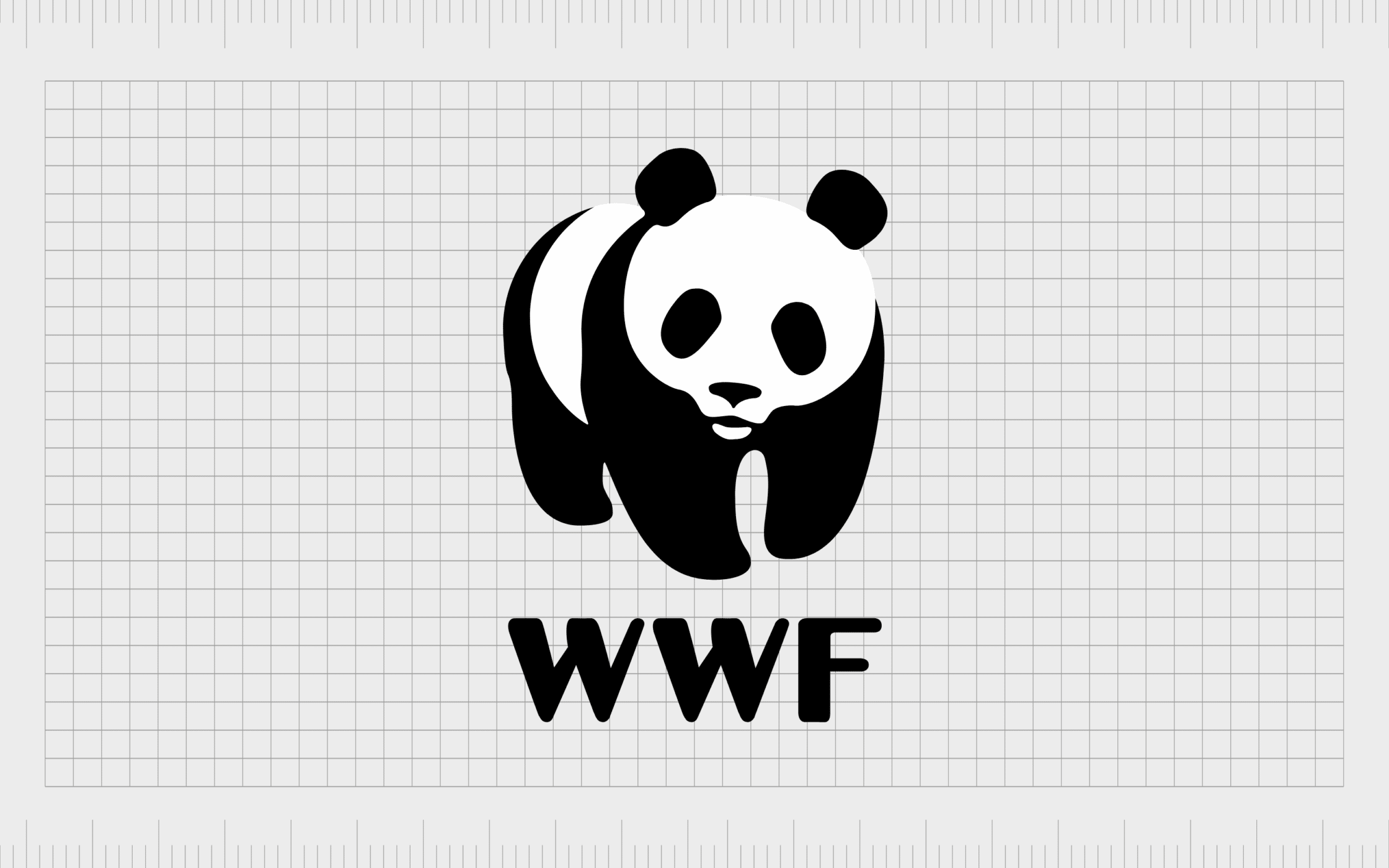
However, the positive space in the black components make it easier for us to make sense of the image.
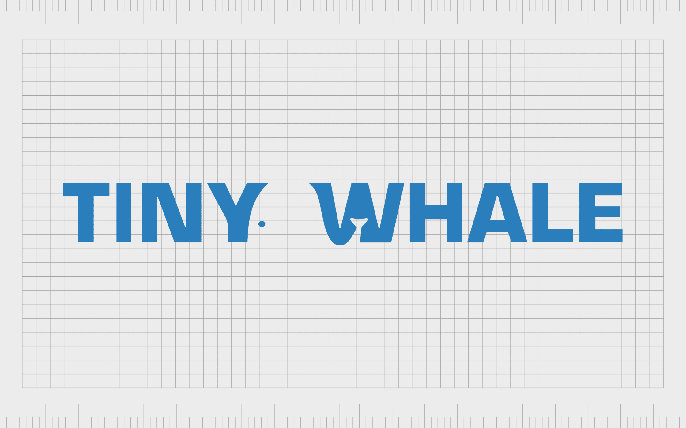
3. Typographical negative space
One of the easiest ways to use negative space is to take advantage of the natural space we automatically place between letters in a wordmark. The white space between the “Y” and the “W” in the image below, combined with the stylized nature of the letter “W” creates a whale.
4. Defining a product or brand
The white space in a logo can also help to create a defining message about what a brand does. In simplistic, minimalist logos, it’s often important to convey as much information as possible with limited resources.
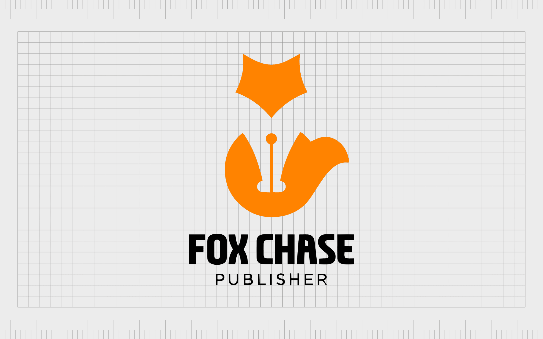
In the example above, the white space in the fox image works in two ways. It completes the image of the fox, tying together different components, as well as creating the image of a pen nib.
Examples of logos that use negative space
Now we know how logos that use negative space work, we can start exploring some excellent examples. Here are some of the most famous logos that use negative space, to help inspire your own design strategy.
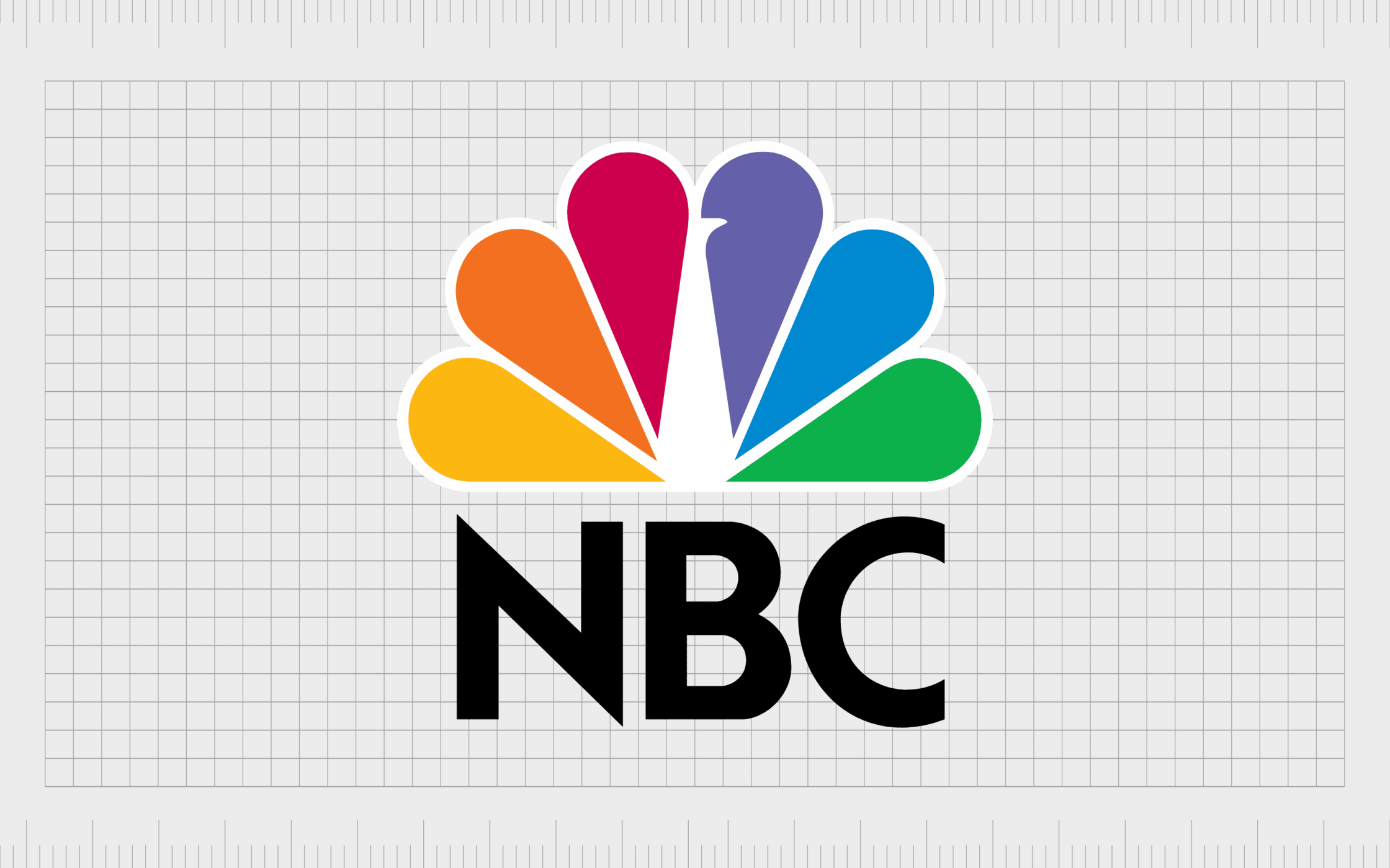
NBC
The NBC logo uses white or negative space to bring additional depth and meaning to the logo image. By adding a very simple white shape to the center of the image, the company transforms a selection of tear-drop shaped color swatches into the image of a peacock.
According to the NBC team, the decision to use a peacock as a kind of “mascot” for the brand was a reference to their focus on the rise of color television. The different colors in the design also highlight the different segments of the network.

The Guild of Food Writers
The use of negative space in a logo is an excellent way to provide more information about a company, and simultaneously highlight the brand’s personality. The Guild of Food Writers, for instance, uses the natural negative space in a pen nib, to add more depth to its logo.
The spacing in the pen nib is designed to look like a spoon, to remind us of the company’s focus on both food and writing. It’s an excellent way to blend the two elements of the brand’s identity into something we can instantly recognize.
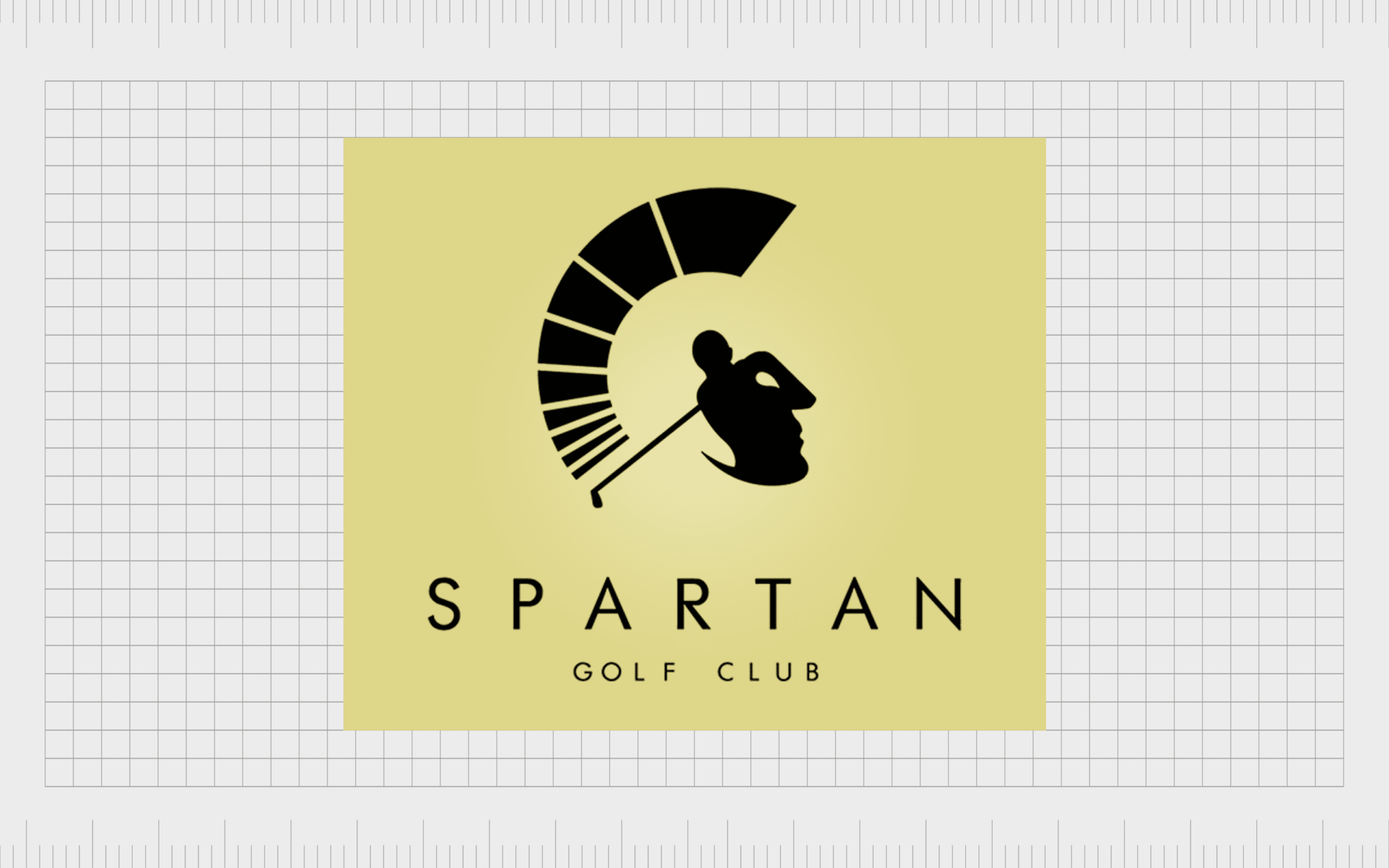
Spartan Golf
Aa fantastic example of how detailed logos that use negative space can be, Spartan Golf’s image is often highlighted in lists like these. At first, we simply see the image of a person playing golf placed above the Spartan wordmark. There’s even a power gauge above the golf club.
However, if you look a little closer, you can also see the gauge as a spartan helmet, and the man playing golf as the face of a soldier. It’s a fantastic, elegant, and unique example of white space in logo design.
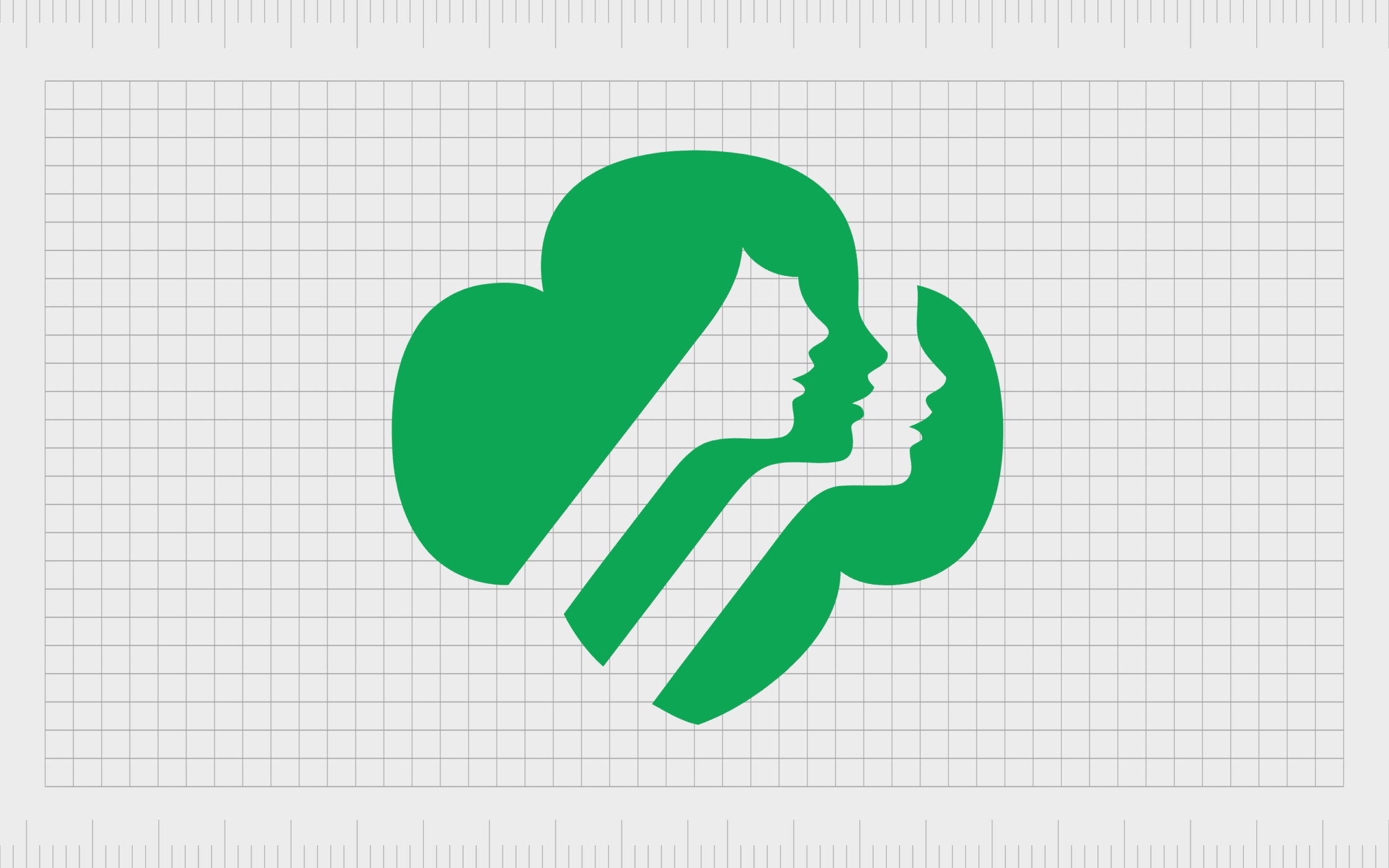
Girl Scouts
As mentioned above, some of the most famous logos that use negative space don’t necessarily leverage this trend to send an additional message. Instead, negative space can bring clarity and unity to the different elements in a page, helping our brain to make sense of what we see.
In the Girl Scouts image, we see a green shape which might look like a tree or a bush, representing the great outdoors. The white space also helps us to see three female faces.
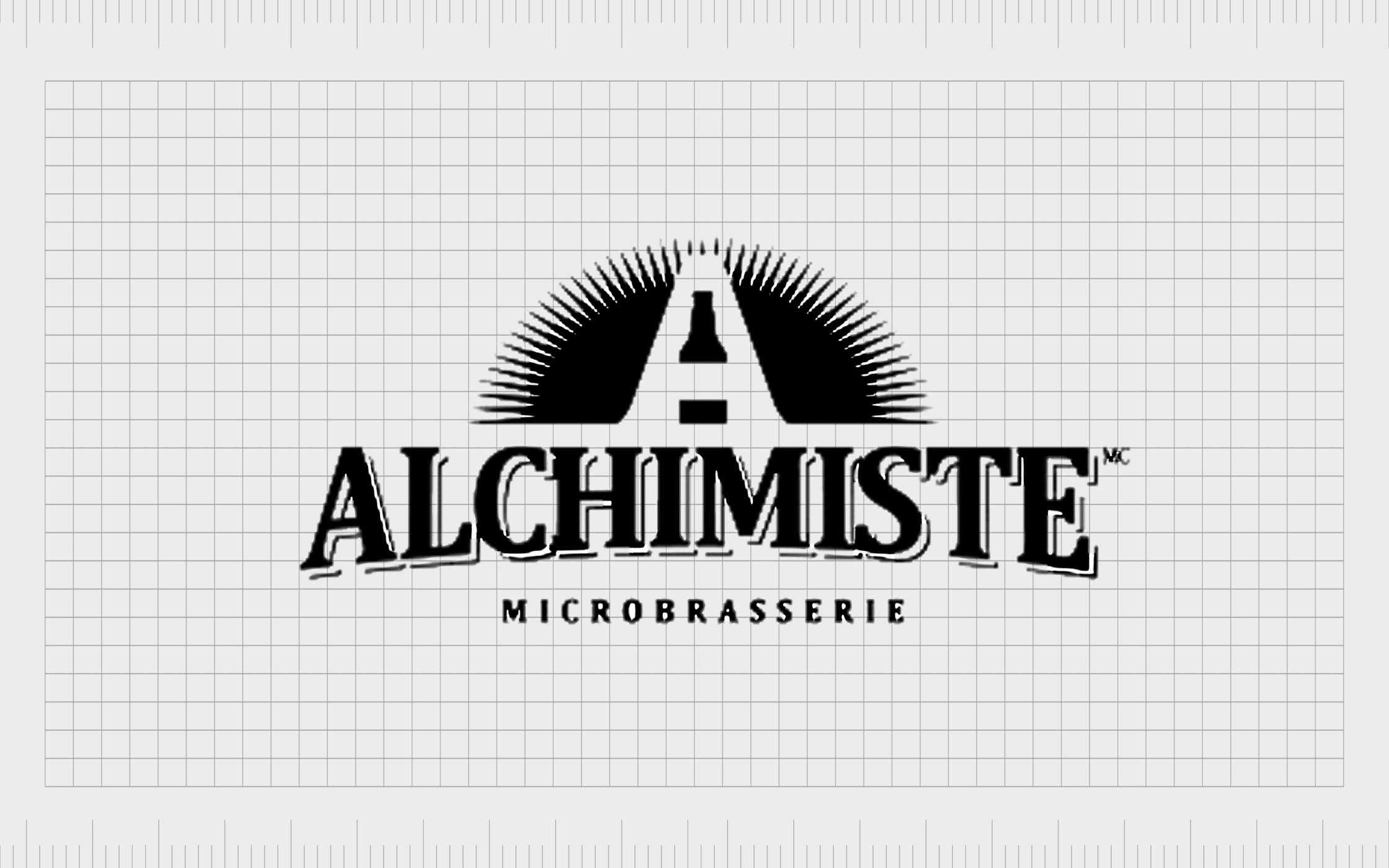
Alchimiste Microbrasserie
The natural white space in the letters of our alphabet is the perfect foundation for adding meaning to logo design. In the Alchimiste logo above, we see the company’s large, defining “A” at the heart of the logo. This represents the name of the brand.
However, to create the “A”, the company has also used positive space in the shape of a beer bottle. This pulls attention to the focus of the company and gives the brand extra personality.

Elettrodomestici
Logos using negative space are often deceptively simple. We can see an example of this in the Elettrodomestici logo. At a glance, the image looks extremely basic. We see a curved European-style plug for an electrical socket – ideal for an electric company.
Look a little closer, however, and you can also see the letter “E” in the white space, followed by the letter “D” in the positive space. This reminds us of the name of the company in a way both minimalist and elegant.
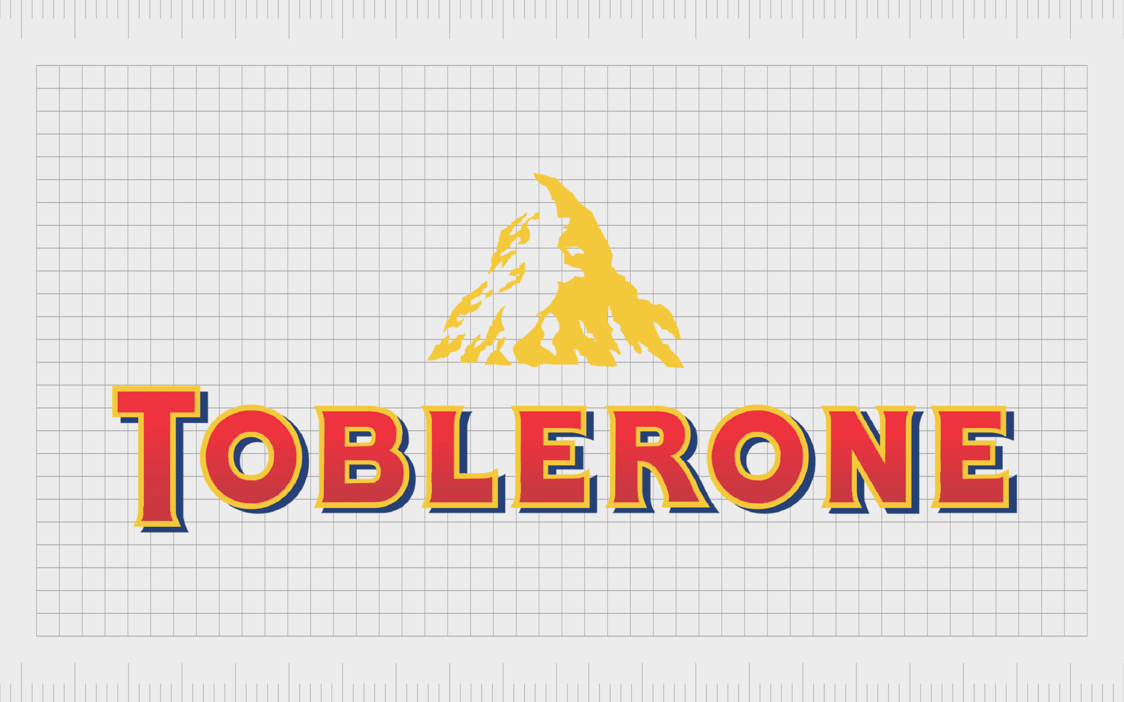
Toblerone
One of the most famous logos that use negative space in the market today, the Toblerone logo has earned a lot of attention for its hidden meaning in recent years. At a glance, the eye-catching logo simply depicts the image of the Matterhorn mountain, an iconic location in Switzerland.
Hidden within the mountain, however, is another reference to Toblerone’s origins. A white bear reminds us of the city of bears, where Toblerone came from. It’s also a reference to the honey used as part of the famous product’s ingredient list.
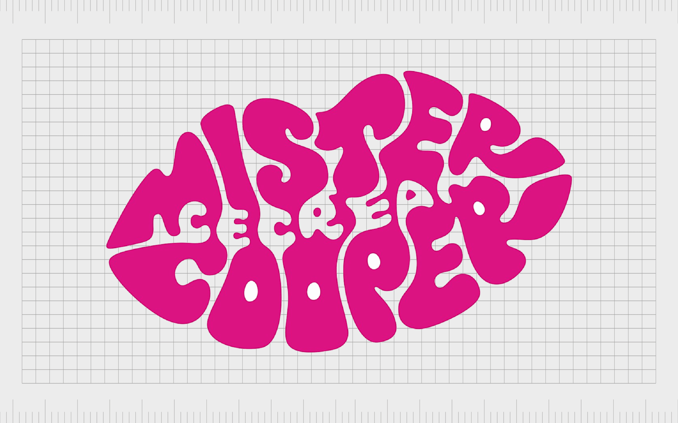
Mister Cooper
While the Mister Cooper ice cream brand might not be quite as well known as some of the other examples of negative space logos on this list, it’s still a great insight into the trend.
To create this logo, the designers have used stylized letters to form the wordmark into the shape of a puckering set of lips, ready for a kiss.
However, in the very middle of the image, within the white space between the stylized letters, we also see the word “ice cream”. This helps remind us of exactly what the business does.
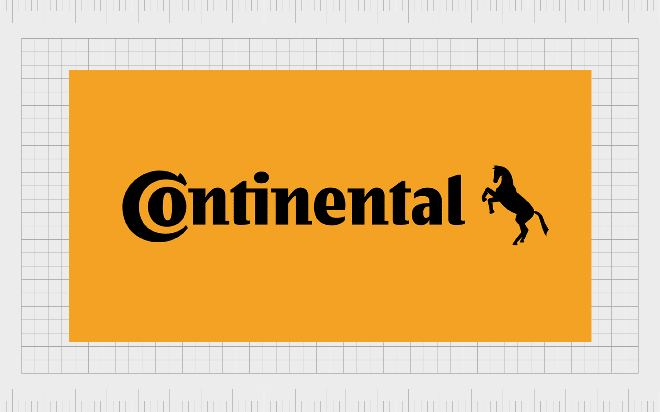
Continental
Subtle, but effective, the Continental Tires logo reminds us logos with negative space don’t have to be overly obvious. This logo is also an insight into how removing the amount of space between components in a logo, like letters in a wordmark, can also create a new image.
By reducing the space between the “C” and the “O” in the “Continental” wordmark, the logo designer has created a simplistic image of a tire. This pulls extra attention to the nature of the business.
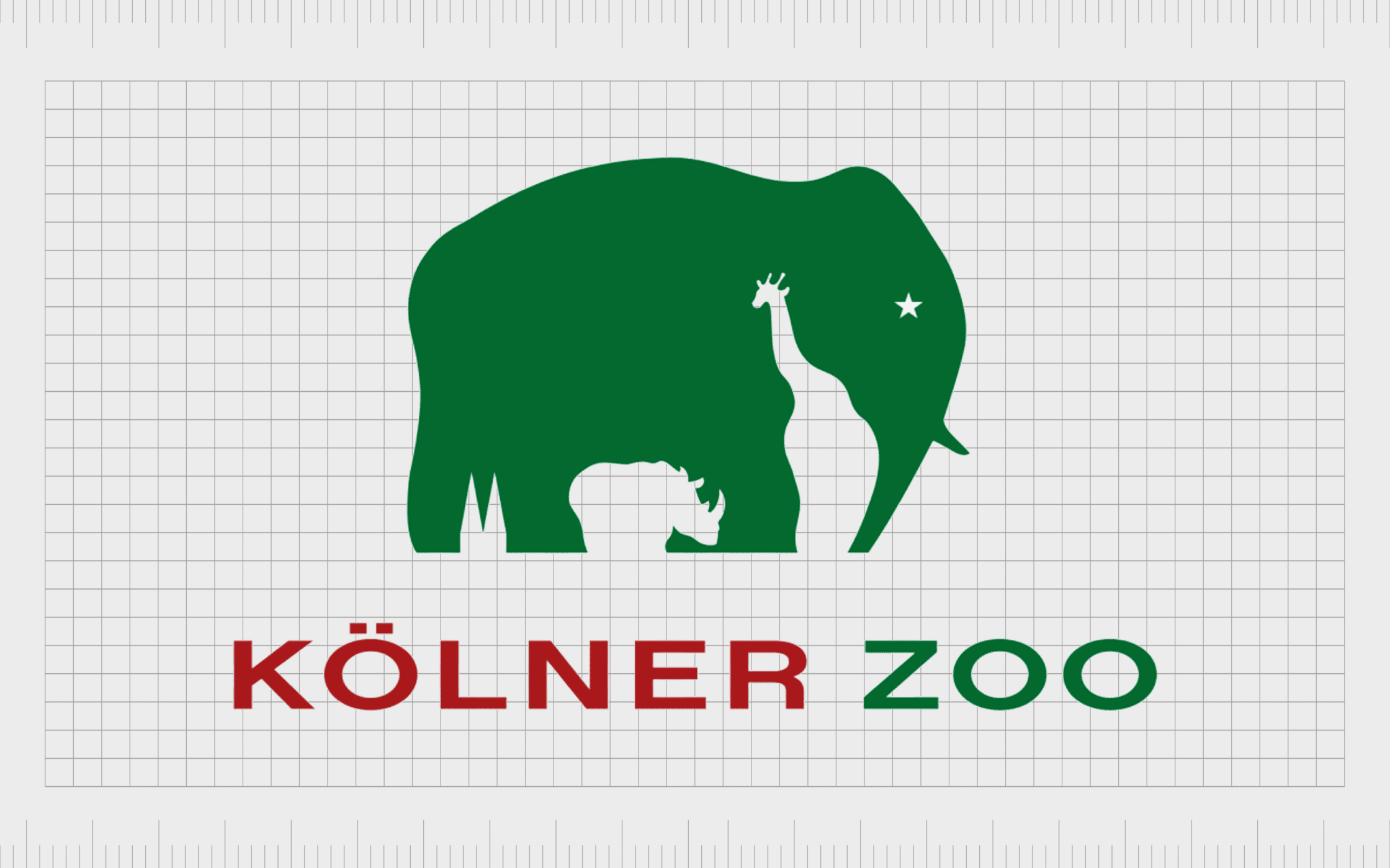
Kolner Zoo
One of our favorite examples of negative space in logo design, the Kolner Zoo logo packs a lot of meaning into a limited space with its brand emblem. To create the image of an elephant with positive space, the company uses white space in the shape of other important symbols.
At the front of the elephant, we see a star for the creature’s eye, a giraffe forming the trunk and front legs, and a rhino in the middle, to separate the front and back legs. There’s even a reference to the Cologne Cathedral at the very back.

My Fonts
A fantastic example of how the negative space between letters in a wordmark can make all the difference to an image’s meaning, the “My Fonts” logo is a wonderful negative space logo design. At first, we just see a creative, handwritten style of wordmark, ideal for an artistic company.
However, if you look a little closer at the “My” section of the wordmark, you’ll quickly discover the image of a hand, with four fingers and a thumb. This is intended to highlight the ability of designers to simply go and grab any font they want from the website.
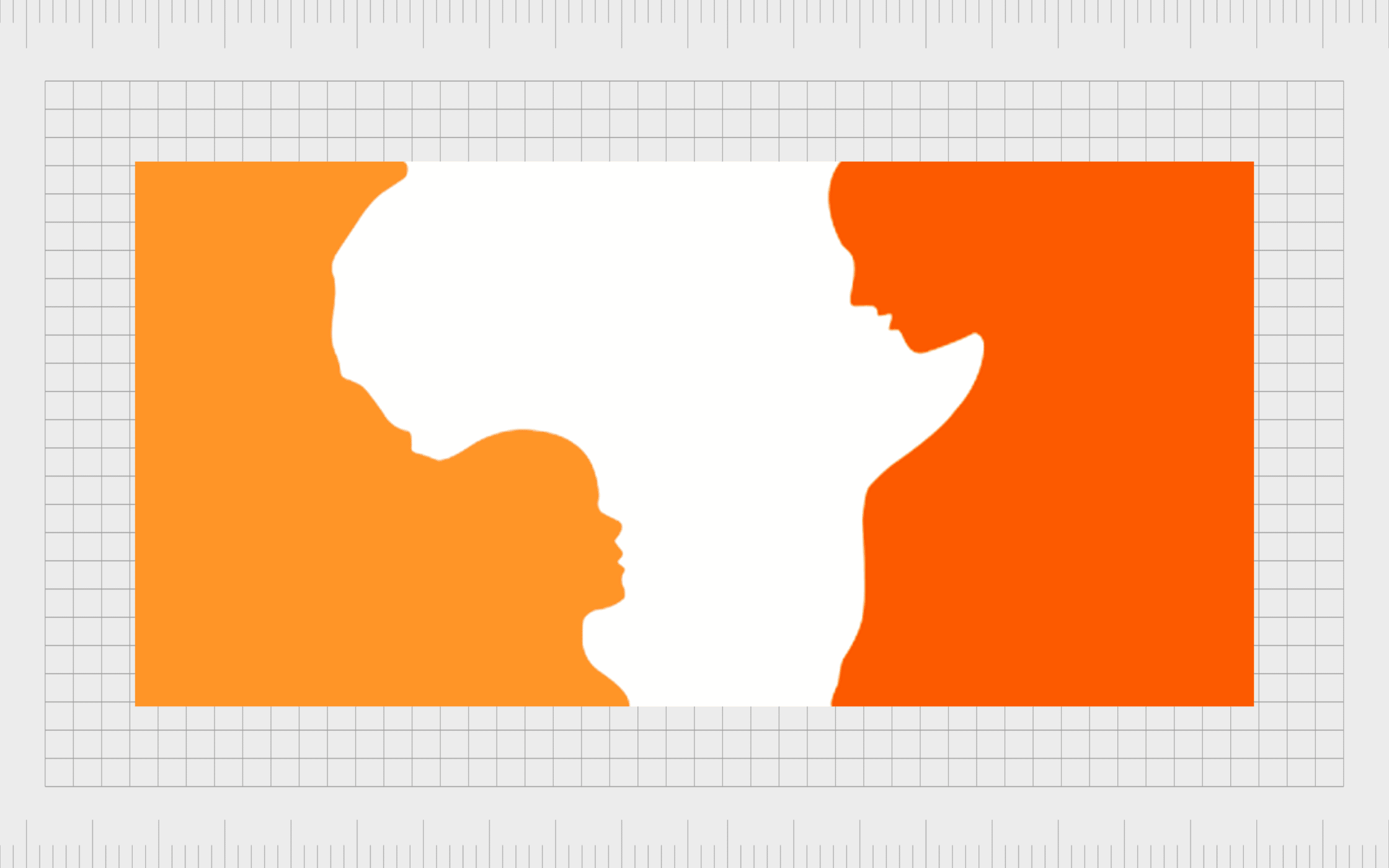
Hope for African Children Initiative
It’s not just big brands and commercial companies leveraging logos that use negative space. Non profit organizations and charitable groups can take advantage of this concept too. The Hope for African Children Initiative is an excellent example of this.
Depending on how you look at the image above, you might see the white space first, depicting a map of Africa. Alternatively, if you focus on the orange segments of the piece, you can see a small child looking towards an adult for guidance.
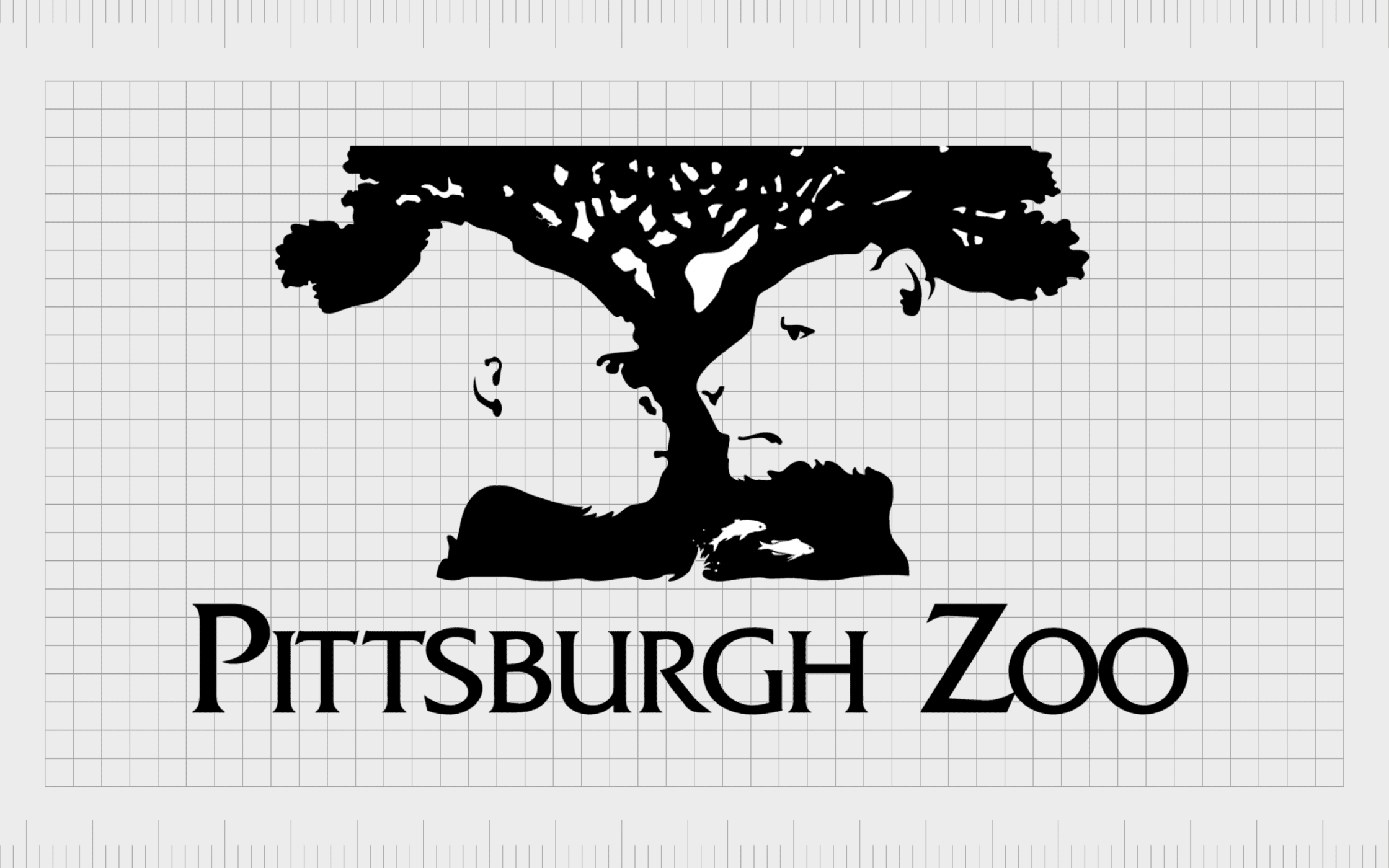
Pittsburgh Zoo
A gorgeous and particularly detailed example of negative space in logo design, the Pittsburgh Zoo image immediately grabs anyone’s attention. At first, we see an exotic looking tree, with birds flying above it. However, the white space around the tree also forms the image of two animals.
On the right side of the image, we have a clear view of a lion’s face, while the left side shows the image of an ape. This offers a fantastic insight into how detailed negative space logos can be.
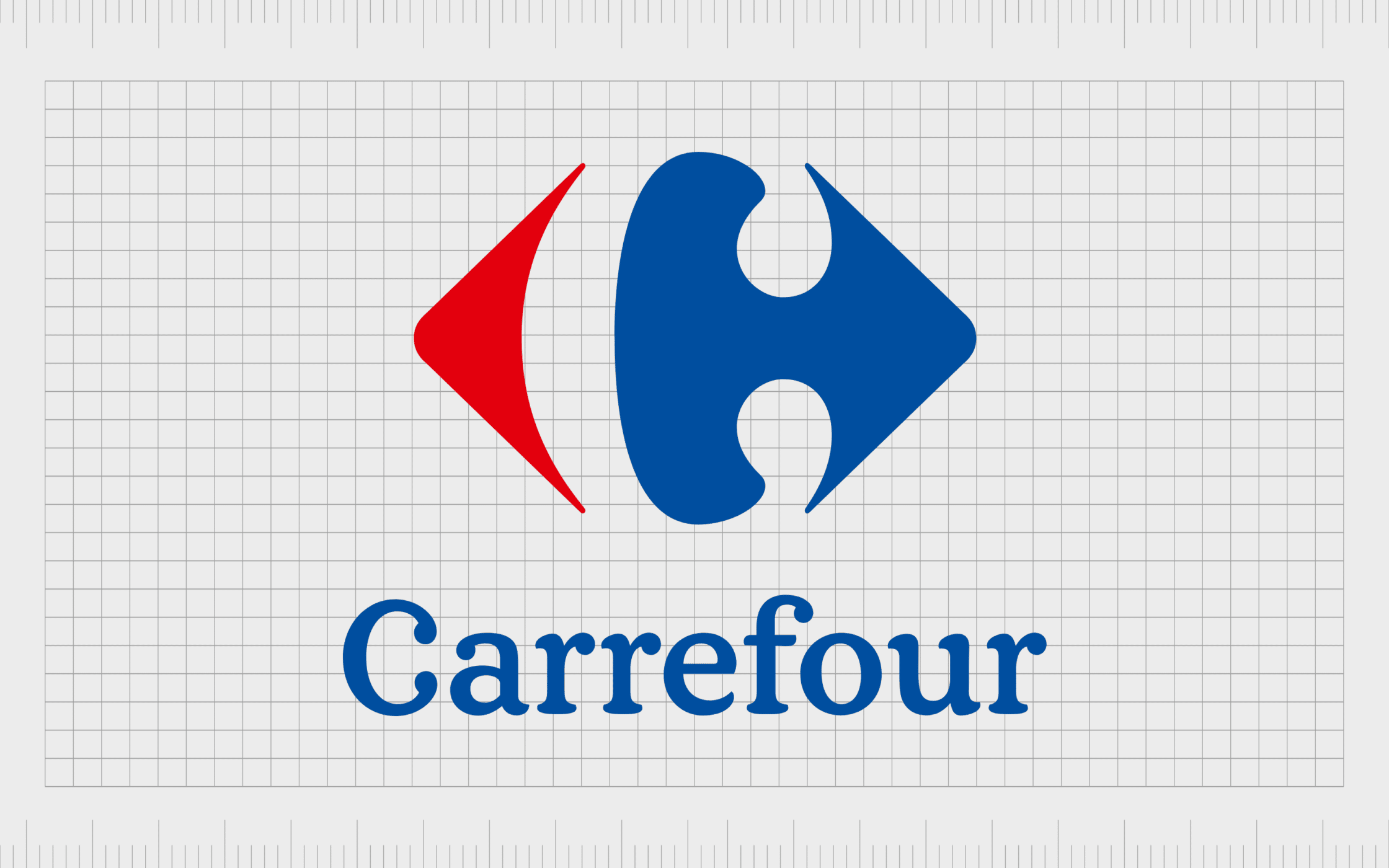
Carrefour
The name Carrefour stands for “crossroads” in French. This could be why the company decided to use a set of two arrows pointing in each direction in its logo. However, there’s more than just the arrows to notice in this logo.
If we examine the image more closely, we see the white space forms the shape of a letter “C”. Notably, the typography choice for this negative space character is the same as the typeface the company uses for its wordmark too.

Beats
Another one of the most famous logos that use negative space, Beats uses white space within a red circle to depict a lowercase “B”. This draws attention to the name of the company, and the wordmark, which also uses lowercase letters.
However, the design of the “B”, which connects to the very top of the red circle, could also convey the image of someone wearing a set of Beats headphones. The red circle simply acts as a very basic shape for a person’s head.
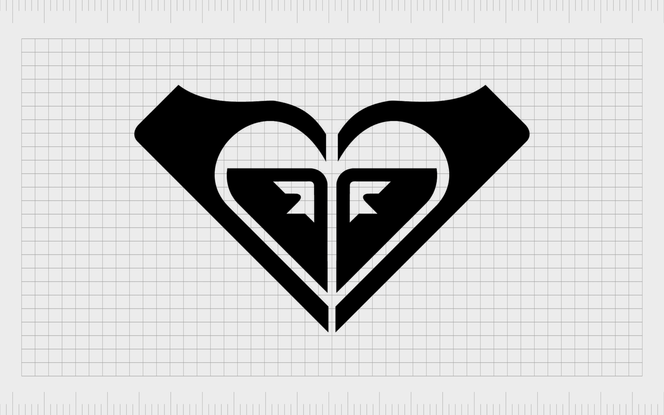
Roxy
The Roxy Quicksilver brand has one of the more memorable logos in the sporting landscape, particularly among younger girls – the company’s target audience. We see a stylized image of a heart in the middle of this logo.
However, what you might not realize is the design is intended to look like two hands holding the heart.
It’s also worth noting that this image has been created by rotating two Quicksilver logos, to draw further attention to the company’s parent brand.
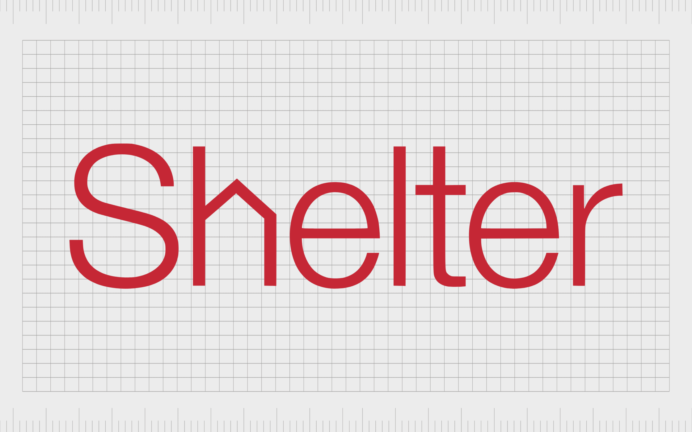
Shelter
Shelter is another example of a non-profit company leveraging logos that use negative space. Non profit brands can definitely benefit from pushing viewers to give their logo a second look, and think a little more carefully about the nature of the design.
Though simple, this logo’s decision to create angles within the “H” of the wordmark turns the whitespace in the character into a house. This reminds us of the group’s desire to put a roof over everyone’s heads.
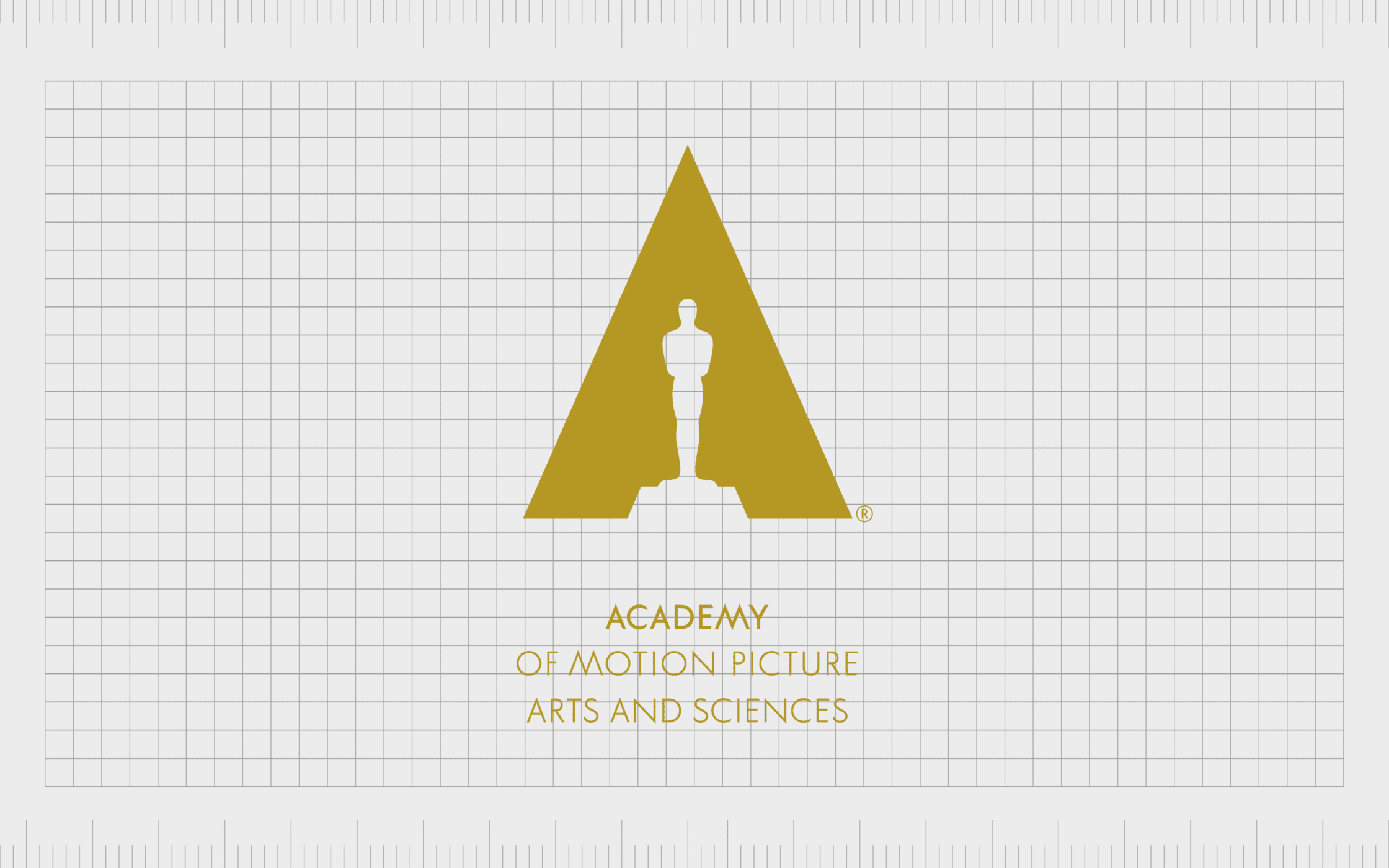
Academy of Motion Picture Arts and Sciences
Simple but effective, the Academy of Motion Picture Arts and Sciences logo immediately gives more depth to the group’s image. The design includes a picture of a famous award in the white space within a large triangle shape.
The combination of the negative and positive space creates the image of an “A”.
This design automatically reminds us of what the academy’s focus is, while still drawing attention to the first letter of the company’s name, like many other logos do.
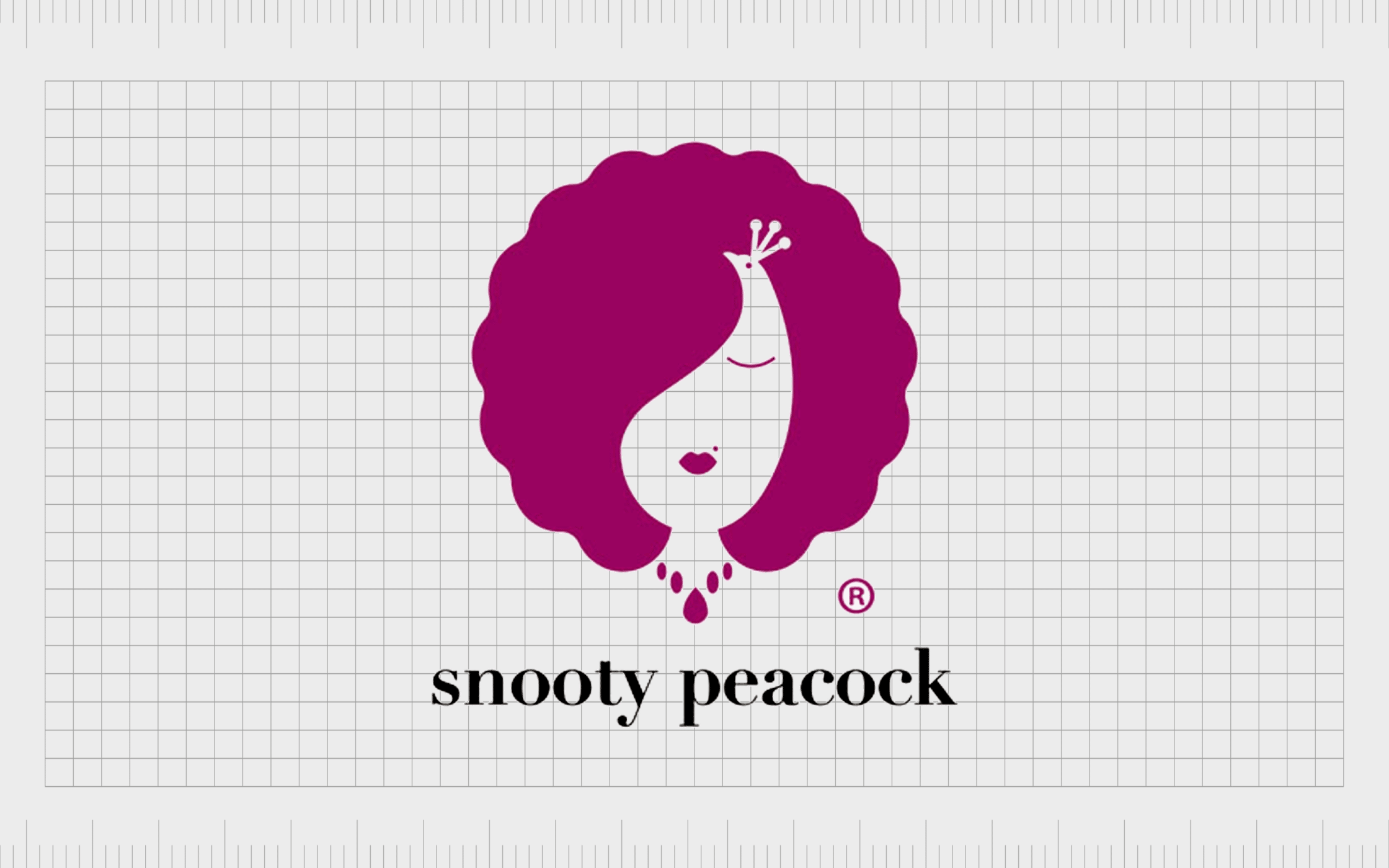
Snooty Peacock
The Snooty Peacock logo is a fun example of how much personality the right use of negative space can give a brand image. Depending on how you look at this image, you may first see the image of the peacock, created within the white space, with various accents to highlight the image.
However, if you focus on the purple, positive space aspects of the image, you’ll see the picture of a woman’s face, reminding us the brand is focused on woman’s fashion.
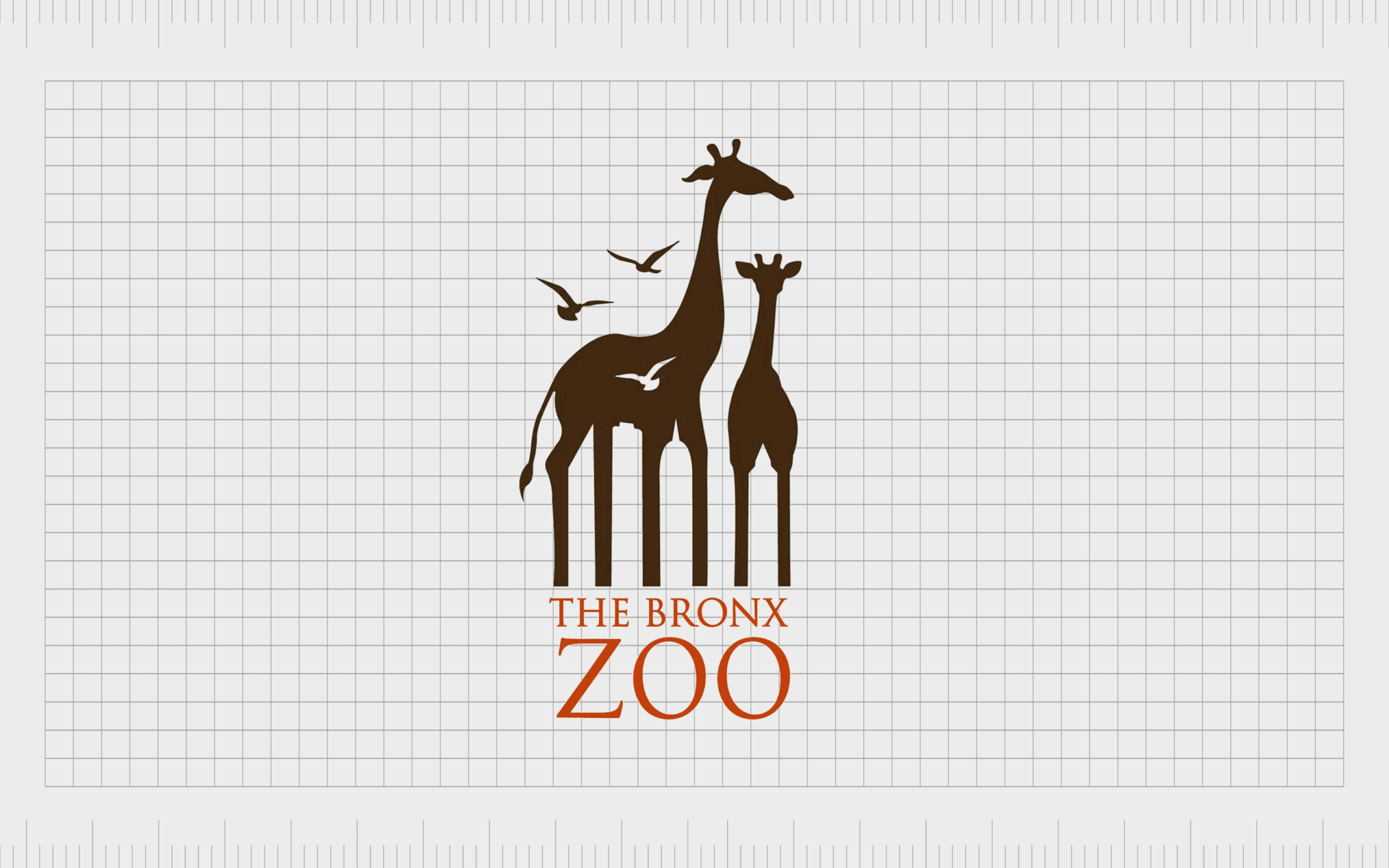
The Bronx Zoo
Logos that use negative space appear to be particularly common in the zoo landscape. Perhaps these companies want to create a real sense of magic and discovery for their attendees. The Bronx Zoo logo is another excellent example of this.
The two giraffes in the image have carefully designed legs, which look similar to the buildings in the Bronx, in New York. This reminds us of the location of the company, while giving extra depth to the overall design.

USA Network
A wonderfully modern and eye-catching image in the world of negative space design, the USA network keeps things simple in its design.
The image simply features the letters “USA”, but instead of using a consistent design for all of these letters, the company uses the negative space between the “U” and the “A” to create an “S”.
This interesting use of the whitespace between letters to create an additional letter helps to make the company stand out, and makes the logo itself more memorable.
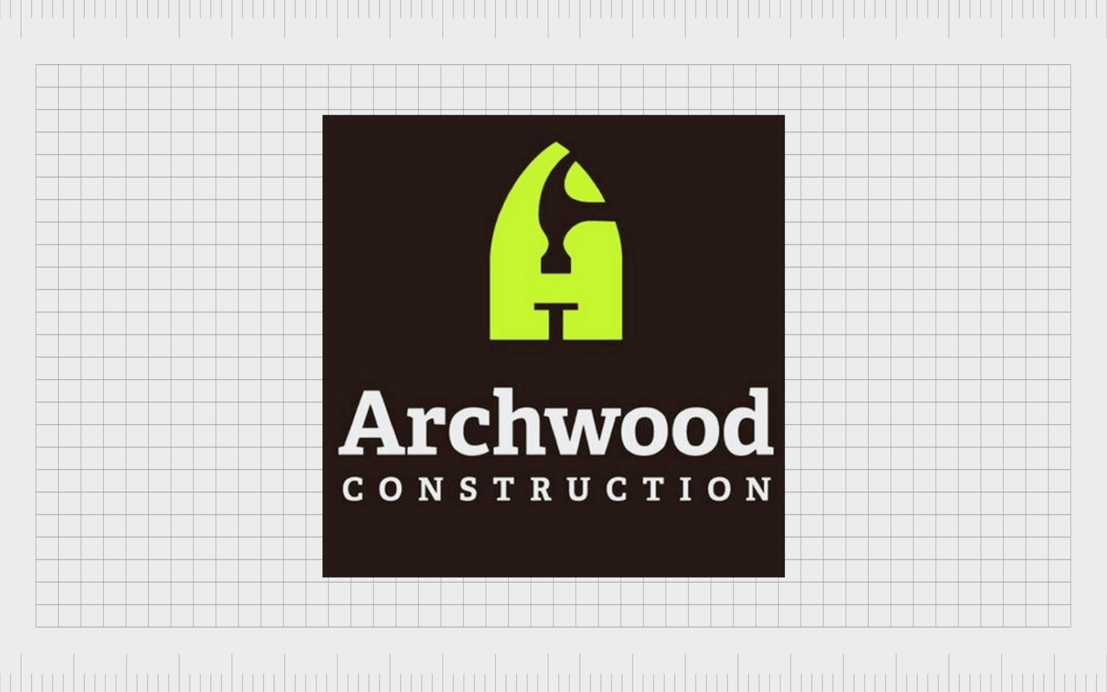
Archwood Construction
Sophisticated and elegant, the Archwood Construction logo uses the white space naturally present within the character for the letter “A” to convey meaning. The top part of the “A” is a hammer, while the bottom section is a nail.
Clearly, this immediately draws attention to the focus of the company, and its commitment to helping people build their ideal homes.
Negative space examples in logos
Logos that use negative space are everywhere in the world today. They offer an excellent insight into how companies can leverage the various components of logo design to convey genuine meaning to their audience.
They’re also fantastic for causing your customers to take a second look at your brand, improving your chances of long-term recognition.
Of course, creating logos with negative space requires strategy and patience. It’s important not to allow the negative space to overwhelm the positive space in an image, as this can make the overall composition too confusing to follow.
If you’re planning on using negative space in your logo design, it’s worth reaching out to a professional designer for extra guidance.
Fabrik: A branding agency for our times.

Clarity starts with a conversation.
Thanks—we’ll get back to you shortly.
Whether you're navigating a rebrand, merger, or simply need a clearer identity—we’re here to help. No hard sell, just honest advice from people who know the sector.
Let’s start with a simple question…
Prefer to email? Drop us a line.
Fabrik’s been helping organisations rethink and reshape their brands for over 25 years. We’ve guided companies through mergers, rebrands and new launches. Whatever stage you’re at, we’ll meet you there.