MUFG Bank logo history: The MUFG brand image

Unless you’re located in Japan or interested in the branding world, you probably don’t know much about the MUFG bank logo. Otherwise known as the Mitsubishi UFJ Financial Group, the MUFG bank is one of the largest players in the financial industry and a major worldwide brand.
Like most bank logos, the MUFG emblem was designed to send an important message to the company’s customers about the organization’s identity, values, and personality. At a glance, the logo tells us the company is sophisticated yet passionate. The image is simple yet evocative.
However, MUFG hasn’t always had the same image or, indeed, the same brand identity as the one we know today. If you’ve ever found yourself wondering about MUFG’s origins or simply want to learn more about logo design, read on for insight into the MUFG bank brand.
What is the full meaning of MUFG?
Let’s start with the basics: What does MUFG mean?
MUFG stands for the “Mitsubishi UFJ Financial Group.” However, the company rarely uses its full name, opting primarily for “MUFG” or “MUFG” bank in its brand assets.
Currently, the MUFG bank is the largest in Japan. It was established on the 1st of January 2006, following the merger of the Bank of Tokyo-Mitsubishi and the UFJ bank (hence the new name). Since then, MUFG has emerged as one of the three banks in Japan known as “megabanks.”
It’s also considered a systemically important bank, according to the Financial Stability Board.
MUFG serves the retail, corporate, and retail banking components of the larger Mitsubishi UFJ Financial Group. The client base of the company largely consists of Japanese corporations. However, MUFG has gradually expanded overseas, lending money to corporations worldwide.
Is MUFG same as Mizuho?
Mihuzo Bank is a separate banking institution, launched originally in 2002.
It belongs to the Mihuzo Financial Group and offers integrated retail and corporate banking surfaces. The reason Mihuzo and MUFG are often confused with one another is they both stand as one of the three megabanks in Japan, alongside SMBC.
What is unique about MUFG?
There are a few reasons why the MUFG bank might be considered relatively unique. First and foremost, it’s Japan’s largest bank and the world’s fourth-largest bank.
What really makes MUFG interesting, however, is its history.
The MUFG company is a product of three major bank mergers, which took place between 1996 and 2006. The story starts with Mitsubishi bank, which was founded in 1880 by Iwasaki Yatarō. This company merged with the Bank of Tokyo in 1996 to create the new Bank of Tokyo-Mitsubishi.
In 1998, the second and third largest banks in the Swiss landscape, the Union Bank of Switzerland and the Swiss Bank Corporation, joined forces to create the “UBS AG” brand. This bank became the second-largest bank in the world at the time, falling just behind the Bank of Tokyo-Mitsubishi.
Until the Tokyo-Mitsubishi merger, another bank based in Osaka was considered the strongest in Japan. This was the “Sanwa bank.” By 2000, however, the company had dropped down to the position of the fourth largest bank in Japan and decided to start looking into mergers for growth.
Sanwa joined forces with the Tokai and Asahi banks to create the world’s third-largest banking corporation by assets. In 2001, the Toyo Trust & Banking company was also added to the group.
The newly created company was named “United Financial Holdings of Japan,” or “UFJ Bank.” In 2005, the holding companies of UFJ and BTM agreed to merge and form Japan’s largest bank overall.
The core units of MTFG and UFJ Holdings, the UFJ Bank and the Bank of Tokyo-Mitsubishi, continued to operate separately until 2006 when the two companies combined to create a new company named the Bank of Tokyo-Mitsubishi UFJ, or BTMU.
In 2018, the name of the company was changed to “MUFG,” or Mitsubishi UFJ Financial Group, removing the “Tokyo” element completely.
MUFG Bank logo history: The MUFG logo
The unique history of the MUFG bank makes the evolution of its logo a little difficult to follow. To really look back at the full transformation of the MUFG brand identity, we also need to consider the various logos of the companies that came together to form the resulting organization.
Unfortunately, there aren’t a lot of resources available online to show us what different Japanese banks logos might have looked like too many years ago. The origins of the Sanwa bank date back to the 1600s.
However, we can formulate a basic timeline, exploring how the bank’s identity has transformed over the most recent decades.

The Sanwa Bank logo
The Sanwa bank, one of the core banks responsible for the eventual formation of the MUFG Bank, used a relatively simplistic logo between 1933 and 2002. The image featured a clover-style emblem with three triangle segments in green.
The bank’s name was written in a simple sans-serif font, in black, on the right-hand side of the emblem.
The Tokai Bank
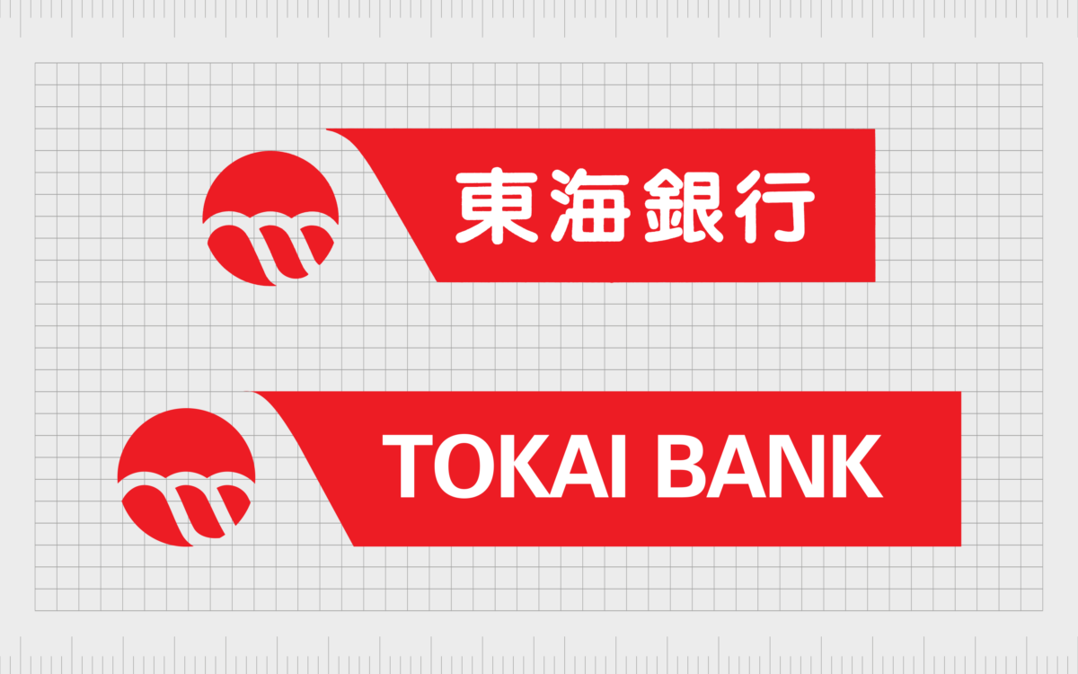
The Tokai Bank featured a banner-style shape with the company’s name written on it in white font. Next to the banner, we see a circular shape with three curved white lines. The lines look similar to waves or hills, which might symbolize concepts like growth and progress.

The Bank of Tokyo
The Bank of Tokyo also used the color green in its emblem. This makes sense when considering the shade’s connotations with ideas of wealth and money.
The Bank of Tokyo used an abstract, white triangle shape placed in a green circle for its emblem, with another green circle in the middle of the triangle. The name of the bank was written in decorative font beside the design.

The Mitsubishi Bank
Before it became the Bank of Tokyo-Mitsubishi, the Mitsubishi bank had a relatively eye-catching logo featuring two flying white birds on the left, and the Mitsubishi symbol, alongside the company’s name on the right.
Anyone familiar with Mitsubishi is sure to recognize the three-diamond emblem here.
The Bank of Tokyo-Mitsubishi
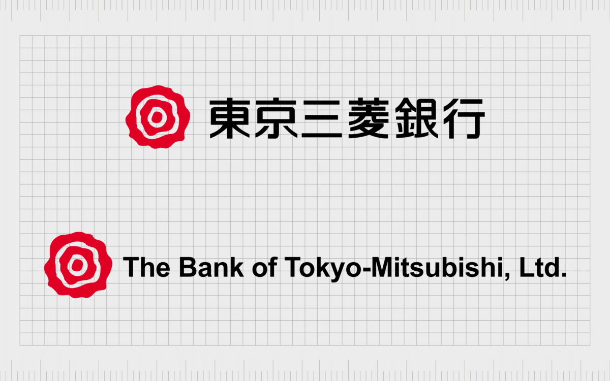
When the Bank of Tokyo and the Mitsubishi bank merged, a new emblem was created, although the red from the previous Mitsubishi emblem was preserved. The design was straightforward, featuring the company’s name alongside a flower-style shape in red and white.

The UFJ Bank
The logo for the UFJ bank is quite unlike anything else we’ve seen from the many financial institutions that came together to create the MUFG Bank. This is the only logo in this list to use a three-dimensional emblem in the form of a gold hoop.
It’s also the only design that features a brown-colored wordmark.
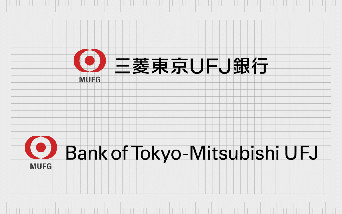
The Bank of Tokyo-Mitsubishi UFJ
Since the MUFG Bank was officially formed, two variations of the logo have been in use. The first featured the full name of the bank, placed alongside an emblem that looks a little like a red and white target. The symbol also included the letters “MUFG” beneath it.
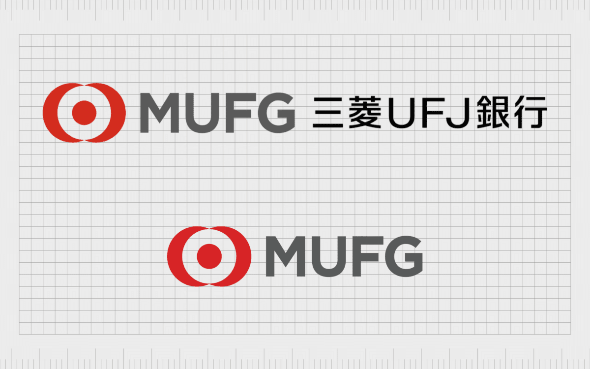
This design was used briefly between 2006 and 2016 until the company eventually updated its logo in 2018 to feature just the acronym “MUFG” with the red target-style design. The MUFG lettering is depicted in a sophisticated grey font.
MUFG logo meaning, colors, and fonts
The MUFG Bank has come a long way over the years. It results from numerous mergers and strategic acquisitions in the Japanese financial market. Today, we can only see a few basic hints about the company’s origins in its logo.
The red coloring, for instance, maybe a reference to the red commonly used in Mitsubishi branding palettes.
The circular shape also appeared as a common design element in many of the different logos used by the banks, eventually forming the MUFG Bank. Overall, however, it’s likely this logo is intended to be a symbol of unity, ambition, and strength for the company.
If you want to look at the MUFG logo, you can find some helpful resources here.
What color is the MUFG Bank logo?
The MUFG Bank logo colors are white, red, and grey. Grey is often a color used to demonstrate sophistication and professionalism in the business world. Red symbolizes passion, power, and vitality, particularly in the Japanese region.
On the other hand, white is often a color used to represent virtue and excellence in many regions of the world.
Unfortunately, there are no official MUFG Bank logo color hex codes listed by the business at this time. However, we know red is extremely bright and vibrant, while grey is soft and silvery.
What font does the MUFG Bank logo use?
The MUFG Bank logo font is a simple sans-serif typeface, at least when it’s seen in the western market. The typography choice is simple but effective. It conveys the company as modern and authoritative, thanks to a gentle bolding.
Learning from the MUFG Bank logo
The MUFG Bank logo today is an interesting and engaging symbol.
It highlights the unique nature of the MUFG brand, showcasing its strength, passion, and sophistication in one neat package. It also offers some insights into the company’s history when we look back at the logos of the brands that came before MUFG Bank.
Hopefully, brief dive into the MUFG Bank branding history has inspired and educated you.
Fabrik: A branding agency for our times.
Clarity starts with a conversation.
Thanks—we’ll get back to you shortly.
Whether you're navigating a rebrand, merger, or simply need a clearer identity—we’re here to help. No hard sell, just honest advice from people who know the sector.
Let’s start with a simple question…
Prefer to email? Drop us a line.
Fabrik’s been helping organisations rethink and reshape their brands for over 25 years. We’ve guided companies through mergers, rebrands and new launches. Whatever stage you’re at, we’ll meet you there.


